plotly_anomaly_fl()
함수 plotly_anomaly_fl() 는 대화형 변칙 차트를 만들기 위해 플롯 템플릿을 사용자 지정할 수 있는 UDF(사용자 정의 함수)입니다.
함수는 원본 및 기준 시계열, 각 크기의 양수 및 음수 변칙 목록 및 차트 레이블 지정 문자열이 포함된 테이블을 허용합니다. 함수는 플롯 JSON을 포함하는 단일 셀 테이블을 반환합니다. 필요에 따라 Azure Data Explorer dashboard 타일에서 데이터를 렌더링할 수 있습니다. 자세한 내용은 Plotly(미리 보기)를 참조하세요.
참고
비대화형 변칙 차트를 렌더링하기 위해 Azure Data Explorer 네이티브 " | render anomalychart" 메서드를 사용하는 것이 좋습니다.
필수 조건
공개적으로 사용 가능한 PlotlyTemplate 테이블에서 필요한 'anomaly' 템플릿을 추출합니다. 대상 데이터베이스에서 다음 KQL 명령을 실행하여 Samples 데이터베이스에서 데이터베이스로 이 테이블을 복사합니다.
.set PlotlyTemplate <| cluster('help.kusto.windows.net').database('Samples').PlotlyTemplate
Syntax
T | invoke plotly_anomaly_fl(, time_col, val_col, baseline_col, time_high_col, val_high_col, size_high_col, time_low_col, val_low__col, size_low_col, chart_title, series_nameval_name)
구문 규칙에 대해 자세히 알아봅니다.
매개 변수
| 이름 | 형식 | 필수 | Description |
|---|---|---|---|
| time_col | string |
✔️ | 원래 시계열의 시간 요소에 대한 동적 배열을 포함하는 열의 이름입니다. |
| val_col | string |
✔️ | 원래 시계열의 값을 포함하는 열의 이름입니다. |
| baseline_col | string |
✔️ | 기준 시계열의 값을 포함하는 열의 이름입니다. 일반적으로 예상 기준 값에서 큰 값 오프셋으로 변칙이 검색됩니다. |
| time_high_col | string |
✔️ | 높은 시간(기준 위) 변칙이 포함된 열의 이름입니다. |
| val_high_col | string |
✔️ | 높은 변칙 값을 포함하는 열의 이름입니다. |
| size_high_col | string |
✔️ | 높은 변칙의 표식 크기를 포함하는 열의 이름입니다. |
| time_low_col | string |
✔️ | 낮은 변칙의 시간 지점을 포함하는 열의 이름입니다. |
| val_low_col | string |
✔️ | 낮은 변칙 값을 포함하는 열의 이름입니다. |
| size_low_col | string |
✔️ | 낮은 변칙의 표식 크기를 포함하는 열의 이름입니다. |
| chart_title | string |
차트 제목, 기본값은 '변칙 차트' | |
| series_name | string |
시계열 이름, 기본값은 '메트릭' | |
| val_name | string |
값 축 이름, 기본값은 'Value' |
함수 정의
코드를 쿼리 정의 함수로 포함하거나 다음과 같이 데이터베이스에 저장된 함수로 만들어 함수를 정의할 수 있습니다.
다음 let 문을 사용하여 함수를 정의합니다. 사용 권한이 필요 없습니다.
let plotly_anomaly_fl=(tbl:(*), time_col:string, val_col:string, baseline_col:string, time_high_col:string , val_high_col:string, size_high_col:string,
                                time_low_col:string, val_low_col:string, size_low_col:string,
                                chart_title:string='Anomaly chart', series_name:string='Metric', val_name:string='Value')
{
    let anomaly_chart = toscalar(PlotlyTemplate | where name == "anomaly" | project plotly);
    let tbl_ex = tbl | extend _timestamp = column_ifexists(time_col, datetime(null)), _values = column_ifexists(val_col, 0.0), _baseline = column_ifexists(baseline_col, 0.0),
                              _high_timestamp = column_ifexists(time_high_col, datetime(null)), _high_values = column_ifexists(val_high_col, 0.0), _high_size = column_ifexists(size_high_col, 1),
                              _low_timestamp = column_ifexists(time_low_col, datetime(null)), _low_values = column_ifexists(val_low_col, 0.0), _low_size = column_ifexists(size_low_col, 1);
    tbl_ex
    | extend plotly = anomaly_chart
    | extend plotly=replace_string(plotly, '$TIME_STAMPS$', tostring(_timestamp))
    | extend plotly=replace_string(plotly, '$SERIES_VALS$', tostring(_values))
    | extend plotly=replace_string(plotly, '$BASELINE_VALS$', tostring(_baseline))
    | extend plotly=replace_string(plotly, '$TIME_STAMPS_HIGH_ANOMALIES$', tostring(_high_timestamp))
    | extend plotly=replace_string(plotly, '$HIGH_ANOMALIES_VALS$', tostring(_high_values))
    | extend plotly=replace_string(plotly, '$HIGH_ANOMALIES_MARKER_SIZE$', tostring(_high_size))
    | extend plotly=replace_string(plotly, '$TIME_STAMPS_LOW_ANOMALIES$', tostring(_low_timestamp))
    | extend plotly=replace_string(plotly, '$LOW_ANOMALIES_VALS$', tostring(_low_values))
    | extend plotly=replace_string(plotly, '$LOW_ANOMALIES_MARKER_SIZE$', tostring(_low_size))
    | extend plotly=replace_string(plotly, '$TITLE$', chart_title)
    | extend plotly=replace_string(plotly, '$SERIES_NAME$', series_name)
    | extend plotly=replace_string(plotly, '$Y_NAME$', val_name)
    | project plotly
};
// Write your query to use the function here.
예제
다음 예제에서는 invoke 연산자를 사용하여 함수를 실행합니다.
쿼리 정의 함수를 사용하려면 포함된 함수 정의 다음에 호출합니다.
let plotly_anomaly_fl=(tbl:(*), time_col:string, val_col:string, baseline_col:string, time_high_col:string , val_high_col:string, size_high_col:string,
                                time_low_col:string, val_low_col:string, size_low_col:string,
                                chart_title:string='Anomaly chart', series_name:string='Metric', val_name:string='Value')
{
    let anomaly_chart = toscalar(PlotlyTemplate | where name == "anomaly" | project plotly);
    let tbl_ex = tbl | extend _timestamp = column_ifexists(time_col, datetime(null)), _values = column_ifexists(val_col, 0.0), _baseline = column_ifexists(baseline_col, 0.0),
                              _high_timestamp = column_ifexists(time_high_col, datetime(null)), _high_values = column_ifexists(val_high_col, 0.0), _high_size = column_ifexists(size_high_col, 1),
                              _low_timestamp = column_ifexists(time_low_col, datetime(null)), _low_values = column_ifexists(val_low_col, 0.0), _low_size = column_ifexists(size_low_col, 1);
    tbl_ex
    | extend plotly = anomaly_chart
    | extend plotly=replace_string(plotly, '$TIME_STAMPS$', tostring(_timestamp))
    | extend plotly=replace_string(plotly, '$SERIES_VALS$', tostring(_values))
    | extend plotly=replace_string(plotly, '$BASELINE_VALS$', tostring(_baseline))
    | extend plotly=replace_string(plotly, '$TIME_STAMPS_HIGH_ANOMALIES$', tostring(_high_timestamp))
    | extend plotly=replace_string(plotly, '$HIGH_ANOMALIES_VALS$', tostring(_high_values))
    | extend plotly=replace_string(plotly, '$HIGH_ANOMALIES_MARKER_SIZE$', tostring(_high_size))
    | extend plotly=replace_string(plotly, '$TIME_STAMPS_LOW_ANOMALIES$', tostring(_low_timestamp))
    | extend plotly=replace_string(plotly, '$LOW_ANOMALIES_VALS$', tostring(_low_values))
    | extend plotly=replace_string(plotly, '$LOW_ANOMALIES_MARKER_SIZE$', tostring(_low_size))
    | extend plotly=replace_string(plotly, '$TITLE$', chart_title)
    | extend plotly=replace_string(plotly, '$SERIES_NAME$', series_name)
    | extend plotly=replace_string(plotly, '$Y_NAME$', val_name)
    | project plotly
};
let min_t = datetime(2017-01-05);
let max_t = datetime(2017-02-03 22:00);
let dt = 2h;
let marker_scale = 8;
let s_name = 'TS1';
demo_make_series2
| make-series num=avg(num) on TimeStamp from min_t to max_t step dt by sid
| where sid == s_name
| extend (anomalies, score, baseline) = series_decompose_anomalies(num, 1.5, -1, 'linefit')
| mv-apply num1=num to typeof(double), anomalies1=anomalies to typeof(double), score1=score to typeof(double), TimeStamp1=TimeStamp to typeof(datetime)  on (
    summarize pAnomalies=make_list_if(num1, anomalies1 > 0), pTimeStamp=make_list_if(TimeStamp1, anomalies1 > 0), pSize=make_list_if(toint(score1*marker_scale), anomalies1 > 0),
              nAnomalies=make_list_if(num1, anomalies1 < 0), nTimeStamp=make_list_if(TimeStamp1, anomalies1 < 0), nSize=make_list_if(toint(-score1*marker_scale), anomalies1 < 0)
)
| invoke plotly_anomaly_fl('TimeStamp', 'num', 'baseline', 'pTimeStamp', 'pAnomalies', 'pSize', 'nTimeStamp', 'nAnomalies', 'nSize',
                           chart_title='Anomaly chart using plotly_anomaly_fl()', series_name=s_name, val_name='# of requests')
| render plotly
출력
출력은 '| 을 사용하여 렌더링할 수 있는 Plotly JSON 문자열입니다. render plotly' 또는 Azure Data Explorer dashboard 타일에 있습니다. dashboard 타일을 만드는 방법에 대한 자세한 내용은 Azure Data Explorer 대시보드를 사용하여 데이터 시각화를 참조하세요.
다음 이미지는 위의 함수를 사용하는 샘플 변칙 차트를 보여줍니다.
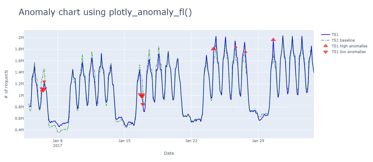
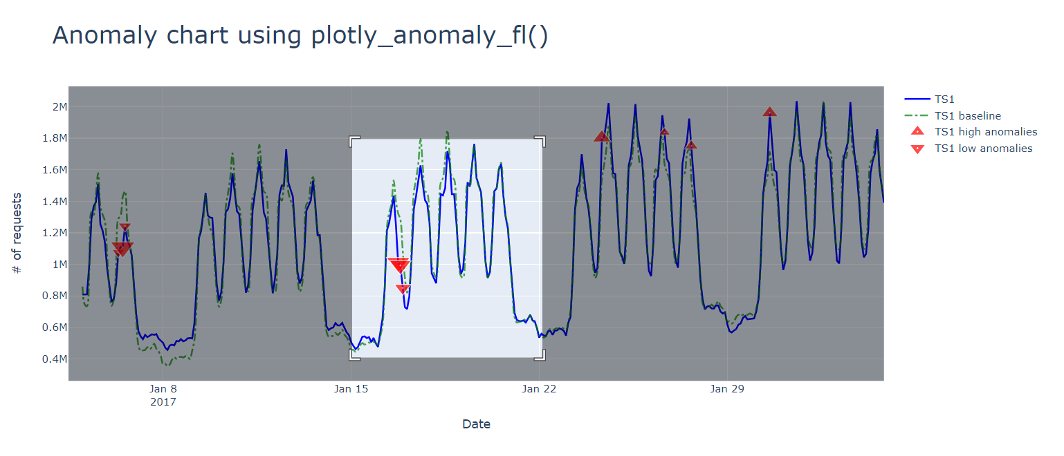
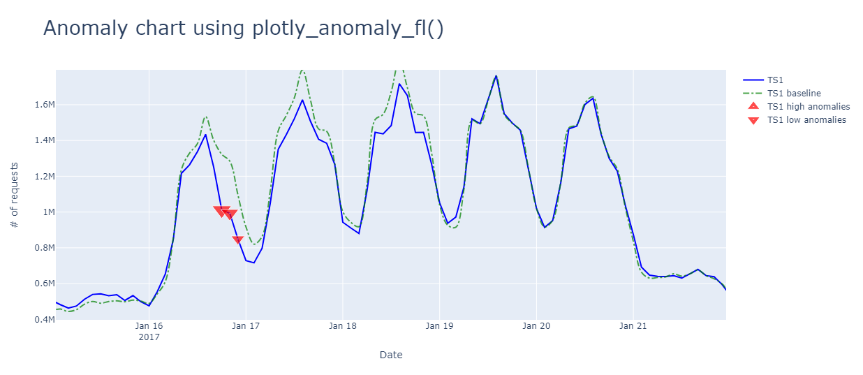
변칙을 확대하고 마우스로 가리킵니다.
피드백
출시 예정: 2024년 내내 콘텐츠에 대한 피드백 메커니즘으로 GitHub 문제를 단계적으로 폐지하고 이를 새로운 피드백 시스템으로 바꿀 예정입니다. 자세한 내용은 다음을 참조하세요. https://aka.ms/ContentUserFeedback
다음에 대한 사용자 의견 제출 및 보기