Important
이 기능은 공개 미리보기 단계에 있습니다.
사용자 지정 시각화를 사용하면 기본 제공 시각화 유형을 넘어 AI/BI 대시보드의 차트를 사용자 지정할 수 있습니다. 사용자 지정 시각화는 Vega-Lite 라이브러리를 사용하여 JSON 사양에서 차트를 렌더링합니다.
커스텀 시각화는 내장 옵션을 넘어서는 특수한 차트 유형을 렌더링할 수 있습니다. 다음 계통계수는 공유 집단 및 가족 중심을 중심으로 관련 기록을 그룹화하기 위해 힘 지향 레이아웃을 사용합니다:
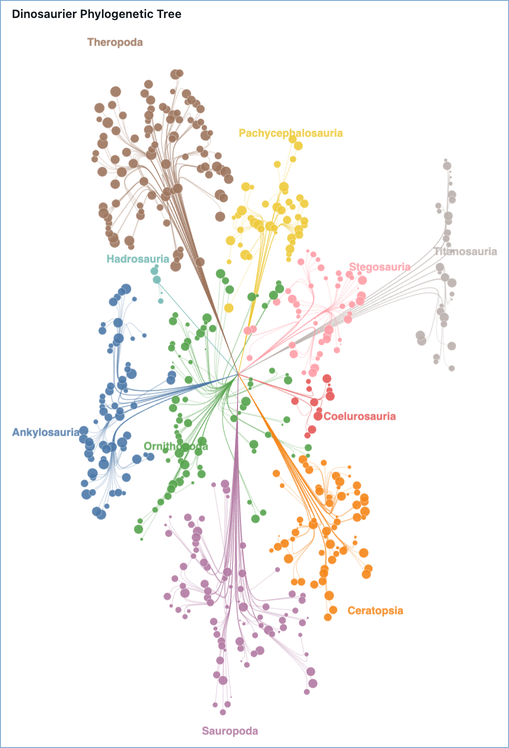
단계별로 차트를 작성하려면 시각화 예시를 참조하세요. 다른 차트 유형에 대한 사양을 참고하려면 '더 많은 차트 사양'을 참조하세요.
사용자 지정 시각화 만들기
맞춤형 시각화를 만들기 위해:
- 데이터 세트를 선택합니다.
- 시각화 구성 창의 고급 시각화 섹션에서 사용자 지정 Viz를 선택합니다.
- 필드 섹션에서 사용할 필드를 추가합니다. 각 필드에는 고유한 이름이 있습니다. Vega-Lite 사양에서 필드를 참조할 때 다음 이름을 사용하세요.
- Vega-Lite 사양 편집기에 Vega-Lite JSON 사양을 입력합니다.
참조 데이터 세트 열
Vega-Lite 명세서의 참조 열은 다음과 같은 방식으로 사용됩니다:
"field": "{columnName}"을 사용합니다. 다음 예제에서는 x축에xField열을 할당합니다."encoding": { "x": { "field": "xField", "type": "quantitative" } }식에서 사용
datum["{columnName}"]또는datum.{columnName}. 다음 예제에서는x및r열에서 새angle열을 정의합니다:{ "calculate": "datum.r * cos(datum.angle)", "as": "x" }
자세한 내용은 Vega 표현식 설명서의 datum을 참조하세요.
대시보드 테마 상속
사용자 지정 시각화는 밝은 모드와 어둡게 모드를 포함하여 대시보드의 테마에 자동으로 적용됩니다. 다음 차트 요소는 사양을 변경하지 않고 테마 값을 상속합니다.
- 축, 범례, 제목 및 헤더 글꼴은 대시보드에 설정된 글꼴과 일치합니다.
- 축 그리드 라인은 활성 모드에서 대시보드의 그리드라인 색상과 일치합니다.
- 차트 배경은 위젯의 테마 배경에 투명합니다.
사양의 config 블록에 정의한 설정이 상속된 기본값보다 우선합니다.
식의 참조 테마 값
테마 인식 값을 사용하여 표시 스타일을 지정하려면 Vega-Lite 식 내에서 다음 신호를 참조합니다({ "expr": "..." }).
| 신호 | 설명 |
|---|---|
colors |
활성 모드용으로 사전 해석된 색상 토큰입니다.
colors.textPrimary.default, colors.gridColor, colors.markHighlightColor와 같은 일반적인 값에 이것들을 사용하세요. 이 항목들은 [mode]로 인덱싱하지 마세요. 이미 해결되었습니다. |
mode |
활성 색상 모드(즉, 'light' 또는 'dark'). 모드별 변형을 제공하는 dashboardTheme 필드를 인덱싱하는 데 사용합니다. |
dashboardTheme |
글꼴(), 범주 팔레트() 및 모드별 색resolvedFontSettings(visualizationColorsgridLineColor)을 포함하여 대시보드 소유자가 구성한 전체 테마입니다. 모드별 변형이 있는 필드에는 인덱스가 [mode] 필요합니다. |
colors 및 dashboardTheme 신호는 독립적입니다. 이 신호는 colors 활성 모드에 맞게 해결된 편의 토큰을 제공하며, dashboardTheme 소유자가 직접 설정한 전체 테마를 노출합니다. 먼저 colors을 사용하고, 글꼴, 전체 팔레트 또는 dashboardTheme에서 제공하지 않는 값을 사용할 때는 colors을 사용합니다.
다음 예시들은 테마 값을 참조하는 방법을 보여줍니다:
텍스트 표시에 대시보드의 본문 글꼴을 사용합니다.
{ "expr": "dashboardTheme.resolvedFontSettings.fieldValue.fontFamily" }활성 모드에 대시보드의 제목 색을 사용합니다.
{ "expr": "dashboardTheme.resolvedFontSettings.fieldTitle.fontColor[mode]" }대시보드의 범주 팔레트에서 색을 사용합니다.
{ "expr": "dashboardTheme.visualizationColors[0]" }
참고
토큰은 colors 이미 활성 모드에 대해 해결되어 있습니다. 인덱스를 [mode] 건너뛰고 , 를 사용하지 colors.markHighlightColor마세요 colors.markHighlightColor[mode]. 와 같은 각 모드별 변형dashboardTheme이 있는 필드는 dashboardTheme.gridLineColor[mode] 인덱스가 [mode] 필요합니다.
선택 영역에서 다른 위젯 필터링
사용자 지정 시각화는 교차 필터 원본 역할을 할 수 있습니다. 사용자가 표시를 클릭하면 선택 영역이 대시보드의 다른 위젯을 필터링합니다. 이를 사용하도록 설정하려면 예약된 이름으로 databricks_mark_selection점 선택 매개 변수를 추가합니다. 렌더러는 이 이름을 검색하고 선택 영역을 대시보드의 교차 필터 상태에 연결합니다.
"params": [
  {
    "name": "databricks_mark_selection",
    "select": { "type": "point", "fields": ["categoryName"] }
  }
]
적용되는 요구 사항은 다음과 같습니다.
- 매개 변수
name는 정확히databricks_mark_selection여야 합니다. 다른 이름은 일반 매개 변수로 처리되며 교차 필터링을 구동하지 않습니다. -
select.type는point이어야 합니다. 간격(브러시) 선택은 교차 필터 원본으로 지원되지 않습니다. -
select.fields는 원시 열 이름이 아니라 위젯 구성의 필드 섹션에 정의된 필드 이름을 나열해야 합니다. -
select.fields에 차원(그룹화) 필드만 나열합니다. 집계된 측정값(예:SUM(...)또는AVG(...))은 교차 필터를 구동할 수 없습니다. - 여러 필드에서 선택하려면 다음을 함께
"fields": ["categoryName", "regionName"]나열합니다.
선택한 표시 강조
선택한 표시를 강조하려면 채우기 기반 표시(예: stroke, strokeWidth 또는 bar)에 arc 및 rect 조건을 사용하고, color 인코딩은 필드에 바인딩된 상태로 유지하세요. 밝은 모드와 어두운 모드 모두에서 강조 표시를 읽을 수 있도록 스트로크에 사용합니다 { "expr": "colors.markHighlightColor" } .
다음은 막대를 클릭할 때 대시보드 categoryName 의 나머지 부분을 필터링하는 예제입니다. 선택한 막대는 테마 스트로크를 표시하고 선택되지 않은 막대는 색 인코딩을 유지하면서 흐리게 표시됩니다.
JSON 사양
{
  "$schema": "https://vega.github.io/schema/vega-lite/v6.json",
  "data": { "name": "databricks_query" },
  "width": "container",
  "height": "container",
  "config": { "autosize": { "type": "fit", "contains": "padding" } },
  "params": [
    {
      "name": "databricks_mark_selection",
      "select": { "type": "point", "fields": ["categoryName"] }
    }
  ],
  "mark": { "type": "bar", "stroke": null },
  "encoding": {
    "x": { "field": "categoryName", "type": "nominal" },
    "y": { "field": "salesValue", "type": "quantitative" },
    "color": { "field": "categoryName", "type": "nominal" },
    "fillOpacity": {
      "condition": { "param": "databricks_mark_selection", "value": 1 },
      "value": 0.3
    },
    "stroke": {
      "condition": {
        "param": "databricks_mark_selection",
        "empty": false,
        "value": { "expr": "colors.markHighlightColor" }
      },
      "value": null
    },
    "strokeWidth": {
      "condition": { "param": "databricks_mark_selection", "empty": false, "value": 2 },
      "value": 0
    }
  }
}
차트 크기 자동 조정
차트 크기를 컨테이너에 맞게 조정하려면 사양의 최상위 수준에 다음 설정을 추가합니다.
"width": "container",
"height": "container",
"config": {
  "autosize": {
    "type": "fit",
    "contains": "padding"
  }
}
시각화 예시
다음 예시들은 단순한 층 차트부터 더 고급 계통계수까지 맞춤형 시각화를 단계별로 만들어 설명합니다.
롤링 평균을 가진 층상 차트
이 예제에서는 Databricks 샘플 데이터 세트의 날씨 데이터를 사용하여 원시 온도 데이터 요소를 롤링 평균 선 오버레이로 그리는 계층화된 차트를 만듭니다.
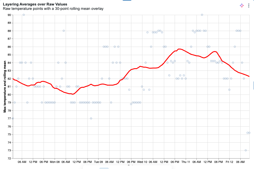
다음 쿼리를 사용하여 데이터 세트를 만듭니다.
SELECT date, temperature AS temp_max
FROM samples.accuweather.historical_hourly_imperial
WHERE city_name = 'singapore'
ORDER BY date;
시각화 구성 창의 고급 아래에서 사용자 지정 Viz를 선택합니다.
이전 단계에서 만든 데이터 세트를 선택합니다.
필드 섹션에서 날짜 열에 대한 필드를 추가하고 이름을
date.로 설정합니다.온도 열에 대한 필드를 추가하고 이름을
temp_max.로 설정합니다.다음 사양을 Vega-Lite 사양 편집기에 복사합니다. x축이 잘려 나간 경우, 차트 자동 크기 조정을 참조하세요.
JSON 사양
{
  "$schema": "https://vega.github.io/schema/vega-lite/v5.json",
  "width": "container",
  "height": "container",
  "config": {
    "autosize": { "type": "fit", "contains": "padding" }
  },
  "data": { "name": "databricks_query" },
  "transform": [
    {
      "window": [{ "field": "temp_max", "op": "mean", "as": "rolling_mean" }],
      "frame": [-15, 15]
    }
  ],
  "encoding": {
    "x": { "field": "date", "type": "temporal", "title": "Date" },
    "y": {
      "type": "quantitative",
      "scale": { "zero": false },
      "axis": { "title": "Max temperature and rolling mean" }
    }
  },
  "layer": [
    {
      "mark": { "type": "point", "opacity": 0.3 },
      "encoding": { "y": { "field": "temp_max", "title": "Max temperature" } }
    },
    {
      "mark": { "type": "line", "color": "red", "size": 3 },
      "encoding": { "y": { "field": "rolling_mean", "title": "Rolling mean of max temperature" } }
    }
  ]
}
계통계도
이 예시는 소수의 샘플 데이터를 사용하여 이 페이지 상단에 보이는 계통 계통수를 구축합니다. Vega-Lite 제공한 좌표에 점을 표시하지만, 네트워크 다이어그램 자체의 노드 위치를 계산하지는 않습니다. 이 계산은 데이터가 차트에 도달하기 전에 쿼리에서 이루어지며, 쿼리는 각 점의 x와 y 좌표를 미리 계산합니다. 쿼리는 세 가지 레코드 유형을 발행하며, 명세서는 이를 별도의 레이어로 렌더링합니다: path 행은 곡선 가지를, node 행은 잎 원을 그리며, label 행은 그룹 라벨을 위치시킵니다.
샘플 데이터를 다운로드합니다. 각 행은 화석 발견물을 나타내며,
dig_longitude와dig_latitude는 발굴 좌표를 나타냅니다.사이드바에서
 대시보드를 클릭합니다.
대시보드 만들기를 클릭합니다.
데이터 탭을 클릭합니다.
데이터 추가를 클릭한 후 데이터 업로드를 클릭하세요.
다운로드 파일을 파일 업로드 창의 생성 또는 수정 테이블 에 넣으세요.
테이블을 저장할 카탈로그 와 스키마 를 선택한 후 테이블 이름을 입력하세요.
테이블 만들기을 클릭합니다. 전체 테이블은 자동으로 데이터셋으로 추가됩니다.
SQL 데이터셋 추가 를 클릭하고 쿼리를 붙여넣으세요. 쿼리
FROM절에서 카탈로그, 스키마, 테이블 이름을 테이블 만들 때 사용한 이름으로 교체하세요.Create custom 시각화 단계에 따라 맞춤 시각화를 만드세요. 필드 섹션에서 각 필드 이름을 이름으로 사용하여 다음 필드를 추가하세요:
record_type,x,y,fossil_tag.point_ordersuborderroar_scoreclade_labelgenus_symbolfamily_taxonlabel_text명세를 Vega-Lite JSON 형태로 사용하세요.
SQL 쿼리
WITH base AS (
  SELECT
    fossil_tag,
    genus_symbol,
    clade_label,
    suborder,
    family_taxon,
    dig_longitude,
    dig_latitude,
    roar_score
  FROM
    `my_catalog`.`default`.`dino_table`
),
root_pt AS (
  SELECT
    AVG(dig_longitude) AS rx,
    AVG(dig_latitude) AS ry
  FROM
    base
),
group_pts AS (
  SELECT
    suborder,
    AVG(dig_longitude) AS gx,
    AVG(dig_latitude) AS gy
  FROM
    base
  GROUP BY
    suborder
),
family_pts AS (
  SELECT
    suborder,
    family_taxon,
    AVG(dig_longitude) AS fx,
    AVG(dig_latitude) AS fy
  FROM
    base
  GROUP BY
    suborder,
    family_taxon
),
ctx AS (
  SELECT
    b.fossil_tag,
    b.suborder,
    b.family_taxon,
    b.clade_label,
    b.genus_symbol,
    b.dig_longitude,
    b.dig_latitude,
    b.roar_score,
    r.rx,
    r.ry,
    g.gx,
    g.gy,
    f.fx,
    f.fy
  FROM
    base b
      CROSS JOIN root_pt r
      JOIN group_pts g
        ON b.suborder = g.suborder
      JOIN family_pts f
        ON b.suborder = f.suborder
        AND b.family_taxon = f.family_taxon
),
waypoints AS (
  SELECT
    fossil_tag,
    suborder,
    family_taxon,
    clade_label,
    genus_symbol,
    roar_score,
    0 AS point_order,
    rx AS x,
    ry AS y
  FROM
    ctx
  UNION ALL
  SELECT
    fossil_tag,
    suborder,
    family_taxon,
    clade_label,
    genus_symbol,
    roar_score,
    1,
    rx + 0.30 * (gx - rx),
    ry + 0.30 * (gy - ry)
  FROM
    ctx
  UNION ALL
  SELECT
    fossil_tag,
    suborder,
    family_taxon,
    clade_label,
    genus_symbol,
    roar_score,
    2,
    gx + 0.15 * (fx - gx),
    gy + 0.15 * (fy - gy)
  FROM
    ctx
  UNION ALL
  SELECT
    fossil_tag,
    suborder,
    family_taxon,
    clade_label,
    genus_symbol,
    roar_score,
    3,
    gx + 0.50 * (fx - gx) + 0.03 * (dig_longitude - fx),
    gy + 0.50 * (fy - gy) + 0.03 * (dig_latitude - fy)
  FROM
    ctx
  UNION ALL
  SELECT
    fossil_tag,
    suborder,
    family_taxon,
    clade_label,
    genus_symbol,
    roar_score,
    4,
    fx + 0.15 * (dig_longitude - fx),
    fy + 0.15 * (dig_latitude - fy)
  FROM
    ctx
  UNION ALL
  SELECT
    fossil_tag,
    suborder,
    family_taxon,
    clade_label,
    genus_symbol,
    roar_score,
    5,
    fx + 0.65 * (dig_longitude - fx),
    fy + 0.65 * (dig_latitude - fy)
  FROM
    ctx
  UNION ALL
  SELECT
    fossil_tag,
    suborder,
    family_taxon,
    clade_label,
    genus_symbol,
    roar_score,
    6,
    dig_longitude,
    dig_latitude
  FROM
    ctx
)
SELECT
  fossil_tag,
  suborder,
  point_order,
  x,
  y,
  family_taxon,
  clade_label,
  genus_symbol,
  roar_score,
  'path' AS record_type,
  CAST(NULL AS STRING) AS label_text
FROM
  waypoints
UNION ALL
SELECT
  fossil_tag,
  suborder,
  99 AS point_order,
  dig_longitude AS x,
  dig_latitude AS y,
  family_taxon,
  clade_label,
  genus_symbol,
  roar_score,
  'node' AS record_type,
  CAST(NULL AS STRING) AS label_text
FROM
  base
UNION ALL
SELECT
  g.suborder AS fossil_tag,
  g.suborder AS suborder,
  100 AS point_order,
  g.gx
    + (g.gx - r.rx)
      * CASE LOWER(g.suborder)
        WHEN 'titanosauria' THEN 0.10
        WHEN 'hadrosauria' THEN 0.25
        WHEN 'ornithopoda' THEN 1.30
        WHEN 'stegosauria' THEN 0.73
        ELSE 0.55
      END AS x,
  g.gy
    + (g.gy - r.ry)
      * CASE LOWER(g.suborder)
        WHEN 'titanosauria' THEN 0.10
        WHEN 'hadrosauria' THEN 0.25
        WHEN 'ornithopoda' THEN 1.30
        WHEN 'stegosauria' THEN 0.73
        ELSE 0.55
      END AS y,
  CAST(NULL AS STRING) AS family_taxon,
  CAST(NULL AS STRING) AS clade_label,
  CAST(NULL AS STRING) AS genus_symbol,
  CAST(NULL AS DOUBLE) AS roar_score,
  'label' AS record_type,
  g.suborder AS label_text
FROM
  group_pts g CROSS JOIN root_pt r
JSON 사양
{
  "$schema": "https://vega.github.io/schema/vega-lite/v5.json",
  "data": { "name": "databricks_query" },
  "width": "container",
  "height": "container",
  "background": "white",
  "config": {
    "autosize": { "type": "fit", "contains": "padding" },
    "view": { "stroke": null }
  },
  "layer": [
    {
      "transform": [{ "filter": "datum.record_type === 'path'" }],
      "mark": {
        "type": "line",
        "interpolate": "basis",
        "strokeCap": "round",
        "strokeJoin": "round"
      },
      "encoding": {
        "x": {
          "field": "x",
          "type": "quantitative",
          "axis": null,
          "scale": { "zero": false, "nice": false }
        },
        "y": {
          "field": "y",
          "type": "quantitative",
          "axis": null,
          "scale": { "zero": false, "nice": false }
        },
        "detail": { "field": "fossil_tag", "type": "nominal" },
        "order": { "field": "point_order", "type": "quantitative" },
        "color": {
          "field": "suborder",
          "type": "nominal",
          "scale": { "scheme": "tableau10" },
          "legend": null
        },
        "opacity": { "value": 0.3 },
        "strokeWidth": { "value": 0.8 }
      }
    },
    {
      "transform": [{ "filter": "datum.record_type === 'node'" }],
      "mark": {
        "type": "circle",
        "opacity": 0.9,
        "stroke": "white",
        "strokeWidth": 0.3
      },
      "encoding": {
        "x": {
          "field": "x",
          "type": "quantitative",
          "axis": null,
          "scale": { "zero": false, "nice": false }
        },
        "y": {
          "field": "y",
          "type": "quantitative",
          "axis": null,
          "scale": { "zero": false, "nice": false }
        },
        "color": {
          "field": "suborder",
          "type": "nominal",
          "scale": { "scheme": "tableau10" },
          "legend": { "title": "Suborder", "orient": "right" }
        },
        "size": {
          "field": "roar_score",
          "type": "quantitative",
          "scale": { "domain": [0, 100], "range": [4, 150] },
          "legend": null
        },
        "tooltip": [
          { "field": "clade_label", "title": "Clade" },
          { "field": "genus_symbol", "title": "Symbol" },
          { "field": "suborder", "title": "Suborder" },
          { "field": "family_taxon", "title": "Family" },
          { "field": "roar_score", "title": "Roar Score", "format": ".1f" }
        ]
      }
    },
    {
      "transform": [{ "filter": "datum.record_type === 'label'" }],
      "mark": {
        "type": "text",
        "fontSize": 12,
        "fontWeight": "bold",
        "opacity": 0.85
      },
      "encoding": {
        "x": {
          "field": "x",
          "type": "quantitative",
          "axis": null,
          "scale": { "zero": false, "nice": false }
        },
        "y": {
          "field": "y",
          "type": "quantitative",
          "axis": null,
          "scale": { "zero": false, "nice": false }
        },
        "text": { "field": "label_text", "type": "nominal" },
        "color": {
          "field": "suborder",
          "type": "nominal",
          "scale": { "scheme": "tableau10" },
          "legend": null
        }
      }
    }
  ]
}
더 많은 차트 사양
다음 사양은 기본 제공 시각화 형식으로 사용할 수 없는 차트를 보여 줍니다. 자세한 예제는 Vega-Lite 예제 갤러리를 참조하세요.
불릿 차트
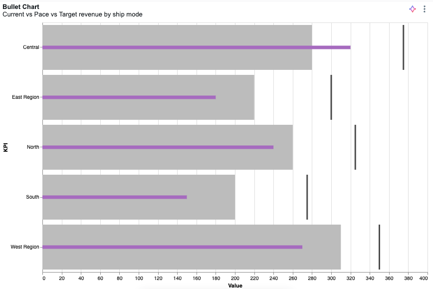
categoryField
currentField 섹션에서 , paceField및 targetField 정의합니다.
JSON 사양
{
  "$schema": "https://vega.github.io/schema/vega-lite/v5.json",
  "width": "container",
  "height": "container",
  "data": { "name": "databricks_query" },
  "config": {
    "autosize": { "type": "fit", "contains": "padding" }
  },
  "transform": [
    {
      "fold": ["targetField", "paceField", "currentField"],
      "as": ["measure_name", "measure_value"]
    },
    {
      "calculate": "toNumber(datum.measure_value)",
      "as": "measure_value"
    },
    {
      "calculate": "{ \"targetField\": \"Target\", \"paceField\": \"Pace\", \"currentField\": \"Current\" }[datum.measure_name]",
      "as": "measure_label"
    },
    {
      "calculate": "indexof([\"Target\", \"Pace\", \"Current\"], datum.measure_label)",
      "as": "measure_order"
    }
  ],
  "layer": [
    {
      "mark": "bar",
      "params": [
        {
          "name": "legend_click",
          "select": { "type": "point", "fields": ["measure_label"] },
          "bind": "legend"
        }
      ],
      "encoding": {
        "color": { "field": "measure_label" },
        "opacity": { "value": 0 }
      }
    },
    {
      "transform": [{ "filter": { "param": "legend_click" } }],
      "layer": [
        {
          "layer": [
            {
              "mark": { "type": "bar", "tooltip": true },
              "encoding": { "color": { "field": "measure_label", "legend": null } },
              "transform": [{ "filter": { "field": "measure_label", "oneOf": ["Pace"] } }]
            },
            {
              "mark": { "type": "bar", "height": 7, "tooltip": true },
              "encoding": { "color": { "field": "measure_label", "legend": null } },
              "transform": [{ "filter": { "field": "measure_label", "oneOf": ["Current"] } }]
            },
            {
              "mark": { "type": "tick", "tooltip": true, "thickness": 3 },
              "encoding": { "color": { "field": "measure_label", "legend": null } },
              "transform": [{ "filter": { "field": "measure_label", "oneOf": ["Target"] } }]
            }
          ],
          "encoding": {
            "x": {
              "field": "measure_value",
              "type": "quantitative",
              "stack": null,
              "title": "Value",
              "axis": { "orient": "bottom" }
            },
            "color": {
              "scale": {
                "domain": ["Target", "Pace", "Current"],
                "range": ["#000000", "#bcbcbc", "#A66BBF"]
              }
            },
            "order": {
              "field": "measure_order",
              "type": "quantitative",
              "sort": "descending"
            }
          }
        }
      ],
      "encoding": {
        "y": {
          "field": "categoryField",
          "type": "ordinal",
          "title": "Category",
          "axis": { "labelOverlap": true }
        },
        "tooltip": [
          { "field": "categoryField", "type": "nominal", "title": "Category" },
          { "field": "currentField", "type": "quantitative", "title": "Current" },
          { "field": "paceField", "type": "quantitative", "title": "Pace" },
          { "field": "targetField", "type": "quantitative", "title": "Target" }
        ]
      }
    }
  ]
}
계기
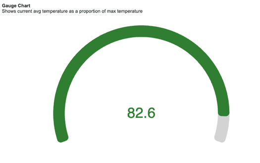
$valueField 섹션에서 $totalField 및 을 정의합니다.
JSON 사양
{
  "$schema": "https://vega.github.io/schema/vega-lite/v6.json",
  "width": "container",
  "height": "container",
  "data": { "name": "databricks_query" },
  "config": {
    "concat": { "spacing": 0 },
    "autosize": { "type": "fit", "contains": "padding" }
  },
  "params": [
    { "name": "ring_max", "expr": "min(width, height) / 2 - 16" },
    { "name": "ring_width", "expr": "max(12, (min(width, height) / 2) * 0.12)" },
    { "name": "ring_gap", "expr": "max(4, (min(width, height) / 2) * 0.03)" },
    { "name": "label_color", "value": "#000000" },
    { "name": "ring_background_opacity", "value": 0.3 },
    { "name": "ring0_percent", "value": 100 },
    { "name": "ring0_outer", "expr": "ring_max + 2" },
    { "name": "ring0_inner", "expr": "ring_max + 1" },
    { "name": "ring1_outer", "expr": "ring0_inner - ring_gap" },
    { "name": "ring1_inner", "expr": "ring1_outer - ring_width" },
    { "name": "ring1_middle", "expr": "(ring1_outer + ring1_inner) / 2" },
    { "name": "arc_size", "expr": "220" }
  ],
  "transform": [
    { "as": "ratio", "calculate": "datum['$valueField'] / datum['$totalField']" },
    { "as": "_arc_start_degrees", "calculate": "360 - ( arc_size / 2 )" },
    { "as": "_arc_end_degrees", "calculate": "0 + ( arc_size / 2 )" },
    { "as": "_arc_start_radians", "calculate": "2 * 3.14 * ( datum['_arc_start_degrees'] - 360 ) / 360" },
    { "as": "_arc_end_radians", "calculate": "2 * 3.14 * datum['_arc_end_degrees'] / 360" },
    { "as": "_arc_total_radians", "calculate": "datum['_arc_end_radians'] - datum['_arc_start_radians']" },
    { "as": "_ring_start_radians", "calculate": "datum['_arc_start_radians']" },
    {
      "as": "_ring_end_radians",
      "calculate": "datum['_arc_start_radians'] + ( datum['_arc_total_radians'] * datum['ratio'] )"
    }
  ],
  "layer": [
    {
      "mark": {
        "type": "arc",
        "color": "lightgrey",
        "theta": { "expr": "datum['_arc_start_radians']" },
        "radius": { "expr": "ring1_outer" },
        "theta2": { "expr": "datum['_arc_end_radians']" },
        "radius2": { "expr": "ring1_inner" },
        "cornerRadius": 10
      }
    },
    {
      "name": "RING",
      "mark": {
        "type": "arc",
        "theta": { "expr": "datum['_ring_start_radians']" },
        "radius": { "expr": "ring1_outer" },
        "theta2": { "expr": "datum['_ring_end_radians']" },
        "radius2": { "expr": "ring1_inner" },
        "cornerRadius": 10
      },
      "encoding": {
        "color": {
          "value": "#307E31",
          "condition": [
            { "test": "datum['ratio'] < 0.33", "value": "#880808" },
            { "test": "datum['ratio'] < 0.66", "value": "#E49B0F" }
          ]
        }
      }
    },
    {
      "mark": { "type": "text", "fontSize": 40 },
      "encoding": {
        "text": { "field": "$valueField" },
        "color": {
          "value": "#307E31",
          "condition": [
            { "test": "datum['ratio'] < 0.33", "value": "#880808" },
            { "test": "datum['ratio'] < 0.66", "value": "#E49B0F" }
          ]
        }
      }
    }
  ]
}
방사형 차트
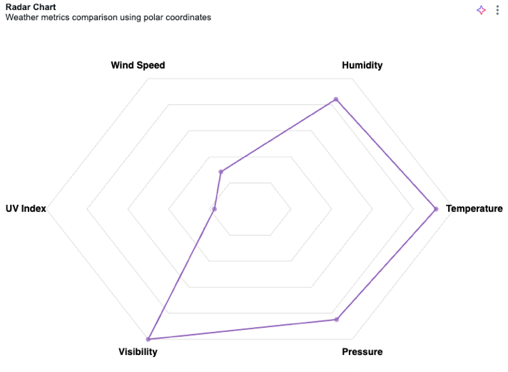
$key 섹션에서 $value 및 을 정의합니다.
JSON 사양
{
  "$schema": "https://vega.github.io/schema/vega-lite/v5.json",
  "width": "container",
  "height": "container",
  "config": {
    "autosize": { "type": "fit", "contains": "padding" }
  },
  "data": { "name": "databricks_query" },
  "transform": [
    { "window": [{ "op": "row_number", "as": "category" }] },
    { "calculate": "datum.category - 1", "as": "category" },
    {
      "joinaggregate": [
        { "op": "count", "as": "numCategories" },
        { "op": "max", "field": "$value", "as": "maxValue" }
      ]
    },
    { "calculate": "2 * PI * datum.category / datum.numCategories", "as": "angle" },
    { "calculate": "100 * datum['$value'] / datum.maxValue", "as": "r" },
    { "calculate": "datum.r * cos(datum.angle)", "as": "x" },
    { "calculate": "datum.r * sin(datum.angle)", "as": "y" },
    { "calculate": "110 * cos(datum.angle)", "as": "label_x" },
    { "calculate": "110 * sin(datum.angle)", "as": "label_y" }
  ],
  "layer": [
    {
      "transform": [
        { "joinaggregate": [{ "op": "count", "as": "numCategories" }] },
        { "aggregate": [{ "op": "max", "field": "numCategories", "as": "numCategories" }] },
        { "calculate": "[0,1,2,3,4,5,6,7,8,9,10,11,12,13,14,15,16,17,18,19,20]", "as": "cats" },
        { "flatten": ["cats"], "as": ["cat"] },
        { "filter": "datum.cat <= datum.numCategories" },
        { "calculate": "2 * PI * datum.cat / datum.numCategories", "as": "angle" },
        { "calculate": "100 * cos(datum.angle)", "as": "x" },
        { "calculate": "100 * sin(datum.angle)", "as": "y" }
      ],
      "mark": { "type": "line", "color": "#ddd", "strokeWidth": 1 },
      "encoding": {
        "x": { "field": "x", "type": "quantitative", "scale": { "domain": [-120, 120] }, "axis": null },
        "y": { "field": "y", "type": "quantitative", "scale": { "domain": [-120, 120] }, "axis": null },
        "order": { "field": "cat" }
      }
    },
    {
      "transform": [
        { "joinaggregate": [{ "op": "count", "as": "numCategories" }] },
        { "aggregate": [{ "op": "max", "field": "numCategories", "as": "numCategories" }] },
        { "calculate": "[20,40,60,80,100]", "as": "levels" },
        { "flatten": ["levels"], "as": ["level"] },
        { "calculate": "[0,1,2,3,4,5,6,7,8,9,10,11,12,13,14,15,16,17,18,19,20]", "as": "cats" },
        { "flatten": ["cats"], "as": ["cat"] },
        { "filter": "datum.cat <= datum.numCategories" },
        { "calculate": "2 * PI * datum.cat / datum.numCategories", "as": "angle" },
        { "calculate": "datum.level", "as": "r" },
        { "calculate": "datum.r * cos(datum.angle)", "as": "x" },
        { "calculate": "datum.r * sin(datum.angle)", "as": "y" }
      ],
      "mark": { "type": "line", "color": "#ddd", "strokeWidth": 1 },
      "encoding": {
        "x": { "field": "x", "type": "quantitative" },
        "y": { "field": "y", "type": "quantitative" },
        "detail": { "field": "level" },
        "order": { "field": "cat" }
      }
    },
    {
      "mark": { "type": "line", "color": "#9467bd", "strokeWidth": 2, "interpolate": "linear-closed" },
      "encoding": {
        "x": { "field": "x", "type": "quantitative" },
        "y": { "field": "y", "type": "quantitative" },
        "order": { "field": "category" }
      }
    },
    {
      "mark": { "type": "point", "filled": true, "size": 50, "color": "#9467bd" },
      "encoding": {
        "x": { "field": "x", "type": "quantitative" },
        "y": { "field": "y", "type": "quantitative" }
      }
    },
    {
      "mark": { "type": "text", "fontSize": 14, "fontWeight": "bold" },
      "encoding": {
        "x": { "field": "label_x", "type": "quantitative" },
        "y": { "field": "label_y", "type": "quantitative" },
        "text": { "field": "$key", "type": "nominal" }
      }
    }
  ],
  "view": { "stroke": null }
}
방사형 차트
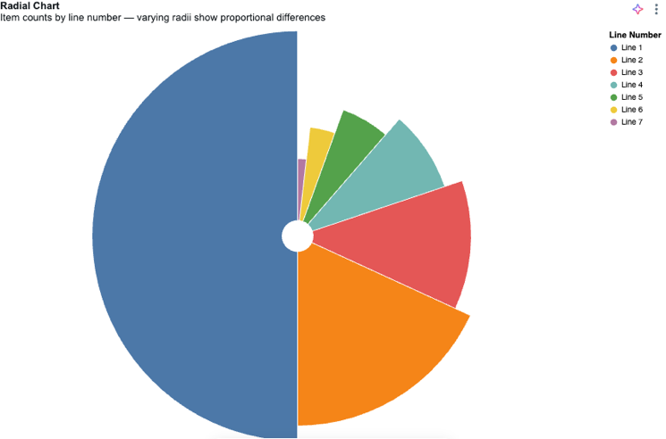
$valueField 섹션에서 $colorField 및 을 정의합니다.
JSON 사양
{
  "$schema": "https://vega.github.io/schema/vega-lite/v6.json",
  "width": "container",
  "height": "container",
  "config": {
    "autosize": { "type": "fit", "contains": "padding" }
  },
  "data": { "name": "databricks_query" },
  "transform": [
    {
      "aggregate": [{ "op": "sum", "field": "$valueField", "as": "total" }],
      "groupby": ["$colorField"]
    },
    {
      "window": [{ "op": "rank", "as": "rank" }],
      "sort": [{ "field": "total", "order": "descending" }]
    }
  ],
  "layer": [
    {
      "mark": { "type": "arc", "innerRadius": 20, "stroke": "#fff" }
    }
  ],
  "encoding": {
    "theta": {
      "field": "total",
      "type": "quantitative",
      "scale": { "type": "sqrt" },
      "stack": true,
      "sort": "descending"
    },
    "radius": { "field": "total", "scale": { "type": "sqrt", "zero": true } },
    "color": {
      "field": "$colorField",
      "type": "nominal",
      "title": "Sub-Category",
      "sort": { "field": "total", "order": "descending" },
      "legend": { "orient": "right" }
    },
    "tooltip": [
      { "field": "$colorField", "type": "nominal", "title": "Sub-Category" },
      { "field": "total", "type": "quantitative", "title": "Sales" }
    ]
  },
  "view": { "stroke": null }
}
선버스트 차트
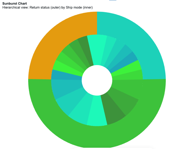
outerGroupField 섹션에서 innerGroupField, sizeField, 를 정의합니다.
JSON 사양
{
  "$schema": "https://vega.github.io/schema/vega-lite/v5.json",
  "width": "container",
  "height": "container",
  "data": { "name": "databricks_query" },
  "config": {
    "autosize": { "type": "fit", "contains": "padding" }
  },
  "transform": [
    { "calculate": "datum['outerGroupField']", "as": "OUTSIDE" },
    { "calculate": "datum['innerGroupField']", "as": "INSIDE" },
    { "calculate": "datum.OUTSIDE + '-' + datum.INSIDE", "as": "OUT_IN" },
    { "calculate": "toNumber(datum['sizeField'])", "as": "SIZE" }
  ],
  "resolve": {
    "scale": { "color": "independent" },
    "legend": { "color": "independent" }
  },
  "layer": [
    {
      "mark": {
        "type": "arc",
        "tooltip": true,
        "innerRadius": { "expr": "min(width, height)/9" },
        "outerRadius": { "expr": "min(width, height)/3" }
      },
      "encoding": {
        "theta": { "field": "SIZE", "type": "quantitative", "stack": true },
        "color": {
          "field": "OUT_IN",
          "type": "ordinal",
          "sort": "ascending",
          "title": "Inner Grouping",
          "scale": {
            "range": [
              "#1DF9B9",
              "#1DE5B9",
              "#1DD1B9",
              "#1DBDB9",
              "#1DA9B9",
              "#3DF23B",
              "#3DDA3B",
              "#3DC23B",
              "#3DAA3B",
              "#3D923B"
            ]
          }
        },
        "order": { "field": "OUT_IN", "sort": "ascending" },
        "tooltip": [
          { "field": "OUTSIDE", "type": "nominal", "title": "Outer Grouping" },
          { "field": "INSIDE", "type": "nominal", "title": "Inner Grouping" },
          { "field": "SIZE", "type": "quantitative", "title": "Count" }
        ]
      }
    },
    {
      "transform": [
        {
          "aggregate": [{ "op": "sum", "field": "SIZE", "as": "total_users" }],
          "groupby": ["OUTSIDE"]
        }
      ],
      "mark": {
        "type": "arc",
        "tooltip": true,
        "innerRadius": { "expr": "min(width, height)/3" }
      },
      "encoding": {
        "theta": {
          "field": "total_users",
          "type": "quantitative",
          "stack": true,
          "sort": "ascending",
          "title": "Users Count"
        },
        "color": {
          "field": "OUTSIDE",
          "type": "ordinal",
          "sort": "ascending",
          "title": "Outer Grouping",
          "scale": { "range": ["#1DD1B9", "#3DC23B"] }
        },
        "order": { "field": "OUTSIDE", "sort": "ascending" },
        "tooltip": [
          { "field": "OUTSIDE", "type": "nominal", "title": "Outer Grouping" },
          { "field": "total_users", "type": "quantitative", "title": "Count" }
        ]
      }
    }
  ]
}
Limitations
- 트리맵 차트는 지원되지 않습니다. Vega-Lite 트리맵을 지원하지 않습니다.
- 이미지 표시는 인라인 base64
data:이미지 URL(예:data:image/png;base64,...37KB 이하)만 PNG, JPEG 또는 WebP 형식으로 지원합니다. 원격 이미지 URL(https:또는http:), 상대 URL, SVG 이미지 및 필드 또는 식 기반 이미지 URL은 지원되지 않습니다.