ContentView
.NET 다중 플랫폼 앱 UI(.NET MAUI) ContentView 는 재사용 가능한 사용자 지정 컨트롤을 만들 수 있는 컨트롤입니다.
클래스는 ContentView 형식의 속성을 정의 Content 합니다. 이 속성은 해당 형식 View의 ContentView콘텐츠를 나타냅니다. 이 속성은 개체에 BindableProperty 의해 지원됩니다. 즉, 데이터 바인딩의 대상이 될 수 있으며 스타일이 지정됩니다.
클래스는 ContentView 컨트롤의 TemplatedView 모양을 정의하는 형식ControlTemplate의 바인딩 가능한 속성을 정의하는 ControlTemplate 클래스에서 파생됩니다. 속성에 ControlTemplate 대한 자세한 내용은 ControlTemplate을 사용하여 모양 사용자 지정을 참조 하세요.
참고 항목
A는 ContentView 단일 자식만 포함할 수 있습니다.
사용자 지정 컨트롤 만들기
클래스는 ContentView 그 자체로 기능이 거의 없지만 사용자 지정 컨트롤을 만드는 데 사용할 수 있습니다. 사용자 지정 컨트롤을 만드는 프로세스는 다음과 같습니다.
- ContentView 클래스에서 파생되는 클래스를 만듭니다.
- 사용자 지정 컨트롤에 대한 코드 숨김 파일의 컨트롤 속성 또는 이벤트를 정의합니다.
- 사용자 지정 컨트롤의 UI를 정의합니다.
이 문서에서는 이미지, 제목 및 설명을 카드 같은 레이아웃으로 표시하는 UI 요소인 컨트롤을 만드는 CardView 방법을 보여 줍니다.
ContentView 파생 클래스 만들기
Visual Studio에서 ContentViewContentView 항목 템플릿을 사용하여 파생 클래스를 만들 수 있습니다. 이 템플릿은 사용자 지정 컨트롤의 UI를 정의할 수 있는 XAML 파일과 컨트롤 속성, 이벤트 및 기타 논리를 정의할 수 있는 코드 숨김 파일을 만듭니다.
컨트롤 속성 정의
모든 컨트롤 속성, 이벤트 및 기타 논리는 -derived 클래스에 대한 ContentView코드 숨김 파일에 정의되어야 합니다.
사용자 지정 컨트롤은 CardView 다음 속성을 정의합니다.
CardTitle카드 표시된 제목을 나타내는 형식string의 입니다.CardDescription카드 표시되는 설명을 나타내는 형식string의 입니다.IconImageSource- 카드 표시된 이미지를 나타내는 형식ImageSource입니다.IconBackgroundColor카드 표시된 이미지의 배경색을 나타내는 형식Color의 입니다.BorderColor카드 테두리, 이미지 테두리 및 구분선의 색을 나타내는 형식Color의 입니다.CardColor카드 배경색을 나타내는 형식Color의 입니다.
각 속성은 인스턴스에서 BindableProperty 지원됩니다.
다음 예제에서는 클래스에 CardTitle 대한 CardView 코드 숨김 파일의 바인딩 가능한 속성을 보여줍니다.
public partial class CardView : ContentView
{
    public static readonly BindableProperty CardTitleProperty = BindableProperty.Create(nameof(CardTitle), typeof(string), typeof(CardView), string.Empty);

    public string CardTitle
    {
        get => (string)GetValue(CardView.CardTitleProperty);
        set => SetValue(CardView.CardTitleProperty, value);
    }
    // ...

    public CardView()
    {
        InitializeComponent();
    }
}
개체에 대한 BindableProperty 자세한 내용은 바인딩 가능한 속성을 참조 하세요.
UI 정의
사용자 지정 컨트롤 UI는 컨트롤의 루트 요소로 사용하는 ContentView -derived 클래스에 대한 ContentViewXAML 파일에서 정의할 수 있습니다.
<ContentView ...
             x:Name="this"
             x:Class="CardViewDemo.Controls.CardView">
    <Frame BindingContext="{x:Reference this}"
           BackgroundColor="{Binding CardColor}"
           BorderColor="{Binding BorderColor}"
            ...>
        <Grid>
            ...
            <Frame BorderColor="{Binding BorderColor, FallbackValue='Black'}"
                   BackgroundColor="{Binding IconBackgroundColor, FallbackValue='Grey'}"
                   ...>
                <Image Source="{Binding IconImageSource}"
                       .. />
            </Frame>
            <Label Text="{Binding CardTitle, FallbackValue='Card Title'}"
                   ... />
            <BoxView BackgroundColor="{Binding BorderColor, FallbackValue='Black'}"
                     ... />
            <Label Text="{Binding CardDescription, FallbackValue='Card description text.'}"
                   ... />
        </Grid>
    </Frame>
</ContentView>
요소는 ContentView 인스턴스에 x:Namethis바인딩된 CardView 개체에 액세스하는 데 사용할 수 있는 속성을 설정합니다. 레이아웃의 요소는 바인딩된 개체에 정의된 값에 대한 속성의 바인딩을 설정합니다. 데이터 바인딩에 대한 자세한 내용은 데이터 바인딩을 참조하세요.
참고 항목
FallbackValue 바인딩null이 있는 경우 식의 Binding 속성은 기본값을 제공합니다.
사용자 지정 컨트롤 인스턴스화
사용자 지정 컨트롤 네임스페이스에 대한 참조를 사용자 지정 컨트롤을 인스턴스화하는 페이지에 추가해야 합니다. 참조가 추가 CardView 되면 인스턴스화할 수 있으며 해당 속성이 정의됩니다.
<ContentPage xmlns="http://schemas.microsoft.com/dotnet/2021/maui"
             xmlns:x="http://schemas.microsoft.com/winfx/2009/xaml"
             xmlns:controls="clr-namespace:CardViewDemo.Controls"
             x:Class="CardViewDemo.CardViewXamlPage">
   <ScrollView>
       <StackLayout>
           <controls:CardView BorderColor="DarkGray"
                              CardTitle="Slavko Vlasic"
                              CardDescription="Lorem ipsum dolor sit amet, consectetur adipiscing elit. Nulla elit dolor, convallis non interdum."
                              IconBackgroundColor="SlateGray"
                              IconImageSource="user.png" />
            <!-- More CardView objects -->
       </StackLayout>
   </ScrollView>
</ContentPage>
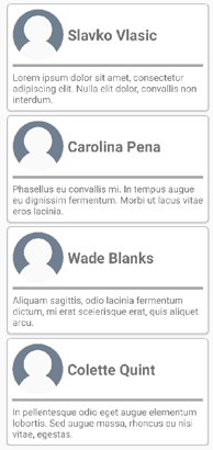
다음 스크린샷은 여러 CardView 개체를 보여줍니다.
ControlTemplate을 사용하여 모양 사용자 지정
클래스에서 ContentView 파생되는 사용자 지정 컨트롤은 XAML 또는 코드를 사용하여 해당 UI를 정의하거나 UI를 전혀 정의하지 않을 수 있습니다. A ControlTemplate 는 모양이 정의된 방식에 관계없이 컨트롤의 모양을 재정의하는 데 사용할 수 있습니다.
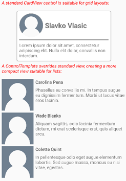
예를 들어 레이아웃이 CardView 일부 사용 사례에 비해 너무 많은 공간을 차지할 수 있습니다. A ControlTemplate 는 압축된 목록에 적합한 보다 컴팩트한 보기를 제공하기 위해 레이아웃을 재정 CardView 의하는 데 사용할 수 있습니다.
<ContentPage.Resources>
    <ResourceDictionary>
        <ControlTemplate x:Key="CardViewCompressed">
            <Grid>
                <Grid.RowDefinitions>
                    <RowDefinition Height="100" />
                </Grid.RowDefinitions>
                <Grid.ColumnDefinitions>
                    <ColumnDefinition Width="100" />
                    <ColumnDefinition Width="100*" />
                </Grid.ColumnDefinitions>
                <Image Source="{TemplateBinding IconImageSource}"
                       BackgroundColor="{TemplateBinding IconBackgroundColor}"
                       WidthRequest="100"
                       HeightRequest="100"
                       Aspect="AspectFill"
                       HorizontalOptions="Center"
                       VerticalOptions="Center" />
                <StackLayout Grid.Column="1">
                    <Label Text="{TemplateBinding CardTitle}"
                           FontAttributes="Bold" />
                    <Label Text="{TemplateBinding CardDescription}" />
                </StackLayout>
            </Grid>
        </ControlTemplate>
    </ResourceDictionary>
</ContentPage.Resources>
데이터 바인딩은 ControlTemplate 태그 확장을 사용하여 TemplateBinding 바인딩을 지정합니다. 그런 다음 해당 ControlTemplate 값을 사용하여 x:Key 정의된 ControlTemplate 개체로 속성을 설정할 수 있습니다. 다음 예제에서는 인스턴스에 ControlTemplate 설정된 속성을 보여 줍니다 CardView .
<controls:CardView ControlTemplate="{StaticResource CardViewCompressed}" />
다음 스크린샷은 표준 CardView 인스턴스 및 컨트롤 템플릿이 재정의된 여러 CardView 인스턴스를 보여 줍니다.
컨트롤 템플릿에 대한 자세한 내용은 컨트롤 템플릿을 참조 하세요.
.NET MAUI
피드백
출시 예정: 2024년 내내 콘텐츠에 대한 피드백 메커니즘으로 GitHub 문제를 단계적으로 폐지하고 이를 새로운 피드백 시스템으로 바꿀 예정입니다. 자세한 내용은 다음을 참조하세요. https://aka.ms/ContentUserFeedback
다음에 대한 사용자 의견 제출 및 보기