XAML을 사용하여 앱 스타일 지정
.NET 다중 플랫폼 앱 UI(.NET MAUI) 앱에는 모양이 동일한 여러 컨트롤이 포함된 경우가 많습니다. 예를 들어 앱에는 동일한 글꼴 옵션 및 레이아웃 옵션이 있는 여러 Label 인스턴스가 있을 수 있습니다.
<Label Text="These labels"
       HorizontalOptions="Center"
       VerticalOptions="Center"
       FontSize="18" />
<Label Text="are not"
       HorizontalOptions="Center"
       VerticalOptions="Center"
       FontSize="18" />
<Label Text="using styles"
       HorizontalOptions="Center"
       VerticalOptions="Center"
       FontSize="18" />
이 예제에서는 각 Label 개체에 의해 표시되는 텍스트의 모양을 제어하기 위한 동일한 속성 값이 있습니다 Label. 그러나 각 개별 컨트롤의 모양을 설정하는 것은 반복적이고 오류가 발생하기 쉽습니다. 대신 모양을 정의하는 스타일을 만든 다음 필요한 컨트롤에 적용할 수 있습니다.
스타일 소개
클래스를 사용하여 Style 속성 값 컬렉션을 하나의 개체로 그룹화하여 여러 시각적 요소에 적용할 수 있는 앱을 스타일화할 수 있습니다. 이렇게 하면 반복적인 태그를 줄일 수 있으며 앱 모양을 보다 쉽게 변경할 수 있습니다.
스타일은 주로 XAML 기반 앱용으로 설계되었지만 C#에서 만들 수도 있습니다.
- StyleXAML에서 만든 개체는 일반적으로 컨트롤, 페이지 또는 앱 컬렉션에 할당된 개체에
Resources정의 ResourceDictionary 됩니다Resources. - Style C#에서 만든 개체는 일반적으로 페이지의 클래스 또는 전역적으로 액세스할 수 있는 클래스에 정의됩니다.
Style을 정의할 위치를 선택하면 사용할 수 있는 위치가 결정됩니다.
- Style 컨트롤 수준에서 정의된 인스턴스는 컨트롤과 해당 자식에만 적용할 수 있습니다.
- Style 페이지 수준에서 정의된 인스턴스는 페이지 및 해당 자식에만 적용할 수 있습니다.
- Style 앱 수준에서 정의된 인스턴스는 앱 전체에 적용할 수 있습니다.
각 Style 개체에는 하나 이상의 Setter 개체 컬렉션이 포함되며 각각 Setter 에는 1과 1 Property 이 있습니다 Value. Property는 스타일이 적용된 요소의 바인딩 가능한 속성 이름이며 Value는 속성에 적용되는 값입니다.
각 Style 개체는 명시적이거나 암시적일 수 있습니다.
- 명시적Style 개체는 값
TargetType과 값을 지정하고x:Key대상 요소의 Style 속성을 참조로 설정하여x:Key정의됩니다. 자세한 내용은 명시적 스타일을 참조 하세요. - 암시적Style 개체는 .
TargetType그러면 개체가 Style 해당 형식의 모든 요소에 자동으로 적용됩니다. 그러나 하위 클래스의TargetType하위 클래스는 Style 자동으로 적용되지 않습니다. 자세한 내용은 암시적 스타일을 참조 하세요.
Style을 만들 때 TargetType 속성이 항상 필요합니다. 다음 예제에서는 명시적 스타일을 보여줍니다.
<Style x:Key="labelStyle" TargetType="Label">
    <Setter Property="HorizontalOptions" Value="Center" />
    <Setter Property="VerticalOptions" Value="Center" />
    <Setter Property="FontSize" Value="18" />
</Style>
대상 개체를 Style적용하려면 대상 개체가 VisualElement 다음의 Style속성 값과 TargetType 일치하는 개체여야 합니다.
<Label Text="Demonstrating an explicit style" Style="{StaticResource labelStyle}" />
뷰 계층 구조에서 낮은 스타일이 정의된 스타일보다 우선합니다. 예를 들어 앱 수준에서 설정되는 설정 Label.TextColorStyleRed 은 페이지 수준 스타일로 설정 Label.TextColorGreen하여 재정의됩니다. 마찬가지로 페이지 수준 스타일은 컨트롤 수준 스타일로 재정의됩니다. 또한 컨트롤 속성에 직접 설정된 경우 Label.TextColor 스타일보다 우선합니다.
스타일은 속성 변경에 응답하지 않으며 앱 기간 동안 변경되지 기본. 그러나 앱은 동적 리소스를 사용하여 런타임에 스타일 변경에 동적으로 응답할 수 있습니다. 자세한 내용은 동적 스타일을 참조 하세요.
명시적 스타일
페이지 수준에서 ResourceDictionary 만들 Style 려면 페이지에 추가해야 하고 하나 이상의 Style 선언을 포함할 ResourceDictionary수 있습니다. A Style 는 선언 x:Key 에 특성을 지정하여 명시적으로 만들어지며, 이 특성은 해당 선언에 ResourceDictionary설명이 포함된 키를 제공합니다. 명시적 스타일은 해당 속성을 설정 Style 하여 특정 시각적 요소에 적용해야 합니다.
다음 예제에서는 페이지의 ResourceDictionary명시적 스타일을 보여 줍니다. 페이지의 개체에 Label 적용 합니다.
<ContentPage ...>
    <ContentPage.Resources>
        <Style x:Key="labelRedStyle"
               TargetType="Label">
            <Setter Property="HorizontalOptions" Value="Center" />
            <Setter Property="VerticalOptions" Value="Center" />
            <Setter Property="FontSize" Value="18" />
            <Setter Property="TextColor" Value="Red" />
        </Style>
        <Style x:Key="labelGreenStyle"
               TargetType="Label">
            <Setter Property="HorizontalOptions" Value="Center" />
            <Setter Property="VerticalOptions" Value="Center" />
            <Setter Property="FontSize" Value="18" />
            <Setter Property="TextColor" Value="Green" />
        </Style>
        <Style x:Key="labelBlueStyle"
               TargetType="Label">
            <Setter Property="HorizontalOptions" Value="Center" />
            <Setter Property="VerticalOptions" Value="Center" />
            <Setter Property="FontSize" Value="18" />
            <Setter Property="TextColor" Value="Blue" />
        </Style>
    </ContentPage.Resources>
    <StackLayout>
        <Label Text="These labels"
               Style="{StaticResource labelRedStyle}" />
        <Label Text="are demonstrating"
               Style="{StaticResource labelGreenStyle}" />
        <Label Text="explicit styles,"
               Style="{StaticResource labelBlueStyle}" />
        <Label Text="and an explicit style override"
               Style="{StaticResource labelBlueStyle}"
               TextColor="Teal" />
    </StackLayout>
</ContentPage>
이 예제 ResourceDictionary 에서는 페이지의 Label 개체에 명시적으로 설정된 세 가지 스타일을 정의합니다. 각각 Style 은 글꼴 크기 및 가로 및 세로 레이아웃 옵션을 설정하는 동시에 다른 색으로 텍스트를 표시하는 데 사용됩니다. 각각 Style 은 태그 확장을 사용하여 속성을 Style 설정하여 다른 Label 값에 StaticResource 적용됩니다. 또한 최종 Label 항목에는 집합이 Style 있지만 속성을 다른 Color 값으로 재정의 TextColor 합니다.
암시적 스타일
페이지 수준에서 ResourceDictionary 만들 Style 려면 페이지에 추가해야 하고 하나 이상의 Style 선언을 포함할 ResourceDictionary수 있습니다. A Style 는 특성을 지정하지 않음으로써 x:Key 암시적으로 만들어집니다. 그러면 스타일이 정확히 일치하는 TargetType 범위 시각적 요소에 적용되지만 값에서 TargetType 파생된 요소에는 적용되지 않습니다.
다음 코드 예제에서는 페이지의 암시적 스타일을 보여 하며 페이지의 ResourceDictionaryEntry 개체에 적용 합니다.
<ContentPage ...>
    <ContentPage.Resources>
        <Style TargetType="Entry">
            <Setter Property="HorizontalOptions" Value="Fill" />
            <Setter Property="VerticalOptions" Value="Center" />
            <Setter Property="BackgroundColor" Value="Yellow" />
            <Setter Property="FontAttributes" Value="Italic" />
            <Setter Property="TextColor" Value="Blue" />
        </Style>
    </ContentPage.Resources>
    <StackLayout>
        <Entry Text="These entries" />
        <Entry Text="are demonstrating" />
        <Entry Text="implicit styles," />
        <Entry Text="and an implicit style override"
               BackgroundColor="Lime"
               TextColor="Red" />
        <local:CustomEntry Text="Subclassed Entry is not receiving the style" />
    </StackLayout>
</ContentPage>
이 예제 ResourceDictionary 에서는 페이지의 Entry 개체에 암시적으로 설정된 단일 암시적 스타일을 정의합니다. 노란색 Style 배경에 파란색 텍스트를 표시하는 동시에 다른 모양 옵션을 설정하는 데 사용됩니다. Style 특성을 지정 x:Key 하지 않고 페이지에 ResourceDictionary 추가됩니다. 따라서 Style 모든 개체는 정확히 속성 Style 과 일치 TargetType 하므로 암시적으로 적용 Entry 됩니다. 그러나 Style 서브클래스Entry된 개체에는 CustomEntry 적용되지 않습니다. 또한 네 번째는 Entry 스타일의 속성과 TextColor 속성을 다른 Color 값으로 재정 BackgroundColor 의합니다.
파생 형식에 스타일 적용
이 Style.ApplyToDerivedTypes 속성을 사용하면 속성에서 참조 TargetType 하는 기본 형식에서 파생된 컨트롤에 스타일을 적용할 수 있습니다. 따라서 속성에 true 지정된 TargetType 기본 형식에서 형식이 파생되는 경우 단일 스타일이 여러 형식을 대상으로 지정할 수 있도록 이 속성을 설정합니다.
다음 예제에서는 인스턴스의 Button 배경색을 빨간색으로 설정하는 암시적 스타일을 보여 줍니다.
<Style TargetType="Button"
       ApplyToDerivedTypes="True">
    <Setter Property="BackgroundColor"
            Value="Red" />
</Style>
이 스타일을 페이지 수준에 ResourceDictionary 배치하면 페이지의 모든 Button 개체와 파생 Button되는 모든 컨트롤에도 적용됩니다. 그러나 속성이 ApplyToDerivedTypes 다시 설정되지 기본 경우 스타일은 개체에 Button 만 적용됩니다.
전역 스타일
스타일을 앱의 리소스 사전에 추가하여 전역적으로 정의할 수 있습니다. 그런 다음 이러한 스타일을 앱 전체에서 사용할 수 있으며 페이지와 컨트롤에서 스타일 중복을 방지할 수 있습니다.
다음 예제에서는 앱 수준에서 정의된 것을 보여줍니다 Style .
<Application xmlns="http://schemas.microsoft.com/dotnet/2021/maui"
             xmlns:x="http://schemas.microsoft.com/winfx/2009/xaml"
             xmlns:local="clr-namespace:Styles"
             x:Class="Styles.App">
    <Application.Resources>
        <Style x:Key="buttonStyle" TargetType="Button">
            <Setter Property="HorizontalOptions"
                        Value="Center" />
            <Setter Property="VerticalOptions"
                        Value="CenterAndExpand" />
            <Setter Property="BorderColor"
                        Value="Lime" />
            <Setter Property="CornerRadius"
                        Value="5" />
            <Setter Property="BorderWidth"
                        Value="5" />
            <Setter Property="WidthRequest"
                        Value="200" />
            <Setter Property="TextColor"
                        Value="Teal" />
        </Style>
    </Application.Resources>
</Application>
이 예제에서는 개체의 ResourceDictionaryButton 모양을 설정하는 데 사용할 단일 명시적 스타일을 buttonStyle정의합니다.
참고 항목
전역 스타일은 명시적 또는 암시적일 수 있습니다.
다음 예제에서는 페이지의 개체를 buttonStyle 사용하는 페이지를 Button 보여줍니다.
<ContentPage ...>
    <StackLayout>
        <Button Text="These buttons"
                Style="{StaticResource buttonStyle}" />
        <Button Text="are demonstrating"
                Style="{StaticResource buttonStyle}" />
        <Button Text="application styles"
                Style="{StaticResource buttonStyle}" />
    </StackLayout>
</ContentPage>
Style 상속
스타일은 다른 스타일에서 상속하여 중복을 줄이고 재사용을 사용하도록 설정할 수 있습니다. 이 작업은 속성을 기존 속성으로 설정 Style.BasedOn 하여 수행됩니다 Style. XAML에서 이 작업은 이전에 만든 Style태그 확장을 참조하는 StaticResource 태그 확장으로 속성을 설정 BasedOn 하여 수행할 수 있습니다.
기본 스타일에서 상속되는 스타일은 새 속성에 대한 인스턴스를 포함 Setter 하거나 기본 스타일에서 setter를 재정의하는 데 사용할 수 있습니다. 또한 기본 스타일에서 상속되는 스타일은 동일한 형식 또는 기본 스타일이 대상으로 하는 형식에서 파생되는 형식을 대상으로 해야 합니다. 예를 들어 기본 스타일이 개체를 View 대상으로 하는 경우 기본 스타일을 기반으로 하는 스타일은 클래스에서 View 파생되는 개체 또는 개체와 같은 LabelButton 형식을 대상으로 지정할 View 수 있습니다.
스타일은 뷰 계층 구조에서 같은 수준 이상의 스타일에서만 상속할 수 있습니다. 이는 다음을 의미합니다.
- 앱 수준 스타일은 다른 앱 수준 스타일에서만 상속할 수 있습니다.
- 페이지 수준 스타일은 앱 수준 스타일 및 기타 페이지 수준 스타일에서 상속할 수 있습니다.
- 컨트롤 수준 스타일은 앱 수준 스타일, 페이지 수준 스타일 및 기타 컨트롤 수준 스타일에서 상속할 수 있습니다.
다음 예제에서는 명시적 스타일 상속을 보여 줍니다.
<ContentPage ...>
    <ContentPage.Resources>
        <Style x:Key="baseStyle"
               TargetType="View">
            <Setter Property="HorizontalOptions" Value="Center" />
            <Setter Property="VerticalOptions" Value="Center" />
        </Style>
    </ContentPage.Resources>
    <StackLayout>
        <StackLayout.Resources>
            <Style x:Key="labelStyle"
                   TargetType="Label"
                   BasedOn="{StaticResource baseStyle}">
                <Setter Property="FontSize" Value="18" />
                <Setter Property="FontAttributes" Value="Italic" />
                <Setter Property="TextColor" Value="Teal" />
            </Style>
            <Style x:Key="buttonStyle"
                   TargetType="Button"
                   BasedOn="{StaticResource baseStyle}">
                <Setter Property="BorderColor" Value="Lime" />
                <Setter Property="CornerRadius" Value="5" />
                <Setter Property="BorderWidth" Value="5" />
                <Setter Property="WidthRequest" Value="200" />
                <Setter Property="TextColor" Value="Teal" />
            </Style>
        </StackLayout.Resources>
        <Label Text="This label uses style inheritance"
               Style="{StaticResource labelStyle}" />
        <Button Text="This button uses style inheritance"
                Style="{StaticResource buttonStyle}" />
    </StackLayout>
</ContentPage>
이 예제에서는 baseStyle 개체를 View 대상으로 하고 속성과 VerticalOptions 속성을 설정합니다HorizontalOptions. 컨트롤 baseStyle 에서 직접 설정되지 않습니다. 대신 바인딩 labelStylebuttonStyle 가능한 추가 속성 값을 설정하여 상속합니다. labelStyle 그런 다음, 개체와 buttonStyle 개체가 a Label 및 Button.에 설정됩니다.
Important
암시적 스타일은 명시적 스타일에서 파생될 수 있지만 명시적 스타일은 암시적 스타일에서 파생될 수 없습니다.
동적 스타일
스타일은 속성 변경에 응답하지 않으며 앱 기간 동안 변경되지 기본. 예를 들어 시각적 요소에 할당한 Style 후 개체 중 Setter 하나가 수정, 제거 또는 새로 Setter 추가된 경우 변경 내용은 시각적 요소에 적용되지 않습니다. 그러나 앱은 동적 리소스를 사용하여 런타임에 스타일 변경에 동적으로 응답할 수 있습니다.
태그 확장은 DynamicResource 둘 다 사전 키를 사용하여 값을 가져오는 ResourceDictionary태그 확장과 유사 StaticResource 합니다. 그러나 단일 사전 조회 DynamicResource 를 수행하는 동안 StaticResource 기본 사전 키에 대한 링크를 가져옵니다. 따라서 키와 연결된 사전 항목이 바뀌면 변경 내용이 시각적 요소에 적용됩니다. 이렇게 하면 앱에서 런타임 스타일을 변경할 수 있습니다.
다음 예제에서는 동적 스타일을 보여 줍니다.
<ContentPage ...>
    <ContentPage.Resources>
        <Style x:Key="baseStyle"
               TargetType="View">
            <Setter Property="VerticalOptions" Value="Center" />
        </Style>
        <Style x:Key="blueSearchBarStyle"
               TargetType="SearchBar"
               BasedOn="{StaticResource baseStyle}">
            <Setter Property="FontAttributes" Value="Italic" />
            <Setter Property="PlaceholderColor" Value="Blue" />
        </Style>
        <Style x:Key="greenSearchBarStyle"
               TargetType="SearchBar">
            <Setter Property="FontAttributes" Value="None" />
            <Setter Property="PlaceholderColor" Value="Green" />
        </Style>
    </ContentPage.Resources>
    <StackLayout>
        <SearchBar Placeholder="SearchBar demonstrating dynamic styles"
                   Style="{DynamicResource blueSearchBarStyle}" />
    </StackLayout>
</ContentPage>
이 예제에서 개체는 SearchBar 태그 확장을 사용하여 DynamicResource 명명blueSearchBarStyle된 이름을 Style 설정합니다. SearchBar 그런 다음 코드에서 해당 Style 정의를 업데이트할 수 있습니다.
Resources["blueSearchBarStyle"] = Resources["greenSearchBarStyle"];
이 예제에서는 정의의 blueSearchBarStyle 값을 사용하도록 정의가 greenSearchBarStyle 업데이트됩니다. 이 코드가 실행 SearchBar 되면 에 정의된 greenSearchBarStyle개체를 Setter 사용하도록 업데이트됩니다.
동적 스타일 상속
속성을 사용하여 Style.BasedOn 동적 스타일에서 스타일을 파생할 수 없습니다. 대신 클래스에는 Style 값이 BaseResourceKey 동적으로 변경될 수 있는 사전 키로 설정할 수 있는 속성이 포함됩니다.
다음 예제에서는 동적 스타일 상속을 보여 줍니다.
<ContentPage ...>
    <ContentPage.Resources>
        <Style x:Key="baseStyle"
               TargetType="View">
            <Setter Property="VerticalOptions" Value="Center" />
        </Style>
        <Style x:Key="blueSearchBarStyle"
               TargetType="SearchBar"
               BasedOn="{StaticResource baseStyle}">
            <Setter Property="FontAttributes" Value="Italic" />
            <Setter Property="TextColor" Value="Blue" />
        </Style>
        <Style x:Key="greenSearchBarStyle"
               TargetType="SearchBar">
            <Setter Property="FontAttributes" Value="None" />
            <Setter Property="TextColor" Value="Green" />
        </Style>
        <Style x:Key="tealSearchBarStyle"
               TargetType="SearchBar"
               BaseResourceKey="blueSearchBarStyle">
            <Setter Property="BackgroundColor" Value="Teal" />
            <Setter Property="CancelButtonColor" Value="White" />
        </Style>
    </ContentPage.Resources>
    <StackLayout>
        <SearchBar Text="SearchBar demonstrating dynamic style inheritance"
                   Style="{StaticResource tealSearchBarStyle}" />
    </StackLayout>
</ContentPage>
이 예제에서 개체는 SearchBar 태그 확장을 사용하여 StaticResource 명명된 tealSearchBarStyle이름을 Style 참조합니다. 이렇게 하면 Style 몇 가지 추가 속성이 설정되고 이 속성이 BaseResourceKey 참조 blueSearchBarStyle됩니다. DynamicResource 태그 확장은 파생되는 경우를 제외하고 Style 변경되지 않으므로 필요하지 tealSearchBarStyle 않습니다. 따라서 tealSearchBarStyle 기본에 대한 링크를 blueSearchBarStyle 클릭하여 기본 스타일이 변경되면 업데이트됩니다.
정의는 blueSearchBarStyle 코드에서 업데이트할 수 있습니다.
Resources["blueSearchBarStyle"] = Resources["greenSearchBarStyle"];
이 예제에서는 정의의 blueSearchBarStyle 값을 사용하도록 정의가 greenSearchBarStyle 업데이트됩니다. 이 코드가 실행 SearchBar 되면 에 정의된 greenSearchBarStyle개체를 Setter 사용하도록 업데이트됩니다.
스타일 클래스
스타일 클래스를 사용하면 스타일 상속에 의존하지 않고 컨트롤에 여러 스타일을 적용할 수 있습니다.
클래스 이름을 나타내는 속성으로 Style 속성을 설정 Class 하여 string 스타일 클래스를 만들 수 있습니다. 특성을 사용하여 x:Key 명시적 스타일을 정의하는 것에 비해 여러 스타일 클래스를 적용할 VisualElement수 있다는 장점이 있습니다.
Important
여러 스타일이 서로 다른 형식을 대상으로 하는 경우 동일한 클래스 이름을 공유할 수 있습니다. 이렇게 하면 동일한 이름의 여러 스타일 클래스가 서로 다른 형식을 대상으로 지정할 수 있습니다.
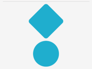
다음 예제에서는 세 BoxView 가지 스타일 클래스와 스타일 클래스를 VisualElement 보여 줍니다.
<ContentPage ...>
    <ContentPage.Resources>
        <Style TargetType="BoxView"
               Class="Separator">
            <Setter Property="BackgroundColor"
                    Value="#CCCCCC" />
            <Setter Property="HeightRequest"
                    Value="1" />
        </Style>

        <Style TargetType="BoxView"
               Class="Rounded">
            <Setter Property="BackgroundColor"
                    Value="#1FAECE" />
            <Setter Property="HorizontalOptions"
                    Value="Start" />
            <Setter Property="CornerRadius"
                    Value="10" />
        </Style>

        <Style TargetType="BoxView"
               Class="Circle">
            <Setter Property="BackgroundColor"
                    Value="#1FAECE" />
            <Setter Property="WidthRequest"
                    Value="100" />
            <Setter Property="HeightRequest"
                    Value="100" />
            <Setter Property="HorizontalOptions"
                    Value="Start" />
            <Setter Property="CornerRadius"
                    Value="50" />
        </Style>

        <Style TargetType="VisualElement"
               Class="Rotated"
               ApplyToDerivedTypes="true">
            <Setter Property="Rotation"
                    Value="45" />
        </Style>
    </ContentPage.Resources>
</ContentPage>
이 예제 Separator에서 , Rounded및 Circle 스타일 클래스는 각각 속성을 특정 값으로 설정합니다 BoxView . 스타일 클래스에는 Rotated 인스턴스에 TargetTypeVisualElement만 적용 VisualElement 할 수 있는 스타일 클래스가 있습니다. 그러나 해당 ApplyToDerivedTypes 속성은 다음과 같이 파생VisualElement되는 모든 컨트롤에 적용할 수 있도록 하는 속성으로 BoxView설정true됩니다. 파생 형식에 스타일을 적용하는 방법에 대한 자세한 내용은 파생 형식에 스타일 적용을 참조 하세요.
스타일 클래스는 형식IList<string>인 컨트롤의 속성을 스타일 클래스 이름 목록으로 설정 StyleClass 하여 사용할 수 있습니다. 컨트롤의 형식이 스타일 클래스의 형식과 일치하는 경우 스타일 클래스가 TargetType 적용됩니다.
다음 예제에서는 각각 다른 스타일 클래스로 설정된 세 BoxView 개의 인스턴스를 보여 줍니다.
<ContentPage ...>
    <ContentPage.Resources>
        ...
    </ContentPage.Resources>
    <StackLayout>
        <BoxView StyleClass="Separator" />
        <BoxView WidthRequest="100"
                 HeightRequest="100"
                 HorizontalOptions="Center"
                 StyleClass="Rounded, Rotated" />
        <BoxView HorizontalOptions="Center"
                 StyleClass="Circle" />
    </StackLayout>
</ContentPage>
이 예제에서 첫 번째 BoxView 스타일은 선 구분 기호로 지정되고 세 번째 BoxView 스타일은 원형입니다. 두 번째 BoxView 스타일 클래스에는 둥근 모서리를 제공하고 45도 회전하는 두 가지 스타일 클래스가 적용됩니다.
Important
속성이 형식IList<string>이므로 여러 스타일 클래스를 컨트롤에 StyleClass 적용할 수 있습니다. 이 경우 스타일 클래스는 오름차순으로 적용됩니다. 따라서 여러 스타일 클래스가 동일한 속성을 설정하는 경우 가장 높은 목록 위치에 있는 스타일 클래스의 속성이 우선합니다.
.NET MAUI
피드백
출시 예정: 2024년 내내 콘텐츠에 대한 피드백 메커니즘으로 GitHub 문제를 단계적으로 폐지하고 이를 새로운 피드백 시스템으로 바꿀 예정입니다. 자세한 내용은 다음을 참조하세요. https://aka.ms/ContentUserFeedback
다음에 대한 사용자 의견 제출 및 보기