필수 XAML 구문
 샘플 찾아보기
XAML은 주로 개체를 인스턴스화하고 초기화하도록 설계되었습니다. 그러나 XML 문자열로 쉽게 나타낼 수 없는 복합 개체로 속성을 설정해야 하는 경우가 많으며, 경우에 따라 한 클래스에서 정의된 속성을 자식 클래스에서 설정해야 합니다. 이러한 두 요구 사항에는 속성 요소 및 연결된 속성의 필수 XAML 구문 기능이 필요합니다.
속성 요소
.NET 다중 플랫폼 앱 UI(.NET MAUI) XAML에서 클래스의 속성은 일반적으로 XML 특성으로 설정됩니다.
<Label Text="Hello, XAML!"
       VerticalOptions="Center"
       FontAttributes="Bold"
       FontSize="18"
       TextColor="Aqua" />
그러나 XAML에서 속성을 설정하는 다른 방법이 있습니다.
<Label Text="Hello, XAML!"
       VerticalOptions="Center"
       FontAttributes="Bold"
       FontSize="18">
    <Label.TextColor>
        Aqua
    </Label.TextColor>
</Label>
속성을 지정 TextColor 하는 다음 두 예제는 기능적으로 동일하며 몇 가지 기본 용어를 도입할 수 있습니다.
- Label는 개체 요소입니다. XML 요소로 표현되는 .NET MAUI 개체입니다.
Text,VerticalOptions및FontAttributesFontSize속성 특성입니다. XML 특성으로 표현되는 .NET MAUI 속성입니다.- 두 번째 예제
TextColor에서는 속성 요소가 되었습니다. XML 요소로 표현되는 .NET MAUI 속성입니다.
참고 항목
속성 요소에서 속성 값은 항상 속성 요소 시작 태그와 끝 태그 사이의 콘텐츠로 정의됩니다.
속성 요소 구문은 개체의 두 개 이상의 속성에서도 사용할 수 있습니다.
<Label Text="Hello, XAML!"
       VerticalOptions="Center">
    <Label.FontAttributes>
        Bold
    </Label.FontAttributes>
    <Label.FontSize>
        Large
    </Label.FontSize>
    <Label.TextColor>
        Aqua
    </Label.TextColor>
</Label>
속성 요소 구문은 불필요하게 보일 수 있지만 속성 값이 너무 복잡하여 단순 문자열로 표현되지 않는 것이 중요합니다. 속성 요소 태그 내에서 다른 개체를 인스턴스화하고 해당 속성을 설정할 수 있습니다. 예를 들어 레이아웃에는 Grid 이름이 지정 RowDefinitions 되고 ColumnDefinitions형식 RowDefinitionCollection 이 각각인 속성이 ColumnDefinitionCollection 있습니다. 이러한 형식은 개체의 RowDefinitionColumnDefinition 컬렉션이며 일반적으로 속성 요소 구문을 사용하여 설정합니다.
<ContentPage xmlns="http://schemas.microsoft.com/dotnet/2021/maui"
             xmlns:x="http://schemas.microsoft.com/winfx/2009/xaml"
             x:Class="XamlSamples.GridDemoPage"
             Title="Grid Demo Page">
    <Grid>
        <Grid.RowDefinitions>
            <RowDefinition Height="Auto" />
            <RowDefinition Height="*" />
            <RowDefinition Height="100" />
        </Grid.RowDefinitions>
        <Grid.ColumnDefinitions>
            <ColumnDefinition Width="Auto" />
            <ColumnDefinition Width="*" />
            <ColumnDefinition Width="100" />
        </Grid.ColumnDefinitions>
        ...
    </Grid>
</ContentPage>
연결된 속성
이전 예제에서는 행과 열을 정의하기 위해 컬렉션에 ColumnDefinitions 대한 RowDefinitions 속성 요소가 필요하다는 것을 Grid 확인했습니다. 이는 각 자식 Grid 이 상주하는 행과 열을 나타내는 기술이 있어야 함을 시사합니다.
각 자식의 Grid 태그 내에서 기본값이 0인 특성 및 특성을 사용하여 Grid.Row 해당 자식의 행과 Grid.Column 열을 지정합니다. 또한 자식이 기본값이 1인 특성과 Grid.ColumnSpan 함께 둘 이상의 행 또는 열에 Grid.RowSpan 걸쳐 있는지 여부를 나타낼 수도 있습니다.
다음 예제에서는 자식을 다음 내에 배치하는 방법을 보여 줍니다.Grid
<ContentPage xmlns="http://schemas.microsoft.com/dotnet/2021/maui"
             xmlns:x="http://schemas.microsoft.com/winfx/2009/xaml"
             x:Class="XamlSamples.GridDemoPage"
             Title="Grid Demo Page">
    <Grid>
        <Grid.RowDefinitions>
            <RowDefinition Height="Auto" />
            <RowDefinition Height="*" />
            <RowDefinition Height="100" />
        </Grid.RowDefinitions>
        <Grid.ColumnDefinitions>
            <ColumnDefinition Width="Auto" />
            <ColumnDefinition Width="*" />
            <ColumnDefinition Width="100" />
        </Grid.ColumnDefinitions>

        <Label Text="Autosized cell"
               TextColor="White"
               BackgroundColor="Blue" />
        <BoxView Color="Silver"
                 Grid.Column="1" />
        <BoxView Color="Teal"
                 Grid.Row="1" />
        <Label Text="Leftover space"
               Grid.Row="1" Grid.Column="1"
               TextColor="Purple"
               BackgroundColor="Aqua"
               HorizontalTextAlignment="Center"
               VerticalTextAlignment="Center" />
        <Label Text="Span two rows (or more if you want)"
               Grid.Column="2" Grid.RowSpan="2"
               TextColor="Yellow"
               BackgroundColor="Blue"
               HorizontalTextAlignment="Center"
               VerticalTextAlignment="Center" />
        <Label Text="Span two columns"
               Grid.Row="2" Grid.ColumnSpan="2"
               TextColor="Blue"
               BackgroundColor="Yellow"
               HorizontalTextAlignment="Center"
               VerticalTextAlignment="Center" />
        <Label Text="Fixed 100x100"
               Grid.Row="2" Grid.Column="2"
               TextColor="Aqua"
               BackgroundColor="Red"
               HorizontalTextAlignment="Center"
               VerticalTextAlignment="Center" />

    </Grid>
</ContentPage>
이 XAML은 다음과 같은 레이아웃을 생성합니다.
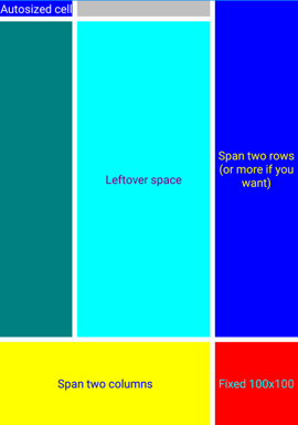
, , 및 특성은 Grid.Row클래스의 Grid 속성으로 표시되지만, 이 클래스는 명명된 이름Row, ColumnRowSpan또는 ColumnSpan.Grid.ColumnSpanGrid.RowSpanGrid.Column 대신 클래스는 Grid 연결된 속성이라고 하는 RowPropertyRowSpanPropertyColumnProperty바인딩 가능한 속성의 특수 형식인 네 개의 바인딩 가능한 속성 , 및 ColumnSpanProperty4개의 바인딩 가능한 속성을 정의합니다. 클래스에 의해 정의되지만 해당 Grid 클래스의 자식에 설정됩니다 Grid.
참고 항목
코드 Grid 에서 이러한 연결된 속성을 사용하려는 경우 클래스는 ,, SetRowGetColumn, SetRowSpanSetColumnGetRowSpanGetColumnSpan, 및 SetColumnSpan.라는 GetRow정적 메서드를 제공합니다.
연결된 속성은 클래스와 속성 이름을 마침표로 구분하여 포함하는 특성으로 XAML에서 인식할 수 있습니다. 연결된 속성은 한 클래스(이 경우Grid)로 정의되지만 다른 개체(이 경우의 Grid자식)에 연결되기 때문에 연결된 속성이라고 합니다. 레이아웃 중에 Grid 이러한 연결된 속성의 값을 심문하여 각 자식의 위치를 알 수 있습니다.
콘텐츠 속성
이전 예제에서 개체는 Grid .의 ContentContentPage속성으로 설정되었습니다. 그러나 속성은 Content XAML에서 참조되지 않았지만 다음이 될 수 있습니다.
<ContentPage xmlns="http://schemas.microsoft.com/dotnet/2021/maui"
             xmlns:x="http://schemas.microsoft.com/winfx/2009/xaml"
             x:Class="XamlSamples.XamlPlusCodePage"
             Title="XAML + Code Page">
    <ContentPage.Content>
        <Grid>
            ...
        </Grid>
    </ContentPage.Content>
</ContentPage>
Content.NET MAUI XAML에서 사용하도록 정의된 요소에는 클래스의 특성으로 지정된 속성이 하나만 허용되므로 XAML에서는 이 속성이 ContentProperty 필요하지 않습니다.
[ContentProperty("Content")]
public class ContentPage : TemplatedPage
{
    ...
}
클래스로 ContentProperty 지정된 속성은 속성에 대한 속성 요소 태그가 필요하지 않음을 의미합니다. 따라서 위의 예제에서는 시작 태그와 끝 ContentPage 태그 사이에 나타나는 모든 XAML 콘텐츠가 속성에 Content 할당되도록 지정합니다.
많은 클래스에도 ContentProperty 특성 정의가 있습니다. 예를 들어 콘텐츠 속성은 Label .입니다 Text.
플랫폼 간 차이점
.NET MAUI 앱은 플랫폼별로 UI 모양을 사용자 지정할 수 있습니다. 이 작업은 다음과 같은 클래스를 사용하여 XAML에서 OnPlatformOn 수행할 수 있습니다.
<ContentPage xmlns="http://schemas.microsoft.com/dotnet/2021/maui"
             xmlns:x="http://schemas.microsoft.com/winfx/2009/xaml"
             x:Class="...">
    <ContentPage.Padding>
        <OnPlatform x:TypeArguments="Thickness">
            <On Platform="iOS" Value="0,20,0,0" />
            <On Platform="Android" Value="10,20,20,10" />
        </OnPlatform>
    </ContentPage.Padding>
    ...
</ContentPage>
OnPlatform 는 제네릭 클래스이므로 제네릭 형식 인수(이 경우 Thickness속성 형식 Padding )를 지정해야 합니다. 이 작업은 XAML 특성을 사용하여 x:TypeArguments 수행됩니다. 클래스는 OnPlatform 모든 플랫폼에 Default 적용할 값으로 설정할 수 있는 속성을 정의합니다.
<ContentPage xmlns="http://schemas.microsoft.com/dotnet/2021/maui"
             xmlns:x="http://schemas.microsoft.com/winfx/2009/xaml"
             x:Class="...">
    <ContentPage.Padding>
        <OnPlatform x:TypeArguments="Thickness" Default="20">
            <On Platform="iOS" Value="0,20,0,0" />
            <On Platform="Android" Value="10,20,20,10" />
        </OnPlatform>
    </ContentPage.Padding>
    ...
</ContentPage>
이 예제 Padding 에서 속성은 iOS 및 Android에서 다른 값으로 설정되고 다른 플랫폼은 기본값으로 설정됩니다.
클래스는 OnPlatform 개체의 Platforms 속성 IListOn 도 정의합니다. 각 On 개체는 특정 플랫폼의 Platform 값을 정의 Thickness 하도록 및 Value 속성을 설정할 수 있습니다. 또한 Platform 속성 On 은 형식 IList<string>이므로 값이 같으면 여러 플랫폼을 포함할 수 있습니다.
<ContentPage xmlns="http://schemas.microsoft.com/dotnet/2021/maui"
             xmlns:x="http://schemas.microsoft.com/winfx/2009/xaml"
             x:Class="...">
    <ContentPage.Padding>
        <OnPlatform x:TypeArguments="Thickness" Default="20">
            <On Platform="iOS, Android" Value="10,20,20,10" />
        </OnPlatform>
    </ContentPage.Padding>
    ...
</ContentPage>
XAML에서 플랫폼 종속 Padding 속성을 설정하는 표준 방법입니다.
참고 항목
개체의 ValueOn 속성을 단일 문자열로 나타낼 수 없는 경우 개체의 속성 요소를 정의할 수 있습니다.
자세한 내용은 플랫폼에 따라 UI 모양 사용자 지정을 참조하세요.
다음 단계
.NET MAUI XAML 태그 확장을 사용하면 속성을 다른 원본에서 간접적으로 참조되는 개체 또는 값으로 설정할 수 있습니다. XAML 태그 확장은 개체를 공유하고 앱 전체에서 사용되는 상수 참조에 특히 중요합니다.
.NET MAUI
피드백
출시 예정: 2024년 내내 콘텐츠에 대한 피드백 메커니즘으로 GitHub 문제를 단계적으로 폐지하고 이를 새로운 피드백 시스템으로 바꿀 예정입니다. 자세한 내용은 다음을 참조하세요. https://aka.ms/ContentUserFeedback
다음에 대한 사용자 의견 제출 및 보기