이중 화면 검색을 위한 CSS 뷰포트 세그먼트 미디어 쿼리
스패닝 CSSmedia기능을 사용하여 출력 디바이스가 이중 화면(또는 접을 수 있음)인지, 브라우저 뷰포트가 두 디스플레이 영역에 걸쳐 있는지 여부를 테스트할 수 있습니다. 환경 변수는 화면에 표시되는 영역과 화면 사이의 힌지 영역(있는 경우)을 계산하는 데도 사용할 수 있습니다.
이 API는 Microsoft Edge 버전 97 이상에서 사용할 수 있습니다.
뷰포트 세그먼트
브라우저가 가로 또는 세로 힌지에 걸쳐 있는 경우 스타일을 선언하는 CSS 구문:
@media (horizontal-viewport-segments: <count>) { }
@media (vertical-viewport-segments: <count>) { }
Surface Duo의 경우 이중 화면 디스플레이와 일치하는 값은 다음과 같습니다.
horizontal-viewport-segments: 2
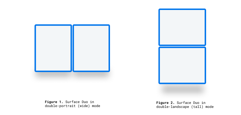
- 브라우저 뷰포트가 단일 접기(두 개의 표시 영역)에 걸쳐 있고 접이식 자세가 세로인 경우의 상태를 설명합니다. 이 값은 이중 세로(와이드) 모드의 Surface Duo와 일치합니다.
vertical-viewport-segments: 2
- 브라우저 뷰포트가 단일 접기(두 개의 표시 영역)에 걸쳐 있고 접이식 자세가 가로인 경우의 상태를 설명합니다. 이 값은 이중 가로(높이) 모드에서 Surface Duo와 일치합니다.
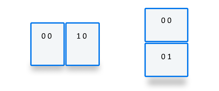
이 예제 CSS 코드 조각은 미디어 기능을 사용하여 -viewport-segments Surface Duo에 스타일을 적용하는 방법을 보여 줍니다.
@media (horizontal-viewport-segments: 2) {
   /* styles applied in double-portrait (wide) mode */
   /* matches Figure 1. below */
}
@media (vertical-viewport-segments: 2) {
   /* styles applied in double-landscape (tall) mode */
   /* matches Figure 2. below */
}
CSS 환경 변수
웹 개발자는 브라우저 정의 환경 변수를 활용하여 표시 영역(또는 지역)의 기하 도형을 가져와 가려진 힌지 영역(있는 경우)의 기하 도형을 계산할 수 있습니다. 각 뷰포트의 속성은 다음 환경 변수 정의를 사용하여 쿼리할 수 있습니다(맨 왼쪽 위 세그먼트의 좌표를 사용).
env(viewport-segment-width <x> <y>);
env(viewport-segment-height <x> <y>);
env(viewport-segment-top <x> <y>);
env(viewport-segment-left <x> <y>);
env(viewport-segment-bottom <x> <y>);
env(viewport-segment-right <x> <y>);
왼쪽 위 세그먼트에서 좌표가 할당됩니다.
이러한 값을 사용하여 힌지 영역의 좌표를 유추할 수 있습니다.
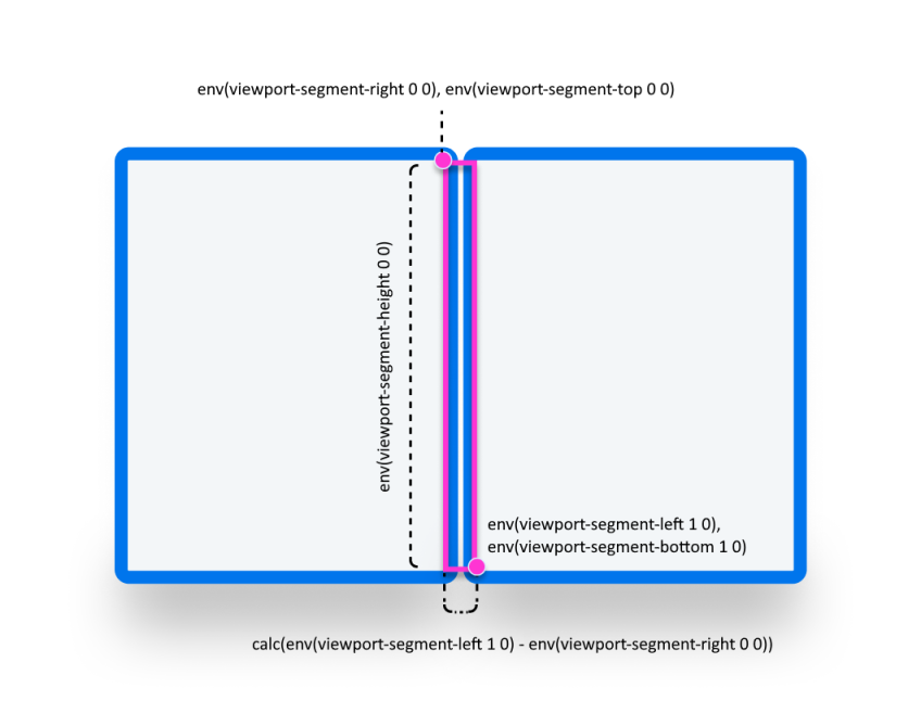
/* double-portrait */
env(viewport-segment-right 0 0);      /* hinge left */
env(viewport-segment-left 1 0);       /* hinge right*/
calc(env(viewport-segment-left 1 0) - env(viewport-segment-right 0 0))
                                      /* hinge width */
/* double-landscape */
env(viewport-segment-bottom 0 0);     /* hinge top */
env(viewport-segment-top 0 1);        /* hinge bottom */
calc(env(viewport-segment-top 0 1) - env(viewport-segment-bottom 0 0))
                                      /* hinge height */
예
Basic
모든 자세에서 <body> 휴대폰 및 green 이중 화면 디바이스에서 배경색이 설정된 yellow 반응형 페이지를 만듭니다.
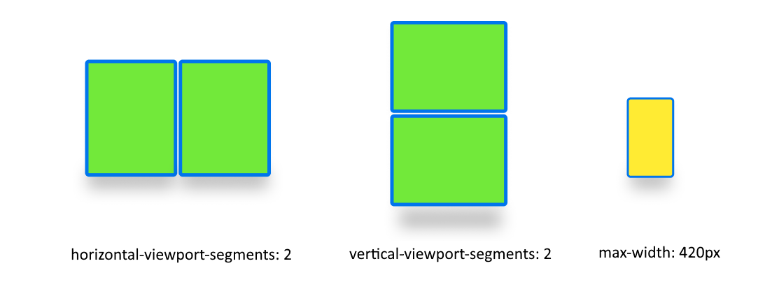
/* maximum width of our customers phones is 420px */
/* spanning: none is optional in this case */
@media (max-width: 420px) {
   body {
      background-color: yellow;
   }
}

/* Separating media features with comma `,` is equivalent to the logical operation OR  */
@media (horizontal-viewport-segments: 2), (vertical-viewport-segments: 2) {
   body {
      background-color: green;
   }
}
Flexbox
flexbox를 사용하여 첫 번째 열에 스크롤 가능한 설명이 포함되어 있고 두 번째 열에 이미지가 포함된 간격 인식 두 열 레이아웃을 만듭니다.
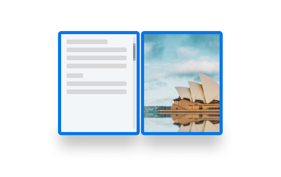
이 레이아웃을 만드는 HTML 및 CSS는 다음과 같습니다.
   <body>
      <article class="article">
         ...
      </article>
      <figure class="figure">
         <img src="/sydney-opera-house.jpg"
               alt="Sydney Opera House">
      </figure>
   </body>
body {
   height: 100vh;
   display: flex;
}

.article {
   /* grow: no, shrink: no, basis: fold-left */
   flex: 0 0 env(viewport-segment-right 0 0);

   /* equals to margin-right when writing mode is left-to-right (english)  */
   /* equals to margin-left when writing mode is right-to-left (arabic, hebrew)  */
   /* this will prevent content from being rendered behind the device mask */
   margin-inline-end: calc(env(viewport-segment-left 1 0) - env(viewport-segment-right 0 0)) ; /* hinge width */

   overflow-y: scroll;
}

.figure {
   /* fill the rest of the space */
   flex: 1;

   margin: 0;
   overflow: hidden;
}

.figure img {
   height: 100%;
}