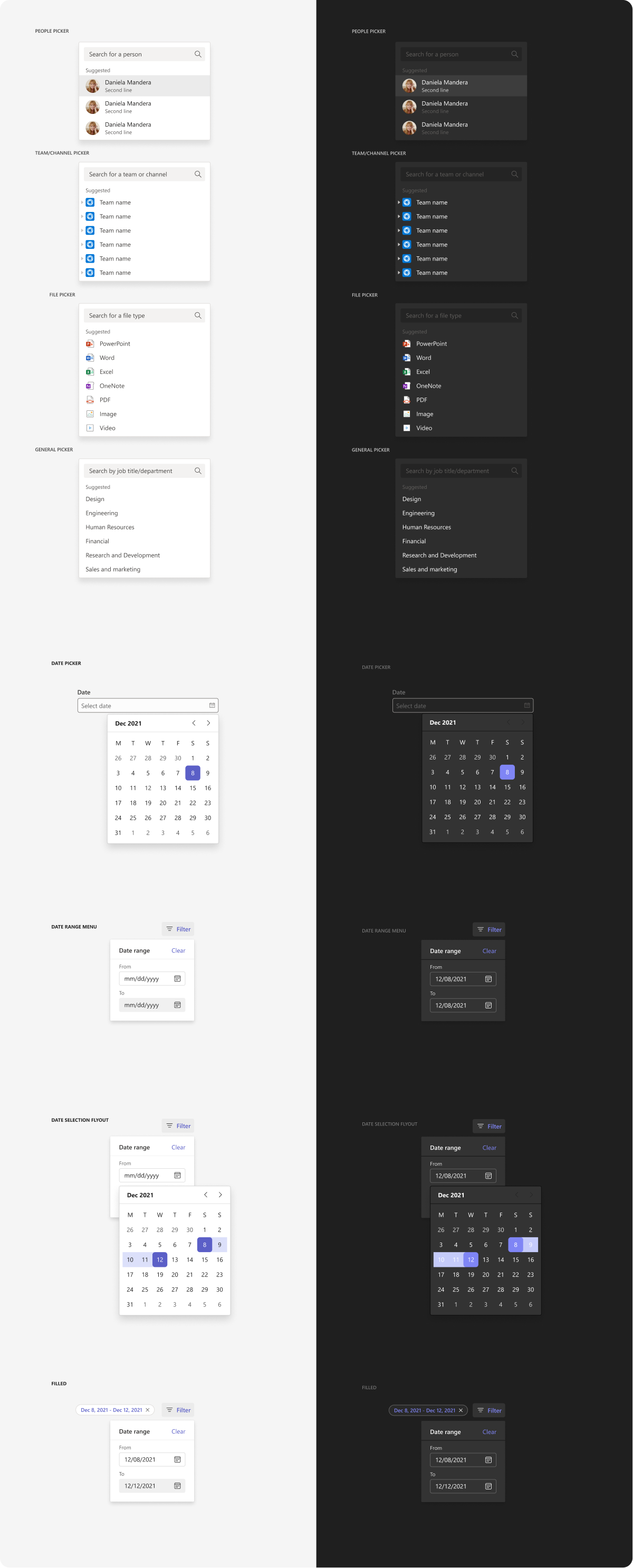
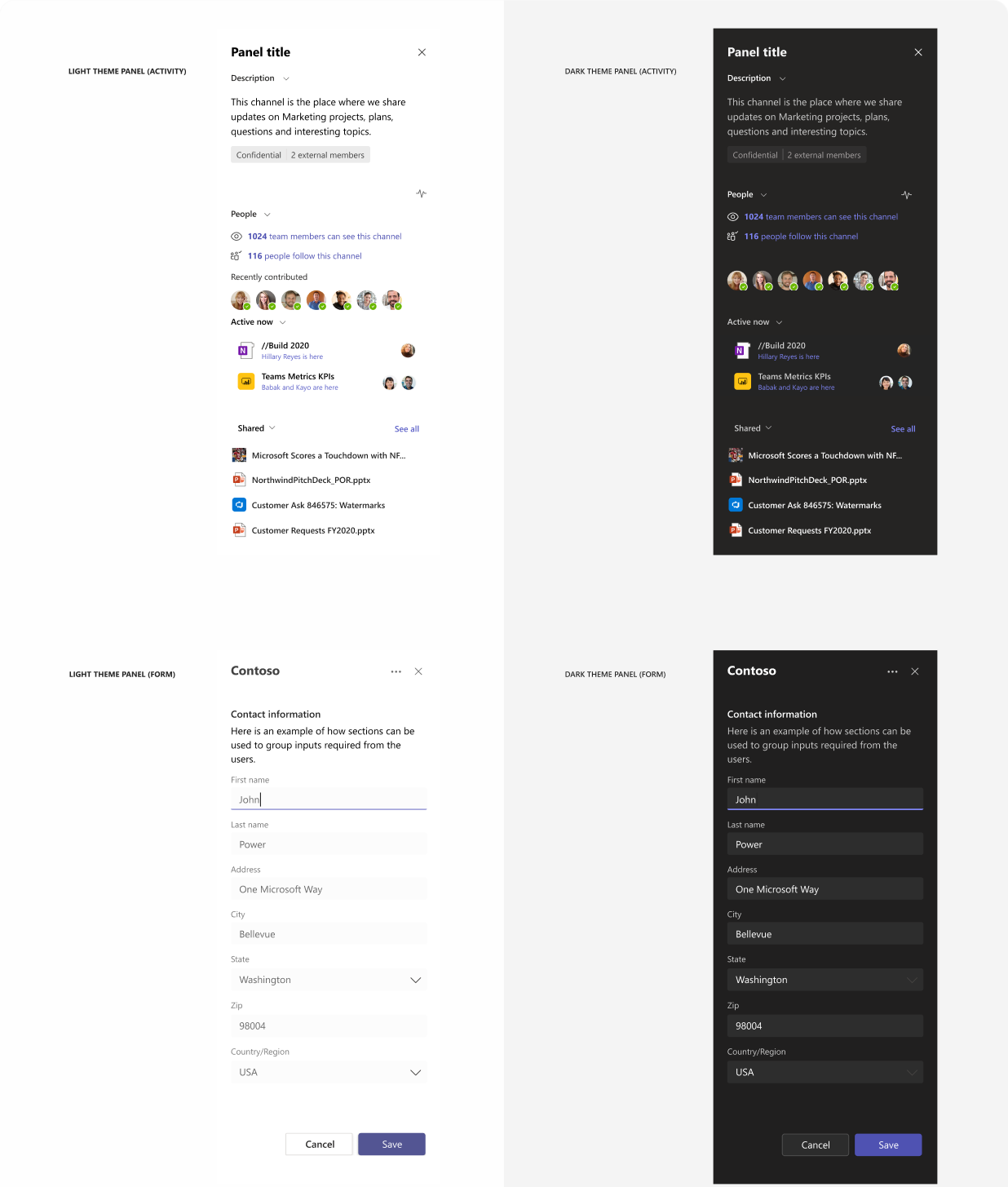
Designing your Microsoft Teams app with basic Fluent UI components
You can design and build your Teams app from scratch with the following basic Fluent UI components. Designed as flat as possible, these components can work across different use cases, themes, and screen sizes.
The illustrations on this page show how components look in Teams default (light) and dark themes.
Microsoft Teams UI Kit
Based on Fluent UI react components, the Microsoft Teams UI Kit includes components and patterns that are designed specifically for building Teams apps. In the UI kit, you can grab and insert the components listed here directly into your design and see more examples of how to use each component.
Alert

Button

Breadcrumb

Card

Carousel

Checkbox

Coachmark

Contextual menu

Dialog

Dropdown

Group list

Hyperlink

Input

Key value pair

Paragraph

Picker
Pivot

Progress indicator

Radio

Scrollbar

Search box

Side panel
Status label

Toast

Toggle
Note: In Fluent UI, toggle is a type of checkbox.

Tooltip

Other resources
Get code samples and implementation details for some of the components listed here and in the Microsoft Teams UI Kit.
Platform Docs
피드백
출시 예정: 2024년 내내 콘텐츠에 대한 피드백 메커니즘으로 GitHub 문제를 단계적으로 폐지하고 이를 새로운 피드백 시스템으로 바꿀 예정입니다. 자세한 내용은 다음을 참조하세요. https://aka.ms/ContentUserFeedback
다음에 대한 사용자 의견 제출 및 보기