Microsoft Teams app design system
Quickly learn about the fundamentals of Teams app design. You can find comprehensive guidance and examples in the Microsoft Teams UI Kit (Figma).
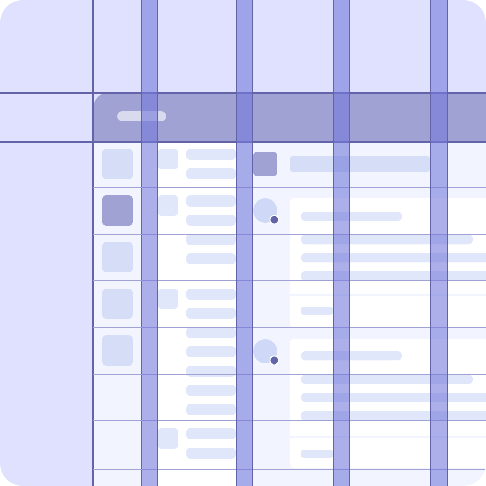
Layout
Teams relies on a grid layout to ensure consistent and elegant relationships between design components. The grid’s 4-pixel base unit allows components to scale consistently across all display sizes in Teams.
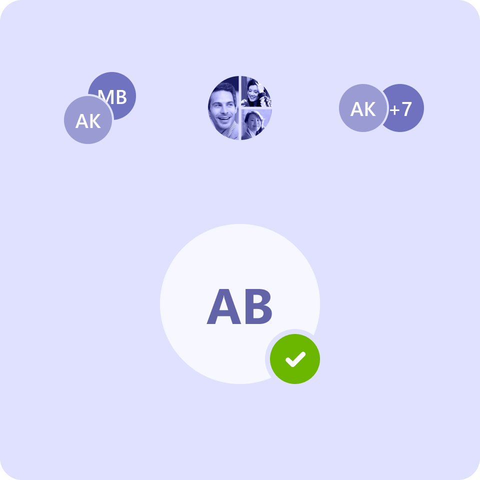
Avatars
An avatar is a graphical representation of a person, team, bot, or entity in Teams. An avatar group is often used to convey live activity or a represent a roster in a way that preserves vertical space.
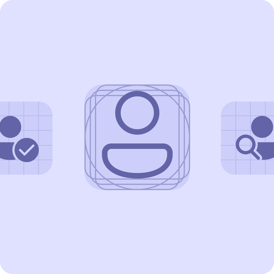
Icons
Your app's primary icon can go a long way in conveying your brand to Teams users. Getting your icon design right is also important for publishing your app to the Microsoft Teams Store.
You also can use Fluent UI icons throughout your app:
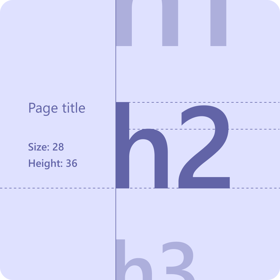
Type
Teams uses Segoe UI for its type ramp and different font sizes and weights to help create hierarchy and ensure readability.
Colors
Teams web and desktop supports default (light), dark, and high-contrast themes, while Teams mobile supports light and dark themes. Each theme has its own color scheme.
Shape and elevation
You can use shape and elevation to create additional hierarchy in your app.
Copy and content
To feel part of Teams, your app copy in general should follow these Microsoft voice principles: warm and relaxed, crisp and clear, and ready to lend hand.
See full copy and content guidelines—including writing for bots (Figma)
Platform Docs
피드백
출시 예정: 2024년 내내 콘텐츠에 대한 피드백 메커니즘으로 GitHub 문제를 단계적으로 폐지하고 이를 새로운 피드백 시스템으로 바꿀 예정입니다. 자세한 내용은 다음을 참조하세요. https://aka.ms/ContentUserFeedback
다음에 대한 사용자 의견 제출 및 보기