연습 - Grid를 사용하여 사용자 인터페이스 빌드
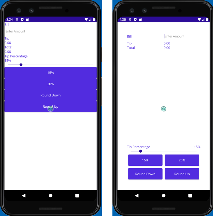
이 연습에서는 Grid를 사용하여 보기를 UI(사용자 인터페이스)에 정렬합니다. TipCalculator 프로젝트의 다른 버전으로 시작하고 UI를 보다 직관적으로 만들기 위해 조정합니다. 또한 단추를 페이지 아래쪽으로 이동합니다. 이번에는 VerticalStackLayout 및 HorizontalStackLayout을 사용하는 대신 Grid 레이아웃을 사용합니다. 다음 이미지는 초기 UI와 이 연습의 단계를 수행하여 발생한 UI를 보여줍니다.
시작 솔루션 열기
시작 솔루션에는 완전하게 작동하는 팁 계산기 앱이 포함되어 있습니다.
Visual Studio를 사용하여 이전 연습의 시작 부분에 복제한 리포지토리의 exercise3/TipCalculator 폴더에서 시작 솔루션을 엽니다.
MainPage.xaml을 엽니다. 모든 보기는 하나의 세로
StackLayout패널을 사용하여 표시됩니다.<?xml version="1.0" encoding="utf-8" ?> <ContentPage xmlns="http://schemas.microsoft.com/dotnet/2021/maui" xmlns:x="http://schemas.microsoft.com/winfx/2009/xaml" xmlns:local="clr-namespace:TipCalculator" x:Class="TipCalculator.MainPage"> <VerticalStackLayout> <Label Text="Bill" /> <Entry x:Name="billInput" Placeholder="Enter Amount" Keyboard="Numeric" /> <Label Text="Tip" /> <Label x:Name="tipOutput" Text="0.00" /> <Label Text="Total" /> <Label x:Name="totalOutput" Text="0.00" /> <Label Text="Tip Percentage" /> <Label x:Name="tipPercent" Text="15%" /> <Slider x:Name="tipPercentSlider" Minimum="0" Maximum="100" Value="15" /> <Button Text="15%" Clicked="OnNormalTip" /> <Button Text="20%" Clicked="OnGenerousTip" /> <Button x:Name="roundDown" Text="Round Down" /> <Button x:Name="roundUp" Text="Round Up" /> </VerticalStackLayout> </ContentPage>
Grid 레이아웃 만들기
레이아웃 패널을
40단위 여백으로VerticalStackLayout에서Grid로 변경합니다.Grid에 대한 7개 행과 2개 열을 정의합니다. 네 번째 행을 제외한 나머지 행을Auto크기로 만듭니다. 네 번째 행은Star를 사용하여 그리드에서 사용 가능한 나머지 모든 공간을 확보해야 합니다. 두 열에는Star크기 조정을 사용합니다.<Grid RowDefinitions="Auto, Auto, Auto, *, Auto, Auto, Auto" ColumnDefinitions="*, *" Padding="40"> ... </Grid>
셀에서 보기 위치 조정
Grid.Row및Grid.Column의 설정을 각 보기에 추가하여Grid의 적절한 셀에 추가합니다. 다음 스크린샷에서 각 보기를 배치할 위치를 확인할 수 있습니다.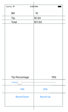
다음 예제에서는 Bill,
Label및billInputEntry보기에 대한 위치를 설정하는 방법을 보여 줍니다.... <Label Text="Bill" Grid.Row="0" Grid.Column="0"/> <Entry x:Name="billInput" Placeholder="Enter Amount" Keyboard="Numeric" Grid.Row="0" Grid.Column="1"/> ...Label에서
VerticalOptions속성을Center로 설정하여 BillLabel과Entry를 맞춥니다.다음 두 열에 걸쳐 있도록
Grid.ColumnSpan의 설정을Slider에 추가합니다.<Slider ... Grid.ColumnSpan="2" ... />팁 비율이라는 텍스트가 포함된
Label을 찾습니다. 사각형의 왼쪽 아래를 점유하도록 설정합니다.<Label Text="Tip Percentage" VerticalOptions="End" HorizontalOptions="Start" ... />tipPercent라는
Label을 찾습니다. 사각형의 오른쪽 아래를 점유하도록 설정합니다.<Label x:Name="tipPercent" VerticalOptions="End" HorizontalOptions="End" ... />네 개의 단추 모두에 대한
Margin속성을5로 설정합니다.
페이지에 대한 전체 XAML 태그는 다음과 같습니다.
<ContentPage xmlns="http://schemas.microsoft.com/dotnet/2021/maui"
             xmlns:x="http://schemas.microsoft.com/winfx/2009/xaml"
             xmlns:local="clr-namespace:TipCalculator"
             x:Class="TipCalculator.MainPage">
    <Grid RowDefinitions="Auto, Auto, Auto, *, Auto, Auto, Auto"
          ColumnDefinitions="*, *"
          Padding="40">

        <Label Text="Bill" VerticalOptions="Center" Grid.Row="0" Grid.Column="0"/>
        <Entry x:Name="billInput" Placeholder="Enter Amount" Keyboard="Numeric" Grid.Row="0" Grid.Column="1"/>

        <Label Text="Tip" Grid.Row="1" Grid.Column="0"/>
        <Label x:Name="tipOutput" Text="0.00" Grid.Row="1" Grid.Column="1"/>

        <Label Text="Total" Grid.Row="2" Grid.Column="0"/>
        <Label x:Name="totalOutput" Text="0.00" Grid.Row="2" Grid.Column="1"/>

        <Label Text="Tip Percentage" VerticalOptions="End" HorizontalOptions="Start" Grid.Row="3" Grid.Column="0"/>
        <Label x:Name="tipPercent" Text="15%" VerticalOptions="End" HorizontalOptions="End" Grid.Row="3" Grid.Column="1"/>
        <Slider x:Name="tipPercentSlider" Minimum="0" Maximum="100" Value="15" Grid.Row="4" Grid.Column="0" Grid.ColumnSpan="2"/>

        <Button Text="15%" Clicked="OnNormalTip" Margin="5" Grid.Row="5" Grid.Column="0"/>
        <Button Text="20%" Clicked="OnGenerousTip" Margin="5" Grid.Row="5" Grid.Column="1"/>

        <Button x:Name="roundDown" Margin="5" Text="Round Down" Grid.Row="6" Grid.Column="0"/>
        <Button x:Name="roundUp"   Margin="5" Text="Round Up" Grid.Row="6" Grid.Column="1"/>

    </Grid>
</ContentPage>
결과 검사
애플리케이션을 실행하고 UI의 차이점을 살펴봅니다. Grid를 사용하여 기존 UI의 모양을 가다듬었습니다. Grid는 StackLayout보다 강력합니다. 특히 Grid를 사용하면 행 간의 보기를 쉽게 맞출 수 있습니다.