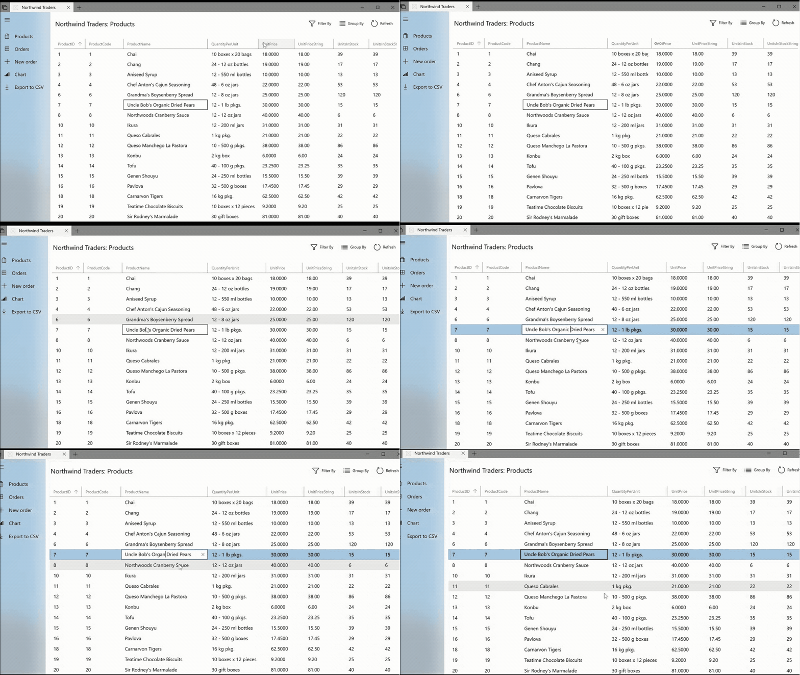
The DataGrid control provides a flexible way to display a collection of data in rows and columns.

Note
The DataGrid control is not part of the WinUI 3 controls available in the Windows Community Toolkit version 8.0 and later yet. The control is available for UWP and Uno Platform apps in Windows Community Toolkit version 7.1.0.
The built-in column types include a text column, a check box column, a combobox column and a template column for hosting custom content. The built-in row type includes a drop-down details section that you can use to display additional content below the cell values.
The DataGrid control supports common table formatting options, such as alternating row backgrounds and foregrounds and the ability to show or hide headers, grid lines, and scroll bars. Additionally, the control provides several style and template properties that you can use to completely change the appearance of the control and its rows, columns, cells, and row or column headers.
The DataGrid has built-in support for Narrator and Touch Narrator to help blind users to navigate and interact easily with the control. Additionally, the control has built-in support for extensive keyboard navigation through cells, headers, rows and columns.
How-Tos
The following guidance sections describe the additional concepts and techniques that you can use to build DataGrid control features into your applications:
- Add a DataGrid control to a page
- Customize the DataGrid control using styling and formatting options
- Sizing options in the DataGrid control
- Default keyboard navigation and selection patterns
- Display and configure Row Details
- Configure Auto-generated columns in the DataGrid control
- Group, sort and filter data using LINQ and the DataGrid control
- Editing and input validation in the DataGrid control
Sample Project
Here's the DataGrid sample source code.
If you have the WinUI 2 Gallery app installed, you can use the app to see the DataGrid in action.
See the other controls available in the Windows Community Toolkit Gallery app or try them with the gallery app in your browser.
Requirements
| Device family | Universal, 10.0.16299.0 or higher |
|---|---|
| Namespace | Microsoft.Toolkit.Uwp.UI.Controls |
| NuGet package | Microsoft.Toolkit.Uwp.UI.Controls.DataGrid |