Nota
L-aċċess għal din il-paġna jeħtieġ l-awtorizzazzjoni. Tista’ tipprova tidħol jew tibdel id-direttorji.
L-aċċess għal din il-paġna jeħtieġ l-awtorizzazzjoni. Tista’ tipprova tibdel id-direttorji.
Visualization widgets render your dashboard datasets as charts. You can choose a chart type, define its axes and encodings, format axis values and labels, and format the widget's title and description with rich text.
Create and configure a chart
After adding a visualization widget to the canvas, the Visualization Configuration panel appears on the right side of the screen. By default, the first dataset listed on the Data tab is selected, and the default visualization type is a Bar chart.
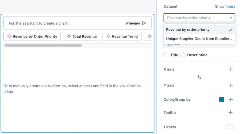
To create a chart, use the following steps:
- Select a dataset: Use the Dataset drop-down to choose the dataset for your visualization.
- Add filters (optional): Click Show filters to apply a static filter or parameter to your visualization. You can filter on any field. If your dataset includes a parameter, an option to apply it will also appear.
- Choose a visualization type: Select a visualization type from the Visualization drop-down menu. For details about available visualization types and their configurations, see AI/BI dashboard visualization types.
- Define x-axis and y-axis fields: After selecting a dataset, choose the fields to display on the x-axis and y-axis. You can reorder fields by dragging them into the desired position. For chart labels, you can use the display name field to rename the axis label.
Note
If you use the Genie Code to generate a chart, the dataset and visualization selections automatically adjust based on your request. For step-by-step guidance on creating AI-assisted visualizations, see Use Genie Code for dashboard authoring.
View the visualization query
While in draft mode, you can view the full SQL query that a visualization widget runs, including any parameters and filters currently applied. This is useful for verifying data accuracy, troubleshooting unexpected results, or understanding how dashboard filters and parameters affect the underlying query.
- Click the
 kebab menu on the visualization widget.
 - Click View visualization query.
A modal appears displaying the SQL query for the visualization widget. This query is specific to the widget and only returns the data necessary to render that visualization. It is not the same as the full dataset query. The query reflects the current state of any applied filters. If the underlying dataset uses parameters, parameter values are not substituted into the query. Instead, they appear at the top of the modal for reference.
Format widget titles and descriptions
Widget titles and descriptions support rich text. You can emphasize key terms, link to a definition, or show a filter's current value in the widget header.
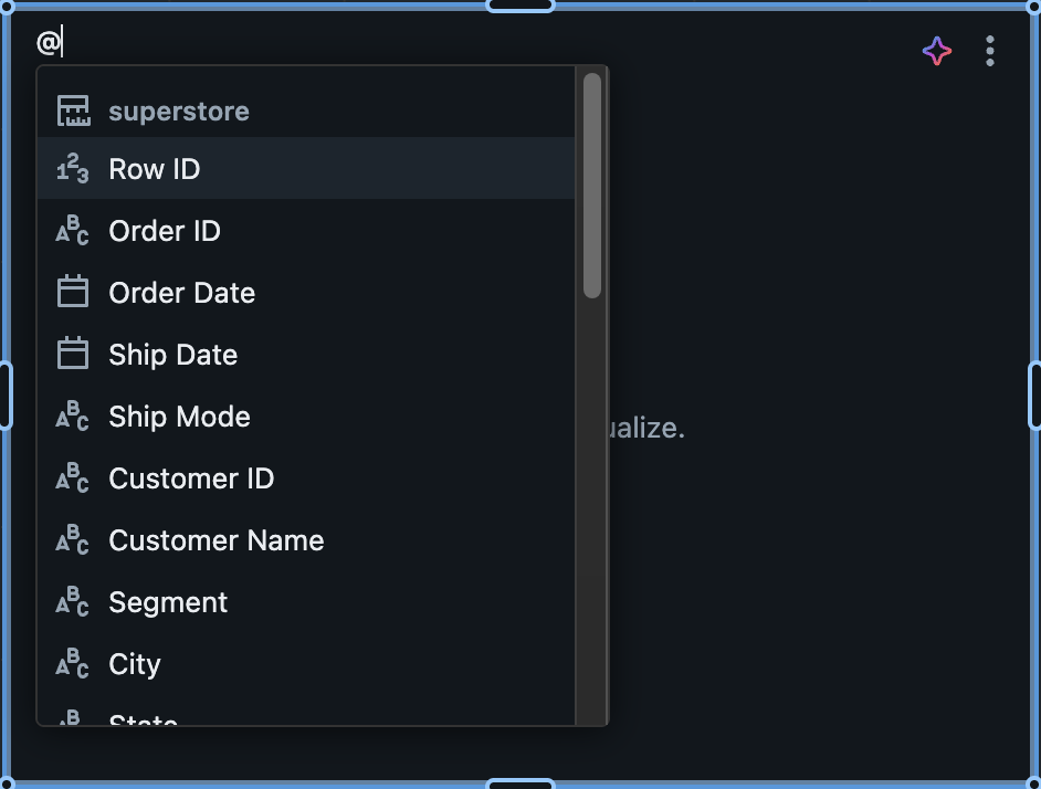
Click a widget's title or description to start editing. A formatting toolbar appears above the widget, and both fields prompt you to type @ to reference a filter or a field.
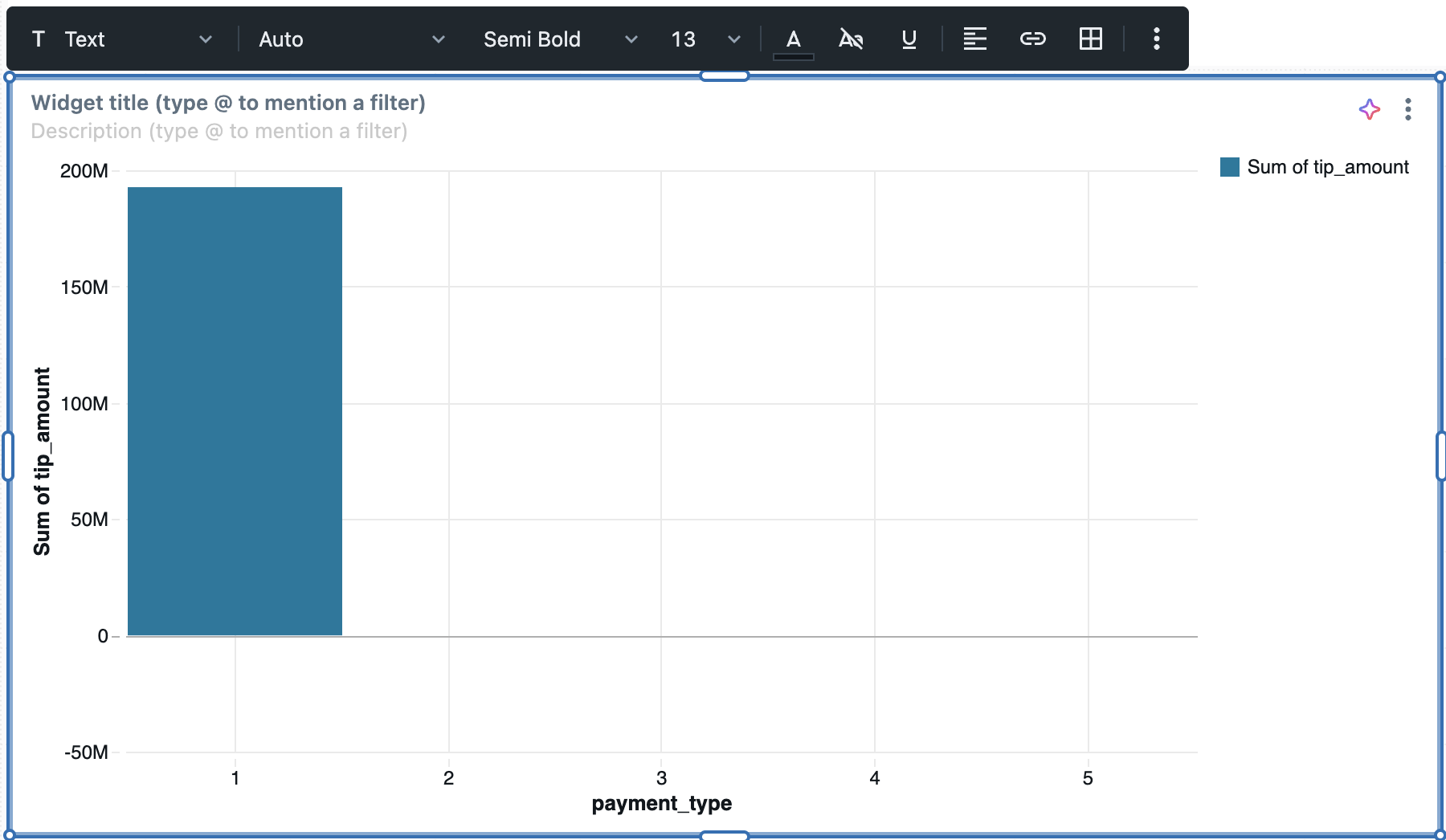
Format text
Use the formatting toolbar to style the title or description in the following ways:
- Text styling: Adjust block style, font, font weight, font size, and text color, and apply underline. Choose from 20 open source fonts in the font drop-down menu.
- Alignment: Align text to the left, center, or right.
- Insert links: Click the link icon to open the link editor. Enter the URL and the link text to display.
- Insert tables: Click the table icon to add a table.
- Clear formatting: Remove all formatting from the selected text.
You can also type markdown syntax directly. For example, typing **Revenue** formats the text as bold. To edit the underlying markdown, click the kebab menu > Show markdown. For details about basic markdown syntax, see the Markdown guide.
Text widgets use the same editor. See Text widgets.
Note
You can't insert images into a widget title or description. Images are supported in text widgets. See Image paths and URLs.
Reference a filter or a field
You can reference a filter or a field in a widget title or description so that the header responds to the dashboard's filters and cross-filter selections. A filter reference reflects the viewer's current selection. A field reference shows a live, aggregated metric.
For example:
- To reference a filter, type
Sales for @regionand select theregionfilter. The title readsSales for Westwhen a viewer selects West, and updates when the selection changes. - To reference a field, type
Total revenue: @and select therevenuefield. The reference resolves to an aggregation, such asTotal revenue: $1.2M, and updates when a viewer applies a filter or cross-filter.
To add a reference:
- Click the widget title or description to start editing.
- Type
@to open the list of available filters and fields. - Continue typing to narrow the list.
- Select a filter or a field.
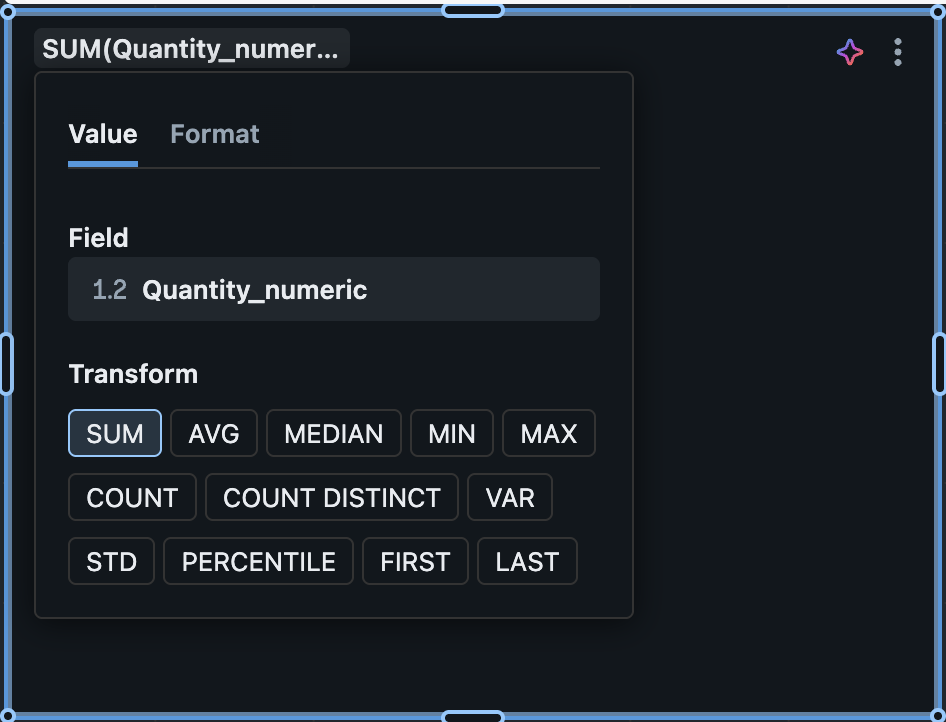
When you select a field, a default aggregation is applied based on the field type. To change the field, aggregation, or formatting, click the reference to open a configuration popover:
- On the Value tab, change the field or select a different aggregation function. The available functions depend on the field type. For numeric fields, they include SUM, AVG, MEDIAN, MIN, MAX, COUNT, COUNT DISTINCT, VAR, STD, PERCENTILE, FIRST, and LAST.
- On the Format tab, set number or date formatting, including the number type, abbreviation, precision, group separator, and negative sign. For details about number formatting, see Format numeric values. The Format tab isn't shown for text fields.
A field reference can target any dataset on the dashboard, not only the widget's own dataset, and a single title or description can reference multiple fields.
References have the following limitations:
- Filter and parameter widgets can't reference other filters. This prevents circular references between filters.
- Field references are available in visualization widget titles and descriptions only. They aren't available on control widgets, such as filter and parameter widgets.
- A field reference targets a field from a single dataset. Cross-dataset measures aren't supported. Dashboards that use a semantic model are supported.
- If a referenced field is renamed or removed, the reference shows
(removed).
To learn about referencing parameters in text widgets, see Use parameters in text widgets.
Where formatting isn't applied
The following places show the title as plain text, with formatting removed. Don't rely on formatting to convey meaning in a title that appears in these places:
- Chart titles and visualization references that Genie displays, including in the chat window, in Genie Agents, and in Genie One
- The widget list in the dashboard editor
- Dashboard subscription attachments
- Filter tooltips
- The file name of a downloaded data export
Other formatting behavior
Formatting also behaves differently in the following cases.
Downloading a widget as an image preserves text styling.
When a widget is only one row tall and shows its title, the description appears in a tooltip behind an information icon instead of next to the title. To show the description inline, make the widget taller or hide the title.
Apply chart formatting
Charts include customizable formatting options for axes, colors, labels, and tooltips. Formatting options vary by chart type and dataset values.
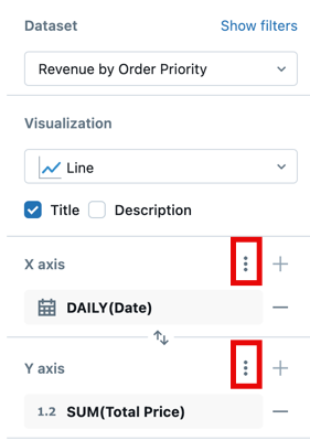
The following screenshot highlights the kebab menus used for formatting the x and y axes.
Format axis settings
To format the x-axis or y-axis, use the kebab menu in the respective X Axis or Y Axis section of the visualization editing panel.
Configure the following settings:
- Show axis title: Enabled by default. Enter a custom title or clear the checkbox to hide the axis title.
- Show axis values: Enabled by default. Clear the checkbox to hide axis values.
Depending on the type of data represented, additional controls appear.
For numeric data:
- Axis range: Select how the axis range is determined:
- Default: Use an automatic range. On a faceted chart, all subcharts share one range so they're directly comparable.
- Per facet: On a faceted chart, scale the axis to each subchart's own data. This has no effect when the chart isn't faceted. See Faceting.
- Custom: Set fixed Minimum and Maximum values for the axis.
- Reverse axis: Select Reverse Axis to show the axis values in descending order.
- Scale function: Choose Linear or Log (Symmetric).
- Click Format to view additional formatting options. Auto automatically formats your chart and is selected by default. Click Custom to see additional formatting options. See Format numeric values.
For categorical data:
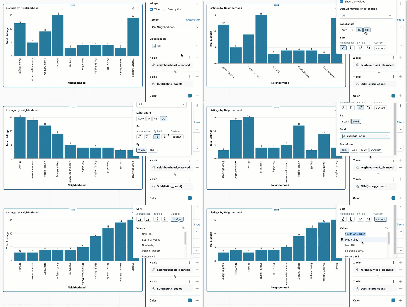
- Label Angle: Choose the angle at which to apply the labels. Auto is selected by default.
- Sort: Choose how to order categorical values on the axis:
- Alphabetical: Sort category names alphabetically
- By field: Sort by a measure field value in ascending or descending order. After selecting the sort direction, choose which field to use:
- Y axis: Sort by the measure field displayed on the Y axis
- Field: Sort by any other measure field in the dataset, even if it's not displayed on the chart. Select the field from the dropdown and choose the aggregation (SUM, MIN, MAX, or COUNT). This is useful for ordering categories by metrics that provide context without cluttering the visualization.
- Custom: Arrange values in a specific order. Hover over a value and use the grab-handle to drag it into position.
Note
If any of the listed options are unavailable, they cannot be applied to the selected chart type.
Format numeric values
You can format numbers for axis tick labels, data labels, and tooltips. To access formatting options:
- Click the kebab menu next to X Axis or Y Axis in the chart configuration panel.
- Click Format and choose from the following options:
- Type: None, Currency ($), Percentage (%)
- Abbreviation: None, Compact, Scientific
- Decimal places: Max, Exact, All, or a custom number of places
- Group separator: Optionally, include a comma or other separator.
- Negative sign: Choose how negative numbers are displayed. Select -123.45 (default) for a standard minus sign, or select (123.45) to use accounting-style parentheses.
Note
Different currency formats are available. After selecting Currency, choose your preferred option from the drop-down menu.
Customize chart elements
You can format chart legends, colors, marker shapes, line patterns, tooltips, and value labels.
Chart colors
To change chart colors:
- Click a color in the chart to open the color picker.
- Enter a HEX or RGB value for an exact color.
- Click the kebab menu in the Color section to adjust the opacity of all colors.
Consistent colors across widgets
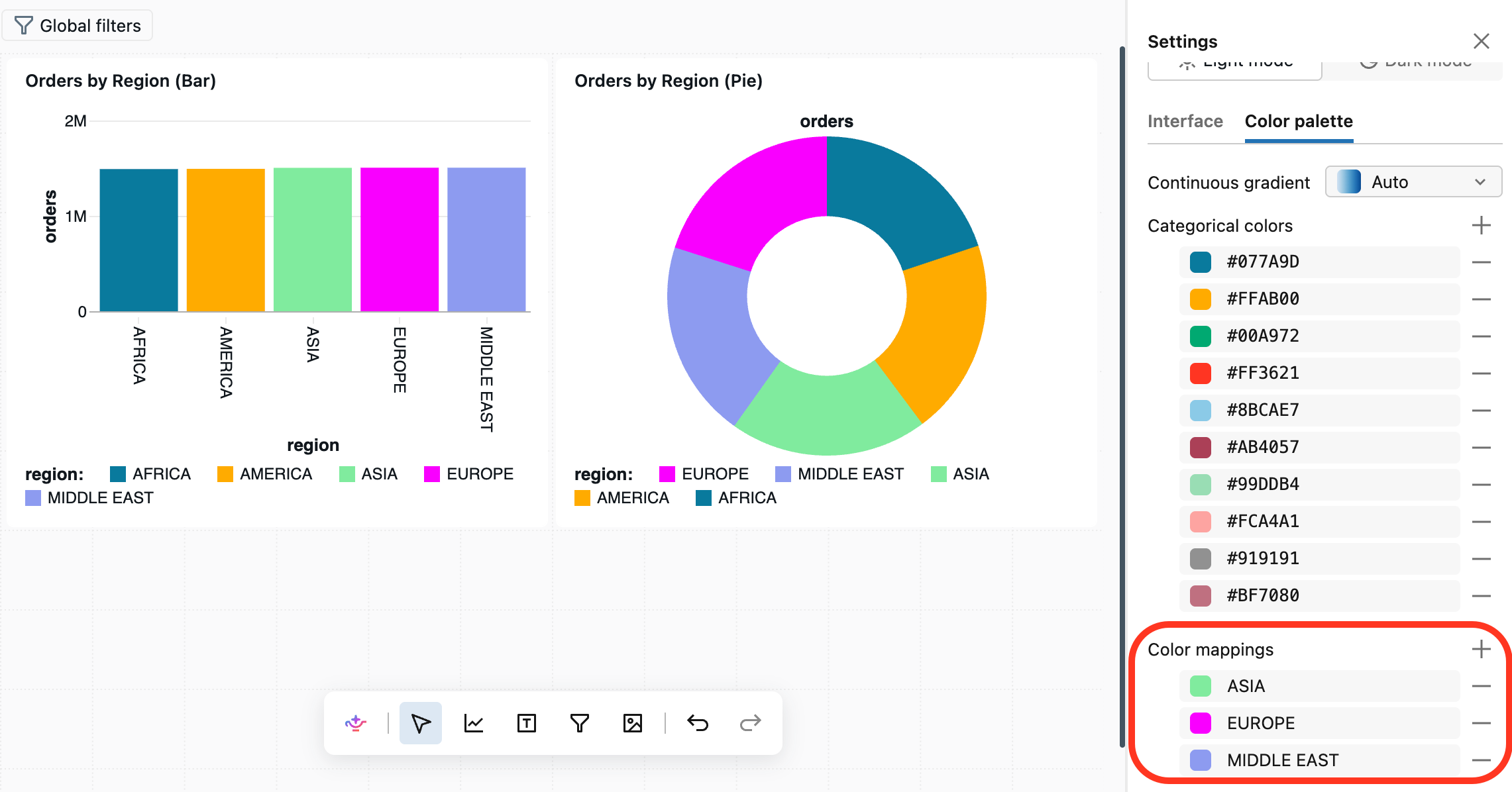
When a chart colors by a categorical field, dashboards automatically use the same color for the same value across every widget on the dashboard. For example, if one chart shows Australia in one color, every other chart on the dashboard that colors by the same field shows Australia in that color.
Widgets share colors only when they color by the same field from the same dataset. A field with the same name from a different dataset keeps its own colors. Color consistency is scoped to a single dashboard, so colors don't carry across dashboards. This applies to Color by field and does not apply to Color by series.
To use a specific color for a value, set it in the color picker. A color you set manually takes precedence over the automatic assignment.
To set the automatic color for a value across the whole dashboard (rather than on one widget at a time), use color mappings in the dashboard's theme settings. See Create or update the workspace theme.
Legend
Click the kebab menu in the Color section to show options for changing the visibility, title, or position of the chart legend. The following options are available:
- Show legend: Use the checkbox to show or hide the legend.
- Show legend title: Use the checkbox to show or hide the legend title. When the title is visible, you can type to override the default value, which is the column name.
- Legend position: Use the drop-down to adjust the legend's placement in the visualization widget. Legends can be positioned at the top, bottom, left, or right of the visualization.
Tooltips
Tooltips display precise measures of the data under the pointer. By default, they show values from the x-axis, y-axis, and any color/grouping fields. To add more fields to a tooltip:
- Click the
 plus icon in the Tooltip section of the visualization editor.
 - Use the drop-down to select additional fields, or use the text entry box to search by name.
Note
If the Tooltip section is not present in the visualization editor, that chart type does not support tooltip customization.
Value labels
Use the toggle to turn data labels on or off. When enabled, you can choose how the labels display:
- Auto: Displays y-axis values as labels.
- Field: Select a specific field to display as labels. You can apply a transformation (such as SUM or AVG) and choose formatting options for the selected field.
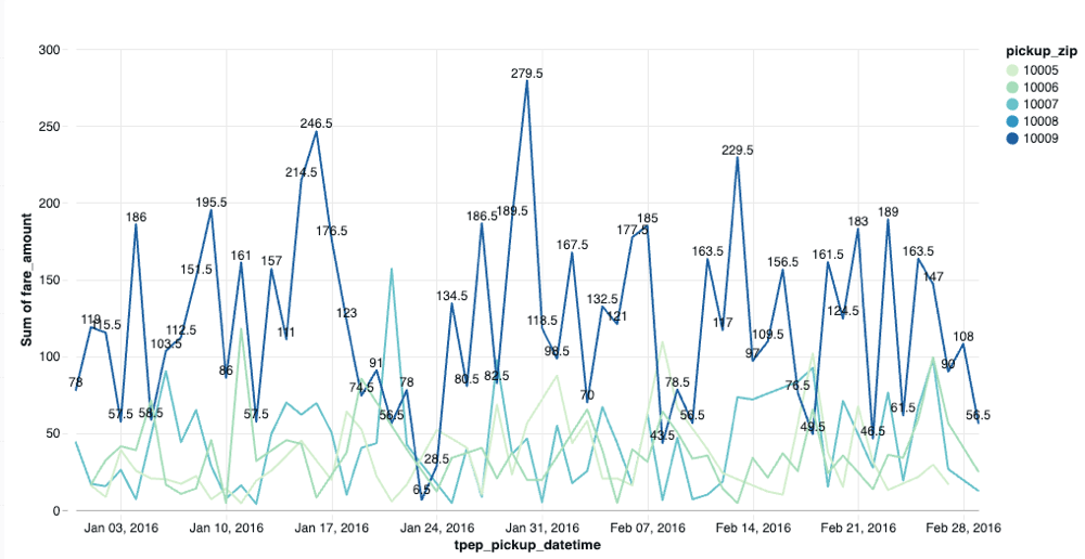
Null values are not displayed as labels on the chart. You can use conditional logic to selectively display labels.
The following query creates a dataset where labels appear only for specific data points:
SELECT
  *,
  CASE
    WHEN pickup_zip = 10009 THEN fare_amount
    ELSE NULL
  END AS custom_label
FROM
  samples.nyctaxi.trips
When you use custom_label as the value label field, only data points where pickup_zip = 10009 display labels showing the fare_amount. All other data points with null values appear on the chart without labels.
Size settings
The Size setting controls visual dimensions for line charts, scatter charts, bubble charts, and point maps. Its usage depends on the chart type:
Line charts:
- If no series are specified in the Size area, the slider changes all line thickness uniformly.
- If series are specified in the Size area, you can set different thickness values for each series.
Scatter and bubble charts:
- Add a field to the Size setting to vary the point marker size based on a metric.
- When size is based on a data field, the chart becomes a bubble chart where each point's size reflects the metric value.
Point maps: Use the Size setting to vary map marker sizes based on a quantitative field, showing magnitude at different geographical locations.
Marker
On line charts, the Marker setting draws a marker at each data point along a line. Click the marker swatch to set one shape for every point, or click the plus icon in the Marker section to vary the marker shape by a categorical field, such as a different shape for each series. Available shapes include a circle, square, diamond, cross, X, star, and triangles.
The Marker setting applies to line charts only. On scatter charts, use the Shape setting instead.
Shape
On scatter charts, the Shape setting controls the shape of each point. Click the shape swatch to set one shape for every point, or click the plus icon in the Shape section to vary the shape by a categorical field, such as a different shape for each category. Available shapes include a circle, square, diamond, cross, X, star, and triangles.
The Shape setting applies to scatter charts only. On line charts, use the Marker setting instead.
Pattern
On line and combo charts, the Pattern setting controls the dash style of each line. Click the plus icon in the Pattern section to choose a categorical field that varies the dash style of each line, such as a solid line for one series and a dashed line for another. The available styles are solid, dashed, and dotted.
The Marker and Shape settings aren't available on combo charts or charts that plot multiple measures. On those charts, use the Pattern setting to distinguish line series.
Gridlines
Charts support toggling gridlines on and off to improve readability. Gridlines appear by default on supported chart types and help viewers interpret data points by providing visual reference lines aligned with axis values.
To toggle gridlines:
- In the visualization configuration panel, locate the gridline options.
- Use the toggle to show or hide gridlines for the chart.
Gridlines automatically adjust based on your custom background colors and axis formatting settings.
Annotations
Annotations are horizontal or vertical reference lines that you can add to charts to track thresholds, targets, or benchmarks. Annotation lines can be a fixed constant value or driven by your data, such as an average or a specific measure.
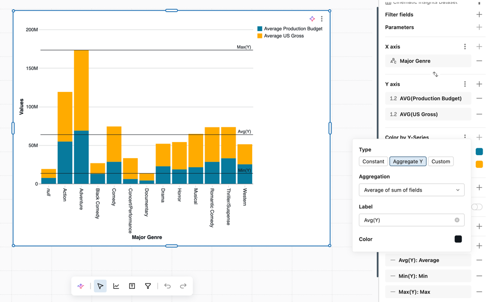
The following chart types support annotations:
- Constant and Custom: Area, Bar, Box, Combo, Heatmap, Histogram, Line, Scatter, and Waterfall
- Aggregate: Area, Bar, Box, Line, and Scatter only. Not available on charts with 100% stack layout.
To add an annotation:
- In the visualization configuration panel, locate the Annotation section.
- Click the plus icon to add a new annotation.
- Select the line orientation:
- Horizontal: Draws a line parallel to the x-axis at a specified y-axis value.
- Vertical: Draws a line parallel to the y-axis at a specified x-axis value.
- Select the annotation type and configure it:
- Constant: Enter a fixed value where the line should appear.
- Aggregate Y (horizontal) / Aggregate X (vertical): Select an aggregation (Avg, Min, or Max). The line position is calculated as an aggregation over the underlying chart data.
- Custom: Select a field or measure from your dataset. The line position is calculated in a separate query. If you select an aggregated field, a single line is drawn. If you select a non-aggregated field, one line is drawn per returned row.
- (Optional) Enter a label. The label appears on the chart next to the line.
- (Optional) Click the color picker to customize the line color.
You can add multiple annotations to a single chart to track different thresholds or reference points.
Generate a forecast
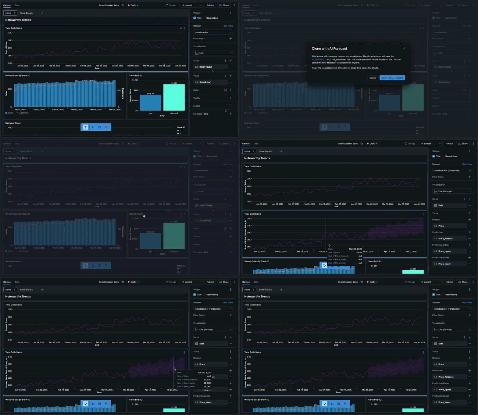
Use AI Forecast (Public Preview) to apply predictive forecasting to line charts to visualize future trends and patterns. Your line chart must have a temporal date field on the x-axis and a single numeric field on the y-axis.
To create a chart with AI forecast:
- With your line chart selected, click the plus icon to the right of Forecast.
- Click Clone with AI Forecast in the dialog that appears. A new line chart is created with forecasting applied.
To learn more about the function that generates the forecast, see ai_forecast function.
Faceting
Add a dimension to the Facet encoding to repeat a chart for all values in that dimension, also known as trellis or small multiple charts. By default, subcharts share one range for each continuous axis so they're directly comparable. To add faceting:
- Click the plus icon in the Facet section of the visualization editor.
- Use the drop-down menu to select a dimension field.
In the kebab menu next to Facet, you can optionally set the number of rows and columns in the underlying grid. Values that overflow the grid scroll on the chart.
To scale a numeric axis to each subchart's own data instead of sharing one range, set its Axis range to Per facet. Categorical facet axes always show each subchart's own categories. See Format axis settings.
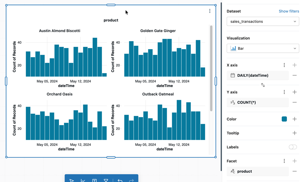
Configuration values: For this example, the following values were set:
- Dataset:
samples.bakehouse.sales_transactions - X axis:
- Field:
dateTime - Transform:
Daily
- Field:
- Y axis:
- Field:
COUNT(*)
- Field:
- Facet:
- Field:
product
- Field:
Other visualization types
To learn more about working with table visualizations, see Table and pivot table visualizations.
To learn more about working with map visualizations, see Map visualizations.