Create a canvas app from an image
The app making journey typically involve a design phase to plan out what the app should look like. Whether the design is based on an existing paper form, a whiteboard drawing, or even an image of a legacy app, it can take a considerable amount of time to build the app from scratch.
With the Image to app feature, you can now create an app from a visual design and connect it to data through a few simple steps in the guided interface. This feature makes it easy for makers of all skill levels to jumpstart the app development process.
Note
- The styling of the components in the app, such as fonts and colors, will be based on the Office Blue theme in Power Apps.
- If you want the exact design styles to be preserved when you create your app, consider creating a canvas app from Figma.
- Power Apps doesn't persist the image that you upload. The uploaded image is only processed in-memory to generate the app.
Prerequisites
- A Power Apps license. If you don't have a license for Power Apps, you can sign-up for free.
- If you're using your own image, the image file extension must be .jpg or .png, file size no more than 4MB. Also, the image must contain a clearly legible one-page form with a light background color. For the best results, edit your image so that it has a white background and high contrast.
Create an app
Sign in to Power Apps.
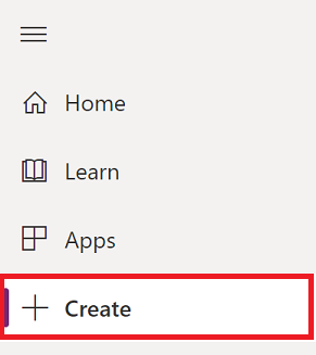
Select + Create from the left-pane.
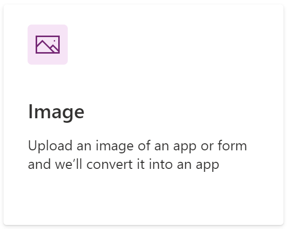
Select Image.
Review the examples of recommended images and tips. For the best experience, make sure your image adheres to these recommendations. Once you’re done, select the Next button.
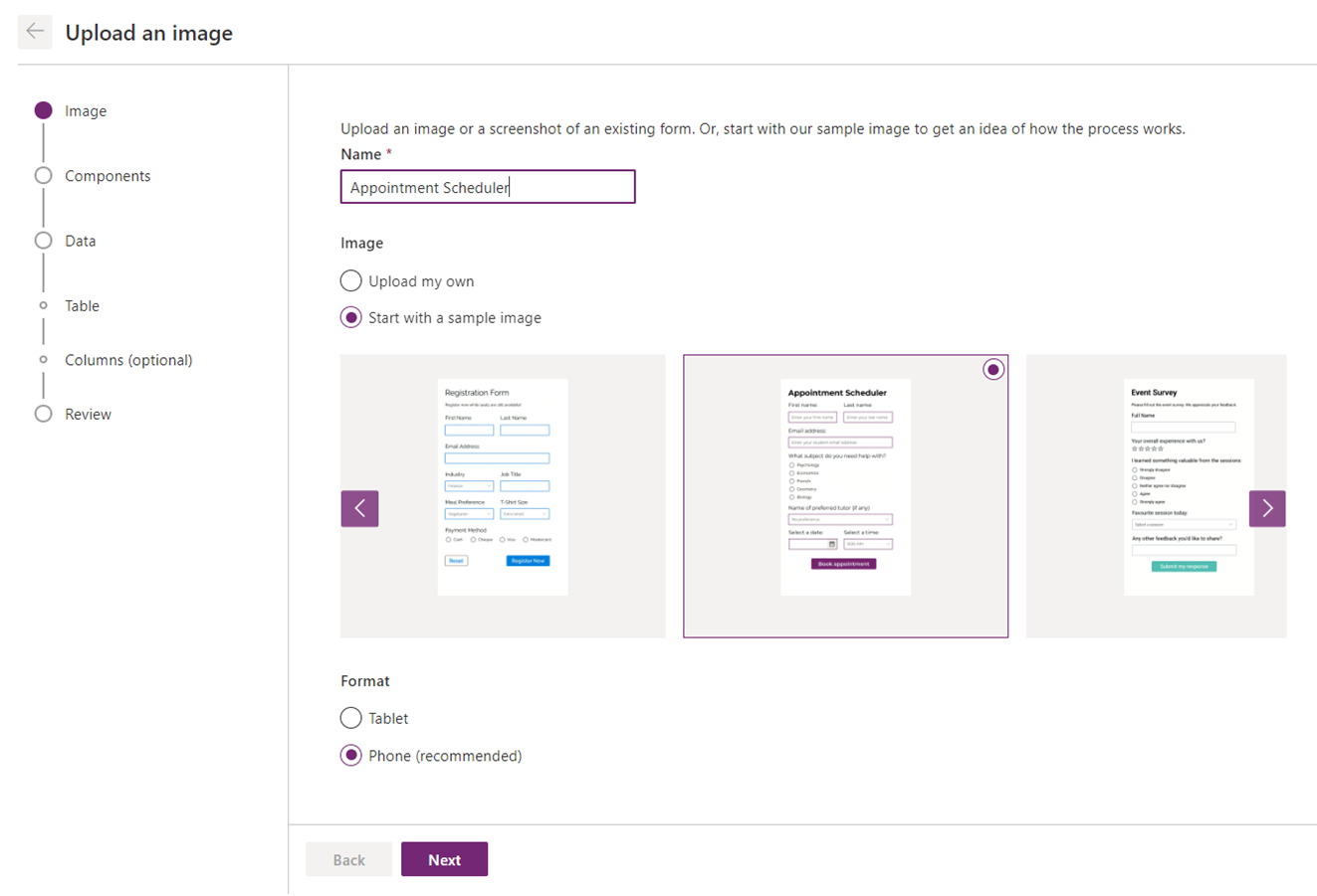
Enter a name for the app.
Upload your own image. If you don't have an image ready, you can also use one of the available sample images.
Note
When using your own image, ensure the image meets the image requirements mentioned in Image requirements.
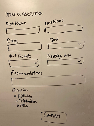
For example, here are two sample images with acceptable and unacceptable qualities:
Acceptable quality Unacceptable quality 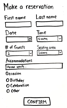
Based on the dimensions of your image, the format (Tablet or Phone) will be automatically selected for you. For the best results, we recommend that you keep the suggested format. Using the suggested format will ensure the closest match between your input image and the final app. Select Next.
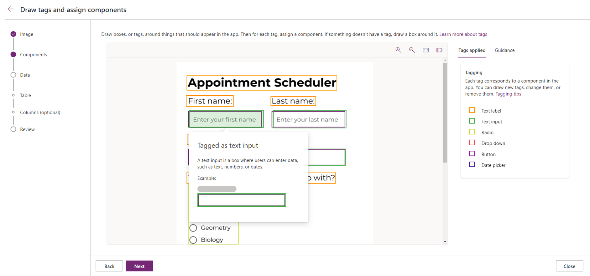
Your image will be automatically tagged based on the components that were identified. For example, in the following sample image, the box that says “Enter your first name” was identified as a Text input control.
You can draw a new tag by selecting and dragging to select the region that encompasses the component. Then, choose the type of component that you want to associate the new tag with.
To make edits to an existing tag or to delete it, select the tag. You can then assign a different component for that tag, or adjust the dimensions of the tag by dragging the corners to change the size. If you'd like to remove the tag, select Delete tag.
Tip
Select the Guidance tab on the right-side of the screen to learn more about the different types of components and how to accurately tag each one.
After you've reviewed the tags and ensured that each component is correctly tagged, select Next.
The next step is to set up data. For the best experience, we recommended that you connect your app to a data source by selecting Connect to a Dataverse table*. If you choose this option and select Next, you'll be guided in the next stage to either select an existing Dataverse table you have and map the fields in the image to the columns in that table or create a new table in Dataverse and add columns based on the form fields in your image, and your app will contain a form component that is connected to your Dataverse table.
If you don't want to connect to Dataverse, select Skip this for now. If you choose this option and select Create, your app will be created as-is, which means that the components you tagged in the previous step will be generated directly. They won't be placed into a form component, and your app won't be connected to data.
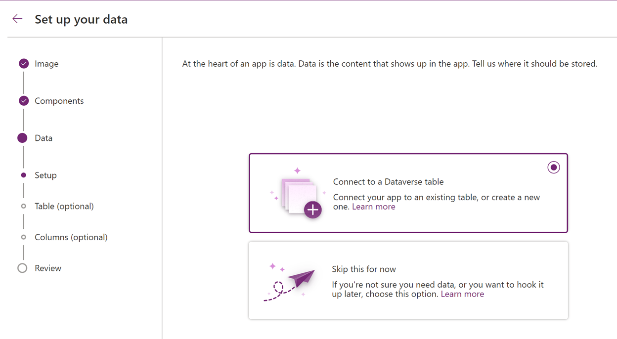
If you choose to skip connecting to Dataverse, select Create and the app will be created for you. Later, you can add data connections to your app to connect the app with your data.
Note
The option to Connect to a Dataverse table will be disabled if you don't have Dataverse in your environment.
If you chose to connect to a Dataverse table, and selected either Create new table or an existing table, you can now edit the table and column details. Each tag corresponds to a data column based on the form fields that were identified in your image.
Select a tag to modify the column properties, such as Display Name, Name, and Data type. To remove an existing column, select the tag and then select Delete column.
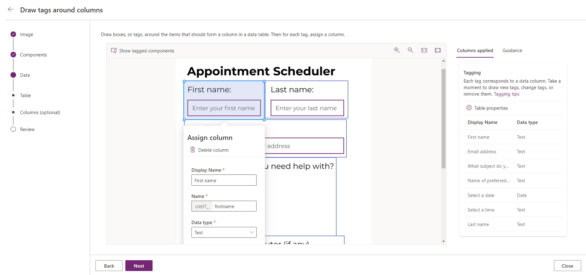
You can add a data column by drawing a new tag and setting the properties. When tagging columns, most of the time you'll draw a tag around two things: a label, and something the user will enter data into, like a text input.
Tip
Select Table properties on the right-side of the screen to view and edit the properties for your new table.
Upon selecting Next, you'll be able to review the table and column structure.
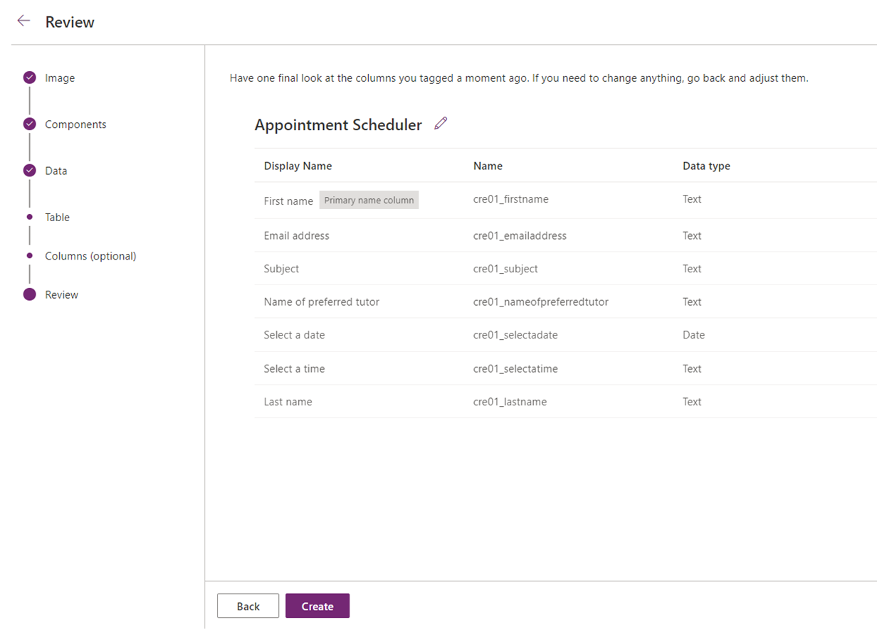
Once you've completed the review, select Create to create the app. The app creation might take a minute or two.
Once the app is created, your new app will open up in Power Apps Studio so you can continue building and customizing your app.
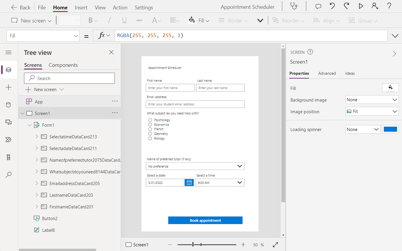
If you chose to create a new table in Dataverse, your form will be automatically connected to your new table.
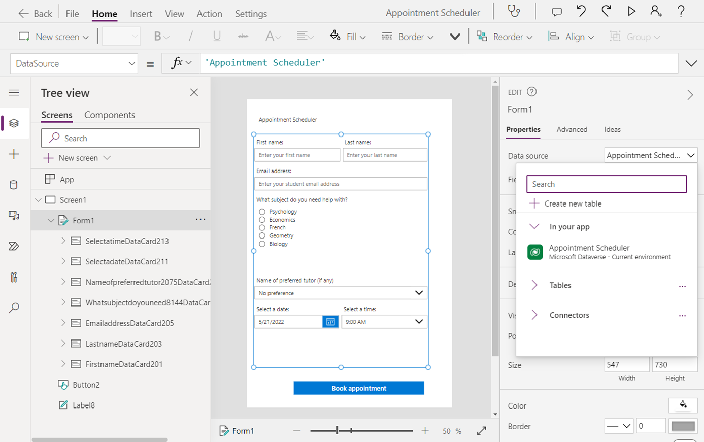
You can continue to build and customize your app by adding more components or modifying the style properties.
Here are some common next steps to take your app to the next level:
- Add a new screen named Screen2 to your app and a gallery to display the records. Set the data source of the gallery to your new Dataverse table.
- On the screen that contains your form, add a button (if you don't have one already) to submit the form data. Set the formula for the OnSelect property to
SubmitForm(Form1). - Select the form, then select the Advanced tab on the right-side of the screen and set the property OnSuccess to
Navigate(Screen2). This way, after the form data is successfully submitted, the app will navigate to the screen that contains the gallery to display the records. - Select Play on top-right side of the screen to preview your app. Fill in the form, and select Submit to submit the form. Your new record will appear in the gallery screen.
Save and publish the app.
Image requirements
- The image you want to upload must have the file extension of .jpg or .png. If you have a design image with another file extension, save the image file with .jpg or .png file extension in order to use it with this feature.
- Image size must be less than 4 MB.
- If you're using screenshots or digital sketches, alter the background to light, pure-color if white is not available.
- If you're taking a picture, use higher contrast or make it brighter. Make sure the part you want to tag is clear and bright.
- If you're taking a picture using a camera or phone, use higher contrast to favor light backgrounds. You can use any available photo editing apps to edit the picture contrast.
- If you're using hand-drawn images, try to use white sketch pad without any lines on it.
Limitations
- Supported components: Button, Check box, Data cards, Date picker, Drop down, Edit form, Label, Radio, Rating, Slider, Text input, Toggle
- Only canvas apps are supported.
- You can upload only one image at a time to create an app.
- Complex forms, forms with colored backgrounds, multi-page forms, and forms with underlined input boxes aren't supported.
- Support for styles is limited. The styling of the components in the app, such as fonts and colors will be based on the Office Blue theme in Power Apps.
- Support for responsiveness is limited. More information: Building responsive canvas apps