Note
Access to this page requires authorization. You can try signing in or changing directories.
Access to this page requires authorization. You can try changing directories.
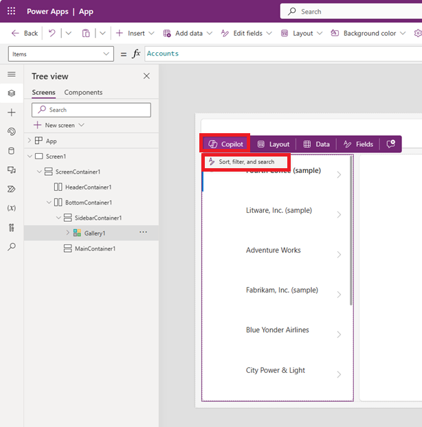
Inline actions are hidden menus that appear when you hover over screen layouts such as a blank screen and gallery or form controls. For example, if you hover over the canvas of a blank screen of your app, you see the Copilot and Templates inline actions appear.

Use inline actions to update layouts, work with data, collaborate with your colleagues, and use Copilot directly on the canvas for specific controls. This means you can build and modify your app without navigating away from your current view in Power Apps Studio. Inline actions provide a more streamlined and efficient way to work.
Use Copilot inline
Use Copilot inline to help you write Power Fx formulas. Use Copilot to apply conditional formatting, sort and filter your data, and more with the help of Power Apps Ideas. The Copilot button appears where applicable, offering suggestions for supported controls such as Gallery, Data table, Text input, Drop down, Combo box, and Text label. For more information, see Power Apps Ideas.
Choose a layout
Inline actions can help you with layout options to create the look you want.
Blank screens
You can use inline actions to apply a layout to blank screens. For example, if you add a new blank screen to your app and hover over the canvas, you can select the inline action Templates and then select one of more than one dozen layouts.
Note
Once you add content to a screen, the Templates button is no longer available unless you remove the content.

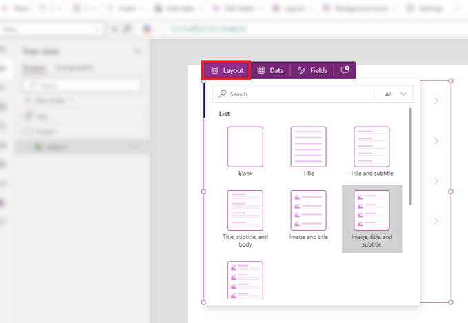
Gallery control (classic) layouts
You can insert a gallery control, hover over the control, and then use the Layout inline action to change the layout for that control. Different layout options appear when you add a Vertical gallery or Horizontal gallery.
Note
When you change or remove controls after applying a layout, your customizations are removed.
Form control (modern or classic) layouts
When you add a modern or classic Form control, you're prompted to add a data source. Once the control is linked to data and added to your screen, you can see the Layout inline action appear when hovering over the control.
You can then use the Layout option to select whether the labels and inputs are arranged vertically or horizontally.

- Select the Vertical layout to place the label above the corresponding input control. For example, you might want a title displayed with a description below the title.
- Select the Horizontal layout to place the label to the left of the input control. For example, you might want an image on the left side of your list item and a name on the right side of your list item.
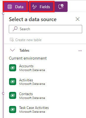
Add Data and Fields
When you link any control with data, you see the Fields inline action fill with fields from the data. For example, linking a Table control with data populates the Fields inline action with fields directly from the data such as Account Number, Address 1, and Account Name. You can choose which fields you want to display or add a new field.
Gallery, Table, and Form
When you add a Gallery, Table, or Form control, you're prompted to add a data source through the Select a data source popup. Once you add a data source, the control displays the data. Use the Fields inline action to select which fields are shown on the control from the selected data source.
In a Table control, you can drag and drop the fields to change the order that they appear in the table.
In a Form control, if you choose a new data source, you're prompted to replace the data card. When you confirm your selection, it removes any customizations and generates a new form with fields corresponding to the new data source.
This form control has the Accounts data set as a data source. If you change that source by selecting the Data inline action, all customized fields are removed or replaced with fields from the new data.

Tip
You can always access the Data and Fields inline actions to modify data used in the Form, Gallery, or Table control. These inline actions are available when hovering, whether or not you've selected a data source already.
Add comments
Comments allow you to tag peers in your app to ask questions, leave instructions, and propose next steps. You can add and read comments on a screen and any control from inline actions.
To add a comment, select the Comments icon in the command bar to show the Comments pane. Select the New button to start writing a comment.

Once the comment is posted, you see a comment icon in the inline action menu, when you hover over a control.
If you remove all comments from a control, the comment icon in the inline action menu is removed too.