Note
Access to this page requires authorization. You can try signing in or changing directories.
Access to this page requires authorization. You can try changing directories.
[This article is pre-release documentation and is subject to change.]
A control used to create a search experience.
Description
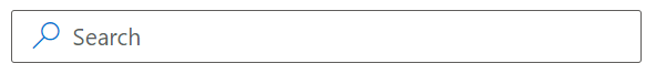
A search box (SearchBox) provides an input field for searching within a site or app to find specific items.
This code component provides a wrapper around the Fluent UI SearchBox control for use in canvas & custom pages.
Important
- This is a preview feature.
- Preview features aren't meant for production use and may have restricted functionality. These features are available before an official release so that customers can get early access and provide feedback.
Key properties
| Property | Description |
|---|---|
SearchText |
Text that is input by the user. Refer to this as the input for search functions. |
IconName |
Name of the Fluent UI icon (see Fluent UI Icons). |
Underlined |
Whether or not the SearchBox is underlined. |
DisableAnimation |
Whether or not to animate the SearchBox icon on focus. |
PlaceholderText |
Placeholder for the search box. |
Additional properties
| Property | Description |
|---|---|
Theme |
The Theme object (not Json formatted). See theming for guidance on how to configure. |
AccessibilityLabel |
Screen reader aria-label. |
InputEvent |
An event to send to the control. E.g. SetFocus. |
Example
Configure search behavior
Add this control to your app where a search interface is needed, usually coupled with a gallery, DetailsList, or any control that can display a dataset.
Create a search experience by using the Search() or Filter() expressions that use the value of the SearchText property in the SearchBox.
Search( Accounts, SearchBox.SearchText, "name" )
Limitations
This code component can only be used in canvas apps and custom pages.