Xamarin.Forms TableView
TableView is a view for displaying scrollable lists of data or choices where there are rows that don't share the same template. Unlike ListView, TableView does not have the concept of an ItemsSource, so items must be manually added as children.

Use cases
TableView is useful when:
- presenting a list of settings,
- collecting data in a form, or
- showing data that is presented differently from row to row (e.g. numbers, percentages and images).
TableView handles scrolling and laying out rows in attractive sections, a common need for the above scenarios. The TableView control uses each platform's underlying equivalent view when available, creating a native look for each platform.
Structure
Elements in a TableView are organized into sections. At the root of the TableView is the TableRoot, which is parent to one or more TableSection instances. Each TableSection consists of a heading and one or more ViewCell instances:
<TableView Intent="Settings">
    <TableRoot>
        <TableSection Title="Ring">
            <SwitchCell Text="New Voice Mail" />
            <SwitchCell Text="New Mail" On="true" />
        </TableSection>
    </TableRoot>
</TableView>
The equivalent C# code is:
Content = new TableView
{
    Root = new TableRoot
    {
        new TableSection("Ring")
        {
          // TableSection constructor takes title as an optional parameter
          new SwitchCell { Text = "New Voice Mail" },
          new SwitchCell { Text = "New Mail", On = true }
        }
    },
    Intent = TableIntent.Settings
};
Appearance
TableView exposes the Intent property, which can be set to any of the TableIntent enumeration members:
Data– for use when displaying data entries. Note that ListView may be a better option for scrolling lists of data.Form– for use when the TableView is acting as a Form.Menu– for use when presenting a menu of selections.Settings– for use when displaying a list of configuration settings.
The TableIntent value you choose may impact how the TableView appears on each platform. Even if there are not clear differences, it is a best practice to select the TableIntent that most closely matches how you intend to use the table.
In addition, the color of the text displayed for each TableSection can be changed by setting the TextColor property to a Color.
Built-in cells
Xamarin.Forms comes with built-in cells for collecting and displaying information. Although ListView and TableView can use all of the same cells, SwitchCell and EntryCell are the most relevant for a TableView scenario.
See ListView Cell Appearance for a detailed description of TextCell and ImageCell.
SwitchCell
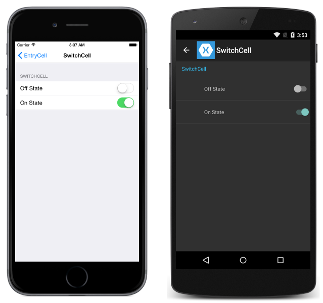
SwitchCell is the control to use for presenting and capturing an on/off or true/false state. It defines the following properties:
Text– text to display beside the switch.On– whether the switch is displayed as on or off.OnColor– theColorof the switch when it's in the on position.
All of these properties are bindable.
SwitchCell also exposes the OnChanged event, allowing you to respond to changes in the cell's state.

EntryCell
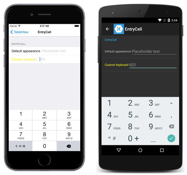
EntryCell is useful when you need to display text data that the user can edit. It defines the following properties:
Keyboard– The keyboard to display while editing. There are options for things like numeric values, email, phone numbers, etc. See the API docs.Label– The label text to display to the left of the text entry field.LabelColor– The color of the label text.Placeholder– Text to display in the entry field when it is null or empty. This text disappears when text entry begins.Text– The text in the entry field.HorizontalTextAlignment– The horizontal alignment of the text. Values are center, left, or right aligned. See the API docs.VerticalTextAlignment– The vertical alignment of the text. Values areStart,Center, orEnd.
EntryCell also exposes the Completed event, which is fired when the user hits the 'done' button on the keyboard while editing text.

Custom cells
When the built-in cells aren't enough, custom cells can be used to present and capture data in the way that makes sense for your app. For example, you may want to present a slider to allow a user to choose the opacity of an image.
All custom cells must derive from ViewCell, the same base class that all of the built-in cell types use.
This is an example of a custom cell:

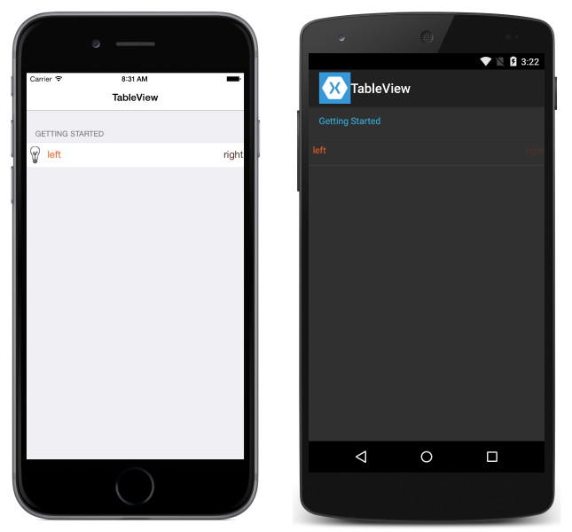
The following example shows the XAML used to create the TableView in the screenshots above:
<?xml version="1.0" encoding="UTF-8"?>
<ContentPage xmlns="http://xamarin.com/schemas/2014/forms"
             xmlns:x="http://schemas.microsoft.com/winfx/2009/xaml"
             x:Class="DemoTableView.TablePage"
             Title="TableView">
      <TableView Intent="Settings">
          <TableRoot>
              <TableSection Title="Getting Started">
                  <ViewCell>
                      <StackLayout Orientation="Horizontal">
                          <Image Source="bulb.png" />
                          <Label Text="left"
                                 TextColor="#f35e20" />
                          <Label Text="right"
                                 HorizontalOptions="EndAndExpand"
                                 TextColor="#503026" />
                      </StackLayout>
                  </ViewCell>
              </TableSection>
          </TableRoot>
      </TableView>
</ContentPage>
The equivalent C# code is:
var table = new TableView();
table.Intent = TableIntent.Settings;
var layout = new StackLayout() { Orientation = StackOrientation.Horizontal };
layout.Children.Add (new Image() { Source = "bulb.png"});
layout.Children.Add (new Label()
{
    Text = "left",
    TextColor = Color.FromHex("#f35e20"),
    VerticalOptions = LayoutOptions.Center
});
layout.Children.Add (new Label ()
{
    Text = "right",
    TextColor = Color.FromHex ("#503026"),
    VerticalOptions = LayoutOptions.Center,
    HorizontalOptions = LayoutOptions.EndAndExpand
});
table.Root = new TableRoot ()
{
    new TableSection("Getting Started")
    {
        new ViewCell() {View = layout}
    }
};
Content = table;
The root element under the TableView is the TableRoot, and there is a TableSection immediately underneath the TableRoot. The ViewCell is defined directly under the TableSection, and a StackLayout is used to manage the layout of the custom cell, although any layout could be used here.
Note
Unlike ListView, TableView does not require that custom (or any) cells are defined in an ItemTemplate.
Row height
The TableView class has two properties that can be used to change the row height of cells:
RowHeight– sets the height of each row to anint.HasUnevenRows– rows have varying heights if set totrue. Note that when setting this property totrue, row heights will automatically be calculated and applied by Xamarin.Forms.
When the height of content in a cell in a TableView is changed, the row height is implicitly updated on Android and the Universal Windows Platform (UWP). However, on iOS it must be forced to update by setting the HasUnevenRows property to true and by calling the Cell.ForceUpdateSize method.
The following XAML example shows a TableView that contains a ViewCell:
<ContentPage ...>
    <TableView ...
               HasUnevenRows="true">
        <TableRoot>
            ...
            <TableSection ...>
                ...
                <ViewCell x:Name="_viewCell"
                          Tapped="OnViewCellTapped">
                    <Grid Margin="15,0">
                        <Grid.RowDefinitions>
                            <RowDefinition Height="Auto" />
                            <RowDefinition Height="Auto" />
                        </Grid.RowDefinitions>
                        <Label Text="Tap this cell." />
                        <Label x:Name="_target"
                               Grid.Row="1"
                               Text="The cell has changed size."
                               IsVisible="false" />
                    </Grid>
                </ViewCell>
            </TableSection>
        </TableRoot>
    </TableView>
</ContentPage>
When the ViewCell is tapped, the OnViewCellTapped event handler is executed:
void OnViewCellTapped(object sender, EventArgs e)
{
    _target.IsVisible = !_target.IsVisible;
    _viewCell.ForceUpdateSize();
}
The OnViewCellTapped event handler shows or hides the second Label in the ViewCell, and explicitly updates the cell's size by calling the Cell.ForceUpdateSize method.
The following screenshots show the cell prior to being tapped upon:

The following screenshots show the cell after being tapped upon:

Important
There is a strong possibility of performance degradation if this feature is overused.