Performance Analysis–Excel (2010) automation : how to create graphs from a Perfmon-generated CSV file–Essay#1
Hi all,
Today I’m concentrating my efforts into generating graphs as painless as possible for many data collected on Exchange servers. I’ll start by generating graphs from the two following counters which give an idea of the load of the servers:
- Active User Count
- RPC Operations/sec
The first step (Essay#1) is to generate as quickly as possible a nice graph to display the trend for these counters.
The second step (Essay#2) will be to generate quickly also graphs from a bunch of files located on a folder.
The third step (Essay#3) will be to quickly generate these graphs on a separate Excel spreadsheet, or even better on a Word document to start a report
the fourth step (Essay #4) will then be to generate the most significant graphs to generate a report that will enable a good graphical performance analysis of many servers at a time, simply using Excel and Word.
First you need to collect Perfmon data and configure the Perfmon data collector to dump statistics on .CSV files. You can also chose to convert existing BLG files to .CSV files using RELOG for example … or loading .BLG files onto a Perfmon console, and export the data on .CSV files … many ways to do this, but it’s not the purpose of this post.
Second, we will then generate our graph with the above mentioned two counters (as a start of my live project).
You have to open Excel 2010, show the “Developer” tab, and copy the following code :
Sub Macro_Search_Active_User()
'NAME the first column which is the timeline column
Range("A:A").Name = "Time_Line"
'FIND the column showing the number of active user count
Cells.Find(What:="Active User Count", After:=ActiveCell, LookIn:=xlFormulas, _
LookAt:=xlPart, SearchOrder:=xlByRows, SearchDirection:=xlNext, _
MatchCase:=False, SearchFormat:=False).Select
'NAME the column just found
Range(Selection, Selection.End(xlDown)).Name = "Active_User_Count"
'FIND the column showing the RPC activity
Cells.Find(What:="RPC Operations/sec", After:=ActiveCell, LookIn:=xlFormulas, _
LookAt:=xlPart, SearchOrder:=xlByRows, SearchDirection:=xlNext, _
MatchCase:=False, SearchFormat:=False).Select
'NAME the column just found
Range(Selection, Selection.End(xlDown)).Name = "RPC_Ops_Per_Sec"
'SELECT then all these 3 colums
Range("Time_Line, Active_User_Count, RPC_Ops_Per_Sec").Select
Range("A1").Activate
'GENERATE the Excel graph
ActiveSheet.Shapes.AddChart2(227, xlLine).Select
ActiveChart.SetSourceData Source:=Range("Time_Line, Active_User_Count, RPC_Ops_Per_Sec")
'NAME the graph to easily retrieve it on other code lines
ActiveChart.Parent.Name = "ActiveUsersAndRPCOps"
'This step is optional : DELETE the X axe label - "xlCategory" (or find an equivalent function to deactivate it) – because you may want to keep the X-axe time data
ActiveChart.Axes(xlCategory).Select
Selection.Delete
' Add a secondary Axe for one of the data series(no matter which one)
' .. Select series nb 1
ActiveChart.FullSeriesCollection(1).Select
' .. add data as a secondart axe
ActiveChart.FullSeriesCollection(1).AxisGroup = 2
' .. Color selected collection to in RGB(xxx,xxx,xxx) with xxx btw 0 and 255
With Selection.Format.Line
.Visible = msoTrue
.ForeColor.RGB = RGB(255, 0, 0)
.Transparency = 0
End With
' .. Color the axis linked to the secondary collection into the same color
' ... Select the secondary axe first
ActiveChart.Axes(xlValue, xlSecondary).Select
' ... then set the selection properties : line visible, color and not transparent ...
With Selection.Format.Line
.Visible = msoTrue
.ForeColor.RGB = RGB(255, 0, 0)
.Transparency = 0
End With
ActiveChart.Axes(xlValue, xlSecondary).Select
With Selection.TickLabels.Font
.Color = RGB(255, 0, 0)
End With
'. Same SELECTing and FORMATting the second data collection and axe
ActiveChart.FullSeriesCollection(2).Select
With Selection.Format.Line
.Visible = msoTrue
.ForeColor.RGB = RGB(0, 130, 0)
.Transparency = 0
End With
ActiveChart.Axes(xlValue).Select
With Selection.Format.Line
.Visible = msoTrue
.ForeColor.RGB = RGB(0, 130, 0)
.Transparency = 0
End With
'Finally, delete the title
ActiveChart.ChartTitle.Select
Selection.Delete
End Sub
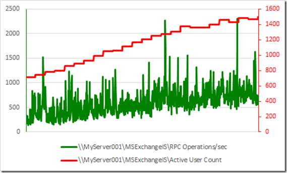
Execute the macro and you’ll instantly have the following type of graph:
Next I’ll try (and succeed hopefully) to generate the above graph type for many CSV Perfmon files stored in a directory.
Comments
Anonymous
January 01, 2003
Thanks for sharingAnonymous
February 23, 2013
A colleague of mine did this and it really helped speed up generating graphs for the analysis of performance testing. - Thanks for sharingAnonymous
July 03, 2013
Couple methods, FullSeriesCollection and AddChart2 gives me compile error in Excel 2010Anonymous
January 30, 2014
Great work and thanks for sharing I had to edit several lines though for compatibility with Excel 2010. Apparently 'FullSeriesCollection' and 'AddChart2' are new in 2013 (Open to correction on this though as this will be a first macro for me and some web searches on the errors pointed to the above being new). I have gotten the code to work by simply editing 'FullSeriesCollection' to 'SeriesCollection' and 'AddChart2' to 'AddChart' for all occurrences of each respectively. Additionally the final section to delete the title fails as in Excel 2010 no title is generated so I simply commented this section out. I love this macro for quick visual performance representation of some log files and the easy column matching (exact column title is not required) a great extension challenge for those more familiar with Excel and Macros would be the parameterization of the columns to be found such that when run the macro pops a GUI requesting columns to be graphed (could be a drop down from available column headings like a custom filter).
