Примечание.
Для доступа к этой странице требуется авторизация. Вы можете попробовать войти или изменить каталоги.
Для доступа к этой странице требуется авторизация. Вы можете попробовать изменить каталоги.
TFS 2017
You use the WebLayout element to define the layout and controls that appear on work item forms displayed through the web portal. It supports the new work item experience. It is in addition to the Layout element which defines the form elements that appear when viewed through Visual Studio and other non-web clients.
Important
This article applies to project customization for Hosted XML and On-premises XML (TFS 2017 and later versions) process models. For TFS 2015 and earlier versions, see Layout XML element reference.
For the Inheritance process model, see Customize a process. For an overview of process models, see Customize your work tracking experience.
The WebLayout element is a required child element of the FORM element. This topic documents the WebLayout element and its child elements. Use this as a guide to further customize a WIT definition that contains the new WebLayout section. To learn more about these changes, see the blog post, Announcing the deprecation of the old Work Item Form in TFS.
To modify the web layout, use the information provided in this topic to modify the XML definition file for a specific work item type. To import and export your changes, see Customize the work tracking web form.
To customize the windows client layout, see Layout XML element.
Enablement of the new form and WebLayout section
When the new form roll out is enabled, the XML definitions for all work item types (WITs) in the collection are updated to include a WebLayout section within the FORM section.
The new form makes available several new features as described in New work item experience. Your account or project collection administrator manages the switch to the new form.
- For the Inheritance process model, the switch to the new form is automatic for all user accounts.
- For the Hosted XML process model, an admin must enable the new form.
- For TFS 2017, the new form is automatically available when you add projects to a new collection. For existing projects, an admin must enable the new form.
- For TFS 2015 the new form isn't available. You must upgrade to TFS 2017 or a later version to access the new form.
Element and attribute summary
The WebLayout and updated Control elements introduce several new elements and deprecate several elements and attributes. Overall, it's a much simpler syntax structure than its predecessor.
| New elements | Maintained elements | Deprecated elements | Deprecated attributes |
|---|---|---|---|
| - ControlContribution - GroupContribution - Input - Inputs - Page - PageContribution - Section - SystemControls - WebLayout |
- FORM - Layout - Group - Control |
- Column - Splitter - Tab - TabGroup |
- ControlSpacing - FixedWidth - LabelPosition - LabelSpacing - Margin - MinimumSize - Padding - PercentWidth |
Tip
The Page element is similar to the deprecated Tab element. However, a Page element can't be grouped or nested. One page defines one tab within the web form.
Header customization
In the new web form layout, the system manages several header elements within the SystemControls element. These include:
- Fields: Work item ID, Title, Assigned To, State, Reason, Area Path, Iteration Path, and tags
- Pages:
 History,
  Links, and
  Attachments.
When you export a WIT definition, you'll see a SystemControls section at the beginning of the WebLayout section, similar to the following:
<WebLayout ShowEmptyReadOnlyFields="true">
<SystemControls>
<Control Type="FieldControl" FieldName="System.Title" EmptyText="Enter title" />
<Control Label="Assi&gned To" Type="FieldControl" FieldName="System.AssignedTo" />
<Control Label="Stat&e" Type="FieldControl" FieldName="System.State" />
<Control Label="Reason" Type="FieldControl" FieldName="System.Reason" />
<Control Label="&Area" Type="WorkItemClassificationControl" FieldName="System.AreaPath" />
<Control Label="Ite&ration" Type="WorkItemClassificationControl" FieldName="System.IterationPath" />
<Control Label="History" Type="WorkItemLogControl" FieldName="System.History" />
<Control Label="Links" Type="LinksControl" Name="Links" />
<Control Label="Attachments" Type="AttachmentsControl" Name="Attachments" />
</SystemControls>
...
Note
The Link element is not an allowed element within the SystemControls section.
For TFS 2017, On-premises XML process model: You can modify select elements within the SystemControls section, such as changing the EmptyText attribute value for the System.Title field. In general, we recommend you don't customize this section much more than that. For example, you can't remove fields from or add other fields within this section.
For TFS 2018, On-premises XML and Azure DevOps Services, Hosted XML process models: You can specify the ShowEmptyReadOnlyFields attribute, or select to hide or replace select fields defined within the SystemControls section.
For example, to hide the Reason field, you modify the Control element with the Visible attribute.
<Control Label="Reason" Type="FieldControl" FieldName="System.Reason" Visible="false" />
To replace the Reason field with another field, use the Replaces attribute. Also, remove the entry for the Reason field from within the section.
<Control Label="Milestone" Type="FieldControl" FieldName="Fabrikam.Milestone" Replaces="System.Reason" />
You can hide or replace the Reason, Area Path, and Iteration Path fields. You can add these fields, if you want, to the Details page, or other custom page. You can't hide or replace the Title, Assigned To, or State fields.
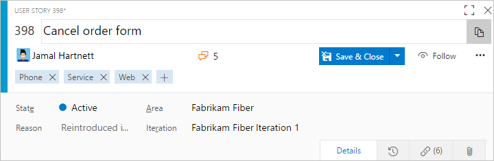
WebLayout example
The following example shows the overall structure of the WebLayout section within the FORM section. The WebLayout specifies a Control element for each field you want to have appear on the form.
You group elements to appear within a Page by using the Section and Group elements. You use a Control element to define each field or control that you want to appear on the form.
The following example specifies the syntax for the Details page shown previously in this topic.
<FORM>
. . .
<WebLayout>
<SystemControls>
<Control Type="FieldControl" FieldName="System.Title" EmptyText="Enter title" />
<Control Label="Assi&gned To" Type="FieldControl" FieldName="System.AssignedTo" />
<Control Label="Stat&e" Type="FieldControl" FieldName="System.State" />
<Control Label="Reason" Type="FieldControl" FieldName="System.Reason" />
<Control Label="&Area" Type="WorkItemClassificationControl" FieldName="System.AreaPath" />
<Control Label="Ite&ration" Type="WorkItemClassificationControl" FieldName="System.IterationPath" />
<Control Label="History" Type="WorkItemLogControl" FieldName="System.History" />
<Control Label="Links" Type="LinksControl" Name="Links" />
<Control Label="Attachments" Type="AttachmentsControl" Name="Attachments" />
</SystemControls>
<Page Label="Details" LayoutMode="FirstColumnWide">
<Section>
<Group Label="Description">
<Control Label="Description" Type="HtmlFieldControl" FieldName="System.Description" />
</Group>
</Section>
<Section>
<Group Label="Planning">
<Control Label="Story Points" Type="FieldControl" FieldName="Microsoft.VSTS.Scheduling.StoryPoints" />
<Control Label="Priority" Type="FieldControl" FieldName="Microsoft.VSTS.Common.Priority" />
</Group>
<Group Label="Classification">
<Control Label="Value area" Type="FieldControl" FieldName="Microsoft.VSTS.Common.ValueArea" />
</Group>
</Section>
<Section>
<Group Label="Development">
<Control Type="LinksControl" Name="Development">
<LinksControlOptions ViewMode="Dynamic" ZeroDataExperience="Development" ShowCallToAction="true">
<ListViewOptions GroupLinks="false">
</ListViewOptions>
<LinkFilters>
<ExternalLinkFilter Type="Build" />
<ExternalLinkFilter Type="Pull Request" />
<ExternalLinkFilter Type="Branch" />
<ExternalLinkFilter Type="Fixed in Commit" />
<ExternalLinkFilter Type="Fixed in Changeset" />
<ExternalLinkFilter Type="Source Code File" />
</LinkFilters>
</LinksControlOptions>
</Control>
</Group>
<Group Label="Related Work">
<Control Type="LinksControl" Name="Related Work">
<LinksControlOptions>
<LinkFilters>
<WorkItemLinkFilter Type="System.LinkTypes.Hierarchy-Reverse" />
<WorkItemLinkFilter Type="System.LinkTypes.Hierarchy-Forward" />
<WorkItemLinkFilter Type="System.LinkTypes.Related" />
</LinkFilters>
<Columns>
<Column Name="System.State" />
<Column Name="System.ChangedDate" />
<Column Name="System.Links.Comment" />
</Columns>
</LinksControlOptions>
</Control>
</Group>
</Section>
</Page>
</WebLayout>
</FORM>
WebLayout element syntax
You can specify how information and work item fields are grouped and appear in a work item form using the elements that are described in the following table.
<WebLayout ShowEmptyReadOnlyFields="true | false">
   ...
</WebLayout>
Attributes
| Attribute | Description |
|---|---|
ShowEmptyReadOnlyFields |
Optional WebLayout attribute. Specify a value of true to display read-only and empty fields (default), and false to hide these fields. |
Tip
The schema definition for work item tracking defines all FORM child elements as camel case and all other elements as all capitalized. If you encounter errors when validating your type definition files, check the case structure of your elements. Also, the case structure of opening and closing tags must match according to the rules for XML syntax. For more information, see Control XML element reference.
Element
Description
Control
Optional child element for a Group within WebLayout. Defines a field, text, hyperlink, or other control element to appear on the work item form.
<Control FieldName="FieldName" Type="DateTimeControl | ExtensionsControl |
FieldControl | HtmlFieldControl | LabelControl | WebpageControl"
Label="LabelText" EmptyText="TextString"
ReadOnly="True | False" Name="InstanceName" />
See Control element attributes and control typefor information about each attribute.
ControlContribution
Optional child element of Group within WebLayout used to specify a field-level work item extension to appear on the form.
<ControlContribution Id="ContributionId" Label="Name">
<Inputs>
<Input Id="FieldName" Value="Value" />
</Inputs>
</ControlContribution>
The ContributionId you specify must be installed on the account or project collection. The WIT definition files that you export contain a list of installed contributions.
Extension
Required child element for Extensions. Use to specify an extension ID of a work item control extension to display in the work item form. You must specify each extension that is used in the layout for a ControlContribution, GroupContribution, or PageContribution element.
<Extension Id="ExtensionId" />
The ExtensionId you specify must be installed on the account or project collection. The WIT definition files that you export contain a list of installed extensions.
Extensions
Optional container child element of WebLayout used to support specifying one or more Extension elements. If extensions are used in the form, specify them prior to a Page element.
<WebLayout >
<Extensions >
<Extension Id="ExtensionId" />
. . .
</Extensions>
. . .
</WebLayout>
FORM
Required child element of WITD used to specify the layout and controls to appear on the work item form. Parent element for both the Layout (client form layout) and WebLayout (web form layout) elements.
<FORM>
<Layout> . . . </Layout>
<WebLayout> . . . </WebLayout>
</FORM>
Group
Required child element of Section. Provides a visual grouping of elements within a section which you can label.
<Group Label="LabelText"
<Control> . . . </Control>
</Group>
GroupContribution
Optional child element of Section< within WebLayout used to specify a group-level work item extension to appear on the form. The extension will appear as a group within the form.
<GroupContribution Id="ContributionId" Label="Name" />
The ContributionId you specify must be installed on the account or project collection. The WIT definition files that you export contain a list of installed contributions.
Input
Required child element for Inputs that specifies input data for an extension.
<Input Id="FieldName" Value="Value" />
Inputs
Optional container child element for ControlContribution used to support specification of input data for an extension.
<Inputs>
<Input Id="FieldName" Value="Value" />
</Inputs>
Page
Required child element of WebLayout. Defines the layout of a page within the web form.
Specify the name of the page and the layout to use.
<Page Label="PageName" LayoutMode="FirstColumnWide | EqualColumns ">
<Section>
<Group> . . .
<Control> . . . </Control>
<Control> . . . </Control>
</Group>
</Section>
</Page>
PageContribution
Optional child element of WebLayout used to specify a page-level work item extension to appear on the form. The extension will appear as a page within the form.
<PageContribution Id="ContributionId" Label="Name" />
The ContributionId you specify must be installed on the account or project collection. The WIT definition files that you export contain a list of installed contributions.
Section
Required child element of Page. Defines the layout of a section within a page of the web form. Sections form groups that support variable resizing. A limit of four sections can be defined within a Page.
<Page>
<Section>
<Group> . . .
<Control> . . . </Control>
<Control> . . . </Control>
</Group>
</Section>
</Page>
SystemControls
Required child element for WebLayout. Defines the labels and empty text values for controls present in the header of the web form . This also includes, the labels for the History, Links, and Attachments pages
<SystemControls>
<Control Type="FieldControl" FieldName="System.Title" EmptyText="Enter title" />
<Control Label="Assi&gned To" Type="FieldControl" FieldName="System.AssignedTo" />
<Control Label="Stat&e" Type="FieldControl" FieldName="System.State" />
<Control Label="Reason" Type="FieldControl" FieldName="System.Reason" />
<Control Label="&Area" Type="WorkItemClassificationControl" FieldName="System.AreaPath" />
<Control Label="Ite&ration" Type="WorkItemClassificationControl" FieldName="System.IterationPath" />
<Control Label="History" Type="WorkItemLogControl" FieldName="System.History" />
<Control Label="Links" Type="LinksControl" Name="Links" />
<Control Label="Attachments" Type="AttachmentsControl" Name="Attachments" />
</SystemControls>
WebLayout
Required child element of FORM. Defines the layout of the work item form displayed in the web portal. Includes one or more Page elements.
<WebLayout>
<Page>
<Section>
<Group> . . .
<Control> . . . </Control>
<Control> . . . </Control>
</Group>
</Section>
</Page>
. . .
</WebLayout>
Control element syntax
You use the Control element to define a work item field, text, hyperlink, or other form type to display in a work item form. The Control element you specify within the WebLayout section should conform to the following syntax:
<Control FieldName="FieldRefName" Type="DateTimeControl | FieldControl |
HtmlFieldControl | LabelControl | WebpageControl Label="LabelText"
LabelPosition="Top | Bottom | Left | Right" EmptyText="TextString"
ReadOnly="True | False" Name="InstanceName" [Visible="false" |
FieldName="ReplacementFieldRefName" Replaces="FieldRefName"] />
Control element attribute syntax
Attribute
Description
FieldName
Optional. Specifies the work item field with which the control is associated. Specify the reference name of the field which should be between 1 and 70 characters.
Type
Required. Specifies the data type of the control. Specify a string from one of these built-in types:
- DateTimeControl: Use to display formatted date fields with a field type of DateTime.
- FieldControl: Use to display Boolean, plain text, numeric fields, person-name fields, and pick lists. Supports fields with a data type of Boolean, Double, Identity, Integer,PlainText, and String.
Note
Feature availability: The Boolean data type field is supported for TFS 2017 and later versions.
- HtmlFieldControl: Use to display multi-line, rich-text format of fields with a field type of HTML.
- LabelControl: Use to display text that is not associated with a field. The text can be plain or hyperlinked. You can specify additional controls using the LabelText, Link and Text elements.
- WebpageControl: Use to display HTML-based content defined by a URI or embedded within a CDATA tag. This control does not have an associated field or field type. You specify the content and links to display using the WebpageControlOptions element.
EmptyText
Optional. Specifies a text string between 1 and 255 characters in length that appears when a field is empty.
Label
Optional. Specifies the visible text on the form that identifies the control. Specify a string of no more than 80 characters. If unspecified, the friendly name of the FieldName is used.
ReadOnly
Optional. Specifies that the field is read-only:
- True: Control field is read-only.
- False: Control field isn't read-only.
Name
Optional. Identifies a control uniquely. The Name is important if more than one control on the form is associated with the same work item field.
Note
You use the Name attribute when you want to have the same field displayed on more than one Page on the form. You specify a unique value for the Name attribute for both control entries so that the system identifies each control uniquely.
Visible
Optional. Specify Visible="false" when you want to hide a field normally included within the header area. You can only specify this attribute in conjunction with the System.Reason, System.AreaPath, or System.IterationPath fields. If you specify this attribute, you can't specify the Replaces attribute.
Replaces
Optional. Specify FieldName="ReplacementFieldRefName" Replaces="FieldRefName" when you want to replace a field within the header area with another field. You can only specify this attribute in conjunction with the System.Reason, System.AreaPath, or System.IterationPath fields. If you specify this attribute, you can't specify the Visible attribute. Also, you need to remove the entry for the field you are replacing from within the section.
Control element Type attribute syntax
Type
Description
DateTimeControl
Use to display formatted date fields with a data type of DateTime.
Use FieldControl to provide a text field for the input or display of a DateTime field.
<Control FieldName=" MyCompany.Group1.StartDate " Type="FieldControl"
Label="Start Date" LabelPosition="Left" />
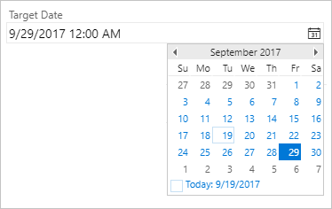
Use DateTimeControl to provide a calendar picker to select a date for a field, as shown in the following illustration.
<Control Type="DateTimeControl" FieldName="FabrikamFiber.Schedule.SubmittedDate"
Label="Submitted Date:" LabelPosition="Left"  Format="Short" />
Note
The date-time format displayed matches the user profile user profile. The WebLayout section doesn't not accept the Layout element CustomFormat property.
FieldControl
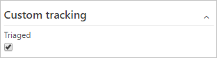
Use to display fields with a data type of Boolean, String, Identity, Integer, Double, and PlainText. For example:
<Control Type="FieldControl" FieldName="FabrikamFiber.Milestone"
Label="Milestone" Name="Milestone" LabelPosition="Left" />
Feature availability: The Boolean data type field is only supported for TFS 2017 and later versions. Within a client work item form, such as Visual Studio or Eclipse, a value of True or False will display.
A Boolean field displays as a checkbox within the web work item form.
HTMLFieldControl
Use to display multi-line, rich-text formatted control. Specify this control type for fields of Type=HTML.
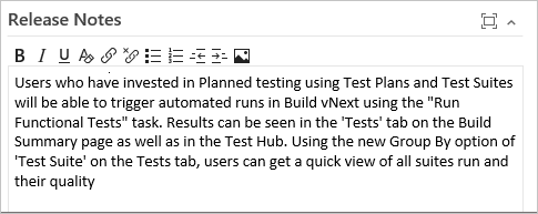
For example:
<Control Type="HtmlFieldControl" FieldName="FabrikamFiber.ReleaseNotes"
Label="Release Notes" Dock="Fill" />
LabelControl
Use to display text that is not associated with a field. The text can be plain or hyperlinked. You can specify additional controls using the LabelText, Link and Text elements. See LabelText and Text XML elements reference and Link and Param XML elements reference.
WebpageControlOptions
Use to display HTML-based content defined by a URI or embedded within a CDATA tag. This control does not have an associated field or field type. You specify the content and links to display using the WebpageControlOptions element.
The WebpageControlOptions element and its child elements have the following syntax structure:
<WebpageControlOptions AllowScript="true | false" ReloadOnParamChange="true | false" >
<Link UrlRoot="UrlRoot" UrlPath ="UrlPathWithParameters" >
<Param index="IndexValue" value="ParamValue" type ="Original | Current">
</Link>
<Content>
<![CDATA[Contents of HTML]]/>
<Content/>
<WebpageControlOptions/>
You use the Content, LabelText, and Link elements to define plain text or hyperlinked labels, add hyperlinks to a field, or display Web page content in a work item form. See Provide help text, hyperlinks, or web content on a work item form for details about the syntax.
Related articles
If you're just getting started with the new form, see these additional topics to manage the roll out or customize it:
- Manage new form rollout
- New work item experience
- Customize the new form (Hosted XML and On-premises XML process models)
- LinksControlOptions elements
To learn more about process models and what's supported with each, see Customize your work tracking experience.
Marketplace extensions
Visit the Azure DevOps Marketplace to find extensions you can start using.
Form extensions
The ControlContribution, GroupContribution, and PageContribution elements reference the Id of contributions from the extensions that have been installed for a project collection or account. You install an extension from Visual Studio Marketplace. To create an extension, see Create your first extension.
Once the extensions have been installed, you add the Contribution element to the XML definition for a work item type. You export these files either by exporting a process or exporting a WIT definition file.
When you export the XML definition, it will contain a comment section that lists the installed extensions, their IDs, and any required inputs. For example:
<!--**********************Work Item Extensions**********************
Extension:
    Name: color-control-dev
    Id: mariamclaughlin.color-control-dev
    Control contribution:
        Id: mariamclaughlin.color-control-dev.color-control-contribution
        Description:
        Inputs:
            Id: FieldName
            Description: The field associated with the control.
            Type: Field
            IsRequired: true
            Id: Labels
            Description: The list of values to select from.
            Type: String
            IsRequired: false
            Id: Colors
            Description: The field associated with the control.
            Type: String
            IsRequired: false
Extension:
    Name: vsts-workitem-recentlyviewed
    Id: mmanela.vsts-workitem-recentlyviewed
    Group contribution:
        Id: mmanela.vsts-workitem-recentlyviewed.recently-viewed-form-group
        Description: Recently viewed work item form group
Extension:
    Name: vsts-extensions-multi-values-control
    Id: ms-devlabs.vsts-extensions-multi-values-control
    Control contribution:
        Id: ms-devlabs.vsts-extensions-multi-values-control.multi-values-form-control
        Description: Multi Values Selection Control.
        Inputs:
            Id: FieldName
            Description: The field associated with the control.
            Type: Field
            IsRequired: true
            Id: Values
            Description: The list of values to select from.
            Type: String
            IsRequired: false
Extension:
    Name: vsts-extension-workitem-activities
    Id: ms-devlabs.vsts-extension-workitem-activities
Extension:
    Name: vsts-uservoice-ui
    Id: ms-devlabs.vsts-uservoice-ui
    Group contribution:
        Id: ms-devlabs.vsts-uservoice-ui.vsts-uservoice-ui-wi-group
        Description: Shows User Voice details on the work item form
-->
Given the above example, you can add the following code snippet to your work item type definition to turn on the user voice group vsts-uservoice-ui extension by specifying the extension Id:
<WebLayout>
...
 <Extensions>
     <Extension Id="ms-devlabs.vsts-uservoice-ui" />
 </Extensions>
...
</WebLayout>
Upon import of the updated WIT definition, the group extension will automatically appear on your work item form.
The next time you export your WIT definition, you'll see that a GroupContribution element has been added. You can move this element within the WebLayout section just as you would any other control.