Note
Access to this page requires authorization. You can try signing in or changing directories.
Access to this page requires authorization. You can try changing directories.
Build custom cards
You can use Gallery formatter to define a totally custom layout of field values inside a card using the same syntax used in Column Formatting.
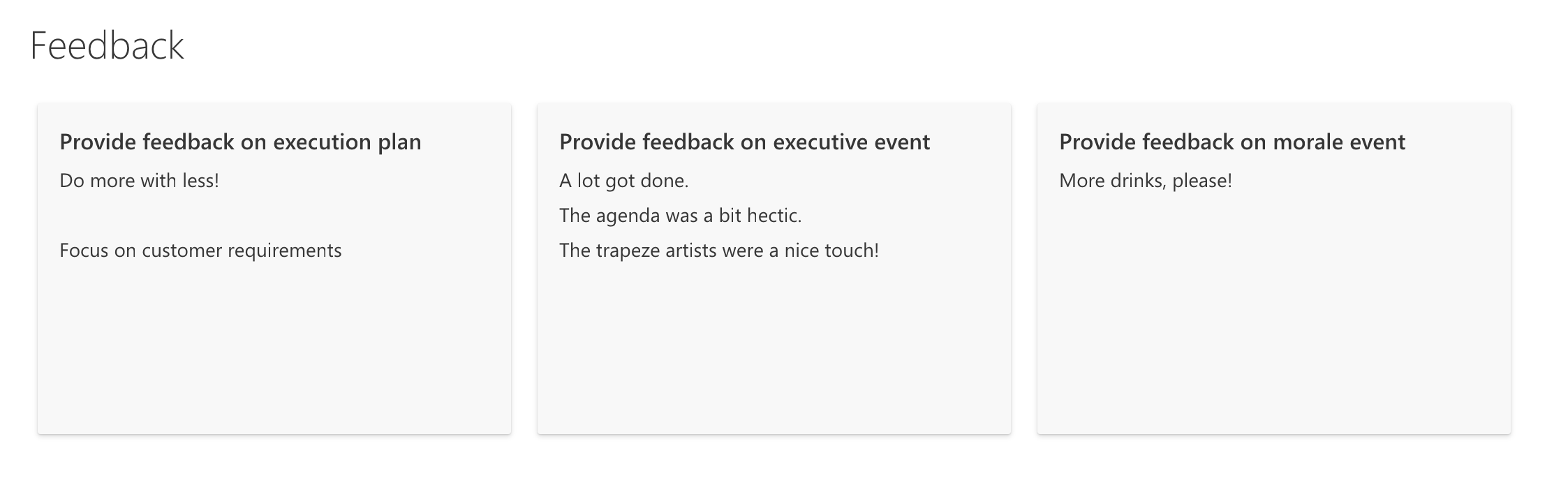
Example: Multi line custom card
The following image shows a customized card in Gallery layout:
{
  "$schema": "https://developer.microsoft.com/json-schemas/sp/v2/tile-formatting.schema.json",
  "height": "250",
  "width": "350",
  "hideSelection": true,
  "formatter": {
    "elmType": "div",
    "style": {
      "display": "flex",
      "align-items": "stretch",
      "margin-bottom": "16px",
      "min-width": "150px",
      "flex-grow": "1",
      "justify-content": "space-around",
      "padding": "5px"
    },
    "children": [
      {
        "elmType": "div",
        "style": {
          "width": "95%",
          "height": "92%",
          "box-shadow": "0px 1.6px 3.6px 0 #00000024, 0px 0.3px 0.9px 0 #00000024",
          "overflow": "hidden",
          "border-radius": "2px",
          "padding-left": "16px",
          "padding-top": "16px"
        },
        "attributes": {
          "class": "ms-bgColor-neutralLighterAlt"
        },
        "children": [
          {
            "elmType": "div",
            "style": {
              "text-align": "left"
            },
            "children": [
              {
                "elmType": "div",
                "style": {
                  "color":"#333333",
                  "font-size": "16px",
                  "font-weight":"600",
                  "margin-bottom":"5px"
              },
                "txtContent": "[$Title]"
              },
              {
                "elmType": "div",
                "style": {
                  "color":"#333333",
                  "font-size": "14px",
                  "line-height":"1.8"
              },
                "attributes": {
                  "class": "sp-row-listPadding"
                },
                "txtContent": "[$Feedback]"
              },
              {
                "elmType": "button",
                "customRowAction": {
                  "action": "defaultClick"
                },
                "txtContent": "Give feedback",
                "attributes": {
                  "class": "sp-row-button"
                },
                "style": {
                  "display": {
                    "operator": "?",
                    "operands": [
                      {
                        "operator": "==",
                        "operands": [
                          "@me",
                          "[$Assigned_x0020_To.email]"
                        ]
                      },
                      "",
                      "none"
                    ]
                  }
                }
              }
            ]
          }
        ]
      }
    ]
  }

}
Build custom group headers
You can use groupProps to format group headers with flexibility to add grouped column's data, display name and item count. You can also add group aggregates in the group headers.
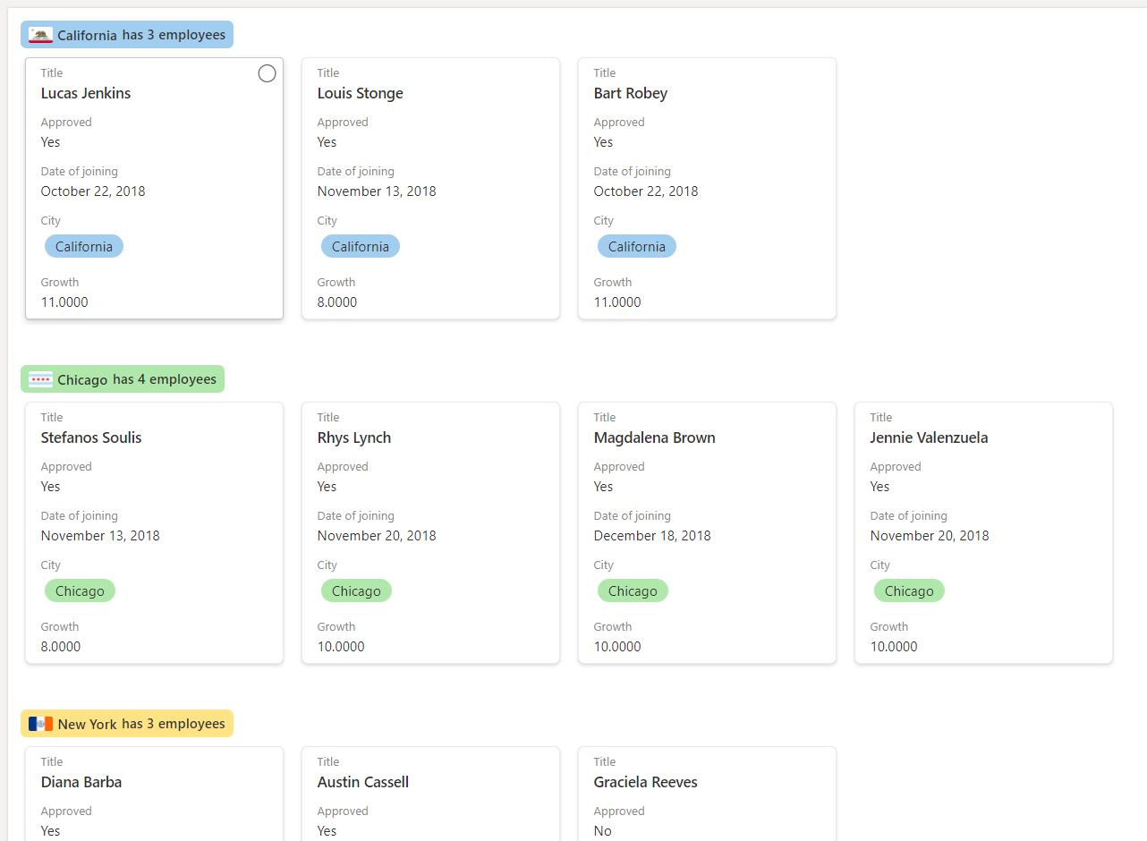
Example: Color coded group header
In the example below we have gallery view with formatted group headers as per column metadata.
Note
Gallery card formatter is skipped in the below JSON for simplicity. The example below also contains line breaks. These have been added to improve the readability of the code.
{
  "$schema": "https://developer.microsoft.com/json-schemas/sp/v2/tile-formatting.schema.json",
  "height": 277,
  "width": 254,
  "hideSelection": false,
  "groupProps": {
    "headerFormatter": {
      "elmType": "div",
      "children": [
        {
          "elmType": "div",
          "style": {
            "flex-wrap": "wrap",
            "display": "flex",
            "box-sizing": "border-box",
            "padding": "4px 8px 5px 8px",
            "border-radius": "6px",
            "align-items": "center",
            "white-space": "nowrap",
            "overflow": "hidden",
            "margin": "1px 4px 4px 1px"
          },
          "attributes": {
            "class": "=if(@group.fieldData == 'California', 'sp-css-backgroundColor-blueBackground37',
                       if(@group.fieldData == 'Chicago', 'sp-css-backgroundColor-successBackground50',
                       if(@group.fieldData == 'New York', 'sp-css-backgroundColor-warningBackground50',
                       if(@group.fieldData == 'Seattle', 'sp-css-backgroundColor-blockingBackground50',
                       if(@group.fieldData == 'Washington DC', 'sp-css-backgroundColor-errorBackground50',
                       'sp-field-borderAllRegular sp-field-borderAllSolid sp-css-borderColor-neutralSecondary'))))"
          },
          "children": [
            {
              "elmType": "img",
              "attributes": {
                "src": "=if(@group.fieldData == 'California', 'https://upload.wikimedia.org/wikipedia/commons/thumb/0/01/Flag_of_California.svg/1920px-Flag_of_California.svg.png',
                         if(@group.fieldData == 'Chicago', 'https://upload.wikimedia.org/wikipedia/commons/thumb/9/9b/Flag_of_Chicago%2C_Illinois.svg/1920px-Flag_of_Chicago%2C_Illinois.svg.png',
                         if(@group.fieldData == 'New York', 'https://upload.wikimedia.org/wikipedia/commons/thumb/b/ba/Flag_of_New_York_City.svg/2560px-Flag_of_New_York_City.svg.png',
                         if(@group.fieldData == 'Seattle', 'https://upload.wikimedia.org/wikipedia/en/thumb/6/6d/Flag_of_Seattle.svg/1920px-Flag_of_Seattle.svg.png',
                         if(@group.fieldData == 'Washington DC', 'https://upload.wikimedia.org/wikipedia/commons/thumb/d/d4/Flag_of_the_District_of_Columbia.svg/2560px-Flag_of_the_District_of_Columbia.svg.png', '')))))"
              },
              "style": {
                "max-width": "24px",
                "max-height": "24px",
                "margin-top": "2px",
                "border-radius": "2px"
              }
            },
            {
              "elmType": "div",
              "children": [
                {
                  "elmType": "span",
                  "style": {
                    "padding": "5px 5px 5px 5px",
                    "font-weight": "500"
                  },
                  "txtContent": {
                    "operator": "+",
                    "operands": [
                      "",
                      "@group.fieldData.displayValue"
                    ]
                  }
                }
              ]
            },
            {
              "elmType": "div",
              "children": [
                {
                  "elmType": "div",
                  "style": {
                    "display": "flex",
                    "flex-direction": "row",
                    "justify-content": "center"
                  },
                  "children": [
                    {
                      "elmType": "div",
                      "txtContent": "='has ' + @group.count + if(@group.count > '1', ' employees', ' employee')",
                      "style": {
                        "font-weight": "500"
                      }
                    }
                  ]
                }
              ]
            }
          ]
        }
      ]
    }
  }
}
Example: Color coded group header with aggregate
In the example below we have list with formatted group headers and group aggregates.
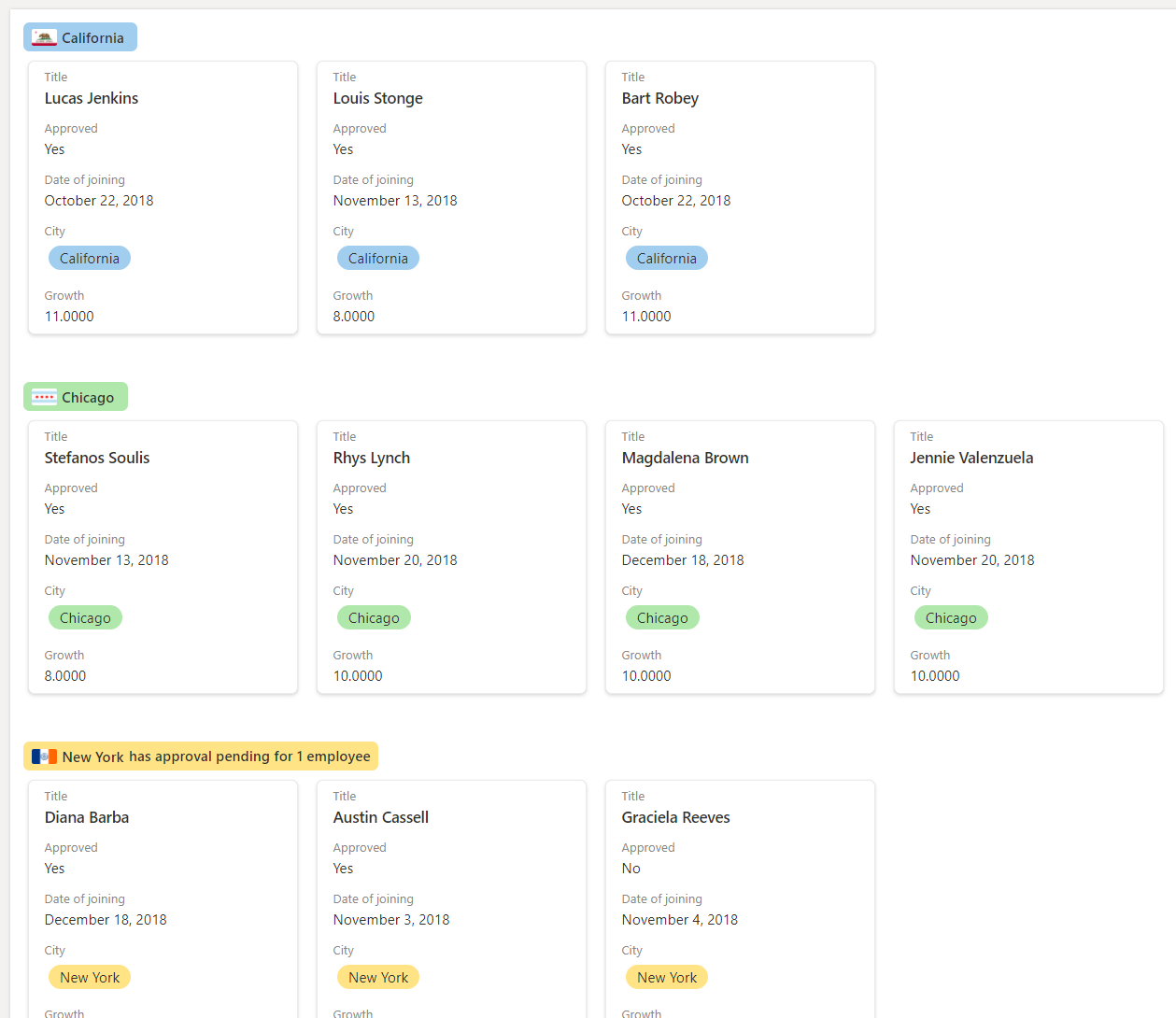
In this example the @aggregates array is used to display a summary in the group header using headerFormatter in groupProps.
Note
Gallery card formatter is skipped in the below JSON for simplicity. The example below also contains line breaks. These have been added to improve the readability of the code.
{
  "$schema": "https://developer.microsoft.com/json-schemas/sp/v2/tile-formatting.schema.json",
  "height": 277,
  "width": 254,
  "hideSelection": false,
  "fillHorizontally": true,
  "groupProps": {
    "headerFormatter": {
      "debugMode": true,
      "elmType": "div",
      "children": [
        {
          "elmType": "div",
          "style": {
            "flex-wrap": "wrap",
            "display": "flex",
            "box-sizing": "border-box",
            "padding": "4px 8px 5px 8px",
            "border-radius": "6px",
            "align-items": "center",
            "white-space": "nowrap",
            "overflow": "hidden",
            "margin": "1px 4px 4px 1px"
          },
          "attributes": {
            "class": "=if(@group.fieldData == 'California', 'sp-css-backgroundColor-blueBackground37',
                       if(@group.fieldData == 'Chicago', 'sp-css-backgroundColor-successBackground50',
                       if(@group.fieldData == 'New York', 'sp-css-backgroundColor-warningBackground50',
                       if(@group.fieldData == 'Seattle', 'sp-css-backgroundColor-blockingBackground50',
                       if(@group.fieldData == 'Washington DC', 'sp-css-backgroundColor-errorBackground50', 'sp-field-borderAllRegular sp-field-borderAllSolid sp-css-borderColor-neutralSecondary')))))"
          },
          "children": [
            {
              "elmType": "img",
              "attributes": {
                "src": "=if(@group.fieldData == 'California', 'https://upload.wikimedia.org/wikipedia/commons/thumb/0/01/Flag_of_California.svg/1920px-Flag_of_California.svg.png',
                         if(@group.fieldData == 'Chicago', 'https://upload.wikimedia.org/wikipedia/commons/thumb/9/9b/Flag_of_Chicago%2C_Illinois.svg/1920px-Flag_of_Chicago%2C_Illinois.svg.png',
                         if(@group.fieldData == 'New York', 'https://upload.wikimedia.org/wikipedia/commons/thumb/b/ba/Flag_of_New_York_City.svg/2560px-Flag_of_New_York_City.svg.png',
                         if(@group.fieldData == 'Seattle', 'https://upload.wikimedia.org/wikipedia/en/thumb/6/6d/Flag_of_Seattle.svg/1920px-Flag_of_Seattle.svg.png',
                         if(@group.fieldData == 'Washington DC', 'https://upload.wikimedia.org/wikipedia/commons/thumb/d/d4/Flag_of_the_District_of_Columbia.svg/2560px-Flag_of_the_District_of_Columbia.svg.png', '')))))"
              },
              "style": {
                "max-width": "24px",
                "max-height": "24px",
                "margin-top": "2px",
                "border-radius": "2px"
              }
            },
            {
              "elmType": "div",
              "children": [
                {
                  "elmType": "span",
                  "style": {
                    "padding": "5px 5px 5px 5px",
                    "font-weight": "500"
                  },
                  "txtContent": "@group.fieldData.displayValue"
                }
              ]
            },
            {
              "elmType": "div",
              "forEach": "aggregate in @aggregates",
              "children": [
                {
                  "elmType": "div",
                  "style": {
                    "display": "=if([$aggregate.columnDisplayName] == 'Approved' && Number([$aggregate.value]) < @group.count, 'flex', 'none')",
                    "flex-direction": "row",
                    "justify-content": "center"
                  },
                  "children": [
                    {
                      "elmType": "div",
                      "txtContent": "='has approval pending for ' + Number(@group.count - Number([$aggregate.value])) + if(@group.count - Number([$aggregate.value]) > 1 , ' employees', ' employee')",
                      "style": {
                        "font-weight": "500"
                      }
                    }
                  ]
                }
              ]
            }
          ]
        }
      ]
    }
  }
}
Detailed syntax reference
hideSelection
Optional element. Specifies whether the ability to select cards in the view is disabled or not. false is the default behavior inside a gallery view (meaning selection is visible and enabled). true means that users will not be able to select list items.
fillHorizontally
Optional element. Specifies whether the cards in the row should be stretched horizontally to fill the row. false is the default behavior (meaning cards in a row are stacked without resizing until they overflow). true means cards in the row are stretched horizontally only if necessary to fill the row.
height
Optional element. Defines the height of the card in pixels.
width
Optional element. Defines the width of the card in pixels. Can go from height/2 to 3 x height.
formatter
JSON object that defines the layout of cards. The schema of this JSON object is identical to the schema of a column format (and that of rowFormatter). For details on this schema and its capabilities, see the Formatting syntax reference.
groupProps
Groups the group related customization options. For details on groupProps, see Group Customization syntax reference
commandBarProps
Groups the command bar customization options. For details on commandBarProps, see Command bar customization syntax reference