Note
Access to this page requires authorization. You can try signing in or changing directories.
Access to this page requires authorization. You can try changing directories.
This preview update brings the long-requested React 18 support to SPFx solutions and continues to harden the Copilot UX components experience based on the feedback we have received from the first preview.
Caution
This article is related to a pre-release (alpha/beta/release candidate) version of the SharePoint Framework.
For production environments, we recommend using the SPFx version referenced on Set up your SharePoint Framework development environment.
- beta.1 released: July 8, 2026
- beta.3 released: August 27, 2026
- beta.4 released: September 17, 2026
- beta.5 released: September 23, 2026
- rc.0 released: October 2, 2026
Important
This page addresses details related to a specific SPFx release version. This page doesn't include additional SPFx prerequisites that must be installed in order to develop SPFx solutions, including Node.js, Yeoman, and other tools.
To learn more about these prerequisites, see Set up your SharePoint Framework development environment.
Install the preview version
Install the latest preview of the SharePoint Framework (SPFx) by using the @next tag:
npm install @microsoft/generator-sharepoint@next --global
New features and capabilities in 1.24
React 18 is here
The out-of-the-box React version used by SPFx solutions has been updated to React 18.x. This has been one of the most consistent asks from customers and partners, and it now lands in the 1.24 preview line so you can start validating your solutions against a modern React runtime well before general availability.
Please take this build for a spin and validate your solutions against React 18 — this is exactly the kind of change where broad, real-world testing before general availability makes the difference. If you run into anything unexpected, report it on our issue list so we can address it in an upcoming preview.
Node.js 24 & 26 support
We are pleased to share the SPFx 1.24 will include an update for the Node.js support all the way to v24 and v26. Current version in Node.js is 24 and the next as version 26 is also already out.
Copilot UX components updates (Public Preview)
This capability was introduced as SharePoint Copilot Apps in the July public preview. The final name is Copilot UX components.
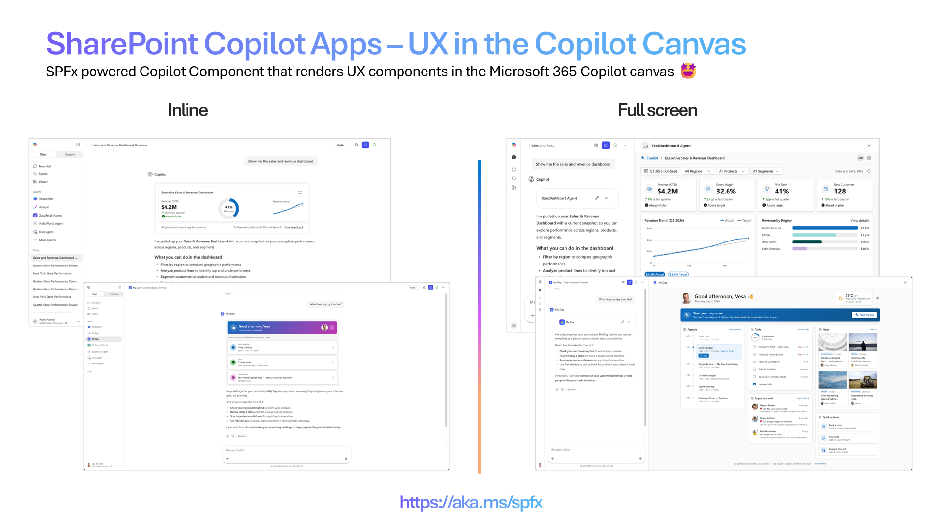
Copilot UX components bring rich, interactive experiences directly into the Microsoft 365 Copilot canvas. Instead of returning text alone, your agent can render charts, maps, KPIs, forms, approvals, and more right where the conversation happens, so users move from intent to action without leaving Copilot.
Copilot UX components are powered by the SharePoint Framework (SPFx) and implement the MCP Apps model. Components are hosted automatically in your Microsoft 365 tenant and you do not need to worry about the hosting or routing typically associated with the MCP Apps model. Developers can focus on building the UX experience and defining the metadata that determines when components are activated, without adding hosting or operational complexity.
You don't need a Microsoft 365 Copilot license to develop or test Copilot UX components during the public preview. Licensing requirements for general availability have not yet been finalized; the final decision is coming soon.
Updates in beta.3
Predictable default display mode: Components can now rely on the default display mode declared in their manifest behaving consistently in the Copilot canvas: a freshly invoked component opens in its declared default mode, closing it returns the conversation to the inline view without the component reopening itself, and an explicit request from the user can reopen it in fullscreen. Previously, display-mode transitions could cause a component to snap back to its default sizing unexpectedly.
No more version conflicts when updating a component: When the content of a Copilot UX component changes, the hotfix segment of its Teams manifest version is now bumped automatically if the author has not already updated it. This removes the confusing conflict error developers hit when adding or updating a component that still carried the same version number. Follow-up work will also surface clearer error messages in the admin center for this scenario.
Declarative agent manifest validation at build time: The build now validates your declarative agent manifest against the agent schema, so definitions that do not comply are caught while you build rather than failing at runtime in the Copilot canvas. Instead of deploying a solution and discovering that a component never loads or a tool never appears, you get a clear error up front, in the same inner-loop step where you can fix it. This is a meaningful reliability improvement for anyone iterating on Copilot UX components, and it removes one of the more frustrating classes of "it built fine but does not work in Copilot" problems.
Newly scaffolded Copilot UX components target declarative agent manifest v1.8: When you scaffold a new Copilot UX component, the declarative agent manifest is now created at v1.8, up from v1.7. You start on the current schema version rather than having to hand-upgrade a freshly created project, and your agent picks up the capabilities and behaviors defined in the newer manifest version out of the box. Existing solutions are not changed automatically — update the manifest version in your own project when you are ready.
Updates in beta.4 and beta.5
Technically beta.5 is rollback to the beta.3 level as we found out an issue on the tool resolution with the new approach introduced in the beta 4. We have decided to keep the model as it is with the beta 3 and most likely next step is the initial release candidate with target to release GA (General Availability) to production usage in October.
Updates in rc.0
RC is technically the same setup as previously, but we have introduced back the dynamic tool recovery pattern as we prepare for General Availability.
Getting started
- Install the SPFx 1.24 preview from npm.
- Scaffold a new Copilot UX component and pick a template (Minimal, No framework, or React).
- Run and test it locally in the Copilot Workbench.
- Deploy to your tenant and surface it in Copilot.
Copilot UX component sample gallery
The Copilot UX component sample gallery is the central location for samples provided by Microsoft and the community. Use the gallery to find examples that you can deploy and test, learn implementation patterns, and explore what you can build with Copilot UX components. More samples will be added as the preview evolves.
Known limitations and considerations
This is a public preview. Keep the following in mind:
- Copilot canvas only (for now): In this initial preview, components render only in the Copilot UX. Support for additional surfaces is in the works.
- Store not supported (yet): Distributing Copilot UX components through the store is not supported during public preview.
- Preview software: Capabilities and APIs may change before general availability. The capability was called "SharePoint Copilot Apps" in the July preview; the final name is "Copilot UX components." Build accordingly, and please share your feedback.
Please share any questions or findings on Copilot UX components through the sp-dev-docs repository issue list. We want to hear from you.
Copilot UX component resources
- Copilot UX components overview
- Build your first Copilot UX component – documentation
- Creating your first SharePoint Copilot App - Tutorial - video
- Going beyond text in Microsoft 365 Copilot: Introducing SharePoint Copilot Apps – Public announcement
- Introduction to SharePoint Copilot Apps – video
- Introduction to SharePoint Copilot Apps developer experience – video
- Build UX components for your Copilot agent – My Day scenario – SharePoint Copilot Apps – video
- GitHub repository for samples - contributions are welcome
New documents for Copilot UX components
- Connect your Copilot UX component to SharePoint data
- Access data from a Copilot UX component
- Troubleshoot Copilot UX components
Addressing npm audit issues
We continue to address the npm audit findings reported when installing the SharePoint Framework Yeoman generator or scaffolding solutions. Dependency vulnerabilities evolve over time, and we review them with every release.
We are aware of the findings reported for this preview and are working with the relevant teams to address them. Based on our current assessment, these findings don't affect the runtime or development-time security of SPFx solutions.
Fixed Issues
Here's a list of specific issues fixed around SharePoint Framework which are specifically fixed with this release:
- #11030 - [SPFx 1.23] Sass cannot resolve bare package imports inside dependencies — no loadPaths / importIncludePaths, no workaround (regression from 1.22)
Deprecations
None for now with 1.24 preview.
Feedback and issues
We're interested in your feedback about the release. If you find any issues, share them using the sp-dev-docs repository issue list. You can also use GitHub Discussions to start a conversation with the engineering team about this release. Thank you for your input in advance.
Happy coding! Sharing is caring! 🧡