Note
Access to this page requires authorization. You can try signing in or changing directories.
Access to this page requires authorization. You can try changing directories.
Principles
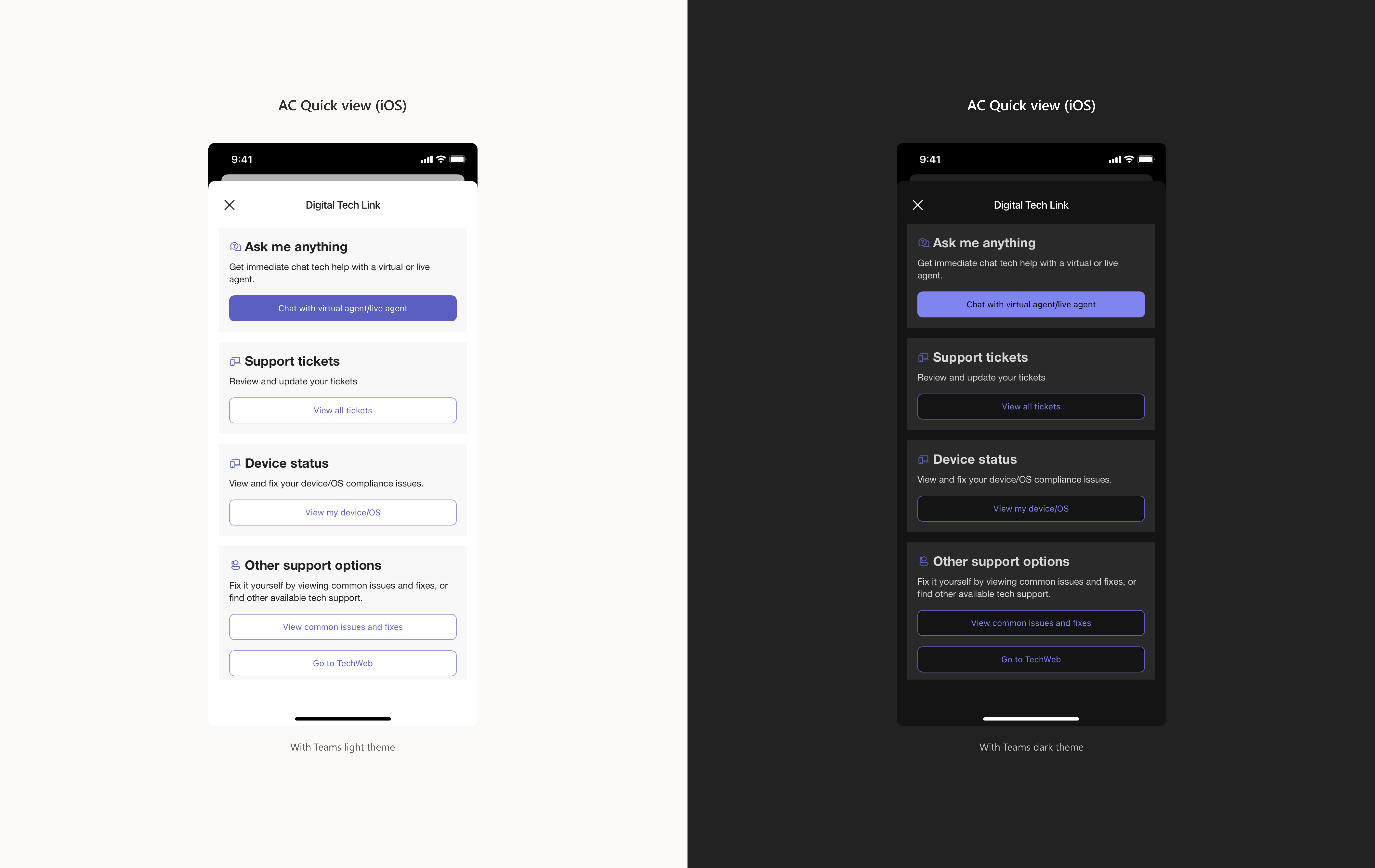
Create Quick Views to provide a bit more detailed information (for example: a detailed list with data) or to accomplish quick tasks (for example a simple form) without opening an app.
Here are a few examples of Quick Views:
Tip
Sample adaptive card designs for the Quick Views are available from GitHub
The Quick View experience works across different platforms and form-factors based on a single JSON. This introduces certain limitations in terms of available styling and placement on controls. You should not expect identical or pixel perfect comparison of a Quick View rendered on web / iOS or Android.
Tip
JSON is an open standard file format and data interchange format that uses human-readable text to store and transmit data objects consisting of attribute–value pairs and arrays (or other serializable values). It is a common data format with a diverse range of functionality in data interchange including communication of web applications with servers. JSON is a language-independent data format. It was derived from JavaScript, but many modern programming languages include code to generate and parse JSON-format data. JSON filenames use the extension .json.
Layout
- Header
- Dismiss Quick View
- Card name, defined by the Dashboard card title
- Open linked app (optional)
- Content area - Scrollable, can contain the following elements defined by Adaptive cards schema:
- Containers
- Container
- ImageSet
- FactSet
- ColumnSet
- Table
- Elements
- TextBlock
- RichTextBlock
- Image
- Media
- ActionSet
- Inputs
- Input.Text
- Input.Date
- Input.Time
- Input.Number
- Input.ChoiceSet
- Input.Toggle
- Containers
Interaction
Quick Views are vertically scrollable independent of the rest of the underlying interface and should not be horizontally scrolled.
Back stack
Avoid adding too many navigation levels within the Quick View. It's best to keep it simple so that it's easy for users to accomplish their task quickly.
While you can open several children Quick Views from the parent Quick View, we recommend not to navigate more than one level down.
Quick Views vs Web views
Despite being visually similar, they are two different surfaces for different use cases.
Quick View
This UI surface is built using JSON code. Serves as a mean to perform fast actions or fill pout simple forms or render more information with faster load times compared to a web page called via Web view.
Web view
Can be used to load web pages with everything they can offer including more complex layouts and better styles, can be way slower to load than a than Quick View.
Any web page opened on mobile is going to be rendered within a web view, while it's going to be a new browser tab if opened on SharePoint.
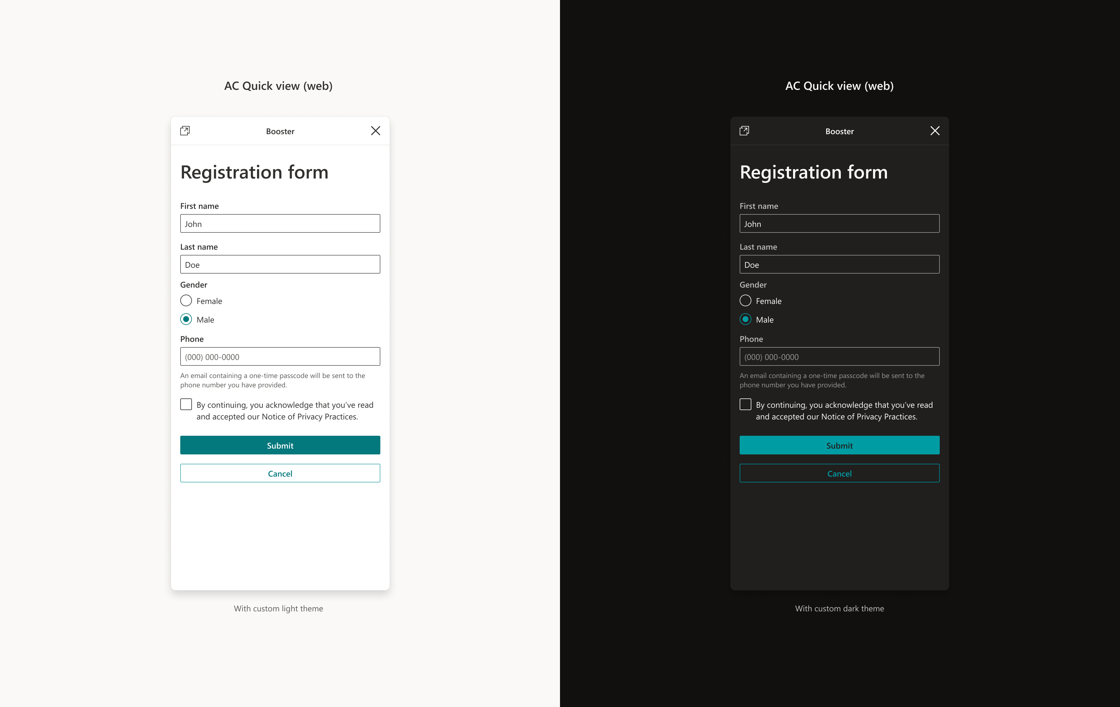
Theming
Web
Quick Views will follow SharePoint default and custom company-created themes.
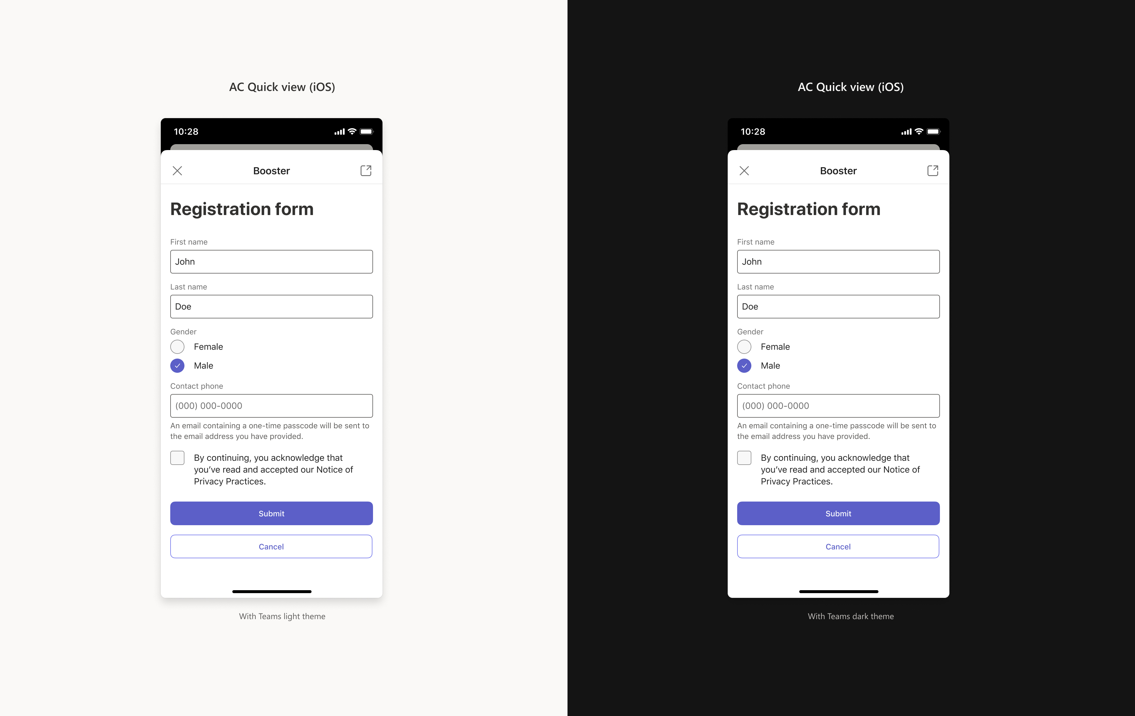
Mobile
Currently dark themes are not supported for Quick Views on iOS and Android mobile.
We plan to introduce dark theme support in Quick View in Viva Connections Mobile for both iOS and Android in early Q4 of CY23. (context.sdks.microsoftTeams.teamsJs.app.getContext()) to get the theme in which Quick View is rendered of the Quick View will be available in SPFx 1.18.1 package.
Important
Please test your existing cards using Adaptive Card designer to make sure that the icons and images used in light mode for Quick View of the existing cards are compatible with dark mode as some discrepancies have been observed. Tenant admins will also be able to test their card Quick Views in dark mode. To update your card for the new theming, please follow the tutorial 'Making your Quick View compatible with Dark Mode in Mobile'.
Behavior for links and Single sign-on
For some cards, you will use links to URLs. Depending on the location of the content, links to URLs may display content in Microsoft Teams or elsewhere and Single sign-on (SSO) behavior can differ. Get more information about how links to URLs and SSO behave depending on the location of the content you are linking to. Learn more