Advanced Card View Functionality
This tutorial builds off the following tutorial: Build your first SharePoint Adaptive Card Extension
In this tutorial, you'll implement advanced card view functionality. You'll build off the the previous tutorial and create a card view that's powered by data in a SharePoint list.
Note
This feature is currently in developer preview feature. In order to use features in developer preview, ensure you use the --plusbeta version of the package. For more information, see: Try SharePoint Framework preview capabilities.
Create a test list
Prepare this tutorial by creating a new list in a SharePoint site with some sample data:
Browse to your site and create a new list named Instruction List.
Add a Single line of text column named Description.
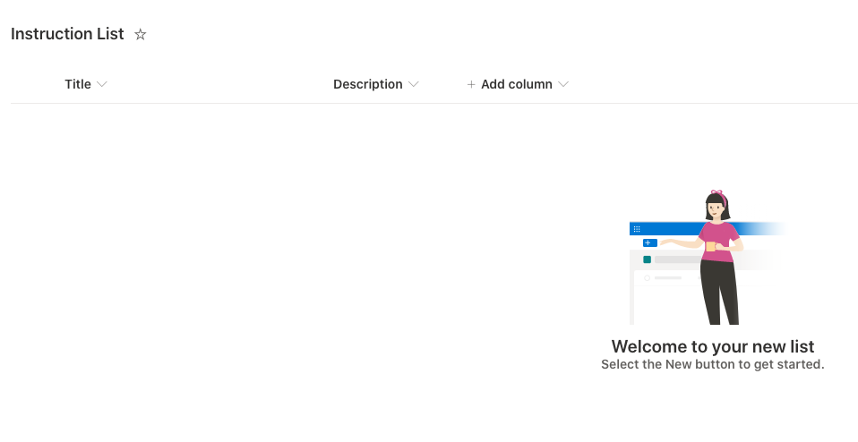
Add a few items to the list:
- Title: Step 1, Description: Use ACEs
- Title: Step 2, Description: ???
- Title: Step 3, Description: SPFx 🚀 🌝
Get the list's ID:
While viewing the list, select the gear icon in the suite bar to open the Settings menu. Then select the List settings menu item:
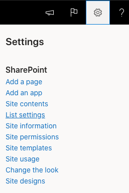
On the List Settings page, locate the list's ID in the URL:

Save the list's ID so you can use it in the next step.
Add ACE functionality
Start with the HelloWorld ACE from the previous tutorial, Build your first SharePoint Adaptive Card Extension. Make the following updates in preparation for Step 2.
Change properties
Let's modify the properties for our ACE and set the list ID that contains the data our ACE will display:
Locate and open the following file in the project: ./src/adaptiveCardExtensions/helloWorld/HelloWorldAdaptiveCardExtension.ts.
Update the interface used to define the type of the ACE's
propertiesproperty:export interface IHelloWorldAdaptiveCardExtensionProps { title: string; listId: string; }Locate and open the following file in the project: ./src/adaptiveCardExtensions/helloWorld/HelloWorldAdaptiveCardExtension.manifest.json.
Initialize the ACE with the ID of the List created in the previous step by setting the following
preConfiguredEntries:"preconfiguredEntries": [{ // ... "properties": { "title": "HelloWorld", "listId": "" // TODO: enter list id } }]Important
Make sure you enter the ID of the list you previously obtained into the
listIdproperty in thepreconfiguredEntriescode above.Locate and open the following file in the project: ./src/adaptiveCardExtensions/helloWorld/HelloWorldPropertyPane.ts.
Update the Property Pane by adding the following field:
PropertyPaneTextField('listId', {
  label: 'List ID'
})
Change the extension state
Next, let's update the state of the extension. When the state changes, it will trigger the ACE to rerender. These changes will add a collection of list items to the state as well as the current item displayed, as indicated by the currentIndex property you'll add.
Locate and open the following file in the project: ./src/adaptiveCardExtensions/helloWorld/HelloWorldAdaptiveCardExtension.ts.
Add a new interface for the List data by adding the following code to the file:
export interface IListItem {
  title: string;
  description: string;
}
Update the interface used to define the ACE's state to use the new IListItem interface:
export interface IHelloWorldAdaptiveCardExtensionState {
  currentIndex: number;
  items: IListItem[];
}
Update the
stateinitialization by updating theonInit()method in the ACE:public onInit(): Promise<void> { this.state = { currentIndex: 0, items: [] }; // ... }Temporarily remove where the
stateis referenced in the ACE and Views by updating theonPropertyPaneFieldChanged()method:// tslint:disable-next-line: no-any protected onPropertyPaneFieldChanged(propertyPath: string, oldValue: any, newValue: any): void { }Locate and open the following file in the project: ./src/adaptiveCardExtensions/helloWorld/quickView/QuickView.ts.
Update the
data()andonAction()methods to the following:public get data(): IQuickViewData { return { subTitle: '', title: strings.Title }; } public onAction(action: IActionArguments): void { }
Now that the state has been updated, we can now update our ACE to fetch data from the SharePoint list.
Add dependency
The next step is to add support to the project and ACE to retrieve items from a SharePoint list. To do this, you'll use the SharePoint Framework (SPFx) API to call the SharePoint REST endpoint.
First, add a dependency to the SPFx package used to submit HTTP requests to REST endpoints:
Locate and open the following file in the project: ./package.json. Take note of the beta version of the SPFx related beta packages used by the other packages listed as dependencies in the
dependenciessection of the package.json file.Install the following NPM package in your project: @microsoft/sp-http:
npm install @microsoft/sp-http -SE
Fetch the list data
Next, add support for calling the SharePoint REST API and adding the retrieved items to the ACE's state. When the state is updated, it will trigger the ACE to rerender.
Locate and open the following file in the project: ./src/adaptiveCardExtensions/helloWorld/HelloWorldAdaptiveCardExtension.ts.
Request the list data using the SPFx SpHttpClient API. Add the following to the class that implements the ACE:
import { SPHttpClient } from '@microsoft/sp-http';

...

private _fetchData(): Promise<void> {
  if (this.properties.listId) {
    return this.context.spHttpClient.get(
      `${this.context.pageContext.web.absoluteUrl}` +
        `/_api/web/lists/GetById(id='${this.properties.listId}')/items`,
      SPHttpClient.configurations.v1
    )
      .then((response) => response.json())
      .then((jsonResponse) => jsonResponse.value.map(
        (item) => { return { title: item.Title, description: item.Description }; })
        )
      .then((items) => this.setState({ items }));
  }

  return Promise.resolve();
}
Update the ACE to request the list data during when it's initialized by updating the
onInit()method.Replace the last line
return Promise.resolve();to bereturn this._fetchData();as follows:public onInit(): Promise<void> { // ... return this._fetchData(); }Update the ACE to request the list data when the Property Pane is updated. Add the following method to the class that implements the ACE. This code will only request the data when the list's ID is changed in the Property Pane:
protected onPropertyPaneFieldChanged(propertyPath: string, oldValue: any, newValue: any): void {
  if (propertyPath === 'listId' && newValue !== oldValue) {
    if (newValue) {
      this._fetchData();
    } else {
      this.setState({ items: [] });
    }
  }
}
Card updates
With the ACE updated to fetch items from a SharePoint list, let's update the card to display this data.
Locate and open the following file in the project: ./src/adaptiveCardExtensions/helloWorld/cardView/CardView.ts.
Update
cardViewParametersgetter to render Primary Text Card View instead of Basic Card View:public get cardViewParameters(): ComponentsCardViewParameters { return PrimaryTextCardView({ cardBar: { componentName: 'cardBar', title: this.properties.title }, header: { componentName: 'text', text: strings.PrimaryText }, body: { componentName: 'text', text: '' }, footer: { componentName: 'cardButton', title: strings.QuickViewButton, action: { type: 'QuickView', parameters: { view: QUICK_VIEW_REGISTRY_ID } } } }); }Update the
cardViewParameters()getter to display data from the list:public get cardViewParameters(): ComponentsCardViewParameters { const { title, description } = this.state.items[this.state.currentIndex]; return PrimaryTextCardView({ // ... header: { componentName: 'text', text: title }, body: { componentName: 'text', text: description }, // ... }); }
Now you can test the ACE. Build and launch the ACE in the hosted workbench:
gulp serve
Once the local web server has loaded, navigate to the hosted workbench: https://{tenant}.sharepoint.com/_layouts/15/workbench.aspx
Note
Remove any old instance of the ACE from your workbench. ACE instances from the previous tutorial will show an error message since the ACE properties have been updated.
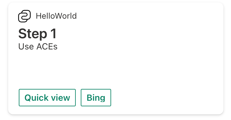
Open the Toolbox and select your ACE:
Conditional card views
By default, Views are automatically responsive to the Card size. However, ACEs can optionally provide different Views for any given Card size.
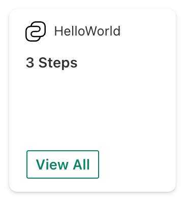
Change the HelloWorld ACE to display the total count of List items in the Medium Card size, and display the List items in the Large Card size to maximize the use of available space.
Medium card view
Let's create a medium card view for our ACE:
Create a new file ./src/adaptiveCardExtensions/helloWorld/cardView/MediumCardView.ts folder.
Add the following code to create a new Medium sized card view:
import {
  BaseComponentsCardView,
  ComponentsCardViewParameters,
  BasicCardView
} from '@microsoft/sp-adaptive-card-extension-base';
import {
  IHelloWorldAdaptiveCardExtensionProps,
  IHelloWorldAdaptiveCardExtensionState,
  QUICK_VIEW_REGISTRY_ID,
} from '../HelloWorldAdaptiveCardExtension';

export class MediumCardView extends BaseComponentsCardView<
  IHelloWorldAdaptiveCardExtensionProps,
  IHelloWorldAdaptiveCardExtensionState,
  ComponentsCardViewParameters
> {
  public get cardViewParameters(): ComponentsCardViewParameters {

    return BasicCardView({
      cardBar: {
        componentName: 'cardBar',
        title: this.properties.title,
        icon: {
          url: this.properties.iconProperty
        }
      },
      header: {
        componentName: 'text',
        text: `3 Steps`, // Display the total number of steps
      },
      footer: {
        componentName: 'cardButton',
        title: 'View All',
        action: {
          type: 'QuickView',
          parameters: {
            view: QUICK_VIEW_REGISTRY_ID,
          },
        },
      },
    });
  }
}
Locate and open the following file in the project: ./src/adaptiveCardExtensions/helloWorld/HelloWorldAdaptiveCardExtension.ts.
Now, register the new View by making the following changes to your ACE:
import { MediumCardView } from './cardView/MediumCardView';

..

const MEDIUM_VIEW_REGISTRY_ID: string = 'HelloWorld_MEDIUM_VIEW';

..

public onInit(): Promise<void> {
  // ...
  this.cardNavigator.register(CARD_VIEW_REGISTRY_ID, () => new CardView());
  this.cardNavigator.register(MEDIUM_VIEW_REGISTRY_ID, () => new MediumCardView());
  // ...
}
Update the
renderCard()method to return either the Medium Card View or the Large Card View based on the Card size:protected renderCard(): string | undefined { return this.cardSize === 'Medium' ? MEDIUM_VIEW_REGISTRY_ID : CARD_VIEW_REGISTRY_ID; }
Test your changes by refreshing the workbench:
Change the Card size to Large and refresh the browser:
Large Card interactivity
ACE Card views support user interaction. The buttons can invoke REST APIs or be used to interact with the Card in other ways. In this section, you'll change the Large Card view to iterate through the items in the SharePoint list.
Locate and open the following file in the project: ./src/adaptiveCardExtensions/helloWorld/cardView/CardView.ts.
At the top of the file, add
IActionArguments,GenericCardViewFooterConfigurationandIAdaptiveCardExtensionCardButtonParametersas the references to import from the @microsoft/sp-adaptive-card-extension-base package:import { // ... GenericCardViewFooterConfiguration, IActionArguments, IAdaptiveCardExtensionCardButtonParameters } from '@microsoft/sp-adaptive-card-extension-base';The buttons on the Card view can be dynamic based on the current state of the ACE. Add the following code to your ACE's CardView.ts file:
public get cardViewParameters(): ComponentsCardViewParameters {
  const { title, description } = this.state.items[this.state.currentIndex];
  let footer: GenericCardViewFooterConfiguration = undefined;

  if (this.state.currentIndex > 0) {
    footer = {
      componentName: 'cardButton',
      title: 'Previous',
      action: {
        type: 'Submit',
        parameters: {
          id: 'previous',
          op: -1 // Decrement the current index
        }
      }
    };
  }
  if (this.state.currentIndex < this.state.items.length - 1) {
    const nextButton: IAdaptiveCardExtensionCardButtonParameters = {
      componentName: 'cardButton',
      title: 'Next',
      action: {
        type: 'Submit',
        parameters: {
          id: 'next',
          op: 1 // Increment the current index
        }
      }
    };

    if (footer) {
      footer = [footer as IAdaptiveCardExtensionCardButtonParameters, nextButton];
    }
    else {
      footer = nextButton;
    }
  }

  return PrimaryTextCardView({
    cardBar: {
      componentName: 'cardBar',
      title: this.properties.title,
      icon: {
        url: this.properties.iconProperty
      }
    },
    header: {
      componentName: 'text',
      text: title
    },
    body: {
      componentName: 'text',
      text: description
    },
    footer: footer
  });
}
Next, update the
statewhen a button is selected by implementing the following method:public onAction(action: IActionArguments): void { if (action.type === 'Submit') { const { id, op } = action.data; switch (id) { case 'previous': case 'next': this.setState({ currentIndex: this.state.currentIndex + op }); break; } } }
Test your changes by reloading the workbench in your browser.
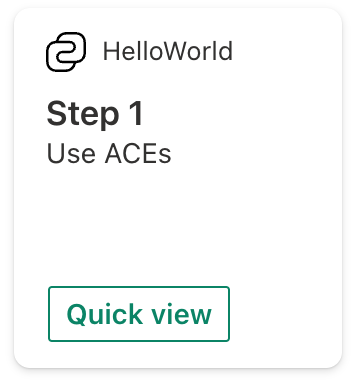
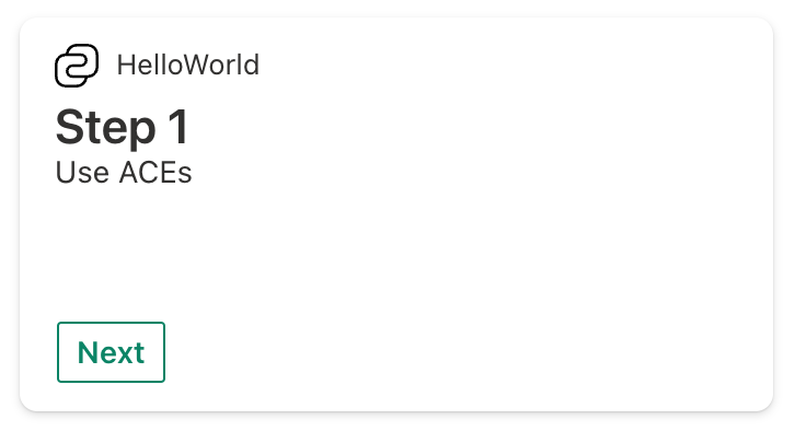
The first instance of the card will show the first list item with a Next button:
Select the Next button. The card will display the next item in the list and add a Previous button:

Select the Next button until you get to the last item in the list. The card will display the item in the list and only display the Previous button:

Caching Card view and ACE state
Starting in SPFx v1.14, ACEs have a client-side caching layer that can be configured to store:
- The latest rendered card.
- The state of the ACE.
Rendering from cached Card view
If the latest rendered card is stored, the Dashboard renders this cached card before the ACE is initialized, improving perceived performance.
The settings for this cache can be configured by overriding the following method:
protected getCacheSettings(): Partial<ICacheSettings> {
  return {
    isEnabled: true, // can be set to false to disable caching
    expiryTimeInSeconds: 86400, // controls how long until the cached card and state are stale
    cachedCardView: () => new CardView() // function that returns the custom Card view that will be used to generate the cached card
  };
}
Rehydrating from cached ACE state
The subset of the ACE state that is cached can be configured by overriding the following method:
protected getCachedState(state: TState): Partial<TState>;
The object returned by this method will be serialized and cached. By default, no state is cached. In the next call to onInit, the deserialized value will be passed to onInit as part of the ICachedLoadParameters
public onInit(cachedLoadParameters?: ICachedLoadParameters): Promise<void>;
The value can then be used to rehydrate the state of the newly initialized ACE.
Conclusion
After this lab you should be familiar with:
- Changing the default
propertiesof an ACE - Changing the ACE
properties/stateinterfaces - Creating and registering Card views
- Conditionally rendering Card view elements
- Advanced Card view manipulation
- Caching Card view and ACE state
See Also
Feedback
Coming soon: Throughout 2024 we will be phasing out GitHub Issues as the feedback mechanism for content and replacing it with a new feedback system. For more information see: https://aka.ms/ContentUserFeedback.
Submit and view feedback for