Build custom controls for the property pane
The SharePoint Framework contains a set of standard controls for the property pane. But sometimes you need additional functionality beyond the basic controls. You might need asynchronous updates to the data on a control or a specific user interface. Build a custom control for the property pane to get the functionality you need.
In this article, you'll build a custom dropdown control that loads its data asynchronously from an external service without blocking the user interface of the web part.
The source of the working web part is available on GitHub at sp-dev-fx-webparts/samples/react-custompropertypanecontrols/.
Note
Before following the steps in this article, be sure to set up your development environment for building SharePoint Framework solutions.
Create new project
Start by creating a new folder for your project:
md react-custompropertypanecontrolGo to the project folder:
cd react-custompropertypanecontrolIn the project folder, run the SharePoint Framework Yeoman generator to scaffold a new SharePoint Framework project:
yo @microsoft/sharepointWhen prompted, enter the following values (select the default option for all prompts omitted below):
- Which type of client-side component to create? WebPart
- What is your Web part name? List items
- Which template would you like to use? React
Open your project folder in your code editor.
Define web part property for storing the selected list
The web part you're building shows list items from the selected SharePoint list. Users can select a list in the web part properties. To store the selected list, create a new web part property named listName.
In the code editor, open the src/webparts/listItems/ListItemsWebPartManifest.json file. Replace the default
descriptionproperty with a new property namedlistName:{ ... "preconfiguredEntries": [{ ... "properties": { "listName": "" } }] }Open the src/webparts/listItems/ListItemsWebPart.ts file and update the
IListItemsWebPartPropsinterface to the following:export interface IListItemsWebPartProps { description: string; listName: string; }In the src/webparts/listItems/ListItemsWebPart.ts file, change the
render()method to:export default class ListItemsWebPart extends BaseClientSideWebPart<IListItemsWebPartProps> { // ... public render(): void { const element: React.ReactElement<IListItemsProps> = React.createElement( ListItems, { listName: this.properties.listName, description: this.properties.description, isDarkTheme: this._isDarkTheme, environmentMessage: this._environmentMessage, hasTeamsContext: !!this.context.sdks.microsoftTeams, userDisplayName: this.context.pageContext.user.displayName } ); ReactDom.render(element, this.domElement); } // ... }Update the
getPropertyPaneConfiguration()method to:export default class ListItemsWebPart extends BaseClientSideWebPart<IListItemsWebPartProps> { // ... protected getPropertyPaneConfiguration(): IPropertyPaneConfiguration { return { pages: [ { header: { description: strings.PropertyPaneDescription }, groups: [ { groupName: strings.BasicGroupName, groupFields: [ PropertyPaneTextField('listName', { label: strings.ListFieldLabel }) ] } ] } ] }; } // ... }In the src/webparts/listItems/loc/mystrings.d.ts file, add a new property
ListFieldLabelof typestringto the existingIListItemsWebPartStringsinterface:declare interface IListItemsWebPartStrings { PropertyPaneDescription: string; BasicGroupName: string; .. ListFieldLabel: string; }In the src/webparts/listItems/loc/en-us.js file, add a new property
ListFieldLabelto the returned object:define([], function() { return { "PropertyPaneDescription": "Description", "BasicGroupName": "Group Name", ... "ListFieldLabel": "List" } });Open the src/webparts/listItems/components/IListItemsProps.ts file, add the
listNameproperty to the list interface:export interface IListItemsProps { description: string; isDarkTheme: boolean; environmentMessage: string; hasTeamsContext: boolean; userDisplayName: string; listName: string; }In the src/webparts/listItems/components/ListItems.tsx file, change the contents of the
render()method to:export default class ListItems extends React.Component<IListItemsProps, {}> { public render(): React.ReactElement<IListItemsProps> { const { description, isDarkTheme, environmentMessage, hasTeamsContext, userDisplayName, listName } = this.props; return ( <section className={`${styles.listItems} ${hasTeamsContext ? styles.teams : ''}`}> <div className={styles.welcome}> <img alt="" src={isDarkTheme ? require('../assets/welcome-dark.png') : require('../assets/welcome-light.png')} className={styles.welcomeImage} /> <h2>Well done, {escape(userDisplayName)}!</h2> <div>{environmentMessage}</div> <div>List name: <strong>{escape(listName)}</strong></div> </div> </section> ); } }Run the following command to verify that the project is running:
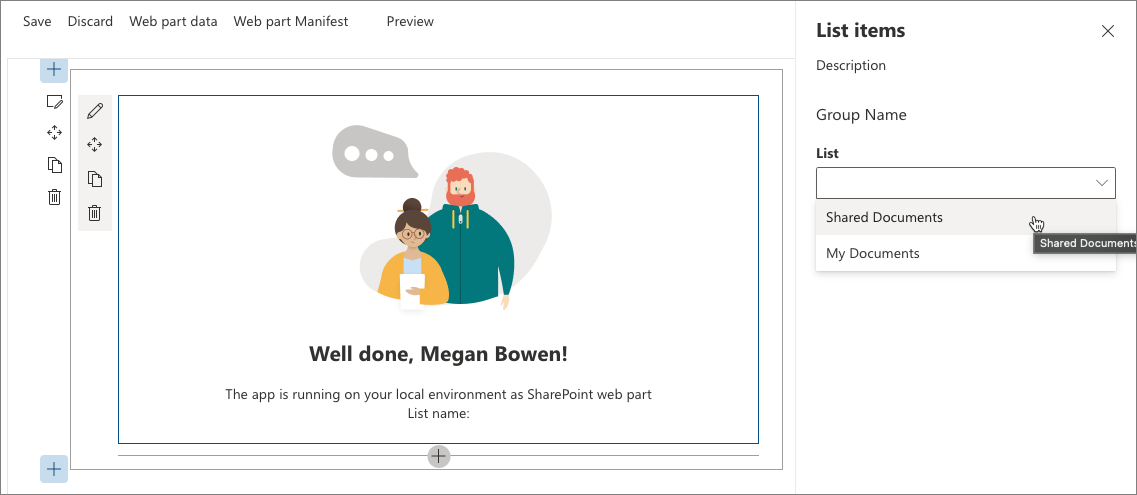
gulp serveIn the web browser, add the List items web part to the canvas and open its properties. Verify that the value set for the List property is displayed in the web part body.
Create asynchronous dropdown property pane control
The SharePoint Framework offers you a standard dropdown control that allows users to select a specific value. The dropdown control is built in a way that requires all its values to be known upfront. If you want to load the values dynamically or you're loading values asynchronously from an external service and you don't want to block the whole web part, building a custom dropdown control is an option.
When creating a custom property pane control that uses React in the SharePoint Framework, the control consists of a class that registers the control with the web part, and a React component that renders the dropdown and manages its data.
Add asynchronous dropdown property pane control React component
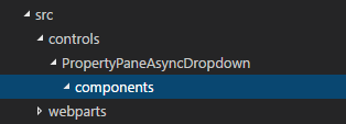
Create the components folder. In the project src folder, create a hierarchy of three new folders so that your folder structure appears as src/controls/PropertyPaneAsyncDropdown/components.
Define asynchronous dropdown React component properties. In the src/controls/PropertyPaneAsyncDropdown/components folder, create a new file named IAsyncDropdownProps.ts, and enter the following code:
import { IDropdownOption } from 'office-ui-fabric-react/lib/components/Dropdown';

export interface IAsyncDropdownProps {
  label: string;
  loadOptions: () => Promise<IDropdownOption[]>;
  onChanged: (option: IDropdownOption, index?: number) => void;
  selectedKey: string | number;
  disabled: boolean;
  stateKey: string;
}
The
IAsyncDropdownPropsclass defines properties that can be set on the React component used by the custom property pane control:- The
labelproperty specifies the label for the dropdown control. - The function associated with the
loadOptionsdelegate is called by the control to load the available options. - The function associated with the
onChangeddelegate is called after the user selects an option in the dropdown. - The
selectedKeyproperty specifies the selected value, which can be a string or a number. - The
disabledproperty specifies if the dropdown control is disabled or not. - The
stateKeyproperty is used to force the React component to re-render.
- The
Define asynchronous dropdown React component interface. In the src/controls/PropertyPaneAsyncDropdown/components folder, create a new file named IAsyncDropdownState.ts, and enter the following code:
import { IDropdownOption } from 'office-ui-fabric-react/lib/components/Dropdown';

export interface IAsyncDropdownState {
  loading: boolean;
  options: IDropdownOption[];
  error: string;
}
The
IAsyncDropdownStateinterface describes the state of the React component:- The
loadingproperty determines if the component is loading its options at the given moment. - The
optionsproperty contains all available options. - If an error occurred, it's assigned to the
errorproperty from where it's communicated to the user.
- The
Define the asynchronous dropdown React component. In the src/controls/PropertyPaneAsyncDropdown/components folder, create a new file named AsyncDropdown.tsx, and enter the following code:
import * as React from 'react';
import { Dropdown, IDropdownOption } from 'office-ui-fabric-react/lib/components/Dropdown';
import { Spinner } from 'office-ui-fabric-react/lib/components/Spinner';
import { IAsyncDropdownProps } from './IAsyncDropdownProps';
import { IAsyncDropdownState } from './IAsyncDropdownState';

export default class AsyncDropdown extends React.Component<IAsyncDropdownProps, IAsyncDropdownState> {
  private selectedKey: React.ReactText;

  constructor(props: IAsyncDropdownProps, state: IAsyncDropdownState) {
    super(props);
    this.selectedKey = props.selectedKey;

    this.state = {
      loading: false,
      options: undefined,
      error: undefined
    };
  }

  public componentDidMount(): void {
    this.loadOptions();
  }

  public componentDidUpdate(prevProps: IAsyncDropdownProps, prevState: IAsyncDropdownState): void {
    if (this.props.disabled !== prevProps.disabled ||
      this.props.stateKey !== prevProps.stateKey) {
      this.loadOptions();
    }
  }

  private loadOptions(): void {
    this.setState({
      loading: true,
      error: undefined,
      options: undefined
    });

    this.props.loadOptions()
      .then((options: IDropdownOption[]): void => {
        this.setState({
          loading: false,
          error: undefined,
          options: options
        });
      }, (error: any): void => {
        this.setState((prevState: IAsyncDropdownState, props: IAsyncDropdownProps): IAsyncDropdownState => {
          prevState.loading = false;
          prevState.error = error;
          return prevState;
        });
      });
  }

  public render(): JSX.Element {
    const loading: JSX.Element = this.state.loading ? <div><Spinner label={'Loading options...'} /></div> : <div />;
    const error: JSX.Element = this.state.error !== undefined ? <div className={'ms-TextField-errorMessage ms-u-slideDownIn20'}>Error while loading items: {this.state.error}</div> : <div />;

    return (
      <div>
        <Dropdown label={this.props.label}
          disabled={this.props.disabled || this.state.loading || this.state.error !== undefined}
          onChanged={this.onChanged.bind(this)}
          selectedKey={this.selectedKey}
          options={this.state.options} />
        {loading}
        {error}
      </div>
    );
  }

  private onChanged(option: IDropdownOption, index?: number): void {
    this.selectedKey = option.key;
    // reset previously selected options
    const options: IDropdownOption[] = this.state.options;
    options.forEach((o: IDropdownOption): void => {
      if (o.key !== option.key) {
        o.selected = false;
      }
    });
    this.setState((prevState: IAsyncDropdownState, props: IAsyncDropdownProps): IAsyncDropdownState => {
      prevState.options = options;
      return prevState;
    });
    if (this.props.onChanged) {
      this.props.onChanged(option, index);
    }
  }
}
The
AsyncDropdownclass represents the React component used to render the asynchronous dropdown property pane control:- When the component first loads, the
componentDidMount()method, or itsdisabledorstateKeyproperties, change, and it loads the available options by calling theloadOptions()method passed through the properties. - After the options are loaded, the component updates its state showing the available options.
- The dropdown itself is rendered by using the Office UI Fabric React dropdown component.
- When the component is loading the available options, it displays a spinner by using the Office UI Fabric React spinner component.
- When the component first loads, the
The next step is to define the custom property pane control. This control is used inside the web part when defining properties in the property pane, and renders using the previously defined React component.
Add asynchronous dropdown property pane control
Define asynchronous dropdown property pane control properties. A custom property pane control has two sets of properties.
The first set of properties are exposed publicly and are used to define the web part property inside the web part. These properties are component-specific properties, such as the label displayed next to the control, minimum and maximum values for a spinner, or available options for a dropdown. When defining a custom property pane control, the type describing these properties must be passed as the
TPropertiestype when implementing theIPropertyPaneField<TProperties>interface.The second set of properties are private properties used internally inside the custom property pane control. These properties have to adhere to the SharePoint Framework APIs for the custom control to render correctly. These properties must implement the
IPropertyPaneCustomFieldPropsinterface from the @microsoft/sp-property-pane package.Define the public properties for the asynchronous dropdown property pane control. In the src/controls/PropertyPaneAsyncDropdown folder, create a new file named IPropertyPaneAsyncDropdownProps.ts, and enter the following code:
import { IDropdownOption } from 'office-ui-fabric-react/lib/components/Dropdown';

export interface IPropertyPaneAsyncDropdownProps {
  label: string;
  loadOptions: () => Promise<IDropdownOption[]>;
  onPropertyChange: (propertyPath: string, newValue: any) => void;
  selectedKey: string | number;
  disabled?: boolean;
}
In the
IPropertyPaneAsyncDropdownPropsinterface:label: defines the label displayed next to the dropdown.loadOptions: defines the method that is called to load the available dropdown options.onPropertyChange: defines a method that is called when the user selects a value in the dropdown.selectedKey: returns the selected dropdown value.disabled: specifies whether the control is disabled or not.
Define the internal properties for the asynchronous dropdown property pane control. In the src/controls/PropertyPaneAsyncDropdown folder, create a new file named IPropertyPaneAsyncDropdownInternalProps.ts, and enter the following code:
import { IPropertyPaneCustomFieldProps } from '@microsoft/sp-property-pane';
import { IPropertyPaneAsyncDropdownProps } from './IPropertyPaneAsyncDropdownProps';

export interface IPropertyPaneAsyncDropdownInternalProps extends IPropertyPaneAsyncDropdownProps, IPropertyPaneCustomFieldProps {
}
While the IPropertyPaneAsyncDropdownInternalProps interface doesn't define any new properties, it combines the properties from the previously defined IPropertyPaneAsyncDropdownProps interface and the standard SharePoint Framework IPropertyPaneCustomFieldProps interface, which is required for a custom control to run correctly.
Define the asynchronous dropdown property pane control. In the src/controls/PropertyPaneAsyncDropdown folder, create a new file named PropertyPaneAsyncDropdown.ts, and enter the following code:
import * as React from 'react';
import * as ReactDom from 'react-dom';
import {
  IPropertyPaneField,
  PropertyPaneFieldType
} from '@microsoft/sp-property-pane';
import { IDropdownOption } from 'office-ui-fabric-react/lib/components/Dropdown';
import { IPropertyPaneAsyncDropdownProps } from './IPropertyPaneAsyncDropdownProps';
import { IPropertyPaneAsyncDropdownInternalProps } from './IPropertyPaneAsyncDropdownInternalProps';
import AsyncDropdown from './components/AsyncDropdown';
import { IAsyncDropdownProps } from './components/IAsyncDropdownProps';

export class PropertyPaneAsyncDropdown implements IPropertyPaneField<IPropertyPaneAsyncDropdownProps> {
  public type: PropertyPaneFieldType = PropertyPaneFieldType.Custom;
  public targetProperty: string;
  public properties: IPropertyPaneAsyncDropdownInternalProps;
  private elem: HTMLElement;

  constructor(targetProperty: string, properties: IPropertyPaneAsyncDropdownProps) {
    this.targetProperty = targetProperty;
    this.properties = {
      key: properties.label,
      label: properties.label,
      loadOptions: properties.loadOptions,
      onPropertyChange: properties.onPropertyChange,
      selectedKey: properties.selectedKey,
      disabled: properties.disabled,
      onRender: this.onRender.bind(this),
      onDispose: this.onDispose.bind(this)
    };
  }

  public render(): void {
    if (!this.elem) {
      return;
    }

    this.onRender(this.elem);
  }

  private onDispose(element: HTMLElement): void {
    ReactDom.unmountComponentAtNode(element);
  }

  private onRender(elem: HTMLElement): void {
    if (!this.elem) {
      this.elem = elem;
    }

    const element: React.ReactElement<IAsyncDropdownProps> = React.createElement(AsyncDropdown, {
      label: this.properties.label,
      loadOptions: this.properties.loadOptions,
      onChanged: this.onChanged.bind(this),
      selectedKey: this.properties.selectedKey,
      disabled: this.properties.disabled,
      // required to allow the component to be re-rendered by calling this.render() externally
      stateKey: new Date().toString()
    });
    ReactDom.render(element, elem);
  }

  private onChanged(option: IDropdownOption, index?: number): void {
    this.properties.onPropertyChange(this.targetProperty, option.key);
  }
}
The
PropertyPaneAsyncDropdownclass implements the standard SharePoint FrameworkIPropertyPaneFieldinterface by using theIPropertyPaneAsyncDropdownPropsinterface as a contract for its public properties that can be set from inside the web part. The class contains the following three public properties defined by theIPropertyPaneFieldinterface:type: Must be set toPropertyPaneFieldType.Customfor a custom property pane control.targetProperty: Used to specify the name of the web part property to be used with the control.properties: Used to define control-specific properties.
Notice how the
propertiesproperty is of the internalIPropertyPaneAsyncDropdownInternalPropstype rather than the publicIPropertyPaneAsyncDropdownPropsinterface implemented by the class. This is on purpose so that thepropertiesproperty can define theonRender()method required by the SharePoint Framework. If theonRender()method was a part of the publicIPropertyPaneAsyncDropdownPropsinterface, when using the asynchronous dropdown control in the web part, you would be required to assign a value to it inside the web part, which isn't desirable.The
PropertyPaneAsyncDropdownclass defines a publicrender()method, which can be used to repaint the control. This is useful in situations such as when you have cascading dropdowns where the value set in one determines the options available in another. By calling therender()method after selecting an item, you can have the dependent dropdown load available options. For this to work, you have to make React detect that the control has changed. This is done by setting the value of thestateKeyto the current date. Using this trick, every time theonRender()method is called, the component not only is re-rendered but also updates its available options. Don't forget to implementonDispose()method to unmount the element every time you close the property pane.
Use the asynchronous dropdown property pane control in the web part
With the asynchronous dropdown property pane control ready, the next step is to use it inside the web part, allowing users to select a list.
Add list info interface
To pass information about available lists around in a consistent manner, define an interface that represents information about a list. In the src/webparts/listItems folder, create a new file named IListInfo.ts, and enter the following code:
export interface IListInfo {
  Id: string;
  Title: string;
}
Use the asynchronous dropdown property pane control to render the listName web part property
Reference required types. In the top section of the src/webparts/listItems/ListItemsWebPart.ts file, import the previously created
PropertyPaneAsyncDropdownclass by adding:import { PropertyPaneAsyncDropdown } from '../../controls/PropertyPaneAsyncDropdown/PropertyPaneAsyncDropdown';After that code, add a reference to the
IDropdownOptioninterface and two helpers functions required to work with web part properties.import { IDropdownOption } from 'office-ui-fabric-react/lib/components/Dropdown'; import { update, get } from '@microsoft/sp-lodash-subset';Add a method to load available lists. In the
ListItemsWebPartclass, add the followingloadLists()method to load available lists. In this article, you use mock data, but you could also call the SharePoint REST API to retrieve the list of available lists from the current web. To simulate loading options from an external service, the method uses a two-second delay.private loadLists(): Promise<IDropdownOption[]> { return new Promise<IDropdownOption[]>((resolve: (options: IDropdownOption[]) => void, reject: (error: any) => void) => { setTimeout(() => { resolve([{ key: 'sharedDocuments', text: 'Shared Documents' }, { key: 'myDocuments', text: 'My Documents' }]); }, 2000); }); }Add method to handle the change of the value in the dropdown. In the
ListItemsWebPartclass, add a new method namedonListChange().private onListChange(propertyPath: string, newValue: any): void { const oldValue: any = get(this.properties, propertyPath); // store new value in web part properties update(this.properties, propertyPath, (): any => { return newValue; }); // refresh web part this.render(); }After selecting a list in the list dropdown, the selected value should be persisted in web part properties, and the web part should be re-rendered to reflect the selected property.
Render the list web part property by using the asynchronous dropdown property pane control. In the
ListItemsWebPartclass, change thegetPropertyPaneConfiguration()method to use the asynchronous dropdown property pane control to render thelistNameweb part property.export default class ListItemsWebPart extends BaseClientSideWebPart<IListItemsWebPartProps> { // ... protected getPropertyPaneConfiguration(): IPropertyPaneConfiguration { return { pages: [ { header: { description: strings.PropertyPaneDescription }, groups: [ { groupName: strings.BasicGroupName, groupFields: [ new PropertyPaneAsyncDropdown('listName', { label: strings.ListFieldLabel, loadOptions: this.loadLists.bind(this), onPropertyChange: this.onListChange.bind(this), selectedKey: this.properties.listName }) ] } ] } ] }; } // ... }At this point, you can select a list by using the newly created asynchronous dropdown property pane control. To verify that the control is working as expected, open the console and run:
gulp serve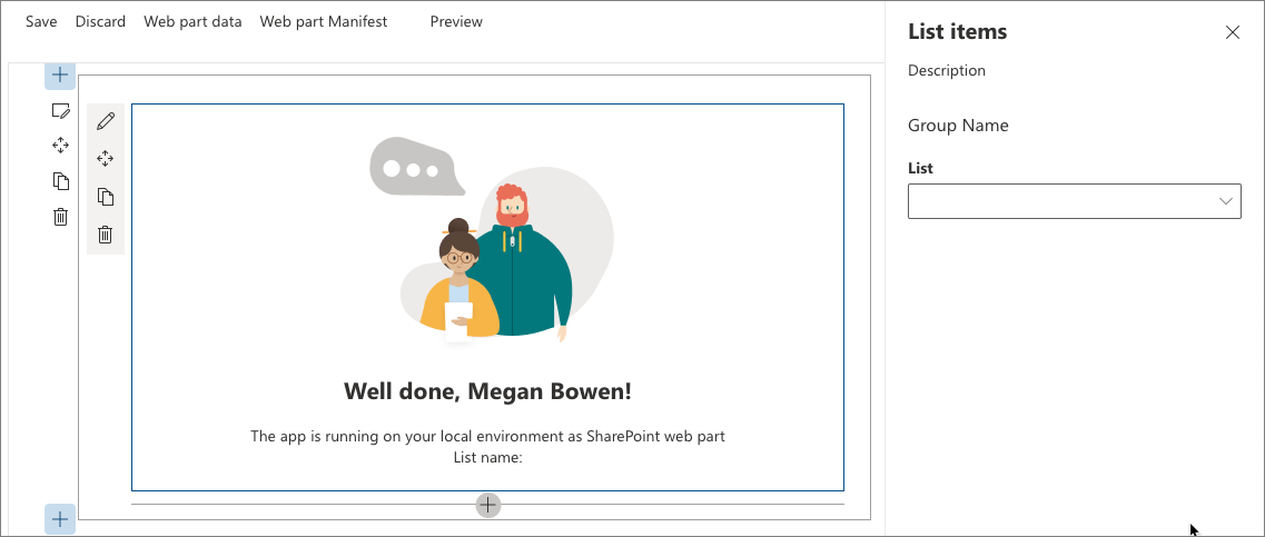
Implement cascading dropdowns using the asynchronous dropdown property pane control
When building SharePoint Framework web parts, you might need to implement a configuration where the available options depend on another option chosen previously. A common example is to first let users choose a list and from that list select a list item. The list of available items would depend on the selected list. Here is how to implement such a scenario by using the asynchronous dropdown property pane control implemented in previous steps.
Add item web part property
In the code editor, open the src/webparts/listItems/ListItemsWebPart.manifest.json file. To the
propertiessection, add a new property nameditemso that it appears as follows:{ ... "preconfiguredEntries": [{ ... "properties": { "description": "List items", "listName": "", "item": "" } }] }Change the code in the IListItemsWebPartProps interface in the src/webparts/listItems/ListItemsWebPart.ts file to:
export interface IListItemsWebPartProps {
  description: string;
  listName: string;
  item: string;
}
Update the contents of the src/webparts/listItems/components/IListItemsProps.ts file to add the
itemproperty:export interface IListItemsProps { ... listName: string; itemName: string; }In the src/webparts/listItems/ListItemsWebPart.ts file, change the code of the
render()method to include theitemproperty:export default class ListItemsWebPart extends BaseClientSideWebPart<IListItemsWebPartProps> { // ... public render(): void { const element: React.ReactElement<IListItemsProps> = React.createElement(ListItems, { listName: this.properties.listName, itemName: this.properties.item, ... }); ReactDom.render(element, this.domElement); } // ... }In the src/webparts/listItems/loc/mystrings.d.ts file, change the
IListItemsWebPartStringsinterface to include theItemFieldLabelproperty:declare interface IListItemsWebPartStrings { ... PropertyPaneDescription: string; BasicGroupName: string; ListFieldLabel: string; ItemFieldLabel: string; }In the src/webparts/listItems/loc/en-us.js file, add the missing definition for the
ItemFieldLabelstring:define([], function() { return { ... "PropertyPaneDescription": "Description", "BasicGroupName": "Group Name", "ListFieldLabel": "List", "ItemFieldLabel": "Item" } });
Render the value of the item web part property
In the src/webparts/listItems/components/ListItems.tsx file, change the render() method to:
export default class ListItems extends React.Component<IListItemsProps, {}> {
  public render(): React.ReactElement<IListItemsProps> {
    const {
      description,
      isDarkTheme,
      environmentMessage,
      hasTeamsContext,
      userDisplayName,
      listName,
      itemName
    } = this.props;

    return (
      <section className={`${styles.listItems} ${hasTeamsContext ? styles.teams : ''}`}>
        <div className={styles.welcome}>
          <img alt="" src={isDarkTheme ? require('../assets/welcome-dark.png') : require('../assets/welcome-light.png')} className={styles.welcomeImage} />
          <h2>Well done, {escape(userDisplayName)}!</h2>
          <div>{environmentMessage}</div>
          <div>List name: <strong>{escape(listName)}</strong></div>
          <div>Item name: <strong>{escape(itemName)}</strong></div>
        </div>
      </section>
    );
  }
}
Add method to load list items
In the src/webparts/listItems/ListItemsWebPart.ts file, in the ListItemsWebPart class, add a new method to load available list items from the selected list. Like the method for loading available lists, you use mock data. Depending on the previously selected list, the loadItems() method returns mock list items. When no list has been selected, the method resolves the promise without any data.
private loadItems(): Promise<IDropdownOption[]> {
  if (!this.properties.listName) {
    // resolve to empty options since no list has been selected
    return Promise.resolve([]);
  }

  const wp: ListItemsWebPart = this;

  return new Promise<IDropdownOption[]>((resolve: (options: IDropdownOption[]) => void, reject: (error: any) => void) => {
    setTimeout(() => {
      const items = {
        sharedDocuments: [
          {
            key: 'spfx_presentation.pptx',
            text: 'SPFx for the masses'
          },
          {
            key: 'hello-world.spapp',
            text: 'hello-world.spapp'
          }
        ],
        myDocuments: [
          {
            key: 'isaiah_cv.docx',
            text: 'Isaiah CV'
          },
          {
            key: 'isaiah_expenses.xlsx',
            text: 'Isaiah Expenses'
          }
        ]
      };
      resolve(items[wp.properties.listName]);
    }, 2000);
  });
}
Add method to handle the selection of an item
In the ListItemsWebPart class, add a new method named onListItemChange(). After selecting an item in the items dropdown, the web part should store the new value in web part properties and re-render the web part to reflect the changes in the user interface.
private onListItemChange(propertyPath: string, newValue: any): void {
  const oldValue: any = get(this.properties, propertyPath);
  // store new value in web part properties
  update(this.properties, propertyPath, (): any => { return newValue; });
  // refresh web part
  this.render();
}
Render the item web part property in the property pane
In the
ListItemsWebPartclass, add a new class property nameditemsDropdown:export default class ListItemsWebPart extends BaseClientSideWebPart<IListItemsWebPartProps> { private itemsDropDown: PropertyPaneAsyncDropdown; // ... }Change the code of the
getPropertyPaneConfiguration()method to:export default class ListItemsWebPart extends BaseClientSideWebPart<IListItemsWebPartProps> { // ... protected getPropertyPaneConfiguration(): IPropertyPaneConfiguration { // reference to item dropdown needed later after selecting a list this.itemsDropDown = new PropertyPaneAsyncDropdown('item', { label: strings.ItemFieldLabel, loadOptions: this.loadItems.bind(this), onPropertyChange: this.onListItemChange.bind(this), selectedKey: this.properties.item, // should be disabled if no list has been selected disabled: !this.properties.listName }); return { pages: [ { header: { description: strings.PropertyPaneDescription }, groups: [ { groupName: strings.BasicGroupName, groupFields: [ new PropertyPaneAsyncDropdown('listName', { label: strings.ListFieldLabel, loadOptions: this.loadLists.bind(this), onPropertyChange: this.onListChange.bind(this), selectedKey: this.properties.listName }), this.itemsDropDown ] } ] } ] }; } // ... }The dropdown for the item property is initialized similarly to the dropdown for the listName property. The only difference is because after selecting a list, the items dropdown has to be refreshed, an instance of the control has to be assigned to the class variable.
Load items for the selected list
Initially when no list is selected, the items dropdown is disabled and becomes enabled after the user selects a list. After selecting a list, the items dropdown also loads list items from that list.
To implement this logic, extend the previously defined
onListChange()method to:private onListChange(propertyPath: string, newValue: any): void { const oldValue: any = get(this.properties, propertyPath); // store new value in web part properties update(this.properties, propertyPath, (): any => { return newValue; }); // reset selected item this.properties.item = undefined; // store new value in web part properties update(this.properties, 'item', (): any => { return this.properties.item; }); // refresh web part this.render(); // reset selected values in item dropdown this.itemsDropDown.properties.selectedKey = this.properties.item; // allow to load items this.itemsDropDown.properties.disabled = false; // load items and re-render items dropdown this.itemsDropDown.render(); }After selecting a list, the selected item is reset, persisted in web part properties, and reset in the items dropdown. The dropdown for selecting an item becomes enabled, and the dropdown is refreshed to load its options.
To verify that everything is working as expected, in the console run:
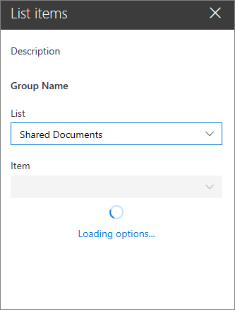
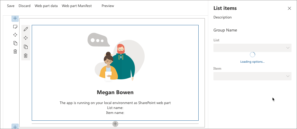
gulp serveAfter adding the web part to the page for the first time and opening its property pane, you should see both dropdowns disabled and loading their options.
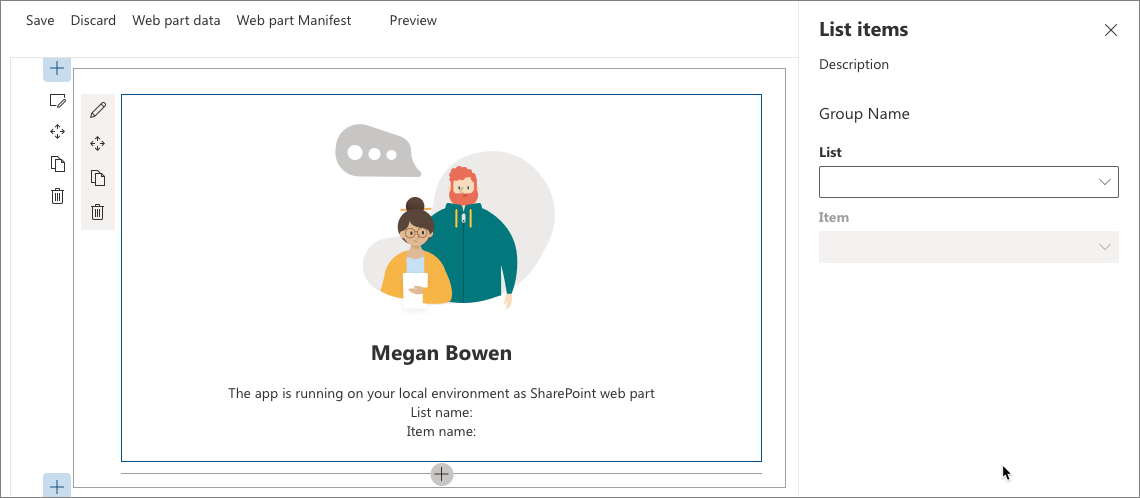
After the options have been loaded, the list dropdown becomes enabled. Because no list has been selected yet, the item dropdown remains disabled.
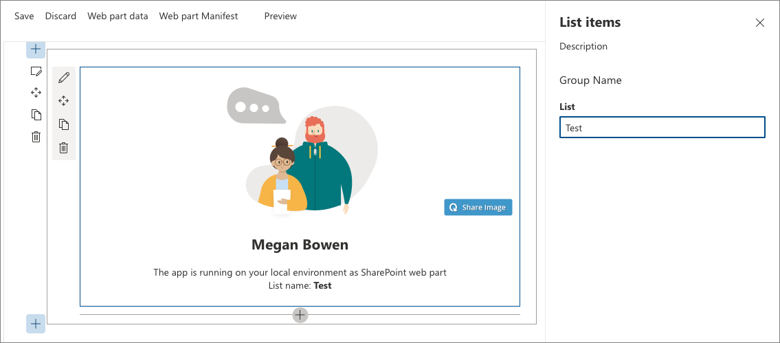
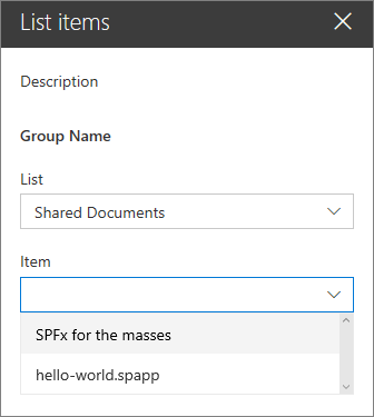
After selecting a list in the list dropdown the item dropdown will load items available in that list.
After the available items have been loaded, the item dropdown becomes enabled.
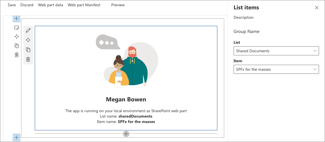
After selecting an item in the item dropdown the web part is refreshed showing the selected item in its body.
Stop the local webserver by pressing CTRL+C in the console.
See also
Feedback
Coming soon: Throughout 2024 we will be phasing out GitHub Issues as the feedback mechanism for content and replacing it with a new feedback system. For more information see: https://aka.ms/ContentUserFeedback.
Submit and view feedback for