Öğretici: Avokado fiyatlarını tahmin etmek için R kullanma
Bu öğretici, Microsoft Fabric'te Synapse Veri Bilimi iş akışının uçtan uca bir örneğini sunar. R kullanarak Birleşik Devletler avokado fiyatlarını analiz eder ve görselleştirir ve gelecekteki avokado fiyatlarını tahmin eden bir makine öğrenmesi modeli oluşturur.
Bu öğretici şu adımları kapsar:
- Varsayılan kitaplıkları yükleme
- Verileri yükleme
- Verileri özelleştirme
- Oturuma yeni paketler ekleme
- Verileri analiz etme ve görselleştirme
- Modeli eğitme

Önkoşullar
Microsoft Fabric aboneliği alın. Alternatif olarak, ücretsiz bir Microsoft Fabric deneme sürümüne kaydolun.
Ana sayfanızın sol alt tarafındaki deneyim değiştiriciyi kullanarak Fabric'e geçin.
Not defterini açın veya oluşturun. Nasıl yapılacağını öğrenmek için bkz . Microsoft Fabric not defterlerini kullanma.
Birincil dili değiştirmek için dil seçeneğini SparkR (R) olarak ayarlayın.
Not defterinizi bir göle ekleyin. Sol tarafta Ekle'yi seçerek mevcut bir göl evi ekleyin veya bir göl evi oluşturun.
Kitaplıkları yükleme
Varsayılan R çalışma zamanından kitaplıkları kullanın:
library(tidyverse)
library(lubridate)
library(hms)
Verileri yükleme
Bir avokado fiyatlarını okuyun. İnternet'ten indirilen CSV dosyası:
df <- read.csv('https://synapseaisolutionsa.blob.core.windows.net/public/AvocadoPrice/avocado.csv', header = TRUE)
head(df,5)
Verileri işleme
İlk olarak sütunlara daha kolay adlar verin.
# To use lowercase
names(df) <- tolower(names(df))

# To use snake case
avocado <- df %>%
  rename("av_index" = "x",
         "average_price" = "averageprice",
         "total_volume" = "total.volume",
         "total_bags" = "total.bags",
         "amount_from_small_bags" = "small.bags",
         "amount_from_large_bags" = "large.bags",
         "amount_from_xlarge_bags" = "xlarge.bags")

# Rename codes
avocado2 <- avocado %>%
  rename("PLU4046" = "x4046",
         "PLU4225" = "x4225",
         "PLU4770" = "x4770")

head(avocado2,5)
Veri türlerini değiştirin, istenmeyen sütunları kaldırın ve toplam tüketimi ekleyin:
# Convert data
avocado2$year = as.factor(avocado2$year)
avocado2$date = as.Date(avocado2$date)
avocado2$month  = factor(months(avocado2$date), levels = month.name)
avocado2$average_price =as.numeric(avocado2$average_price)
avocado2$PLU4046 = as.double(avocado2$PLU4046)
avocado2$PLU4225 = as.double(avocado2$PLU4225)
avocado2$PLU4770 = as.double(avocado2$PLU4770)
avocado2$amount_from_small_bags = as.numeric(avocado2$amount_from_small_bags)
avocado2$amount_from_large_bags = as.numeric(avocado2$amount_from_large_bags)
avocado2$amount_from_xlarge_bags = as.numeric(avocado2$amount_from_xlarge_bags)


# Remove unwanted columns
avocado2 <- avocado2 %>%
  select(-av_index,-total_volume, -total_bags)

# Calculate total consumption
avocado2 <- avocado2 %>%
  mutate(total_consumption = PLU4046 + PLU4225 + PLU4770 + amount_from_small_bags + amount_from_large_bags + amount_from_xlarge_bags)
Yeni paketleri yükleme
Oturuma yeni paketler eklemek için satır içi paket yüklemesini kullanın:
install.packages(c("repr","gridExtra","fpp2"))
Gerekli kitaplıkları yükleyin.
library(tidyverse)
library(knitr)
library(repr)
library(gridExtra)
library(data.table)
Verileri analiz etme ve görselleştirme
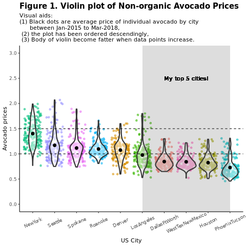
Bölgeye göre geleneksel (nonorganik) avokado fiyatlarını karşılaştırın:
options(repr.plot.width = 10, repr.plot.height =10)
# filter(mydata, gear %in% c(4,5))
avocado2 %>%
  filter(region %in% c("PhoenixTucson","Houston","WestTexNewMexico","DallasFtWorth","LosAngeles","Denver","Roanoke","Seattle","Spokane","NewYork")) %>%
  filter(type == "conventional") %>%
  select(date, region, average_price) %>%
  ggplot(aes(x = reorder(region, -average_price, na.rm = T), y = average_price)) +
  geom_jitter(aes(colour = region, alpha = 0.5)) +
  geom_violin(outlier.shape = NA, alpha = 0.5, size = 1) +
  geom_hline(yintercept = 1.5, linetype = 2) +
  geom_hline(yintercept = 1, linetype = 2) +
  annotate("rect", xmin = "LosAngeles", xmax = "PhoenixTucson", ymin = -Inf, ymax = Inf, alpha = 0.2) +
  geom_text(x = "WestTexNewMexico", y = 2.5, label = "My top 5 cities!", hjust = 0.5) +
  stat_summary(fun = "mean") +
  labs(x = "US city",
       y = "Avocado prices",
       title = "Figure 1. Violin plot of nonorganic avocado prices",
       subtitle = "Visual aids: \n(1) Black dots are average prices of individual avocados by city \n     between January 2015 and March 2018. \n(2) The plot is ordered descendingly.\n(3) The body of the violin becomes fatter when data points increase.") +
  theme_classic() +
  theme(legend.position = "none",
        axis.text.x = element_text(angle = 25, vjust = 0.65),
        plot.title = element_text(face = "bold", size = 15)) +
  scale_y_continuous(lim = c(0, 3), breaks = seq(0, 3, 0.5))
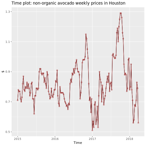
Houston bölgesine odaklanın.
library(fpp2)
conv_houston <- avocado2 %>%
  filter(region == "Houston",
         type == "conventional") %>%
  group_by(date) %>%
  summarise(average_price = mean(average_price))

# Set up ts

conv_houston_ts <- ts(conv_houston$average_price,
                 start = c(2015, 1),
                 frequency = 52)
# Plot

autoplot(conv_houston_ts) +
  labs(title = "Time plot: nonorganic avocado weekly prices in Houston",
       y = "$") +
  geom_point(colour = "brown", shape = 21) +
  geom_path(colour = "brown")
Makine öğrenmesi modeli eğitme
Houston bölgesi için AutoRegressive Integrated Moving Average (ARIMA) temelinde bir fiyat tahmini modeli oluşturun:
conv_houston_ts_arima <- auto.arima(conv_houston_ts,
                                    d = 1,
                                    approximation = F,
                                    stepwise = F,
                                    trace = T)
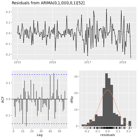
checkresiduals(conv_houston_ts_arima)
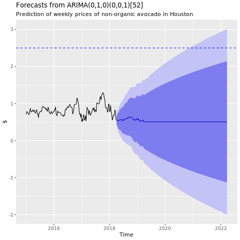
Houston ARIMA modelinden tahminlerin grafiğini göster:
conv_houston_ts_arima_fc <- forecast(conv_houston_ts_arima, h = 208)

autoplot(conv_houston_ts_arima_fc) + labs(subtitle = "Prediction of weekly prices of nonorganic avocados in Houston",
       y = "$") +
  geom_hline(yintercept = 2.5, linetype = 2, colour = "blue")