Not
Bu sayfaya erişim yetkilendirme gerektiriyor. Oturum açmayı veya dizinleri değiştirmeyi deneyebilirsiniz.
Bu sayfaya erişim yetkilendirme gerektiriyor. Dizinleri değiştirmeyi deneyebilirsiniz.
Bu konu başlığında Windows uygulamalarında komutu açıklıyoruz. Özellikle, kullanılan cihaz ve giriş türüne bakılmaksızın çeşitli denetim türlerinde komutları paylaşmak ve yönetmek için XamlUICommand ve StandardUICommand sınıflarını (ICommand arabirimiyle birlikte) nasıl kullanabileceğinizi tartışacağız.
Cihaz ve giriş türünden bağımsız olarak komutları çeşitli denetimler arasında paylaşma
Önemli API'ler
Genel Bakış
Komutlar, bir düğmeye tıklama veya bağlam menüsünden bir öğe seçme gibi kullanıcı arabirimi etkileşimleri aracılığıyla doğrudan çağrılabilir. Bunlar klavye hızlandırıcısı, hareket, konuşma tanıma veya otomasyon/erişilebilirlik aracı gibi bir giriş cihazı aracılığıyla dolaylı olarak da çağrılabilir. Komut çağrıldıktan sonra bir denetim (düzenleme denetiminde metin gezintisi), bir pencere (arka gezinti) veya uygulama (çıkış) tarafından işlenebilir.
Komutlar, uygulamanızdaki metin silme veya eylemi geri alma gibi belirli bir bağlam üzerinde çalışabilir veya sesi kapatma veya parlaklığı ayarlama gibi bağlamsız olabilir.
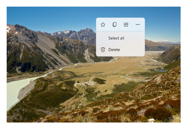
Aşağıdaki görüntüde, aynı komutlardan bazılarını paylaşan iki komut arabirimi ( CommandBar ve kayan bağlamsal CommandBarFlyout) gösterilmektedir.
Komut çubuğu
Microsoft Fotoğraflar galerisindeki bağlam menüsü
Komut etkileşimleri
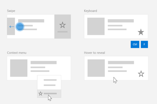
Bir komutun çağrılma biçimini etkileyebilecek çeşitli cihazlar, giriş türleri ve kullanıcı arabirimi yüzeyleri nedeniyle komutlarınızı mümkün olduğunca çok komut yüzeyi aracılığıyla kullanıma çıkarmanızı öneririz. Bunlar, Swipe, Menü Çubuğu, CommandBar, CommandBarFlyout ve geleneksel bağlam menüsü birleşimini içerebilir.
Kritik komutlar için girişe özgü hızlandırıcıları kullanın. Giriş hızlandırıcıları, kullanıcının kullandığı giriş cihazına bağlı olarak eylemleri daha hızlı gerçekleştirmesini sağlar.
Çeşitli giriş türleri için bazı yaygın giriş hızlandırıcıları şunlardır:
- İşaretçi - Fare & Kalem vurgulama düğmeleri
- Klavye - Kısayollar (erişim tuşları ve hızlandırıcı tuşları)
- Dokunma - Kaydırma
- Dokunma - Verileri yenilemek için çekme
Uygulamanızın işlevselliğini evrensel olarak erişilebilir hale getirmek için giriş türünü ve kullanıcı deneyimlerini dikkate almanız gerekir. Örneğin, koleksiyonlar (özellikle de kullanıcı tarafından düzenlenebilir olanlar), genellikle giriş cihazına bağlı olarak oldukça farklı gerçekleştirilen çeşitli belirli komutları içerir.
Aşağıdaki tabloda bazı tipik koleksiyon komutları ve bu komutları kullanıma sunma yolları gösterilmektedir.
| Command | Giriş-belirsiz | Fare hızlandırıcısı | Klavye hızlandırıcısı | Dokunmatik hızlandırıcı |
|---|---|---|---|---|
| Öğeyi sil | Bağlam menüsü | Vurgula düğmesi | DEL tuşu | Silmek için kaydırın |
| Öğeyi işaretle | Bağlam menüsü | Vurgula düğmesi | Ctrl+Shift+G | Bayraklamak için kaydır |
| Verileri yenileme | Bağlam menüsü | Yok | F5 tuşu | Yenilemek için çekme |
| Öğeyi sık kullanılanlara ekleme | Bağlam menüsü | Vurgula düğmesi | F, Ctrl+S | Favorilere kaydır |
Her zaman bir bağlam menüsü sağlayın Her ikisi de tüm giriş türleri için desteklendiği için tüm ilgili bağlamsal komutları geleneksel bağlam menüsüne veya CommandBarFlyout'a eklemenizi öneririz. Örneğin, bir komut yalnızca işaretçiyle vurgulama olayı sırasında gösteriliyorsa, yalnızca dokunmatik bir cihazda kullanılamaz.
Windows uygulamalarında komutlar
Bir Windows uygulamasında komut deneyimlerini paylaşmanın ve yönetmenin birkaç yolu vardır. Arka planda kodda Click gibi standart etkileşimler için olay işleyicileri tanımlayabilirsiniz (kullanıcı arabiriminizin karmaşıklığına bağlı olarak bu oldukça verimsiz olabilir), paylaşılan işleyiciye standart etkileşimler için olay dinleyicisini bağlayabilir veya denetimin Command özelliğini komut mantığını açıklayan bir ICommand uygulamasına bağlayabilirsiniz.
Komut yüzeylerinde verimli ve en az kod yinelemesi ile zengin ve kapsamlı kullanıcı deneyimleri sağlamak için, bu konuda açıklanan komut bağlama özelliklerini kullanmanızı öneririz (standart olay işleme için tek tek olay konularına bakın).
Paylaşılan komut kaynağına denetim bağlamak için, ICommand arabirimlerini kendiniz uygulayabilir veya komutunuzu XamlUICommand temel sınıfından veya StandardUICommand türetilmiş sınıfı tarafından tanımlanan platform komutlarından birinden oluşturabilirsiniz.
- ICommand arabirimi (Windows.UI.Xaml.Input.ICommand veya System.Windows.Input.ICommand), uygulamanız genelinde tamamen özelleştirilmiş, yeniden kullanılabilir komutlar oluşturmanıza olanak tanır.
- XamlUICommand ayrıca bu özelliği sağlar ancak komut davranışı, klavye kısayolları (erişim tuşu ve hızlandırıcı tuşu), simge, etiket ve açıklama gibi yerleşik komut özellikleri kümesini kullanıma sunarak geliştirmeyi basitleştirir.
- StandardUICommand , önceden tanımlanmış özelliklere sahip bir dizi standart platform komutu arasından seçim yapmanıza izin vererek işleri daha da basitleştirir.
Önemli
WinUI uygulamalarında komutlar, seçtiğiniz dil çerçevesine bağlı olarak Windows.UI.Xaml.Input.ICommand (C++) veya System.Windows.Input.ICommand (C#) arabiriminin uygulamalarıdır.
StandardUICommand sınıfını kullanarak komut deneyimleri
XamlUICommand'dan türetilen (C++ için Windows.UI.Xaml.Input.ICommand veya C# için System.Windows.Input.ICommand'dan türetilir), StandardUICommand sınıfı simge, klavye hızlandırıcısı ve açıklama gibi önceden tanımlanmış özelliklere sahip bir dizi standart platform komutunu kullanıma sunar.
StandardUICommand, veya Savegibi Delete yaygın komutları tanımlamak için hızlı ve tutarlı bir yol sağlar. Tek yapmanız gereken execute ve canExecute işlevlerini sağlamaktır.
Example
StandardUICommandSample
| Bu örneğin kodunu indirin |
|---|
| Komut örneği (StandardUICommand) |
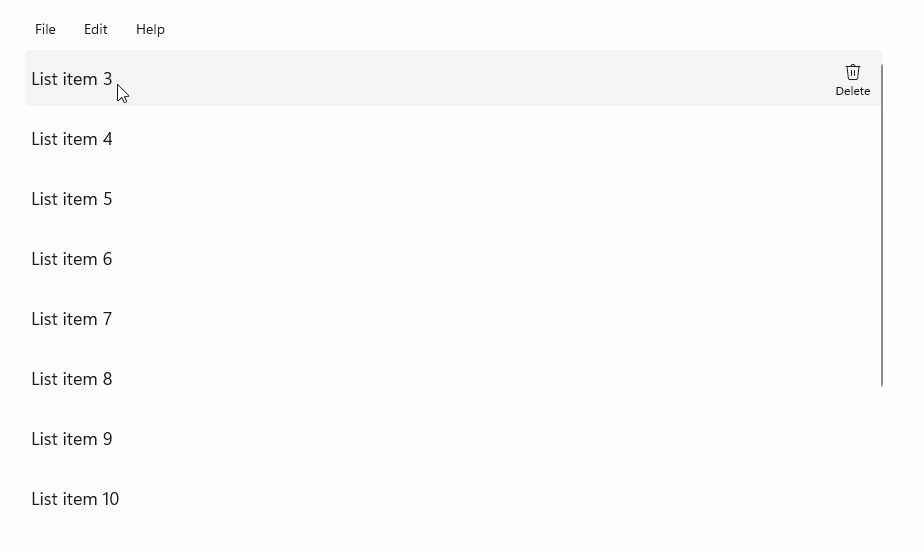
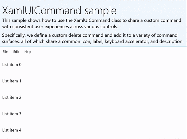
Bu örnekte, Bir MenuBar, Çekme denetimi, vurgulama düğmeleri ve bağlam menüsü kullanarak çeşitli giriş türleri için kullanıcı deneyimini iyileştirirken StandardUICommand sınıfı aracılığıyla uygulanan bir Öğeyi sil komutuyla temel bir ListView'un nasıl geliştirileceklerini göstereceğiz.
Xaml:
Örnek kullanıcı arabirimi beş öğeden oluşan bir ListView içerir. Delete StandardUICommand, MenuBarItem, SwipeItem, AppBarButton ve ContextFlyout menüsüne bağlıdır.
<Page
    x:Class="StandardUICommandSample.MainPage"
    xmlns="http://schemas.microsoft.com/winfx/2006/xaml/presentation"
    xmlns:x="http://schemas.microsoft.com/winfx/2006/xaml"
    xmlns:local="using:StandardUICommandSample"
    xmlns:d="http://schemas.microsoft.com/expression/blend/2008"
    xmlns:mc="http://schemas.openxmlformats.org/markup-compatibility/2006"
    xmlns:muxcontrols="using:Microsoft.UI.Xaml.Controls"
    mc:Ignorable="d"
    Background="{ThemeResource ApplicationPageBackgroundThemeBrush}">

    <Page.Resources>
        <Style x:Key="HorizontalSwipe"
               TargetType="ListViewItem"
               BasedOn="{StaticResource ListViewItemRevealStyle}">
            <Setter Property="Height" Value="60"/>
            <Setter Property="Padding" Value="0"/>
            <Setter Property="HorizontalContentAlignment" Value="Stretch"/>
            <Setter Property="VerticalContentAlignment" Value="Stretch"/>
            <Setter Property="BorderThickness" Value="0"/>
        </Style>
    </Page.Resources>

    <Grid Loaded="ControlExample_Loaded">
        <Grid.RowDefinitions>
            <RowDefinition Height="Auto" />
            <RowDefinition Height="Auto" />
            <RowDefinition Height="*"/>
        </Grid.RowDefinitions>

        <StackPanel Grid.Row="0"
                    Padding="10"
                    BorderThickness="0,0,0,1"
                    BorderBrush="LightBlue"
                    Background="AliceBlue">
            <TextBlock Style="{StaticResource HeaderTextBlockStyle}">
                StandardUICommand sample
            </TextBlock>
            <TextBlock Style="{StaticResource SubtitleTextBlockStyle}" Margin="0,0,0,10">
                This sample shows how to use the StandardUICommand class to
                share a platform command and consistent user experiences
                across various controls.
            </TextBlock>
            <TextBlock Style="{StaticResource SubtitleTextBlockStyle}" Margin="0,0,0,0">
                Specifically, we define a standard delete command and add it
                to a variety of command surfaces, all of which share a common
                icon, label, keyboard accelerator, and description.
            </TextBlock>
        </StackPanel>

        <muxcontrols:MenuBar Grid.Row="1" Padding="10">
            <muxcontrols:MenuBarItem Title="File">
            </muxcontrols:MenuBarItem>
            <muxcontrols:MenuBarItem Title="Edit">
                <MenuFlyoutItem x:Name="DeleteFlyoutItem"/>
            </muxcontrols:MenuBarItem>
            <muxcontrols:MenuBarItem Title="Help">
            </muxcontrols:MenuBarItem>
        </muxcontrols:MenuBar>

        <ListView x:Name="ListViewRight" Grid.Row="2"
                  Loaded="ListView_Loaded"
                  IsItemClickEnabled="True"
                  SelectionMode="Single"
                  SelectionChanged="ListView_SelectionChanged"
                  ItemContainerStyle="{StaticResource HorizontalSwipe}">
            <ListView.ItemTemplate>
                <DataTemplate x:DataType="local:ListItemData">
                    <UserControl PointerEntered="ListViewSwipeContainer_PointerEntered"
                                 PointerExited="ListViewSwipeContainer_PointerExited">
                        <UserControl.ContextFlyout>
                            <MenuFlyout>
                                <MenuFlyoutItem
                                    Command="{x:Bind Command}"
                                    CommandParameter="{x:Bind Text}" />
                            </MenuFlyout>
                        </UserControl.ContextFlyout>
                        <Grid AutomationProperties.Name="{x:Bind Text}">
                            <VisualStateManager.VisualStateGroups>
                                <VisualStateGroup x:Name="HoveringStates">
                                    <VisualState x:Name="HoverButtonsHidden" />
                                    <VisualState x:Name="HoverButtonsShown">
                                        <VisualState.Setters>
                                            <Setter Target="HoverButton.Visibility"
                                                    Value="Visible" />
                                        </VisualState.Setters>
                                    </VisualState>
                                </VisualStateGroup>
                            </VisualStateManager.VisualStateGroups>
                            <SwipeControl x:Name="ListViewSwipeContainer" >
                                <SwipeControl.RightItems>
                                    <SwipeItems Mode="Execute">
                                        <SwipeItem x:Name="DeleteSwipeItem"
                                                   Background="Red"
                                                   Command="{x:Bind Command}"
                                                   CommandParameter="{x:Bind Text}"/>
                                    </SwipeItems>
                                </SwipeControl.RightItems>
                                <Grid VerticalAlignment="Center">
                                    <TextBlock Text="{x:Bind Text}"
                                               Margin="10"
                                               FontSize="18"
                                               HorizontalAlignment="Left"
                                               VerticalAlignment="Center"/>
                                    <AppBarButton x:Name="HoverButton"
                                                  IsTabStop="False"
                                                  HorizontalAlignment="Right"
                                                  Visibility="Collapsed"
                                                  Command="{x:Bind Command}"
                                                  CommandParameter="{x:Bind Text}"/>
                                </Grid>
                            </SwipeControl>
                        </Grid>
                    </UserControl>
                </DataTemplate>
            </ListView.ItemTemplate>
        </ListView>
    </Grid>
</Page>
Arka planda kod
- İlk olarak, ListView'umuzdaki her ListViewItem için bir metin dizesi ve ICommand içeren bir sınıf tanımlayacağız
ListItemData.
public class ListItemData
{
    public String Text { get; set; }
    public ICommand Command { get; set; }
}
- MainPage sınıfında,
ListItemDataItemTemplate'ın DataTemplate için bir nesne koleksiyonu tanımladık. Ardından beş öğeden oluşan metin içeren ilk koleksiyonla ve ilişkili StandardUICommand Delete komutu ile doldururuz.
/// <summary>
/// ListView item collection.
/// </summary>
ObservableCollection<ListItemData> collection =
    new ObservableCollection<ListItemData>();

/// <summary>
/// Handler for the layout Grid control load event.
/// </summary>
/// <param name="sender">Source of the control loaded event</param>
/// <param name="e">Event args for the loaded event</param>
private void ControlExample_Loaded(object sender, RoutedEventArgs e)
{
    // Create the standard Delete command.
    var deleteCommand = new StandardUICommand(StandardUICommandKind.Delete);
    deleteCommand.ExecuteRequested += DeleteCommand_ExecuteRequested;

    DeleteFlyoutItem.Command = deleteCommand;

    for (var i = 0; i < 5; i++)
    {
        collection.Add(
            new ListItemData {
                Text = "List item " + i.ToString(),
                Command = deleteCommand });
    }
}

/// <summary>
/// Handler for the ListView control load event.
/// </summary>
/// <param name="sender">Source of the control loaded event</param>
/// <param name="e">Event args for the loaded event</param>
private void ListView_Loaded(object sender, RoutedEventArgs e)
{
    var listView = (ListView)sender;
    // Populate the ListView with the item collection.
    listView.ItemsSource = collection;
}
- Ardından, öğe silme komutunu uyguladığımız ICommand ExecuteRequested işleyicisini tanımlayacağız.
/// <summary>
/// Handler for the Delete command.
/// </summary>
/// <param name="sender">Source of the command event</param>
/// <param name="e">Event args for the command event</param>
private void DeleteCommand_ExecuteRequested(
    XamlUICommand sender, ExecuteRequestedEventArgs args)
{
    // If possible, remove specified item from collection.
    if (args.Parameter != null)
    {
        foreach (var i in collection)
        {
            if (i.Text == (args.Parameter as string))
            {
                collection.Remove(i);
                return;
            }
        }
    }
    if (ListViewRight.SelectedIndex != -1)
    {
        collection.RemoveAt(ListViewRight.SelectedIndex);
    }
}
- Son olarak PointerEntered, PointerExited ve SelectionChanged olayları da dahil olmak üzere çeşitli ListView olayları için işleyiciler tanımlıyoruz. İşaretçi olay işleyicileri, her öğenin Sil düğmesini göstermek veya gizlemek için kullanılır.
/// <summary>
/// Handler for the ListView selection changed event.
/// </summary>
/// <param name="sender">Source of the selection changed event</param>
/// <param name="e">Event args for the selection changed event</param>
private void ListView_SelectionChanged(object sender, SelectionChangedEventArgs e)
{
    if (ListViewRight.SelectedIndex != -1)
    {
        var item = collection[ListViewRight.SelectedIndex];
    }
}

/// <summary>
/// Handler for the pointer entered event.
/// Displays the delete item "hover" buttons.
/// </summary>
/// <param name="sender">Source of the pointer entered event</param>
/// <param name="e">Event args for the pointer entered event</param>
private void ListViewSwipeContainer_PointerEntered(
    object sender, PointerRoutedEventArgs e)
{
    if (e.Pointer.PointerDeviceType ==
        Windows.Devices.Input.PointerDeviceType.Mouse ||
        e.Pointer.PointerDeviceType ==
        Windows.Devices.Input.PointerDeviceType.Pen)
    {
        VisualStateManager.GoToState(
            sender as Control, "HoverButtonsShown", true);
    }
}

/// <summary>
/// Handler for the pointer exited event.
/// Hides the delete item "hover" buttons.
/// </summary>
/// <param name="sender">Source of the pointer exited event</param>
/// <param name="e">Event args for the pointer exited event</param>

private void ListViewSwipeContainer_PointerExited(
    object sender, PointerRoutedEventArgs e)
{
    VisualStateManager.GoToState(
        sender as Control, "HoverButtonsHidden", true);
}
XamlUICommand sınıfını kullanarak komut deneyimleri
StandardUICommand sınıfı tarafından tanımlanmayan bir komut oluşturmanız gerekiyorsa veya komut görünümü üzerinde daha fazla denetim sahibi olmak istiyorsanız, XamlUICommand sınıfı ICommand arabiriminden türetilir ve özel bir komutun kullanıcı arabirimini ve davranışını hızla tanımlamak için çeşitli kullanıcı arabirimi özellikleri (simge, etiket, açıklama ve klavye kısayolları gibi), yöntemler ve olaylar ekler.
XamlUICommand , tek tek özellikleri ayarlamadan denetim bağlaması aracılığıyla simge, etiket, açıklama ve klavye kısayolları (hem erişim tuşu hem de klavye hızlandırıcısı) gibi kullanıcı arabirimini belirtmenize olanak tanır.
Example
XamlUICommandSample
| Bu örneğin kodunu indirme | | -------------------- | | WinUI komut örneği (XamlUICommand) | | Bu örneğin kodunu indirme | | -------------------- | | Komut örneği (XamlUICommand) | Birçok platform denetimi, önceki bölümdeki StandardUICommand örneğimizde olduğu gibi, kapakların altındaki XamlUICommand özelliklerini kullanır.
Xaml:
Örnek kullanıcı arabirimi beş öğeden oluşan bir ListView içerir. Özel XamlUICommand CustomXamlUICommand bir MenuBarItem, SwipeItem, AppBarButton ve ContextFlyout menüsüne bağlıdır.
<Page
x:Class="XamlUICommand_Sample.MainPage"
xmlns="http://schemas.microsoft.com/winfx/2006/xaml/presentation"
xmlns:x="http://schemas.microsoft.com/winfx/2006/xaml"
xmlns:local="using:XamlUICommand_Sample"
xmlns:d="http://schemas.microsoft.com/expression/blend/2008"
xmlns:mc="http://schemas.openxmlformats.org/markup-compatibility/2006"
xmlns:muxcontrols="using:Microsoft.UI.Xaml.Controls"
mc:Ignorable="d"
Background="{ThemeResource ApplicationPageBackgroundThemeBrush}">
<Page.Resources>
<XamlUICommand x:Name="CustomXamlUICommand"
ExecuteRequested="DeleteCommand_ExecuteRequested"
Description="Custom XamlUICommand"
Label="Custom XamlUICommand">
<XamlUICommand.IconSource>
<FontIconSource FontFamily="Wingdings" Glyph="M"/>
</XamlUICommand.IconSource>
<XamlUICommand.KeyboardAccelerators>
<KeyboardAccelerator Key="D" Modifiers="Control"/>
</XamlUICommand.KeyboardAccelerators>
</XamlUICommand>
<Style x:Key="HorizontalSwipe"
TargetType="ListViewItem"
BasedOn="{StaticResource ListViewItemRevealStyle}">
<Setter Property="Height" Value="70"/>
<Setter Property="Padding" Value="0"/>
<Setter Property="HorizontalContentAlignment" Value="Stretch"/>
<Setter Property="VerticalContentAlignment" Value="Stretch"/>
<Setter Property="BorderThickness" Value="0"/>
</Style>
</Page.Resources>
<Grid Loaded="ControlExample_Loaded" Name="MainGrid">
<Grid.RowDefinitions>
<RowDefinition Height="Auto" />
<RowDefinition Height="Auto" />
<RowDefinition Height="*"/>
</Grid.RowDefinitions>
<StackPanel Grid.Row="0"
Padding="10"
BorderThickness="0,0,0,1"
BorderBrush="LightBlue"
Background="AliceBlue">
<TextBlock Style="{StaticResource HeaderTextBlockStyle}">
XamlUICommand sample
</TextBlock>
<TextBlock Style="{StaticResource SubtitleTextBlockStyle}" Margin="0,0,0,10">
This sample shows how to use the XamlUICommand class to
share a custom command with consistent user experiences
across various controls.
</TextBlock>
<TextBlock Style="{StaticResource SubtitleTextBlockStyle}" Margin="0,0,0,0">
Specifically, we define a custom delete command and add it
to a variety of command surfaces, all of which share a common
icon, label, keyboard accelerator, and description.
</TextBlock>
</StackPanel>
<muxcontrols:MenuBar Grid.Row="1">
<muxcontrols:MenuBarItem Title="File">
</muxcontrols:MenuBarItem>
<muxcontrols:MenuBarItem Title="Edit">
<MenuFlyoutItem x:Name="DeleteFlyoutItem"
Command="{StaticResource CustomXamlUICommand}"/>
</muxcontrols:MenuBarItem>
<muxcontrols:MenuBarItem Title="Help">
</muxcontrols:MenuBarItem>
</muxcontrols:MenuBar>
<ListView x:Name="ListViewRight" Grid.Row="2"
Loaded="ListView_Loaded"
IsItemClickEnabled="True"
SelectionMode="Single"
SelectionChanged="ListView_SelectionChanged"
ItemContainerStyle="{StaticResource HorizontalSwipe}">
<ListView.ItemTemplate>
<DataTemplate x:DataType="local:ListItemData">
<UserControl PointerEntered="ListViewSwipeContainer_PointerEntered"
PointerExited="ListViewSwipeContainer_PointerExited">
<UserControl.ContextFlyout>
<MenuFlyout>
<MenuFlyoutItem
Command="{x:Bind Command}"
CommandParameter="{x:Bind Text}" />
</MenuFlyout>
</UserControl.ContextFlyout>
<Grid AutomationProperties.Name="{x:Bind Text}">
<VisualStateManager.VisualStateGroups>
<VisualStateGroup x:Name="HoveringStates">
<VisualState x:Name="HoverButtonsHidden" />
<VisualState x:Name="HoverButtonsShown">
<VisualState.Setters>
<Setter Target="HoverButton.Visibility"
Value="Visible" />
</VisualState.Setters>
</VisualState>
</VisualStateGroup>
</VisualStateManager.VisualStateGroups>
<SwipeControl x:Name="ListViewSwipeContainer">
<SwipeControl.RightItems>
<SwipeItems Mode="Execute">
<SwipeItem x:Name="DeleteSwipeItem"
Background="Red"
Command="{x:Bind Command}"
CommandParameter="{x:Bind Text}"/>
</SwipeItems>
</SwipeControl.RightItems>
<Grid VerticalAlignment="Center">
<TextBlock Text="{x:Bind Text}"
Margin="10"
FontSize="18"
HorizontalAlignment="Left"
VerticalAlignment="Center"/>
<AppBarButton x:Name="HoverButton"
IsTabStop="False"
HorizontalAlignment="Right"
Visibility="Collapsed"
Command="{x:Bind Command}"
CommandParameter="{x:Bind Text}"/>
</Grid>
</SwipeControl>
</Grid>
</UserControl>
</DataTemplate>
</ListView.ItemTemplate>
</ListView>
</Grid>
</Page>
Arka planda kod
- İlk olarak, ListView'umuzdaki her ListViewItem için bir metin dizesi ve ICommand içeren bir sınıf tanımlayacağız
ListItemData.
public class ListItemData
{
    public String Text { get; set; }
    public ICommand Command { get; set; }
}
- MainPage sınıfında,
ListItemDataItemTemplate'ın DataTemplate için bir nesne koleksiyonu tanımladık. Ardından, ilk olarak metin ve ilişkili XamlUICommand içeren beş öğeden oluşan bir koleksiyonla onu doldururuz.
ObservableCollection<ListItemData> collection = new ObservableCollection<ListItemData>();

private void ControlExample_Loaded(object sender, RoutedEventArgs e)
{
    for (var i = 0; i < 5; i++)
    {
        collection.Add(
           new ListItemData { Text = "List item " + i.ToString(), Command = CustomXamlUICommand });
    }
}

private void ListView_Loaded(object sender, RoutedEventArgs e)
{
    var listView = (ListView)sender;
    listView.ItemsSource = collection;
}
- Ardından, öğe silme komutunu uyguladığımız ICommand ExecuteRequested işleyicisini tanımlayacağız.
private void DeleteCommand_ExecuteRequested(
   XamlUICommand sender, ExecuteRequestedEventArgs args)
{
    if (args.Parameter != null)
    {
        foreach (var i in collection)
        {
            if (i.Text == (args.Parameter as string))
            {
                collection.Remove(i);
                return;
            }
        }
    }
    if (ListViewRight.SelectedIndex != -1)
    {
        collection.RemoveAt(ListViewRight.SelectedIndex);
    }
}
- Son olarak PointerEntered, PointerExited ve SelectionChanged olayları da dahil olmak üzere çeşitli ListView olayları için işleyiciler tanımlıyoruz. İşaretçi olay işleyicileri, her öğenin Sil düğmesini göstermek veya gizlemek için kullanılır.
private void ListView_SelectionChanged(object sender, SelectionChangedEventArgs e)
{
    if (ListViewRight.SelectedIndex != -1)
    {
        var item = collection[ListViewRight.SelectedIndex];
    }
}

private void ListViewSwipeContainer_PointerEntered(object sender, PointerRoutedEventArgs e)
{
    if (e.Pointer.PointerDeviceType ==
        Windows.Devices.Input.PointerDeviceType.Mouse ||
        e.Pointer.PointerDeviceType == Windows.Devices.Input.PointerDeviceType.Pen)
    {
        VisualStateManager.GoToState(sender as Control, "HoverButtonsShown", true);
    }
}

private void ListViewSwipeContainer_PointerExited(object sender, PointerRoutedEventArgs e)
{
    VisualStateManager.GoToState(sender as Control, "HoverButtonsHidden", true);
}
ICommand arabirimini kullanan komut deneyimleri
Standart WinUI denetimleri (düğme, liste, seçim, takvim, tahmine dayalı metin) birçok yaygın komut deneyimi için temel oluşturur. Denetim türlerinin tam listesi için bkz. Windows uygulamaları için denetimler ve desenler.
Yapılandırılmış komut deneyimini desteklemenin en temel yolu, ICommand arabiriminin bir uygulamasını tanımlamaktır (C++ için Windows.UI.Xaml.Input.ICommand veya C# için System.Windows.Input.ICommand ). Bu ICommand örneği daha sonra düğmeler gibi denetimlere bağlanabilir.
Uyarı
Bazı durumlarda, bir yöntemi Click olayına ve bir özelliği de IsEnabled özelliğine bağlamak en az o kadar verimli olabilir. Standart WinUI denetimleri (düğme, liste, seçim, takvim, tahmine dayalı metin) birçok yaygın komut deneyimi için temel oluşturur. Denetim türlerinin tam listesi için bkz. Windows uygulamaları için denetimler ve desenler.
Example
ICommand örneği
| Bu örneğin kodunu indirin |
|---|
| Komut örneği (ICommand) |
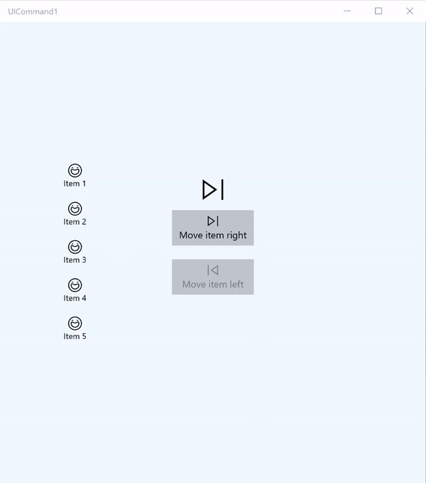
Bu temel örnekte tek bir komutun düğme tıklaması, klavye hızlandırıcısı ve fare tekerleği döndürülerek nasıl çağrılabileceğini göstereceğiz.
| Bu örneğin kodunu indirin |
|---|
| Komut örneği (ICommand) |
<Page
x:Class="UICommand1.View.MainPage"
xmlns="http://schemas.microsoft.com/winfx/2006/xaml/presentation"
xmlns:x="http://schemas.microsoft.com/winfx/2006/xaml"
xmlns:vm="using:UICommand1.ViewModel"
xmlns:d="http://schemas.microsoft.com/expression/blend/2008"
xmlns:mc="http://schemas.openxmlformats.org/markup-compatibility/2006"
mc:Ignorable="d"
Background="{ThemeResource ApplicationPageBackgroundThemeBrush}">
<Page.Resources>
<vm:OpacityConverter x:Key="opaque" />
</Page.Resources>
<Grid Name="ItemGrid"
Background="AliceBlue"
PointerWheelChanged="Page_PointerWheelChanged">
<Grid.ColumnDefinitions>
<ColumnDefinition Width="*"/>
<ColumnDefinition Width="2*"/>
<ColumnDefinition Width="*"/>
</Grid.ColumnDefinitions>
<ListView Grid.Column="0" VerticalAlignment="Center"
x:Name="CommandListView"
ItemsSource="{x:Bind Path=ViewModel.ListItemLeft}"
SelectionMode="None" IsItemClickEnabled="False"
HorizontalAlignment="Right">
<ListView.ItemTemplate>
<DataTemplate x:DataType="vm:ListItemData">
<Grid VerticalAlignment="Center">
<AppBarButton Label="{x:Bind ListItemText}">
<AppBarButton.Icon>
<SymbolIcon Symbol="{x:Bind ListItemIcon}"/>
</AppBarButton.Icon>
</AppBarButton>
</Grid>
</DataTemplate>
</ListView.ItemTemplate>
</ListView>
<Grid Grid.Column="1" Margin="0,0,0,0"
HorizontalAlignment="Center"
VerticalAlignment="Center">
<Grid.RowDefinitions>
<RowDefinition Height="*"/>
<RowDefinition Height="*"/>
<RowDefinition Height="*"/>
</Grid.RowDefinitions>
<StackPanel Grid.Row="1">
<FontIcon FontFamily="{StaticResource SymbolThemeFontFamily}"
FontSize="40" Glyph=""
Opacity="{x:Bind Path=ViewModel.ListItemLeft.Count,
Mode=OneWay, Converter={StaticResource opaque}}"/>
<Button Name="MoveItemRightButton"
Margin="0,10,0,10" Width="120" HorizontalAlignment="Center"
Command="{x:Bind Path=ViewModel.MoveRightCommand}">
<Button.KeyboardAccelerators>
<KeyboardAccelerator
Modifiers="Control"
Key="Add" />
</Button.KeyboardAccelerators>
<StackPanel>
<SymbolIcon Symbol="Next"/>
<TextBlock>Move item right</TextBlock>
</StackPanel>
</Button>
<Button Name="MoveItemLeftButton"
Margin="0,10,0,10" Width="120" HorizontalAlignment="Center"
Command="{x:Bind Path=ViewModel.MoveLeftCommand}">
<Button.KeyboardAccelerators>
<KeyboardAccelerator
Modifiers="Control"
Key="Subtract" />
</Button.KeyboardAccelerators>
<StackPanel>
<SymbolIcon Symbol="Previous"/>
<TextBlock>Move item left</TextBlock>
</StackPanel>
</Button>
<FontIcon FontFamily="{StaticResource SymbolThemeFontFamily}"
FontSize="40" Glyph=""
Opacity="{x:Bind Path=ViewModel.ListItemRight.Count,
Mode=OneWay, Converter={StaticResource opaque}}"/>
</StackPanel>
</Grid>
<ListView Grid.Column="2"
x:Name="CommandListViewRight"
VerticalAlignment="Center"
IsItemClickEnabled="False"
SelectionMode="None"
ItemsSource="{x:Bind Path=ViewModel.ListItemRight}"
HorizontalAlignment="Left">
<ListView.ItemTemplate>
<DataTemplate x:DataType="vm:ListItemData">
<Grid VerticalAlignment="Center">
<AppBarButton Label="{x:Bind ListItemText}">
<AppBarButton.Icon>
<SymbolIcon Symbol="{x:Bind ListItemIcon}"/>
</AppBarButton.Icon>
</AppBarButton>
</Grid>
</DataTemplate>
</ListView.ItemTemplate>
</ListView>
</Grid>
</Page>
İşte önceki kullanıcı arabiriminin kodu.
Code-behind dosyasında, komut kodumuzu içeren görünüm modelimize bağlanırız. Buna ek olarak, komut kodumuzu da bağlayan fare tekerleğinden giriş için bir işleyici tanımlarız.
using Windows.UI.Xaml;
using Windows.UI.Xaml.Input;
using Windows.UI.Xaml.Controls;
using UICommand1.ViewModel;
using Windows.System;
using Windows.UI.Core;

namespace UICommand1.View
{
    /// <summary>
    /// An empty page that can be used on its own or navigated to within a Frame.
    /// </summary>
    public sealed partial class MainPage : Page
    {
        // Reference to our view model.
        public UICommand1ViewModel ViewModel { get; set; }

        // Initialize our view and view model.
        public MainPage()
        {
            this.InitializeComponent();
            ViewModel = new UICommand1ViewModel();
        }

        /// <summary>
        /// Handle mouse wheel input and assign our
        /// commands to appropriate direction of rotation.
        /// </summary>
        /// <param name="sender"></param>
        /// <param name="e"></param>
        private void Page_PointerWheelChanged(object sender, PointerRoutedEventArgs e)
        {
            var props = e.GetCurrentPoint(sender as UIElement).Properties;

            // Require CTRL key and accept only vertical mouse wheel movement
            // to eliminate accidental wheel input.
            if ((Window.Current.CoreWindow.GetKeyState(VirtualKey.Control) !=
                CoreVirtualKeyStates.None) && !props.IsHorizontalMouseWheel)
            {
                bool delta = props.MouseWheelDelta < 0 ? true : false;

                switch (delta)
                {
                    case true:
                        ViewModel.MoveRight();
                        break;
                    case false:
                        ViewModel.MoveLeft();
                        break;
                    default:
                        break;
                }
            }
        }
    }
}
Görünüm modelimizin kodu aşağıdadır
Görünüm modelimiz, uygulamamızdaki iki komutun yürütme ayrıntılarını tanımladığımız, bir ListView dolduracağımız ve her ListView'un öğe sayısına göre bazı ek kullanıcı arabirimini gizlemek veya görüntülemek için bir opaklık değeri dönüştürücüsü sağladığımız yerdir.
using System;
using System.Collections.ObjectModel;
using System.ComponentModel;
using Windows.UI.Xaml.Controls;
using Windows.UI.Xaml.Data;

namespace UICommand1.ViewModel
{
    /// <summary>
    /// UI properties for our list items.
    /// </summary>
    public class ListItemData
    {
        /// <summary>
        /// Gets and sets the list item content string.
        /// </summary>
        public string ListItemText { get; set; }
        /// <summary>
        /// Gets and sets the list item icon.
        /// </summary>
        public Symbol ListItemIcon { get; set; }
    }

    /// <summary>
    /// View Model that sets up a command to handle invoking the move item buttons.
    /// </summary>
    public class UICommand1ViewModel
    {
        /// <summary>
        /// The command to invoke when the Move item left button is pressed.
        /// </summary>
        public RelayCommand MoveLeftCommand { get; private set; }

        /// <summary>
        /// The command to invoke when the Move item right button is pressed.
        /// </summary>
        public RelayCommand MoveRightCommand { get; private set; }

        // Item collections
        public ObservableCollection<ListItemData> ListItemLeft { get; } =
           new ObservableCollection<ListItemData>();
        public ObservableCollection<ListItemData> ListItemRight { get; } =
           new ObservableCollection<ListItemData>();

        public ListItemData listItem;

        /// <summary>
        /// Sets up a command to handle invoking the move item buttons.
        /// </summary>
        public UICommand1ViewModel()
        {
            MoveLeftCommand =
               new RelayCommand(new Action(MoveLeft), CanExecuteMoveLeftCommand);
            MoveRightCommand =
               new RelayCommand(new Action(MoveRight), CanExecuteMoveRightCommand);

            LoadItems();
        }

        /// <summary>
        ///  Populate our list of items.
        /// </summary>
        public void LoadItems()
        {
            for (var x = 0; x <= 4; x++)
            {
                listItem = new ListItemData();
                listItem.ListItemText = "Item " + (ListItemLeft.Count + 1).ToString();
                listItem.ListItemIcon = Symbol.Emoji;
                ListItemLeft.Add(listItem);
            }
        }

        /// <summary>
        /// Move left command valid when items present in the list on right.
        /// </summary>
        /// <returns>True, if count is greater than 0.</returns>
        private bool CanExecuteMoveLeftCommand()
        {
            return ListItemRight.Count > 0;
        }

        /// <summary>
        /// Move right command valid when items present in the list on left.
        /// </summary>
        /// <returns>True, if count is greater than 0.</returns>
        private bool CanExecuteMoveRightCommand()
        {
            return ListItemLeft.Count > 0;
        }

        /// <summary>
        /// The command implementation to execute when the Move item right button is pressed.
        /// </summary>
        public void MoveRight()
        {
            if (ListItemLeft.Count > 0)
            {
                listItem = new ListItemData();
                ListItemRight.Add(listItem);
                listItem.ListItemText = "Item " + ListItemRight.Count.ToString();
                listItem.ListItemIcon = Symbol.Emoji;
                ListItemLeft.RemoveAt(ListItemLeft.Count - 1);
                MoveRightCommand.RaiseCanExecuteChanged();
                MoveLeftCommand.RaiseCanExecuteChanged();
            }
        }

        /// <summary>
        /// The command implementation to execute when the Move item left button is pressed.
        /// </summary>
        public void MoveLeft()
        {
            if (ListItemRight.Count > 0)
            {
                listItem = new ListItemData();
                ListItemLeft.Add(listItem);
                listItem.ListItemText = "Item " + ListItemLeft.Count.ToString();
                listItem.ListItemIcon = Symbol.Emoji;
                ListItemRight.RemoveAt(ListItemRight.Count - 1);
                MoveRightCommand.RaiseCanExecuteChanged();
                MoveLeftCommand.RaiseCanExecuteChanged();
            }
        }

        /// <summary>
        /// Views subscribe to this event to get notified of property updates.
        /// </summary>
        public event PropertyChangedEventHandler PropertyChanged;

        /// <summary>
        /// Notify subscribers of updates to the named property
        /// </summary>
        /// <param name="propertyName">The full, case-sensitive, name of a property.</param>
        protected void NotifyPropertyChanged(string propertyName)
        {
            PropertyChangedEventHandler handler = this.PropertyChanged;
            if (handler != null)
            {
                PropertyChangedEventArgs args = new PropertyChangedEventArgs(propertyName);
                handler(this, args);
            }
        }
    }

    /// <summary>
    /// Convert a collection count to an opacity value of 0.0 or 1.0.
    /// </summary>
    public class OpacityConverter : IValueConverter
    {
        /// <summary>
        /// Converts a collection count to an opacity value of 0.0 or 1.0.
        /// </summary>
        /// <param name="value">The count passed in</param>
        /// <param name="targetType">Ignored.</param>
        /// <param name="parameter">Ignored</param>
        /// <param name="language">Ignored</param>
        /// <returns>1.0 if count > 0, otherwise returns 0.0</returns>
        public object Convert(object value, Type targetType, object parameter, string language)
        {
            return ((int)value > 0 ? 1.0 : 0.0);
        }

        /// <summary>
        /// Not used, converter is not intended for two-way binding.
        /// </summary>
        /// <param name="value">Ignored</param>
        /// <param name="targetType">Ignored</param>
        /// <param name="parameter">Ignored</param>
        /// <param name="language">Ignored</param>
        /// <returns></returns>
        public object ConvertBack(object value, Type targetType, object parameter, string language)
        {
            throw new NotImplementedException();
        }
    }
}
Son olarak, ICommand arabirimini uygulamamız aşağıdadır
Burada , ICommand arabirimini uygulayan ve işlevselliğini diğer nesnelere aktaran bir komut tanımlayacağız.
using System;
using System.Windows.Input;

namespace UICommand1
{
    /// <summary>
    /// A command whose sole purpose is to relay its functionality
    /// to other objects by invoking delegates.
    /// The default return value for the CanExecute method is 'true'.
    /// <see cref="RaiseCanExecuteChanged"/> needs to be called whenever
    /// <see cref="CanExecute"/> is expected to return a different value.
    /// </summary>
    public class RelayCommand : ICommand
    {
        private readonly Action _execute;
        private readonly Func<bool> _canExecute;

        /// <summary>
        /// Raised when RaiseCanExecuteChanged is called.
        /// </summary>
        public event EventHandler CanExecuteChanged;

        /// <summary>
        /// Creates a new command that can always execute.
        /// </summary>
        /// <param name="execute">The execution logic.</param>
        public RelayCommand(Action execute)
            : this(execute, null)
        {
        }

        /// <summary>
        /// Creates a new command.
        /// </summary>
        /// <param name="execute">The execution logic.</param>
        /// <param name="canExecute">The execution status logic.</param>
        public RelayCommand(Action execute, Func<bool> canExecute)
        {
            if (execute == null)
                throw new ArgumentNullException("execute");
            _execute = execute;
            _canExecute = canExecute;
        }

        /// <summary>
        /// Determines whether this <see cref="RelayCommand"/> can execute in its current state.
        /// </summary>
        /// <param name="parameter">
        /// Data used by the command. If the command does not require
        /// data to be passed, this object can be set to null.
        /// </param>
        /// <returns>true if this command can be executed; otherwise, false.</returns>
        public bool CanExecute(object parameter)
        {
            return _canExecute == null ? true : _canExecute();
        }

        /// <summary>
        /// Executes the <see cref="RelayCommand"/> on the current command target.
        /// </summary>
        /// <param name="parameter">
        /// Data used by the command. If the command does not require
        /// data to be passed, this object can be set to null.
        /// </param>
        public void Execute(object parameter)
        {
            _execute();
        }

        /// <summary>
        /// Method used to raise the <see cref="CanExecuteChanged"/> event
        /// to indicate that the return value of the <see cref="CanExecute"/>
        /// method has changed.
        /// </summary>
        public void RaiseCanExecuteChanged()
        {
            var handler = CanExecuteChanged;
            if (handler != null)
            {
                handler(this, EventArgs.Empty);
            }
        }
    }
}
Özet
WinUI, denetim türleri, cihazlar ve giriş türleri arasında komutları paylaşan ve yöneten uygulamalar oluşturmanıza olanak tanıyan sağlam ve esnek bir komut sistemi sağlar.
Windows uygulamalarınız için komut oluştururken aşağıdaki yaklaşımları kullanın:
- XAML'de ve code-behind'de olayları dinleme ve işleme
- Click WinUI gibi bir olay işleme yöntemine bağlama, denetim türleri, cihazlar ve giriş türleri arasında komutları paylaşan ve yöneten uygulamalar oluşturmanıza olanak tanıyan sağlam ve esnek bir komut sistemi sağlar.
- Önceden tanımlanmış bir özellik kümesi için kendi değerlerinizle XamlUICommand nesneleri oluşturma
- Önceden tanımlanmış platform özellikleri ve değerleri kümesiyle StandardUICommand nesneleri oluşturma
Sonraki Adımlar
WinUI 3 Galeri uygulamasını açın ve XamlUICommand'ı çalışırken görün
Ayrıca bakınız
Windows uygulamaları için denetimler ve desenler
Samples
Konu örnekleri
Diğer örnekler
GitHub'da bizimle işbirliği yapın
Bu içeriğin kaynağı GitHub'da bulunabilir; burada ayrıca sorunları ve çekme isteklerini oluşturup gözden geçirebilirsiniz. Daha fazla bilgi için katkıda bulunan kılavuzumuzu inceleyin.

Windows developer