Xamarin.Forms Visual State Manager
Use the Visual State Manager to make changes to XAML elements based on visual states set from code.
The Visual State Manager (VSM) provides a structured way to make visual changes to the user interface from code. In most cases, the user interface of the application is defined in XAML, and this XAML includes markup describing how the Visual State Manager affects the visuals of the user interface.
The VSM introduces the concept of visual states. A Xamarin.Forms view such as a Button can have several different visual appearances depending on its underlying state — whether it's disabled, or pressed, or has input focus. These are the button's states.
Visual states are collected in visual state groups. All the visual states within a visual state group are mutually exclusive. Both visual states and visual state groups are identified by simple text strings.
The Xamarin.Forms Visual State Manager defines one visual state group named "CommonStates" with the following visual states:
- "Normal"
- "Disabled"
- "Focused"
- "Selected"
This visual state group is supported for all classes that derive from VisualElement, which is the base class for View and Page.
You can also define your own visual state groups and visual states, as this article will demonstrate.
Note
Xamarin.Forms developers familiar with triggers are aware that triggers can also make changes to visuals in the user interface based on changes in a view's properties or the firing of events. However, using triggers to deal with various combinations of these changes can become quite confusing. Historically, the Visual State Manager was introduced in Windows XAML-based environments to alleviate the confusion resulting from combinations of visual states. With the VSM, the visual states within a visual state group are always mutually exclusive. At any time, only one state in each group is the current state.
Common states
The Visual State Manager allows you to include markup in your XAML file that can change the visual appearance of a view if the view is normal, or disabled, or has the input focus. These are known as the common states.
For example, suppose you have an Entry view on your page, and you want the visual appearance of the Entry to change in the following ways:
- The
Entryshould have a pink background when theEntryis disabled. - The
Entryshould have a lime background normally. - The
Entryshould expand to twice its normal height when it has input focus.
You can attach the VSM markup to an individual view, or you can define it in a style if it applies to multiple views. The next two sections describe these approaches.
VSM markup on a view
To attach VSM markup to an Entry view, first separate the Entry into start and end tags:
<Entry FontSize="18">

</Entry>
It's given an explicit font size because one of the states will use the FontSize property to double the size of the text in the Entry.
Next, insert VisualStateManager.VisualStateGroups tags between those tags:
<Entry FontSize="18">
    <VisualStateManager.VisualStateGroups>

    </VisualStateManager.VisualStateGroups>
</Entry>
VisualStateGroups is an attached bindable property defined by the VisualStateManager class. (For more information on attached bindable properties, see the article Attached properties.) This is how the VisualStateGroups property is attached to the Entry object.
The VisualStateGroups property is of type VisualStateGroupList, which is a collection of VisualStateGroup objects. Within the VisualStateManager.VisualStateGroups tags, insert a pair of VisualStateGroup tags for each group of visual states you wish to include:
<Entry FontSize="18">
    <VisualStateManager.VisualStateGroups>
        <VisualStateGroup x:Name="CommonStates">

        </VisualStateGroup>
    </VisualStateManager.VisualStateGroups>
</Entry>
Notice that the VisualStateGroup tag has an x:Name attribute indicating the name of the group. The VisualStateGroup class defines a Name property that you can use instead:
<VisualStateGroup Name="CommonStates">
You can use either x:Name or Name but not both in the same element.
The VisualStateGroup class defines a property named States, which is a collection of VisualState objects. States is the content property of VisualStateGroups so you can include the VisualState tags directly between the VisualStateGroup tags. (Content properties are discussed in the article Essential XAML Syntax.)
The next step is to include a pair of tags for every visual state in that group. These also can be identified using x:Name or Name:
<Entry FontSize="18">
    <VisualStateManager.VisualStateGroups>
        <VisualStateGroup x:Name="CommonStates">
            <VisualState x:Name="Normal">

            </VisualState>

            <VisualState x:Name="Focused">

            </VisualState>

            <VisualState x:Name="Disabled">

            </VisualState>
        </VisualStateGroup>
    </VisualStateManager.VisualStateGroups>
</Entry>
VisualState defines a property named Setters, which is a collection of Setter objects. These are the same Setter objects that you use in a Style object.
Setters is not the content property of VisualState, so it is necessary to include property element tags for the Setters property:
<Entry FontSize="18">
    <VisualStateManager.VisualStateGroups>
        <VisualStateGroup x:Name="CommonStates">
            <VisualState x:Name="Normal">
                <VisualState.Setters>

                </VisualState.Setters>
            </VisualState>

            <VisualState x:Name="Focused">
                <VisualState.Setters>

                </VisualState.Setters>
            </VisualState>

            <VisualState x:Name="Disabled">
                <VisualState.Setters>

                </VisualState.Setters>
            </VisualState>
        </VisualStateGroup>
    </VisualStateManager.VisualStateGroups>
</Entry>
You can now insert one or more Setter objects between each pair of Setters tags. These are the Setter objects that define the visual states described earlier:
<Entry FontSize="18">
    <VisualStateManager.VisualStateGroups>
        <VisualStateGroup x:Name="CommonStates">
            <VisualState x:Name="Normal">
                <VisualState.Setters>
                    <Setter Property="BackgroundColor" Value="Lime" />
                </VisualState.Setters>
            </VisualState>

            <VisualState x:Name="Focused">
                <VisualState.Setters>
                    <Setter Property="FontSize" Value="36" />
                </VisualState.Setters>
            </VisualState>

            <VisualState x:Name="Disabled">
                <VisualState.Setters>
                    <Setter Property="BackgroundColor" Value="Pink" />
                </VisualState.Setters>
            </VisualState>
        </VisualStateGroup>
    </VisualStateManager.VisualStateGroups>
</Entry>
Each Setter tag indicates the value of a particular property when that state is current. Any property referenced by a Setter object must be backed by a bindable property.
Markup similar to this is the basis of the VSM on View page in the sample program. The page includes three Entry views, but only the second one has the VSM markup attached to it:
<ContentPage xmlns="http://xamarin.com/schemas/2014/forms"
             xmlns:x="http://schemas.microsoft.com/winfx/2009/xaml"
             xmlns:local="clr-namespace:VsmDemos"
             x:Class="VsmDemos.MainPage"
             Title="VSM Demos">

    <StackLayout>
        <StackLayout.Resources>
            <Style TargetType="Entry">
                <Setter Property="Margin" Value="20, 0" />
                <Setter Property="FontSize" Value="18" />
            </Style>

            <Style TargetType="Label">
                <Setter Property="Margin" Value="20, 30, 20, 0" />
                <Setter Property="FontSize" Value="Large" />
            </Style>
        </StackLayout.Resources>

        <Label Text="Normal Entry:" />
        <Entry />
        <Label Text="Entry with VSM: " />
        <Entry>
            <VisualStateManager.VisualStateGroups>
                <VisualStateGroup x:Name="CommonStates">
                    <VisualState x:Name="Normal">
                        <VisualState.Setters>
                            <Setter Property="BackgroundColor" Value="Lime" />
                        </VisualState.Setters>
                    </VisualState>
                    <VisualState x:Name="Focused">
                        <VisualState.Setters>
                            <Setter Property="FontSize" Value="36" />
                        </VisualState.Setters>
                    </VisualState>
                    <VisualState x:Name="Disabled">
                        <VisualState.Setters>
                            <Setter Property="BackgroundColor" Value="Pink" />
                        </VisualState.Setters>
                    </VisualState>
                </VisualStateGroup>
            </VisualStateManager.VisualStateGroups>

            <Entry.Triggers>
                <DataTrigger TargetType="Entry"
                             Binding="{Binding Source={x:Reference entry3},
                                               Path=Text.Length}"
                             Value="0">
                    <Setter Property="IsEnabled" Value="False" />
                </DataTrigger>
            </Entry.Triggers>
        </Entry>
        <Label Text="Entry to enable 2nd Entry:" />
        <Entry x:Name="entry3"
               Text=""
               Placeholder="Type something to enable 2nd Entry" />
    </StackLayout>
</ContentPage>
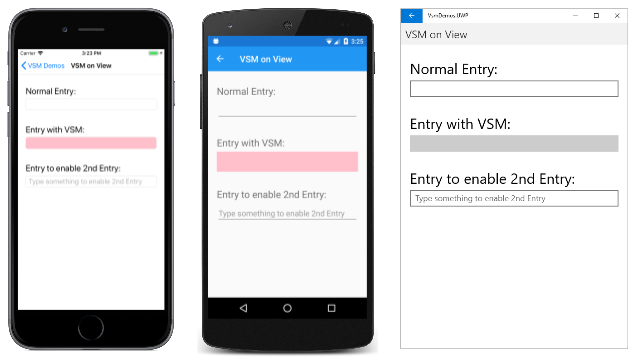
Notice that the second Entry also has a DataTrigger as part of its Trigger collection. This causes the Entry to be disabled until something is typed into the third Entry. Here's the page at startup running on iOS, Android, and the Universal Windows Platform (UWP):
The current visual state is "Disabled" so the background of the second Entry is pink on the iOS and Android screens. The UWP implementation of Entry does not allow setting the background color when the Entry is disabled.
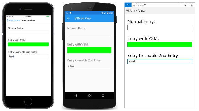
When you enter some text into the third Entry, the second Entry switches into the "Normal" state, and the background is now lime:
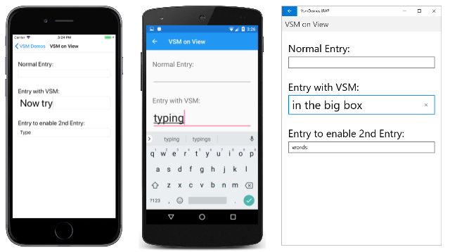
When you touch the second Entry, it gets the input focus. It switches to the "Focused" state and expands to twice its height:
Notice that the Entry does not retain the lime background when it gets the input focus. As the Visual State Manager switches between the visual states, the properties set by the previous state are unset. Keep in mind that the visual states are mutually exclusive. The "Normal" state does not mean solely that the Entry is enabled. It means that the Entry is enabled and does not have input focus.
If you want the Entry to have a lime background in the "Focused" state, add another Setter to that visual state:
<VisualState x:Name="Focused">
    <VisualState.Setters>
        <Setter Property="FontSize" Value="36" />
        <Setter Property="BackgroundColor" Value="Lime" />
    </VisualState.Setters>
</VisualState>
In order for these Setter objects to work properly, a VisualStateGroup must contain VisualState objects for all the states in that group. If there is a visual state that does not have any Setter objects, include it anyway as an empty tag:
<VisualState x:Name="Normal" />
Visual State Manager markup in a style
It's often necessary to share the same Visual State Manager markup among two or more views. In this case, you'll want to put the markup in a Style definition.
Here's the existing implicit Style for the Entry elements in the VSM On View page:
<Style TargetType="Entry">
    <Setter Property="Margin" Value="20, 0" />
    <Setter Property="FontSize" Value="18" />
</Style>
Add Setter tags for the VisualStateManager.VisualStateGroups attached bindable property:
<Style TargetType="Entry">
    <Setter Property="Margin" Value="20, 0" />
    <Setter Property="FontSize" Value="18" />
    <Setter Property="VisualStateManager.VisualStateGroups">

    </Setter>
</Style>
The content property for Setter is Value, so the value of the Value property can be specified directly within those tags. That property is of type VisualStateGroupList:
<Style TargetType="Entry">
    <Setter Property="Margin" Value="20, 0" />
    <Setter Property="FontSize" Value="18" />
    <Setter Property="VisualStateManager.VisualStateGroups">
        <VisualStateGroupList>

        </VisualStateGroupList>
    </Setter>
</Style>
Within those tags you can include one of more VisualStateGroup objects:
<Style TargetType="Entry">
    <Setter Property="Margin" Value="20, 0" />
    <Setter Property="FontSize" Value="18" />
    <Setter Property="VisualStateManager.VisualStateGroups">
        <VisualStateGroupList>
            <VisualStateGroup x:Name="CommonStates">

            </VisualStateGroup>
        </VisualStateGroupList>
    </Setter>
</Style>
The remainder of the VSM markup is the same as before.
Here's the VSM in Style page showing the complete VSM markup:
<ContentPage xmlns="http://xamarin.com/schemas/2014/forms"
             xmlns:x="http://schemas.microsoft.com/winfx/2009/xaml"
             x:Class="VsmDemos.VsmInStylePage"
             Title="VSM in Style">
    <StackLayout>
        <StackLayout.Resources>
            <Style TargetType="Entry">
                <Setter Property="Margin" Value="20, 0" />
                <Setter Property="FontSize" Value="18" />
                <Setter Property="VisualStateManager.VisualStateGroups">
                    <VisualStateGroupList>
                        <VisualStateGroup x:Name="CommonStates">
                            <VisualState x:Name="Normal">
                                <VisualState.Setters>
                                    <Setter Property="BackgroundColor" Value="Lime" />
                                </VisualState.Setters>
                            </VisualState>
                            <VisualState x:Name="Focused">
                                <VisualState.Setters>
                                    <Setter Property="FontSize" Value="36" />
                                    <Setter Property="BackgroundColor" Value="Lime" />
                                </VisualState.Setters>
                            </VisualState>
                            <VisualState x:Name="Disabled">
                                <VisualState.Setters>
                                    <Setter Property="BackgroundColor" Value="Pink" />
                                </VisualState.Setters>
                            </VisualState>
                        </VisualStateGroup>
                    </VisualStateGroupList>
                </Setter>
            </Style>

            <Style TargetType="Label">
                <Setter Property="Margin" Value="20, 30, 20, 0" />
                <Setter Property="FontSize" Value="Large" />
            </Style>
        </StackLayout.Resources>

        <Label Text="Normal Entry:" />
        <Entry />
        <Label Text="Entry with VSM: " />
        <Entry>
            <Entry.Triggers>
                <DataTrigger TargetType="Entry"
                             Binding="{Binding Source={x:Reference entry3},
                                               Path=Text.Length}"
                             Value="0">
                    <Setter Property="IsEnabled" Value="False" />
                </DataTrigger>
            </Entry.Triggers>
        </Entry>
        <Label Text="Entry to enable 2nd Entry:" />
        <Entry x:Name="entry3"
               Text=""
               Placeholder="Type something to enable 2nd Entry" />
    </StackLayout>
</ContentPage>
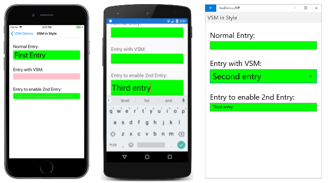
Now all the Entry views on this page respond the same way to their visual states. Notice also that the "Focused" state now includes a second Setter that gives each Entry a lime background also when it has input focus:
Visual states in Xamarin.Forms
The following table lists the visual states that are defined in Xamarin.Forms:
| Class | States | More Information |
|---|---|---|
Button |
Pressed |
Button visual states |
CheckBox |
IsChecked |
CheckBox visual states |
CarouselView |
DefaultItem, CurrentItem, PreviousItem, NextItem |
CarouselView visual states |
ImageButton |
Pressed |
ImageButton visual states |
RadioButton |
Checked, Unchecked |
RadioButton visual states |
Switch |
On, Off |
Switch visual states |
VisualElement |
Normal, Disabled, Focused, Selected |
Common states |
Each of these states can be accessed through the visual state group named CommonStates.
In addition, the CollectionView implements the Selected state. For more information, see Change selected item color.
Set state on multiple elements
In the previous examples, visual states were attached to and operated on single elements. However, it's also possible to create visual states that are attached to a single element, but that set properties on other elements within the same scope. This avoids having to repeat visual states on each element the states operate on.
The Setter type has a TargetName property, of type string, that represents the target element that the Setter for a visual state will manipulate. When the TargetName property is defined, the Setter sets the Property of the element defined in TargetName to Value:
<Setter TargetName="label"
        Property="Label.TextColor"
        Value="Red" />
In this example, a Label named label will have its TextColor property set to Red. When setting the TargetName property you must specify the full path to the property in Property. Therefore, to set the TextColor property on a Label, Property is specified as Label.TextColor.
Note
Any property referenced by a Setter object must be backed by a bindable property.
The VSM with Setter TargetName page in the sample shows how to set state on multiple elements, from a single visual state group. The XAML file consists of a StackLayout containing a Label element, an Entry, and a Button:
<ContentPage xmlns="http://xamarin.com/schemas/2014/forms"
             xmlns:x="http://schemas.microsoft.com/winfx/2009/xaml"
             x:Class="VsmDemos.VsmSetterTargetNamePage"
             Title="VSM with Setter TargetName">
    <StackLayout Margin="10">
        <Label Text="What is the capital of France?" />
        <Entry x:Name="entry"
               Placeholder="Enter answer" />
        <Button Text="Reveal answer">
            <VisualStateManager.VisualStateGroups>
                <VisualStateGroup x:Name="CommonStates">
                    <VisualState x:Name="Normal" />
                    <VisualState x:Name="Pressed">
                        <VisualState.Setters>
                            <Setter Property="Scale"
                                    Value="0.8" />
                            <Setter TargetName="entry"
                                    Property="Entry.Text"
                                    Value="Paris" />
                        </VisualState.Setters>
                    </VisualState>
                </VisualStateGroup>
            </VisualStateManager.VisualStateGroups>
        </Button>
    </StackLayout>
</ContentPage>
VSM markup is attached to the StackLayout. There are two mutually-exclusive states, named "Normal" and "Pressed", with each state containing VisualState tags.
The "Normal" state is active when the Button isn't pressed, and a response to the question can be entered:
The "Pressed" state becomes active when the Button is pressed:
The "Pressed" VisualState specifies that when the Button is pressed, its Scale property will be changed from the default value of 1 to 0.8. In addition, the Entry named entry will have its Text property set to Paris. Therefore, the result is that when the Button is pressed it's rescaled to be slightly smaller, and the Entry displays Paris. Then, when the Button is released it's rescaled to its default value of 1, and the Entry displays any previously entered text.
Important
Property paths are currently unsupported in Setter elements that specify the TargetName property.
Define your own visual states
Every class that derives from VisualElement supports the common states "Normal", "Focused", and "Disabled". In addition, the CollectionView class supports the "Selected" state. Internally, the VisualElement class detects when it's becoming enabled or disabled, or focused or unfocused, and calls the static VisualStateManager.GoToState method:
VisualStateManager.GoToState(this, "Focused");
This is the only Visual State Manager code that you'll find in the VisualElement class. Because GoToState is called for every object based on every class that derives from VisualElement, you can use the Visual State Manager with any VisualElement object to respond to these changes.
Interestingly, the name of the visual state group "CommonStates" is not explicitly referenced in VisualElement. The group name is not part of the API for the Visual State Manager. Within one of the two sample program shown so far, you can change the name of the group from "CommonStates" to anything else, and the program will still work. The group name is merely a general description of the states in that group. It is implicitly understood that the visual states in any group are mutually exclusive: One state and only one state is current at any time.
If you want to implement your own visual states, you'll need to call VisualStateManager.GoToState from code. Most often you'll make this call from the code-behind file of your page class.
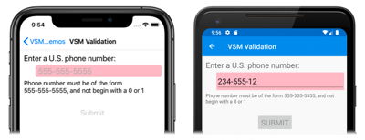
The VSM Validation page in the sample shows how to use the Visual State Manager in connection with input validation. The XAML file consists of a StackLayout containing two Label elements, an Entry, and a Button:
<ContentPage xmlns="http://xamarin.com/schemas/2014/forms"
             xmlns:x="http://schemas.microsoft.com/winfx/2009/xaml"
             x:Class="VsmDemos.VsmValidationPage"
             Title="VSM Validation">
    <StackLayout x:Name="stackLayout"
                 Padding="10, 10">
            <VisualStateManager.VisualStateGroups>
                <VisualStateGroup Name="ValidityStates">
                    <VisualState Name="Valid">
                        <VisualState.Setters>
                            <Setter TargetName="helpLabel"
                                    Property="Label.TextColor"
                                    Value="Transparent" />
                            <Setter TargetName="entry"
                                    Property="Entry.BackgroundColor"
                                    Value="Lime" />
                        </VisualState.Setters>
                    </VisualState>
                    <VisualState Name="Invalid">
                        <VisualState.Setters>
                            <Setter TargetName="entry"
                                    Property="Entry.BackgroundColor"
                                    Value="Pink" />
                            <Setter TargetName="submitButton"
                                    Property="Button.IsEnabled"
                                    Value="False" />
                        </VisualState.Setters>
                    </VisualState>
                </VisualStateGroup>
            </VisualStateManager.VisualStateGroups>
        <Label Text="Enter a U.S. phone number:"
               FontSize="Large" />
        <Entry x:Name="entry"
               Placeholder="555-555-5555"
               FontSize="Large"
               Margin="30, 0, 0, 0"
               TextChanged="OnTextChanged" />
        <Label x:Name="helpLabel"
               Text="Phone number must be of the form 555-555-5555, and not begin with a 0 or 1" />
        <Button x:Name="submitButton"
                Text="Submit"
                FontSize="Large"
                Margin="0, 20"
                VerticalOptions="Center"
                HorizontalOptions="Center" />
    </StackLayout>
</ContentPage>
VSM markup is attached to the StackLayout (named stackLayout). There are two mutually-exclusive states, named "Valid" and "Invalid", with each state containing VisualState tags.
If the Entry does not contain a valid phone number, then the current state is "Invalid", and so the Entry has a pink background, the second Label is visible, and the Button is disabled:
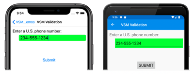
When a valid phone number is entered, then the current state becomes "Valid". The Entry gets a lime background, the second Label disappears, and the Button is now enabled:
The code-behind file is responsible for handling the TextChanged event from the Entry. The handler uses a regular expression to determine if the input string is valid or not. The method in the code-behind file named GoToState calls the static VisualStateManager.GoToState method for stackLayout:
public partial class VsmValidationPage : ContentPage
{
    public VsmValidationPage()
    {
        InitializeComponent();

        GoToState(false);
    }

    void OnTextChanged(object sender, TextChangedEventArgs args)
    {
        bool isValid = Regex.IsMatch(args.NewTextValue, @"^[2-9]\d{2}-\d{3}-\d{4}$");
        GoToState(isValid);
    }

    void GoToState(bool isValid)
    {
        string visualState = isValid ? "Valid" : "Invalid";
        VisualStateManager.GoToState(stackLayout, visualState);
    }
}
Notice also that the GoToState method is called from the constructor to initialize the state. There should always be a current state. But nowhere in the code is there any reference to the name of the visual state group, although it's referenced in the XAML as "ValidationStates" for purposes of clarity.
Notice that the code-behind file only needs to take account of the object on the page that defines the visual states, and to call VisualStateManager.GoToState for this object. This is because both visual states target multiple objects on the page.
You might wonder: If the code-behind file must reference the object on the page that defines the visual states, why can't the code-behind file simply access this and other objects directly? It surely could. However, the advantage of using the VSM is that you can control how visual elements react to different state entirely in XAML, which keeps all of the UI design in one location. This avoids setting visual appearance by accessing visual elements directly from the code-behind.
Visual state triggers
Visual states support state triggers, which are a specialized group of triggers that define the conditions under which a VisualState should be applied.
State triggers are added to the StateTriggers collection of a VisualState. This collection can contain a single state trigger, or multiple state triggers. A VisualState will be applied when any state triggers in the collection are active.
When using state triggers to control visual states, Xamarin.Forms uses the following precedence rules to determine which trigger (and corresponding VisualState) will be active:
- Any trigger that derives from
StateTriggerBase. - An
AdaptiveTriggeractivated due to theMinWindowWidthcondition being met. - An
AdaptiveTriggeractivated due to theMinWindowHeightcondition being met.
If multiple triggers are simultaneously active (for example, two custom triggers) then the first trigger declared in the markup takes precedence.
For more information about state triggers, see State triggers.
Use the Visual State Manager for adaptive layout
A Xamarin.Forms application running on a phone can usually be viewed in a portrait or landscape aspect ratio, and a Xamarin.Forms program running on the desktop can be resized to assume many different sizes and aspect ratios. A well-designed application might display its content differently for these various page or window form factors.
This technique is sometimes known as adaptive layout. Because adaptive layout solely involves a program's visuals, it is an ideal application of the Visual State Manager.
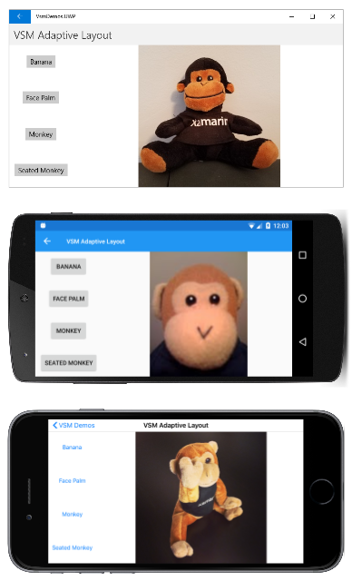
A simple example is an application that displays a small collection of buttons that affect the application's content. In portrait mode, these buttons might be displayed in a horizontal row on the top of the page:
In landscape mode, the array of buttons might be moved to one side, and displayed in a column:
From top to bottom, the program is running on the Universal Windows Platform, Android, and iOS.
The VSM Adaptive Layout page in the sample defines a group named "OrientationStates" with two visual states named "Portrait" and "Landscape". (A more complex approach might be based on several different page or window widths.)
VSM markup occurs in four places in the XAML file. The StackLayout named mainStack contains both the menu and the content, which is an Image element. This StackLayout should have a vertical orientation in portrait mode and a horizontal orientation in landscape mode:
<ContentPage xmlns="http://xamarin.com/schemas/2014/forms"
             xmlns:x="http://schemas.microsoft.com/winfx/2009/xaml"
             x:Class="VsmDemos.VsmAdaptiveLayoutPage"
             Title="VSM Adaptive Layout">

    <StackLayout x:Name="mainStack">
        <VisualStateManager.VisualStateGroups>
            <VisualStateGroup Name="OrientationStates">
                <VisualState Name="Portrait">
                    <VisualState.Setters>
                        <Setter Property="Orientation" Value="Vertical" />
                    </VisualState.Setters>
                </VisualState>
                <VisualState Name="Landscape">
                    <VisualState.Setters>
                        <Setter Property="Orientation" Value="Horizontal" />
                    </VisualState.Setters>
                </VisualState>
            </VisualStateGroup>
        </VisualStateManager.VisualStateGroups>

        <ScrollView x:Name="menuScroll">
            <VisualStateManager.VisualStateGroups>
                <VisualStateGroup Name="OrientationStates">
                    <VisualState Name="Portrait">
                        <VisualState.Setters>
                            <Setter Property="Orientation" Value="Horizontal" />
                        </VisualState.Setters>
                    </VisualState>
                    <VisualState Name="Landscape">
                        <VisualState.Setters>
                            <Setter Property="Orientation" Value="Vertical" />
                        </VisualState.Setters>
                    </VisualState>
                </VisualStateGroup>
            </VisualStateManager.VisualStateGroups>

            <StackLayout x:Name="menuStack">
                <VisualStateManager.VisualStateGroups>
                    <VisualStateGroup Name="OrientationStates">
                        <VisualState Name="Portrait">
                            <VisualState.Setters>
                                <Setter Property="Orientation" Value="Horizontal" />
                            </VisualState.Setters>
                        </VisualState>
                        <VisualState Name="Landscape">
                            <VisualState.Setters>
                                <Setter Property="Orientation" Value="Vertical" />
                            </VisualState.Setters>
                        </VisualState>
                    </VisualStateGroup>
                </VisualStateManager.VisualStateGroups>

                <StackLayout.Resources>
                    <Style TargetType="Button">
                        <Setter Property="VisualStateManager.VisualStateGroups">
                            <VisualStateGroupList>
                                <VisualStateGroup Name="OrientationStates">
                                    <VisualState Name="Portrait">
                                        <VisualState.Setters>
                                            <Setter Property="HorizontalOptions" Value="CenterAndExpand" />
                                            <Setter Property="Margin" Value="10, 5" />
                                        </VisualState.Setters>
                                    </VisualState>
                                    <VisualState Name="Landscape">
                                        <VisualState.Setters>
                                            <Setter Property="VerticalOptions" Value="CenterAndExpand" />
                                            <Setter Property="HorizontalOptions" Value="Center" />
                                            <Setter Property="Margin" Value="10" />
                                        </VisualState.Setters>
                                    </VisualState>
                                </VisualStateGroup>
                            </VisualStateGroupList>
                        </Setter>
                    </Style>
                </StackLayout.Resources>

                <Button Text="Banana"
                        Command="{Binding SelectedCommand}"
                        CommandParameter="Banana.jpg" />
                <Button Text="Face Palm"
                        Command="{Binding SelectedCommand}"
                        CommandParameter="FacePalm.jpg" />
                <Button Text="Monkey"
                        Command="{Binding SelectedCommand}"
                        CommandParameter="monkey.png" />
                <Button Text="Seated Monkey"
                        Command="{Binding SelectedCommand}"
                        CommandParameter="SeatedMonkey.jpg" />
            </StackLayout>
        </ScrollView>

        <Image x:Name="image"
               VerticalOptions="FillAndExpand"
               HorizontalOptions="FillAndExpand" />
    </StackLayout>
</ContentPage>
The inner ScrollView named menuScroll and the StackLayout named menuStack implement the menu of buttons. The orientation of these layouts is opposite of mainStack. The menu should be horizontal in portrait mode and vertical in landscape mode.
The fourth section of VSM markup is in an implicit style for the buttons themselves. This markup sets VerticalOptions, HorizontalOptions, and Margin properties specific to the portrait and landscape orientations.
The code-behind file sets the BindingContext property of menuStack to implement Button commanding, and also attaches a handler to the SizeChanged event of the page:
public partial class VsmAdaptiveLayoutPage : ContentPage
{
    public VsmAdaptiveLayoutPage ()
    {
        InitializeComponent ();

        SizeChanged += (sender, args) =>
        {
            string visualState = Width > Height ? "Landscape" : "Portrait";
            VisualStateManager.GoToState(mainStack, visualState);
            VisualStateManager.GoToState(menuScroll, visualState);
            VisualStateManager.GoToState(menuStack, visualState);

            foreach (View child in menuStack.Children)
            {
                VisualStateManager.GoToState(child, visualState);
            }
        };

        SelectedCommand = new Command<string>((filename) =>
        {
            image.Source = ImageSource.FromResource("VsmDemos.Images." + filename);
        });

        menuStack.BindingContext = this;
    }

    public ICommand SelectedCommand { private set; get; }
}
The SizeChanged handler calls VisualStateManager.GoToState for the two StackLayout and ScrollView elements, and then loops through the children of menuStack to call VisualStateManager.GoToState for the Button elements.
It may seem as if the code-behind file can handle orientation changes more directly by setting properties of elements in the XAML file, but the Visual State Manager is definitely a more structured approach. All the visuals are kept in the XAML file, where they become easier to examine, maintain, and modify.
Visual State Manager with Xamarin.University
Xamarin.Forms 3.0 Visual State Manager video
