Note
Access to this page requires authorization. You can try signing in or changing directories.
Access to this page requires authorization. You can try changing directories.
In this tutorial, you'll build a .NET MAUI app with a user interface created without XAML by using C# Markup from the .NET MAUI Community Toolkit.
Introduction
The .NET MAUI Community Toolkit is a set of extensions, behaviors, animations, and other helpers. One of the features, C# Markup, provides the ability to create a user interface entirely in C# code. In this tutorial, you'll learn how to create a .NET MAUI app for Windows that uses C# Markup to create the user interface.
Setting up the environment
If you haven't already set up your environment for .NET MAUI development, please follow the steps to Get started with .NET MAUI on Windows.
Creating the .NET MAUI project
In this section, you'll create a new .NET MAUI project. If you are already familiar with setting up a .NET MAUI project, you can skip to the next section.
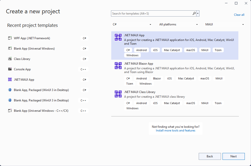
Launch Visual Studio, and in the start window click Create a new project to create a new project.
In the Create a new project window, select MAUI in the All project types drop-down, select the .NET MAUI App template, and click the Next button:
Next, on the Configure your new project screen, give your project a name, choose a location for it, and click the Next button.
On the final screen, Additional information, click the Create button.
Wait for the project to be created, and for its dependencies to be restored.
In the Visual Studio toolbar, press the Windows Machine button to build and run the app. Click the Click me button and verify that the button content updates with the number of clicks.
Now that you have verified that the .NET MAUI app on Windows is working as expected, we can integrate the MVVM Toolkit and C# Markup packages. In the next section, you'll add these packages to your new project.
Add C# Markup from the .NET MAUI Community Toolkit
Now that you have your .NET MAUI app running on Windows, let's add a couple of NuGet packages to the project to integrate with the MVVM Toolkit and C# Markup from the .NET MAUI Community Toolkit.
Right-click the project in Solution Explorer and select Manage NuGet Packages... from the context menu.
In the NuGet Package Manager window, select the Browse tab and search for CommunityToolkit.MVVM:

Add the latest stable version of the CommunityToolkit.MVVM package to the project by clicking Install.
Next, search for CommunityToolkit.Maui:

Add the latest stable version of the CommunityToolkit.Maui.Markup package to the project by clicking Install.
Close the NuGet Package Manager window after the new packages have finished installing.
Add a ViewModel to the project
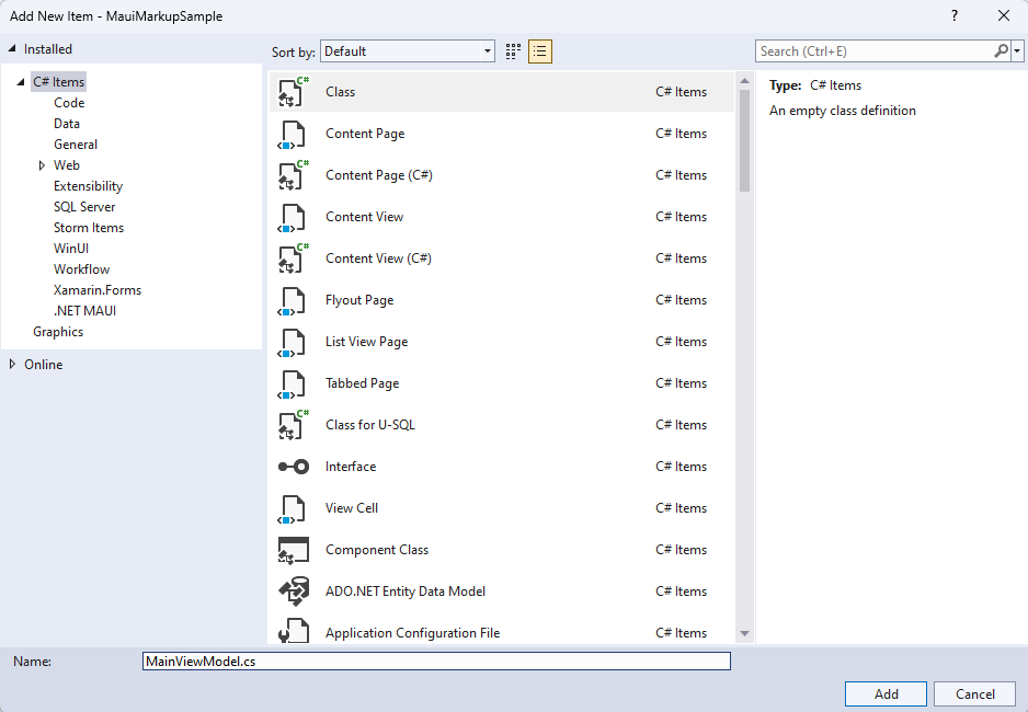
We are going to add a simple Model-View-ViewModel (MVVM) implementation with the MVVM Toolkit. Let's start by creating a viewmodel to pair with our view (MainPage). Right-click the project again and select Add | Class from the context menu.
In the Add New Item window that appears, name the class MainViewModel and click Add:
We are going to leverage the power of the MVVM Toolkit in MainViewModel. Replace the contents of the class with the following code:
using CommunityToolkit.Mvvm.ComponentModel;
using System.ComponentModel;
using System.Diagnostics;

namespace MauiMarkupSample
{
    [INotifyPropertyChanged]
    public partial class MainViewModel
    {
        [ObservableProperty]
        private string name;
        partial void OnNameChanging(string value)
        {
            Debug.WriteLine($"Name is about to change to {value}");
        }
        partial void OnNameChanged(string value)
        {
            Debug.WriteLine($"Name has changed to {value}");
        }
    }
}
If you have completed the Build your first .NET MAUI app for Windows tutorial, you will understand what the code above does, and you can skip the explanation. If you haven't, here's a brief overview:
The MainViewModel class is decorated with the INotifyPropertyChanged attribute, which allows the MVVM Toolkit to generate the INotifyPropertyChanged implementation for the class. Marking MainViewModel as a partial class is required for the .NET source generator to work. The ObservableProperty attribute on the name private field will add a Name property for the class with the proper INotifyPropertyChanged implementation in the generated partial class. Adding the OnNameChanging and OnNameChanged partial methods is optional, but allows you to add custom logic when the Name property is changing or has changed.
Build a UI with C# Markup
When building a UI with C# Markup, the first step is to update the CreateMauiApp method in MauiProgram.cs. Replace the contents of the method with the following code:
public static MauiApp CreateMauiApp()
{
    var builder = MauiApp.CreateBuilder();

    builder
        .UseMauiApp<App>()
        .UseMauiCommunityToolkitMarkup();

    return builder.Build();
}
You also need to add a new using statement to the top of the file: using CommunityToolkit.Maui.Markup;. The call to UseMauiCommunityToolkitMarkup() will add the C# Markup support to the app, allowing you to construct your UI with C# code instead of XAML.
The MainPage.xaml file will no longer be used when rendering the UI, so you can remove the contents of the ContentPage.
<?xml version="1.0" encoding="utf-8" ?>
<ContentPage xmlns="http://schemas.microsoft.com/dotnet/2021/maui"
             xmlns:x="http://schemas.microsoft.com/winfx/2009/xaml"
             x:Class="MauiMarkupSample.MainPage">
</ContentPage>
In MainPage.xaml.cs, remove the click event handler and add three private members to the class:
private readonly MainViewModel ViewModel = new();
private enum Row { TextEntry }
private enum Column { Description, Input }
The ViewModel property will create an instance of the MainViewModel class to be used when data binding the UI. The Row and Column enums will be used to define the layout of the UI with C# Markup. It's a simple UI with a single row and two columns which we'll be defining in the next step. You'll also need to add a namespace directive to the top of the file: using static CommunityToolkit.Maui.Markup.GridRowsColumns;.
Because the UI elements are going to be defined in the C# code, the InitializeComponent() method will not be needed. Remove the call and replace it with the following code to create the UI:
public MainPage()
{
    BindingContext = ViewModel;
    Content = new Grid
    {
        RowDefinitions = Rows.Define(
            (Row.TextEntry, 36)),

        ColumnDefinitions = Columns.Define(
            (Column.Description, Star),
            (Column.Input, Stars(2))),

        Children =
        {
            new Label()
                .Text("Customer name:")
                .Row(Row.TextEntry).Column(Column.Description),

            new Entry
            {
                Keyboard = Keyboard.Numeric,
                BackgroundColor = Colors.AliceBlue,
            }.Row(Row.TextEntry).Column(Column.Input)
                .FontSize(15)
                .Placeholder("Enter name")
                .TextColor(Colors.Black)
                .Height(44)
                .Margin(6, 6)
                .Bind(Entry.TextProperty, nameof(ViewModel.Name), BindingMode.TwoWay)
        }
    };
}
The new code in the MainPage constructor is leveraging C# Markup to define the UI. A Grid is set as the Content of the page. Our new grid defines a row with a height of 36 pixels and two columns with their widths defined using Star values, rather than absolute pixel values. The Input column will always be twice the width of the Description column. The equivalent XAML for these definitions would be:
<Grid.RowDefinitions>
    <RowDefinition Height="36" />
</Grid.RowDefinitions>
<Grid.ColumnDefinitions>
    <ColumnDefinition Width="*" />
    <ColumnDefinition Width="2*" />
</Grid.ColumnDefinitions>
The rest of the code to create the grid adds two Children, a Label and an Entry. The Text, Row, and Column properties are set on the Label element, and the Entry is created with the following properties:
| Property | Value | Description |
|---|---|---|
Row |
Row.TextEntry |
Defines the row number. |
Column |
Column.Input |
Defines the column number. |
FontSize |
15 |
Sets the font size. |
Placeholder |
"Enter name" |
Sets the placeholder text to display when the element is empty. |
TextColor |
Colors.Black |
Sets the text color. |
Height |
44 |
Sets the height of the element. |
Margin |
6, 6 |
Defines the margin around the element. |
Bind |
Entry.TextProperty, nameof(ViewModel.Name), BindingMode.TwoWay |
Binds the Text property of the element to the Name property of the view model using two-way data binding. |
The equivalent XAML to define these child elements would be:
<Label Text="Customer name:"
       Grid.Row="0" Grid.Column="0" />
<Entry Grid.Row="1" Grid.Column="0"
       FontSize="15"
       Placeholder="Enter name"
       HeightRequest="44"
       Margin="6, 6"
       Text="{Binding Path=ViewModel.Name, Mode=TwoWay}" />
You may have noticed that the TextColor property is not set in the markup above. Setting the TextColor of a control requires setting a custom style. For more information about using styles in .NET MAUI, see Style apps using XAML. This is one example where setting properties in C# Markup can be more streamlined than the equivalent XAML. However, using styles in adds ease of reuse and inheritance.
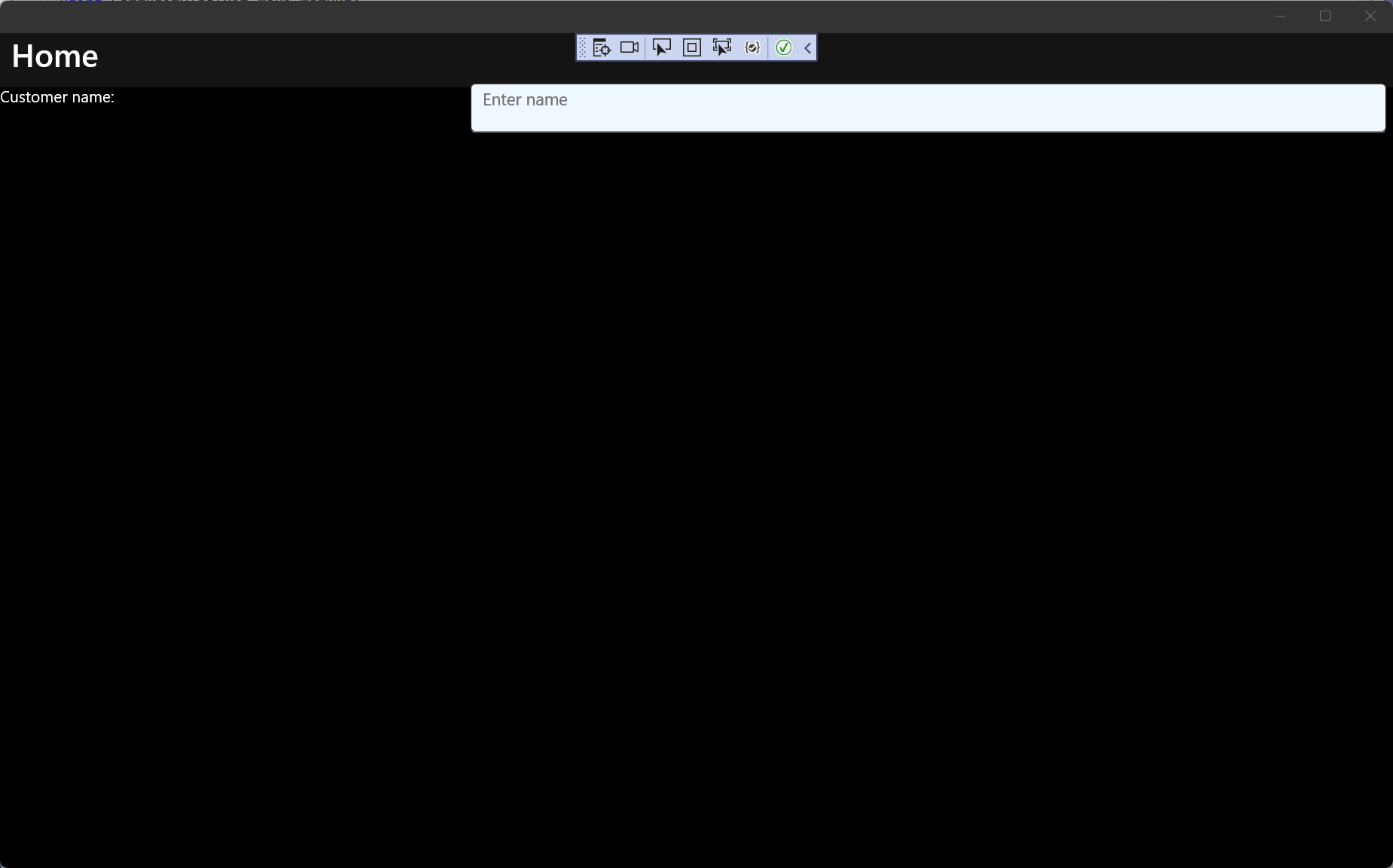
You're now ready to run the app. Press F5 to build and run the project. The app should look similar to the following screenshot:
Summary and next steps
You've now created your first C# Markup app on Windows with .NET MAUI. To learn more about what you can do with C# Markup, see C# Markup documentation.
Related content
Resources for learning .NET MAUI