Note
Access to this page requires authorization. You can try signing in or changing directories.
Access to this page requires authorization. You can try changing directories.
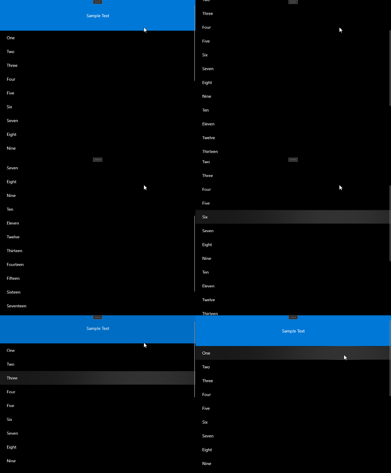
The FadeHeaderBehavior, QuickReturnHeaderBehavior, and StickyHeaderBehavior apply behaviors to ListView and GridView Headers.
The FadeHeaderBehavior causes the Header of a ListView or GridView to fade in and out as the user scrolls to the top of the ListView or GridView.
The QuickReturnHeaderBehavior causes the Header of a ListView or GridView to scroll into view as soon as the user scrolls up even if they are not near the of the ListView or GridView.
The StickyHeaderBehavior causes the Header of a ListView or GridView to stay in view as the user scrolls up and down in the ListView or GridView.
Platform APIs: FadeHeaderBehavior, QuickReturnHeaderBehavior, StickyHeaderBehavior
Example
This is an example using the FadeHeaderBehavior the header will fade in and out of view when scrolling.
<ListView Name="listView">
    <interactivity:Interaction.Behaviors>
        <behaviors:FadeHeaderBehavior />
    </interactivity:Interaction.Behaviors>
    <ListView.Header>
        <Grid MinHeight="100" Background="#FF0078D7">
            <TextBlock HorizontalAlignment="Center" VerticalAlignment="Center" Text="Sample Text"/>
        </Grid>
    </ListView.Header>
    <ListView.ItemTemplate>
        <DataTemplate x:DataType="x:String">
            <Grid MinHeight="25" Margin="10">
                <TextBlock Text="{Binding}" VerticalAlignment="Center" />
            </Grid>
        </DataTemplate>
    </ListView.ItemTemplate>
    <ListView.Items>
        <x:String>One</x:String>
        <x:String>Two</x:String>
        <x:String>Three</x:String>
        <x:String>Four</x:String>
        <x:String>Five</x:String>
        <x:String>Six</x:String>
        <x:String>Seven</x:String>
        <x:String>Eight</x:String>
        <x:String>Nine</x:String>
        <x:String>Ten</x:String>
        <x:String>Eleven</x:String>
        <x:String>Twelve</x:String>
        <x:String>Thirteen</x:String>
        <x:String>Fourteen</x:String>
        <x:String>Fifteen</x:String>
        <x:String>Sixteen</x:String>
        <x:String>Seventeen</x:String>
        <x:String>Eighteen</x:String>
        <x:String>Nineteen</x:String>
        <x:String>Twenty</x:String>
    </ListView.Items>
</ListView>
Example Output

Sample Project
ScrollHeader. You can see this in action in Windows Community Toolkit Sample App.