Windows 應用程式中使用 StandardUICommand、XamlUICommand 和 ICommand 的命令
在本主題中,我們會說明 Windows 應用程式中的命令。 我們特別討論如何使用 XamlUICommand 和 StandardUICommand 類別 (連同 ICommand 介面) 來共用及管理各種控制項類型的命令 (不論所使用的裝置和輸入類型為何)。
跨各種控制項共用命令 (不論裝置與輸入類型為何)
重要 API
概觀
您可以透過 UI 互動直接叫用命令,例如按一下按鈕,或從操作功能表中選取項目。 也可以透過輸入裝置間接叫用,例如鍵盤快速操作鍵、手勢、語音辨識或自動化工具/協助工具。 一旦叫用,命令即可接著由控制項 (編輯控制項中的文字瀏覽)、視窗 (向後瀏覽) 或應用程式 (結束) 處理。
您可以在您應用程式內的特定內容上操作命令,例如刪除文字或復原動作,也可以進行免內容的操作,例如靜音音訊或調整亮度。
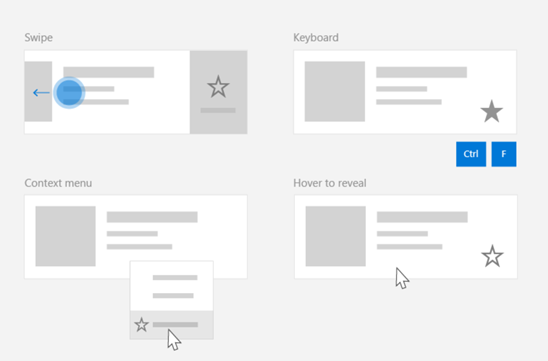
下圖顯示兩個共用一些相同命令的命令介面 (CommandBar 及浮動關聯式 CommandBarFlyout)。
命令列
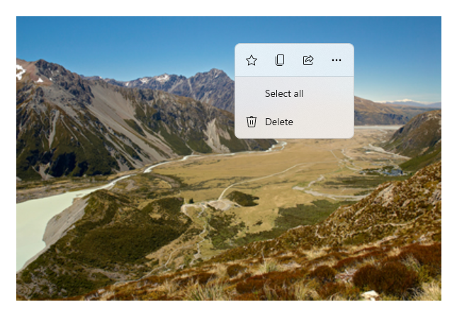
Microsoft 相片圖庫中的內容功能表
命令互動
由於有各式各樣可能影響命令叫用方式的裝置、輸入類型及 UI 介面,我們建議盡可能透過多個命令介面公開您的命令。 這些可以包含 Swipe、MenuBar、CommandBar、CommandBarFlyout 和傳統操作功能表的組合。
對於重要命令,請使用輸入專用加速器。 輸入加速器可讓使用者根據其所使用的輸入裝置,更快速地執行動作。
以下是各種輸入類型的一些常見輸入加速器:
- 指標 - 滑鼠和畫筆動態顯示按鈕
- 鍵盤 - 快速鍵 (便捷鍵和快速操作鍵)
- 觸控 - 撥動
- 觸控 - 拖動以重新整理資料
您必須考量輸入類型和使用者體驗,讓您的應用程式功能可隨處存取。 例如,集合 (尤其是使用者可編輯的集合) 通常包含各種特定命令,其執行方式因輸入裝置而相當不同。
下表列出了一些常見的集合命令,以及公開這些命令的方式。
| Command | 不限輸入類型 | 滑鼠快速操作 | 鍵盤快速操作鍵 | 觸控快速操作 |
|---|---|---|---|---|
| 刪除項目 | 內容功能表 | 暫留按鈕 | DEL 鍵 | 撥動以刪除 |
| 為項目加上旗標 | 內容功能表 | 暫留按鈕 | Ctrl+Shift+G | 撥動以加上旗標 |
| 重新整理資料 | 內容功能表 | N/A | F5 鍵 | 提取以重新整理 |
| 將項目加入我的最愛 | 內容功能表 | 暫留按鈕 | F、Ctrl+S | 撥動以加入我的最愛 |
一律提供操作功能表 我們建議在傳統操作功能表或 CommandBarFlyout 中包含所有相關的關聯式命令,因為所有輸入類型都支援這兩者。 比方說,如果某個命令僅在指標暫留事件期間公開,它就無法在只能觸控的裝置上使用。
Windows 應用程式中的命令
您可以使用一些方式來共用及管理 Windows 應用程式中的命令體驗。 您可以在程式碼後置中定義適用於標準互動 (例如 Click ) 的事件處理常式 (視您的 UI 複雜度而定,這可能相當沒有效率)、可以將適用於標準互動的事件接聽程式繫結至共用處理常式,也可以將控制項的 Command 屬性繫結至可描述命令邏輯的 ICommand 實作。
若要透過命令介面和最少的程式碼複製,有效率地提供豐富且完整的使用者體驗,我們建議使用本主題所述的命令繫結功能 (如需標準事件處理,請參閱個別的事件主題)。
若要將控制項繫結至共用命令資源,您可以自行實作 ICommand 介面,也可以從 XamlUICommand 基底類別或 StandardUICommand 衍生類別所定義的其中一個平台命令建置您的命令。
- ICommand 介面 (Windows.UI.Xaml.Input.ICommand 或 System.Windows.Input.ICommand) 可讓您在應用程式中建立完全自訂、可重複使用的命令。
- XamlUICommand 也提供這項功能,但藉由公開一組內建命令屬性,例如命令行為、鍵盤快速鍵 (便捷鍵和快速操作鍵)、圖示、標籤及描述,簡化開發作業。
- StandardUICommand 可讓您從一組已預先定義屬性的標準平台命令中選擇,進一步簡化作業。
重要
在 UWP 應用程式中,命令是 Windows.UI.Xaml.Input.ICommand (C++) 或 System.Windows.Input.ICommand (C#) 介面的實作,這取決於您所選擇的語言架構。
使用 StandardUICommand 類別的命令體驗
衍生自 XamlUiCommand (衍生自適用於 C++ 的 Windows.UI.Xaml.Input.ICommand 或適用於 C# 的 System.Windows.Input.ICommand),StandardUICommand 類別會公開一組標準平台命令,其具有使用預先定義的屬性,例如圖示、鍵盤快速操作鍵及描述。
StandardUICommand 提供快速且一致的方式來定義通用命令,例如 Save 或 Delete。 您只需要提供 execute 和 canExecute 函式。
範例
StandardUICommandSample
| 下載此範例的程式碼 |
|---|
| UWP 命令範例 (StandardUICommand) |
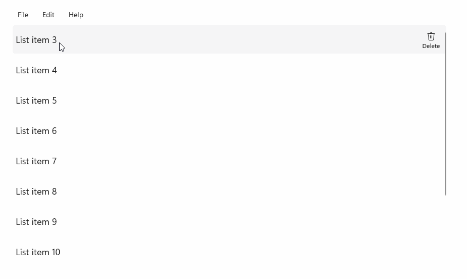
在此範例中,我們示範如何以透過 StandardUICommand 類別實作的 Delete 項目命令增強基本 ListView,同時使用 MenuBar、Swipe 控制項、動態顯示按鈕及操作功能表,將各種輸入類型的使用者體驗最佳化。
注意
此範例需要 Microsoft.UI.Xaml.Controls NuGet 套件,這是 Microsoft Windows UI 程式庫的一部分。
Xaml:
範例 UI 包含五個項目的 ListView。 Delete StandardUICommand 會繫結至 MenuBarItem、SwipeItem、AppBarButton 和 ContextFlyout 功能表。
<Page
    x:Class="StandardUICommandSample.MainPage"
    xmlns="http://schemas.microsoft.com/winfx/2006/xaml/presentation"
    xmlns:x="http://schemas.microsoft.com/winfx/2006/xaml"
    xmlns:local="using:StandardUICommandSample"
    xmlns:d="http://schemas.microsoft.com/expression/blend/2008"
    xmlns:mc="http://schemas.openxmlformats.org/markup-compatibility/2006"
    xmlns:muxcontrols="using:Microsoft.UI.Xaml.Controls"
    mc:Ignorable="d"
    Background="{ThemeResource ApplicationPageBackgroundThemeBrush}">

    <Page.Resources>
        <Style x:Key="HorizontalSwipe"
               TargetType="ListViewItem"
               BasedOn="{StaticResource ListViewItemRevealStyle}">
            <Setter Property="Height" Value="60"/>
            <Setter Property="Padding" Value="0"/>
            <Setter Property="HorizontalContentAlignment" Value="Stretch"/>
            <Setter Property="VerticalContentAlignment" Value="Stretch"/>
            <Setter Property="BorderThickness" Value="0"/>
        </Style>
    </Page.Resources>

    <Grid Loaded="ControlExample_Loaded">
        <Grid.RowDefinitions>
            <RowDefinition Height="Auto" />
            <RowDefinition Height="Auto" />
            <RowDefinition Height="*"/>
        </Grid.RowDefinitions>

        <StackPanel Grid.Row="0"
                    Padding="10"
                    BorderThickness="0,0,0,1"
                    BorderBrush="LightBlue"
                    Background="AliceBlue">
            <TextBlock Style="{StaticResource HeaderTextBlockStyle}">
                StandardUICommand sample
            </TextBlock>
            <TextBlock Style="{StaticResource SubtitleTextBlockStyle}" Margin="0,0,0,10">
                This sample shows how to use the StandardUICommand class to
                share a platform command and consistent user experiences
                across various controls.
            </TextBlock>
            <TextBlock Style="{StaticResource SubtitleTextBlockStyle}" Margin="0,0,0,0">
                Specifically, we define a standard delete command and add it
                to a variety of command surfaces, all of which share a common
                icon, label, keyboard accelerator, and description.
            </TextBlock>
        </StackPanel>

        <muxcontrols:MenuBar Grid.Row="1" Padding="10">
            <muxcontrols:MenuBarItem Title="File">
            </muxcontrols:MenuBarItem>
            <muxcontrols:MenuBarItem Title="Edit">
                <MenuFlyoutItem x:Name="DeleteFlyoutItem"/>
            </muxcontrols:MenuBarItem>
            <muxcontrols:MenuBarItem Title="Help">
            </muxcontrols:MenuBarItem>
        </muxcontrols:MenuBar>

        <ListView x:Name="ListViewRight" Grid.Row="2"
                  Loaded="ListView_Loaded"
                  IsItemClickEnabled="True"
                  SelectionMode="Single"
                  SelectionChanged="ListView_SelectionChanged"
                  ItemContainerStyle="{StaticResource HorizontalSwipe}">
            <ListView.ItemTemplate>
                <DataTemplate x:DataType="local:ListItemData">
                    <UserControl PointerEntered="ListViewSwipeContainer_PointerEntered"
                                 PointerExited="ListViewSwipeContainer_PointerExited">
                        <UserControl.ContextFlyout>
                            <MenuFlyout>
                                <MenuFlyoutItem
                                    Command="{x:Bind Command}"
                                    CommandParameter="{x:Bind Text}" />
                            </MenuFlyout>
                        </UserControl.ContextFlyout>
                        <Grid AutomationProperties.Name="{x:Bind Text}">
                            <VisualStateManager.VisualStateGroups>
                                <VisualStateGroup x:Name="HoveringStates">
                                    <VisualState x:Name="HoverButtonsHidden" />
                                    <VisualState x:Name="HoverButtonsShown">
                                        <VisualState.Setters>
                                            <Setter Target="HoverButton.Visibility"
                                                    Value="Visible" />
                                        </VisualState.Setters>
                                    </VisualState>
                                </VisualStateGroup>
                            </VisualStateManager.VisualStateGroups>
                            <SwipeControl x:Name="ListViewSwipeContainer" >
                                <SwipeControl.RightItems>
                                    <SwipeItems Mode="Execute">
                                        <SwipeItem x:Name="DeleteSwipeItem"
                                                   Background="Red"
                                                   Command="{x:Bind Command}"
                                                   CommandParameter="{x:Bind Text}"/>
                                    </SwipeItems>
                                </SwipeControl.RightItems>
                                <Grid VerticalAlignment="Center">
                                    <TextBlock Text="{x:Bind Text}"
                                               Margin="10"
                                               FontSize="18"
                                               HorizontalAlignment="Left"
                                               VerticalAlignment="Center"/>
                                    <AppBarButton x:Name="HoverButton"
                                                  IsTabStop="False"
                                                  HorizontalAlignment="Right"
                                                  Visibility="Collapsed"
                                                  Command="{x:Bind Command}"
                                                  CommandParameter="{x:Bind Text}"/>
                                </Grid>
                            </SwipeControl>
                        </Grid>
                    </UserControl>
                </DataTemplate>
            </ListView.ItemTemplate>
        </ListView>
    </Grid>
</Page>
程式碼後置
- 首先,我們會定義
ListItemData類別,其中包含 ListView 中每個 ListViewItem 的文字字串和 ICommand。
public class ListItemData
{
    public String Text { get; set; }
    public ICommand Command { get; set; }
}
- 在 MainPage 類別中,我們會針對 ListViewItemTemplate 的 DataTemplate定義
ListItemData物件集合。 我們會接著在其中填入 5 個項目的初始集合 (使用文字和相關聯的 StandardUICommand Delete)。
/// <summary>
/// ListView item collection.
/// </summary>
ObservableCollection<ListItemData> collection =
    new ObservableCollection<ListItemData>();

/// <summary>
/// Handler for the layout Grid control load event.
/// </summary>
/// <param name="sender">Source of the control loaded event</param>
/// <param name="e">Event args for the loaded event</param>
private void ControlExample_Loaded(object sender, RoutedEventArgs e)
{
    // Create the standard Delete command.
    var deleteCommand = new StandardUICommand(StandardUICommandKind.Delete);
    deleteCommand.ExecuteRequested += DeleteCommand_ExecuteRequested;

    DeleteFlyoutItem.Command = deleteCommand;

    for (var i = 0; i < 5; i++)
    {
        collection.Add(
            new ListItemData {
                Text = "List item " + i.ToString(),
                Command = deleteCommand });
    }
}

/// <summary>
/// Handler for the ListView control load event.
/// </summary>
/// <param name="sender">Source of the control loaded event</param>
/// <param name="e">Event args for the loaded event</param>
private void ListView_Loaded(object sender, RoutedEventArgs e)
{
    var listView = (ListView)sender;
    // Populate the ListView with the item collection.
    listView.ItemsSource = collection;
}
- 接下來,我們會定義用來實作項目刪除命令的 ICommand ExecuteRequested 處理常式。
/// <summary>
/// Handler for the Delete command.
/// </summary>
/// <param name="sender">Source of the command event</param>
/// <param name="e">Event args for the command event</param>
private void DeleteCommand_ExecuteRequested(
    XamlUICommand sender, ExecuteRequestedEventArgs args)
{
    // If possible, remove specified item from collection.
    if (args.Parameter != null)
    {
        foreach (var i in collection)
        {
            if (i.Text == (args.Parameter as string))
            {
                collection.Remove(i);
                return;
            }
        }
    }
    if (ListViewRight.SelectedIndex != -1)
    {
        collection.RemoveAt(ListViewRight.SelectedIndex);
    }
}
- 最後,我們會定義各種 ListView 事件的處理常式,包括 PointerEntered、PointerExited和 SelectionChanged 事件。 指標事件處理常式用來顯示或隱藏每個項目的 Delete 按鈕。
/// <summary>
/// Handler for the ListView selection changed event.
/// </summary>
/// <param name="sender">Source of the selection changed event</param>
/// <param name="e">Event args for the selection changed event</param>
private void ListView_SelectionChanged(object sender, SelectionChangedEventArgs e)
{
    if (ListViewRight.SelectedIndex != -1)
    {
        var item = collection[ListViewRight.SelectedIndex];
    }
}

/// <summary>
/// Handler for the pointer entered event.
/// Displays the delete item "hover" buttons.
/// </summary>
/// <param name="sender">Source of the pointer entered event</param>
/// <param name="e">Event args for the pointer entered event</param>
private void ListViewSwipeContainer_PointerEntered(
    object sender, PointerRoutedEventArgs e)
{
    if (e.Pointer.PointerDeviceType ==
        Windows.Devices.Input.PointerDeviceType.Mouse ||
        e.Pointer.PointerDeviceType ==
        Windows.Devices.Input.PointerDeviceType.Pen)
    {
        VisualStateManager.GoToState(
            sender as Control, "HoverButtonsShown", true);
    }
}

/// <summary>
/// Handler for the pointer exited event.
/// Hides the delete item "hover" buttons.
/// </summary>
/// <param name="sender">Source of the pointer exited event</param>
/// <param name="e">Event args for the pointer exited event</param>

private void ListViewSwipeContainer_PointerExited(
    object sender, PointerRoutedEventArgs e)
{
    VisualStateManager.GoToState(
        sender as Control, "HoverButtonsHidden", true);
}
使用 XamlUICommand 類別的命令體驗
如果您需要建立一個不是由 StandardUICommand 類別所定義的命令,或您想要更充分掌控命令外觀,XamlUiCommand 類別會衍生自 ICommand 介面,並新增各種 UI 屬性 (例如圖示、標籤、描述和鍵盤快速鍵)、方法和事件,以快速定義自訂命令的 UI 和行為。
XamlUICommand 可讓您透過控制項繫結來指定 UI,例如圖示、標籤、描述和鍵盤快速鍵 (便捷鍵和鍵盤快速操作鍵),而不需設定個別的屬性。
範例
XamlUICommandSample
| 下載此範例的程式碼 |
|---|
| UWP 命令範例 (XamlUICommand) |
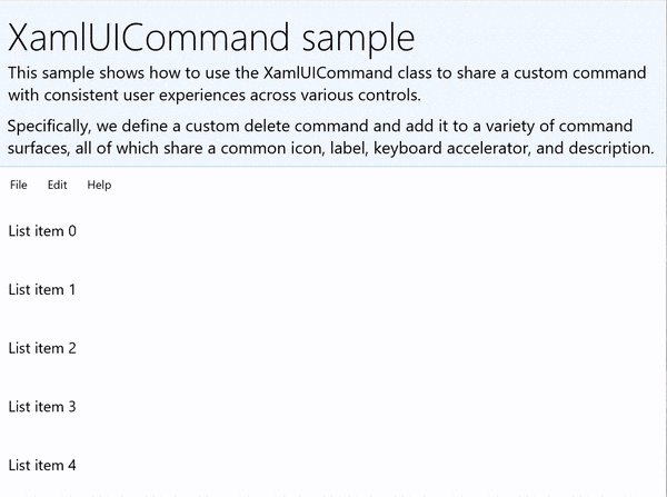
此範例共用前一個 StandardUICommand 範例的 Delete 功能,但會顯示 XamlUICommand 類別如何讓您以自己的字型圖示、標籤、鍵盤快速操作鍵和描述來定義自訂 delete 命令。 如同 StandardUICommand範例,我們以透過 XamlUICommand類別實作的 Delete 項目命令增強基本 ListView,同時使用 MenuBar、Swipe 控制項、動態顯示按鈕及操作功能表,將各種輸入類型的使用者體驗最佳化。
實際上,許多平台控制項會使用 XamlUICommand 屬性,就像上一節中的 StandardUICommand 範例一樣。
注意
此範例需要 Microsoft.UI.Xaml.Controls NuGet 套件,這是 Microsoft Windows UI 程式庫的一部分。
Xaml:
範例 UI 包含五個項目的 ListView。 自訂 XamlUICommand Delete 會繫結至 MenuBarItem、SwipeItem、AppBarButton 和 ContextFlyout 功能表。
<Page
x:Class="XamlUICommand_Sample.MainPage"
xmlns="http://schemas.microsoft.com/winfx/2006/xaml/presentation"
xmlns:x="http://schemas.microsoft.com/winfx/2006/xaml"
xmlns:local="using:XamlUICommand_Sample"
xmlns:d="http://schemas.microsoft.com/expression/blend/2008"
xmlns:mc="http://schemas.openxmlformats.org/markup-compatibility/2006"
xmlns:muxcontrols="using:Microsoft.UI.Xaml.Controls"
mc:Ignorable="d"
Background="{ThemeResource ApplicationPageBackgroundThemeBrush}">
<Page.Resources>
<XamlUICommand x:Name="CustomXamlUICommand"
ExecuteRequested="DeleteCommand_ExecuteRequested"
Description="Custom XamlUICommand"
Label="Custom XamlUICommand">
<XamlUICommand.IconSource>
<FontIconSource FontFamily="Wingdings" Glyph="M"/>
</XamlUICommand.IconSource>
<XamlUICommand.KeyboardAccelerators>
<KeyboardAccelerator Key="D" Modifiers="Control"/>
</XamlUICommand.KeyboardAccelerators>
</XamlUICommand>
<Style x:Key="HorizontalSwipe"
TargetType="ListViewItem"
BasedOn="{StaticResource ListViewItemRevealStyle}">
<Setter Property="Height" Value="70"/>
<Setter Property="Padding" Value="0"/>
<Setter Property="HorizontalContentAlignment" Value="Stretch"/>
<Setter Property="VerticalContentAlignment" Value="Stretch"/>
<Setter Property="BorderThickness" Value="0"/>
</Style>
</Page.Resources>
<Grid Loaded="ControlExample_Loaded" Name="MainGrid">
<Grid.RowDefinitions>
<RowDefinition Height="Auto" />
<RowDefinition Height="Auto" />
<RowDefinition Height="*"/>
</Grid.RowDefinitions>
<StackPanel Grid.Row="0"
Padding="10"
BorderThickness="0,0,0,1"
BorderBrush="LightBlue"
Background="AliceBlue">
<TextBlock Style="{StaticResource HeaderTextBlockStyle}">
XamlUICommand sample
</TextBlock>
<TextBlock Style="{StaticResource SubtitleTextBlockStyle}" Margin="0,0,0,10">
This sample shows how to use the XamlUICommand class to
share a custom command with consistent user experiences
across various controls.
</TextBlock>
<TextBlock Style="{StaticResource SubtitleTextBlockStyle}" Margin="0,0,0,0">
Specifically, we define a custom delete command and add it
to a variety of command surfaces, all of which share a common
icon, label, keyboard accelerator, and description.
</TextBlock>
</StackPanel>
<muxcontrols:MenuBar Grid.Row="1">
<muxcontrols:MenuBarItem Title="File">
</muxcontrols:MenuBarItem>
<muxcontrols:MenuBarItem Title="Edit">
<MenuFlyoutItem x:Name="DeleteFlyoutItem"
Command="{StaticResource CustomXamlUICommand}"/>
</muxcontrols:MenuBarItem>
<muxcontrols:MenuBarItem Title="Help">
</muxcontrols:MenuBarItem>
</muxcontrols:MenuBar>
<ListView x:Name="ListViewRight" Grid.Row="2"
Loaded="ListView_Loaded"
IsItemClickEnabled="True"
SelectionMode="Single"
SelectionChanged="ListView_SelectionChanged"
ItemContainerStyle="{StaticResource HorizontalSwipe}">
<ListView.ItemTemplate>
<DataTemplate x:DataType="local:ListItemData">
<UserControl PointerEntered="ListViewSwipeContainer_PointerEntered"
PointerExited="ListViewSwipeContainer_PointerExited">
<UserControl.ContextFlyout>
<MenuFlyout>
<MenuFlyoutItem
Command="{x:Bind Command}"
CommandParameter="{x:Bind Text}" />
</MenuFlyout>
</UserControl.ContextFlyout>
<Grid AutomationProperties.Name="{x:Bind Text}">
<VisualStateManager.VisualStateGroups>
<VisualStateGroup x:Name="HoveringStates">
<VisualState x:Name="HoverButtonsHidden" />
<VisualState x:Name="HoverButtonsShown">
<VisualState.Setters>
<Setter Target="HoverButton.Visibility"
Value="Visible" />
</VisualState.Setters>
</VisualState>
</VisualStateGroup>
</VisualStateManager.VisualStateGroups>
<SwipeControl x:Name="ListViewSwipeContainer">
<SwipeControl.RightItems>
<SwipeItems Mode="Execute">
<SwipeItem x:Name="DeleteSwipeItem"
Background="Red"
Command="{x:Bind Command}"
CommandParameter="{x:Bind Text}"/>
</SwipeItems>
</SwipeControl.RightItems>
<Grid VerticalAlignment="Center">
<TextBlock Text="{x:Bind Text}"
Margin="10"
FontSize="18"
HorizontalAlignment="Left"
VerticalAlignment="Center"/>
<AppBarButton x:Name="HoverButton"
IsTabStop="False"
HorizontalAlignment="Right"
Visibility="Collapsed"
Command="{x:Bind Command}"
CommandParameter="{x:Bind Text}"/>
</Grid>
</SwipeControl>
</Grid>
</UserControl>
</DataTemplate>
</ListView.ItemTemplate>
</ListView>
</Grid>
</Page>
程式碼後置
- 首先,我們會定義
ListItemData類別,其中包含 ListView 中每個 ListViewItem 的文字字串和 ICommand。
public class ListItemData
{
    public String Text { get; set; }
    public ICommand Command { get; set; }
}
- 在 MainPage 類別中,我們會針對 ListViewItemTemplate 的 DataTemplate定義
ListItemData物件集合。 我們會接著在其中填入 5 個項目的初始集合 (使用文字和相關聯的 XamlUICommand)。
ObservableCollection<ListItemData> collection = new ObservableCollection<ListItemData>();

private void ControlExample_Loaded(object sender, RoutedEventArgs e)
{
    for (var i = 0; i < 5; i++)
    {
        collection.Add(
           new ListItemData { Text = "List item " + i.ToString(), Command = CustomXamlUICommand });
    }
}

private void ListView_Loaded(object sender, RoutedEventArgs e)
{
    var listView = (ListView)sender;
    listView.ItemsSource = collection;
}
- 接下來,我們會定義用來實作項目刪除命令的 ICommand ExecuteRequested 處理常式。
private void DeleteCommand_ExecuteRequested(
   XamlUICommand sender, ExecuteRequestedEventArgs args)
{
    if (args.Parameter != null)
    {
        foreach (var i in collection)
        {
            if (i.Text == (args.Parameter as string))
            {
                collection.Remove(i);
                return;
            }
        }
    }
    if (ListViewRight.SelectedIndex != -1)
    {
        collection.RemoveAt(ListViewRight.SelectedIndex);
    }
}
- 最後,我們會定義各種 ListView 事件的處理常式,包括 PointerEntered、PointerExited和 SelectionChanged 事件。 指標事件處理常式用來顯示或隱藏每個項目的 Delete 按鈕。
private void ListView_SelectionChanged(object sender, SelectionChangedEventArgs e)
{
    if (ListViewRight.SelectedIndex != -1)
    {
        var item = collection[ListViewRight.SelectedIndex];
    }
}

private void ListViewSwipeContainer_PointerEntered(object sender, PointerRoutedEventArgs e)
{
    if (e.Pointer.PointerDeviceType ==
        Windows.Devices.Input.PointerDeviceType.Mouse ||
        e.Pointer.PointerDeviceType == Windows.Devices.Input.PointerDeviceType.Pen)
    {
        VisualStateManager.GoToState(sender as Control, "HoverButtonsShown", true);
    }
}

private void ListViewSwipeContainer_PointerExited(object sender, PointerRoutedEventArgs e)
{
    VisualStateManager.GoToState(sender as Control, "HoverButtonsHidden", true);
}
使用 ICommand 介面的命令體驗
標準 UWP 控制項 (按鈕、清單、選取項目、行事曆、預測文字) 提供許多常見命令體驗的基礎。 如需完整的控制項類型清單,請參閱適用於 Windows 應用程式的控制項和模式。
支援結構化命令體驗的最基本方式就是定義 ICommand 介面實作 (適用於 C++ 的 Windows.UI.Xaml.Input.ICommand或適用於 C# 的 System.Windows.Input.ICommand)。 此 ICommand 執行個體可以接著繫結至按鈕等控制項。
注意
在某些情況下,就如同將方法繫結至 Click 事件以及將屬性繫結至 IsEnabled 屬性一樣有效率。
範例
ICommand example
| 下載此範例的程式碼 |
|---|
| UWP 命令範例 (ICommand) |
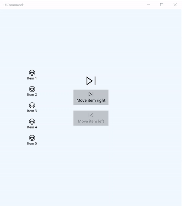
在此基本範例中,我們會示範如何透過按一下按鈕、鍵盤快速操作鍵及轉動滑鼠滾輪來叫用單一命令。
我們使用兩個 Listview(一個填入五個項目,另一個是空的),以及兩個按鈕 (一個用於將項目從左邊 ListView 移到右邊 ListView,另一個用於將項目從右邊移到左邊)。 每個按鈕都會繫結至對應的命令 (分別是 ViewModel.MoveRightCommand 和 ViewModel.MoveLeftCommand),並且會根據其相關 ListView 中的項目數自動啟用和停用。
下列 XAML 程式碼針對我們的範例定義 UI。
<Page
x:Class="UICommand1.View.MainPage"
xmlns="http://schemas.microsoft.com/winfx/2006/xaml/presentation"
xmlns:x="http://schemas.microsoft.com/winfx/2006/xaml"
xmlns:vm="using:UICommand1.ViewModel"
xmlns:d="http://schemas.microsoft.com/expression/blend/2008"
xmlns:mc="http://schemas.openxmlformats.org/markup-compatibility/2006"
mc:Ignorable="d"
Background="{ThemeResource ApplicationPageBackgroundThemeBrush}">
<Page.Resources>
<vm:OpacityConverter x:Key="opaque" />
</Page.Resources>
<Grid Name="ItemGrid"
Background="AliceBlue"
PointerWheelChanged="Page_PointerWheelChanged">
<Grid.ColumnDefinitions>
<ColumnDefinition Width="*"/>
<ColumnDefinition Width="2*"/>
<ColumnDefinition Width="*"/>
</Grid.ColumnDefinitions>
<ListView Grid.Column="0" VerticalAlignment="Center"
x:Name="CommandListView"
ItemsSource="{x:Bind Path=ViewModel.ListItemLeft}"
SelectionMode="None" IsItemClickEnabled="False"
HorizontalAlignment="Right">
<ListView.ItemTemplate>
<DataTemplate x:DataType="vm:ListItemData">
<Grid VerticalAlignment="Center">
<AppBarButton Label="{x:Bind ListItemText}">
<AppBarButton.Icon>
<SymbolIcon Symbol="{x:Bind ListItemIcon}"/>
</AppBarButton.Icon>
</AppBarButton>
</Grid>
</DataTemplate>
</ListView.ItemTemplate>
</ListView>
<Grid Grid.Column="1" Margin="0,0,0,0"
HorizontalAlignment="Center"
VerticalAlignment="Center">
<Grid.RowDefinitions>
<RowDefinition Height="*"/>
<RowDefinition Height="*"/>
<RowDefinition Height="*"/>
</Grid.RowDefinitions>
<StackPanel Grid.Row="1">
<FontIcon FontFamily="{StaticResource SymbolThemeFontFamily}"
FontSize="40" Glyph=""
Opacity="{x:Bind Path=ViewModel.ListItemLeft.Count,
Mode=OneWay, Converter={StaticResource opaque}}"/>
<Button Name="MoveItemRightButton"
Margin="0,10,0,10" Width="120" HorizontalAlignment="Center"
Command="{x:Bind Path=ViewModel.MoveRightCommand}">
<Button.KeyboardAccelerators>
<KeyboardAccelerator
Modifiers="Control"
Key="Add" />
</Button.KeyboardAccelerators>
<StackPanel>
<SymbolIcon Symbol="Next"/>
<TextBlock>Move item right</TextBlock>
</StackPanel>
</Button>
<Button Name="MoveItemLeftButton"
Margin="0,10,0,10" Width="120" HorizontalAlignment="Center"
Command="{x:Bind Path=ViewModel.MoveLeftCommand}">
<Button.KeyboardAccelerators>
<KeyboardAccelerator
Modifiers="Control"
Key="Subtract" />
</Button.KeyboardAccelerators>
<StackPanel>
<SymbolIcon Symbol="Previous"/>
<TextBlock>Move item left</TextBlock>
</StackPanel>
</Button>
<FontIcon FontFamily="{StaticResource SymbolThemeFontFamily}"
FontSize="40" Glyph=""
Opacity="{x:Bind Path=ViewModel.ListItemRight.Count,
Mode=OneWay, Converter={StaticResource opaque}}"/>
</StackPanel>
</Grid>
<ListView Grid.Column="2"
x:Name="CommandListViewRight"
VerticalAlignment="Center"
IsItemClickEnabled="False"
SelectionMode="None"
ItemsSource="{x:Bind Path=ViewModel.ListItemRight}"
HorizontalAlignment="Left">
<ListView.ItemTemplate>
<DataTemplate x:DataType="vm:ListItemData">
<Grid VerticalAlignment="Center">
<AppBarButton Label="{x:Bind ListItemText}">
<AppBarButton.Icon>
<SymbolIcon Symbol="{x:Bind ListItemIcon}"/>
</AppBarButton.Icon>
</AppBarButton>
</Grid>
</DataTemplate>
</ListView.ItemTemplate>
</ListView>
</Grid>
</Page>
以下是上述 UI 的程式碼後置。
在程式碼後置中,我們會連線到包含命令碼的檢視模型。 此外,我們會定義從滑鼠滾輪輸入的處理常式,其也會連線我們的命令碼。
using Windows.UI.Xaml;
using Windows.UI.Xaml.Input;
using Windows.UI.Xaml.Controls;
using UICommand1.ViewModel;
using Windows.System;
using Windows.UI.Core;

namespace UICommand1.View
{
    /// <summary>
    /// An empty page that can be used on its own or navigated to within a Frame.
    /// </summary>
    public sealed partial class MainPage : Page
    {
        // Reference to our view model.
        public UICommand1ViewModel ViewModel { get; set; }

        // Initialize our view and view model.
        public MainPage()
        {
            this.InitializeComponent();
            ViewModel = new UICommand1ViewModel();
        }

        /// <summary>
        /// Handle mouse wheel input and assign our
        /// commands to appropriate direction of rotation.
        /// </summary>
        /// <param name="sender"></param>
        /// <param name="e"></param>
        private void Page_PointerWheelChanged(object sender, PointerRoutedEventArgs e)
        {
            var props = e.GetCurrentPoint(sender as UIElement).Properties;

            // Require CTRL key and accept only vertical mouse wheel movement
            // to eliminate accidental wheel input.
            if ((Window.Current.CoreWindow.GetKeyState(VirtualKey.Control) !=
                CoreVirtualKeyStates.None) && !props.IsHorizontalMouseWheel)
            {
                bool delta = props.MouseWheelDelta < 0 ? true : false;

                switch (delta)
                {
                    case true:
                        ViewModel.MoveRight();
                        break;
                    case false:
                        ViewModel.MoveLeft();
                        break;
                    default:
                        break;
                }
            }
        }
    }
}
以下是我們的檢視模型中的程式碼
在我們的檢視模型中,我們為應用程式中的兩個命令定義執行詳細資料、填入一個 ListView,以及提供不透明度值轉換器,以便根據每個 ListView 的項目計數來隱藏或顯示額外一些 UI。
using System;
using System.Collections.ObjectModel;
using System.ComponentModel;
using Windows.UI.Xaml.Controls;
using Windows.UI.Xaml.Data;

namespace UICommand1.ViewModel
{
    /// <summary>
    /// UI properties for our list items.
    /// </summary>
    public class ListItemData
    {
        /// <summary>
        /// Gets and sets the list item content string.
        /// </summary>
        public string ListItemText { get; set; }
        /// <summary>
        /// Gets and sets the list item icon.
        /// </summary>
        public Symbol ListItemIcon { get; set; }
    }

    /// <summary>
    /// View Model that sets up a command to handle invoking the move item buttons.
    /// </summary>
    public class UICommand1ViewModel
    {
        /// <summary>
        /// The command to invoke when the Move item left button is pressed.
        /// </summary>
        public RelayCommand MoveLeftCommand { get; private set; }

        /// <summary>
        /// The command to invoke when the Move item right button is pressed.
        /// </summary>
        public RelayCommand MoveRightCommand { get; private set; }

        // Item collections
        public ObservableCollection<ListItemData> ListItemLeft { get; } =
           new ObservableCollection<ListItemData>();
        public ObservableCollection<ListItemData> ListItemRight { get; } =
           new ObservableCollection<ListItemData>();

        public ListItemData listItem;

        /// <summary>
        /// Sets up a command to handle invoking the move item buttons.
        /// </summary>
        public UICommand1ViewModel()
        {
            MoveLeftCommand =
               new RelayCommand(new Action(MoveLeft), CanExecuteMoveLeftCommand);
            MoveRightCommand =
               new RelayCommand(new Action(MoveRight), CanExecuteMoveRightCommand);

            LoadItems();
        }

        /// <summary>
        ///  Populate our list of items.
        /// </summary>
        public void LoadItems()
        {
            for (var x = 0; x <= 4; x++)
            {
                listItem = new ListItemData();
                listItem.ListItemText = "Item " + (ListItemLeft.Count + 1).ToString();
                listItem.ListItemIcon = Symbol.Emoji;
                ListItemLeft.Add(listItem);
            }
        }

        /// <summary>
        /// Move left command valid when items present in the list on right.
        /// </summary>
        /// <returns>True, if count is greater than 0.</returns>
        private bool CanExecuteMoveLeftCommand()
        {
            return ListItemRight.Count > 0;
        }

        /// <summary>
        /// Move right command valid when items present in the list on left.
        /// </summary>
        /// <returns>True, if count is greater than 0.</returns>
        private bool CanExecuteMoveRightCommand()
        {
            return ListItemLeft.Count > 0;
        }

        /// <summary>
        /// The command implementation to execute when the Move item right button is pressed.
        /// </summary>
        public void MoveRight()
        {
            if (ListItemLeft.Count > 0)
            {
                listItem = new ListItemData();
                ListItemRight.Add(listItem);
                listItem.ListItemText = "Item " + ListItemRight.Count.ToString();
                listItem.ListItemIcon = Symbol.Emoji;
                ListItemLeft.RemoveAt(ListItemLeft.Count - 1);
                MoveRightCommand.RaiseCanExecuteChanged();
                MoveLeftCommand.RaiseCanExecuteChanged();
            }
        }

        /// <summary>
        /// The command implementation to execute when the Move item left button is pressed.
        /// </summary>
        public void MoveLeft()
        {
            if (ListItemRight.Count > 0)
            {
                listItem = new ListItemData();
                ListItemLeft.Add(listItem);
                listItem.ListItemText = "Item " + ListItemLeft.Count.ToString();
                listItem.ListItemIcon = Symbol.Emoji;
                ListItemRight.RemoveAt(ListItemRight.Count - 1);
                MoveRightCommand.RaiseCanExecuteChanged();
                MoveLeftCommand.RaiseCanExecuteChanged();
            }
        }

        /// <summary>
        /// Views subscribe to this event to get notified of property updates.
        /// </summary>
        public event PropertyChangedEventHandler PropertyChanged;

        /// <summary>
        /// Notify subscribers of updates to the named property
        /// </summary>
        /// <param name="propertyName">The full, case-sensitive, name of a property.</param>
        protected void NotifyPropertyChanged(string propertyName)
        {
            PropertyChangedEventHandler handler = this.PropertyChanged;
            if (handler != null)
            {
                PropertyChangedEventArgs args = new PropertyChangedEventArgs(propertyName);
                handler(this, args);
            }
        }
    }

    /// <summary>
    /// Convert a collection count to an opacity value of 0.0 or 1.0.
    /// </summary>
    public class OpacityConverter : IValueConverter
    {
        /// <summary>
        /// Converts a collection count to an opacity value of 0.0 or 1.0.
        /// </summary>
        /// <param name="value">The count passed in</param>
        /// <param name="targetType">Ignored.</param>
        /// <param name="parameter">Ignored</param>
        /// <param name="language">Ignored</param>
        /// <returns>1.0 if count > 0, otherwise returns 0.0</returns>
        public object Convert(object value, Type targetType, object parameter, string language)
        {
            return ((int)value > 0 ? 1.0 : 0.0);
        }

        /// <summary>
        /// Not used, converter is not intended for two-way binding.
        /// </summary>
        /// <param name="value">Ignored</param>
        /// <param name="targetType">Ignored</param>
        /// <param name="parameter">Ignored</param>
        /// <param name="language">Ignored</param>
        /// <returns></returns>
        public object ConvertBack(object value, Type targetType, object parameter, string language)
        {
            throw new NotImplementedException();
        }
    }
}
最後,以下是我們的 ICommand 介面實作
在此,我們會定義一個命令,以實作 ICommand 介面並將其功能轉送到其他物件。
using System;
using System.Windows.Input;

namespace UICommand1
{
    /// <summary>
    /// A command whose sole purpose is to relay its functionality
    /// to other objects by invoking delegates.
    /// The default return value for the CanExecute method is 'true'.
    /// <see cref="RaiseCanExecuteChanged"/> needs to be called whenever
    /// <see cref="CanExecute"/> is expected to return a different value.
    /// </summary>
    public class RelayCommand : ICommand
    {
        private readonly Action _execute;
        private readonly Func<bool> _canExecute;

        /// <summary>
        /// Raised when RaiseCanExecuteChanged is called.
        /// </summary>
        public event EventHandler CanExecuteChanged;

        /// <summary>
        /// Creates a new command that can always execute.
        /// </summary>
        /// <param name="execute">The execution logic.</param>
        public RelayCommand(Action execute)
            : this(execute, null)
        {
        }

        /// <summary>
        /// Creates a new command.
        /// </summary>
        /// <param name="execute">The execution logic.</param>
        /// <param name="canExecute">The execution status logic.</param>
        public RelayCommand(Action execute, Func<bool> canExecute)
        {
            if (execute == null)
                throw new ArgumentNullException("execute");
            _execute = execute;
            _canExecute = canExecute;
        }

        /// <summary>
        /// Determines whether this <see cref="RelayCommand"/> can execute in its current state.
        /// </summary>
        /// <param name="parameter">
        /// Data used by the command. If the command does not require
        /// data to be passed, this object can be set to null.
        /// </param>
        /// <returns>true if this command can be executed; otherwise, false.</returns>
        public bool CanExecute(object parameter)
        {
            return _canExecute == null ? true : _canExecute();
        }

        /// <summary>
        /// Executes the <see cref="RelayCommand"/> on the current command target.
        /// </summary>
        /// <param name="parameter">
        /// Data used by the command. If the command does not require
        /// data to be passed, this object can be set to null.
        /// </param>
        public void Execute(object parameter)
        {
            _execute();
        }

        /// <summary>
        /// Method used to raise the <see cref="CanExecuteChanged"/> event
        /// to indicate that the return value of the <see cref="CanExecute"/>
        /// method has changed.
        /// </summary>
        public void RaiseCanExecuteChanged()
        {
            var handler = CanExecuteChanged;
            if (handler != null)
            {
                handler(this, EventArgs.Empty);
            }
        }
    }
}
摘要
通用 Windows 平台提供強大且富有彈性的命令系統,可讓您建置應用程式來共用及管理各種控制項類型、裝置和輸入類型的命令。
建立 Windows 應用程式的命令時,請使用下列方法:
- 在 XAML/程式碼後置中接聽和處理事件
- 繫結至事件處理常式方法,例如 Click
- 定義您自己的 ICommand 實作
- 使用您自己的一組預先定義屬性值來建立 XamlUICommand 物件
- 使用一組預先定義的平台屬性和值來建立 StandardUICommand 物件
下一步
如需示範 XamlUICommand 和 StandardUICommand 實作的完整範例,請參閱 XAML 控制項庫範例。
另請參閱
範例
主題範例
其他範例

意見反應
即將登場:在 2024 年,我們將逐步淘汰 GitHub 問題作為內容的意見反應機制,並將它取代為新的意見反應系統。 如需詳細資訊,請參閱:https://aka.ms/ContentUserFeedback。
提交並檢視相關的意見反應