Using Synoptic Panel Custom Visualization in Power BI
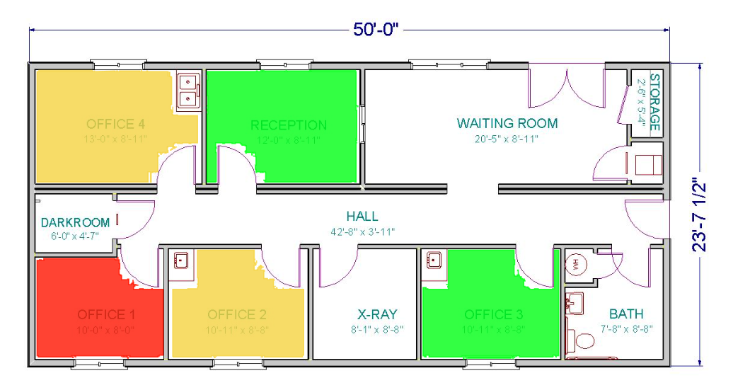
As part of the recently concluded Readiness program(Phase 1) for Data Insights team, we were assigned HVAC (Heating, Ventilation and Air conditioning) data analysis solution. I was planning to make a visualization in PowerBI that would display the building plan and indicate the temperature conditions of each meeting rooms. Something in line with the below image, where “Office 1” (meeting room) actual temperature seems to be high above the target temperature.
Achieving the above seemed possible with a bit of custom visualization by drawing layers over image using svg. But with the timeline of the readiness program, I was not able to develop this. Recently I came across a custom visualization which enables to create this very easily. It’s called Synoptic Designer for PowerBI, apparently the winner of Power BI Best Visual Contest last year. If you have a requirement to depict the occupied seats in a Cinema hall, airplane, an office, parking lot or anything in lines with similar scenario. It’s very easy with PowerBI using this custom visualization, Read on!
Achieving this is four step process
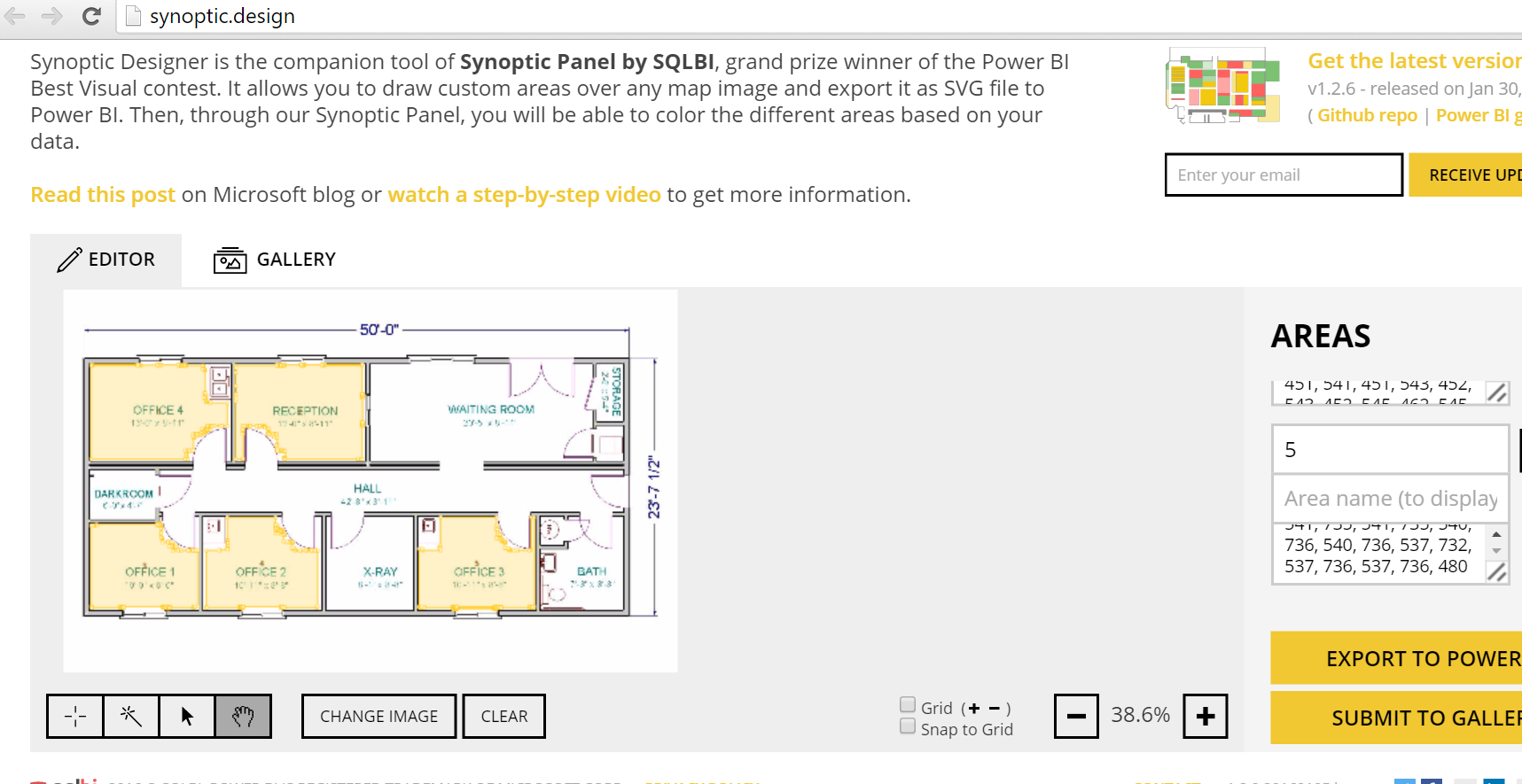
1) Create regions in your map using https://synoptic.design/. Upload your image and use the tools provided to create areas within the map. Each area will have an area name, remember this is the name to which you will be doing databinding later on. Once done with area creation in map, use the Export to Power BI option to download the. svg file for your map.
2) Download the custom visualization SynopticPanelBySQLBI. This is .pbivzi file(the extension for custom visualizations in PowerBI)
3) Model your data in a way that suits the visualization. For achieving the data for the above scenario I made following dataset. The Room Numbers are the name which I gave in Step 1. Import this data to PowerBI
| Room | Target Temparature | Actual Temparature | Variance |
| 1 | 24 | 26 | 2 |
| 2 | 23 | 23 | 0 |
| 3 | 24 | 28 | 4 |
| 4 | 24 | 21 | 3 |
| 5 | 24 | 23 | 1 |
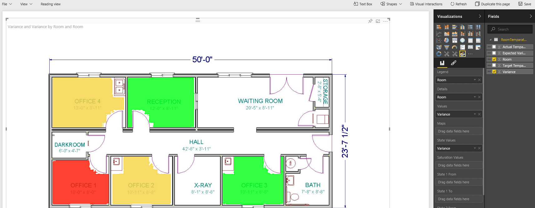
4) Import Custom Visualization that you downloaded in Step 2 onto PowerBI. Drag the Visualisation to Page and from the Dataset fields drag drop Room Attribute to Details and Variance attribute to Values and State Values
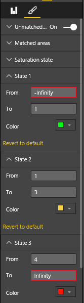
Click on the formatting section and specify the color and range values as shown in below image
With d3.js behind the scenes PowerBI custom visualizations rocks!