FlyoutPage
 浏览示例
浏览示例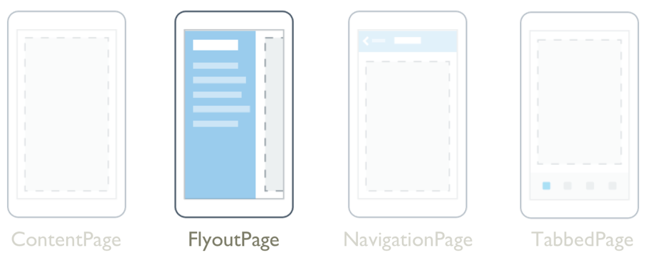
.NET Multi-platform App UI (.NET MAUI) FlyoutPage 是一个管理两个相关信息页面的页面 – 一个浮出控件页面和一个详细信息页面,前者显示项,而后者显示有关浮出控件页面上的项的详细信息。
FlyoutPage 有两种布局行为:
- 在弹出框布局中,详细信息页面会覆盖或部分覆盖浮出控件页面。 选择浮出控件页面上的项时,将会导航到相应的详细信息页面。 在手机上运行的应用始终使用此布局行为。
- 在拆分布局中,浮出控件页面显示在左侧,详细信息页面显示在右侧。 在平板电脑或桌面设备上运行的应用可以使用此布局行为,Windows 将默认使用它。
有关布局行为的详细信息,请参阅布局行为。
FlyoutPage 定义以下属性:
Detail,类型为 Page,用于定义针对浮出控件页面中的选定项显示的详细信息页面。Flyout,类型为 Page,用于定义浮出控件页面。FlyoutLayoutBehavior,类型为FlyoutLayoutBehavior,指示浮出控件面和详细信息页面的布局行为。IsGestureEnabled,类型为bool,确定轻扫手势是否在浮出控件页面和详细信息页面之间切换。 此属性的默认值为true。IsPresented,类型为bool,确定是否显示浮出控件页面或详细信息页面。 此属性的默认值是false,它显示详细信息页面。 应将其设置为true以显示浮出控件页面。
IsGestureEnabled、IsPresented 和 FlyoutLayoutBehavior 属性由 BindableProperty 对象提供支持,这意味着可以将它们用作数据绑定的目标,并能对它们进行样式设置。
FlyoutPage 还定义了 IsPresentedChanged 事件,在 IsPresented 属性更改值时会引发该事件。
警告
FlyoutPage 与 .NET MAUI Shell 应用不兼容,如果尝试在 Shell 应用中使用 FlyoutPage,将引发异常。 有关 Shell 应用的详细信息,请参阅 Shell。
创建 FlyoutPage
若要创建浮出控件页,需创建 FlyoutPage 对象并设置其 Flyout 和 Detail 属性。 应将 Flyout 属性设置为 ContentPage 对象,将 Detail 属性设置为 TabbedPage、NavigationPage 或 ContentPage 对象。 这将有助于确保在所有平台上都有一致的用户体验。
重要
FlyoutPage 被设计为应用的根页面,将其用作其他页面类型中的子页面可能会导致意外和不一致的行为。
下面的示例展示了设置 Flyout 和 Detail 属性的 FlyoutPage:
<FlyoutPage xmlns="http://schemas.microsoft.com/dotnet/2021/maui"
            xmlns:x="http://schemas.microsoft.com/winfx/2009/xaml"
            xmlns:local="clr-namespace:FlyoutPageNavigation"
            x:Class="FlyoutPageNavigation.MainPage">
    <FlyoutPage.Flyout>
        <local:FlyoutMenuPage x:Name="flyoutPage" />
    </FlyoutPage.Flyout>
    <FlyoutPage.Detail>
        <NavigationPage>
            <x:Arguments>
                <local:ContactsPage />
            </x:Arguments>
        </NavigationPage>
    </FlyoutPage.Detail>
</FlyoutPage>
在此示例中,Flyout 属性被设置为 ContentPage 对象,而 Detail 属性设置被为包含 ContentPage 对象的 NavigationPage。
以下示例展示了 FlyoutMenuPage 对象的定义,该对象的类型为 ContentPage:
<ContentPage xmlns="http://schemas.microsoft.com/dotnet/2021/maui"
             xmlns:x="http://schemas.microsoft.com/winfx/2009/xaml"
             xmlns:local="clr-namespace:FlyoutPageNavigation"
             x:Class="FlyoutPageNavigation.FlyoutMenuPage"
             Padding="0,40,0,0"
             IconImageSource="hamburger.png"
             Title="Personal Organiser">
    <CollectionView x:Name="collectionView"
                    x:FieldModifier="public"
                    SelectionMode="Single">
        <CollectionView.ItemsSource>
            <x:Array Type="{x:Type local:FlyoutPageItem}">
                <local:FlyoutPageItem Title="Contacts"
                                      IconSource="contacts.png"
                                      TargetType="{x:Type local:ContactsPage}" />
                <local:FlyoutPageItem Title="TodoList"
                                      IconSource="todo.png"
                                      TargetType="{x:Type local:TodoListPage}" />
                <local:FlyoutPageItem Title="Reminders"
                                      IconSource="reminders.png"
                                      TargetType="{x:Type local:ReminderPage}" />
            </x:Array>
        </CollectionView.ItemsSource>
        <CollectionView.ItemTemplate>
            <DataTemplate>
                <Grid Padding="5,10">
                    <Grid.ColumnDefinitions>
                        <ColumnDefinition Width="30"/>
                        <ColumnDefinition Width="*" />
                    </Grid.ColumnDefinitions>
                    <Image Source="{Binding IconSource}" />
                    <Label Grid.Column="1"
                           Margin="20,0"
                           Text="{Binding Title}"
                           FontSize="20"
                           FontAttributes="Bold"
                           VerticalOptions="Center" />
                </Grid>
            </DataTemplate>
        </CollectionView.ItemTemplate>
    </CollectionView>
</ContentPage>
在此示例中,浮出控件页面由 CollectionView 组成,通过将其 ItemsSource 属性设置为 FlyoutPageItem 对象的数组来填充数据。 以下示例展示了 FlyoutPageItem 类的定义:
public class FlyoutPageItem
{
    public string Title { get; set; }
    public string IconSource { get; set; }
    public Type TargetType { get; set; }
}
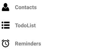
DataTemplate 指定为 CollectionView.ItemTemplate 属性以显示每个 FlyoutPageItem。 DataTemplate 包含由 Image 和 Label 组成的 Grid。 Image 显示 IconSource 属性值,Label 显示每个 FlyoutPageItem 的 Title 属性值。 此外,还设置了浮出控件页面的 Title 和 IconImageSource 属性。 如果详细信息页有标题栏,则图标将显示在详细信息页上。
注意
Flyout 页必须要有其 Title 属性集,否则会出现异常。
以下屏幕截图展示了生成的浮出控件:
创建并显示详细信息页
FlyoutMenuPage 对象包含从 MainPage 类引用的 CollectionView。 这允许 MainPage 类为 SelectionChanged 事件注册处理程序。 这使 MainPage 对象能够将 Detail 属性设置为表示所选 CollectionView 项的页面。 以下示例展示了事件处理程序:
public partial class MainPage : FlyoutPage
{
    public MainPage()
    {
        ...
        flyoutPage.collectionView.SelectionChanged += OnSelectionChanged;
    }

    void OnSelectionChanged(object sender, SelectionChangedEventArgs e)
    {
        var item = e.CurrentSelection.FirstOrDefault() as FlyoutPageItem;
        if (item != null)
        {
            Detail = new NavigationPage((Page)Activator.CreateInstance(item.TargetType));
            if (!((IFlyoutPageController)this).ShouldShowSplitMode)
                IsPresented = false;
        }
    }
}
在此示例中,OnSelectionChanged 事件处理程序从 CollectionView 对象中检索 CurrentSelection,并将详细信息页面设置为存储在 FlyoutPageItem 的 TargetType 属性中的页面类型的实例。 如果 FlyoutPage 未使用拆分布局,通过将 FlyoutPage.IsPresented 属性设置为 false 即可显示详细信息页面。 如果 FlyoutPage 使用拆分布局,则将同时显示浮出控件页面和详细信息页面,因此无需设置 FlyoutPage.IsPresented 属性。
布局行为
FlyoutPage 显示浮出控件页面和详细信息页面的方式取决于运行应用的设备的外形规格、设备的方向以及 FlyoutLayoutBehavior 属性的值。 此属性应设置为定义以下成员的 FlyoutLayoutBehavior 枚举的值:
Default– 使用平台默认值显示页面。Popover– 详细信息页面覆盖或部分覆盖浮出控件页面。Split– 浮出控件页面显示在左侧,详细信息页面显示在右侧。SplitOnLandscape– 设备处于横向时使用分屏。SplitOnPortrait– 设备处于纵向时使用分屏。
以下示例展示了如何在 FlyoutPage 上设置 FlyoutLayoutBehavior 属性:
<FlyoutPage ...
            FlyoutLayoutBehavior="Split">
  ...
</FlyoutPage>
重要
FlyoutLayoutBehavior 属性的值仅影响在平板电脑或台式机上运行的应用。 在手机上运行的应用始终具有 Popover 行为。
反馈
即将发布:在整个 2024 年,我们将逐步淘汰作为内容反馈机制的“GitHub 问题”,并将其取代为新的反馈系统。 有关详细信息,请参阅:https://aka.ms/ContentUserFeedback。
提交和查看相关反馈