Insights and recommendations - Smart Store Analytics
The Insights and recommendations page of Smart Store Analytics applies data science to unearth deeper insights into store performance, shoppers, and products. You can get insights into a certain store or the entire retail chain.
Note
The store data is always processed and displayed in accordance with the local time zone of the specific store. Consequently, the time zone for reports cannot be altered in real-time through PowerApps or by adjusting the settings on a Mac or PC.
Frequently bought together
The Frequently bought together feature empowers the store or the merchandising manager to make data-driven decisions on products’ placement and promotions, based on insights on closely related products. It identifies combinations of products that are strongly associated with each other so that retailers can effectively promote cross-selling activity.
The data from customer store journeys and actions enrich these results to provide relevant context. This way, you reveal data for strongly associated product pairs that could be placed closer together to boost the joint sales of the two products. Alternatively, products with low conversion rates in the store could benefit from cross-selling with more popular related products.
There are two views for Frequently bought together product associations:
Frequently bought together products view
The Frequently bought together products view shows the top most strongly related product associations for the last 7, 30, or 90 days.

Note
When you choose a store from the dropdown menu, the table will show top product combinations based on transactions in the store of choice. When you select the retailer view in the menu, the table will show top product combinations based on transactions across the entire retail chain.
The table includes the following data:
Product names : Names of the associated products
Product SKUs : Products IDs of the associated products
Strength of association : The strength of association is based on a statistical calculation that represents how likely customers buy these products together due to their relatedness and not random chance. This way, you can find more interesting and meaningful product combinations strongly associated specifically with one another rather than just being common purchases overall, either together or apart.
The categories are assigned based on a statistical metric that measures the strength of the association. Based on the store or the retailer transactions, the metric sorts the associated product pairs. Then, the pairs are divided into three equally sized categories with Excellent being the top third, Good in the middle third, and Fair being the bottom third. Sometimes, an indication of “Based on limited data” can appear next to the identified strength of association when the characteristics of the store transactions don't allow reliable statistical inference. The reason can be the small number of transactions per period, small average basket size, or low variability in purchased products.
Number of times bought together : Number of times customers bought the two products together in the chosen period.
Delay in picking up products : Delay in picking up products is the average time that has passed between customers’ picking up two associated products. It also indicated whether the delay is more or less than the average time when customers pick up any two products in the store. If the time delay in picking up the two associated products is above average, you can consider placing them closer to one another.
A Not enough information can appear in this column when there isn't enough data to reliably calculate the average pick-up delay.
A Not applicable message appears in the column for product combinations across retail chain transactions, due to the variability in different store layouts.
Product-specific drilldown view
The Product-specific drilldown view shows the top five most strongly related product associations for the last 7, 30, or 90 days.

In the dropdown menu, you can search for a product of interest. The table shows the top five products most strongly associated with the chosen product over the period of choice, such as the last 7, 30, or 90 days. The data on associated products is similar to the previous frequently bought together products view table.
The menu only includes products that identify at least one strongly associated combination. In addition, the menu displays the performance of the selected product.
The conversion rate represents the ratio between the number of times the product has interacted with the store to the number of times a customer purchased it. When a product has a low conversion rate, you can consider cross-selling it with strongly associated products that appear in the Frequently bought together products view table to improve their sales.
Product substitutes
The product substitute recommendations feature offers insights into products that customers see as alternatives to other products in the store or the retail chain. These insights enable the merchandising manager of the retail chain or the store management team to make data-driven decisions when choosing a replacement for a product that is out of stock. Alternatively, the manager can analyze the performance of the alternative products with one another, as they're potentially competing products.
An AI model analyses granular data from customer journeys and interactions with products in the store and produces product recommendations. The AI model identifies products that are often purchased in the same context as potential alternatives. The context of the products is defined by other products that customers pick up during the same session and the sequence in which they're picked up. The more similar the context, the higher the chance of two products being identified as alternatives. The recommended substitute products would address customer needs similar to the original product based on the analysis.
Caution
The AI model is unsupervised (is not trained on any predefined data set of product alternatives), and thus infers product substitutability based on customer activity in the store and the context of the other products picked up in the same session. Since having a similar context does not always guarantee that the products are substitutes, occasionally, the model may recommend a product that would not be considered a suitable substitute.
Product substitutes screen
The Product substitutes screen shows the recommended substitutes for any product in a store or across the retail chain. You can select a store to find the best available alternative in that store or switch to retailer view for a potentially wider selection at the retailer level. It's also possible to focus on alternatives for the best-selling or lowest-selling products in the store or the retail chain. When you select one of the options - all products, high-selling or low-selling - the AI insights would update the content of the drill-down menu to include the relevant products according to the chosen filter.
Note
The product choice drill down only includes products from the store/retailer catalogue for which there were potential substitutes, based on the character and frequency of customer interaction. Products from the retailer catalogue that do not appear in the drill down (either for all products or for the high-selling and low-selling products menus) which don’t have recommendations available.
Product substitutes table
The product recommendations are presented in a table as shown. The recommendations are based on the analysis of data collected over the past 90 days, and are updated every 24 hours.
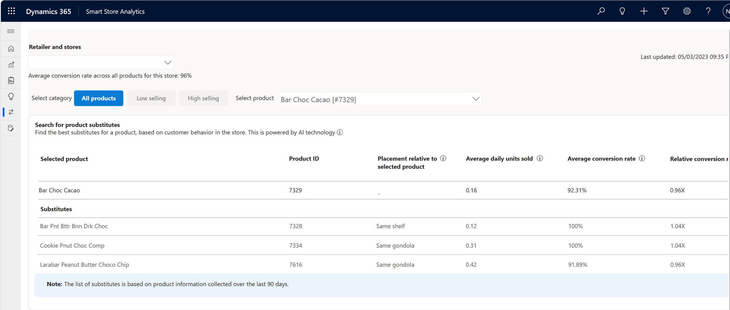
The table shows up to three recommended product substitutes for the product selected from the drill-down menu, and some extra details that are instrumental for the customer to select one of the substitutes over the other or in comparing the performance of the original product and the various suggested alternatives. The details for each of the suggested substitutes are as follows:
- Product names: shows the names of the alternative products
- Product SKUs: shows the Products IDs of the alternative products
- Placement relative to the selected product: indicates whether the selected product and the suggested substitute are placed on the same shelf, the same gondola (different shelves within it), or in different locations in the store.
Note
This column is relevant only for the store-level alternative product recommendations (and will remain empty for the retailer level), due to the variations in product placement across different stores in the retail chain. If the same product is placed in several locations within a store, , the column will represent the closest location among them.
- Average daily units sold: shows the average daily units sold of the selected and the alternative products over the last 90 days.
- Average conversion rate: shows the average daily conversion rate of the selected and alternative products. The conversion rate is the number of times customers viewed the product in the store divided by the number of times customers purchased the product.
- Relative conversion rate: shows the relation between the product conversion rate and the average conversion rate in the store or the retail chain across all products to allow easier comparison between different products. The retail chain/store average conversion rate appears below the store filter.
Performance of alternate products
The performance of alternate products graph allows you to analyze the performance of the selected and alternative products over time.
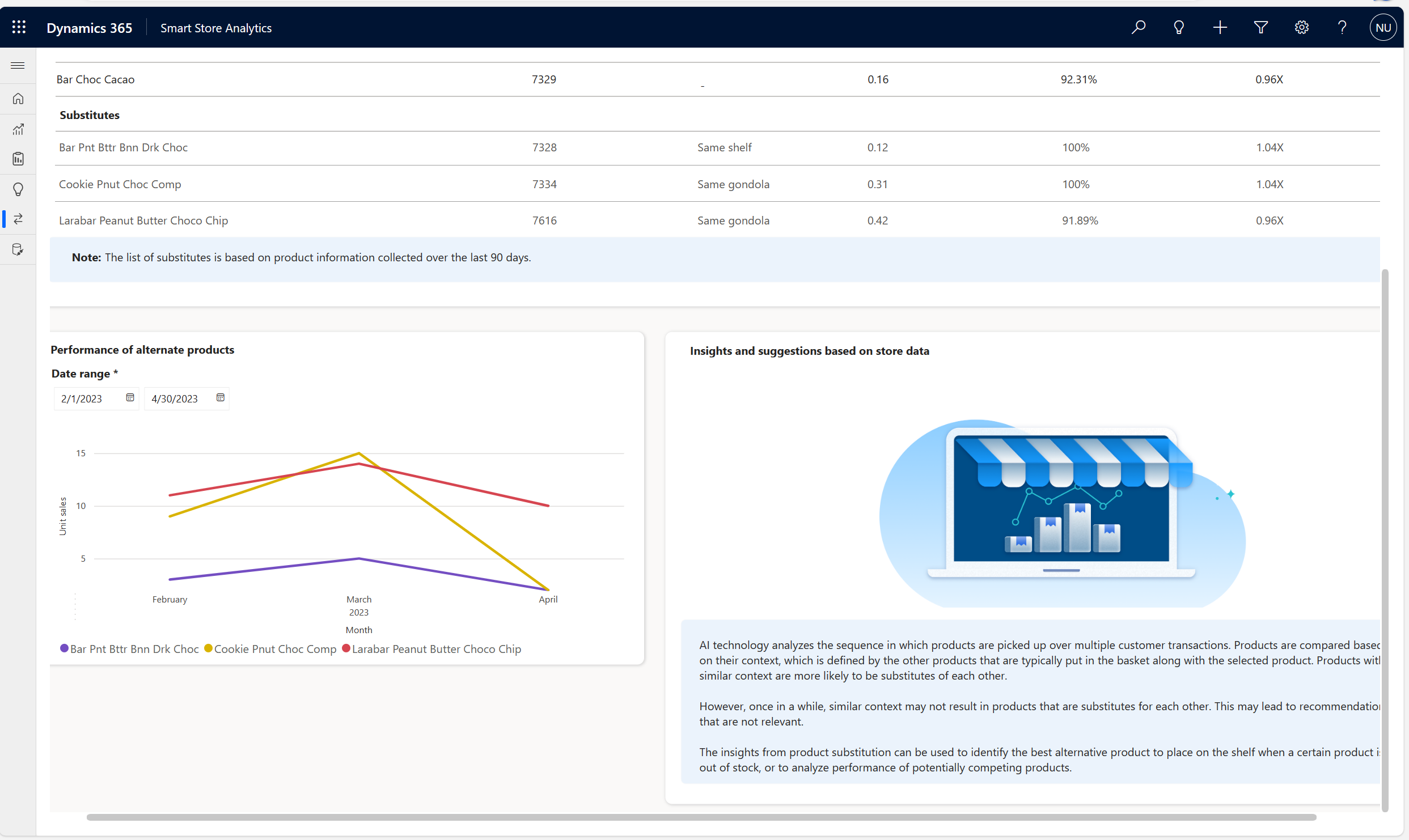
This graph shows the daily unit sales of the selected and alternative products over time. The graph shows the daily unit sales of the products across the time chosen in the dates filter fields.
Foot traffic forecast
Retailers’ sales & store organization depend heavily on how many customers visit their shops during the day. Predictive foot traffic is an AI/ML model that analyzes past foot traffic, with external factors (for example, season, holidays) and produces insights, which enable retailers to anticipate customer demand and adjust their activities accordingly. Foot traffic forecast AI model in Smart Store Analytics makes a forecast for foot traffic for every hour of the upcoming seven days. This data provides store managers and the marketing team with an hourly forecast of how many customers can visit a store in the next seven days.
With foot traffic forecast, retailers can:
- Develop optimized schedules that align with peak periods, ensuring adequate staffing levels.
- Allocate workforce for each store and among stores, with hourly granularity.
- Schedule tasks, such as shelf replenishment and restocking before peak hours to enable store associates to focus on assisting customers during high-demand periods.
- Optimize replenishment schedules and prioritize shipments based on demand fluctuations.
Foot traffic forecast for a day is made by aggregating the hourly values of foot traffic for that day. To make a forecast, the AI model uses actual historical values of foot traffic at a store and a list of public holidays in the region where the store is located. It doesn’t consider factors such as weather, store schedules, unexpected store closures, or other conditions that affect the accuracy of the forecast.
Foot traffic forecast dashboard
Foot traffic forecast dashboard enables store managers and marketing teams to monitor foot traffic predictions for a selected smart store on a specific date.
Important
For the model to show a forecast, it must have access to at least 14 days of actual historical data for a particular store. The forecast becomes more accurate over time as the model learns from larger historical datasets. Stores that have extremely low and intermittent hourly foot traffic may have a less accurate forecast.
The foot traffic forecast dashboard has four key areas:

- Filters: The Retailer and stores dropdown shows all stores in the retailer’s chain for which you have data. The Day lets you pick one of the seven days for which the AI/ML model produced a prediction. The filters available for ‘Retailer and stores’ & ‘Day’ apply to all data on the page.
Note
The ”Last updated on mm/dd/yyyy hh:mm UTC” provides the timestamp when the dashboard is refreshed and the seven days of prediction of foot traffic starts from this date. It is important to note that hours are considered in Universal Time Coordinated UTC, i.e., zero Longitude: Greenwich, UK time-zone.
KPIs: Top-level KPIs help evaluate predictive foot traffic vs past week:
Forecast of foot traffic for the day: Prediction of the number of shoppers entering the selected store, including repeated entries, for the selected day. Shoppers in a group are counted as one. Thus, a family of five is counted as a single unique shopper.
The variation in percentage (%) from the same day of the previous week is also displayed in this widget. There’s an arrow indicating the trend, and the text is colored in green for growth or red to indicate decrease in foot traffic.
The AI model makes a forecast for foot traffic for every hour of the upcoming seven days. Foot traffic forecast for a day is made by aggregating the hourly values of foot traffic for that day.
Actual foot traffic for the same day of the previous week: The actual (or historic) foot traffic on the same day of the previous week is shown. The calculated date for the same day the previous week is also shown. This view enables valuable comparison, between two consecutive Mondays or any day of the week.
Forecast of foot traffic over the next 7 days: The sum of the predicted number of shoppers entering the selected store, for the seven days ahead as indicated by date range: mm/dd/yyyy – mm/dd/yyyy. This widget is impacted by the selection of a store, but not by the selection of a day in the filter.
The variation in percentage (%) from the last seven days is also shown in this widget. There’s an arrow indicating the trend, and the text is colored green for growth or red to indicate a decrease in foot traffic.
Actual foot traffic for the previous 7 days: The actual (or historic) foot traffic on the previous seven days, as indicated by date range: mm/dd/yyyy – mm/dd/yyyy. This widget is impacted by the selection of a store, but not by the selection of a Day in the filter.
Time series graphs: The time series graphs show predicted foot traffic over time, in three variants:
Forecast of foot traffic by hour of the day shows number of shoppers by the hour of the selected day
Forecast of foot traffic by day over the next 7 days shows the bars show the predicted number of shoppers entering the selected store, for each of the 7 days ahead as indicated by date range: mm/dd/yyyy – mm/dd/yyyy. The line in vivid color shows the actual (or historic) foot traffic on the previous seven days. This widget is impacted by the selection of a store, but not by the selection of a day in the filter.
Forecast of foot traffic by day and hour of the day over the next 7 days shows each day represented by a row, and the hours as columns. The color of each square represents the number of shoppers at a certain hour, of a certain day, as defined in the legend. By convention, the darker the square, the higher the number of shoppers. The hours run from 0 to 23, and the days cover seven days ahead as indicated by the date range: mm/dd/yyyy – mm/dd/yyyy.
How is the forecast for foot traffic calculated? - This section provides basic information on the predictive forecast model, input data, that is, the importance of the historical dataset, and the factors that are currently not considered in the model.