Performance - Smart Store Analytics
The Performance page of Smart Store Analytics has two sections:
Chain summary
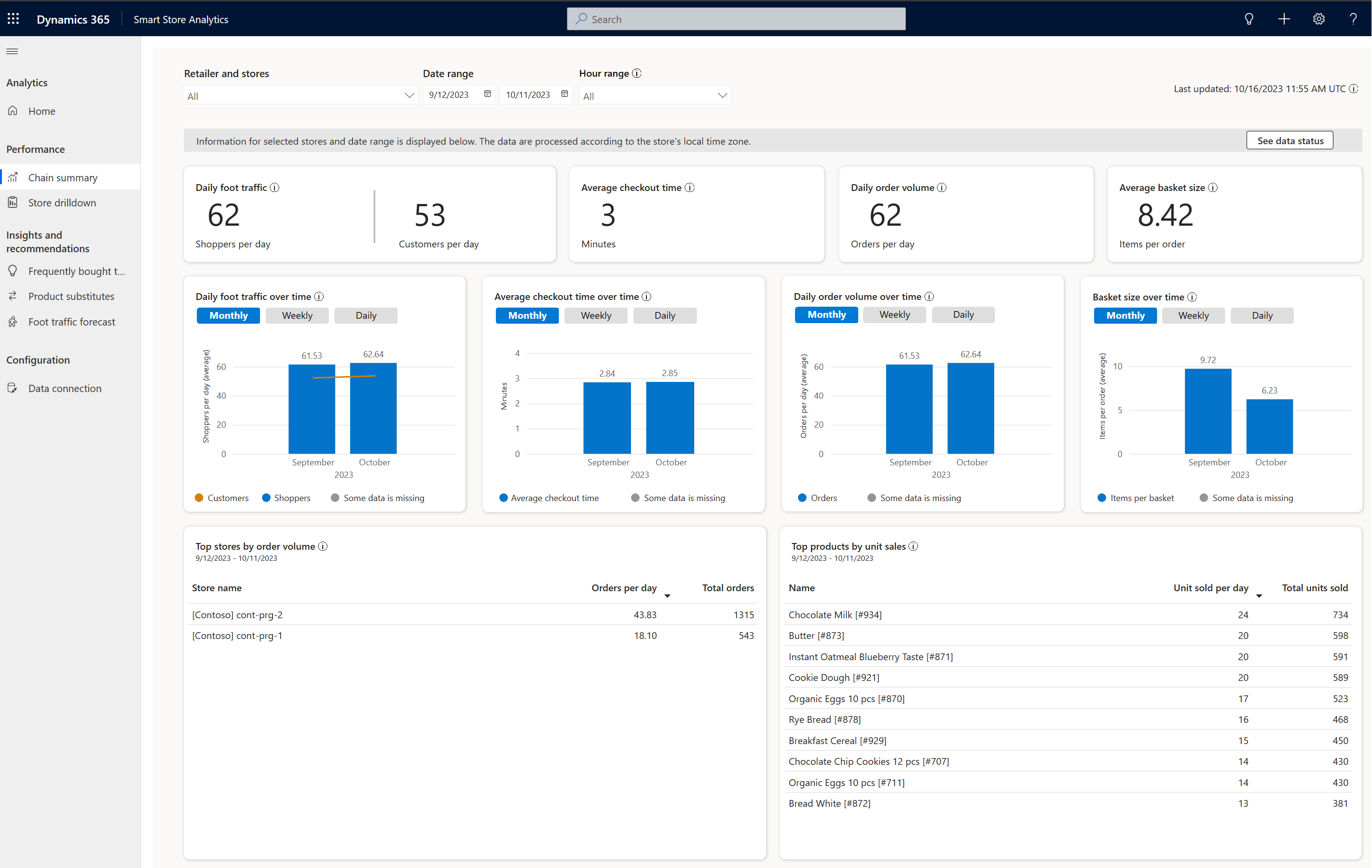
The Chain summary section serves as a one-stop shop for store managers to monitor the overall performance of a fleet of smart stores. A store manager can get a dashboard view of the chain’s entire fleet of stores from this section.
Note
The store data is always processed and displayed in accordance with the local time zone of the specific store. Consequently, the time zone for reports cannot be altered in real-time through PowerApps or by adjusting the settings on a Mac or PC.
The key areas within the chain summary section are as follows:
Filters : The available filters for stores and date range help you drill into a specific retailer or store for a specific date range. The Retailer and stores dropdown shows all stores in the retailer’s chain for which you have data. You can select multiple stores to aggregate KPI information. The Date Range lets you pick the From and To dates that apply to all data on the rest of the page. The Hour range filter lets you pick the hour for which you want the insights.
KPIs : Top-level KPIs help understand fleet performance:
Shoppers per day : Average number of daily shoppers entering a store, including repeat entries. Shoppers in a group are counted as one. Thus, a family of five is counted as a single unique shopper.
Customers per day : Average number of daily customers, a subset of shoppers per day. A customer is any shopper who bought at least one item from the store.
Average checkout time (minutes) : Average time a customer takes from entering the store to exiting it after purchasing something. Shoppers who didn't purchase anything aren't counted.
Daily order volume (orders per day) : Average number of orders a store processes per day.
Average basket size (items per order) : Average number of items purchased per order, also called a basket.
Time series graphs : Time series graphs for the different KPIs such as Daily foot traffic over time, Average checkout time over time, Daily order volume over time, and Basket size over time are configurable as monthly, weekly or daily views.
- Choose the daily view if you’d like to view the change in the value of the KPI as daily values over a period.
- Choose the weekly view if you’d like to view the change in the value of the KPI as weekly values over a period.
- Choose the monthly view if you’d like to view the change in the value of the KPI as monthly values over a period. The value shown for each month is the average daily value for the month.
Top stores by daily order volume : List of stores ranked by the average number of orders they process per day and the total orders. The details give a sense of the top-performing stores in the fleet.
Top products by unit sales : List of products ranked by their number of units sold per day and the total units sold. The details give a sense of the top-performing products in the fleet.
Note
A tooltip against each KPI or widget contains more information on how the KPI is defined or how each widget is calculated.
Store drilldown
The Store drilldown section provides store managers a deeper look into the performance of a chosen store and helps discover ideas for greater performance. It helps the store manager to drills down into the performance of a single store, offering KPIs, visualizations and more.
Note
The store data is always processed and displayed in accordance with the local time zone of the specific store. Consequently, the time zone for reports cannot be altered in real-time through PowerApps or by adjusting the settings on a Mac or PC.
The store drilldown section has three screens:
Store screen
The key areas within the store screen are as follows:
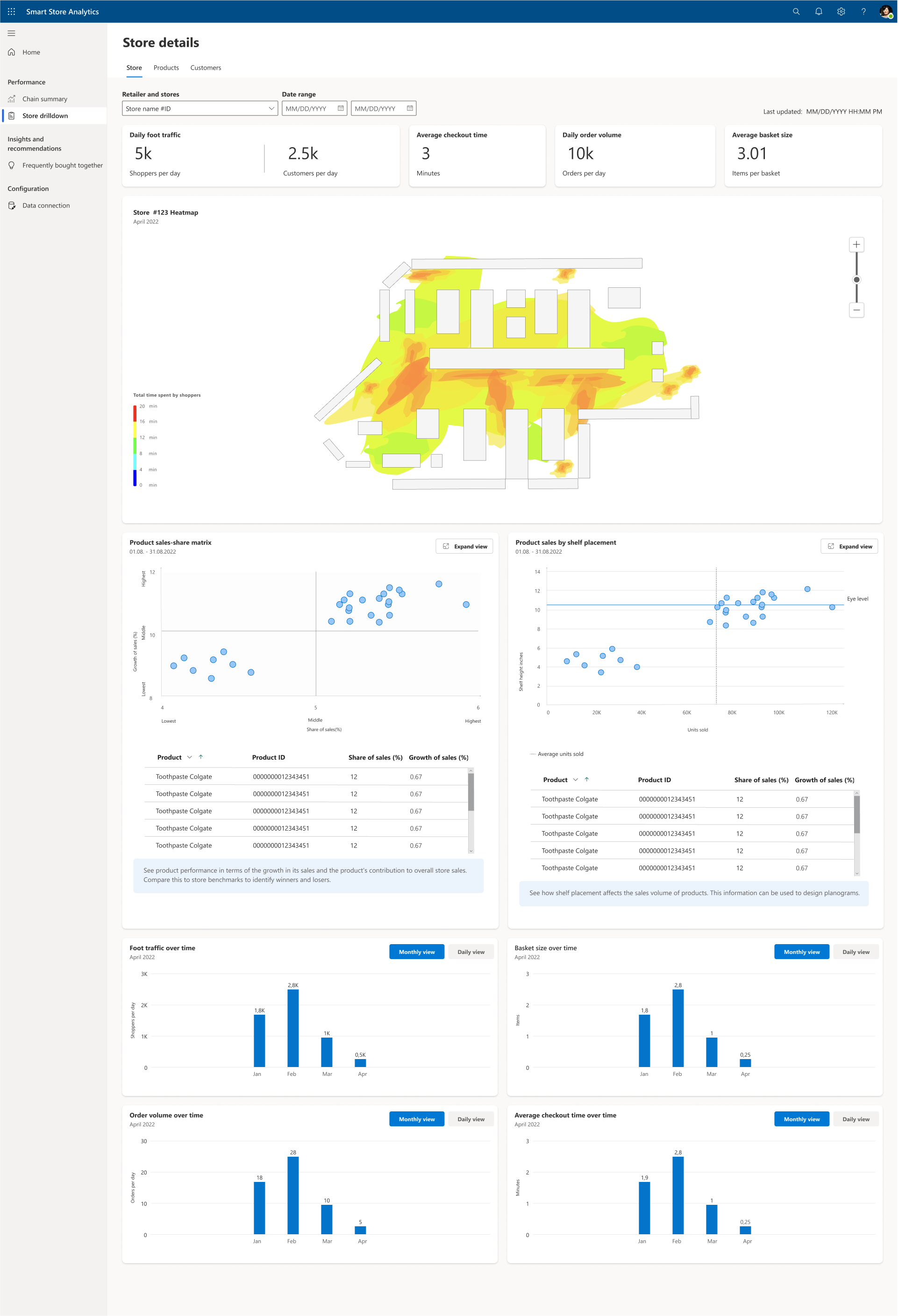
Filters : The available filters for stores and date range help you drill into a specific store and product for a specific date range. The Retailer and stores dropdown shows all stores in the retailer’s chain for which you have data allowing you to select one at a time. The Date range lets you pick the From and To dates that apply to all data on the rest of the page.
Daily foot traffic KPIs : Top-level KPIs help understand fleet performance:
Shoppers per day : Average number of daily shoppers entering a store, including repeat entries. Shoppers in a group are counted as one. Thus, a family of five is counted as a single unique shopper.
Customers per day : Average number of daily customers, a subset of shoppers per day. A customer is any shopper who bought at least one item from the store.
Average checkout time (minutes) : Average time a customer takes from entering the store to exiting it after purchasing something. Shoppers who didn't purchase anything aren't counted.
Daily order volume (orders per day) : Average number of orders a store processes per day.
Average basket size (items per basket) : Average number of items purchased per order, also called a basket.
Store heatmap : Data visualization that maps shopper foot traffic, counted as time spent, in different sections of the physical store during the chosen date period. The store heatmap can help store managers get a quick sense of the areas of the store, which are most popular and which aren't, generating ideas for where to stock items or where to remove them from.
Product sales-share matrix : The chart shows the growth in unit sales and share of overall sales for various products in the selected date range. Based on long-term results, products in the top right corner are best selling, while the products in the bottom left needs more attention. The bottom portion of the product sales-share 2x2 matrix is a table of all plotted products listing each product’s ID, Name, Share of sales (%), and Growth of Sales(%). You can sort the table using these columns.
Note
The chart can be empty if there is no data in the date period previous to the selected date range (i.e. no reference period)
Product sales by shelf placement matrix : The chart shows the unit sales and average shelf placement height for various products in the selected date range. The dotted line is the average eye level of most shoppers. Products placed much above or below eye level and recording high sales could see further improvement by moving them closer to eye level. Products placed around eye level and recording lower sales are an opportunity cost. The bottom portion of the product sales by shelf placement 2x2 matrix is a table of all plotted products listing each product’s ID, Name, Shelf height, and Number of items sold. You can sort the table using these columns.
Time series graphs : Time series graphs for the different KPIs, configurable as monthly or daily views
Choose the daily view if you’d like to view the change in value of the KPI as daily values over a period.
Choose the monthly view if you’d like to view the change in value of the KPI as monthly values over a period. The value shown for each month is the average daily value for the month.
Products screen
The Products screen provides store managers with a deeper look into the performance of a chosen product and helps to generate ideas to drive greater product performance.
The key areas within the products screen are as follows:
Filters : The available filters for stores, products and date range help you drill into a specific store and product for a specific date range. The Retailer and stores dropdown shows all stores in the retailer’s chain for which you have data allowing you to select one at a time. The Product dropdown lists all products for the chosen store, allowing you to pick one at a time. The Date range lets you pick the From and To dates that apply to all data on the rest of the page.
KPIs - Top-level KPIs help understand product performance:
Sales volume : Average number of units sold per day for the chosen product. The total number of units sold during the chosen date range is also provided. To get a sense of the product’s popularity, a share of overall sales (across all products) is also computed and displayed.
Average units per order : Average number of units of the chosen product sold per order. You can view a comparison against the overall store average (across all products) of units sold per order.
Product purchase funnel : Data visualization shows shopper interactions with the selected product. It starts with shoppers viewing the product and ends with them walking out of the store with it, which marks a purchase. Drop off shows the percentage of shoppers that didn't progress to purchase.
Unit sales of product by shelf placement : The chart shows unit sales and average shelf placement height of the selected product. Based on long-term data, moving a product closer to eye level improves its visibility and can in turn increase unit sales. The eye level mark is based on shoppers who interacted with the product. The chart shows performance (number of units sold) for the chosen product through chosen date range, and also shows the following data for comparison purposes: (a) units sold for chosen product, last three months (b) average sales of the best-selling (top 10) products (c) average sales of the least-selling (bottom 10) products.
Unit sales of product over time : The chart shows unit sales of the chosen product and different store zones where the product was placed. To draw this graph, the store is divided into three parts, front, middle, and rear, based on distance from the nearest store entrance. There are two views supported: (a) a daily view, which shows sales per day (b) a monthly view, which shows sales per month, both as applied to the selected date range. A table below the graph shows zone and shelf placement for different product facings, which can be correlated with unit sales information as shown in the graph. The graph can be useful to determine which zone within the store was most effective in driving sales.
Customers screen
The Customers screen provides store managers with a deeper look into customer traffic in the store.
The key areas within the customers screen are as follows:
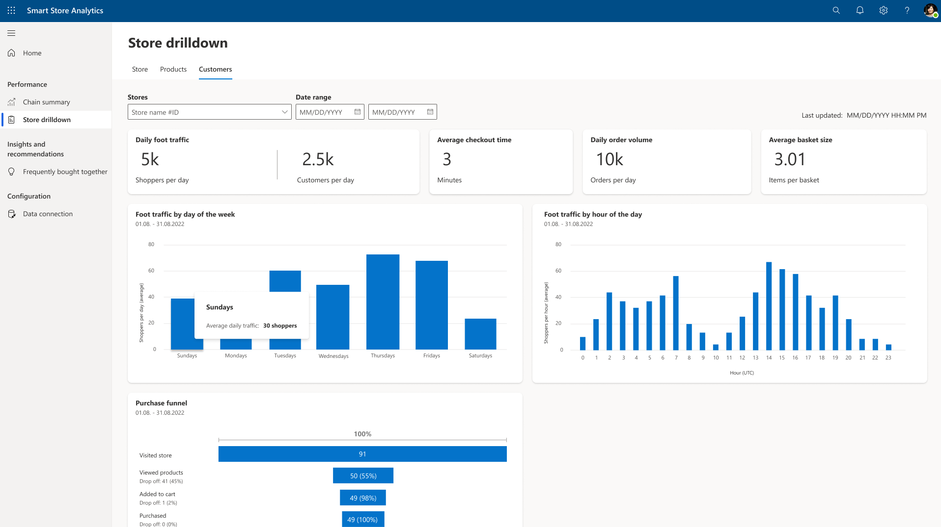
Filters : The available filters for stores, products, and date range help you drill into a specific store and product for a specific date range. The Store dropdown shows all stores in the retailer’s chain for which you have data allowing you to select one at a time. The Date range lets you pick the From and To dates that apply to all data on the rest of the page.
KPIs : Top-level KPIs help understand store performance:
Daily foot traffic : Average number of daily shoppers entering a store, including repeat entries. Shoppers in a group are counted as One. Thus, a family of five is counted as a unique shopper. The average number of daily customers is also displayed.
Average checkout time (minutes) : Average time a customer takes from entering the store to exiting it after purchasing something. Shoppers who didn't purchase anything aren't counted.
Daily order volume : Average number of orders a store processes per day
Average basket size (items per basket) : Average number of items purchased per order, also called a basket.
Purchase funnel : Data visualization shows shopper interactions with the selected product. It starts with shoppers viewing the product and ends with them walking out of the store with it, which marks a purchase. Drop off shows the percentage of shoppers that didn't progress to purchase.
Foot traffic by day of the week. : Shoppers count in the store during the chosen date range grouped as per the day of the week. This grouping shows which days of the week have the heaviest traffic.
Foot traffic by hour of the day. : Shoppers count in the store during the chosen date range grouped as per the hour of the day. This grouping gives a sense of which hours of the day have the heaviest traffic.


