练习 - 使用网格生成用户界面
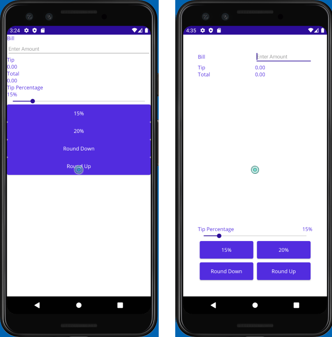
在本练习中,你将使用 Grid 在用户界面 (UI) 中排列视图。 你将从 TipCalculator 项目的另一个版本开始,并对其进行调整以使 UI 更直观。 你还会将按钮移动到页面底部。 这次,你将使用 Grid 布局,而不是使用 VerticalStackLayout 和 HorizontalStackLayout。 下图显示了初始 UI 和按照本练习中的步骤生成的 UI:
打开初学者解决方案
初学者解决方案包含功能完整的小费计算器应用程序。
使用 Visual Studio,打开在上一个练习开始时克隆的存储库中 exercise3/TipCalculator 文件夹中的初学者解决方案。
打开 MainPage.xaml。 请注意,所有视图都是用垂直
StackLayout面板显示的:<?xml version="1.0" encoding="utf-8" ?> <ContentPage xmlns="http://schemas.microsoft.com/dotnet/2021/maui" xmlns:x="http://schemas.microsoft.com/winfx/2009/xaml" xmlns:local="clr-namespace:TipCalculator" x:Class="TipCalculator.MainPage"> <VerticalStackLayout> <Label Text="Bill" /> <Entry x:Name="billInput" Placeholder="Enter Amount" Keyboard="Numeric" /> <Label Text="Tip" /> <Label x:Name="tipOutput" Text="0.00" /> <Label Text="Total" /> <Label x:Name="totalOutput" Text="0.00" /> <Label Text="Tip Percentage" /> <Label x:Name="tipPercent" Text="15%" /> <Slider x:Name="tipPercentSlider" Minimum="0" Maximum="100" Value="15" /> <Button Text="15%" Clicked="OnNormalTip" /> <Button Text="20%" Clicked="OnGenerousTip" /> <Button x:Name="roundDown" Text="Round Down" /> <Button x:Name="roundUp" Text="Round Up" /> </VerticalStackLayout> </ContentPage>
创建网格布局
将版式面板从
VerticalStackLayout更改为填充为40个单位的Grid。为
Grid定义七行两列。 将所有行都设为Auto大小(第四行除外)。 第四行应使用Star,这样它将得到网格中所有剩余的可用空间。 使用Star调整两列的大小。<Grid RowDefinitions="Auto, Auto, Auto, *, Auto, Auto, Auto" ColumnDefinitions="*, *" Padding="40"> ... </Grid>
将视图放置在单元格中
将
Grid.Row和Grid.Column的设置添加到每个视图,以将其分配到Grid中合适的单元格。 使用以下屏幕截图来帮助确定每个视图应放置的位置: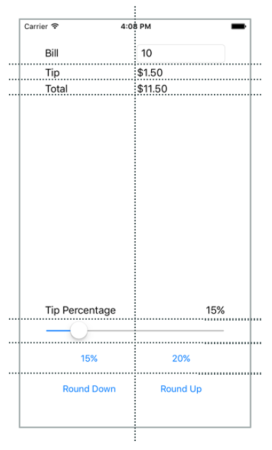
以下示例显示如何设置“帐单”
Label和billInputEntry视图的位置:... <Label Text="Bill" Grid.Row="0" Grid.Column="0"/> <Entry x:Name="billInput" Placeholder="Enter Amount" Keyboard="Numeric" Grid.Row="0" Grid.Column="1"/> ...通过在“标签”上将
VerticalOptions属性设置为Center,将“帐单”Label与Entry对齐。将
Grid.ColumnSpan的设置添加到Slider,以便它占据两列的宽度:<Slider ... Grid.ColumnSpan="2" ... />找到包含文本“小费百分比”的
Label。 将其设置为占据所在矩形中的左下角位置:<Label Text="Tip Percentage" VerticalOptions="End" HorizontalOptions="Start" ... />查找名为“tipPercent”的
Label。 将其设置为占据所在矩形中的右下角位置:<Label x:Name="tipPercent" VerticalOptions="End" HorizontalOptions="End" ... />将四个按钮的
Margin属性均设置为5。
页面的完整 XAML 标记应如下所示:
<ContentPage xmlns="http://schemas.microsoft.com/dotnet/2021/maui"
             xmlns:x="http://schemas.microsoft.com/winfx/2009/xaml"
             xmlns:local="clr-namespace:TipCalculator"
             x:Class="TipCalculator.MainPage">
    <Grid RowDefinitions="Auto, Auto, Auto, *, Auto, Auto, Auto"
          ColumnDefinitions="*, *"
          Padding="40">

        <Label Text="Bill" VerticalOptions="Center" Grid.Row="0" Grid.Column="0"/>
        <Entry x:Name="billInput" Placeholder="Enter Amount" Keyboard="Numeric" Grid.Row="0" Grid.Column="1"/>

        <Label Text="Tip" Grid.Row="1" Grid.Column="0"/>
        <Label x:Name="tipOutput" Text="0.00" Grid.Row="1" Grid.Column="1"/>

        <Label Text="Total" Grid.Row="2" Grid.Column="0"/>
        <Label x:Name="totalOutput" Text="0.00" Grid.Row="2" Grid.Column="1"/>

        <Label Text="Tip Percentage" VerticalOptions="End" HorizontalOptions="Start" Grid.Row="3" Grid.Column="0"/>
        <Label x:Name="tipPercent" Text="15%" VerticalOptions="End" HorizontalOptions="End" Grid.Row="3" Grid.Column="1"/>
        <Slider x:Name="tipPercentSlider" Minimum="0" Maximum="100" Value="15" Grid.Row="4" Grid.Column="0" Grid.ColumnSpan="2"/>

        <Button Text="15%" Clicked="OnNormalTip" Margin="5" Grid.Row="5" Grid.Column="0"/>
        <Button Text="20%" Clicked="OnGenerousTip" Margin="5" Grid.Row="5" Grid.Column="1"/>

        <Button x:Name="roundDown" Margin="5" Text="Round Down" Grid.Row="6" Grid.Column="0"/>
        <Button x:Name="roundUp"   Margin="5" Text="Round Up" Grid.Row="6" Grid.Column="1"/>

    </Grid>
</ContentPage>
检查结果
运行应用程序并查看 UI 中的差异。 已使用 Grid 提升现有 UI 的美感。 Grid 的功能比 StackLayout 强大。 具体而言,Grid 使对齐各行的视图容易得多。