自定义 ViewCell
Xamarin.Forms ViewCell 是可以添加到 ListView 或 TableView 中的单元,它包含开发人员定义的视图。 本文演示如何为 Xamarin.Forms ListView 控件中托管的 ViewCell 创建自定义呈现器。 这可防止在 ListView 滚动期间重复调用 Xamarin.Forms 布局计算。
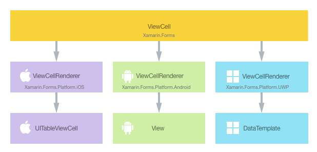
每个 Xamarin.Forms 单元都有一个附带的呈现器,适用于创建本机控件实例的各个平台。 当 Xamarin.Forms 应用程序呈现 ViewCell 时,将在 iOS 中实例化 ViewCellRenderer 类,而该操作又会实例化本机 UITableViewCell 控件。 在 Android 平台上,ViewCellRenderer 类实例化本机 View 控件。 在通用 Windows 平台 (UWP) 上,ViewCellRenderer 类实例化本机 DataTemplate。 有关 Xamarin.Forms 控件映射到的呈现器和本机控件类的详细信息,请参阅呈现器基类和本机控件。
下图说明了 ViewCell 和实现它的相应本机控件之间的关系:
通过在每个平台上为 ViewCell 创建自定义呈现器,可以利用呈现过程来实现特定于平台的自定义。 执行此操作的过程如下:
现在将依次讨论每个项,以实现 NativeCell 呈现器,该呈现器为 Xamarin.FormsListView 控件中托管的每个单元利用特定于平台的布局。 这可防止在 ListView 滚动期间重复调用 Xamarin.Forms 布局计算。
创建自定义单元
通过子类化 ViewCell 类,可以创建自定义单元控件,如下面的代码示例所示:
public class NativeCell : ViewCell
{
  public static readonly BindableProperty NameProperty =
    BindableProperty.Create ("Name", typeof(string), typeof(NativeCell), "");

  public string Name {
    get { return (string)GetValue (NameProperty); }
    set { SetValue (NameProperty, value); }
  }

  public static readonly BindableProperty CategoryProperty =
    BindableProperty.Create ("Category", typeof(string), typeof(NativeCell), "");

  public string Category {
    get { return (string)GetValue (CategoryProperty); }
    set { SetValue (CategoryProperty, value); }
  }

  public static readonly BindableProperty ImageFilenameProperty =
    BindableProperty.Create ("ImageFilename", typeof(string), typeof(NativeCell), "");

  public string ImageFilename {
    get { return (string)GetValue (ImageFilenameProperty); }
    set { SetValue (ImageFilenameProperty, value); }
  }
}
NativeCell 类创建在 .NET Standard 库项目中,它定义自定义单元的 API。 自定义单元公开可以通过数据绑定显示的 Name、Category 和 ImageFilename 属性。 若要深入了解数据绑定,请参阅数据绑定基本知识。
使用自定义单元
通过在自定义单元元素上声明 NativeCell 自定义单元位置的命名空间并使用命名空间前缀,可以在 .NET Standard 库项目的 XAML 中引用该自定义单元。 下面的代码示例演示 XAML 页可以如何使用 NativeCell 自定义单元:
<ContentPage ...
    xmlns:local="clr-namespace:CustomRenderer;assembly=CustomRenderer"
    ...>
    ...
    <ContentPage.Content>
          <StackLayout>
              <Label Text="Xamarin.Forms native cell" HorizontalTextAlignment="Center" />
              <ListView x:Name="listView" CachingStrategy="RecycleElement" ItemSelected="OnItemSelected">
                  <ListView.ItemTemplate>
                      <DataTemplate>
                          <local:NativeCell Name="{Binding Name}" Category="{Binding Category}" ImageFilename="{Binding ImageFilename}" />
                      </DataTemplate>
                  </ListView.ItemTemplate>
              </ListView>
          </StackLayout>
      </ContentPage.Content>
</ContentPage>
local 命名空间前缀可以命名为任何内容。 但是,clr-namespace 和 assembly 值必须与自定义控件的详细信息相匹配。 声明命名空间后,前缀用于引用自定义单元。
下面的代码示例演示 C# 页可以如何使用 NativeCell 自定义单元:
public class NativeCellPageCS : ContentPage
{
    ListView listView;

    public NativeCellPageCS()
    {
        listView = new ListView(ListViewCachingStrategy.RecycleElement)
        {
            ItemsSource = DataSource.GetList(),
            ItemTemplate = new DataTemplate(() =>
            {
                var nativeCell = new NativeCell();
                nativeCell.SetBinding(NativeCell.NameProperty, "Name");
                nativeCell.SetBinding(NativeCell.CategoryProperty, "Category");
                nativeCell.SetBinding(NativeCell.ImageFilenameProperty, "ImageFilename");

                return nativeCell;
            })
        };

        switch (Device.RuntimePlatform)
        {
            case Device.iOS:
                Padding = new Thickness(0, 20, 0, 0);
                break;
            case Device.Android:
            case Device.UWP:
                Padding = new Thickness(0);
                break;
        }

        Content = new StackLayout
        {
            Children = {
                new Label { Text = "Xamarin.Forms native cell", HorizontalTextAlignment = TextAlignment.Center },
                listView
            }
        };
        listView.ItemSelected += OnItemSelected;
    }
    ...
}
Xamarin.FormsListView 控件用于显示数据列表,该数据列表通过 ItemSource 属性填充。 RecycleElement 缓存策略尝试通过回收列表单元最大程度减少 ListView 的内存占用并降低其执行速度。 有关更多信息,请参阅缓存策略。
列表中的每一行都包含三项数据:名称、类别和图像文件名。 列表中每行的布局由通过 ListView.ItemTemplate 可绑定属性来引用的 DataTemplate 定义。 DataTemplate 定义列表中的每行数据将是 NativeCell,它通过数据绑定显示其 Name、Category 和 ImageFilename 属性。 有关 ListView 控件的详细信息,请参阅 ListView。
现在可以向每个应用程序项目添加自定义呈现器,以便为每个单元自定义特定于平台的布局。
在每个平台上创建自定义呈现器
创建自定义呈现器类的过程如下所示:
- 创建呈现自定义单元的
ViewCellRenderer类的子类。 - 替代呈现自定义单元的特定于平台的方法,并编写逻辑以进行自定义。
- 向自定义呈现器类添加
ExportRenderer属性,以指定其将用于呈现 Xamarin.Forms 自定义单元。 此属性用于向 Xamarin.Forms 注册自定义呈现器。
注意
对于大多数 Xamarin.Forms 元素,都可选择在每个平台项目中提供自定义呈现器。 如果未注册自定义呈现器,将使用控件基类的默认呈现器。 但是,呈现 ViewCell 元素时,每个平台项目中都需要自定义呈现器。
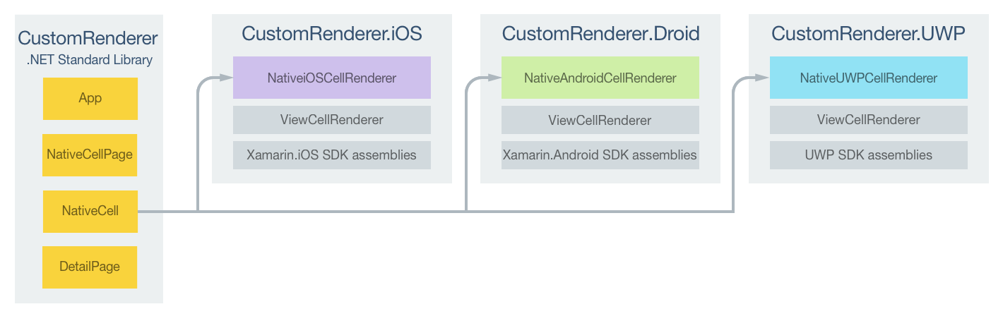
下图说明了示例应用程序中每个项目的职责,以及它们之间的关系:
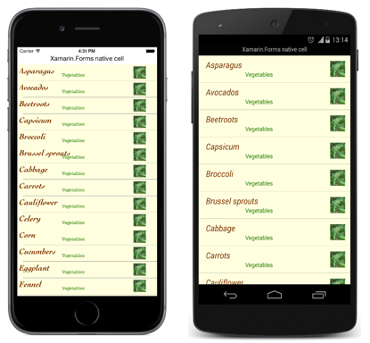
NativeCell 自定义单元由平台特定的呈现器类呈现,这些类均派生自各平台的 ViewCellRenderer 类。 这导致每个 NativeCell 自定义单元都使用特定于平台的布局呈现,如下面的屏幕截图所示:
ViewCellRenderer 类公开呈现自定义单元的特定于平台的方法。 这是 iOS 平台上的 GetCell 方法、Android 平台上的 GetCellCore 方法和 UWP 上的 GetTemplate 方法。
每个自定义呈现器类均用 ExportRenderer 属性修饰,该属性向 Xamarin.Forms 注册呈现器。 该属性采用两个参数:要呈现的 Xamarin.Forms 单元的类型名称和自定义呈现器的类型名称。 属性的 assembly 前缀指示属性适用于整个程序集。
以下各部分讨论每个平台特定的 自定义呈现器类的实现。
在 iOS 上创建自定义呈现器
以下代码示例展示了适用于 iOS 平台的自定义呈现器:
[assembly: ExportRenderer(typeof(NativeCell), typeof(NativeiOSCellRenderer))]
namespace CustomRenderer.iOS
{
    public class NativeiOSCellRenderer : ViewCellRenderer
    {
        NativeiOSCell cell;

        public override UITableViewCell GetCell(Cell item, UITableViewCell reusableCell, UITableView tv)
        {
            var nativeCell = (NativeCell)item;

            cell = reusableCell as NativeiOSCell;
            if (cell == null)
                cell = new NativeiOSCell(item.GetType().FullName, nativeCell);
            else
                cell.NativeCell.PropertyChanged -= OnNativeCellPropertyChanged;

            nativeCell.PropertyChanged += OnNativeCellPropertyChanged;
            cell.UpdateCell(nativeCell);
            return cell;
        }
        ...
    }
}
调用 GetCell 方法构建要显示的每个单元。 每个单元都是定义单元布局及其数据的 NativeiOSCell 实例。 GetCell 方法的操作依赖于 ListView 缓存策略:
ListView缓存策略为RetainElement时,将为每个单元调用GetCell方法。 将为每个最初在屏幕上显示的NativeCell实例创建NativeiOSCell实例。 用户滚动浏览ListView时,将重用NativeiOSCell实例。 有关 iOS 单元重用的详细信息,请参阅单元重用。注意
ListView设置为保留单元时,此自定义呈现器代码将执行一些单元重用。每个
NativeiOSCell实例显示的数据(无论是新创建的还是重用的)都将通过UpdateCell方法更新为每个NativeCell实例中的数据。注意
ListView缓存策略设置为保留单元时,将永不调用OnNativeCellPropertyChanged方法。ListView缓存策略为RecycleElement时,将为每个最初在屏幕上显示的单元调用GetCell方法。 将为每个最初在屏幕上显示的NativeCell实例创建NativeiOSCell实例。 每个NativeiOSCell实例显示的数据都将通过UpdateCell方法更新为每个NativeCell实例中的数据。 但是,用户滚动浏览ListView时,将不会调用GetCell方法。 而是会重用NativeiOSCell实例。NativeCell实例的数据发生变化时,将引发PropertyChanged事件,OnNativeCellPropertyChanged事件处理程序将更新每个重用的NativeiOSCell实例中的数据。
下面的代码示例演示引发 PropertyChanged 事件时,调用的 OnNativeCellPropertyChanged 方法:
namespace CustomRenderer.iOS
{
    public class NativeiOSCellRenderer : ViewCellRenderer
    {
        ...

        void OnNativeCellPropertyChanged(object sender, PropertyChangedEventArgs e)
        {
            var nativeCell = (NativeCell)sender;
            if (e.PropertyName == NativeCell.NameProperty.PropertyName)
            {
                cell.HeadingLabel.Text = nativeCell.Name;
            }
            else if (e.PropertyName == NativeCell.CategoryProperty.PropertyName)
            {
                cell.SubheadingLabel.Text = nativeCell.Category;
            }
            else if (e.PropertyName == NativeCell.ImageFilenameProperty.PropertyName)
            {
                cell.CellImageView.Image = cell.GetImage(nativeCell.ImageFilename);
            }
        }
    }
}
此方法通过重用的 NativeiOSCell 实例更新正在显示的数据。 检查已更改的属性,因为可以多次调用该方法。
NativeiOSCell 类定义每个单元的布局,如以下代码示例所示:
internal class NativeiOSCell : UITableViewCell, INativeElementView
{
  public UILabel HeadingLabel { get; set; }
  public UILabel SubheadingLabel { get; set; }
  public UIImageView CellImageView { get; set; }

  public NativeCell NativeCell { get; private set; }
  public Element Element => NativeCell;

  public NativeiOSCell(string cellId, NativeCell cell) : base(UITableViewCellStyle.Default, cellId)
  {
    NativeCell = cell;

    SelectionStyle = UITableViewCellSelectionStyle.Gray;
    ContentView.BackgroundColor = UIColor.FromRGB(255, 255, 224);
    CellImageView = new UIImageView();

    HeadingLabel = new UILabel()
    {
      Font = UIFont.FromName("Cochin-BoldItalic", 22f),
      TextColor = UIColor.FromRGB(127, 51, 0),
      BackgroundColor = UIColor.Clear
    };

    SubheadingLabel = new UILabel()
    {
      Font = UIFont.FromName("AmericanTypewriter", 12f),
      TextColor = UIColor.FromRGB(38, 127, 0),
      TextAlignment = UITextAlignment.Center,
      BackgroundColor = UIColor.Clear
    };

    ContentView.Add(HeadingLabel);
    ContentView.Add(SubheadingLabel);
    ContentView.Add(CellImageView);
  }

  public void UpdateCell(NativeCell cell)
  {
    HeadingLabel.Text = cell.Name;
    SubheadingLabel.Text = cell.Category;
    CellImageView.Image = GetImage(cell.ImageFilename);
  }

  public UIImage GetImage(string filename)
  {
    return (!string.IsNullOrWhiteSpace(filename)) ? UIImage.FromFile("Images/" + filename + ".jpg") : null;
  }

  public override void LayoutSubviews()
  {
    base.LayoutSubviews();

    HeadingLabel.Frame = new CGRect(5, 4, ContentView.Bounds.Width - 63, 25);
    SubheadingLabel.Frame = new CGRect(100, 18, 100, 20);
    CellImageView.Frame = new CGRect(ContentView.Bounds.Width - 63, 5, 33, 33);
  }
}
此类定义用于呈现该单元内容及其布局的控件。 该类实现 INativeElementView 接口,ListView 使用 RecycleElement 缓存策略时,这是必需的。 此接口指定该类必须实现 Element 属性,其应返回回收单元的自定义单元数据。
NativeiOSCell 构造函数初始化 HeadingLabel、SubheadingLabel 和 CellImageView 属性的外观。 这些属性用于显示 NativeCell 实例中存储的数据,并且调用 UpdateCell 方法来设置每个属性的值。 此外,ListView 使用 RecycleElement 缓存策略时,可以在自定义呈现器中使用 OnNativeCellPropertyChanged 方法更新 HeadingLabel、SubheadingLabel 和 CellImageView 属性所显示的数据。
通过 LayoutSubviews 替代执行单元布局,其在单元内设置 HeadingLabel、SubheadingLabel 和 CellImageView 的坐标。
在 Android 上创建自定义呈现器
以下代码示例展示了适用于 Android 平台的自定义呈现器:
[assembly: ExportRenderer(typeof(NativeCell), typeof(NativeAndroidCellRenderer))]
namespace CustomRenderer.Droid
{
    public class NativeAndroidCellRenderer : ViewCellRenderer
    {
        NativeAndroidCell cell;

        protected override Android.Views.View GetCellCore(Cell item, Android.Views.View convertView, ViewGroup parent, Context context)
        {
            var nativeCell = (NativeCell)item;
            Console.WriteLine("\t\t" + nativeCell.Name);

            cell = convertView as NativeAndroidCell;
            if (cell == null)
            {
                cell = new NativeAndroidCell(context, nativeCell);
            }
            else
            {
                cell.NativeCell.PropertyChanged -= OnNativeCellPropertyChanged;
            }

            nativeCell.PropertyChanged += OnNativeCellPropertyChanged;

            cell.UpdateCell(nativeCell);
            return cell;
        }
        ...
    }
}
调用 GetCellCore 方法构建要显示的每个单元。 每个单元都是定义单元布局及其数据的 NativeAndroidCell 实例。 GetCellCore 方法的操作依赖于 ListView 缓存策略:
ListView缓存策略为RetainElement时,将为每个单元调用GetCellCore方法。 将为每个最初在屏幕上显示的NativeCell实例创建NativeAndroidCell。 用户滚动浏览ListView时,将重用NativeAndroidCell实例。 有关 Android 单元重用的详细信息,请参阅行视图重用。注意
请注意:
ListView设置为保留单元时,此自定义呈现器代码将执行一些单元重用。每个
NativeAndroidCell实例显示的数据(无论是新创建的还是重用的)都将通过UpdateCell方法更新为每个NativeCell实例中的数据。注意
请注意,尽管
ListView设置为保留单元时将调用OnNativeCellPropertyChanged方法,但该方法将不会更新NativeAndroidCell属性值。ListView缓存策略为RecycleElement时,将为每个最初在屏幕上显示的单元调用GetCellCore方法。 将为每个最初在屏幕上显示的NativeCell实例创建NativeAndroidCell实例。 每个NativeAndroidCell实例显示的数据都将通过UpdateCell方法更新为每个NativeCell实例中的数据。 但是,用户滚动浏览ListView时,将不会调用GetCellCore方法。 而是会重用NativeAndroidCell实例。NativeCell实例的数据发生变化时,将引发PropertyChanged事件,OnNativeCellPropertyChanged事件处理程序将更新每个重用的NativeAndroidCell实例中的数据。
下面的代码示例演示引发 PropertyChanged 事件时,调用的 OnNativeCellPropertyChanged 方法:
namespace CustomRenderer.Droid
{
    public class NativeAndroidCellRenderer : ViewCellRenderer
    {
        ...

        void OnNativeCellPropertyChanged(object sender, PropertyChangedEventArgs e)
        {
            var nativeCell = (NativeCell)sender;
            if (e.PropertyName == NativeCell.NameProperty.PropertyName)
            {
                cell.HeadingTextView.Text = nativeCell.Name;
            }
            else if (e.PropertyName == NativeCell.CategoryProperty.PropertyName)
            {
                cell.SubheadingTextView.Text = nativeCell.Category;
            }
            else if (e.PropertyName == NativeCell.ImageFilenameProperty.PropertyName)
            {
                cell.SetImage(nativeCell.ImageFilename);
            }
        }
    }
}
此方法通过重用的 NativeAndroidCell 实例更新正在显示的数据。 检查已更改的属性,因为可以多次调用该方法。
NativeAndroidCell 类定义每个单元的布局,如以下代码示例所示:
internal class NativeAndroidCell : LinearLayout, INativeElementView
{
  public TextView HeadingTextView { get; set; }
  public TextView SubheadingTextView { get; set; }
  public ImageView ImageView { get; set; }

  public NativeCell NativeCell { get; private set; }
  public Element Element => NativeCell;

  public NativeAndroidCell(Context context, NativeCell cell) : base(context)
  {
    NativeCell = cell;

    var view = (context as Activity).LayoutInflater.Inflate(Resource.Layout.NativeAndroidCell, null);
    HeadingTextView = view.FindViewById<TextView>(Resource.Id.HeadingText);
    SubheadingTextView = view.FindViewById<TextView>(Resource.Id.SubheadingText);
    ImageView = view.FindViewById<ImageView>(Resource.Id.Image);

    AddView(view);
  }

  public void UpdateCell(NativeCell cell)
  {
    HeadingTextView.Text = cell.Name;
    SubheadingTextView.Text = cell.Category;

    // Dispose of the old image
    if (ImageView.Drawable != null)
    {
      using (var image = ImageView.Drawable as BitmapDrawable)
      {
        if (image != null)
        {
          if (image.Bitmap != null)
          {
            image.Bitmap.Dispose();
          }
        }
      }
    }

    SetImage(cell.ImageFilename);
  }

  public void SetImage(string filename)
  {
    if (!string.IsNullOrWhiteSpace(filename))
    {
      // Display new image
      Context.Resources.GetBitmapAsync(filename).ContinueWith((t) =>
      {
        var bitmap = t.Result;
        if (bitmap != null)
        {
          ImageView.SetImageBitmap(bitmap);
          bitmap.Dispose();
        }
      }, TaskScheduler.FromCurrentSynchronizationContext());
    }
    else
    {
      // Clear the image
      ImageView.SetImageBitmap(null);
    }
  }
}
此类定义用于呈现该单元内容及其布局的控件。 该类实现 INativeElementView 接口,ListView 使用 RecycleElement 缓存策略时,这是必需的。 此接口指定该类必须实现 Element 属性,其应返回回收单元的自定义单元数据。
NativeAndroidCell 构造函数增大 NativeAndroidCell 布局,并初始化所增大的布局中的控件的 HeadingTextView、SubheadingTextView 和 ImageView 属性。 这些属性用于显示 NativeCell 实例中存储的数据,并且调用 UpdateCell 方法来设置每个属性的值。 此外,ListView 使用 RecycleElement 缓存策略时,可以在自定义呈现器中使用 OnNativeCellPropertyChanged 方法更新 HeadingTextView、SubheadingTextView 和 ImageView 属性所显示的数据。
下面的代码示例显示 NativeAndroidCell.axml 布局文件的布局定义:
<?xml version="1.0" encoding="utf-8"?>
<RelativeLayout xmlns:android="http://schemas.android.com/apk/res/android"
    android:layout_width="fill_parent"
    android:layout_height="wrap_content"
    android:padding="8dp"
    android:background="@drawable/CustomSelector">
    <LinearLayout
        android:id="@+id/Text"
        android:orientation="vertical"
        android:layout_width="wrap_content"
        android:layout_height="wrap_content"
        android:paddingLeft="10dip">
        <TextView
            android:id="@+id/HeadingText"
            android:layout_width="wrap_content"
            android:layout_height="wrap_content"
            android:textColor="#FF7F3300"
            android:textSize="20dip"
            android:textStyle="italic" />
        <TextView
            android:id="@+id/SubheadingText"
            android:layout_width="wrap_content"
            android:layout_height="wrap_content"
            android:textSize="14dip"
            android:textColor="#FF267F00"
            android:paddingLeft="100dip" />
    </LinearLayout>
    <ImageView
        android:id="@+id/Image"
        android:layout_width="48dp"
        android:layout_height="48dp"
        android:padding="5dp"
        android:src="@drawable/icon"
        android:layout_alignParentRight="true" />
</RelativeLayout>
此布局指定使用两个 TextView 控件和一个 ImageView 控件来显示单元内容。 两个 TextView 控件在 LinearLayout 控件中为垂直方向,并且要包含的所有控件都在 RelativeLayout 内。
在 UWP 上创建自定义呈现器
以下代码示例展示了适用于 UWP 的自定义呈现器:
[assembly: ExportRenderer(typeof(NativeCell), typeof(NativeUWPCellRenderer))]
namespace CustomRenderer.UWP
{
    public class NativeUWPCellRenderer : ViewCellRenderer
    {
        public override Windows.UI.Xaml.DataTemplate GetTemplate(Cell cell)
        {
            return App.Current.Resources["ListViewItemTemplate"] as Windows.UI.Xaml.DataTemplate;
        }
    }
}
调用 GetTemplate 方法以返回列表中每行数据要呈现的单元。 它为将在屏幕上显示的每个 NativeCell 实例创建 DataTemplate,并且 DataTemplate 定义单元的外观和内容。
DataTemplate 存储于应用程序级资源字典中,并在下面的代码示例中显示:
<DataTemplate x:Key="ListViewItemTemplate">
    <Grid Background="LightYellow">
        <Grid.Resources>
            <local:ConcatImageExtensionConverter x:Name="ConcatImageExtensionConverter" />
        </Grid.Resources>
        <Grid.RowDefinitions>
            <RowDefinition Height="Auto" />
            <RowDefinition Height="Auto" />
        </Grid.RowDefinitions>
        <Grid.ColumnDefinitions>
            <ColumnDefinition Width="0.40*" />
            <ColumnDefinition Width="0.40*"/>
            <ColumnDefinition Width="0.20*" />
        </Grid.ColumnDefinitions>
        <TextBlock Grid.ColumnSpan="2" Foreground="#7F3300" FontStyle="Italic" FontSize="22" VerticalAlignment="Top" Text="{Binding Name}" />
        <TextBlock Grid.RowSpan="2" Grid.Column="1" Foreground="#267F00" FontWeight="Bold" FontSize="12" VerticalAlignment="Bottom" Text="{Binding Category}" />
        <Image Grid.RowSpan="2" Grid.Column="2" HorizontalAlignment="Left" VerticalAlignment="Center" Source="{Binding ImageFilename, Converter={StaticResource ConcatImageExtensionConverter}}" Width="50" Height="50" />
        <Line Grid.Row="1" Grid.ColumnSpan="3" X1="0" X2="1" Margin="30,20,0,0" StrokeThickness="1" Stroke="LightGray" Stretch="Fill" VerticalAlignment="Bottom" />
    </Grid>
</DataTemplate>
DataTemplate 指定用于显示单元内容及其布局和外观的控件。 两个 TextBlock 控件和一个 Image 控件用于通过数据绑定显示单元内容。 此外,ConcatImageExtensionConverter 实例用于将 .jpg 文件扩展连接到每个图像文件名。 这可确保 Source 控件在其 Image 属性设置后可以加载和呈现图像。
总结
本文演示了如何为 Xamarin.FormsListView 控件中托管的 ViewCell 创建自定义呈现器。 这可防止在 ListView 滚动期间重复调用 Xamarin.Forms 布局计算。