Xamarin.Forms 标签
在 Xamarin.Forms 中显示文本
Label 视图用于显示单行和多行文本。 标签可以具有文本修饰、彩色文本并使用自定义字体(系列、大小和选项)。
文本修饰
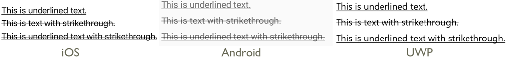
通过将 Label.TextDecorations 属性设置为一个或多个 TextDecorations 枚举成员,可以将下划线和删除线文本修饰应用于 Label 实例:
NoneUnderlineStrikethrough
以下 XAML 示例演示如何设置 Label.TextDecorations 属性:
<Label Text="This is underlined text." TextDecorations="Underline"  />
<Label Text="This is text with strikethrough." TextDecorations="Strikethrough" />
<Label Text="This is underlined text with strikethrough." TextDecorations="Underline, Strikethrough" />
等效 C# 代码如下:
var underlineLabel = new Label { Text = "This is underlined text.", TextDecorations = TextDecorations.Underline };
var strikethroughLabel = new Label { Text = "This is text with strikethrough.", TextDecorations = TextDecorations.Strikethrough };
var bothLabel = new Label { Text = "This is underlined text with strikethrough.", TextDecorations = TextDecorations.Underline | TextDecorations.Strikethrough };
以下屏幕截图显示了应用于 Label 实例的 TextDecorations 枚举成员:
转换文本
Label 可以通过将 TextTransform 属性设置为 TextTransform 枚举的值来转换存储在 Text 属性中的文本的大小写。 此枚举有四个值:
None指示不会转换文本。Default指示将使用平台的默认行为。 这是TextTransform属性的默认值。Lowercase指示文本将被转换为小写。Uppercase指示文本将被转换为大写。
以下示例展示了如何将文本转换为大写:
<Label Text="This text will be displayed in uppercase."
       TextTransform="Uppercase" />
等效 C# 代码如下:
Label label = new Label
{
    Text = "This text will be displayed in uppercase.",
    TextTransform = TextTransform.Uppercase
};
字符间距
通过将 Label.CharacterSpacing 属性设置为 double 值,可以将字符间距应用于 Label 实例:
<Label Text="Character spaced text"
       CharacterSpacing="10" />
等效 C# 代码如下:
Label label = new Label { Text = "Character spaced text", CharacterSpacing = 10 };
结果是,Label 显示的文本中的字符为间隔开来的 CharacterSpacing 独立于设备的单位。
新行
有两种主要方法可用于通过 XAML 强制使 Label 中的文本进入新行:
- 使用 unicode 换行符,即“ ”。
- 使用属性元素语法指定文本。
下面的代码显示了这两种方法的示例:
<!-- Unicode line feed character -->
<Label Text="First line Second line" />
<!-- Property element syntax -->
<Label>
<Label.Text>
First line
Second line
</Label.Text>
</Label>
在 C# 中,文本可以使用“\n”字符强制换行:
Label label = new Label { Text = "First line\nSecond line" };
颜色
标签可以设置为通过可绑定的 TextColor 属性使用自定义文本颜色。
需要特别小心,以确保颜色在每个平台上都可用。 由于每个平台都有不同的文本和背景颜色默认值,因此需要小心选择一个适用于每种平台的默认值。
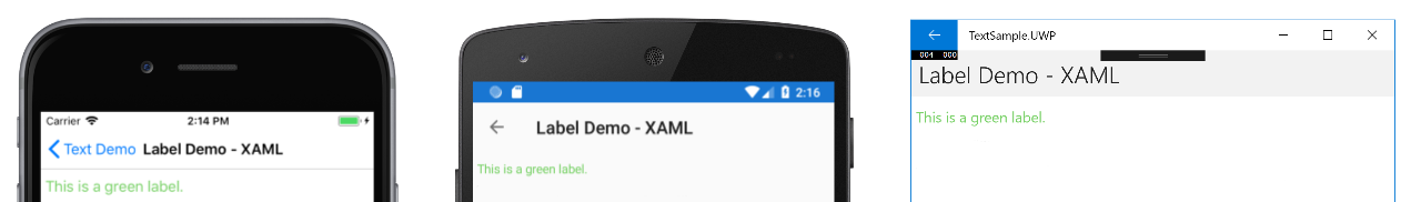
以下 XAML 示例设置了 Label 的文本颜色:
<ContentPage xmlns="http://xamarin.com/schemas/2014/forms"
             xmlns:x="http://schemas.microsoft.com/winfx/2009/xaml"
             x:Class="TextSample.LabelPage"
             Title="Label Demo">
    <StackLayout Padding="5,10">
      <Label TextColor="#77d065" FontSize = "20" Text="This is a green label." />
    </StackLayout>
</ContentPage>
等效 C# 代码如下:
public partial class LabelPage : ContentPage
{
    public LabelPage ()
    {
        InitializeComponent ();

        var layout = new StackLayout { Padding = new Thickness(5,10) };
        var label = new Label { Text="This is a green label.", TextColor = Color.FromHex("#77d065"), FontSize = 20 };
        layout.Children.Add(label);
        this.Content = layout;
    }
}
以下屏幕截图显示了设置 TextColor 属性的结果:
有关颜色的详细信息,请参阅颜色。
字体
有关在 Label 上指定字体的详细信息,请参阅“字体”。
截断和换行
标签可以通过 LineBreakMode 属性中的几种方式来处理无法在一行容纳的文本。 LineBreakMode 是具有以下值的枚举:
- HeadTruncation–截断文本的头,显示结尾。
- CharacterWrap–会将文本换行到字符边界的新行上。
- MiddleTruncation–会显示文本的开头和结尾,中间替换为省略号。
- NoWrap–不对文本进行换行,只显示一行可以容纳的文字量。
- TailTruncation–显示文本的开头,截断末尾。
- WordWrap–在字边界处对文本进行换行。
显示特定数量的行
可以通过将 Label.MaxLines 属性设置为 int 值来指定由 Label 显示的行数:
- 当
MaxLines为 -1(默认值)时,Label将遵循LineBreakMode属性的值,以仅显示一行(可能被截断)或显示包含全部文本的所有行。 - 当
MaxLines为 0 时,不显示Label。 - 当
MaxLines为 1 时,结果与将LineBreakMode属性设置为NoWrap、HeadTruncation、MiddleTruncation或TailTruncation相同。 但是,Label将遵循LineBreakMode属性的值来放置省略号(如果适用)。 - 当
MaxLines大于 1 时,Label最多将显示指定的行数,同时在省略号的放置方面遵循LineBreakMode属性的值(如果适用)。 但是,如果LineBreakMode属性设置为NoWrap,则将MaxLines属性设置为大于 1 的值没有效果。
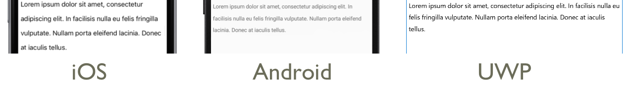
以下 XAML 示例演示了如何在 Label 上设置 MaxLines 属性:
<Label Text="Lorem ipsum dolor sit amet, consectetur adipiscing elit. In facilisis nulla eu felis fringilla vulputate. Nullam porta eleifend lacinia. Donec at iaculis tellus."
       LineBreakMode="WordWrap"
       MaxLines="2" />
等效 C# 代码如下:
var label =
{
  Text = "Lorem ipsum dolor sit amet, consectetur adipiscing elit. In facilisis nulla eu felis fringilla vulputate. Nullam porta eleifend lacinia. Donec at iaculis tellus.", LineBreakMode = LineBreakMode.WordWrap,
  MaxLines = 2
};
以下屏幕截图显示了将 MaxLines 属性设置为 2 的结果,此时文本足够长,占用了超过 2 行:

显示 HTML
Label 类具有 TextType 属性,该属性确定 Label 实例应显示纯文本还是 HTML 文本。 此属性应设置为 TextType 枚举的其中一个成员:
Text表示Label将显示纯文本,并且是Label.TextType属性的默认值。Html表示Label将显示 HTML 文本。
因此,Label 实例可以通过将 Label.TextType 属性设置为 Html,将 Label.Text 属性设置为 HTML 字符串来显示 HTML:
Label label = new Label
{
    Text = "This is <strong style=\"color:red\">HTML</strong> text.",
    TextType = TextType.Html
};
在上面的示例中,HTML 中的双引号字符必须使用 \ 符号进行转义。
在 XAML 中,由于会对 < 和 > 符号进行额外转义,HTML 字符串可能变得不可读:
<Label Text="This is <strong style="color:red">HTML</strong> text."
TextType="Html" />
或者,为了提高可读性,可以在 CDATA 部分中内联 HTML:
<Label TextType="Html">
    <![CDATA[
    This is <strong style="color:red">HTML</strong> text.
    ]]>
</Label>
在此示例中,Label.Text 属性设置为 CDATA 部分中内联的 HTML 字符串。 这是因为 Text 属性是 Label 类的 ContentProperty。
以下截图显示了一个显示 HTML 的 Label 页面:

重要
在 Label 中显示 HTML 仅限于基础平台所支持的 HTML 标记。
带格式文本
标签会公开一个 FormattedText 属性,该属性允许在同一视图中显示具有多个字体和颜色的文本。
FormattedText 属性的类型为 FormattedString,它包含一个或多个通过 Spans 属性设置的 Span 实例。 以下 Span 属性可用于设置视觉对象外观:
BackgroundColor–跨度背景的颜色。CharacterSpacing,属于double类型,是Span文本字符之间的间距。Font–跨度中文本的字体。FontAttributes–跨度中文本的字体特性。FontFamily- 该范围的字体所属的字体系列。FontSize- 该范围中的文本字号。ForegroundColor–跨度中文本的颜色。 此属性已过时,已由TextColor属性替换。LineHeight- 应用于跨度的默认行高度的乘数。 有关详细信息,请参阅“行高”。Style–要应用于跨度的样式。Text–跨度的文本。TextColor–跨度中文本的颜色。TextDecorations- 应用于跨度中的文本的修饰。 有关详细信息,请参阅“文本修饰”。
BackgroundColor、Text 和 Text 可绑定属性的默认绑定模式为 OneWay。 有关此绑定模式的详细信息,请参阅“绑定模式”指南中的“默认绑定模式”。
此外,GestureRecognizers 属性可用于定义手势识别器的集合,这些手势识别器将响应 Span 上的手势。
注意
无法在 Span 中显示 HTML。
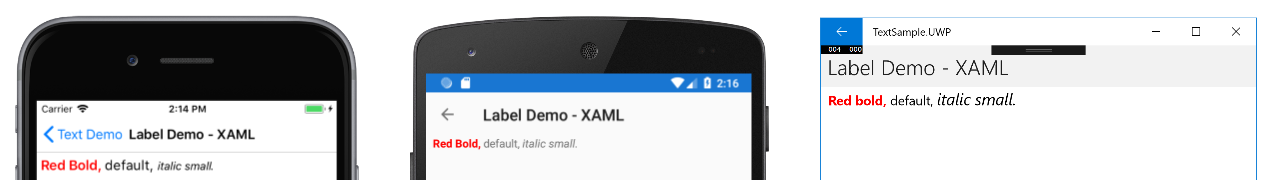
下面的 XAML 示例将演示由三个 Span 实例组成的 FormattedText 属性:
<ContentPage xmlns="http://xamarin.com/schemas/2014/forms"
             xmlns:x="http://schemas.microsoft.com/winfx/2009/xaml"
             x:Class="TextSample.LabelPage"
             Title="Label Demo - XAML">
    <StackLayout Padding="5,10">
        ...
        <Label LineBreakMode="WordWrap">
            <Label.FormattedText>
                <FormattedString>
                    <Span Text="Red Bold, " TextColor="Red" FontAttributes="Bold" />
                    <Span Text="default, " Style="{DynamicResource BodyStyle}">
                        <Span.GestureRecognizers>
                            <TapGestureRecognizer Command="{Binding TapCommand}" />
                        </Span.GestureRecognizers>
                    </Span>
                    <Span Text="italic small." FontAttributes="Italic" FontSize="Small" />
                </FormattedString>
            </Label.FormattedText>
        </Label>
    </StackLayout>
</ContentPage>
等效 C# 代码如下:
public class LabelPageCode : ContentPage
{
    public LabelPageCode ()
    {
        var layout = new StackLayout{ Padding = new Thickness (5, 10) };
        ...
        var formattedString = new FormattedString ();
        formattedString.Spans.Add (new Span{ Text = "Red bold, ", ForegroundColor = Color.Red, FontAttributes = FontAttributes.Bold });

        var span = new Span { Text = "default, " };
        span.GestureRecognizers.Add(new TapGestureRecognizer { Command = new Command(async () => await DisplayAlert("Tapped", "This is a tapped Span.", "OK")) });
        formattedString.Spans.Add(span);
        formattedString.Spans.Add (new Span { Text = "italic small.", FontAttributes = FontAttributes.Italic, FontSize =  Device.GetNamedSize(NamedSize.Small, typeof(Label)) });

        layout.Children.Add (new Label { FormattedText = formattedString });
        this.Content = layout;
    }
}
请注意,Span 还可以响应添加到跨度的 GestureRecognizers 集合中的任何手势。 例如,上述代码示例中已将 TapGestureRecognizer 添加到第二个 Span。 因此,点击此 Span 时,TapGestureRecognizer 将通过执行 Command 属性定义的 ICommand 进行响应。 有关手势识别器的详细信息,请参阅 Xamarin.Forms 手势。
以下屏幕截图显示了将 FormattedString 属性设置为三个 Span 实例的结果:
Line height
可以通过将 Label.LineHeight 属性或将 Span.LineHeight 设置为 double 值来自定义 Label 和 Span 的垂直高度。 在 iOS 和 Android 上,这些值是原始行高乘数,在通用 Windows 平台 (UWP) 上,Label.LineHeight 属性值是标签字号的乘数。
注意
- 在 iOS 上,
Label.LineHeight和Span.LineHeight属性会更改适合单行的文本和换行到多行的文本的行高。 - 在 Android 上,
Label.LineHeight和Span.LineHeight属性仅会更改换行到多行的文本行高。 - 在 UWP 上,
Label.LineHeight属性会更改环绕到多行的文本的行高,Span.LineHeight属性不会起作用。
以下 XAML 示例演示了如何在 Label 上设置 LineHeight 属性:
<Label Text="Lorem ipsum dolor sit amet, consectetur adipiscing elit. In facilisis nulla eu felis fringilla vulputate. Nullam porta eleifend lacinia. Donec at iaculis tellus."
       LineBreakMode="WordWrap"
       LineHeight="1.8" />
等效 C# 代码如下:
var label =
{
  Text = "Lorem ipsum dolor sit amet, consectetur adipiscing elit. In facilisis nulla eu felis fringilla vulputate. Nullam porta eleifend lacinia. Donec at iaculis tellus.", LineBreakMode = LineBreakMode.WordWrap,
  LineHeight = 1.8
};
以下屏幕截图显示了将 Label.LineHeight 属性设置为 1.8 的结果:
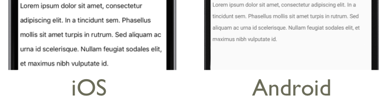
以下 XAML 示例演示了如何在 Span 上设置 LineHeight 属性:
<Label LineBreakMode="WordWrap">
    <Label.FormattedText>
        <FormattedString>
            <Span Text="Lorem ipsum dolor sit amet, consectetur adipiscing elit. In a tincidunt sem. Phasellus mollis sit amet turpis in rutrum. Sed aliquam ac urna id scelerisque. "
                  LineHeight="1.8"/>
            <Span Text="Nullam feugiat sodales elit, et maximus nibh vulputate id."
                  LineHeight="1.8" />
        </FormattedString>
    </Label.FormattedText>
</Label>
等效 C# 代码如下:
var formattedString = new FormattedString();
formattedString.Spans.Add(new Span
{
  Text = "Lorem ipsum dolor sit amet, consectetur adipiscing elit. In a tincidunt sem. Phasellus mollis sit amet turpis in rutrum. Sed aliquam ac urna id scelerisque. ",
  LineHeight = 1.8
});
formattedString.Spans.Add(new Span
{
  Text = "Nullam feugiat sodales elit, et maximus nibh vulputate id.",
  LineHeight = 1.8
});
var label = new Label
{
  FormattedText = formattedString,
  LineBreakMode = LineBreakMode.WordWrap
};
以下屏幕截图显示了将 Span.LineHeight 属性设置为 1.8 的结果:
填充
填充表示元素与其子元素之间的空间,用于将元素与其自身内容分开。 通过将 Label.Padding 属性设置为 Thickness 值,可以将填充应用于 Label 实例:
<Label Padding="10">
    <Label.FormattedText>
        <FormattedString>
            <Span Text="Lorem ipsum" />
            <Span Text="dolor sit amet." />
        </FormattedString>
    </Label.FormattedText>
</Label>
等效 C# 代码如下:
FormattedString formattedString = new FormattedString();
formattedString.Spans.Add(new Span
{
  Text = "Lorem ipsum"
});
formattedString.Spans.Add(new Span
{
  Text = "dolor sit amet."
});
Label label = new Label
{
    FormattedText = formattedString,
    Padding = new Thickness(20)
};
重要
在 iOS 上,创建设置 Padding 属性的 Label 时,将应用填充,并且稍后可以更新填充值。 但是,创建未设置 Padding 属性的 Label 时,以后尝试对其进行设置将不起作用。
在 Android 和通用 Windows 平台上,可以在创建 Label 或更高版本时指定 Padding 属性值。
有关填充的详细信息,请参阅“边距和填充”。
超链接
可以使用以下方法将 Label 和 Span 实例显示的文本转换为超链接:
- 设置
Label或Span的TextColor和TextDecoration属性。 - 将
TapGestureRecognizer添加到Label或Span的GestureRecognizers集合中,其Command属性绑定到ICommand,并且其CommandParameter属性包含要打开的 URL。 - 定义将由
TapGestureRecognizer执行的ICommand。 - 编写将由
ICommand执行的代码。
以下代码示例显示了一个 Label,其内容是从多个 Span 实例设置的:
<Label>
    <Label.FormattedText>
        <FormattedString>
            <Span Text="Alternatively, click " />
            <Span Text="here"
                  TextColor="Blue"
                  TextDecorations="Underline">
                <Span.GestureRecognizers>
                    <TapGestureRecognizer Command="{Binding TapCommand}"
                                          CommandParameter="https://learn.microsoft.com/xamarin/" />
                </Span.GestureRecognizers>
            </Span>
            <Span Text=" to view Xamarin documentation." />
        </FormattedString>
    </Label.FormattedText>
</Label>
在此示例中,第一个和第三个 Span 实例构成文本,而第二个 Span 表示可点击的超链接。 它的文本颜色设置为蓝色,并且具有下划线文本修饰。 这会创建超链接的外观,如以下屏幕截图所示:

当点击超链接时,TapGestureRecognizer 将通过执行由其 Command 属性定义的 ICommand 来响应。 此外,CommandParameter 属性指定的 URL 将作为参数传递给 ICommand。
XAML 页的代码隐藏包含 TapCommand 实现:
public partial class MainPage : ContentPage
{
    // Launcher.OpenAsync is provided by Xamarin.Essentials.
    public ICommand TapCommand => new Command<string>(async (url) => await Launcher.OpenAsync(url));

    public MainPage()
    {
        InitializeComponent();
        BindingContext = this;
    }
}
TapCommand 执行 Launcher.OpenAsync 方法,将 TapGestureRecognizer.CommandParameter 属性值作为参数传递。 Launcher.OpenAsync 方法由 Xamarin.Essentials 提供,并会在 Web 浏览器中打开 URL。 因此,总体效果是,当在页面上点击超链接时,会出现一个 Web 浏览器,并导航到与该超链接关联的 URL。
创建可重用的超链接类
以前创建超链接的方法需要在每次需要在应用程序中创建超链接时编写重复的代码。 但是,Label 和 Span 类都可以通过子类化来创建 HyperlinkLabel 和 HyperlinkSpan 类,并在其中添加手势识别器和文本格式代码。
以下代码示例演示了 HyperlinkSpan 类:
public class HyperlinkSpan : Span
{
    public static readonly BindableProperty UrlProperty =
        BindableProperty.Create(nameof(Url), typeof(string), typeof(HyperlinkSpan), null);

    public string Url
    {
        get { return (string)GetValue(UrlProperty); }
        set { SetValue(UrlProperty, value); }
    }

    public HyperlinkSpan()
    {
        TextDecorations = TextDecorations.Underline;
        TextColor = Color.Blue;
        GestureRecognizers.Add(new TapGestureRecognizer
        {
            // Launcher.OpenAsync is provided by Xamarin.Essentials.
            Command = new Command(async () => await Launcher.OpenAsync(Url))
        });
    }
}
HyperlinkSpan 类定义 Url 属性和关联的 BindableProperty,而构造函数设置超链接外观和将会在点击超链接时做出响应的 TapGestureRecognizer。 点击 HyperlinkSpan 时,TapGestureRecognizer 将通过执行 Launcher.OpenAsync 方法在 Web 浏览器中打开 Url 属性指定的 URL。
可以通过向 XAML 添加类的实例来使用 HyperlinkSpan 类:
<ContentPage xmlns="http://xamarin.com/schemas/2014/forms"
             xmlns:x="http://schemas.microsoft.com/winfx/2009/xaml"
             xmlns:local="clr-namespace:HyperlinkDemo"
             x:Class="HyperlinkDemo.MainPage">
    <StackLayout>
        ...
        <Label>
            <Label.FormattedText>
                <FormattedString>
                    <Span Text="Alternatively, click " />
                    <local:HyperlinkSpan Text="here"
                                         Url="https://learn.microsoft.com/appcenter/" />
                    <Span Text=" to view AppCenter documentation." />
                </FormattedString>
            </Label.FormattedText>
        </Label>
    </StackLayout>
</ContentPage>
设置标签样式
前面的部分介绍了如何基于每个实例设置 Label 和 Span 属性。 但是,属性集可以归类为一种样式,统一应用于一个或多个视图。 这可以提高代码的可读性,并使设计更改更易于实现。 有关详细信息,请参阅“样式”。