TitleBar 控制項提供簡化的方式,為您的應用程式建立自定義標題列。 標題列是 Windows 應用程式使用者介面的基本元件,透過圖示和標題識別應用程式,包含系統標題按鈕,讓使用者能關閉、最大化、最小化及還原視窗,並讓使用者在螢幕上拖曳視窗。
您可以使用自定義標題列,更妥善地整合標題列區域與您的應用程式 UI。 標題列可以透過Mica主題進行自定義,以配合應用程式的視覺樣式。 它可以包含其他相關信息,例如文件標題或目前狀態(例如「編輯」、「檢視」等)。 它也能承載其他 WinUI 3 控制項,如 AutoSuggestBox 和 PersonPicture,為您的應用程式提供統一的使用者體驗。

這是正確的控制嗎?
當您想將標題列區域與應用程式 UI 整合,例如使用字幕、Mica 主題和與 WinUI 控件整合等自定義選項時,請使用 TitleBar 控件。
解剖學
根據預設,標題欄只會顯示系統標題按鈕。 標題欄的其他部分會根據相關聯的屬性設定顯示或隱藏。
標題列分成下列區域:
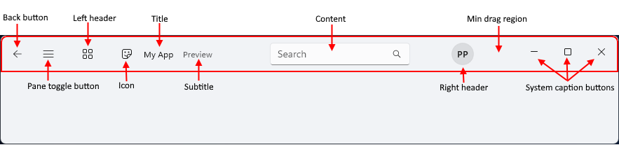
- 上一頁按鈕:IsBackButtonEnabled、 IsBackButtonVisible、 BackRequested - 用於瀏覽的內建返回按鈕。
- 窗格切換按鈕:IsPaneToggleButtonVisible、 PaneToggleRequested - 此按鈕是要與 NavigationView 控件搭配使用。
- 左標題:LeftHeader
- 圖示:IconSource
- 標題:標題
- 副標題:副標題
- 內容:內容
- 右標頭:RightHeader
- 最小拖曳區域: 此區域會保留於系統標題按鈕旁邊,讓使用者一律有一個位置可抓取要拖曳的視窗。
- 系統標題按鈕: 這些按鈕不是 TitleBar 控件的一部分-它只會根據 RTL 或 LTR 設定來配置標題按鈕出現的空間。 標題按鈕和自定義是由 AppWindowTitleBar處理。
當 FlowDirection 為 RightToLeft 時,配置會反轉。
建立標題列
- 重要 API:TitleBar 類別、 Title 屬性

WinUI 3 圖庫應用程式包含互動式的 WinUI 控制項與功能範例。 你可以從 Microsoft Store下載 App,或在 GitHub 瀏覽原始碼。
此範例會建立簡單的標題列,以取代系統標題列。 它有標題、圖示和Mica主題。
<Window
... >
<Window.SystemBackdrop>
<MicaBackdrop Kind="Base"/>
</Window.SystemBackdrop>
<Grid>
<Grid.RowDefinitions>
<RowDefinition Height="Auto" />
<RowDefinition Height="*" />
</Grid.RowDefinitions>
<TitleBar x:Name="SimpleTitleBar"
Title="My App">
<TitleBar.IconSource>
<FontIconSource Glyph=""/>
</TitleBar.IconSource>
</TitleBar>
<!-- App content -->
<Frame x:Name="RootFrame" Grid.Row="1"/>
</Grid>
</Window>
public MainWindow()
{
    this.InitializeComponent();

    // Hides the default system title bar.
    ExtendsContentIntoTitleBar = true;
    // Replace system title bar with the WinUI TitleBar control.
    SetTitleBar(SimpleTitleBar);
}
與 NavigationView 整合
瀏覽檢視具有內建的返回按鈕和窗格切換按鈕。 Fluent Design 指引建議在使用自定義標題列時,將這些控件放在標題欄中。
這個範例示範如何在導覽檢視中隱藏返回按鈕和窗格切換按鈕,並改用標題欄上的對應按鈕,將 TitleBar 控件與 NavigationView 控件整合。
<Grid>
    <Grid.RowDefinitions>
        <RowDefinition Height="Auto" />
        <RowDefinition Height="*" />
    </Grid.RowDefinitions>

    <TitleBar Title="My App"
              IsBackButtonVisible="True"
              IsBackButtonEnabled="{x:Bind RootFrame.CanGoBack, Mode=OneWay}"
              BackRequested="TitleBar_BackRequested"
              IsPaneToggleButtonVisible="True"
              PaneToggleRequested="TitleBar_PaneToggleRequested">
    </TitleBar>

    <NavigationView x:Name="RootNavigationView" Grid.Row="1"
                    IsBackButtonVisible="Collapsed"
                    IsPaneToggleButtonVisible="False">
        <Frame x:Name="RootFrame" />
    </NavigationView>
</Grid>
private void TitleBar_BackRequested(TitleBar sender, object args)
{
    if (RootFrame.CanGoBack)
    {
        RootFrame.GoBack();
    }
}

private void TitleBar_PaneToggleRequested(TitleBar sender, object args)
{
    RootNavigationView.IsPaneOpen = !RootNavigationView.IsPaneOpen;
}
自訂拖曳區域
使用者透過拖曳標題列來移動視窗。 標題列控制項決定其 Content 區域的哪些部分可供使用者拖曳,以及哪些部分可接收指標輸入,例如點擊。
從 Windows 應用程式 SDK 2.1.3 開始,標題列控制項會檢視其內容中的元素,並僅將互動式控制項(如按鈕、文字方塊和下拉式方塊)排除在拖曳區域之外。 空白空間和非互動元素(如文字區塊)預設可拖曳,因此你不需要更改標記。 在早期版本中,內容區的空白可能會阻擋視窗拖曳。 這個預設行為就是 TitleBar_ContentDragRegions 執行階段相容性變更。 更多資訊請參見 RuntimeCompatibilityOptions.DisabledChanges。
以下範例基於 WinUI 3 圖庫範例。 標題列的內容是一個包含 AutoSuggestBox 和按鈕的 Grid。 兩個控制鍵都可以點擊,旁邊的空白區域可以拖曳。
<TitleBar x:Name="AppTitleBar" Title="My App">
    <TitleBar.Resources>
        <!-- Stretch the content across the available width of the title bar. -->
        <HorizontalAlignment x:Key="TitleBarContentHorizontalAlignment">Stretch</HorizontalAlignment>
    </TitleBar.Resources>
    <TitleBar.Content>
        <Grid ColumnSpacing="8">
            <Grid.ColumnDefinitions>
                <ColumnDefinition Width="*" />
                <ColumnDefinition Width="Auto" />
            </Grid.ColumnDefinitions>

            <AutoSuggestBox MaxWidth="580"
                            VerticalAlignment="Center"
                            PlaceholderText="Search..."
                            QueryIcon="Find" />

            <StackPanel x:Name="RightPanel"
                        Grid.Column="1"
                        Orientation="Horizontal"
                        Spacing="8"
                        VerticalAlignment="Center">
                <Button x:Name="StatusButton"
                        Content="Status"
                        Click="StatusButton_Click" />
            </StackPanel>
        </Grid>
    </TitleBar.Content>
</TitleBar>
覆寫元素的拖曳行為
要覆寫標題欄內容中某元素的預設行為,請設定 TitleBar.IsDragRegion 附加屬性。 該屬性是一個可為無的布林值。
| Value | 行為 |
|---|---|
未設定 (null) |
由 TitleBar 控制項決定。 互動式控制可點擊,其他元素則可拖曳。 |
True |
這個元素是可以拖曳的,即使它是互動式控制項。 元素上的指標輸入會移動視窗,讓使用者無法點擊該元素。 |
False |
這個元素是可以點擊的,即使它不是互動式控制項。 |
你可以將屬性設定在面板上,例如 StackPanel:
- 如果你把它設成
False,整個面板區域都可以點擊,包括其子元素之間的空間。 - 如果你設定為
True,面板及其子節點是可拖曳的,但屬性設為False的子節點除外。
將屬性設定在最小且需要它的元素上,避免標題列中一大片區域意外變成可拖曳或可點擊。
這個範例讓一組格式控制項整體可點擊,讓使用者按下控制項之間的空白處時不會拖動視窗。
<StackPanel Orientation="Horizontal" Spacing="8" TitleBar.IsDragRegion="False">
    <ComboBox PlaceholderText="Font" />
    <ComboBox PlaceholderText="Size" />
    <ToggleButton Content="Bold" />
</StackPanel>
在程式碼中,呼叫 SetIsDragRegion 來設定值,然後呼叫 ClearValue 搭配 IsDragRegionProperty 來恢復為預設行為。 要讀取數值,請呼叫 GetIsDragRegion。 如果屬性沒有設定,它會回傳 null 。 當值改變時,TitleBar 控制項會更新拖曳區域。
// Make the button draggable. Users can't click it.
TitleBar.SetIsDragRegion(StatusButton, true);

// Make the button clickable.
TitleBar.SetIsDragRegion(StatusButton, false);

// Clear the value so that the TitleBar control decides.
StatusButton.ClearValue(TitleBar.IsDragRegionProperty);
當內容變更時,更新拖曳區域
標題列控制項會在你設定或替換內容、內容載入時、標題列大小改變,以及元素上的 TitleBar.IsDragRegion 值變更時,更新拖曳區域。
如果您在執行時新增、移除或調整標題列內容中的元素,請在更改後呼叫 RecomputeDragRegions 。
private void AddButton_Click(object sender, RoutedEventArgs e)
{
    RightPanel.Children.Insert(0, new Button { Content = "Extra" });

    // Update the drag regions so that the new button is clickable.
    AppTitleBar.RecomputeDragRegions();
}
如果標題列內容經常變動,你可以改為將 AutoRefreshDragRegions 設為 True。 TitleBar 控制項會在每次佈局通過後更新拖曳區域。 這個選項會影響效能,所以預設為False停用。
<TitleBar x:Name="AppTitleBar" Title="My App" AutoRefreshDragRegions="True">
    <!-- Title bar content that changes at run time. -->
</TitleBar>
Note
拖曳區域只影響指標輸入。 它們不會改變鍵盤焦點,也不會改變 使用者介面自動化 客戶端(例如螢幕閱讀器)與標題列元素的互動方式。 確保標題欄的互動控制鍵仍能用鍵盤操作。
如果你的應用程式沒有使用 TitleBar 控制項,請使用 InputNonClientPointerSource 類別來設定自訂標題列的互動區域。 欲了解更多資訊,請參閱 互動內容。