Windows Presentation Foundation(WPF)包含許多你幾乎在每個 Windows 應用程式中使用的常用 UI 元件,例如 Button、 Label、 TextBoxMenuListBox和 。 歷史上,開發者稱這些物件為控制項。 開發者鬆散地使用「控制」一詞來指任何代表應用程式中可見物件的類別。 一個類別不需要繼承該 Control 類別才能有明顯存在感。 從 Control 類別繼承的類別包含 ControlTemplate,這使得控制的使用者可以在不必建立新子類別的情況下,大幅更改控制的外觀。 本文討論如何在 WPF 中使用控制項(包括從類別繼承 Control 的控制項與不繼承的控制項)。
建立控件的實例
您可以使用可延伸應用程式標記語言 (XAML) 或程式代碼,將控制項新增至應用程式。 例如,請考慮 WPF 視窗的下圖,要求使用者提供其名稱和位址:
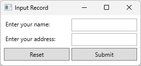
此視窗有六個控件:兩個標籤、兩個文字框和兩個按鈕。 該應用程式使用 XAML 來建立這些控制,如下片段所示:
<Window x:Class="Examples.ExampleApp"
        xmlns="http://schemas.microsoft.com/winfx/2006/xaml/presentation"
        xmlns:x="http://schemas.microsoft.com/winfx/2006/xaml"
        Title="Input Record" Height="Auto" Width="300" SizeToContent="Height">
    <Grid Margin="5">
        <Grid.RowDefinitions>
            <RowDefinition Height="30"/>
            <RowDefinition Height="30"/>
            <RowDefinition Height="30"/>
        </Grid.RowDefinitions>
        <Grid.ColumnDefinitions>
            <ColumnDefinition/>
            <ColumnDefinition/>
        </Grid.ColumnDefinitions>

        <Label>Enter your name:</Label>
        <TextBox Grid.Row="0" Grid.Column="1" Name="FirstName" Margin="2" />

        <Label Grid.Row="1">Enter your address:</Label>
        <TextBox Grid.Row="1" Grid.Column="1" Name="LastName" Margin="2" />

        <Button Grid.Row="2" Grid.Column="0" Name="Reset" Margin="2">Reset</Button>
        <Button Grid.Row="2" Grid.Column="1" Name="Submit" Margin="2">Submit</Button>
    </Grid>
</Window>
你可以用 XAML 類似的方式建立所有控制項。 你也可以在程式碼中建立相同的視窗:
// Grid container which is the content of the Window
Grid container = new() { Margin = new Thickness(5) };
container.RowDefinitions.Add(new RowDefinition());
container.RowDefinitions.Add(new RowDefinition());
container.RowDefinitions.Add(new RowDefinition());
container.ColumnDefinitions.Add(new ColumnDefinition());
container.ColumnDefinitions.Add(new ColumnDefinition());

// Create the two labels, assign the second label to the second row
Label labelName = new() { Content = "Enter your name:" };
container.Children.Add(labelName);

Label labelAddress = new() { Content = "Enter your address:" };
Grid.SetRow(labelAddress, 1);
container.Children.Add(labelAddress);

// Create the two textboxes, assign both to the second column and
// assign the second textbox to the second row.
TextBox textboxName = new() { Margin = new Thickness(2) };
Grid.SetColumn(textboxName, 1);
container.Children.Add(textboxName);

TextBox textboxAddress = new() { Margin = new Thickness(2) };
Grid.SetRow(textboxAddress, 1);
Grid.SetColumn(textboxAddress, 1);
container.Children.Add(textboxAddress);

// Create the two buttons, assign both to the third row and
// assign the second button to the second column.
Button buttonReset = new() { Margin = new Thickness(2), Content = "Reset" };
Grid.SetRow(buttonReset, 2);
container.Children.Add(buttonReset);

Button buttonSubmit = new() { Margin = new Thickness(2), Content = "Submit" };
Grid.SetColumn(buttonSubmit, 1);
Grid.SetRow(buttonSubmit, 2);
container.Children.Add(buttonSubmit);

// Create the popup window and assign the container (Grid) as its content
Window inputWindow = new()
{
    Title = "Input Record",
    Height = double.NaN,
    Width = 300,
    SizeToContent = SizeToContent.Height,
    Content = container
};

inputWindow.Show();
' Grid container which is the content of the Window
Dim container As New Grid() With {.Margin = New Thickness(5)}
container.RowDefinitions.Add(New RowDefinition())
container.RowDefinitions.Add(New RowDefinition())
container.RowDefinitions.Add(New RowDefinition())
container.ColumnDefinitions.Add(New ColumnDefinition())
container.ColumnDefinitions.Add(New ColumnDefinition())

' Create the two labels, assign the second label to the second row
Dim labelName As New Label() With {.Content = "Enter your name:"}
container.Children.Add(labelName)

Dim labelAddress As New Label() With {.Content = "Enter your address:"}
Grid.SetRow(labelAddress, 1)
container.Children.Add(labelAddress)

' Create the two textboxes, assign both to the second column and
' assign the second textbox to the second row.
Dim textboxName As New TextBox() With {.Margin = New Thickness(2)}
Grid.SetColumn(textboxName, 1)
container.Children.Add(textboxName)

Dim textboxAddress As New TextBox() With {.Margin = New Thickness(2)}
Grid.SetRow(textboxAddress, 1)
Grid.SetColumn(textboxAddress, 1)
container.Children.Add(textboxAddress)

' Create the two buttons, assign both to the third row and
' assign the second button to the second column.
Dim buttonReset As New Button() With {.Margin = New Thickness(2), .Content = "Reset"}
Grid.SetRow(buttonReset, 2)
container.Children.Add(buttonReset)

Dim buttonSubmit As New Button() With {.Margin = New Thickness(2), .Content = "Submit"}
Grid.SetColumn(buttonSubmit, 1)
Grid.SetRow(buttonSubmit, 2)
container.Children.Add(buttonSubmit)

' Create the window and assign the container (Grid) as its content
Dim inputWindow As New Window() With
{
    .Title = "Input Record",
    .Height = Double.NaN,
    .Width = 300,
    .SizeToContent = SizeToContent.Height,
    .Content = container
}

inputWindow.Show()
訂閱活動通知
您可以使用 XAML 或程式碼來訂閱控制項的事件,但只能在程式碼中處理事件。
在 XAML 中,將事件設為元素上的屬性。 您無法將 <Element.Event>handler<Element.Event> 表示法用於事件。 下列代碼段示範如何訂閱 Click 的 Button事件:
<Button Click="Submit_Click" Grid.Row="2" Grid.Column="1" Name="Submit" Margin="2">Submit</Button>
以下是在程式碼中做同樣事情的方法:
Button buttonSubmit = new() { Margin = new Thickness(2), Content = "Submit" };
buttonSubmit.Click += Submit_Click;
Dim buttonSubmit As New Button() With {.Margin = New Thickness(2), .Content = "Submit"}
AddHandler buttonSubmit.Click, AddressOf Submit_Click
下列代碼段會處理 Click 的 Button事件:
private void Submit_Click(object sender, RoutedEventArgs e)
{
    MessageBox.Show("Someone clicked the submit button.");
}
Private Sub Submit_Click(sender As Object, e As Windows.RoutedEventArgs)
    MessageBox.Show("Someone clicked the submit button.")
End Sub
變更控件的外觀
變更控件的外觀,以符合您 app 的外觀和風格很常見。 您可以根據想要達成的目的,執行下列其中一項操作來變更控制項的外觀:
- 變更控制項的屬性值。
- 為控制項建立 Style。
- 為控制項建立新的 ControlTemplate。
變更控件的屬性
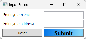
許多按鍵都有屬性,可以用來改變按鍵的外觀,例如按鈕的背景。 在 XAML 和程式碼中都設定值屬性。 下列範例會在 XAML 中對Background設定FontSize、FontWeight及Button屬性:
<Button Grid.Row="2" Grid.Column="1" Name="Submit" Margin="2" Content="Submit">
    <Button.FontSize>18</Button.FontSize>
    <Button.FontWeight>Bold</Button.FontWeight>
    <Button.Background>
        <LinearGradientBrush>
            <GradientStop Color="#0073E6" Offset="0.0" />
            <GradientStop Color="#81D4FA" Offset="0.9" />
        </LinearGradientBrush>
    </Button.Background>
</Button>
以下是在程式碼中做同樣事情的方法:
Button buttonSubmit = new() { Margin = new Thickness(2), Content = "Submit" };
buttonSubmit.FontSize = 18f;
buttonSubmit.FontWeight = FontWeights.Bold;
buttonSubmit.Background =
    new LinearGradientBrush(
        (Color)ColorConverter.ConvertFromString("#0073E6"),
        (Color)ColorConverter.ConvertFromString("#81D4FA"),
        new Point(0d, 0d),
        new Point(0.9d, 0d));
Dim buttonSubmit As New Button() With {.Margin = New Thickness(2), .Content = "Submit"}
buttonSubmit.FontSize = 18.0F
buttonSubmit.FontWeight = FontWeights.Bold
buttonSubmit.Background =
        New LinearGradientBrush(
            ColorConverter.ConvertFromString("#0073E6"),
            ColorConverter.ConvertFromString("#81D4FA"),
            New Point(0D, 0D),
            New Point(0.9D, 0D))
下圖顯示範例視窗:
建立控件的樣式
WPF 可讓您透過建立 Style來指定控制件的外觀,而不是在每個控件上設定屬性。 通常,你會在 XAML 的Style中定義ResourceDictionary,例如Resources的控制項或視窗的屬性。 資源適用於你所定義的範圍。 如需詳細資訊,請參閱 XAML 資源概觀。
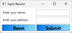
下列範例會將 Style 套用至定義樣式之相同 Button 中所含的每個 Grid :
<Grid.Resources>
    <Style TargetType="{x:Type Button}">
        <Style.Setters>
            <Setter Property="FontSize" Value="18" />
            <Setter Property="FontWeight" Value="Bold" />
            <Setter Property="Background">
                <Setter.Value>
                    <LinearGradientBrush>
                        <GradientStop Color="#0073E6" Offset="0.0" />
                        <GradientStop Color="#81D4FA" Offset="0.9" />
                    </LinearGradientBrush>
                </Setter.Value>
            </Setter>
        </Style.Setters>
    </Style>
</Grid.Resources>
以下是在程式碼中做同樣事情的方法:
Grid container = new() { Margin = new Thickness(5) };
container.RowDefinitions.Add(new RowDefinition());
container.RowDefinitions.Add(new RowDefinition());
container.RowDefinitions.Add(new RowDefinition());
container.ColumnDefinitions.Add(new ColumnDefinition());
container.ColumnDefinitions.Add(new ColumnDefinition());

Style buttonStyle = new(typeof(Button));
buttonStyle.Setters.Add(new Setter(Button.FontSizeProperty, 18d));
buttonStyle.Setters.Add(new Setter(Button.FontWeightProperty, FontWeights.Bold));
buttonStyle.Setters.Add(new Setter(Button.BackgroundProperty,
    new LinearGradientBrush(
        (Color)ColorConverter.ConvertFromString("#0073E6"),
        (Color)ColorConverter.ConvertFromString("#81D4FA"),
        new Point(0d, 0d),
        new Point(0.9d, 0d))));

container.Resources.Add(typeof(Button), buttonStyle);
Dim container As New Grid() With {.Margin = New Thickness(5)}
container.RowDefinitions.Add(New RowDefinition())
container.RowDefinitions.Add(New RowDefinition())
container.RowDefinitions.Add(New RowDefinition())
container.ColumnDefinitions.Add(New ColumnDefinition())
container.ColumnDefinitions.Add(New ColumnDefinition())

Dim buttonStyle As New Style(GetType(Button))
buttonStyle.Setters.Add(New Setter(Button.FontSizeProperty, 18.0R))
buttonStyle.Setters.Add(New Setter(Button.FontWeightProperty, FontWeights.Bold))
buttonStyle.Setters.Add(New Setter(Button.BackgroundProperty,
        New LinearGradientBrush(
            ColorConverter.ConvertFromString("#0073E6"),
            ColorConverter.ConvertFromString("#81D4FA"),
            New Point(0D, 0D),
            New Point(0.9D, 0D))))

container.Resources.Add(GetType(Button), buttonStyle)
下圖顯示套用至視窗方格的樣式,這會變更兩個按鈕的外觀:
你不必將樣式套用到所有特定類型的控制項,而是透過在資源字典中加入樣式鍵,並在控制項屬性中引用該鍵 Style 來指派該樣式。 如需樣式的詳細資訊,請參閱樣式設定和範本化。
建立 ControlTemplate
A Style 可以同時設定多個控制項的屬性,但有時候需要超越 Style 的限制,進一步自訂控制項的外觀。 繼承自 Control 類別的類別具有 ControlTemplate,其定義控件的結構和外觀。
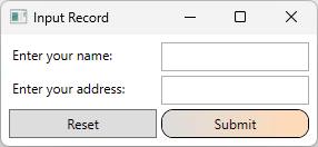
請考慮控制項 Button ,這是幾乎每個應用程式所使用的通用控制件。 按鈕的主要行為是讓用戶選取按鈕時,讓應用程式採取一些動作。 根據預設,WPF 中的按鈕會顯示為突起的矩形。 在開發應用程式時,您可能希望利用按鈕的行為,也就是使用者與按鈕的互動方式,這會引發一個 Click 事件,但您可能會希望改變按鈕的外觀,而不僅限於調整按鈕的屬性。 在此情況下,您可以建立一個新的 ControlTemplate。
下列範例將建立 ControlTemplate 以用於 Button。
ControlTemplate 為 Button 創造具有圓角及漸層背景的邊框視覺效果。
<Button Grid.Row="2" Grid.Column="1" Name="Submit" Margin="2" Content="Submit">
    <Button.Template>
        <ControlTemplate TargetType="Button">
            <Border Name="Border" CornerRadius="10" BorderThickness="1" BorderBrush="Black">
                <Border.Background>
                    <LinearGradientBrush StartPoint="0,0.5"
                         EndPoint="1,0.5">
                        <GradientStop Color="{Binding Background.Color, RelativeSource={RelativeSource TemplatedParent}}" Offset="0.0" />
                        <GradientStop Color="PeachPuff" Offset="0.9" />
                    </LinearGradientBrush>
                </Border.Background>
                <ContentPresenter Margin="2" HorizontalAlignment="Center" VerticalAlignment="Center" RecognizesAccessKey="True"/>
            </Border>
            <ControlTemplate.Triggers>
                <!--Change the appearance of the button when the user clicks it.-->
                <Trigger Property="IsPressed" Value="true">
                    <Setter TargetName="Border" Property="Background">
                        <Setter.Value>
                            <LinearGradientBrush StartPoint="0,0.5" EndPoint="1,0.5">
                                <GradientStop Color="{Binding Background.Color, RelativeSource={RelativeSource TemplatedParent}}" Offset="0.0" />
                                <GradientStop Color="LightBlue" Offset="0.9" />
                            </LinearGradientBrush>
                        </Setter.Value>
                    </Setter>
                </Trigger>
            </ControlTemplate.Triggers>
        </ControlTemplate>
    </Button.Template>
</Button>
備註
將Button的Background屬性設為SolidColorBrush,這樣範例才能正常運作。
以下是在程式碼中做到同樣事情的方法。 以下程式碼會建立一個 XAML 字串並解析它,產生一個你可以套用的範本。 此方法是執行時產生範本的支援方式。
Button buttonSubmit = new() { Margin = new Thickness(2), Content = "Submit" };

// Create the XAML used to define the button template
const string xaml = """
    <ControlTemplate TargetType="Button">
        <Border Name="Border" CornerRadius="10" BorderThickness="1" BorderBrush="Black">
            <Border.Background>
                <LinearGradientBrush StartPoint="0,0.5"
                     EndPoint="1,0.5">
                    <GradientStop Color="{Binding Background.Color, RelativeSource={RelativeSource TemplatedParent}}" Offset="0.0" />
                    <GradientStop Color="PeachPuff" Offset="0.9" />
                </LinearGradientBrush>
            </Border.Background>
            <ContentPresenter Margin="2" HorizontalAlignment="Center" VerticalAlignment="Center" RecognizesAccessKey="True"/>
        </Border>
        <ControlTemplate.Triggers>
            <!--Change the appearance of the button when the user clicks it.-->
            <Trigger Property="IsPressed" Value="true">
                <Setter TargetName="Border" Property="Background">
                    <Setter.Value>
                        <LinearGradientBrush StartPoint="0,0.5" EndPoint="1,0.5">
                            <GradientStop Color="{Binding Background.Color, RelativeSource={RelativeSource TemplatedParent}}" Offset="0.0" />
                            <GradientStop Color="LightBlue" Offset="0.9" />
                        </LinearGradientBrush>
                    </Setter.Value>
                </Setter>
            </Trigger>
        </ControlTemplate.Triggers>
    </ControlTemplate>
    """;

// Load the XAML into a stream that can be parsed
using MemoryStream stream = new(System.Text.Encoding.UTF8.GetBytes(xaml));

// Create a parser context and add the default namespace and
// the x namespace, which is common to WPF XAML
System.Windows.Markup.ParserContext context = new();
context.XmlnsDictionary.Add("", "http://schemas.microsoft.com/winfx/2006/xaml/presentation");
context.XmlnsDictionary.Add("x", "http://schemas.microsoft.com/winfx/2006/xaml");

// Parse the XAML and assign it to the button's template
buttonSubmit.Template = (ControlTemplate)System.Windows.Markup.XamlReader.Load(stream, context);

// Set the other properties of the button
Grid.SetColumn(buttonSubmit, 1);
Grid.SetRow(buttonSubmit, 2);

// Assign the button to the grid container
container.Children.Add(buttonSubmit);
Dim buttonSubmit As New Button() With {.Margin = New Thickness(2), .Content = "Submit"}

' Create the XAML used to define the button template
Const xaml As String = "
    <ControlTemplate TargetType=""Button"">
        <Border Name=""Border"" CornerRadius=""10"" BorderThickness=""1"" BorderBrush=""Black"">
            <Border.Background>
                <LinearGradientBrush StartPoint=""0,0.5""
                     EndPoint=""1,0.5"">
                    <GradientStop Color=""{Binding Background.Color, RelativeSource={RelativeSource TemplatedParent}}"" Offset=""0.0"" />
                    <GradientStop Color=""PeachPuff"" Offset=""0.9"" />
                </LinearGradientBrush>
            </Border.Background>
            <ContentPresenter Margin=""2"" HorizontalAlignment=""Center"" VerticalAlignment=""Center"" RecognizesAccessKey=""True""/>
        </Border>
        <ControlTemplate.Triggers>
            <!--Change the appearance of the button when the user clicks it.-->
            <Trigger Property=""IsPressed"" Value=""true"">
                <Setter TargetName=""Border"" Property=""Background"">
                    <Setter.Value>
                        <LinearGradientBrush StartPoint=""0,0.5"" EndPoint=""1,0.5"">
                            <GradientStop Color=""{Binding Background.Color, RelativeSource={RelativeSource TemplatedParent}}"" Offset=""0.0"" />
                            <GradientStop Color=""LightBlue"" Offset=""0.9"" />
                        </LinearGradientBrush>
                    </Setter.Value>
                </Setter>
            </Trigger>
        </ControlTemplate.Triggers>
    </ControlTemplate>"

' Load the XAML into a stream that can be parsed
Using stream As New MemoryStream(System.Text.Encoding.UTF8.GetBytes(xaml))

    ' Create a parser context and add the default namespace and
    ' the x namespace, which is common to WPF XAML
    Dim context = New System.Windows.Markup.ParserContext()
    context.XmlnsDictionary.Add("", "http://schemas.microsoft.com/winfx/2006/xaml/presentation")
    context.XmlnsDictionary.Add("x", "http://schemas.microsoft.com/winfx/2006/xaml")

    ' Parse the XAML and assign it to the button's template
    buttonSubmit.Template = System.Windows.Markup.XamlReader.Load(stream, context)
End Using

' Set the other properties of the button
Grid.SetColumn(buttonSubmit, 1)
Grid.SetRow(buttonSubmit, 2)

' Assign the button to the grid container
container.Children.Add(buttonSubmit)
下圖顯示套用時範本的外觀:
在前面的例子中,你將 的 參數 ControlTemplate 套用到單一按鈕上。 不過,你可以把 a ControlTemplate 指派到 a Style 並套用到所有按鈕,就像在 「為控制建立樣式 」區塊示範的那樣。
如需如何利用範本提供之獨特功能的詳細資訊,請參閱 設定樣式和範本化。
控件中的豐富內容
大多數繼承自該 Control 類別的類別都可以包含豐富的內容。 例如,Label 便可以包含任何物件,像是字串、Image 或 Panel。 下列類別提供豐富內容的支援,並做為 WPF 中大部分控件的基類:
ContentControl—繼承自這個類別的一些類別範例為 Label、 Button和 ToolTip。
ItemsControl—繼承自這個類別的一些類別範例為 ListBox、 Menu和 StatusBar。
HeaderedContentControl—繼承自這個類別的一些類別範例為 TabItem、 GroupBox和 Expander。
HeaderedItemsControl—繼承自這個類別的一些類別範例為 MenuItem、 TreeViewItem和 ToolBar。