控制項範本
 流覽範例
流覽範例.NET 多平臺應用程式 UI (.NET MAUI) 控件範本可讓您定義衍生自定義控件和ContentPage衍生頁面的ContentView視覺結構。 控制項範本會將自訂控制項或頁面的使用者介面 (UI),從實作控制項或頁面的邏輯分開。 其他內容也可以在預先定義的位置插入樣板化自訂控制項或樣板化頁面。
例如,您可以建立控制項範本來重新定義由自訂控制項提供的 UI。 然後必要的自訂控制項執行個體即可使用控制項範本。 或者,也可以建立控件範本,以定義應用程式中多個頁面將使用的任何通用 UI。 然後,控制項範本即可由多個頁面使用,而每個頁面仍會顯示其唯一的內容。
建立 ControlTemplate
下列範例顯示 CardView 自訂控制項的程式碼:
public class CardView : ContentView
{
    public static readonly BindableProperty CardTitleProperty =
        BindableProperty.Create(nameof(CardTitle), typeof(string), typeof(CardView), string.Empty);
    public static readonly BindableProperty CardDescriptionProperty =
        BindableProperty.Create(nameof(CardDescription), typeof(string), typeof(CardView), string.Empty);

    public string CardTitle
    {
        get => (string)GetValue(CardTitleProperty);
        set => SetValue(CardTitleProperty, value);
    }

    public string CardDescription
    {
        get => (string)GetValue(CardDescriptionProperty);
        set => SetValue(CardDescriptionProperty, value);
    }
    ...
}
衍生自 ContentView 類別的 CardView 類別,會以卡片式配置來表示顯示資料的自訂控制項。 該類別包含其所顯示資料的屬性,這些屬性由可繫結的屬性支援。 不過,CardView 類別不會定義任何 UI。 UI 會藉由控制項範本來定義。 如需建立 ContentView 衍生自定義控件的詳細資訊,請參閱 ContentView。
控制項範本以 ControlTemplate 類型建立。 當建立 ControlTemplate 時,您會結合 View 物件來建置自訂控制項或頁面的 UI。 ControlTemplate 必須只有一個 View 作為其根項目。 不過,根項目通常會包含其他 View 物件。 這些物件的組合會構成控制項的視覺結構。
雖然 ControlTemplate 可以用內嵌方式定義,但宣告 ControlTemplate 的一般方法是作為資源字典中資源。 由於控制項範本是資源,因此會遵守適用於所有資源的範圍規則。 例如,如果您在應用層級資源字典中宣告控件範本,則可以在應用程式中的任何位置使用範本。 如果您在頁面中定義範本,則只有該頁面可以使用控制項範本。 如需資源的詳細資訊,請參閱 資源字典。
下列 XAML 範例顯示 CardView 物件的 ControlTemplate:
<ContentPage xmlns="http://schemas.microsoft.com/dotnet/2021/maui"
             xmlns:x="http://schemas.microsoft.com/winfx/2009/xaml"
             ...>
    <ContentPage.Resources>
      <ControlTemplate x:Key="CardViewControlTemplate">
          <Frame BindingContext="{Binding Source={RelativeSource TemplatedParent}}"
                 BackgroundColor="{Binding CardColor}"
                 BorderColor="{Binding BorderColor}"
                 ...>
              <!-- UI objects that define the CardView visual structure -->
          </Frame>
      </ControlTemplate>
    </ContentPage.Resources>
    ...
</ContentPage>
當 ControlTemplate 宣告為資源時,必須具有以 x:Key 屬性指定的索引鍵,才能在資源字典中找到。 在此範例中,CardViewControlTemplate 的根項目為 Frame 物件。 Frame 物件使用 RelativeSource 標記延伸將其 BindingContext 設定為將套用範本的執行階段物件執行個體,稱為「樣板化父系」。 物件 Frame 會使用控件的組合來定義 物件的視覺結構 CardView 。 由於從根 Frame 項目繼承 BindingContext,這些物件的繫結運算式會對 CardView 屬性進行解析。 如需標記延伸的詳細資訊 RelativeSource ,請參閱 相對系結。
使用 ControlTemplate
ControlTemplate 可以將其 ControlTemplate 屬性設定為控制項範本物件,以套用至 ContentView 衍生自訂控制項。 同樣,ControlTemplate 也可以將其 ControlTemplate 屬性設定為控制項範本物件,以套用至 ContentPage 衍生頁面。 在執行階段套用 ControlTemplate 時,在 ControlTemplate 中所定義全部控制項都會新增至樣板化自訂控制項或樣板化頁面的視覺化樹狀結構中。
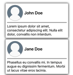
下列範例顯示 CardViewControlTemplate 指派給 ControlTemplate 兩 CardView 個 物件的 屬性:
<ContentPage xmlns="http://schemas.microsoft.com/dotnet/2021/maui"
             xmlns:x="http://schemas.microsoft.com/winfx/2009/xaml"
             xmlns:controls="clr-namespace:ControlTemplateDemos.Controls"
             ...>
    <StackLayout Margin="30">
        <controls:CardView BorderColor="DarkGray"
                           CardTitle="John Doe"
                           CardDescription="Lorem ipsum dolor sit amet, consectetur adipiscing elit. Nulla elit dolor, convallis non interdum."
                           IconBackgroundColor="SlateGray"
                           IconImageSource="user.png"
                           ControlTemplate="{StaticResource CardViewControlTemplate}" />
        <controls:CardView BorderColor="DarkGray"
                           CardTitle="Jane Doe"
                           CardDescription="Phasellus eu convallis mi. In tempus augue eu dignissim fermentum. Morbi ut lacus vitae eros lacinia."
                           IconBackgroundColor="SlateGray"
                           IconImageSource="user.png"
                           ControlTemplate="{StaticResource CardViewControlTemplate}" />
    </StackLayout>
</ContentPage>
在此範例中,CardViewControlTemplate 中控制項會成為每個 CardView 物件視覺化樹狀結構的一部分。 由於控制項範本的根 Frame 物件將其 BindingContext 設定為樣板化父系,因此 Frame 和其子系會對每個 CardView 物件的屬性解析其繫結運算式。
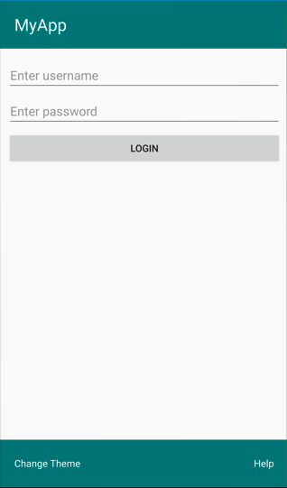
下列螢幕快照顯示套 CardViewControlTemplate 用至 CardView 物件的 :
重要
您可以透過覆寫樣板化自訂控制項或樣板化頁面中的 OnApplyTemplate 方法,以偵測 ControlTemplate 套用至控制項執行個體的時間點。 如需詳細資訊,請參閱從範本取得具名項目。
使用 TemplateBinding 傳遞參數
TemplateBinding 標記延伸可將 ControlTemplate 中項目屬性繫結至由樣板化自訂控制項或樣本化頁面定義的公用屬性。 當您使用 TemplateBinding 時,可讓控制項上的屬性能夠作為範本參數。 因此,在設定樣板化自訂控制項或樣板化頁面上的屬性時,該值會傳遞至具有 TemplateBinding 的項目。
重要
標記 TemplateBinding 表達式可讓 RelativeSource 移除先前控件範本的系結,並取代 Binding 表達式。
TemplateBinding 標記延伸會定義下列屬性:
- Path,屬於
string類型,屬性的路徑。 - Mode,屬於 BindingMode 類型,在「來源」與「目標」之間變更散佈的方向。
- Converter,屬於 IValueConverter 類型,繫結值轉換器。
- ConverterParameter,屬於
object類型,繫結值轉換器的參數。 - StringFormat,屬於
string類型,繫結的字串格式。
TemplateBinding 標記延伸的 ContentProperty 是 Path。 因此,如果路徑是 TemplateBinding 運算式中的第一個項目,則標記延伸的 "Path=" 部分會省略。 如需在系結表達式中使用這些屬性的詳細資訊,請參閱 數據系結。
警告
TemplateBinding 標記延伸只能在 ControlTemplate 內使用。 不過,當嘗試在 ControlTemplate 外使用 TemplateBinding 運算式時,不會導致建置錯誤或擲回例外狀況。
下列 XAML 範例顯示 CardView 物件的 ControlTemplate,該物件使用 TemplateBinding 標記延伸:
<ContentPage xmlns="http://schemas.microsoft.com/dotnet/2021/maui"
             xmlns:x="http://schemas.microsoft.com/winfx/2009/xaml"
             ...>
    <ContentPage.Resources>
        <ControlTemplate x:Key="CardViewControlTemplate">
            <Frame BackgroundColor="{TemplateBinding CardColor}"
                   BorderColor="{TemplateBinding BorderColor}"
                   ...>
                <!-- UI objects that define the CardView visual structure -->
            </Frame>
        </ControlTemplate>
    </ContentPage.Resources>
    ...
</ContentPage>
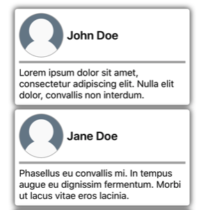
在此範例中,TemplateBinding 標記延伸會對每個 CardView 物件的屬性解析繫結運算式。 下列螢幕快照顯示套 CardViewControlTemplate 用至 CardView 物件的 :
重要
使用 TemplateBinding 標記延伸,這相當於將範本中根項目的 BindingContext 設定為其具有 RelativeSource 標記延伸的樣板化父系,然後使用 Binding 標記延伸模組來解析子物件的繫結。 實際上,TemplateBinding 標記延伸會建立其 Source 為 RelativeBindingSource.TemplatedParent 的 Binding。
使用樣式來套用 ControlTemplate
控制項範本也可以使用樣式來套用。 您可以建立「隱含」或「明確」樣式 (此樣式使用 ControlTemplate) 來完成此操作。
下列 XAML 範例顯示使用 CardViewControlTemplate 的「隱含」樣式:
<ContentPage xmlns="http://schemas.microsoft.com/dotnet/2021/maui"
             xmlns:x="http://schemas.microsoft.com/winfx/2009/xaml"
             xmlns:controls="clr-namespace:ControlTemplateDemos.Controls"
             ...>
    <ContentPage.Resources>
        <ControlTemplate x:Key="CardViewControlTemplate">
            ...
        </ControlTemplate>

        <Style TargetType="controls:CardView">
            <Setter Property="ControlTemplate"
                    Value="{StaticResource CardViewControlTemplate}" />
        </Style>
    </ContentPage.Resources>
    <StackLayout Margin="30">
        <controls:CardView BorderColor="DarkGray"
                           CardTitle="John Doe"
                           CardDescription="Lorem ipsum dolor sit amet, consectetur adipiscing elit. Nulla elit dolor, convallis non interdum."
                           IconBackgroundColor="SlateGray"
                           IconImageSource="user.png" />
        ...
    </StackLayout>
</ContentPage>
在此範例中,「隱含」的 Style 會自動套用至每個 CardView 物件,並將每個 CardView 的 ControlTemplate 屬性設定為 CardViewControlTemplate。
如需樣式的詳細資訊,請參閱樣式。
重新定義控制項的 UI
在將 ControlTemplate 具現化並指派給 ContentView 衍生自訂控制項的 ControlTemplate 屬性或 ContentPage 衍生頁面時,針對自訂控制項或頁面定義的視覺化結構,會取代為在 ControlTemplate 中定義的視覺化結構。
例如,CardViewUI 自訂控制項會使用下列 XAML 來定義其使用者介面:
<ContentView xmlns="http://schemas.microsoft.com/dotnet/2021/maui"
             xmlns:x="http://schemas.microsoft.com/winfx/2009/xaml"
             x:Class="ControlTemplateDemos.Controls.CardViewUI"
             x:Name="this">
    <Frame BindingContext="{x:Reference this}"
           BackgroundColor="{Binding CardColor}"
           BorderColor="{Binding BorderColor}"
           ...>
        <!-- UI objects that define the CardView visual structure -->
    </Frame>
</ContentView>
但是,您可以藉由在 ControlTemplate 中定義新的視覺化結構,並將其指派給 CardViewUI 物件的 ControlTemplate 屬性,以取代組成此 UI 的控制項:
<ContentPage xmlns="http://schemas.microsoft.com/dotnet/2021/maui"
             xmlns:x="http://schemas.microsoft.com/winfx/2009/xaml"
             ...>
    <ContentPage.Resources>
        <ControlTemplate x:Key="CardViewCompressed">
            <Grid RowDefinitions="100"
                  ColumnDefinitions="100, *">
                <Image Source="{TemplateBinding IconImageSource}"
                       BackgroundColor="{TemplateBinding IconBackgroundColor}"
                       ...>
                <!-- Other UI objects that define the CardView visual structure -->
            </Grid>
        </ControlTemplate>
    </ContentPage.Resources>
    <StackLayout Margin="30">
        <controls:CardViewUI BorderColor="DarkGray"
                             CardTitle="John Doe"
                             CardDescription="Lorem ipsum dolor sit amet, consectetur adipiscing elit. Nulla elit dolor, convallis non interdum."
                             IconBackgroundColor="SlateGray"
                             IconImageSource="user.png"
                             ControlTemplate="{StaticResource CardViewCompressed}" />
        ...
    </StackLayout>
</ContentPage>
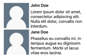
在此範例中,CardViewUI 物件的視覺化結構會在 ControlTemplate 中重新定義,其提供適用於緊縮清單的更精簡視覺化結構,:
以 ContentPresenter 來替代內容
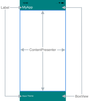
您可以將 ContentPresenter 放置於控制項範本中,以標示樣板化自訂控制項或樣板化頁面將顯示內容的位置。 然後,使用控制項範本的自訂控制項或頁面將定義 ContentPresenter 要顯示的內容。 下圖說明內含一些控制項的頁面 ControlTemplate,包括以藍色方框標示的 ContentPresenter:
下列 XAML 顯示名為 TealTemplate 的控制項範本,其中包含其視覺化結構中的 ContentPresenter:
<ControlTemplate x:Key="TealTemplate">
    <Grid RowDefinitions="0.1*, 0.8*, 0.1*">
        <BoxView Color="Teal" />
        <Label Margin="20,0,0,0"
               Text="{TemplateBinding HeaderText}"
               ... />
        <ContentPresenter Grid.Row="1" />
        <BoxView Grid.Row="2"
                 Color="Teal" />
        <Label x:Name="changeThemeLabel"
               Grid.Row="2"
               Margin="20,0,0,0"
               Text="Change Theme"
               ...>
            <Label.GestureRecognizers>
                <TapGestureRecognizer Tapped="OnChangeThemeLabelTapped" />
            </Label.GestureRecognizers>
        </Label>
        <controls:HyperlinkLabel Grid.Row="2"
                                 Margin="0,0,20,0"
                                 Text="Help"
                                 Url="https://learn.microsoft.com/dotnet/maui/"
                                 ... />
    </Grid>
</ControlTemplate>
下列範例顯示指派給 ContentPage 衍生頁面 ControlTemplate 屬性的 TealTemplate:
<controls:HeaderFooterPage xmlns="http://schemas.microsoft.com/dotnet/2021/maui"
                           xmlns:x="http://schemas.microsoft.com/winfx/2009/xaml"
                           xmlns:controls="clr-namespace:ControlTemplateDemos.Controls"
                           ControlTemplate="{StaticResource TealTemplate}"
                           HeaderText="MyApp"
                           ...>
    <StackLayout Margin="10">
        <Entry Placeholder="Enter username" />
        <Entry Placeholder="Enter password"
               IsPassword="True" />
        <Button Text="Login" />
    </StackLayout>
</controls:HeaderFooterPage>
在執行階段將 TealTemplate 套用至頁面時,頁面內容會替代在控制項範本中定義的 ContentPresenter:
從範本取得具名元素
控制項範本內的具名項目,可以從樣板化自訂控制項或樣板化頁面擷取。 這可透過 GetTemplateChild 方法來完成,此方法會傳回已具現化的 ControlTemplate 視覺化樹狀結構中具名項目 (如有找到)。 否則會傳回 null。
在控制項範本具現化之後,會呼叫範本的 OnApplyTemplate 方法。 因此,GetTemplateChild 方法應從樣板化控制項或樣板化頁面中的 OnApplyTemplate 覆寫呼叫。
重要
只有在呼叫 OnApplyTemplate 方法之後,才應該呼叫 GetTemplateChild 方法。
下列 XAML 顯示名為 TealTemplate 的控制項範本,其可套用至 ContentPage 衍生頁面:
<ControlTemplate x:Key="TealTemplate">
    <Grid>
        ...
        <Label x:Name="changeThemeLabel"
               Text="Change Theme"
               ...>
            <Label.GestureRecognizers>
                <TapGestureRecognizer Tapped="OnChangeThemeLabelTapped" />
            </Label.GestureRecognizers>
        </Label>
        ...
    </Grid>
</ControlTemplate>
在此範例中,Label 項目為具名,並可以在樣板化頁面的程式碼中擷取。 此操作可透過從樣板化頁面的 OnApplyTemplate 覆寫呼叫 GetTemplateChild 方法來完成:
public partial class AccessTemplateElementPage : HeaderFooterPage
{
    Label themeLabel;

    public AccessTemplateElementPage()
    {
        InitializeComponent();
    }

    protected override void OnApplyTemplate()
    {
        base.OnApplyTemplate();
        themeLabel = (Label)GetTemplateChild("changeThemeLabel");
        themeLabel.Text = OriginalTemplate ? "Aqua Theme" : "Teal Theme";
    }
}
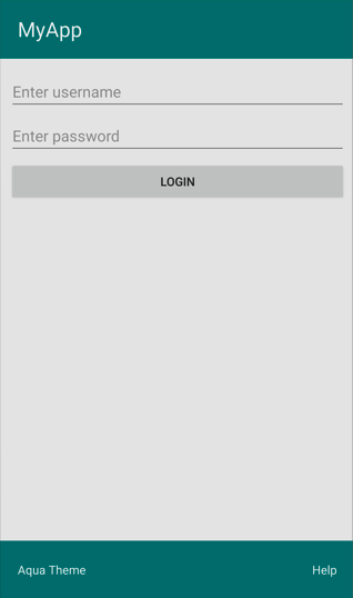
在此範例中,一旦 ControlTemplate 具現化後,會擷取名為 changeThemeLabel 的 Label 物件。 changeThemeLabel 接著可由 AccessTemplateElementPage 類別存取並操作。 下列螢幕快照顯示 所 Label 顯示的文字已變更:
繫結至 viewmodel
ControlTemplate 可以將資料繫結至 viewmodel,即使當 ControlTemplate 繫結至樣板化父系 (套用範本的執行階段物件執行個體) 時也一樣。
下列 XAML 範例顯示頁面,該頁面使用名為 PeopleViewModel 的 viewmodel:
<ContentPage xmlns="http://schemas.microsoft.com/dotnet/2021/maui"
             xmlns:x="http://schemas.microsoft.com/winfx/2009/xaml"
             xmlns:local="clr-namespace:ControlTemplateDemos"
             xmlns:controls="clr-namespace:ControlTemplateDemos.Controls"
             ...>
    <ContentPage.BindingContext>
        <local:PeopleViewModel />
    </ContentPage.BindingContext>

    <ContentPage.Resources>
        <DataTemplate x:Key="PersonTemplate">
            <controls:CardView BorderColor="DarkGray"
                               CardTitle="{Binding Name}"
                               CardDescription="{Binding Description}"
                               ControlTemplate="{StaticResource CardViewControlTemplate}" />
        </DataTemplate>
    </ContentPage.Resources>

    <StackLayout Margin="10"
                 BindableLayout.ItemsSource="{Binding People}"
                 BindableLayout.ItemTemplate="{StaticResource PersonTemplate}" />
</ContentPage>
在此範例中,頁面的 BindingContext 設定為 PeopleViewModel 執行個體。 此 viewmodel 會公開 People 集合與名為 DeletePersonCommand 的 ICommand。 頁面上的 StackLayout 會使用可繫結配置來將資料繫結至 People 集合,而可繫結配置的 ItemTemplate 會設定為 PersonTemplate 資源。 此 DataTemplate 會指定 People 集合中的每個項目都使用 CardView 物件來顯示。 CardView 物件的視覺化結構,使用名為 CardViewControlTemplate 的 ControlTemplate 來定義:
<ControlTemplate x:Key="CardViewControlTemplate">
    <Frame BindingContext="{Binding Source={RelativeSource TemplatedParent}}"
           BackgroundColor="{Binding CardColor}"
           BorderColor="{Binding BorderColor}"
           ...>
        <!-- UI objects that define the CardView visual structure -->
    </Frame>
</ControlTemplate>
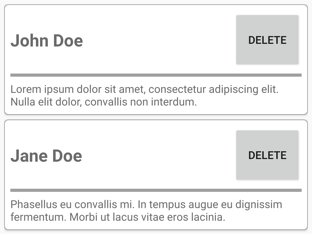
在此範例中,ControlTemplate 的根項目為 Frame 物件。 Frame 物件使用 RelativeSource 標記延伸來將其 BindingContext 設定為樣板化父系。 由於從根 Frame 項目繼承 BindingContext,Frame 物件和其子系的繫結運算式會對 CardView 屬性進行解析。 下列螢幕快照顯示顯示 People 集合的頁面:
ControlTemplate 中的物件會繫結至其樣板化父系上的屬性,而控制項範本內的 Button 則會同時繫結至其樣板化父系,以及 viewmodel 中的 DeletePersonCommand。 這是因為 Button.Command 屬性會將其繫結來源重新定義為上階的繫結內容,而該上階的繫結內容類型為 PeopleViewModel,其為 StackLayout。 接著,繫結運算式的 Path 部分即可解析 DeletePersonCommand 屬性。 不過,Button.CommandParameter 屬性不會改變其繫結來源,而會從 ControlTemplate 中的父系來繼承該繫結來源。 因此,CommandParameter 屬性會繫結至 CardView 的 CardTitle 屬性。
Button 繫結的整體影響,是當點選 Button 時,會執行 PeopleViewModel 類別中的 DeletePersonCommand,並將 CardName 屬性的值傳遞至 DeletePersonCommand。 這會導致從可系結的設定中移除指定的 CardView 。
如需相對系結的詳細資訊,請參閱 相對系結。