.NET 多平台應用程式使用者介面(.NET MAUI) ImageButton 檢視結合 Button 檢視和 Image 檢視,以建立內容為影像的按鈕。 當你用手指按下或 ImageButton 用滑鼠點擊時,應用程式會指示執行某項任務。 然而,與 不同的 Button 是,該 ImageButton 視圖沒有文字及文字外觀的概念。
ImageButton 定義下列屬性:
-
Aspect,型為Aspect,決定影像如何縮放以符合顯示區域。 -
BorderColor,型別 Color為 ,描述按鈕的邊框顏色。 -
BorderWidth,型別double為 ,定義按鈕邊界的寬度。 -
Command,型別 ICommand為 ,定義了當按下按鈕時執行的指令。 -
CommandParameter,型別object,是傳遞給Command的參數。 -
CornerRadius,型別為int,描述按鈕邊界的角落半徑。 -
IsLoading,型別bool為 ,代表影像的載入狀態。 這個屬性預設值為false。 -
IsOpaque的bool型別決定 .NET MAUI 在渲染時是否應將影像視為不透明。 這個屬性預設值為false。 -
IsPressed,型為bool,代表按鈕是否被按下。 這個屬性預設值為false。 -
Padding的類型為Thickness,決定按鈕的填充。 -
Source,類型為 ImageSource,指定作為按鈕內容顯示的圖像。
這些屬性由 BindableProperty 物件支援,這表示它們可以成為資料繫結的目標並且可以設定樣式。
Aspect屬性可設定為列舉中的Aspect其中一個成員:
-
Fill- 將影像拉伸至完全且精確地填滿 ImageButton。 這可能會導致影像扭曲。 -
AspectFill- 裁切影像,使其填滿畫面 ImageButton 同時保持長寬比。 -
AspectFit- 根據需要對圖片進行信箱化,確保整張圖片能夠放入ImageButton,並依照圖像的寬高比,在上/下方或兩側添加留白。 這是列舉的預設值Aspect。 -
Center- 在 ImageButton 中將影像置中,同時保持長寬比。
此外, ImageButton 定義 Clicked、Pressed 和 Released 事件。
Clicked當用ImageButton手指或滑鼠指標輕觸按鈕表面時,事件會被觸發。 當手指按下 ImageButton 或當滑鼠按鈕被按下且指標位於 ImageButton 上時,Pressed 事件會引發。 當放開手指或滑鼠按鈕時,事件 Released 會被觸發。 通常,Clicked事件也會與事件Released同時被觸發,但如果手指或滑鼠的指標在釋放ImageButton前滑離Clicked表面,事件可能不會發生。
這很重要
A ImageButton 必須將其 IsEnabled 屬性設定為 true,才能回應點擊。
建立一個影像按鈕
要建立影像按鈕,請建立 ImageButton 物件,設定其 Source 屬性並處理其 Clicked 事件。
以下 XAML 範例展示了如何建立:ImageButton
<ContentPage xmlns="http://schemas.microsoft.com/dotnet/2021/maui"
             xmlns:x="http://schemas.microsoft.com/winfx/2009/xaml"
             x:Class="ControlGallery.Views.XAML.ImageButtonDemoPage"
             Title="ImageButton Demo">
    <StackLayout>
       <ImageButton Source="image.png"
                    SemanticProperties.Description="Click to increment counter"
                    Clicked="OnImageButtonClicked"
                    HorizontalOptions="Center"
                    VerticalOptions="Center" />
    </StackLayout>
</ContentPage>
該 Source 性質指定出現在 ImageButton中的影像。 事件 Clicked 設定為一個名為 OnImageButtonClicked的事件處理程序。 此處理器位於後置程式碼檔案中:
public partial class ImageButtonDemoPage : ContentPage
{
    int clickTotal;

    public ImageButtonDemoPage()
    {
        InitializeComponent();
    }

    void OnImageButtonClicked(object sender, EventArgs e)
    {
        clickTotal += 1;
        label.Text = $"{clickTotal} ImageButton click{(clickTotal == 1 ? "" : "s")}";
    }
}
在這個例子中,當ImageButton被點擊時,OnImageButtonClicked方法會執行。 負責sender事件的是ImageButton這一參數。 你可以用它來存取物件 ImageButton ,或區分多個 ImageButton 共享同一 Clicked 事件的物件。
Clicked處理程序會遞增計數器,並顯示計數器的值在Label之中。
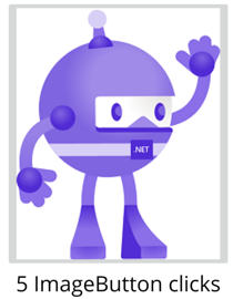
建立 ImageButton 的等價 C# 程式碼為:
Label label;
int clickTotal = 0;
...

ImageButton imageButton = new ImageButton
{
    Source = "XamarinLogo.png",
    HorizontalOptions = LayoutOptions.Center,
    VerticalOptions = LayoutOptions.Center
};
SemanticProperties.SetDescription(imageButton, "Click to increment counter");
imageButton.Clicked += (s, e) =>
{
  clickTotal += 1;
  label.Text = $"{clickTotal} ImageButton click{(clickTotal == 1 ? "" : "s")}";
};
使用指令介面
應用程式可以對ImageButton輕觸做出回應,而不處理Clicked事件。 它 ImageButton 實作了一種稱為 命令 介面或 命令 介面的替代通知機制。 這包含兩個特性:
-
Command型別為 ICommand,在System.Windows.Input命名空間中定義的一個介面。 -
CommandParameter類型為Object的屬性。
此方法適用於資料綁定,特別是在實作 Model-View-ViewModel(MVVM)模式時。 欲了解更多關於指令的資訊,請參閱按鈕文章中的「使用指令介面」。
按下並釋放圖像按鈕
當手指按下 ImageButton,或滑鼠按鍵被按且指標放在 ImageButton 上方時,Pressed 事件會被觸發。 當放開手指或滑鼠按鈕時,事件 Released 會被觸發。 通常,Clicked事件與Released事件會同時被觸發,但如果手指或滑鼠指標在放開ImageButton前滑離Clicked的表面,Clicked事件可能不會發生。
ImageButton 的視覺狀態
ImageButton 有一個 PressedVisualState,在啟用時可用來按下以對 ImageButton 進行視覺變更。
以下 XAML 範例展示了如何為 Pressed 狀態定義視覺狀態:
 <ImageButton Source="image.png"
              SemanticProperties.Description="Image button"
              ...>
     <VisualStateManager.VisualStateGroups>
         <VisualStateGroupList>
             <VisualStateGroup x:Name="CommonStates">
                 <VisualState x:Name="Normal">
                     <VisualState.Setters>
                         <Setter Property="Scale"
                                 Value="1" />
                     </VisualState.Setters>
                 </VisualState>
                 <VisualState x:Name="Pressed">
                     <VisualState.Setters>
                         <Setter Property="Scale"
                                 Value="0.8" />
                     </VisualState.Setters>
                 </VisualState>
                 <VisualState x:Name="PointerOver" />
             </VisualStateGroup>
         </VisualStateGroupList>
     </VisualStateManager.VisualStateGroups>
 </ImageButton>
在此範例中,PressedVisualState 指定當 ImageButton 被按下時,其 Scale 屬性會從預設值 1 變為 0.8。 該 NormalVisualState 指定當 處於 ImageButton 正常狀態時,其 Scale 性質將設為 1。 因此,整體效果是當按下 ImageButton 時,它會被縮小,稍微變小,當放開 ImageButton 時,它會恢復到預設大小。
這很重要
要讓 ImageButton 返回它的 Normal 狀態,VisualStateGroup 還必須定義一個 PointerOver 狀態。 如果你使用 .NET MAUI 應用程式專案範本所建立的樣式ResourceDictionary,那麼你已經擁有一個定義PointerOver狀態的隱式ImageButton樣式。
停用 ImageButton
有時應用程式會進入一種狀態,點擊 ImageButton 不被視為有效操作。 在這種情況下,應將ImageButton的IsEnabled屬性設為false來停用。