 瀏覽範例
瀏覽範例.NET 多平台應用程式介面(.NET MAUI)顯示 Label 單行與多行文字。 由 a Label 顯示的文字可以有顏色、間隔,並帶有文字裝飾。
Label 定義下列屬性:
-
CharacterSpacing為型別double,設定顯示文字中字元間的間距。 -
FontAttributes,型別為FontAttributes,決定文字樣式。 -
FontAutoScalingEnabled, 型別bool, 定義文字是否會反映操作系統中設定的縮放偏好設定。 這個屬性預設值為true。 -
FontFamily,類型是string,定義字型系列。 -
FontSize的型別double定義了字型大小。 -
FormattedText,型別FormattedString為 ,指定以多種呈現選項(如字型與顏色)呈現文字。 -
HorizontalTextAlignment,類型為TextAlignment,定義了顯示文字的水平對齊。 -
LineBreakMode,類型為LineBreakMode,決定當文字無法放入一行時應如何處理。 -
LineHeight,型別為double,指定在顯示文字時應用乘數於預設行高。 -
MaxLines,類型為int,表示Label中允許的最大行數。 -
Padding,類型為Thickness的,決定了標籤的填充。 -
Text,型別為string的,定義了作為標籤內容顯示的文字。 -
TextColor,型別 Color為 ,定義顯示文字的顏色。 -
TextDecorations,型別TextDecorations,指定將要套用的文字裝飾,例如底線與刪除線。 -
TextTransform,其類型為TextTransform,指定顯示文字的大小寫。 -
TextType,類型為TextType,決定 Label 應顯示純文字還是 HTML 文字。 -
VerticalTextAlignment,其類型為 TextAlignment,定義了顯示文字的垂直對齊方式。
這些屬性由 BindableProperty 物件支援,這表示它們可以成為資料繫結的目標並且可以設定樣式。
建立標籤
下列範例示範如何建立 TableView:
<Label Text="Hello world" />
對等的 C# 程式代碼為:
Label label = new Label { Text = "Hello world" };
設定顏色
標籤可以透過屬性 TextColor 設定使用特定的文字顏色。
以下範例設定Label的文字顏色:
<Label TextColor="#77d065"
       Text="This is a green label." />
欲了解更多關於顏色的資訊,請參見顏色。
設定字元間距
字元間距可以透過將Label屬性設定為CharacterSpacing值,來套用於double物件。
<Label Text="Character spaced text"
       CharacterSpacing="10" />
結果是,Label 所顯示的文字中,字元之間的間距為 CharacterSpacing 裝置無關單位。
新增行
XAML 中有兩種主要的技術可以強制將 Label 中的文字換行:
- 使用 Unicode 換行字元,也就是「 」。
- 用 屬性元素 語法來指定你的文字。
以下程式碼展示了這兩種技術的範例:
<!-- Unicode line feed character -->
<Label Text="First line Second line" />
<!-- Property element syntax -->
<Label>
<Label.Text>
First line
Second line
</Label.Text>
</Label>
在 C# 中,可以使用「\n」字元將文字強制換行:
Label label = new Label { Text = "First line\nSecond line" };
控制文字截斷與換行
文字換行與截斷可以透過將 LineBreakMode 屬性設為 LineBreakMode 枚舉中的值來控制:
-
NoWrap— 不會將文字換行,只顯示能在一行內容納的文字。 -
WordWrap— 在單字邊界處收尾。 此為LineBreakMode屬性的預設值。 -
CharacterWrap— 在字元邊界處將文字包裹到新行。 -
HeadTruncation——截斷了正文的開頭,顯示結尾。 -
MiddleTruncation— 顯示文字的開頭與結尾,中間部分被省略號取代。 -
TailTruncation——顯示文本的開頭,截斷結尾。
顯示特定數量的線數
顯示 Label 的行數可以透過將 MaxLines 屬性設為 int 值來指定:
- 當
MaxLines為 -1(預設值)時,該 Label 屬性會尊重該屬性的值LineBreakMode,要麼只顯示一行(可能被截斷),要麼全行文字。 - 當
MaxLines為 0 時,則 Label 不會顯示。 - 當
MaxLines為 1 時,結果與將屬性設LineBreakMode為NoWrap、HeadTruncation、MiddleTruncation或TailTruncation相同。 不過,Label 在放置省略號時,會依據LineBreakMode屬性的值來決定是否適用。 - 當
MaxLines大於 1 時,Label 將顯示最多指定的行數,同時會根據LineBreakMode屬性的設定來決定是否使用省略號(如果適用)。 然而,若將MaxLines屬性設為LineBreakMode,則即使將NoWrap屬性設為大於1,也不會產生影響。
以下 XAML 範例示範如何在 : MaxLines上設定該Label屬性:
<Label Text="Lorem ipsum dolor sit amet, consectetur adipiscing elit. In facilisis nulla eu felis fringilla vulputate. Nullam porta eleifend lacinia. Donec at iaculis tellus."
       LineBreakMode="WordWrap"
       MaxLines="2" />
設定線高
A 的 Label 垂直高度可以透過將 Label.LineHeight 屬性設定為 double 的值來自訂。
注意
- 在 iOS 上,這個
Label.LineHeight屬性會改變單行文字和多行換行文字的行高。 - 在 Android 上,這個
Label.LineHeight屬性只會改變多行換行文字的行高。 - 在 Windows 上,這個
Label.LineHeight屬性會改變文字換行到多行時的行高。
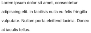
以下範例示範如何將該LineHeight屬性設定在:Label
<Label Text="Lorem ipsum dolor sit amet, consectetur adipiscing elit. In facilisis nulla eu felis fringilla vulputate. Nullam porta eleifend lacinia. Donec at iaculis tellus."
       LineBreakMode="WordWrap"
       LineHeight="1.8" />
以下截圖顯示將屬性設 Label.LineHeight 為 1.8 的結果:
顯示 HTML
重要
在 a Label 中顯示 HTML 僅限於底層平台支援的 HTML 標籤。 例如,Android 只支援部分 HTML 標籤,重點在於區塊層級元素 <span> 如 和 <p>的基本樣式與格式化。 對於較複雜的 HTML 渲染,請考慮使用 WebView 或 FormattedText。
該 Label 類別有一個 TextType 屬性,決定物件應該 Label 顯示純文字還是 HTML 文字。 此屬性應設為列舉中的 TextType 其中一個成員:
因此, Label 物件可以透過將屬性設 TextType 為 Html,並將 Text 屬性設為 HTML 字串來顯示 HTML:
Label label = new Label
{
    Text = "This is <span style=\"color:red;\"><strong>HTML</strong></span> text.",
    TextType = TextType.Html
};
在上述範例中,HTML 中的雙引號字元必須使用 符號 \ 來避義。
在 XAML 中,HTML 字串可能因對 < 和 > 符號的額外轉義而變得難以閱讀:
<Label Text="This is <span style="color:red"><strong>HTML</strong></span> text."
TextType="Html" />
另外,為了提升可讀性,HTML 也可以內嵌在以下 CDATA 區塊中:
<Label TextType="Html">
<![CDATA[
<Label Text="This is <span style="color:red"><strong>HTML</strong></span> text."
]]>
</Label>
在這個範例中,Text 屬性設定為 CDATA 區段中的內嵌 HTML 字串。 這之所以有效,是因為該Text屬性是ContentProperty類別的Label。
裝飾文字
透過將Label屬性設定為一個或多個TextDecorations枚舉成員,可以對TextDecorations物件套用文字底線和刪除線裝飾。
NoneUnderlineStrikethrough
以下範例示範如何設定該 TextDecorations 屬性:
<Label Text="This is underlined text." TextDecorations="Underline"  />
<Label Text="This is text with strikethrough." TextDecorations="Strikethrough" />
<Label Text="This is underlined text with strikethrough." TextDecorations="Underline, Strikethrough" />
對等的 C# 程式代碼為:
Label underlineLabel = new Label { Text = "This is underlined text.", TextDecorations = TextDecorations.Underline };
Label strikethroughLabel = new Label { Text = "This is text with strikethrough.", TextDecorations = TextDecorations.Strikethrough };
Label bothLabel = new Label { Text = "This is underlined text with strikethrough.", TextDecorations = TextDecorations.Underline | TextDecorations.Strikethrough };
以下截圖顯示 TextDecorations 套用到 Label 實例的列舉成員:

轉換文字
A Label 可以透過將 Text 屬性設定為 TextTransform 列舉中的一個值來轉換其儲存在 TextTransform 屬性中的文字格式。 此列舉具有四個值:
-
None表示文字不會被改變。 -
Default表示將使用平台的預設行為。 此為TextTransform屬性的預設值。 -
Lowercase表示文字將會轉換成小寫。 -
Uppercase表示文字將被轉換為大寫。
下列範例顯示將文字轉換成大寫:
<Label Text="This text will be displayed in uppercase."
       TextTransform="Uppercase" />
使用格式化文字
Label 它暴露了一個 FormattedText 特性,允許在同一視圖中呈現多種字型與顏色的文字。 屬性 FormattedText 的型別 FormattedString為 ,包含一個或多個 Span 實例,透過屬性 Spans 設定。
注意
無法在Span中顯示HTML。
Span 定義下列屬性:
-
BackgroundColor的型別是 Color,代表 span 背景的顏色。 -
CharacterSpacing為型別double,設定顯示文字中字元間的間距。 -
FontAttributes,型別為FontAttributes,決定文字樣式。 -
FontAutoScalingEnabled, 型別bool, 定義文字是否會反映操作系統中設定的縮放偏好設定。 這個屬性預設值為true。 -
FontFamily,類型是string,定義字型系列。 -
FontSize的型別double定義了字型大小。 -
LineHeight,型別為double,指定在顯示文字時應用乘數於預設行高。 -
Style,類型為 Style,用於範圍的樣式。 -
Text,型別string為 ,定義顯示的文字為 Span的內容。 -
TextColor,型別 Color為 ,定義顯示文字的顏色。 -
TextDecorations,型別TextDecorations,指定將要套用的文字裝飾,例如底線與刪除線。 -
TextTransform,其類型為TextTransform,指定顯示文字的大小寫。
這些屬性由 BindableProperty 物件支援,這表示它們可以成為資料繫結的目標並且可以設定樣式。
注意
這個 Span.LineHeight 特性對 Windows 沒有影響。
此外,該 GestureRecognizers 屬性還可用來定義一組手勢識別器,這些識別器會對 上的 Span手勢做出回應。
以下 XAML 範例展示了 FormattedText 由三個 Span 實例組成的性質:
<Label LineBreakMode="WordWrap">
    <Label.FormattedText>
        <FormattedString>
            <Span Text="Red Bold, " TextColor="Red" FontAttributes="Bold" />
            <Span Text="default, " FontSize="14">
                <Span.GestureRecognizers>
                    <TapGestureRecognizer Command="{Binding TapCommand}" />
                </Span.GestureRecognizers>
            </Span>
            <Span Text="italic small." FontAttributes="Italic" FontSize="12" />
        </FormattedString>
    </Label.FormattedText>
</Label>
對等的 C# 程式代碼為:
FormattedString formattedString = new FormattedString ();
formattedString.Spans.Add (new Span { Text = "Red bold, ", TextColor = Colors.Red, FontAttributes = FontAttributes.Bold });

Span span = new Span { Text = "default, " };
span.GestureRecognizers.Add(new TapGestureRecognizer { Command = new Command(async () => await DisplayAlert("Tapped", "This is a tapped Span.", "OK")) });
formattedString.Spans.Add(span);
formattedString.Spans.Add (new Span { Text = "italic small.", FontAttributes = FontAttributes.Italic, FontSize = 14 });

Label label = new Label { FormattedText = formattedString };
FormattedString formattedString = new FormattedString ();
formattedString.Spans.Add (new Span { Text = "Red bold, ", TextColor = Colors.Red, FontAttributes = FontAttributes.Bold });

Span span = new Span { Text = "default, " };
span.GestureRecognizers.Add(new TapGestureRecognizer { Command = new Command(async () => await DisplayAlertAsync("Tapped", "This is a tapped Span.", "OK")) });
formattedString.Spans.Add(span);
formattedString.Spans.Add (new Span { Text = "italic small.", FontAttributes = FontAttributes.Italic, FontSize = 14 });

Label label = new Label { FormattedText = formattedString };

A Span 也能響應新增到 GestureRecognizers 範圍集合中的任何手勢。 例如,上述例子中,a TapGestureRecognizer 被加入第二 Span 元。 因此,當點擊 Span 時,TapGestureRecognizer 會通過執行由 ICommand 屬性定義的 Command 來回應。 欲了解更多關於點擊手勢辨識的資訊,請參閱 「辨識輕觸手勢」。
建立超連結
由 和 LabelSpan 實例顯示的文字可透過以下方法轉換成超連結:
- 設定
TextColor或TextDecoration的 Label 和 Span 屬性。 - 將TapGestureRecognizer加入
GestureRecognizers或Label的Span集合,其Command屬性綁定於ICommand,且其CommandParameter屬性包含要開啟的 URL。 - 定義 ICommand,由 TapGestureRecognizer 執行。
- 撰寫將由 ICommand執行的程式碼。
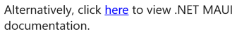
以下範例顯示一個 Label 內容由多個 Span 物件組成的集合:
<Label>
    <Label.FormattedText>
        <FormattedString>
            <Span Text="Alternatively, click " />
            <Span Text="here"
                  TextColor="Blue"
                  TextDecorations="Underline">
                <Span.GestureRecognizers>
                    <TapGestureRecognizer Command="{Binding TapCommand}"
                                          CommandParameter="https://learn.microsoft.com/dotnet/maui/" />
                </Span.GestureRecognizers>
            </Span>
            <Span Text=" to view .NET MAUI documentation." />
        </FormattedString>
    </Label.FormattedText>
</Label>
在此範例中,第一和第三 Span 個實例包含文字,而第二個 Span 實例代表可點擊的超連結。 它的文字顏色設定為藍色,並有底線文字裝飾。 這會產生超連結的外觀,如下圖所示:
當點擊超連結時,TapGestureRecognizer會響應並執行由其ICommand屬性定義的Command。 此外,屬性指定的CommandParameter網址也會作為參數傳遞給 。ICommand
XAML 頁面的後置程式碼包含 TapCommand 的實作。
using System.Windows.Input;

public partial class MainPage : ContentPage
{
    // Launcher.OpenAsync is provided by Essentials.
    public ICommand TapCommand => new Command<string>(async (url) => await Launcher.OpenAsync(url));

    public MainPage()
    {
        InitializeComponent();
        BindingContext = this;
    }
}
TapCommand 執行 Launcher.OpenAsync 方法,並將 TapGestureRecognizer.CommandParameter 屬性值作為參數傳遞。 此 Launcher.OpenAsync 方法會在網頁瀏覽器中開啟該網址。 因此,整體效果是當點擊該超連結時,會出現一個網頁瀏覽器,並導引到與該連結相關的網址。
建立可重複使用的超連結類別
之前建立超連結的方法,是每次需要在應用程式中建立超連結時,都必須寫重複的程式碼。 不過, Label 和 Span 類別都可以被子分類來創建 HyperlinkLabel 和 HyperlinkSpan 類別,並加入手勢辨識器和文字格式化程式碼。
以下範例展示了一個 HyperlinkSpan 類別:
public class HyperlinkSpan : Span
{
    public static readonly BindableProperty UrlProperty =
        BindableProperty.Create(nameof(Url), typeof(string), typeof(HyperlinkSpan), null);

    public string Url
    {
        get { return (string)GetValue(UrlProperty); }
        set { SetValue(UrlProperty, value); }
    }

    public HyperlinkSpan()
    {
        TextDecorations = TextDecorations.Underline;
        TextColor = Colors.Blue;
        GestureRecognizers.Add(new TapGestureRecognizer
        {
            // Launcher.OpenAsync is provided by Essentials.
            Command = new Command(async () => await Launcher.OpenAsync(Url))
        });
    }
}
該 HyperlinkSpan 類別定義了一個 Url 屬性及其對應的 BindableProperty,建構子則設定超連結的外觀以及點擊超連結時會回應的 TapGestureRecognizer。 當點擊 HyperlinkSpan 時,TapGestureRecognizer 會透過執行 Launcher.OpenAsync 方法,根據 Url 屬性指定的 URL,在網頁瀏覽器中開啟該網址。
HyperlinkSpan類別可以透過將該類別的實例新增至 XAML 來使用:
<ContentPage xmlns="http://schemas.microsoft.com/dotnet/2021/maui"
             xmlns:x="http://schemas.microsoft.com/winfx/2009/xaml"
             xmlns:local="clr-namespace:HyperlinkDemo"
             x:Class="HyperlinkDemo.MainPage">
    <StackLayout>
        ...
        <Label>
            <Label.FormattedText>
                <FormattedString>
                    <Span Text="Alternatively, click " />
                    <local:HyperlinkSpan Text="here"
                                         Url="https://learn.microsoft.com/dotnet/" />
                    <Span Text=" to view .NET documentation." />
                </FormattedString>
            </Label.FormattedText>
        </Label>
    </StackLayout>
</ContentPage>