Microsoft Fabric 是整合式分析服務,可加速跨數據倉儲和巨量數據系統的深入解析。 筆記本中的數據視覺效果是一項重要功能,可讓您輕鬆了解數據,協助用戶識別模式、趨勢和極端值。
使用 Fabric 中的 Apache Spark 時,您有內建選項可將數據可視化,包括網狀架構筆記本圖表功能,以及存取熱門的開放原始碼連結庫。
網狀架構筆記本也可讓您將表格式結果轉換成自定義圖表,而不需要撰寫任何程序代碼,即可提供更直覺且順暢的數據探索體驗。
內建視覺效果命令 - display() 函式
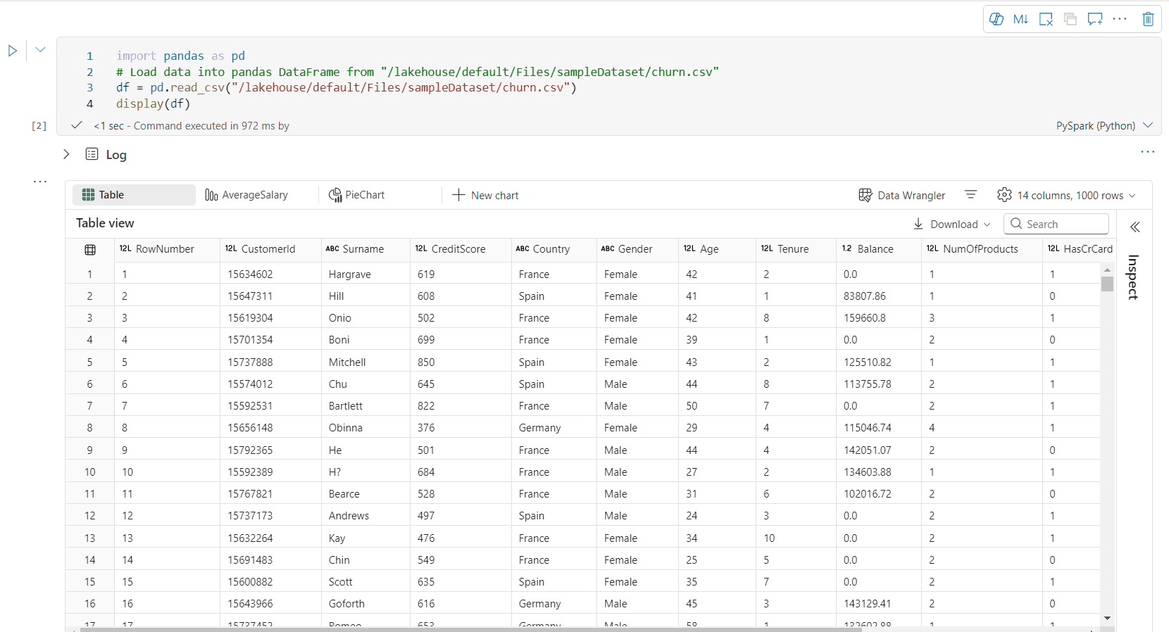
網狀架構內建視覺效果函式可讓您將 Apache Spark DataFrame、Pandas DataFrame 和 SQL 查詢結果轉換成豐富的互動式數據視覺效果。
使用 顯示 函式,您可以將 PySpark 和 Scala Spark 數據框架或彈性分散式數據集 (RDD) 轉譯為動態數據表或圖表。
您可以指定要轉譯之數據框架的行數。 預設值為 1000。 筆記本 顯示 輸出小工具最多支援檢視及分析數據框架中的 10000 列。

您可以使用全域工具列上的篩選函式,將自訂規則套用至您的數據。 篩選條件會套用至指定的數據行,而且結果會同時反映在數據表和圖表檢視中。

SQL 語句的輸出預設會使用 display() 相同的輸出小工具。
豐富的資料框表格檢視
資料表檢視的免費選取支持
根據預設,在 Fabric 筆記本中使用 display() 命令時,會轉譯數據表檢視。 豐富的數據框架預覽提供直覺式的免費選取函式,其設計目的是透過啟用彈性的互動式選取選項來增強數據分析體驗。 這項功能可讓用戶輕鬆地流覽和探索數據框架。
欄位選取
- 單一列:點擊列標題以選取整個列。
- 多個數據行:選取單一數據行之後,按住 'Shift' 鍵,然後按下另一個數據行標頭來選取多個數據行。
行選取
- 單一列:單擊列標頭以選取整列。
- 多個數據列:選取單一數據列之後,按住 『Shift』 鍵,然後按下另一個數據列標頭以選取多個數據列。
儲存格內容預覽:預覽個別儲存格的內容,以快速且詳細地查看數據,而不需要撰寫其他程式代碼。
列摘要:取得每個欄位的摘要,包括資料分佈和關鍵統計資料,以快速了解資料的特性。
[免費區域選取範圍]:選取數據表的任何連續區段,以取得所選單元格總計和所選區域中數值的概觀。
複製選取的內容:在所有選取情況下,您可以使用 『Ctrl + C』 快捷方式快速複製選取的內容。 選取的數據會以 CSV 格式複製,讓您可以輕鬆地在其他應用程式中處理。

透過 [檢視] 窗格的數據概況分析支援

您可以按下 [檢查] 按鈕來分析資料框架。 它提供摘要資料分佈,並顯示每個資料行的統計資料。
[檢查] 側邊窗格中的每個卡片都會對應至資料框架的資料行,您可以按兩下卡片或選取資料表中的資料行來檢視更多詳細資料。
您可以按下資料表的儲存格來檢視儲存格詳細資料。 當數據框架包含長字串類型的內容時,這項功能很有用。
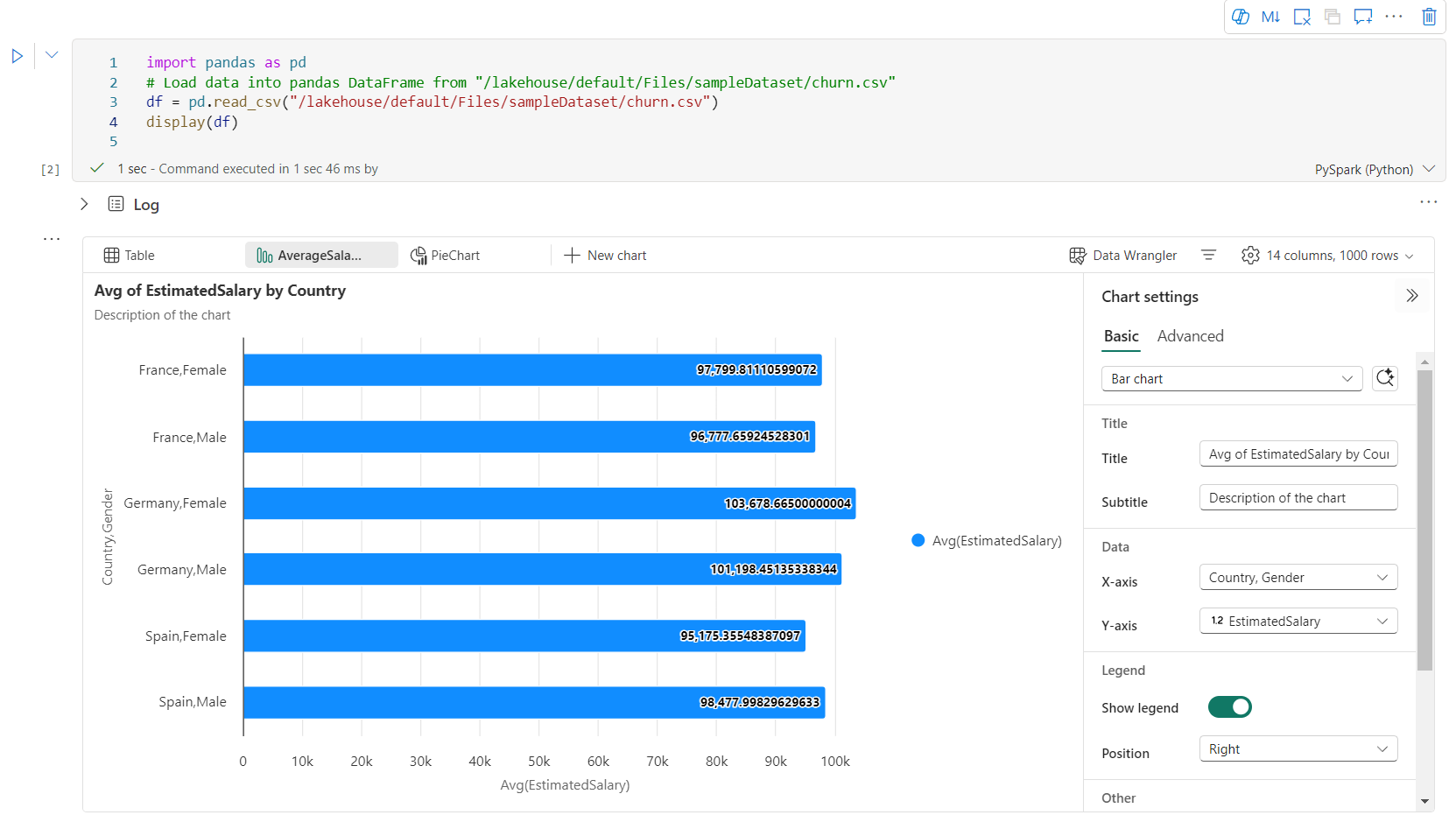
增強型豐富數據框架圖表檢視
display() 命令中改善的圖表檢視提供更直覺且動態的方式,以可視化您的數據。
重要增強功能:
多圖表支援:選取 [新增圖表],即可在單一顯示() 輸出小工具內新增最多五個圖表,以便跨不同數據行進行輕鬆比較。
智慧型圖表建議:根據您的 DataFrame 取得建議圖表清單。 選擇編輯建議的視覺效果,或從頭開始建立自定義圖表。

彈性自定義:使用根據所選圖表類型調整的可調整設定,將視覺效果個人化。
類別 基本設定 說明 圖表類型 顯示函式支援各種不同的圖表類型,包括條形圖、散佈圖、折線圖、數據透視表等等。 標題 標題 圖表的標題。 標題 子標題 具有更多描述的圖表副標題。 資料 X 軸 指定圖表的索引鍵。 資料 Y 軸 指定圖表的值。 圖例 顯示圖例 啟用/停用圖例。 圖例 位置 自訂圖例的位置。 其他 序列群組 使用此組態來判斷彙總的群組。 其他 彙總 使用此方法來彙總視覺效果中的資料。 其他 堆疊 設定結果的顯示樣式。 其他 遺漏值和空值 (NULL) 設定如何顯示遺漏或 NULL 圖表值。 注意
此外,您可以指定顯示的數據列數目,預設設定為 1,000。 筆記本 顯示 輸出小工具支持檢視和分析多達 10,000 行的資料框數據。 選取 [匯總所有結果 ],然後選取 [ 套用 ] 以套用整個數據框架中的圖表產生。 當圖表設定變更時,會觸發 Spark 作業。 完成計算並轉譯圖表可能需要幾分鐘的時間。
類別 進階設定 說明 顏色 佈景主題 定義圖表的主題色彩集。 X 軸 標籤 指定 X 軸的標籤。 X 軸 規模 指定 X 軸的縮放函數。 X 軸 範圍 指定數值範圍 X 軸。 Y 軸 標籤 為 Y 軸指定標籤。 Y 軸 規模 指定 Y 軸的縮放函數。 Y 軸 範圍 指定值範圍 Y 軸。 顯示器 顯示標籤 顯示/隱藏圖表上的結果標籤。 組態的變更會立即生效,而且所有設定都會自動儲存在筆記本內容中。
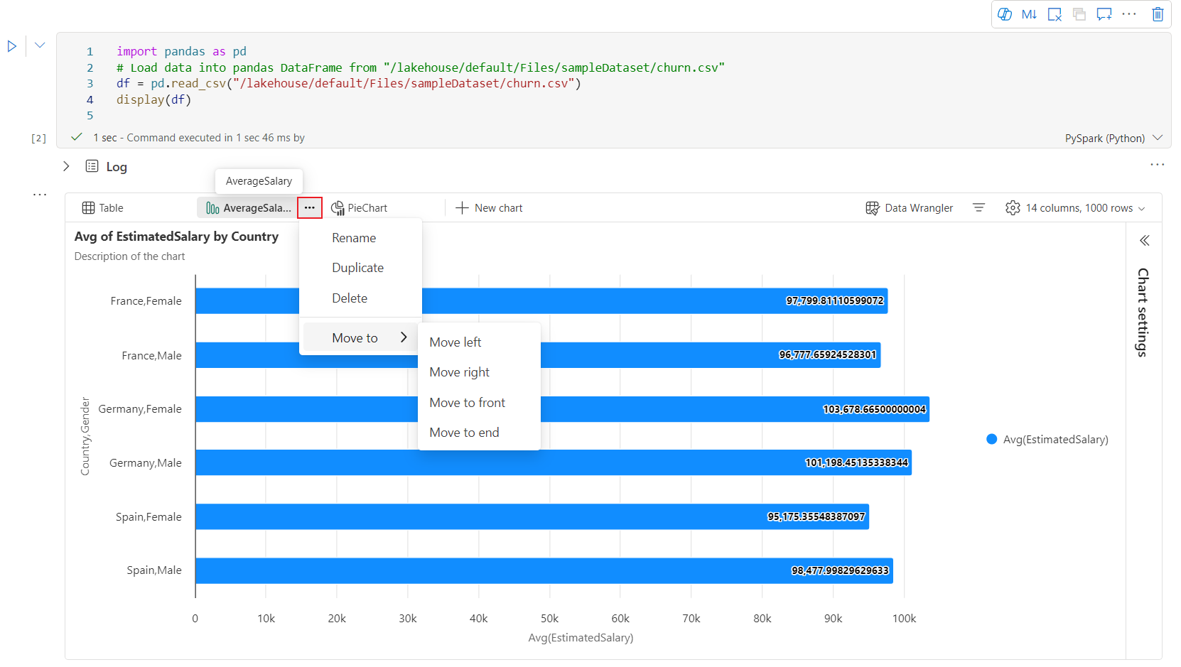
您可以在圖表索引標籤表中輕鬆地 重新命名、 複製、 刪除或 移動 圖表。 您也可以拖放索引標籤來重新排列索引標籤。 開啟筆記本時,第一個索引標籤標會顯示為預設值。
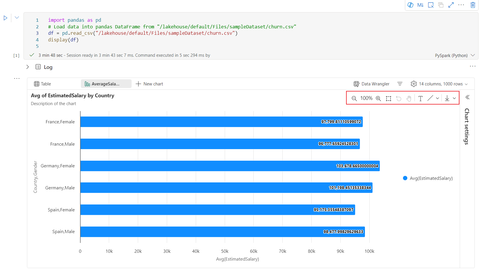
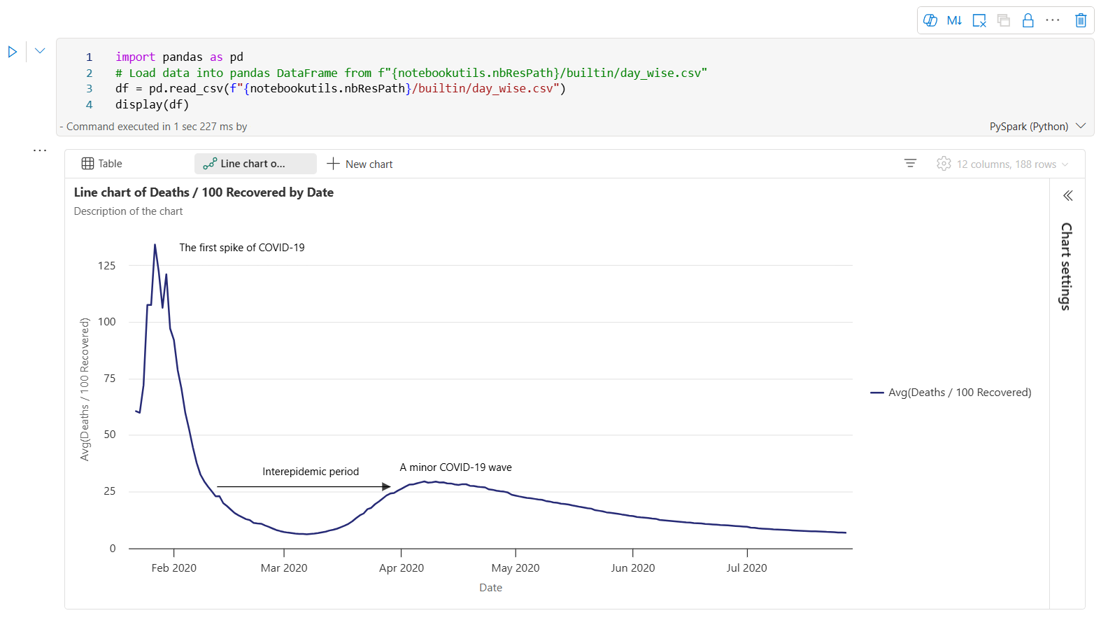
當使用者將滑鼠停留在圖表上時,可以在新的圖表體驗中使用互動式工具列。 支援如放大、縮小、選取縮放、重設、平移、批注編輯等作業。
以下是圖表批注的範例。


display() 摘要檢視
使用 display(df, summary = true) 來檢查指定 Apache Spark DataFrame 的統計資料摘要。 摘要包含資料行名稱、資料行類型、唯一值,以及每個資料行的遺漏值。 您也可以選取特定資料行,以查看其最小值、最大值、平均值和標準偏差。

displayHTML() 選項
Fabric 筆記本支援使用 displayHTML 函式的 HTML 圖形。
下圖是使用 D3.js 建立視覺效果的範例。

若要建立此視覺效果,請執行下列程式碼。
displayHTML("""<!DOCTYPE html>
<meta charset="utf-8">

<!-- Load d3.js -->
<script src="https://d3js.org/d3.v4.js"></script>

<!-- Create a div where the graph will take place -->
<div id="my_dataviz"></div>
<script>

// set the dimensions and margins of the graph
var margin = {top: 10, right: 30, bottom: 30, left: 40},
  width = 400 - margin.left - margin.right,
  height = 400 - margin.top - margin.bottom;

// append the svg object to the body of the page
var svg = d3.select("#my_dataviz")
.append("svg")
  .attr("width", width + margin.left + margin.right)
  .attr("height", height + margin.top + margin.bottom)
.append("g")
  .attr("transform",
        "translate(" + margin.left + "," + margin.top + ")");

// Create Data
var data = [12,19,11,13,12,22,13,4,15,16,18,19,20,12,11,9]

// Compute summary statistics used for the box:
var data_sorted = data.sort(d3.ascending)
var q1 = d3.quantile(data_sorted, .25)
var median = d3.quantile(data_sorted, .5)
var q3 = d3.quantile(data_sorted, .75)
var interQuantileRange = q3 - q1
var min = q1 - 1.5 * interQuantileRange
var max = q1 + 1.5 * interQuantileRange

// Show the Y scale
var y = d3.scaleLinear()
  .domain([0,24])
  .range([height, 0]);
svg.call(d3.axisLeft(y))

// a few features for the box
var center = 200
var width = 100

// Show the main vertical line
svg
.append("line")
  .attr("x1", center)
  .attr("x2", center)
  .attr("y1", y(min) )
  .attr("y2", y(max) )
  .attr("stroke", "black")

// Show the box
svg
.append("rect")
  .attr("x", center - width/2)
  .attr("y", y(q3) )
  .attr("height", (y(q1)-y(q3)) )
  .attr("width", width )
  .attr("stroke", "black")
  .style("fill", "#69b3a2")

// show median, min and max horizontal lines
svg
.selectAll("toto")
.data([min, median, max])
.enter()
.append("line")
  .attr("x1", center-width/2)
  .attr("x2", center+width/2)
  .attr("y1", function(d){ return(y(d))} )
  .attr("y2", function(d){ return(y(d))} )
  .attr("stroke", "black")
</script>

"""
)
在筆記本中內嵌 Power BI 報表
重要
這項功能目前處於預覽階段。
Fabric 筆記本現在原生支援 Powerbiclient Python 套件。 您不需要在 Fabric Notebook Spark 執行階段 3.4 上執行任何額外的設定 (例如驗證程式)。 只要匯入 powerbiclient,然後繼續探索。 若要深入了解如何使用 powerbiclient 套件,請參閱 powerbiclient 文件。
Powerbiclient 支援下列主要功能。
呈現現有的 Power BI 報表
只要幾行程式碼,您就可以輕鬆地在筆記本中內嵌 Power BI 報表並與其互動。
下圖是轉譯現有 Power BI 報表的範例。

執行下列程式碼來轉譯現有的 Power BI 報表。
from powerbiclient import Report

report_id="Your report id"
report = Report(group_id=None, report_id=report_id)

report
從 Spark DataFrame 建立報表視覺效果
您可以在筆記本中使用 Spark DataFrame 來快速產生深入解析的視覺效果。 您也可以選取內嵌報表中的 [儲存],以在目標工作區中建立報表項目。
下圖是 Spark DataFrame 中的範例 QuickVisualize()。

執行下列程式碼,從 Spark DataFrame 轉譯報表。
# Create a spark dataframe from a Lakehouse parquet table
sdf = spark.sql("SELECT * FROM testlakehouse.table LIMIT 1000")

# Create a Power BI report object from spark data frame
from powerbiclient import QuickVisualize, get_dataset_config
PBI_visualize = QuickVisualize(get_dataset_config(sdf))

# Render new report
PBI_visualize
從 pandas DataFrame 建立報表視覺效果
您也可以根據 Notebook 中的 pandas DataFrame 建立報表。
下圖是 pandas DataFrame 中的 QuickVisualize() 範例。

執行下列程式碼,從 Spark DataFrame 轉譯報表。
import pandas as pd

# Create a pandas dataframe from a URL
df = pd.read_csv("https://raw.githubusercontent.com/plotly/datasets/master/fips-unemp-16.csv")

# Create a pandas dataframe from a Lakehouse csv file
from powerbiclient import QuickVisualize, get_dataset_config

# Create a Power BI report object from your data
PBI_visualize = QuickVisualize(get_dataset_config(df))

# Render new report
PBI_visualize
熱門程式庫
在資料視覺效果方面,Python 提供多個圖形程式庫,其中包含許多不同的功能。 根據預設,Fabric 中的每個 Apache Spark 集區都包含一組策劃且熱門的開放原始碼程式庫。
Matplotlib
您可以使用每個程式庫的內建轉譯函式,來轉譯標準繪製程式庫,例如 Matplotlib。
下圖是使用 Matplotlib 建立橫條圖的範例。


執行下列範例程式碼來繪製此橫條圖。
# Bar chart

import matplotlib.pyplot as plt

x1 = [1, 3, 4, 5, 6, 7, 9]
y1 = [4, 7, 2, 4, 7, 8, 3]

x2 = [2, 4, 6, 8, 10]
y2 = [5, 6, 2, 6, 2]

plt.bar(x1, y1, label="Blue Bar", color='b')
plt.bar(x2, y2, label="Green Bar", color='g')
plt.plot()

plt.xlabel("bar number")
plt.ylabel("bar height")
plt.title("Bar Chart Example")
plt.legend()
plt.show()
Bokeh
您可以使用 displayHTML(df) 來轉譯 HTML 或互動式程式庫,例如 bokeh。
下圖是使用 bokeh 在地圖上繪製字符的範例。

若要繪製此映像,請執行下列範例程式碼。
from bokeh.plotting import figure, output_file
from bokeh.tile_providers import get_provider, Vendors
from bokeh.embed import file_html
from bokeh.resources import CDN
from bokeh.models import ColumnDataSource

tile_provider = get_provider(Vendors.CARTODBPOSITRON)

# range bounds supplied in web mercator coordinates
p = figure(x_range=(-9000000,-8000000), y_range=(4000000,5000000),
           x_axis_type="mercator", y_axis_type="mercator")
p.add_tile(tile_provider)

# plot datapoints on the map
source = ColumnDataSource(
    data=dict(x=[ -8800000, -8500000 , -8800000],
              y=[4200000, 4500000, 4900000])
)

p.circle(x="x", y="y", size=15, fill_color="blue", fill_alpha=0.8, source=source)

# create an html document that embeds the Bokeh plot
html = file_html(p, CDN, "my plot1")

# display this html
displayHTML(html)
Plotly
您可以使用 displayHTML() 來轉譯 HTML 或互動式程式庫,例如 Plotly。
若要繪製此映像,請執行下列範例程式碼。

from urllib.request import urlopen
import json
with urlopen('https://raw.githubusercontent.com/plotly/datasets/master/geojson-counties-fips.json') as response:
    counties = json.load(response)

import pandas as pd
df = pd.read_csv("https://raw.githubusercontent.com/plotly/datasets/master/fips-unemp-16.csv",
                   dtype={"fips": str})

import plotly
import plotly.express as px

fig = px.choropleth(df, geojson=counties, locations='fips', color='unemp',
                           color_continuous_scale="Viridis",
                           range_color=(0, 12),
                           scope="usa",
                           labels={'unemp':'unemployment rate'}
                          )
fig.update_layout(margin={"r":0,"t":0,"l":0,"b":0})

# create an html document that embeds the Plotly plot
h = plotly.offline.plot(fig, output_type='div')

# display this html
displayHTML(h)
Pandas
您可以將 pandas DataFrame 的 HTML 輸出視為預設輸出。 Fabric 筆記本會自動顯示樣式的 HTML 內容。

import pandas as pd
import numpy as np

df = pd.DataFrame([[38.0, 2.0, 18.0, 22.0, 21, np.nan],[19, 439, 6, 452, 226,232]],

                  index=pd.Index(['Tumour (Positive)', 'Non-Tumour (Negative)'], name='Actual Label:'),

                  columns=pd.MultiIndex.from_product([['Decision Tree', 'Regression', 'Random'],['Tumour', 'Non-Tumour']], names=['Model:', 'Predicted:']))

df