Expander 控制項可讓您顯示或隱藏與永遠顯示主要內容相關的較不重要內容。
標頭中包含的項目永遠顯示。 使用者可以透過與標頭互動來展開和摺疊顯示次要內容的內容區域。 當內容區域展開時,它會將其他 UI 元素推開,而不是重疊在其他 UI 上。
Expander 可以向上或向下展開。
Header 和 Content 區域都可以包含任何內容,從簡單的文字到複雜的 UI 版面配置都可以。 例如,您可以使用控制項來顯示項目的其他選項。
這是正確的控制嗎?
當某些主要內容應永遠顯示,但相關次要內容在不需要時隱藏,請使用 Expander。 當顯示空間有限,以及資訊或選項可以群組在一起時,通常會使用此 UI。 在不需要時隱藏次要內容也可以幫助使用者將注意力集中在應用程式中最重要的部分。
建立展開工具
- 重要 API:Expander 類別、Header 屬性、Content 屬性
WinUI 3 Gallery 應用程式包含大部分 WinUI 3 控制項、特性和功能的互動式範例。 從 Microsoft Store 取得應用程式,或在 GitHub 上取得原始程式碼
此範例示範如何使用預設樣式建立簡單的展開工具。
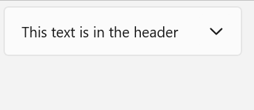
Header 屬性定義永遠顯示的元素。
Content 屬性定義可以摺疊和展開的元素。 此範例會建立一個與上圖類似的 Expander。
<Expander Header="This text is in the header"
               Content="This is in the content"/>
擴充工具內容
的 Expander 屬性可以是任何類型的物件,但通常是字串或 UIElement。 有關設定 Content 屬性的更多詳細資料,請參閱 ContentControl 類別的備註一節。
您可以使用複雜的互動式 UI 作為 Expander 的內容,包括上層 Expander 內容中的巢狀 Expander 控制項,如下所示。
內容對齊
您可以透過設定 控制項上的 HorizontalContentAlignment 和 Expander 屬性來對齊內容。 設定這些屬性時,對齊方式只會套用到展開的內容,而不會套用到標頭。
控制展開工具的大小
預設情況下,標頭和內容區域會自動調整大小以符合其內容。 請務必使用正確的技術來控制 Expander 的大小,以避免不良的外觀或行為。
寬度
如果內容比標頭寬,則標頭寬度會在展開時增加以符合內容區域,並在內容區域摺疊時縮小。 為了防止控制項寬度在展開或摺疊時發生變化,您可以設定明確的寬度,或者,如果該控制項是 Panel 的子系,則將 HorizontalAlignment 設為延展,並讓版面配置面板控制大小調整。
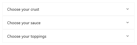
這裡,一系列相關的 Expander 控制項會放置在一個 StackPanel 中。 中每個 的 會設定為HorizontalAlignment使用 Expander,而 的StackPanel寬度會決定控制件的Stretch寬度。StackPanel
<StackPanel x:Name="ExpanderStack" MaxWidth="600">
    <StackPanel.Resources>
        <Style TargetType="Expander">
            <Setter Property="HorizontalAlignment" Value="Stretch"/>
            <Setter Property="HorizontalContentAlignment" Value="Stretch"/>
        </Style>
    </StackPanel.Resources>
    <Expander Header="Choose your crust"> ... </Expander>
    <Expander Header="Choose your sauce"> ... </Expander>
    <Expander Header="Choose your toppings"> ... </Expander>
 </StackPanel>
高度
不要在 上指定Expander。 如果這樣做,即使內容區域摺疊,控制項也會保留該空間,這違背了 Expander 的目的。 若要指定展開內容區域的大小,請在 Expander 的內容上設定大小維度。 如果需要,您可以限制內容的 Height,並使內容可捲動。
可捲動的內容
如果您的內容對於內容區域的大小來說太大,您可以將內容包裝為 ScrollViewer 以使內容區域可捲動。
Expander 控制項不會自動提供捲動功能。
將 ScrollViewer 放置在 Expander 內容中時,將 ScrollViewer 控制項上的高度設定為內容區域所需的高度。 如果您在 ScrollViewer 內的內容上設定高度維度,ScrollViewer 無法識別此設定,因此不提供可捲動內容。
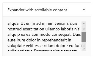
以下範例示範如何建立包含可捲動文字作為其內容的 Expander。
<Expander Header="Expander with scrollable content">
    <ScrollViewer MaxHeight="200">
        <Grid>
            <TextBlock TextWrapping="Wrap">
                Lorem ipsum dolor sit amet, consectetur adipisicing elit,
                sed do eiusmod tempor incididunt ut labore et dolore magna
                aliqua. Ut enim ad minim veniam, quis nostrud exercitation
                ullamco laboris nisi ut aliquip ex ea commodo consequat.
                Duis aute irure dolor in reprehenderit in voluptate velit
                esse cillum dolore eu fugiat nulla pariatur. Excepteur sint
                occaecat cupidatat non proident, sunt in culpa qui officia
                deserunt mollit anim id est laborum.
            </TextBlock>
        </Grid>
    </ScrollViewer>
</Expander>
展開和摺疊內容區域
預設情況下,展開工具處於摺疊狀態並向下展開。
- 將 IsExpanded 屬性設為
true以使內容區域一開始就展開。 - 將 ExpandDirection 屬性設為向上,以使內容向上展開。
<Expander IsExpanded="True" ExpandDirection="Up">
Expander透過設定 IsExpanded 屬性或與 Header互動,以程式設計方式展開或折疊 ;無法關閉。
小提示
暫時性 UI (例如 Flyout 或 ComboBox 的開啟下拉式選單) 會在您按一下或點擊其外部時關閉。 這稱為消失關閉。
Expander 的內容區域不視為暫時性,並且不會重疊其他 UI,因此它不支援消失關閉。
您也可以處理 Expanding 和 Collapsed 事件,以便在顯示或隱藏內容時採取動作。 以下是這類事件的一些範例。
Expanding 事件
在此範例中,您有一組展開工具,而且要一次只打開一個。 當使用者開啟 Expander 時,您將處理 Expanding 事件,並摺疊該群組中除使用者點擊的控制項之外的所有 Expander 控制項。
謹慎
根據您的應用程式和使用者體驗,當使用者展開另一個控制項時,自動摺疊 Expander 控制項可能會更方便。 然而,這也奪走了使用者的控制權。 如果該行為可能有用,請考慮讓它成為使用者可以輕鬆設定的選項。
<StackPanel x:Name="ExpanderStack">
    <Expander Header="Choose your crust"
                   Expanding="Expander_Expanding"> ... </Expander>
    <Expander Header="Choose your sauce"
                   Expanding="Expander_Expanding"> ... </Expander>
    <Expander Header="Choose your toppings"
                   Expanding="Expander_Expanding"> ... </Expander>
 </StackPanel>
// Let the user opt out of custom behavior.
private bool _autoCollapse = true;

private void Expander_Expanding(muxc.Expander sender,
                                muxc.ExpanderExpandingEventArgs args)
{
    if (_autoCollapse == true)
    {
        foreach (muxc.Expander ex in ExpanderStack.Children)
        {
            if (ex != sender && ex.IsExpanded)
                ex.IsExpanded = false;
        }
    }
}
Collapsed 事件
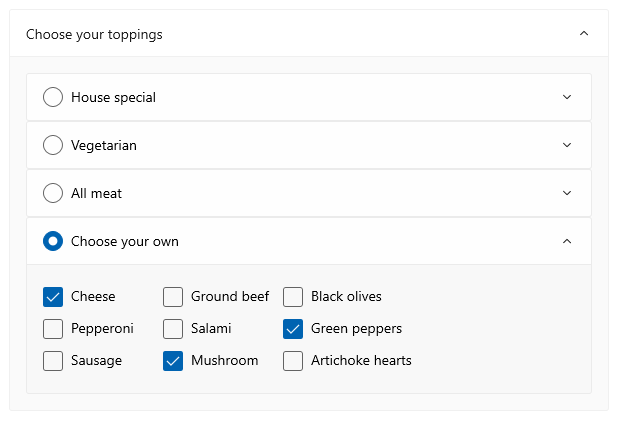
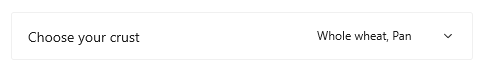
在此範例中,您會處理 Collapsed 事件,並使用在 Header 中選擇的選項摘要填入 Content。
此圖顯示了已展開內容並選擇選項的 Expander。
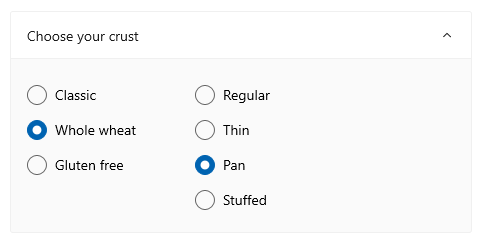
摺疊時,所選的選項會匯總在標頭中,讓使用者無需打開 Expander 也可以看到它們。
<Expander IsExpanded="True"
        Expanding="Expander_Expanding"
        Collapsed="Expander_Collapsed">
    <Expander.Header>
        <Grid>
            <TextBlock Text="Choose your crust"/>
            <TextBlock x:Name="tbCrustSelections"
                       HorizontalAlignment="Right"
                       Style="{StaticResource CaptionTextBlockStyle}"/>
        </Grid>
    </Expander.Header>
    <StackPanel Orientation="Horizontal">
        <RadioButtons x:Name="rbCrustType" SelectedIndex="0">
            <x:String>Classic</x:String>
            <x:String>Whole wheat</x:String>
            <x:String>Gluten free</x:String>
        </RadioButtons>
        <RadioButtons x:Name="rbCrustStyle" SelectedIndex="0"
                           Margin="48,0,0,0">
            <x:String>Regular</x:String>
            <x:String>Thin</x:String>
            <x:String>Pan</x:String>
            <x:String>Stuffed</x:String>
        </RadioButtons>
    </StackPanel>
</Expander>
private void Expander_Collapsed(muxc.Expander sender,
                                muxc.ExpanderCollapsedEventArgs args)
{
    // Update the header with options selected in the content.
    tbCrustSelections.Text = rbCrustType.SelectedItem.ToString() +
        ", " + rbCrustStyle.SelectedItem.ToString();
}
輕量化造型
您可以修改預設 Style 和 ControlTemplate,為控制項提供獨特的外觀。 如需可用主題資源的清單,請參閱展開工具 API 文件的「控制項樣式和範本」一節。 如需詳細資訊,請參閱樣式控制項文章的輕量型樣式設定一節。
Recommendations
- 當顯示空間有限,且某些次要內容除非使用者要求否則隱藏時,請使用
Expander。
程式碼範例
此 XAML 建立本文其他部分所示的 Expander 控制項群組。
Expanding 和 Collapsed 事件處理常式的程式碼也在先前的區段中顯示。
<StackPanel x:Name="ExpanderStack" MaxWidth="600">
    <StackPanel.Resources>
        <Style TargetType="Expander">
            <Setter Property="HorizontalAlignment" Value="Stretch"/>
            <Setter Property="HorizontalContentAlignment" Value="Stretch"/>
        </Style>
    </StackPanel.Resources>
    <Expander IsExpanded="True"
                   Expanding="Expander_Expanding"
                   Collapsed="Expander_Collapsed">
        <Expander.Header>
            <Grid>
                <TextBlock Text="Choose your crust"/>
                <TextBlock x:Name="tbCrustSelections"
                           HorizontalAlignment="Right"
        Style="{StaticResource CaptionTextBlockStyle}"/>
            </Grid>
        </Expander.Header>
        <StackPanel Orientation="Horizontal">
            <RadioButtons x:Name="rbCrustType" SelectedIndex="0">
                <x:String>Classic</x:String>
                <x:String>Whole wheat</x:String>
                <x:String>Gluten free</x:String>
            </RadioButtons>
            <RadioButtons x:Name="rbCrustStyle" SelectedIndex="0"
                   Margin="48,0,0,0">
                <x:String>Regular</x:String>
                <x:String>Thin</x:String>
                <x:String>Pan</x:String>
                <x:String>Stuffed</x:String>
            </RadioButtons>
        </StackPanel>
    </Expander>

    <Expander Header="Choose your sauce" Margin="24"
            Expanding="Expander_Expanding">
        <RadioButtons SelectedIndex="0" MaxColumns="2">
            <x:String>Classic red</x:String>
            <x:String>Garlic</x:String>
            <x:String>Pesto</x:String>
            <x:String>Barbecue</x:String>
        </RadioButtons>
    </Expander>

    <Expander Header="Choose your toppings"
                   Expanding="Expander_Expanding">
        <StackPanel>
            <Expander>
                <Expander.Header>
                    <RadioButton GroupName="Toppings" Content="House special"/>
                </Expander.Header>
                <TextBlock Text="Cheese, pepperoni, sausage, black olives, mushrooms"
                           TextWrapping="WrapWholeWords"/>
            </Expander>
            <Expander>
                <Expander.Header>
                    <RadioButton GroupName="Toppings" Content="Vegetarian"/>
                </Expander.Header>
                <TextBlock Text="Cheese, mushrooms, black olives, green peppers, artichoke hearts"
                           TextWrapping="WrapWholeWords"/>
            </Expander>
            <Expander>
                <Expander.Header>
                    <RadioButton GroupName="Toppings" Content="All meat"/>
                </Expander.Header>
                <TextBlock Text="Cheese, pepperoni, sausage, ground beef, salami"
                           TextWrapping="WrapWholeWords"/>
            </Expander>
            <Expander>
                <Expander.Header>
                    <RadioButton GroupName="Toppings" Content="Choose your own"/>
                </Expander.Header>
                <StackPanel Orientation="Horizontal">
                    <StackPanel>
                        <CheckBox Content="Cheese"/>
                        <CheckBox Content="Pepperoni"/>
                        <CheckBox Content="Sausage"/>
                    </StackPanel>
                    <StackPanel>
                        <CheckBox Content="Ground beef"/>
                        <CheckBox Content="Salami"/>
                        <CheckBox Content="Mushroom"/>
                    </StackPanel>
                    <StackPanel>
                        <CheckBox Content="Black olives"/>
                        <CheckBox Content="Green peppers"/>
                        <CheckBox Content="Artichoke hearts"/>
                    </StackPanel>
                </StackPanel>
            </Expander>
        </StackPanel>
    </Expander>
</StackPanel>
UWP 和 WinUI 2
這很重要
本文中的資訊和範例針對使用 Windows App SDK 和 WinUI 3 的應用程式進行了最佳化,但通常適用於使用 WinUI 2 的 UWP 應用程式。 如需平台特定資訊和範例,請參閱 UWP API 參考。
本節包含您在 UWP 或 WinUI 2 應用程式中使用控制項所需的資訊。
UWP 應用程式的 Expander 需要 WinUI 2。 如需詳細資訊 (包括安裝指示),請參閱 WinUI 2。 此控件的 API 存在於 Microsoft.UI.Xaml.Controls 命名空間中。
- WinUI 2 Apis:Expander 類別、Header 屬性、Content 屬性
- 開啟 WinUI 2 資源庫應用程式,並查看 Expander 運作情形。 WinUI 2 圖庫應用程式包含了大部分 WinUI 2 控制項、特性和功能的互動式範例。 從 Microsoft Store 取得應用程式,或在 GitHub 上取得原始程式碼。
若要在 WinUI 2 中使用本文中的程式碼,請在 XAML 中使用別名 (我們使用 muxc) 來表示專案中包含的 Windows UI 程式庫 API。 如需詳細資訊,請參閱開始使用 WinUI 2。
xmlns:muxc="using:Microsoft.UI.Xaml.Controls"

<muxc:Expander />
