使用 ItemsRepeater,即可使用靈活的版面配置系統、自訂檢視畫面、進行模擬,藉以建立自訂的集合體驗。
與 ListView 不同,ItemsRepeater 並未提供全面的使用者體驗,無預設的 UI,也未提供焦點、選取或使用者互動的相關原則。 相反地,這是一個建置組塊,可用來建立自己的唯一集合型體驗和自定義控件。 雖然沒有內建原則,但可讓您附加原則以建置所需的體驗。 例如,您可以定義要使用的配置、鍵盤輸入原則、選取原則等。
您可以在概念上將 ItemsRepeater 視為以資料為主的窗格,而非 ListView 那種完整的控制項。 您可以指定要顯示的資料項目集合,產生每個資料項目的 UI 元素項目範本,以及決定元素大小和位置方式的配置。 然後,ItemsRepeater 會根據資料來源,產生出子元素,並依照項目範本和配置的指定方式加以顯示。 顯示的項目不需要同質性,因為 ItemsRepeater 可以根據您在資料範本選取器中指定的條件,載入內容來呈現資料項目。
這是正確的控制嗎?
使用 ItemsRepeater 建立資料集合的自訂顯示畫面。 雖然這可以用來呈現一組基本項目,但較可能經常用來做為自訂控制項範本中的顯示元素。
如果需要立即可用的控制項,以清單或格線的形式來呈現資料,且想要盡可能減少自訂需求,就推薦使用 ListView 或 GridView。
ItemsRepeater 沒有內建的項目集合。 如果需要直接提供項目集合,而不是繫結至個別的資料來源,則可能需要更高原則的體驗,建議使用 ListView 或 GridView。
ItemsControl 和 ItemsRepeater 皆支援可自訂的集合體驗,但 ItemsRepeater 支援虛擬化的 UI 配置,ItemsControl 則不支援。 無論是僅用於顯示資料中的一些項目,還是建置自訂集合控制項,都建議使用 ItemsRepeater,而不是 ItemsControl。
以 ItemsRepeater 捲動
ItemsRepeater 不是衍生自 Control,因此沒有控制項範本。 所以,並未包含任何類似於 ListView 或其他集合控制項的內建捲動功能。
當您使用 ItemsRepeater 時,請將其包裝在 ScrollViewer 控制項內,以此方式提供捲動功能。
建立項目重複器
- 重要 API:ItemsRepeater 類別、ScrollViewer 類別

WinUI 3 圖庫應用程式包含互動式的 WinUI 控制項與功能範例。 你可以從 Microsoft Store下載 App,或在 GitHub 瀏覽原始碼。
若要使用 ItemsRepeater,則需設定 ItemsSource 屬性,以此方式提供要顯示的資料。 然後,藉由設定 ItemTemplate 屬性,即可知道如何顯示項目。
項目來源
若要填入視圖,請將 ItemsSource 屬性設為資料項目的集合。 在這裡,ItemsSource 會在程式碼中直接設定為集合的執行個體。
ObservableCollection<string> Items = new ObservableCollection<string>();

ItemsRepeater itemsRepeater1 = new ItemsRepeater();
itemsRepeater1.ItemsSource = Items;
您也可以將 ItemsSource 屬性繫結到 XAML 中的集合。 如需資料繫結的詳細資訊,請參閱資料繫結概觀。
<ItemsRepeater ItemsSource="{x:Bind Items}"/>
項目模板
若要指定資料項目視覺化的方式,請將 ItemTemplate 屬性設為您已定義的 DataTemplate 或 DataTemplateSelector。 資料範本會定義資料視覺化的方式。 根據預設,項目會透過 TextBlock 顯示在視圖中,其使用字串來顯示資料物件。
不過,通常會想要透過使用範本,該範本定義了一個或多個用於顯示個別項目的控制項的佈局和外觀,以此來更加豐富地呈現您的資料。 您在範本中使用的控制項可以繫結至資料物件的屬性,或以內嵌方式定義靜態內容。
資料模板
在此範例中,資料物件是一個簡單字串。 DataTemplate 在文字左側有個影像,且會設定 TextBlock 的樣式,以顯示出藍綠色的字串。
備註
當您在 DataTemplate 中使用 x:Bind markup extension 時,必須在 DataTemplate 上指定 DataType (x:DataType)。
<DataTemplate x:DataType="x:String">
    <Grid>
        <Grid.ColumnDefinitions>
            <ColumnDefinition Width="47"/>
            <ColumnDefinition/>
        </Grid.ColumnDefinitions>
        <Image Source="Assets/placeholder.png" Width="32" Height="32"
               HorizontalAlignment="Left"/>
        <TextBlock Text="{x:Bind}" Foreground="Teal"
                   FontSize="15" Grid.Column="1"/>
    </Grid>
</DataTemplate>
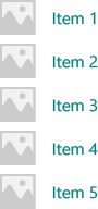
以下是使用此 DataTemplate 顯示項目時的呈現方式。
如果視圖顯示了大量項目,則項目的 DataTemplate 中使用的元素數量會對效能產生重大影響。 如需如何如何使用 DataTemplate 以定義清單中項目外觀的更多資訊和範例,請參閱項目容器與範本。
小提示
為了方便起見,如果要宣告範本內嵌,而不是作為靜態資源參考,可以將 DataTemplate 或 DataTemplateSelector 指定為 ItemsRepeater 的直接子項。 會將其指派為 ItemTemplate 屬性的值。 例如,以下為有效:
<ItemsRepeater ItemsSource="{x:Bind Items}">
    <DataTemplate>
        <!-- ... -->
    </DataTemplate>
</ItemsRepeater>
小提示
與 ListView 和其他集合控制項不同,ItemsRepeater 不會將 DataTemplate 的元素與含有預設原則 (例如邊界、邊框間距、選項視覺效果,或視覺狀態指標) 的其他項目容器包裝在一起。 相反地,ItemsRepeater 僅會顯示 DataTemplate 中定義的內容。 如果希望項目與清單檢視項目具有相同的外觀,可以在資料範本中明確包含容器,例如 ListViewItem。 ItemsRepeater 會顯示 ListViewItem 視覺效果,但不會自動使用其他功能,例如選擇或顯示多重選取的核取方塊。
同樣地,如果您的資料集合是實際控制項的集合,例如 Button (List<Button>),則可將 ContentPresenter 放在 DataTemplate 中,以顯示控制項。
資料模板選擇器
您在視圖中顯示的項目不需要是相同類型。 您可以使用 DataTemplateSelector 提供的 ItemTemplate 屬性,以根據您指定的準則來選取不同的 DataTemplate。
此範例假設已定義 DataTemplateSelector,它決定在兩個不同的 DataTemplate 之間,用以表示大型和小型項目。
<ItemsRepeater ...>
    <ItemsRepeater.ItemTemplate>
        <local:VariableSizeTemplateSelector Large="{StaticResource LargeItemTemplate}"
                                            Small="{StaticResource SmallItemTemplate}"/>
    </ItemsRepeater.ItemTemplate>
</ItemsRepeater>
定義 DataTemplateSelector 與 ItemsRepeater 搭配使用時,您只需要為 SelectTemplateCore(Object) 方法實作覆寫。 如需詳細資訊和範例,請參閱 DataTemplateSelector。
備註
在更進階的情況下,管理元素創建的替代方案是實作您自己的 IElementFactory 來用作 ItemTemplate,以取代使用 DataTemplate。 其負責在要求時產生內容。
設定資料來源
使用 ItemsSource 屬性以指定要用來產生項目內容的集合。 您可以將 ItemsSource 設為實作 IEnumerable 的任何類型。 您的資料來源實作的附加集合介面決定了 ItemsRepeater 可以利用哪些功能來與您的資料互動。
此清單顯示可用的介面,以及何時使用每個介面。
IEnumerable(.NET) / IIterable
可用於小型的靜態資料集。
資料來源至少必須實作 IEnumerable / IIterable 介面。 如果這是一切所支援的功能,那麼控件將遍歷所有項目一次,以建立一個它可以通過索引值存取項目的副本。
IReadonlyList(.NET) / IVectorView
可用於靜態、唯讀的資料集。
使控制項能依索引存取項,避免重複的內部副本。
-
可用於靜態資料集。
使控制項能依索引存取項,避免重複的內部副本。
警告:在未實作 INotifyCollectionChanged 的情況下,對於清單/向量所做的變更,並不會反映在 UI 中。
INotifyCollectionChanged(.NET)
建議支援變更通知。
讓控制項能夠觀察並回應資料來源中的變更,並在 UI 中反映這些變更。
-
支援變更通知
就像 INotifyCollectionChanged 介面,如此可讓控制項觀察並回應資料來源中的變更。
警告:Windows。Foundation.IObservableVector<T> 不支援「移動」動作。 這可能導致項目的 UI 失去可見狀態。 例如,一個目前被選取及/或具有焦點的項目,在透過先「移除」再「新增」來移動時,會失去焦點且不再被選取。
Platform.Collections.Vector<T> 使用 IObservableVector<T>,而且具有此相同限制。 如果需要支援「移動」動作,請使用 INotifyCollectionChanged 介面。 .NET ObservableCollection<T> 類別使用 INotifyCollectionChanged。
-
當唯一識別碼可以與每個項目相關聯時。 建議在使用「重設」作為集合變更動作時使用。
收到強制「重設」動作做為 INotifyCollectionChanged 或 IObservableVector 事件的一部分時,可讓控制項非常有效率地復原現有 UI。 收到重設後,控制項將使用提供的唯一識別碼,將目前資料與其建立的元素建立關聯。 如果沒有索引鍵以編製索引對應,控制項必須假設它需要從頭開始為資料建立 UI。
以上列出的介面 (IKeyIndexMapping 除外) 在 ItemsRepeater 中提供與在 ListView 和 GridView 中相同的行為。
在 ItemsSource 的下列介面在 ListView 和 GridView 控制項中啟用特殊功能,但目前對 ItemsRepeater 沒有影響:
當使用者向上或向下捲動時,累加式載入資料的另一種方式是觀察 ScrollViewer 檢視區的位置,並在檢視區接近範圍時載入更多資料。
<ScrollViewer ViewChanged="ScrollViewer_ViewChanged">
    <ItemsRepeater ItemsSource="{x:Bind MyItemsSource}" .../>
</ScrollViewer>
private async void ScrollViewer_ViewChanged(object sender, ScrollViewerViewChangedEventArgs e)
{
    if (!e.IsIntermediate)
    {
        var scroller = (ScrollViewer)sender;
        var distanceToEnd = scroller.ExtentHeight - (scroller.VerticalOffset + scroller.ViewportHeight);

        // trigger if within 2 viewports of the end
        if (distanceToEnd <= 2.0 * scroller.ViewportHeight
                && MyItemsSource.HasMore && !itemsSource.Busy)
        {
            // show an indeterminate progress UI
            myLoadingIndicator.Visibility = Visibility.Visible;

            await MyItemsSource.LoadMoreItemsAsync(/*DataFetchSize*/);

            loadingIndicator.Visibility = Visibility.Collapsed;
        }
    }
}
變更項目的配置
ItemsRepeater 顯示的項目是依照 Layout 物件排列,該物件管理的是其子元素的大小和位置。 與 ItemsRepeater 搭配使用時,Layout 物件會啟用 UI 模擬。 提供的配置為 StackLayout 和 UniformGridLayout。 依預設,ItemsRepeater 會使用垂直方向的 StackLayout。
StackLayout(堆疊佈局)
StackLayout 會將元素排成一行,可設定水平或垂直方向。
您可以設定 Spacing 屬性,以調整項目之間的間距。 間距會套用在配置 Orientation 的方向。
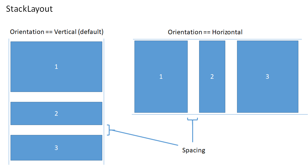
此範例演示如何將 ItemsRepeater.Layout 屬性設置為具有水平方向和 8 像素間距的 StackLayout。
<!-- xmlns:muxc="using:Microsoft.UI.Xaml.Controls" -->
<muxc:ItemsRepeater ItemsSource="{x:Bind Items}" ItemTemplate="{StaticResource MyTemplate}">
    <muxc:ItemsRepeater.Layout>
        <muxc:StackLayout Orientation="Horizontal" Spacing="8"/>
    </muxc:ItemsRepeater.Layout>
</muxc:ItemsRepeater>
UniformGridLayout(均一網格佈局)
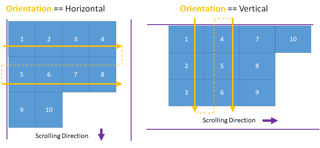
UniformGridLayout 會以換行配置的方式依序放置元素。 當 Orientation 為 Horizontal 時,項目依照從左到右的順序排列,當 Orientation 為 Vertical 時,則從上到下排列。 每個項目的大小相同。
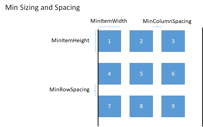
水平配置的每列項目數會受到最小項目寬度的影響。 垂直配置的每欄項目數會受到最小項目高度的影響。
- 您可以藉由設定 MinItemHeight 和 MinItemWidth 屬性,明確提供要使用的大小下限。
- 如果未指定大小下限,第一個項目的測量大小會視為每個項目的大小下限。
您也可以藉由設定 MinColumnSpacing 和 MinRowSpacing 屬性,將配置的最小間距設為包含在列和欄之間。
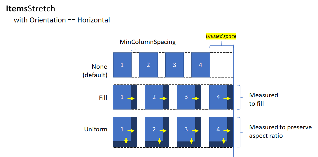
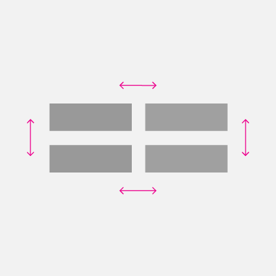
根據項目的最小尺寸和間距確定資料列或資料欄的項目數量後,可能會在資料列或資料欄中最後一個項目之後留下未使用的空間(如上圖所示)。 您可以指定是否要忽略額外的空間,或是用於增加每個項目的大小,或用於建立項目之間的額外空間。 這是由 ItemsStretch 和 ItemsJustification 屬性控制。
您可以設定 ItemsStretch 屬性,以指定如何增加項目大小以填滿未使用的空間。
此清單顯示可用的值。 此定義假設預設的 Orientation 為 Horizontal。
- 無:在列的最後留下未使用的額外空間。 這是預設值。
- 填滿:項目會增加寬度以填滿可用空間(如果是垂直方向,則填滿高度)。
- 均一化:項目會獲得額外的寬度,以填滿可用空間,並獲得額外的高度,以維持縱橫比例(如果是垂直方向,則交換高度和寬度)。
此影像顯示在水平配置中 ItemsStretch 值的效果。
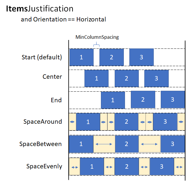
當 ItemsStretch 為 None,您可以設定 ItemsJustification 屬性以指定如何使用額外空間以對齊項目。
此清單顯示可用的值。 此定義假設預設的 Orientation 為 Horizontal。
- Start:項目與列的開始對齊。 列的最後有額外空間未使用。 這是預設值。
- Center:項目在列中置中對齊。 額外的空間在列的起始和結尾處平均分配。
- End:項目與列齊尾對齊。 列的開頭留有未使用的多餘空間。
- SpaceAround:項目平均分配空間。 在每個項目的前後加入等量的空間。
- SpaceBetween:項目平均分佈。 在每個項目之間加入等量的空間。 在列的前後沒有加入空間。
- SpaceEvenly:項目平均分佈,每個項目之間以及列的開頭和結尾都有相等的空間。
此影像顯示在垂直配置中 ItemsStretch 值的效果 (套用到欄,而非套用到列)。
小提示
ItemsStretch 屬性影響布局的測量過程。 ItemsJustification 屬性會影響配置的排列過程。
此範例示範如何將 ItemsRepeater.Layout 屬性設為 UniformGridLayout。
<!-- xmlns:muxc="using:Microsoft.UI.Xaml.Controls" -->
<muxc:ItemsRepeater ItemsSource="{x:Bind Items}"
                    ItemTemplate="{StaticResource MyTemplate}">
    <muxc:ItemsRepeater.Layout>
        <muxc:UniformGridLayout MinItemWidth="200"
                                MinColumnSpacing="28"
                                ItemsJustification="SpaceAround"/>
    </muxc:ItemsRepeater.Layout>
</muxc:ItemsRepeater>
生命週期事件
當您在 ItemsRepeater 中託管項目時,在顯示項目或停止顯示項目時,可能需要採取某些動作,例如啟動某些內容的非同步下載作業、將元素與機制建立關聯以追蹤選取項目,或是停止某項背景工作。
在虛擬化的控制項中,無法依賴載入/卸載事件,因為回收時,可能無法將元素從即時視覺化樹狀結構中移除。 而是改為提供其他事件,來管理元素的生命週期。 此圖顯示了 ItemsRepeater 中的元素生命週期,以及引發相關事件的時間。
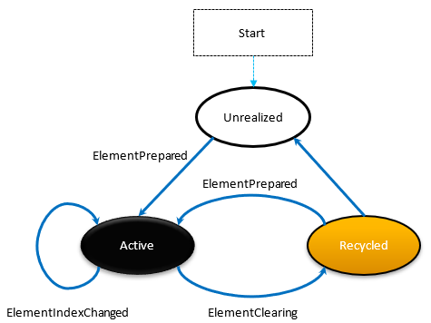
- 每當元素準備就緒,ElementPrepared 就會發生。 對於新創建的元素,亦對於已存在並從回收佇列中重新使用的元素,此情況都會發生。
- 每次將元素傳送至回收佇列時 (例如當元素超出具現化項目的範圍時),會立即發生 ElementClearing。
- 每個具現化的 UIElement (其代表的項目索引已變更) 都會發生 ElementIndexChanged。 例如,在資料來源中新增或移除另一個項目時,依序排列之後的項目索引會收到此事件。
此範例示範如何使用這些事件來附加自訂選擇服務,以追蹤使用 ItemsRepeater 顯示項目之自訂控制項的項目選擇。
<!-- xmlns:muxc="using:Microsoft.UI.Xaml.Controls" -->
<UserControl ...>
    ...
    <ScrollViewer>
        <muxc:ItemsRepeater ItemsSource="{x:Bind Items}"
                            ItemTemplate="{StaticResource MyTemplate}"
                            ElementPrepared="OnElementPrepared"
                            ElementIndexChanged="OnElementIndexChanged"
                            ElementClearing="OnElementClearing">
        </muxc:ItemsRepeater>
    </ScrollViewer>
    ...
</UserControl>
interface ISelectable
{
    int SelectionIndex { get; set; }
    void UnregisterSelectionModel(SelectionModel selectionModel);
    void RegisterSelectionModel(SelectionModel selectionModel);
}

private void OnElementPrepared(ItemsRepeater sender, ElementPreparedEventArgs args)
{
    var selectable = args.Element as ISelectable;
    if (selectable != null)
    {
        // Wire up this item to recognize a 'select' and listen for programmatic
        // changes to the selection model to know when to update its visual state.
        selectable.SelectionIndex = args.Index;
        selectable.RegisterSelectionModel(this.SelectionModel);
    }
}

private void OnElementIndexChanged(ItemsRepeater sender, ElementIndexChangedEventArgs args)
{
    var selectable = args.Element as ISelectable;
    if (selectable != null)
    {
        // Sync the ID we use to notify the selection model when the item
        // we represent has changed location in the data source.
        selectable.SelectionIndex = args.NewIndex;
    }
}

private void OnElementClearing(ItemsRepeater sender, ElementClearingEventArgs args)
{
    var selectable = args.Element as ISelectable;
    if (selectable != null)
    {
        // Disconnect handlers to recognize a 'select' and stop
        // listening for programmatic changes to the selection model.
        selectable.UnregisterSelectionModel(this.SelectionModel);
        selectable.SelectionIndex = -1;
    }
}
排序、篩選和重設資料
當您執行篩選或排序資料集之類的動作時,習慣上可能會將先前的資料集與新資料比較,然後透過 INotifyCollectionChanged 發出細微變更通知。 但是,改用重設動作,將舊資料完全取代為新資料,並觸發集合變更通知,通常更加容易。
通常,重設會導致控制項釋出現有子元素,並從捲動位置 0 重新開始建置 UI,因為它無法確切知道資料在重設期間的變化。
但是,如果指派為 ItemsSource 的集合藉由實作 IKeyIndexMapping 介面以支援唯一的識別碼,則 ItemsRepeater 可以快速識別:
- 用於重設前後已存在資料的可重複使用使用者介面元素
- 已移除的先前可見項目
- 可看見的新增項目
這可讓 ItemsRepeater 避免從捲軸位置 0 從頭開始。 也可以針對重設時未變更的資料以快速還原 UIElements,進而產生更好的效能。
此範例示範如何在垂直堆疊中顯示項目清單,其中 MyItemsSource 是包裝基礎項目清單的自訂資料來源。 其會公開 Data 屬性,該屬性可用於將新清單重新指派為項目來源,然後觸發重設。
<ScrollViewer x:Name="sv">
    <ItemsRepeater x:Name="repeater"
                ItemsSource="{x:Bind MyItemsSource}"
                ItemTemplate="{StaticResource MyTemplate}">
       <ItemsRepeater.Layout>
           <StackLayout ItemSpacing="8"/>
       </ItemsRepeater.Layout>
   </ItemsRepeater>
</ScrollViewer>
public MainPage()
{
    this.InitializeComponent();

    // Similar to an ItemsControl, a developer sets the ItemsRepeater's ItemsSource.
    // Here we provide our custom source that supports unique IDs which enables
    // ItemsRepeater to be smart about handling resets from the data.
    // Unique IDs also make it easy to do things apply sorting/filtering
    // without impacting any state (i.e. selection).
    MyItemsSource myItemsSource = new MyItemsSource(data);

    repeater.ItemsSource = myItemsSource;

    // ...

    // We can sort/filter the data using whatever mechanism makes the
    // most sense (LINQ, database query, etc.) and then reassign
    // it, which in our implementation triggers a reset.
    myItemsSource.Data = someNewData;
}

// ...


public class MyItemsSource : IReadOnlyList<ItemBase>, IKeyIndexMapping, INotifyCollectionChanged
{
    private IList<ItemBase> _data;

    public MyItemsSource(IEnumerable<ItemBase> data)
    {
        if (data == null) throw new ArgumentNullException();

        this._data = data.ToList();
    }

    public IList<ItemBase> Data
    {
        get { return _data; }
        set
        {
            _data = value;

            // Instead of tossing out existing elements and re-creating them,
            // ItemsRepeater will reuse the existing elements and match them up
            // with the data again.
            this.CollectionChanged?.Invoke(
                this,
                new NotifyCollectionChangedEventArgs(NotifyCollectionChangedAction.Reset));
        }
    }

    #region IReadOnlyList<T>

    public ItemBase this[int index] => this.Data != null
        ? this.Data[index]
        : throw new IndexOutOfRangeException();

    public int Count => this.Data != null ? this.Data.Count : 0;
    public IEnumerator<ItemBase> GetEnumerator() => this.Data.GetEnumerator();
    IEnumerator IEnumerable.GetEnumerator() => this.GetEnumerator();

    #endregion

    #region INotifyCollectionChanged

    public event NotifyCollectionChangedEventHandler CollectionChanged;

    #endregion

    #region IKeyIndexMapping

    private int lastRequestedIndex = IndexNotFound;
    private const int IndexNotFound = -1;

    // When UniqueIDs are supported, the ItemsRepeater caches the unique ID for each item
    // with the matching UIElement that represents the item.  When a reset occurs the
    // ItemsRepeater pairs up the already generated UIElements with items in the data
    // source.
    // ItemsRepeater uses IndexForUniqueId after a reset to probe the data and identify
    // the new index of an item to use as the anchor.  If that item no
    // longer exists in the data source it may try using another cached unique ID until
    // either a match is found or it determines that all the previously visible items
    // no longer exist.
    public int IndexForUniqueId(string uniqueId)
    {
        // We'll try to increase our odds of finding a match sooner by starting from the
        // position that we know was last requested and search forward.
        var start = lastRequestedIndex;
        for (int i = start; i < this.Count; i++)
        {
            if (this[i].PrimaryKey.Equals(uniqueId))
                return i;
        }

        // Then try searching backward.
        start = Math.Min(this.Count - 1, lastRequestedIndex);
        for (int i = start; i >= 0; i--)
        {
            if (this[i].PrimaryKey.Equals(uniqueId))
                return i;
        }

        return IndexNotFound;
    }

    public string UniqueIdForIndex(int index)
    {
        var key = this[index].PrimaryKey;
        lastRequestedIndex = index;
        return key;
    }

    #endregion
}
建立自訂集合控制項
您可以使用 ItemsRepeater 以建立自訂集合控制項,配有自己的控制項類型以顯示每個項目。
備註
這與使用 ItemsControl 類似,但不是衍生自 ItemsControl,並將 ItemsPresenter 放在控制項範本中,而是衍生自 Control,並會插入 ItemsRepeater 控制項範本中。 自訂集合控制項「具有」ItemsRepeater 而且「是」ItemsControl。 這表示您也必須明確選擇要公開的屬性,而不是未支援的繼承屬性。
此範例示範如何在名稱為 MediaCollectionView 的自訂控制項範本中放置 ItemsRepeater,並公開其屬性。
<!-- xmlns:muxc="using:Microsoft.UI.Xaml.Controls" -->
<Style TargetType="local:MediaCollectionView">
    <Setter Property="Template">
        <Setter.Value>
            <ControlTemplate TargetType="local:MediaCollectionView">
                <Border
                    Background="{TemplateBinding Background}"
                    BorderBrush="{TemplateBinding BorderBrush}"
                    BorderThickness="{TemplateBinding BorderThickness}">
                    <ScrollViewer x:Name="ScrollViewer">
                        <muxc:ItemsRepeater x:Name="ItemsRepeater"
                                            ItemsSource="{TemplateBinding ItemsSource}"
                                            ItemTemplate="{TemplateBinding ItemTemplate}"
                                            Layout="{TemplateBinding Layout}"
                                            TabFocusNavigation="{TemplateBinding TabFocusNavigation}"/>
                    </ScrollViewer>
                </Border>
            </ControlTemplate>
        </Setter.Value>
    </Setter>
</Style>
public sealed class MediaCollectionView : Control
{
    public object ItemsSource
    {
        get { return (object)GetValue(ItemsSourceProperty); }
        set { SetValue(ItemsSourceProperty, value); }
    }

    // Using a DependencyProperty as the backing store for ItemsSource.  This enables animation, styling, binding, etc...
    public static readonly DependencyProperty ItemsSourceProperty =
        DependencyProperty.Register(nameof(ItemsSource), typeof(object), typeof(MediaCollectionView), new PropertyMetadata(0));

    public DataTemplate ItemTemplate
    {
        get { return (DataTemplate)GetValue(ItemTemplateProperty); }
        set { SetValue(ItemTemplateProperty, value); }
    }

    // Using a DependencyProperty as the backing store for ItemTemplate.  This enables animation, styling, binding, etc...
    public static readonly DependencyProperty ItemTemplateProperty =
        DependencyProperty.Register(nameof(ItemTemplate), typeof(DataTemplate), typeof(MediaCollectionView), new PropertyMetadata(0));

    public Layout Layout
    {
        get { return (Layout)GetValue(LayoutProperty); }
        set { SetValue(LayoutProperty, value); }
    }

    // Using a DependencyProperty as the backing store for Layout.  This enables animation, styling, binding, etc...
    public static readonly DependencyProperty LayoutProperty =
        DependencyProperty.Register(nameof(Layout), typeof(Layout), typeof(MediaCollectionView), new PropertyMetadata(0));

    public MediaCollectionView()
    {
        this.DefaultStyleKey = typeof(MediaCollectionView);
    }
}
顯示分組項目
您可以在 ItemsRepeater 的 ItemTemplate 中嵌套另一個 ItemsRepeater,以建立嵌套的虛擬化布局。 該架構會盡量減少不必要的元素實現 (無法檢視或在目前檢視區附近的元素),以此方式善加運用資源。
此範例會示範如何在垂直堆疊中顯示分組的項目清單。 外層的 ItemsRepeater 會產生每個群組。 在每個群組的範本中,另一個 ItemsRepeater 會產生項目。
<!-- xmlns:muxc="using:Microsoft.UI.Xaml.Controls" -->

<Page.Resources>
    <muxc:StackLayout x:Key="MyGroupLayout"/>
    <muxc:StackLayout x:Key="MyItemLayout" Orientation="Horizontal"/>
</Page.Resources>

<ScrollViewer>
  <muxc:ItemsRepeater ItemsSource="{x:Bind AppNotifications}"
                      Layout="{StaticResource MyGroupLayout}">
    <muxc:ItemsRepeater.ItemTemplate>
      <DataTemplate x:DataType="ExampleApp:AppNotifications">
        <!-- Group -->
        <StackPanel>
          <!-- Header -->
          <TextBlock Text="{x:Bind AppTitle}"/>
          <!-- Items -->
          <muxc:ItemsRepeater ItemsSource="{x:Bind Notifications}"
                              Layout="{StaticResource MyItemLayout}"
                              ItemTemplate="{StaticResource MyTemplate}"/>
          <!-- Footer -->
          <Button Content="{x:Bind FooterText}"/>
        </StackPanel>
      </DataTemplate>
    </muxc:ItemsRepeater.ItemTemplate>
  </muxc:ItemsRepeater>
</ScrollViewer>
下圖顯示使用上述範例作為指導方針所建立的基本版面配置。
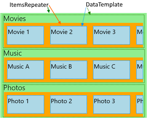
下一個範例示範應用程式的配置,此配置有各種類別,可以根據使用者偏好設定進行變更,並以水平捲動清單顯示。 此範例的版面配置也會以上述影像表示。
<!-- xmlns:muxc="using:Microsoft.UI.Xaml.Controls" -->
<!-- Include the <muxc:ItemsRepeaterScrollHost> if targeting Windows 10 versions earlier than 1809. -->
<ScrollViewer>
  <muxc:ItemsRepeater ItemsSource="{x:Bind Categories}"
                      Background="LightGreen">
    <muxc:ItemsRepeater.ItemTemplate>
      <DataTemplate x:DataType="local:Category">
        <StackPanel Margin="12,0">
          <TextBlock Text="{x:Bind Name}" Style="{ThemeResource TitleTextBlockStyle}"/>
          <!-- Include the <muxc:ItemsRepeaterScrollHost> if targeting Windows 10 versions earlier than 1809. -->
          <ScrollViewer HorizontalScrollMode="Enabled"
                                          VerticalScrollMode="Disabled"
                                          HorizontalScrollBarVisibility="Auto" >
            <muxc:ItemsRepeater ItemsSource="{x:Bind Items}"
                                Background="Orange">
              <muxc:ItemsRepeater.ItemTemplate>
                <DataTemplate x:DataType="local:CategoryItem">
                  <Grid Margin="10"
                        Height="60" Width="120"
                        Background="LightBlue">
                    <TextBlock Text="{x:Bind Name}"
                               Style="{StaticResource SubtitleTextBlockStyle}"
                               Margin="4"/>
                  </Grid>
                </DataTemplate>
              </muxc:ItemsRepeater.ItemTemplate>
              <muxc:ItemsRepeater.Layout>
                <muxc:StackLayout Orientation="Horizontal"/>
              </muxc:ItemsRepeater.Layout>
            </muxc:ItemsRepeater>
          </ScrollViewer>
        </StackPanel>
      </DataTemplate>
    </muxc:ItemsRepeater.ItemTemplate>
  </muxc:ItemsRepeater>
</ScrollViewer>
將元素帶入檢視
當 XAML 架構 1) 接收鍵盤焦點或 2) 接收朗讀程式焦點時,XAML 架構已將 FrameworkElement 帶入檢視。 可能還有其他情況需要明確地將元素帶入檢視中。 例如,回應使用者動作,或在頁面導覽後還原 UI 狀態。
將虛擬化的項目帶入檢視涉及以下內容:
- 實作項目的 UIElement
- 執行配置,以確保元素具有有效位置
- 提出請求以將已實現的元素顯示出來
以下範例示範在頁面導覽之後,還原一般、垂直清單中項目的捲動位置的步驟。 對於使用巢狀 ItemsRepeaters 的階層資料,方法基本上相同,但必須在每個階層層級執行。
<ScrollViewer x:Name="scrollviewer">
  <ItemsRepeater x:Name="repeater" .../>
</ScrollViewer>
public class MyPage : Page
{
    // ...

     protected override void OnNavigatedTo(NavigationEventArgs e)
    {
        base.OnNavigatedTo(e);

        // retrieve saved offset + index(es) of the tracked element and then bring it into view.
        // ...

        var element = repeater.GetOrCreateElement(index);

        // ensure the item is given a valid position
        element.UpdateLayout();

        element.StartBringIntoView(new BringIntoViewOptions()
        {
            VerticalOffset = relativeVerticalOffset
        });
    }

    protected override void OnNavigatingFrom(NavigatingCancelEventArgs e)
    {
        base.OnNavigatingFrom(e);

        // retrieve and save the relative offset and index(es) of the scrollviewer's current anchor element ...
        var anchor = this.scrollviewer.CurrentAnchor;
        var index = this.repeater.GetElementIndex(anchor);
        var anchorBounds = anchor.TransformToVisual(this.scrollviewer).TransformBounds(new Rect(0, 0, anchor.ActualSize.X, anchor.ActualSize.Y));
        relativeVerticalOffset = this.scrollviewer.VerticalOffset - anchorBounds.Top;
    }
}
啟用協助工具
ItemsRepeater 未提供預設的協助工具體驗。 Usability for Windows App 的文件提供了大量資訊,幫助您確保應用程式提供包容性的使用者體驗。 如果您使用 ItemsRepeater 來建立自訂控制項,請務必查看自訂自動化夥伴的相關文件。
鍵盤輸入
ItemsRepeater 所提供焦點移動的最小鍵盤支援是根據 XAML 的用於鍵盤輸入的 2D 方向導航。
ItemsRepeater 的 XYFocusKeyboardNavigation 模式預設為已啟用。 根據預期的體驗,請考慮對常用的鍵盤輸入互動新增支援,例如 Home、End、PageUp 和 PageDown。
ItemsRepeater 會自動確保其項目的預設 Tab 鍵順序 (無論是否虛擬化),遵循與資料中項目相同的順序。 依預設,ItemsRepeater 已將其 TabFocusNavigation 屬性設為Once,而不是常見的預設值Local。
備註
ItemsRepeater 不會自動記住最後一個焦點項目。 這表示當使用者使用 Shift + Tab 鍵時,他們可能會進入最後一個實現的項目。
在螢幕助讀程式中宣告「Y 的項目 X」
您需要管理設定適當的自動化屬性,例如r PositionInSet 和 SizeOfSet 的值,並確保在新增、移動、刪除項目等等動作時,保持最新狀態。
在某些自訂配置中,視覺順序可能沒有明顯的順序。 使用者最低限度地期望螢幕助讀程式使用的 PositionInSet 和 SizeOfSet 屬性值將與項目在資料中出現的順序相符 (位移 1 以符合自然計數與以 0 為基礎的順序)。
達成此目的的最佳方法是讓項目控制項的自動化對等實作 GetPositionInSetCore 和 GetSizeOfSetCore 方法,並報告控制項所代表的資料集中的項目位置。 只有在輔助技術存取時,才會在執行階段計算該值,使其保持在最新狀態已不再是問題。 值符合資料順序。
此範例示範出現名稱為 CardControl 的自訂控制項時,如何執行此操作。
<ScrollViewer >
    <ItemsRepeater x:Name="repeater" ItemsSource="{x:Bind MyItemsSource}">
       <ItemsRepeater.ItemTemplate>
           <DataTemplate x:DataType="local:CardViewModel">
               <local:CardControl Item="{x:Bind}"/>
           </DataTemplate>
       </ItemsRepeater.ItemTemplate>
   </ItemsRepeater>
</ScrollViewer>
internal sealed class CardControl : CardControlBase
{
    protected override AutomationPeer OnCreateAutomationPeer() => new CardControlAutomationPeer(this);

    private sealed class CardControlAutomationPeer : FrameworkElementAutomationPeer
    {
        private readonly CardControl owner;

        public CardControlAutomationPeer(CardControl owner) : base(owner) => this.owner = owner;

        protected override int GetPositionInSetCore()
          => ((ItemsRepeater)owner.Parent)?.GetElementIndex(this.owner) + 1 ?? base.GetPositionInSetCore();

        protected override int GetSizeOfSetCore()
          => ((ItemsRepeater)owner.Parent)?.ItemsSourceView?.Count ?? base.GetSizeOfSetCore();
    }
}
