透過大小定義和調整原則自訂功能區
功能區命令列中裝載的控制項受限於 Windows 功能區架構強制執行的版面配置規則,並根據預設行為和版面配置範本的組合, (架構定義和自訂) 如功能區標記中所宣告。 這些規則會定義功能區架構的調適型配置行為,以影響命令列中的控制項在執行時間適應各種功能區大小的方式。
簡介
功能區架構所定義的調適型配置,是功能區 UI 中所有控制項根據執行時間功能區大小變更動態調整其組織、大小、格式和相對規模的能力。
架構會透過一組專用於指定和自訂各種版面配置行為的標記專案來公開調適型配置功能。 名為 SizeDefinitions的樣板集合是由架構所定義,每個架構都支援各種控制項和配置案例。 不過,如果預先定義的範本未提供應用程式所需的 UI 體驗或配置,架構也支援自訂範本。
若要在特定功能區大小上顯示慣用版面配置中的控制項,預先定義的範本和自訂範本都會與 ScalingPolicy 元素搭配運作。 此元素包含在轉譯功能區時,架構用來做為指南的大小喜好設定資訊清單。
注意
功能區架構會根據一組內建啟發學習法,在執行時間提供控制項的預設版面配置行為,而不需要預先定義的 SizeDefinition 範本。 不過,這項功能僅供原型設計之用。
功能區大小定義範本
功能區架構提供一組完整的 SizeDefinition 範本,可指定功能區控制項 群組 的大小和版面配置行為。 這些範本涵蓋在功能區應用程式中組織控制項最常見的案例。
若要跨功能區應用程式強制執行一致的使用者體驗,每個 SizeDefinition 範本都會對控制項或它支援的控制項系列施加限制。
例如,按鈕系列控制項包括:
雖然輸入系列控制項包含:
核取方塊 和 功能區內資源庫 不屬於按鈕系列或輸入系列。 這兩個控制項只能用於 SizeDefinition 範本中明確指出的位置。
以下是 SizeDefinition 範本的清單,其中包含每個範本所允許的配置和控制項的描述。
OneButton
一個按鈕系列控制項。
僅支援大型群組大小。

TwoButtons
兩個按鈕系列控制項。
僅支援大型和中型群組大小。
ThreeButtons
三個按鈕系列控制項。
僅支援大型和中型群組大小。
ThreeButtons-OneBigAndTwoSmall
三個按鈕系列控制項。
第一個按鈕會以三種大小以醒目方式呈現。
ThreeButtonsAndOneCheckBox
三個按鈕系列控制項伴隨單一 CheckBox 控制項。
僅支援大型和中型群組大小。
FourButtons
四個按鈕系列控制項。
FiveButtons
五個按鈕系列控制項。
FiveOrSixButtons
五個按鈕系列控制項和選擇性的第六個按鈕。
SixButtons
六個按鈕系列控制項。
SixButtons-TwoColumns
(替代簡報) 的六個按鈕系列控制項。
SevenButtons
七個按鈕系列控制項。
EightButtons
八個按鈕系列控制項。
EightButtons-LastThreeSmall
(替代簡報) 八個按鈕系列控制項。
注意
使用此範本宣告的所有控制項元素都必須包含在兩個 ControlGroup 元素中:一個用於前五個元素,另一個用於最後三個元素。
下列範例示範此範本所需的標記。
<Group CommandName="cmdSizeDefinitionsGroup"
       SizeDefinition="EightButtons-LastThreeSmall">
  <ControlGroup>
    <Button CommandName="cmdSDButton1" />
    <Button CommandName="cmdSDButton2" />
    <Button CommandName="cmdSDButton3" />
    <Button CommandName="cmdSDButton4" />
    <Button CommandName="cmdSDButton5" />
  </ControlGroup>
  <ControlGroup>
    <Button CommandName="cmdSDButton6" />
    <Button CommandName="cmdSDButton7" />
    <Button CommandName="cmdSDButton8" />
  </ControlGroup>
</Group>
NineButtons
九個按鈕系列控制項。
TenButtons
十個按鈕系列控制項。
十一按鈕
十一個按鈕系列控制項。
OneFontControl
一個 FontControl。
僅支援大型和中型群組大小。
重要
架構不支援在自訂範本定義中包含 FontControl 。
OneInRibbonGallery
一個 InRibbonGallery 控制項。
僅支援大型和小型群組大小。
InRibbonGalleryAndBigButton
一個 InRibbonGallery 控制項和按鈕系列控制項。
僅支援大型和小型群組大小。
InRibbonGalleryAndButtons-GalleryScalesFirst
一個 功能區內資源庫 控制項和兩個或三個按鈕系列控制項。
資源庫會折迭為中小型群組大小的快顯標記法。
ButtonGroups
32 個按鈕系列控制項的複雜相片順序 (大部分都是選擇性的) 。
注意
除了大型 ButtonGroups 範本的選擇性完整大小按鈕之外,使用此範本宣告的所有控制項元素都必須包含在 ControlGroup 元素中。
下列範例示範使用此範本顯示所有 32 個控制項元素所需的標記, (必要和選擇性) 。
<Group CommandName="cmdSizeDefinitionsGroup"
       SizeDefinition="ButtonGroups">
  <!-- Row 1 -->
  <ControlGroup>
    <ControlGroup>
      <Button CommandName="cmdSDButton1" />
      <Button CommandName="cmdSDButton2" />
      <Button CommandName="cmdSDButton3" />
      <Button CommandName="cmdSDButton4" />
      <Button CommandName="cmdSDButton5" />
      <Button CommandName="cmdSDButton6" />
      <Button CommandName="cmdSDButton7" />
      <Button CommandName="cmdSDButton8" />
      <Button CommandName="cmdSDButton9" />
      <Button CommandName="cmdSDButton10" />
    </ControlGroup>
    <ControlGroup>
      <Button CommandName="cmdSDButton11" />
      <Button CommandName="cmdSDButton12" />
    </ControlGroup>
    <ControlGroup>
      <Button CommandName="cmdSDButton13" />
      <Button CommandName="cmdSDButton14" />
    </ControlGroup>
    <ControlGroup>
      <Button CommandName="cmdSDButton15" />
    </ControlGroup>
    <ControlGroup>
      <Button CommandName="cmdSDButton16" />
    </ControlGroup>
    <ControlGroup>
      <Button CommandName="cmdSDButton17" />
      <Button CommandName="cmdSDButton18" />
    </ControlGroup>
  </ControlGroup>
  <!-- Row 2 -->
  <ControlGroup>
    <ControlGroup>
      <Button CommandName="cmdSDButton19" />
      <Button CommandName="cmdSDButton20" />
      <Button CommandName="cmdSDButton21" />
      <Button CommandName="cmdSDButton22" />
      <Button CommandName="cmdSDButton23" />
      <Button CommandName="cmdSDButton24" />
      <Button CommandName="cmdSDButton25" />
      <Button CommandName="cmdSDButton26" />
      <Button CommandName="cmdSDButton27" />
      <Button CommandName="cmdSDButton28" />
    </ControlGroup>
    <ControlGroup>
      <Button CommandName="cmdSDButton29" />
    </ControlGroup>
    <ControlGroup>
      <Button CommandName="cmdSDButton30" />
      <Button CommandName="cmdSDButton31" />
    </ControlGroup>
  </ControlGroup>
  <Button CommandName="cmdSDButton32" />
</Group>
ButtonGroupsAndInputs
第二個輸入系列控制項 (是選擇性的) ,後面接著 29 個按鈕系列控制項的複雜相片順序, (大部分都是選擇性) 。
僅支援大型和中型群組大小。
注意
使用此範本宣告的所有控制項元素都必須包含在 ControlGroup 元素中。
下列範例示範使用此範本顯示 (必要和選擇性) 的所有控制項元素所需的標記。
<Group CommandName="cmdSizeDefinitionsGroup"
       SizeDefinition="ButtonGroupsAndInputs">
  <!-- Row 1 -->
  <ControlGroup>
    <ControlGroup>
      <ComboBox CommandName="cmdSDComboBox" />
      <Spinner CommandName="cmdSDSpinner" />
    </ControlGroup>
    <ControlGroup>
      <Button CommandName="cmdSDButton1" />
      <Button CommandName="cmdSDButton2" />
      <Button CommandName="cmdSDButton3" />
      <Button CommandName="cmdSDButton4" />
      <Button CommandName="cmdSDButton5" />
      <Button CommandName="cmdSDButton6" />
      <Button CommandName="cmdSDButton7" />
      <Button CommandName="cmdSDButton8" />
      <Button CommandName="cmdSDButton9" />
    </ControlGroup>
    <ControlGroup>
      <Button CommandName="cmdSDButton10" />
    </ControlGroup>
    <ControlGroup>
      <Button CommandName="cmdSDButton11" />
      <Button CommandName="cmdSDButton12" />
    </ControlGroup>
    <ControlGroup>
      <Button CommandName="cmdSDButton13" />
    </ControlGroup>
    <ControlGroup>
      <Button CommandName="cmdSDButton14" />
    </ControlGroup>
  </ControlGroup>
  <!-- Row 2 -->
  <ControlGroup>
    <ControlGroup>
      <Button CommandName="cmdSDButton15" />
      <Button CommandName="cmdSDButton16" />
      <Button CommandName="cmdSDButton17" />
      <Button CommandName="cmdSDButton18" />
      <Button CommandName="cmdSDButton19" />
      <Button CommandName="cmdSDButton20" />
      <Button CommandName="cmdSDButton21" />
      <Button CommandName="cmdSDButton22" />
      <Button CommandName="cmdSDButton23" />
      <Button CommandName="cmdSDButton24" />
    </ControlGroup>
    <ControlGroup>
      <Button CommandName="cmdSDButton25" />
      <Button CommandName="cmdSDButton26" />
    </ControlGroup>
    <ControlGroup>
      <Button CommandName="cmdSDButton27" />
      <Button CommandName="cmdSDButton28" />
    </ControlGroup>
    <ControlGroup>
      <Button CommandName="cmdSDButton29" />
    </ControlGroup>
  </ControlGroup>
</Group>
BigButtonsAndSmallButtonsOrInputs
兩個按鈕系列控制項 (兩個選擇性) 後面接著兩個或三個按鈕或輸入系列控制項。
僅支援大型和中型群組大小。

基本 SizeDefinition 範例
下列程式碼範例提供如何在功能區標記中宣告 SizeDefinition 範本的基本示範。
OneInRibbonGallerySizeDefinition用於這個特定範例,但所有架構範本都會以類似的方式指定。
<!-- InRibbonGallery -->
<Group CommandName="cmdInRibbonGalleryGroup" SizeDefinition="OneInRibbonGallery">
  <InRibbonGallery CommandName="cmdInRibbonGallery"
                   MaxColumns="10"
                   MaxColumnsMedium="5"
                   MinColumnsLarge="5"
                   MinColumnsMedium="3"
                   Type="Items">
    <InRibbonGallery.MenuLayout>
      <VerticalMenuLayout Rows="2"
                          Gripper="Vertical"/>
    </InRibbonGallery.MenuLayout>
    <InRibbonGallery.MenuGroups>
      <MenuGroup>
        <Button CommandName="cmdButton1"></Button>
        <Button CommandName="cmdButton2"></Button>
      </MenuGroup>
      <MenuGroup>
        <Button CommandName="cmdButton3"></Button>
      </MenuGroup>
    </InRibbonGallery.MenuGroups>
  </InRibbonGallery>
</Group>
具有調整原則的複雜 SizeDefinition 範例
SizeDefinition範本的折迭行為可以透過在功能區標記中使用縮放原則來控制。
ScalePolicy元素包含ScalePolicy.IdealSizes和Scale宣告的資訊清單,可在調整功能區調整大小時指定一或多個Group元素的調適型配置喜好設定。
注意
強烈建議指定適當的縮放原則詳細資料,如此一來,如果不是全部,Group元素都會與Size屬性等於 Popup 的Scale元素相關聯。 這麼做可讓架構盡可能以最小的大小轉譯功能區,並支援最廣泛的顯示裝置,然後再自動導入捲動機制。
下列程式碼範例示範一個ScalingPolicy資訊清單,指定 [常用] 索引標籤上四組控制項的ScalingPolicy.IdealSizesSizeDefinition喜好設定。此外,會指定Scale元素來影響每個群組的遞減大小順序來影響折迭行為。
<Tab CommandName="Home">
  <Tab.ScalingPolicy>
    <ScalingPolicy>
      <ScalingPolicy.IdealSizes>
        <Scale Group="GroupClipboard" Size="Medium"/>
        <Scale Group="GroupView" Size="Large"/>
        <Scale Group="GroupFont" Size="Large"/>
        <Scale Group="GroupParagraph" Size="Large"/>
      </ScalingPolicy.IdealSizes>
      <Scale Group="GroupClipboard" Size="Small"/>
      <Scale Group="GroupClipboard" Size="Popup"/>
      <Scale Group="GroupFont" Size="Medium"/>
      <Scale Group="GroupFont" Size="Popup"/>
      <Scale Group="GroupParagraph" Size="Medium"/>
      <Scale Group="GroupParagraph" Size="Popup"/>
      <!--
        GroupView group is associated with the OneButton SizeDefinition.
        Since this template is constrained to one size (Large) there
        is no need to declare further scaling preferences.
      -->
    </ScalingPolicy>
  </Tab.ScalingPolicy>

  <Group CommandName="GroupClipboard" SizeDefinition="FourButtons">
    <Button CommandName="Paste"/>
    <Button CommandName="Cut"/>
    <Button CommandName="Copy"/>
    <Button CommandName="SelectAll"/>
  </Group>

  <Group CommandName="GroupFont"  ApplicationModes="1">
    <FontControl CommandName="Font" FontType="FontWithColor" />
  </Group>

  <Group CommandName="GroupParagraph"  ApplicationModes="1" SizeDefinition="ButtonGroups">
    <ControlGroup>
      <ControlGroup>
        <ToggleButton CommandName="Numbered" />
        <ToggleButton CommandName="Bulleted" />
      </ControlGroup>
    </ControlGroup>
    <ControlGroup>
      <ControlGroup>
        <ToggleButton CommandName="LeftJustify" />
        <ToggleButton CommandName="CenterJustify" />
        <ToggleButton CommandName="RightJustify" />
      </ControlGroup>
      <ControlGroup/>
      <ControlGroup>
        <Button CommandName="Outdent" />
        <Button CommandName="Indent" />
      </ControlGroup>
    </ControlGroup>
  </Group>

  <Group CommandName="GroupView" SizeDefinition="OneButton" >
    <ToggleButton CommandName="ViewSource"/>
  </Group>

</Tab>
自訂範本
如果預設配置行為和預先定義的 SizeDefinition 範本不提供特定版面配置案例的彈性或支援,功能區架構會透過 Ribbon.SizeDefinitions 元素支援自訂範本。
自訂範本可以透過兩種方式宣告:使用 Ribbon.SizeDefinitions 元素來宣告可重複使用、具名範本或 群組特定內嵌方法的獨立方法。
獨立範本
下列程式碼範例說明基本的可重複使用自訂範本。
<Ribbon.SizeDefinitions>
  <SizeDefinition Name="CustomTemplate">
    <GroupSizeDefinition Size="Large">
      <ControlSizeDefinition ImageSize="Large" IsLabelVisible="true" />
    </GroupSizeDefinition>
    <GroupSizeDefinition Size="Medium">
      <ControlSizeDefinition ImageSize="Small" IsLabelVisible="false" />
    </GroupSizeDefinition>
    <GroupSizeDefinition Size="Small">
      <ControlSizeDefinition ImageSize="Small" IsLabelVisible="false" />
    </GroupSizeDefinition>
  </SizeDefinition>
</Ribbon.SizeDefinitions>
內嵌範本
下列程式碼範例說明四個按鈕群組的基本內嵌自訂範本。
這一節的程式碼會顯示一組按鈕的命令宣告。 這裡也會指定大型和小型映射資源。
<!-- Button -->
<Command Name="cmdButtonGroup"
         Symbol="cmdButtonGroup"
         Comment="Button Group"
         LabelTitle="ButtonGroup"/>
<Command Name="cmdButton1"
         Symbol="cmdButton1"
         Comment="Button1"
         LabelTitle="Button1"/>
<Command Name="cmdButton2"
         Symbol="cmdButton2"
         Comment="Button2"
         LabelTitle="Button2"/>
<Command Name="cmdButton3"
         Symbol="cmdButton3"
         Comment="Button3"
         LabelTitle="Button3"/>
<Command Name="cmdButtonGroup2"
         Symbol="cmdButtonGroup2"
         Comment="Button Group2"
         LabelTitle="ButtonGroup2"/>
<Command Name="cmdButtonG21"
         Symbol="cmdButtonG21"
         Comment="ButtonG21"
         LabelTitle="ButtonG21">
  <Command.LargeImages>
    <Image Source="res/large.bmp"/>
  </Command.LargeImages>
  <Command.SmallImages>
    <Image Source="res/small.bmp"/>
  </Command.SmallImages>
</Command>
<Command Name="cmdButtonG22"
         Symbol="cmdButtonG22"
         Comment="ButtonG22"
         LabelTitle="ButtonG22">
  <Command.LargeImages>
    <Image Source="res/large.bmp"/>
  </Command.LargeImages>
  <Command.SmallImages>
    <Image Source="res/small.bmp"/>
  </Command.SmallImages>
</Command>
<Command Name="cmdButtonG23"
         Symbol="cmdButtonG23"
         Comment="ButtonG23"
         LabelTitle="ButtonG23">
  <Command.LargeImages>
    <Image Source="res/large.bmp"/>
  </Command.LargeImages>
  <Command.SmallImages>
    <Image Source="res/small.bmp"/>
  </Command.SmallImages>
</Command>
<Command Name="cmdButtonG24"
         Symbol="cmdButtonG24"
         Comment="ButtonG24"
         LabelTitle="ButtonG24">
  <Command.LargeImages>
    <Image Source="res/large.bmp"/>
  </Command.LargeImages>
  <Command.SmallImages>
    <Image Source="res/small.bmp"/>
  </Command.SmallImages>
</Command>
這一節的程式碼示範如何定義大型、中型和小型 GroupSizeDefinition 範本,以各種大小和版面配置顯示四個按鈕。 索引標籤的 ScalingPolicy 宣告會根據使用中索引標籤所需的功能區大小和空間,定義一組控制項所使用的範本。
        <Tab CommandName="cmdTab6">
          <Tab.ScalingPolicy>
            <ScalingPolicy>
              <ScalingPolicy.IdealSizes>
                <Scale Group="cmdButtonGroup"
                       Size="Large"/>
                <Scale Group="cmdButtonGroup2"
                       Size="Large"/>
                <Scale Group="cmdToggleButtonGroup"
                       Size="Large"/>
              </ScalingPolicy.IdealSizes>
              <Scale Group="cmdButtonGroup"
                     Size="Medium"/>
              <Scale Group="cmdButtonGroup2"
                     Size="Medium"/>
              <Scale Group="cmdButtonGroup2"
                     Size="Small"/>
              <Scale Group="cmdButtonGroup2"
                     Size="Popup"/>
            </ScalingPolicy>
          </Tab.ScalingPolicy>

          <Group CommandName="cmdButtonGroup2">
            <SizeDefinition>
              <ControlNameMap>
                <ControlNameDefinition Name="button1"/>
                <ControlNameDefinition Name="button2"/>
                <ControlNameDefinition Name="button3"/>
                <ControlNameDefinition Name="button4"/>
              </ControlNameMap>
              <GroupSizeDefinition Size="Large">
                <ControlGroup>
                  <ControlSizeDefinition ControlName="button1"
                                         ImageSize="Large"
                                         IsLabelVisible="true" />
                  <ControlSizeDefinition ControlName="button2"
                                         ImageSize="Large"
                                         IsLabelVisible="true" />
                </ControlGroup>
                <ColumnBreak ShowSeparator="true"/>
                <ControlGroup>
                  <ControlSizeDefinition ControlName="button3"
                                         ImageSize="Large"
                                        IsLabelVisible="true" />
                  <ControlSizeDefinition ControlName="button4"
                                        ImageSize="Large"
                                        IsLabelVisible="true" />
                </ControlGroup>
              </GroupSizeDefinition>
              <GroupSizeDefinition Size="Medium">
                <Row>
                  <ControlSizeDefinition ControlName="button1"
                                         ImageSize="Small"
                                         IsLabelVisible="true" />
                  <ControlSizeDefinition ControlName="button3"
                                         ImageSize="Small"
                                         IsLabelVisible="true" />
                </Row>
                <Row>
                  <ControlSizeDefinition ControlName="button2"
                                         ImageSize="Small"
                                         IsLabelVisible="true" />
                  <ControlSizeDefinition ControlName="button4"
                                         ImageSize="Small"
                                         IsLabelVisible="true" />
                </Row>
              </GroupSizeDefinition>
              <GroupSizeDefinition Size="Small">
                <Row>
                  <ControlSizeDefinition ControlName="button1"
                                         ImageSize="Small"
                                         IsLabelVisible="true" />
                  <ControlSizeDefinition ControlName="button3"
                                         ImageSize="Small"
                                         IsLabelVisible="false" />
                </Row>
                <Row>
                  <ControlSizeDefinition ControlName="button2"
                                         ImageSize="Small"
                                         IsLabelVisible="true" />
                  <ControlSizeDefinition ControlName="button4"
                                         ImageSize="Small"
                                         IsLabelVisible="false" />
                </Row>
              </GroupSizeDefinition>
            </SizeDefinition>
            <Button CommandName="cmdButtonG21"></Button>
            <Button CommandName="cmdButtonG22"></Button>
            <Button CommandName="cmdButtonG23"></Button>
            <Button CommandName="cmdButtonG24"></Button>
          </Group>
          <Group CommandName="cmdCheckBoxGroup">
            <CheckBox CommandName="cmdCheckBox"></CheckBox>
          </Group>
          <Group CommandName="cmdToggleButtonGroup"
                 SizeDefinition="OneButton">
            <ToggleButton CommandName="cmdToggleButton"></ToggleButton>
          </Group>
          <Group CommandName="cmdButtonGroup"
                 SizeDefinition="ThreeButtons">
            <Button CommandName="cmdButton1"></Button>
            <Button CommandName="cmdButton2"></Button>
            <Button CommandName="cmdButton3"></Button>
          </Group>
        </Tab>
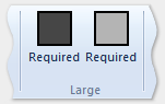
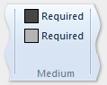
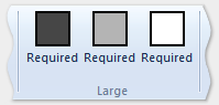
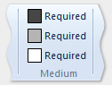
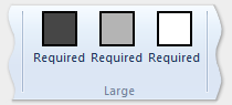
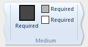
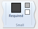
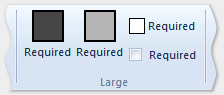
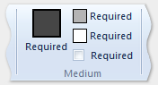
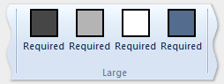
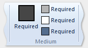
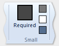
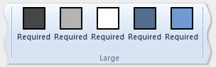
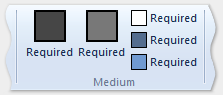
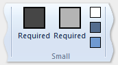
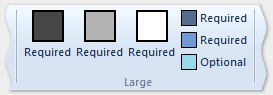
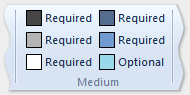
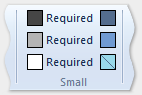
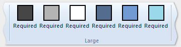
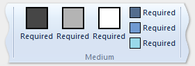
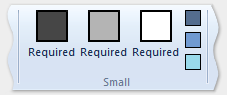
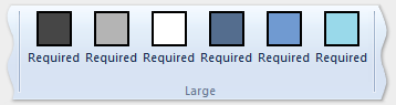
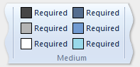
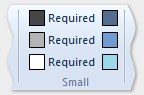
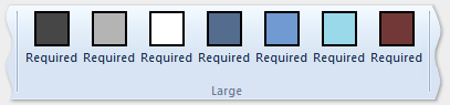
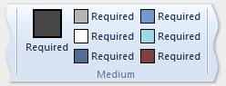
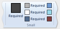
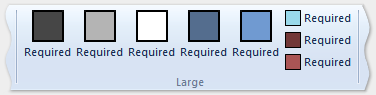
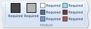
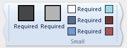
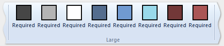
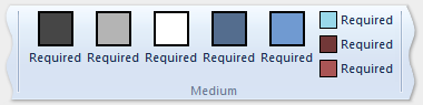
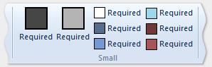
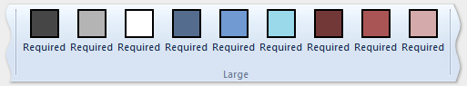
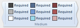
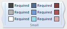
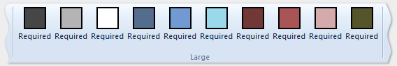
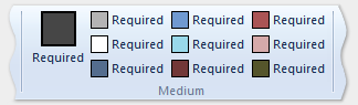
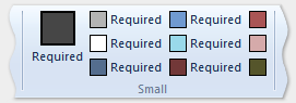
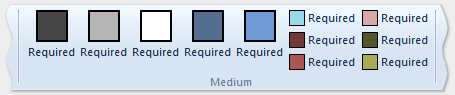
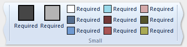
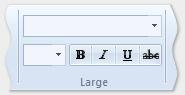
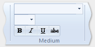
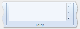
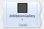
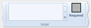
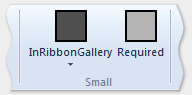
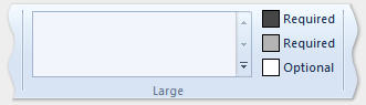
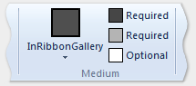
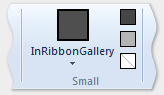
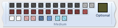
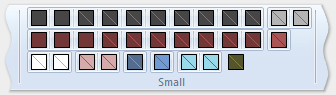
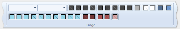
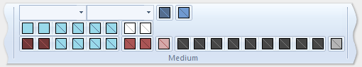
下圖顯示上一個範例中的範本如何套用至功能區 UI,以容納功能區大小的減少。
| 類型 | 映像 |
|---|---|
| 大型 | 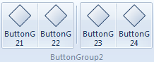 |
| 中 | 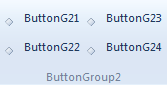 |
| 小型 | 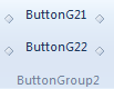 |
| 快顯 | 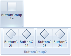 |
相關主題
意見反應
即將登場:在 2024 年,我們將逐步淘汰 GitHub 問題作為內容的意見反應機制,並將它取代為新的意見反應系統。 如需詳細資訊,請參閱:https://aka.ms/ContentUserFeedback。
提交並檢視相關的意見反應