項目容器與範本
ListView 和 GridView 控制項可管理其項目的排列方式 (水平、垂直、換行等),以及使用者與項目之間的互動方式,但不會管理個別項目在畫面上的顯示方式。 項目視覺效果是由項目容器所管理。 將項目新增到清單檢視時,會自動將它們放到容器中。 ListView 的預設項目容器是 ListViewItem; 如果是 GridView,則是 GridViewItem。
重要 API:ListView 類別、GridView 類別、ListViewItem 類別、GridViewItem 類別、ItemTemplate 屬性、ItemContainerStyle 屬性
注意
ListView 和 GridView 都是衍生自 ListViewBase 類別,因此它們具有相同功能,但會以不同方式顯示資料。 在本文中,當我們討論清單檢視時,除非另外指定,否則該資訊同時適用於 ListView 和 GridView 控制項。 我們可能會參考像是 ListView 或 ListViewItem 等類別,但對於對應的方格對等項目 (GridView 或 GridViewItem),可使用 Grid 來取代 List 首碼。
ListView 項目和 GridView 項目
如先前所述,ListView 項目會自動放到 ListViewItem 容器中,而 GridView 項目會放到 GridViewItem 容器中。 這些項目容器具有自己內建樣式和互動的控制項,但也可以高度自訂。 不過,在自訂之前,請務必先孰悉對 ListViewItem 和 GridViewItem 的建議樣式和指導方針:
- ListViewItems - 項目主要是以文字為主,並且圖形細長。 圖示或影像可能會出現在文字的左側。
- GridViewItems - 項目通常圖形是方形,或至少是較細長的矩形。 項目是以影像為主,而且可能會在影像周圍出現或重疊顯示文字。
自訂簡介
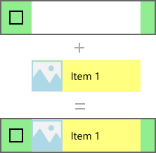
容器控制項 (例如 ListViewItem 和 GridViewItem) 是由兩個重要部分所組成,可結合來建立項目最終顯示的視覺效果:資料範本和控制項範本。
- 資料範本 - 您會將 DataTemplate \(英文\) 指派到清單檢視的 ItemTemplate \(英文\) 屬性,以指定個別資料項目的顯示方式。
- 控制項範本 - 控制項範本提供項目視覺效果的部分,此部分是由架構所負責 (例如視覺狀態)。 您可以使用 ItemContainerStyle 屬性來修改控制項範本。 一般而言,這樣做可修改清單檢視色彩以符合您的品牌,或變更所選取項目的顯示方式。
下圖顯示控制項範本和資料範本如何結合來建立項目最終的視覺效果。
以下是建立這個項目的 XAML。 我們稍後將說明範本。
<ListView Width="220" SelectionMode="Multiple">
    <ListView.ItemTemplate>
        <DataTemplate x:DataType="x:String">
            <Grid Background="Yellow">
                <Grid.ColumnDefinitions>
                    <ColumnDefinition Width="54"/>
                    <ColumnDefinition/>
                </Grid.ColumnDefinitions>
                <Image Source="Assets/placeholder.png" Width="44" Height="44"
                       HorizontalAlignment="Left"/>
                <TextBlock Text="{x:Bind}" Foreground="Black"
                           FontSize="14" Grid.Column="1"
                           VerticalAlignment="Center"
                           Padding="0,0,54,0"/>
            </Grid>
        </DataTemplate>
    </ListView.ItemTemplate>
    <ListView.ItemContainerStyle>
        <Style TargetType="ListViewItem">
            <Setter Property="Background" Value="LightGreen"/>
        </Style>
    </ListView.ItemContainerStyle>
    <x:String>Item 1</x:String>
    <x:String>Item 2</x:String>
    <x:String>Item 3</x:String>
    <x:String>Item 4</x:String>
    <x:String>Item 5</x:String>
</ListView>
重要
資料範本和控制項範本是用來為 ListView 和 GridView 以外的許多控制項自訂樣式。 其中包括具有自己內建樣式的控制項,例如 FlipView,以及自訂建立的控制項,例如 ItemsRepeater。 雖然以下範例是 ListView/GridView 所特有的,但這些概念可以套用到其他許多控制項上。
必要條件
- 我們假設您知道如何使用清單檢視控制項。 如需詳細資訊,請參閱 ListView 與 GridView 一文。
- 我們也假設您了解如何控制樣式與範本,包括如何使用樣式內嵌或作為資源。 如需詳細資訊,請參閱設定控制項的樣式和控制項範本。
資料
在更深入查看如何於清單檢視中顯示資料項目之前,我們需要了解所顯示的資料。 在這個範例中,我們會建立名為 NamedColor 的資料類型。 它結合了色彩名稱、色彩值及色彩的 SolidColorBrush,它會公開為 3 個屬性︰Name、Color 及 Brush。
我們接著會針對 Colors \(英文\) 類別中的每個具名色彩,填入具有 NamedColor 物件的 List。 此清單會設為清單檢視的 ItemsSource。
以下程式碼可定義類別並填入 NamedColors 清單。
C#
using System.Collections.Generic;
using System.Linq;
using System.Reflection;
using Windows.UI;
using Windows.UI.Xaml.Controls;
using Windows.UI.Xaml.Media;

namespace ColorsListApp
{
    public sealed partial class MainPage : Page
    {
        // The list of colors won't change after it's populated, so we use List<T>.
        // If the data can change, we should use an ObservableCollection<T> intead.
        List<NamedColor> NamedColors = new List<NamedColor>();

        public MainPage()
        {
            this.InitializeComponent();

            // Use reflection to get all the properties of the Colors class.
            IEnumerable<PropertyInfo> propertyInfos = typeof(Colors).GetRuntimeProperties();

            // For each property, create a NamedColor with the property name (color name),
            // and property value (color value). Add it the NamedColors list.
            for (int i = 0; i < propertyInfos.Count(); i++)
            {
                NamedColors.Add(new NamedColor(propertyInfos.ElementAt(i).Name,
                                    (Color)propertyInfos.ElementAt(i).GetValue(null)));
            }

            colorsListView.ItemsSource = NamedColors;
        }
    }

    class NamedColor
    {
        public NamedColor(string colorName, Color colorValue)
        {
            Name = colorName;
            Color = colorValue;
        }

        public string Name { get; set; }

        public Color Color { get; set; }

        public SolidColorBrush Brush
        {
            get { return new SolidColorBrush(Color); }
        }
    }
}
DataTemplate \(英文\)
您會指定資料範本,以告知清單檢視應如何顯示您的資料項目。
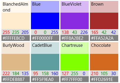
根據預設,資料項目會在清單檢視中,以字串形式顯示所繫結的資料物件。 如果您在資料清單中顯示 'NamedColors' 資料,而未告知清單檢視它應呈現的外觀,則它就只會顯示 ToString 方法傳回的任何內容,如下所示。
XAML
<ListView x:Name="colorsListView"/>
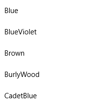
您可以將 DisplayMemberPath 設定為該屬性,以顯示資料項目之特定屬性的字串表示法。 您要在這裡將 DisplayMemberPath 設為 NamedColor 項目的 Name 屬性。
XAML
<ListView x:Name="colorsListView" DisplayMemberPath="Name" />
清單檢視現在會依名稱顯示項目,如下所示。 這更實用,但並不是很有趣,而且還是隱藏了許多資訊。
您通常會想要以更多樣化的表示方式顯示資料。 為了明確指定項目在清單檢視中的顯示方式,您需要建立一個 DataTemplate。 在 DataTemplate 中的 XAML 會定義用來顯示個別項目之控制項的配置和外觀。 配置中的控制項可以繫結至資料物件的屬性,或以內嵌方式定義靜態內容。 將 DataTemplate 指派給清單控制項的 ItemTemplate 屬性。
重要
您無法同時使用 ItemTemplate 和 DisplayMemberPath。 如果同時設定這兩個屬性,就會發生例外狀況。
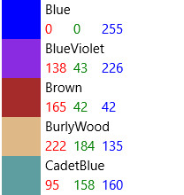
您要在這裡定義 DataTemplate,在項目色彩中顯示 Rectangle,以及色彩名稱和 RGB 值。
注意
當您在 DataTemplate 中使用 x:Bind markup extension 時,必須在 DataTemplate 上指定 DataType (x:DataType)。
XAML
<ListView x:Name="colorsListView">
    <ListView.ItemTemplate>
        <DataTemplate x:DataType="local:NamedColor">
            <Grid>
                <Grid.ColumnDefinitions>
                    <ColumnDefinition MinWidth="54"/>
                    <ColumnDefinition Width="32"/>
                    <ColumnDefinition Width="32"/>
                    <ColumnDefinition Width="32"/>
                    <ColumnDefinition/>
                </Grid.ColumnDefinitions>
                <Grid.RowDefinitions>
                    <RowDefinition/>
                    <RowDefinition/>
                </Grid.RowDefinitions>
                <Rectangle Width="44" Height="44" Fill="{x:Bind Brush}" Grid.RowSpan="2"/>
                <TextBlock Text="{x:Bind Name}" Grid.Column="1" Grid.ColumnSpan="4"/>
                <TextBlock Text="{x:Bind Color.R}" Grid.Column="1" Grid.Row="1" Foreground="Red"/>
                <TextBlock Text="{x:Bind Color.G}" Grid.Column="2" Grid.Row="1" Foreground="Green"/>
                <TextBlock Text="{x:Bind Color.B}" Grid.Column="3" Grid.Row="1" Foreground="Blue"/>
            </Grid>
        </DataTemplate>
    </ListView.ItemTemplate>
</ListView>
以下是使用此資料範本顯示資料項目時的樣子。
重要
ListViewItems 依預設會將其內容靠左對齊,亦即其 HorizontalContentAlignmentProperty 設定為 Left。 如果 ListViewItem 中有多個水平相鄰的元素,例如水平堆疊元素或放在相同格線列中的元素,則這些元素將會保持靠左對齊,並且僅以其定義的邊界分隔。
為了讓元素散佈以填滿 ListItem 全部的主體,您必須使用 ListView 內的 Setter,將 HorizontalContentAlignmentProperty 設定為 Stretch:
<ListView.ItemContainerStyle>
    <Style TargetType="ListViewItem">
        <Setter Property="HorizontalContentAlignment" Value="Stretch"/>
    </Style>
</ListView.ItemContainerStyle>
您可能想要在 GridView 中顯示資料。 以下提供另一個範本,其會以更適合方格配置的方式來顯示資料。 這次,要將資料範本定義為資源,而不是針對 GridView 使用 XAML 進行內嵌。
XAML
<Page.Resources>
    <DataTemplate x:Key="namedColorItemGridTemplate" x:DataType="local:NamedColor">
        <Grid>
            <Grid.ColumnDefinitions>
                <ColumnDefinition Width="32"/>
                <ColumnDefinition Width="32"/>
                <ColumnDefinition Width="32"/>
            </Grid.ColumnDefinitions>
            <Grid.RowDefinitions>
                <RowDefinition Height="96"/>
                <RowDefinition/>
                <RowDefinition/>
            </Grid.RowDefinitions>

            <Rectangle Width="96" Height="96" Fill="{x:Bind Brush}" Grid.ColumnSpan="3" />
            <!-- Name -->
            <Border Background="#AAFFFFFF" Grid.ColumnSpan="3" Height="40" VerticalAlignment="Top">
                <TextBlock Text="{x:Bind Name}" TextWrapping="Wrap" Margin="4,0,0,0"/>
            </Border>
            <!-- RGB -->
            <Border Background="Gainsboro" Grid.Row="1" Grid.ColumnSpan="3"/>
            <TextBlock Text="{x:Bind Color.R}" Foreground="Red"
                   Grid.Column="0" Grid.Row="1" HorizontalAlignment="Center"/>
            <TextBlock Text="{x:Bind Color.G}" Foreground="Green"
                   Grid.Column="1" Grid.Row="1" HorizontalAlignment="Center"/>
            <TextBlock Text="{x:Bind Color.B}" Foreground="Blue"
                   Grid.Column="2" Grid.Row="1" HorizontalAlignment="Center"/>
            <!-- HEX -->
            <Border Background="Gray" Grid.Row="2" Grid.ColumnSpan="3">
                <TextBlock Text="{x:Bind Color}" Foreground="White" Margin="4,0,0,0"/>
            </Border>
        </Grid>
    </DataTemplate>
</Page.Resources>

...

<GridView x:Name="colorsGridView"
          ItemTemplate="{StaticResource namedColorItemGridTemplate}"/>
使用此資料範本在方格內顯示資料時,它看起來如下。
效能考量
資料範本是您定義清單檢視外觀的主要方式。 如果您的清單會顯示大量項目,它們也會對效能產生顯著的影響。
資料範本中每個 XAML 元素的執行個體是針對清單檢視中的每個項目所建立。 例如,上一個範例中的方格範本具有 10 個 XAML 元素 (1 個 Grid、1 個 Rectangle、3 個 Border、5 個 TextBlock)。 使用此資料範本在畫面上顯示 20 個項目的 GridView 至少會建立 200 個元素 (20*10=200)。 減少資料範本中的元素數目,可大幅降低為清單檢視建立的元素總數。 有關詳細資訊,請參閱 ListView 和 GridView UI 最佳化:減少各個項目的元素計數。
請考慮方格資料範本的這個區段。 讓我們看看一些可減少元素計數的資訊。
XAML
<!-- RGB -->
<Border Background="Gainsboro" Grid.Row="1" Grid.ColumnSpan="3"/>
<TextBlock Text="{x:Bind Color.R}" Foreground="Red"
           Grid.Column="0" Grid.Row="1" HorizontalAlignment="Center"/>
<TextBlock Text="{x:Bind Color.G}" Foreground="Green"
           Grid.Column="1" Grid.Row="1" HorizontalAlignment="Center"/>
<TextBlock Text="{x:Bind Color.B}" Foreground="Blue"
           Grid.Column="2" Grid.Row="1" HorizontalAlignment="Center"/>
- 首先,配置會使用單一 Grid。 您可以有單欄 Grid,並在 StackPanel 中放置這 3 個 TextBlock,但在要多次建立的資料範本中,您應尋找方法來避免在其他配置面板中內嵌配置面板。
- 其次,您可以使用 Border 控制項來轉譯背景,而不實際將項目放置於 Border 元素內。 Border 元素可以只有一個子元素,因此,您需要新增額外的配置面板,在 XAML 的 Border 元素內裝載這 3 個 TextBlock 元素。 您可以藉由不產生任何 Border 的 TextBlock 子元素,來消除使用面板保存 TextBlock 的需求。
- 最後,可將 TextBlock 放置於 StackPanel 內部,並在 StackPanel 上設定框線屬性,而不是明確地使用 Border 元素。 不過,比起 StackPanel,Border 元素是更輕量型控制項,因此在進行多次轉譯時,它對效能產生的影響較小。
針對不同的項目使用不同的版面配置
控制項範本
項目的控制項範本包含顯示狀態的視覺效果,例如選取、指標暫留及焦點。 這些視覺效果都是在資料範本的上方或下方進行轉譯。 以下顯示一些 ListView 控制項範本所繪製的預設視覺效果。
- 暫留 – 在資料範本下方繪製淺灰色矩形。
- 選取 – 在資料範本下方繪製淺藍色矩形。
- 鍵盤焦點 – 在專案範本的頂端繪製高可見度焦點視覺效果。
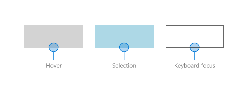
清單檢視結合了來自資料範本和控制項範本的項目,以建立最終要在螢幕上呈現的視覺效果。 以下是在清單檢視的內容中顯示狀態視覺效果。
ListViewItemPresenter
如我們先前有關資料範本的敘述,針對每個項目所建立的 XAML 元素數目會對清單檢視的效能產生顯著的影響。 由於會結合資料範本和控制項範本來顯示每個項目,因此,顯示項目所需的實際元素數目會包含這兩個範本中的元素。
ListView 和 GridView 控制項已最佳化,可減少針對每個項目所建立的 XAML 元素數目。 ListViewItem 視覺效果是由 ListViewItemPresenter \(英文\) 所建立,其為特殊的 XAML 元素,能針對焦點、選取項目和其他視覺效果狀態顯示複雜的視覺效果,而不會有許多 UIElement 所帶來的額外負荷。
注意
在適用於 Windows 的 UWP 應用程式中,ListViewItem 和 GridViewItem 都會使用ListViewItemPresenter; GridViewItemPresenter 已過時,因此您不應該使用它。 ListViewItem 和 GridViewItem 會在 ListViewItemPresenter 上設定不同的屬性值,以實現不同的預設外觀。
若要修改項目容器的外觀,請使用 ItemContainerStyle \(英文\) 屬性,並提供 Style \(英文\) 且將其 TargetType \(英文\) 設為 ListViewItem 或 GridViewItem。
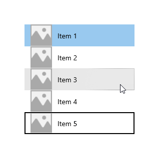
在這個範例中,您要在ListViewItem 中加入邊框間距,在清單的項目之間建立一些空間。
<ListView x:Name="colorsListView">
    <ListView.ItemTemplate>
        <!-- DataTemplate XAML shown in previous ListView example -->
    </ListView.ItemTemplate>

    <ListView.ItemContainerStyle>
        <Style TargetType="ListViewItem">
            <Setter Property="Padding" Value="0,4"/>
        </Style>
    </ListView.ItemContainerStyle>
</ListView>
清單檢視現在看起來如下,在項目之間已有空間。
在 ListViewItem 預設樣式中,ListViewItemPresenter ContentMargin 屬性具有針對 ListViewItem Padding 屬性的 TemplateBinding \(英文\) (<ListViewItemPresenter ContentMargin="{TemplateBinding Padding}"/>)。 當我們設定 Padding 屬性,真的會將該值傳遞到 ListViewItemPresenter ContentMargin 屬性。
若要修改其他的 ListViewItemPresenter 屬性不是繫結至 ListViewItems 屬性的範本,您需要使用新的 ListViewItemPresenter (您可以修改其上的屬性) 重新建立 ListViewItem 的範本。
注意
ListViewItem 和 GridViewItem 預設樣式會在 ListViewItemPresenter 上設定許多屬性。 您應一律從使用預設樣式的複本開始,並且只修改您也需要的屬性。 否則,由於某些屬性未正確地設定,因此視覺效果可能不會以您預期的方式顯示。
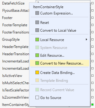
在 Visual Studio 中建立預設範本的複本
- 開啟文件大綱窗格 (檢視>其他視窗>文件大綱)。
- 選取要修改的清單或方格元素。 在這個範例中,您可以修改
colorsGridView元素。 - 以滑鼠右鍵按一下,然後選取編輯其他範本>編輯產生的項目容器 (ItemContainerStyle)>編輯複本。
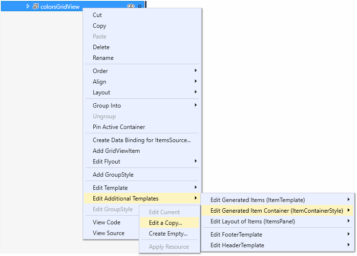
- 在 [建立樣式資源] 對話方塊中,輸入樣式的名稱。 在此範例中,您使用
colorsGridViewItemStyle。![Visual Studio [建立樣式資源] 對話方塊](images/listview-style-resource-vs.png)
將預設樣式的複本新增到您的 app 以做為資源,並將 GridView.ItemContainerStyle 屬性設為該資源,如這個 XAML 中所示。
<Style x:Key="colorsGridViewItemStyle" TargetType="GridViewItem">
    <Setter Property="FontFamily" Value="{ThemeResource ContentControlThemeFontFamily}"/>
    <Setter Property="FontSize" Value="{ThemeResource ControlContentThemeFontSize}" />
    <Setter Property="Background" Value="Transparent"/>
    <Setter Property="Foreground" Value="{ThemeResource SystemControlForegroundBaseHighBrush}"/>
    <Setter Property="TabNavigation" Value="Local"/>
    <Setter Property="IsHoldingEnabled" Value="True"/>
    <Setter Property="HorizontalContentAlignment" Value="Center"/>
    <Setter Property="VerticalContentAlignment" Value="Center"/>
    <Setter Property="Margin" Value="0,0,4,4"/>
    <Setter Property="MinWidth" Value="{ThemeResource GridViewItemMinWidth}"/>
    <Setter Property="MinHeight" Value="{ThemeResource GridViewItemMinHeight}"/>
    <Setter Property="Template">
        <Setter.Value>
            <ControlTemplate TargetType="GridViewItem">
                <ListViewItemPresenter
                    CheckBrush="{ThemeResource SystemControlForegroundBaseMediumHighBrush}"
                    ContentMargin="{TemplateBinding Padding}"
                    CheckMode="Overlay"
                    ContentTransitions="{TemplateBinding ContentTransitions}"
                    CheckBoxBrush="{ThemeResource SystemControlBackgroundChromeMediumBrush}"
                    DragForeground="{ThemeResource ListViewItemDragForegroundThemeBrush}"
                    DragOpacity="{ThemeResource ListViewItemDragThemeOpacity}"
                    DragBackground="{ThemeResource ListViewItemDragBackgroundThemeBrush}"
                    DisabledOpacity="{ThemeResource ListViewItemDisabledThemeOpacity}"
                    FocusBorderBrush="{ThemeResource SystemControlForegroundAltHighBrush}"
                    FocusSecondaryBorderBrush="{ThemeResource SystemControlForegroundBaseHighBrush}"
                    HorizontalContentAlignment="{TemplateBinding HorizontalContentAlignment}"
                    PointerOverForeground="{ThemeResource SystemControlForegroundBaseHighBrush}"
                    PressedBackground="{ThemeResource SystemControlHighlightListMediumBrush}"
                    PlaceholderBackground="{ThemeResource ListViewItemPlaceholderBackgroundThemeBrush}"
                    PointerOverBackground="{ThemeResource SystemControlHighlightListLowBrush}"
                    ReorderHintOffset="{ThemeResource GridViewItemReorderHintThemeOffset}"
                    SelectedPressedBackground="{ThemeResource SystemControlHighlightListAccentHighBrush}"
                    SelectionCheckMarkVisualEnabled="True"
                    SelectedForeground="{ThemeResource SystemControlForegroundBaseHighBrush}"
                    SelectedPointerOverBackground="{ThemeResource SystemControlHighlightListAccentMediumBrush}"
                    SelectedBackground="{ThemeResource SystemControlHighlightAccentBrush}"
                    VerticalContentAlignment="{TemplateBinding VerticalContentAlignment}"/>
            </ControlTemplate>
        </Setter.Value>
    </Setter>
</Style>

...

<GridView x:Name="colorsGridView" ItemContainerStyle="{StaticResource colorsGridViewItemStyle}"/>
您現在可以修改 ListViewItemPresenter 上的屬性,來控制選取核取方塊、項目位置及筆刷色彩,以供視覺狀態使用。
內嵌和重疊選取視覺效果
ListView 和 GridView 會根據控制項和 SelectionMode,以不同方式指出所選取的項目。 如需清單檢視選取的詳細資訊,請參閱 ListView 與 GridView。
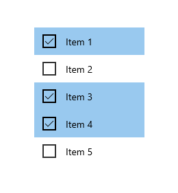
當 SelectionMode 設為 Multiple,選取核取方塊就會顯示為項目控制項範本的一部分。 您可以使用 SelectionCheckMarkVisualEnabled 屬性,來關閉 Multiple 選取模式中的選取核取方塊。 不過,這個屬性在其他選取模式中會被忽略,因此您無法在 Extended 或 Single 選取模式中開啟此核取方塊。
您可以設定 CheckMode 屬性,以指定是否要使用內嵌樣式或重疊樣式來顯示核取方塊。
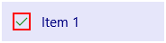
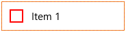
- 內嵌:此樣式會在內容左邊顯示核取方塊,並將色彩加入項目容器的背景來表示選取。 這是 ListView 的預設樣式。
- 重疊:此樣式會在內容上方顯示核取方塊,並只會將色彩加入項目容器的框線來表示選取。 這是 GridView 的預設樣式。
下表顯示用來表示選取的預設視覺效果。
| SelectionMode: | 單一/延伸 | 多個 |
|---|---|---|
| 內嵌 | 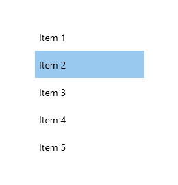 |
 |
| Overlay | 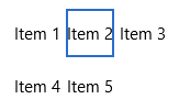 |
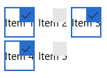 |
注意
在這個範例與後續範例中,會顯示沒有資料範本的簡單字串資料項目,以強調控制項範本所提供的視覺效果。
同時也會提供數個筆刷屬性來變更核取方塊的色彩。 我們接下來將看看這些屬性以及其他筆刷屬性。
筆刷
有許多屬性可指定在不同視覺狀態中使用的筆刷。 您可能想要修改這些屬性以符合您的品牌色彩。
下表顯示 ListViewItem 的通用和選取視覺狀態,以及用來轉譯每個狀態之視覺效果的筆刷。 其中的影像顯示筆刷在內嵌和重疊選取視覺樣式中的效果。
注意
在此表格中,修改過的筆刷色彩值是硬式編碼的命名色彩,而且會選取色彩以使其在套用它們的範本中更明顯。 這些不是視覺狀態的預設色彩。 如果您在應用程式中修改預設色彩,就應該使用筆刷資源來修改色彩值,就像在預設範本中所做的一樣。
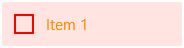
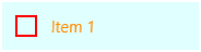
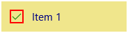
| 狀態/筆刷名稱 | 內嵌樣式 | 重疊樣式 |
|---|---|---|
Normal
|
 |
 |
PointerOver
|
 |
 |
Pressed
|
 |
 |
Selected
|
 |
 |
PointerOverSelected
|
 |
 |
PressedSelected
|
 |
 |
Focused
|
 |
 |
ListViewItemPresenter 有其他筆刷屬性適用於資料預留位置和拖曳狀態。 如果您會在清單檢視中使用增量載入或拖放,則應考慮是否也需要修改這些額外的筆刷屬性。 如需您可修改的屬性完整清單,請參閱 ListViewItemPresenter 類別。
延伸的 XAML 項目範本
如果您需要做的修改比 ListViewItemPresenter 屬性允許的還多 (例如,如果您需要變更核取方塊的位置),您可以使用 ListViewItemExpanded 或 GridViewItemExpanded 範本。 這些範本都包含於 generic.xaml 的預設樣式中。 這些範本會遵循標準 XAML 模式,從個別的 UIElement 建置所有的視覺效果。
如先前所提及,項目範本中的 UIElement 數目會對清單檢視的效能產生顯著影響。 使用延伸的 XAML 範本取代 ListViewItemPresenter 可大幅增加元素計數,當您的清單檢視將顯示大量項目,或者需要顧慮到效能時,則不建議此做法。
注意
只有當清單檢視的 ItemsPanel 是 ItemsWrapGrid 或 ItemsStackPanel 時,才會支援 ListViewItemPresenter。 如果您變更 ItemsPanel 來使用 VariableSizedWrapGrid、WrapGrid 或 StackPanel,則項目範本會自動切換到延伸的 XAML 範本。 如需詳細資訊,請參閱 ListView 與 GridView UI 最佳化。
若要自訂延伸的 XAML 範本,您需要在應用程式中建立它的複本,並將 ItemContainerStyle 屬性設為您的複本。
複製延伸的範本
針對 ListView 或 GridView 設定 ItemContainerStyle 屬性,如下所示。
<ListView ItemContainerStyle="{StaticResource ListViewItemExpanded}"/>
<GridView ItemContainerStyle="{StaticResource GridViewItemExpanded}"/>
在 Visual Studio 的 [屬性] 窗格中,展開 [其他] 區段並尋找 ItemContainerStyle 屬性。 (請確定已選取 ListView 或 GridView)。
按一下 ItemContainerStyle 屬性的屬性標記。 (它是 TextBox 旁邊的小方塊。如果顏色為綠色表示它已設定為 StaticResource。) 屬性功能表隨即開啟。
在屬性功能表中,按一下 [轉換成新資源]。
在 [建立樣式資源] 對話方塊中,輸入樣式的名稱,然後按一下 [確定]。
系統已在您的應用程式中建立 generic.xaml 的延伸範本複本,您可以視需要進行修改。
相關文章
- 清單
- ListView 和 GridView \(英文\)
