TextBlock 類別
定義
重要
部分資訊涉及發行前產品,在發行之前可能會有大幅修改。 Microsoft 對此處提供的資訊,不做任何明確或隱含的瑕疵擔保。
提供輕量化控制,以顯示少量文字。
public ref class TextBlock sealed : FrameworkElement/// [Microsoft.UI.Xaml.Markup.ContentProperty(Name="Inlines")]
/// [Windows.Foundation.Metadata.Activatable(65536, "Microsoft.UI.Xaml.WinUIContract")]
/// [Windows.Foundation.Metadata.ContractVersion(Microsoft.UI.Xaml.WinUIContract, 65536)]
/// [Windows.Foundation.Metadata.MarshalingBehavior(Windows.Foundation.Metadata.MarshalingType.Agile)]
/// [Windows.Foundation.Metadata.Threading(Windows.Foundation.Metadata.ThreadingModel.Both)]
class TextBlock final : FrameworkElement[Microsoft.UI.Xaml.Markup.ContentProperty(Name="Inlines")]
[Windows.Foundation.Metadata.Activatable(65536, "Microsoft.UI.Xaml.WinUIContract")]
[Windows.Foundation.Metadata.ContractVersion(typeof(Microsoft.UI.Xaml.WinUIContract), 65536)]
[Windows.Foundation.Metadata.MarshalingBehavior(Windows.Foundation.Metadata.MarshalingType.Agile)]
[Windows.Foundation.Metadata.Threading(Windows.Foundation.Metadata.ThreadingModel.Both)]
public sealed class TextBlock : FrameworkElementPublic NotInheritable Class TextBlock
Inherits FrameworkElement<TextBlock ...>text</TextBlock>
-or-
<TextBlock>
oneOrMoreInlineElements
</TextBlock>
-or-
<TextBlock .../>
- 繼承
- 屬性
範例
Tip
更多資訊、設計指導與程式碼範例,請參閱 文字區塊。
WinUI 3 Gallery 應用程式包含大部分 WinUI 3 控制項、特性和功能的互動式範例。 從 Microsoft Store 取得應用程式,或在 GitHub 上取得原始程式碼
此範例展示了啟用文字選擇與文字換行的 TextBlock。
這很重要
若使用鍵盤在 TextBlock 內選取文字,使用者必須先啟動 Caret 瀏覽 (應用程式置於前景,按下 F7)。
轉譯的文字如下所示:
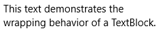
<TextBlock Text="This text demonstrates the wrapping behavior of a TextBlock." Width="240"
           IsTextSelectionEnabled="True" TextWrapping="Wrap"/>
TextBlock textBlock = new TextBlock();
textBlock.Text = "This text demonstrates the wrapping behavior of a TextBlock.";
textBlock.Width = 240;
textBlock.IsTextSelectionEnabled = true;
textBlock.TextWrapping = TextWrapping.Wrap;

// Add TextBlock to the visual tree.
rootPanel.Children.Add(textBlock);
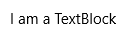
此範例展示了如何用單一 文字行來 自訂 TextBlock 的外觀。 FontWeight、FontFamily、FontStyle、Foreground color 和 SelectionHighlightColor 屬性皆可自訂。
轉譯的文字如下所示:

<TextBlock Text="This text demonstrates some TextBlock properties."
           IsTextSelectionEnabled="True"
           SelectionHighlightColor="Green"
           Foreground="Blue"
           FontWeight="Light"
           FontFamily="Arial"
           FontStyle="Italic"/>
TextBlock textBlock = new TextBlock();
textBlock.Text = "This text demonstrates some TextBlock properties.";
textBlock.IsTextSelectionEnabled = true;
textBlock.SelectionHighlightColor = new SolidColorBrush(Windows.UI.Colors.Green);
textBlock.Foreground = new SolidColorBrush(Windows.UI.Colors.Blue);
textBlock.FontWeight = Windows.UI.Text.FontWeights.Light;
textBlock.FontFamily = new FontFamily("Arial");
textBlock.FontStyle = Windows.UI.Text.FontStyle.Italic;

// Add TextBlock to the visual tree.
rootPanel.Children.Add(textBlock);
此範例示範如何在 TextBlock 內自訂不同的內嵌元素。
轉譯的文字如下所示:

<TextBlock IsTextSelectionEnabled="True" SelectionHighlightColor="Green" FontFamily="Arial">
    <Run Foreground="Blue" FontWeight="Light" Text="This text demonstrates "></Run>
    <Span FontWeight="SemiBold">
        <Run FontStyle="Italic">the use of inlines </Run>
        <Run Foreground="Red">with formatting.</Run>
    </Span>
</TextBlock>
TextBlock textBlock = new TextBlock();
textBlock.IsTextSelectionEnabled = true;
textBlock.SelectionHighlightColor = new SolidColorBrush(Windows.UI.Colors.Green);
textBlock.FontFamily = new FontFamily("Arial");

// For Run and Span, add 'using Windows.UI.Xaml.Documents;'
Windows.UI.Xaml.Documents.Run run = new Run();
run.Foreground = new SolidColorBrush(Windows.UI.Colors.Blue);
run.FontWeight = Windows.UI.Text.FontWeights.Light;
run.Text = "This text demonstrates ";

Windows.UI.Xaml.Documents.Span span = new Span();
span.FontWeight = Windows.UI.Text.FontWeights.SemiBold;

Run run1 = new Run();
run1.FontStyle = Windows.UI.Text.FontStyle.Italic;
run1.Text = "the use of inlines ";

Run run2 = new Run();
run2.Foreground = new SolidColorBrush(Windows.UI.Colors.Red);
run2.Text = "with formatting.";

span.Inlines.Add(run1);
span.Inlines.Add(run2);
textBlock.Inlines.Add(run);
textBlock.Inlines.Add(span);

// Add TextBlock to the visual tree.
rootPanel.Children.Add(textBlock);
這個範例展示了如何使用內嵌超連結。 欲了解更多資訊,請參閱 超連結。
<TextBlock><Hyperlink xml:space="preserve" NavigateUri="http://www.bing.com"> Hyperlink to Bing </Hyperlink></TextBlock>
// Create a TextBlock this is needed to put the hyperlink inside
TextBlock textBlock = new TextBlock();

// Create a Hyperlink and a Run.
// The Run is used as the visible content of the hyperlink.
Hyperlink hyperlink = new Hyperlink();
Run run = new Run();

// Set the Text property on the run.
// This is the visible text of the hyperlink.
run.Text = " Hyperlink to Bing ";

// Add the Run to the Hyperlink.
hyperlink.Inlines.Add(run);

// Set the URI for the Hyperlink.
hyperlink.NavigateUri = new Uri("http://www.bing.com");

// Add the Hyperlink to the TextBlock.
textBlock.Inlines.Add(hyperlink);

// Add TextBlock to the visual tree.
rootPanel.Children.Add(textBlock);
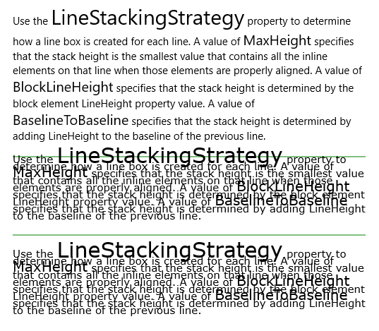
以下範例展示了如何使用 LineStackingStrategy 屬性來判斷 TextBlock 文字行的行框如何建立。 第一個 TextBlock 的 LineStackingStrategy 值為 MaxHeight,第二個 TextBlock 為 BlockLineHeight,第三個 TextBlock 為 BaselineToBaseline。
轉譯的文字如下所示:
<StackPanel>

<!-- This TextBlock has a LineStackingStrategy set to "MaxHeight". -->
<TextBlock FontFamily="Verdana"
           LineStackingStrategy="MaxHeight"
           LineHeight="10"
           Width="500"
           TextWrapping="Wrap" >
    Use the <Run FontSize="30">LineStackingStrategy</Run> property to determine how a line box is
    created for each line. A value of <Run FontSize="20">MaxHeight</Run> specifies that the stack
    height is the smallest value that contains all the inline elements on that line when those
    elements are properly aligned. A value of <Run FontSize="20">BlockLineHeight</Run> specifies
    that the stack height is determined by the block element LineHeight property value. A value of
    <Run FontSize="20">BaselineToBaseline</Run> specifies that the stack height is determined by adding
    LineHeight to the baseline of the previous line.
</TextBlock>

<!-- With a margin pushing down 20 pixels, draw a line just above the second textblock. -->
<!-- The fonts will reach above the LineHeight size and over the line. -->
<StackPanel Margin="0,20,0,0" HorizontalAlignment="Center">
    <Line Stroke="Green"  X2="500" />
</StackPanel>

<!-- Here is the same TextBlock but the LineStackingStrategy is set to "BlockLineHeight". -->
<TextBlock FontFamily="Verdana"
           LineStackingStrategy="BlockLineHeight"
           LineHeight="10"
           Width="500"
           TextWrapping="Wrap">
    Use the <Run FontSize="30">LineStackingStrategy</Run> property to determine how a line box is
    created for each line. A value of <Run FontSize="20">MaxHeight</Run> specifies that the stack
    height is the smallest value that contains all the inline elements on that line when those
    elements are properly aligned. A value of <Run FontSize="20">BlockLineHeight</Run> specifies
    that the stack height is determined by the block element LineHeight property value. A value of
    <Run FontSize="20">BaselineToBaseline</Run> specifies that the stack height is determined by adding
    LineHeight to the baseline of the previous line.
</TextBlock>

<!-- With a margin pushing down 20 pixels, draw a line just above the third textblock. -->
<StackPanel Margin="0,20,0,0" HorizontalAlignment="Center">
    <Line Stroke="Green"  X2="500" />
</StackPanel>

<!-- Here is the same TextBlock but the LineStackingStrategy is set to "BaselineToBaseline". -->
<TextBlock FontFamily="Verdana"
           LineStackingStrategy="BaselineToBaseline"
           LineHeight="10"
           Width="500"
           TextWrapping="Wrap">
    Use the <Run FontSize="30">LineStackingStrategy</Run> property to determine how a line box is
    created for each line. A value of <Run FontSize="20">MaxHeight</Run> specifies that the stack
    height is the smallest value that contains all the inline elements on that line when those
    elements are properly aligned. A value of <Run FontSize="20">BlockLineHeight</Run> specifies
    that the stack height is determined by the block element LineHeight property value. A value of
    <Run FontSize="20">BaselineToBaseline</Run> specifies that the stack height is determined by adding
    LineHeight to the baseline of the previous line.
</TextBlock>

</StackPanel>
備註
Tip
更多資訊、設計指導與程式碼範例,請參閱 文字區塊。
TextBlock 是應用程式中顯示唯讀文字的主要控制項。 您可以使用它來顯示單行或多行文字、內嵌超連結,以及採用粗體、斜體或底線格式的文字。
TextBlock 通常比較容易使用,且比 RichTextBlock 提供更好的文字渲染效能,因此大多數應用程式的 UI 文字都偏好它。 它也提供許多相同的格式設定選項,讓您自訂文字的轉譯方式。 儘管您可以在文字中放置分行符號,但 TextBlock 是針對顯示單一段落而設計,不支援文字縮排。 如果你需要支援多段落、多欄文字或像圖片這類的內嵌 UI 元素,可以考慮使用 RichTextBlock 。
文字效能
從 Windows 10 開始,TextBlock 進行了效能提升,降低了整體記憶體使用量,並大幅減少了用於文字測量與排序的 CPU 時間。 想了解更多關於這些效能改進的資訊,以及如何確保你有使用它們,請參閱 TextBlock 控制指南中的效能考量部分。
內建文字樣式
你可以使用平台內建的 Windows 10 文字樣式,將文字風格與系統中使用的文字對齊。 以下是如何利用內建樣式與 Windows 10 類型漸進式對齊的方法。 更多資訊請參閱 XAML 主題資源。
<TextBlock Text="Header" Style="{StaticResource HeaderTextBlockStyle}"/>
<TextBlock Text="SubHeader" Style="{StaticResource SubheaderTextBlockStyle}"/>
<TextBlock Text="Title" Style="{StaticResource TitleTextBlockStyle}"/>
<TextBlock Text="SubTitle" Style="{StaticResource SubtitleTextBlockStyle}"/>
<TextBlock Text="Base" Style="{StaticResource BaseTextBlockStyle}"/>
<TextBlock Text="Body" Style="{StaticResource BodyTextBlockStyle}"/>
<TextBlock Text="Caption" Style="{StaticResource CaptionTextBlockStyle}"/>
轉譯的文字如下所示:

彩色字體
預設情況下,TextBlock 支援顯示色彩字型。 系統預設的彩色字型是 Segoe UI Emoji,TextBlock 會退回到這個字型來顯示彩色字形。 如需詳細資訊,請參閱 IsColorFontEnabled 屬性。
<TextBlock FontSize="30">Hello ☺⛄☂♨⛅</TextBlock>
轉譯的文字如下所示:

建構函式
| 名稱 | Description |
|---|---|
| TextBlock() |
初始化 TextBlock 類別的新實例。 |
屬性
| 名稱 | Description |
|---|---|
| AccessKey |
取得或設定此元素的存取鍵(助記鍵)。 (繼承來源 UIElement) |
| AccessKeyScopeOwner |
取得或設定一個來源元素,提供該元素的存取鍵作用域,即使該元素不在原始元素的視覺樹中。 (繼承來源 UIElement) |
| ActualHeight |
會取得 FrameworkElement 的渲染高度。 請參閱備註。 (繼承來源 FrameworkElement) |
| ActualOffset |
取得此 UIElement 相對於其父節點的位置,該位置是在佈局流程的排列過程中計算出來的。 (繼承來源 UIElement) |
| ActualSize |
取得該 UIElement 在佈局流程安排過程中計算出的大小。 (繼承來源 UIElement) |
| ActualTheme |
取得該元素目前使用的 UI 主題,這可能和 RequestedTheme 不同。 (繼承來源 FrameworkElement) |
| ActualWidth |
它會取得 FrameworkElement 的渲染寬度。 請參閱備註。 (繼承來源 FrameworkElement) |
| AllowDrop |
取得或設定一個值,判斷該 UIElement 是否能作為拖放操作的丟棄目標。 (繼承來源 UIElement) |
| AllowFocusOnInteraction |
會獲得或設定一個值,指示該元素在使用者互動時是否自動獲得焦點。 (繼承來源 FrameworkElement) |
| AllowFocusWhenDisabled |
取得或設定失效控制是否能接收焦點。 (繼承來源 FrameworkElement) |
| BaselineOffset |
回傳一個值,使每行文字與基準線相差。 |
| BaseUri |
取得一個統一資源識別碼(URI),代表 XAML 載入時所建構物件的基礎 URI。 此特性對執行時的 URI 解析非常有用。 (繼承來源 FrameworkElement) |
| CacheMode |
取得或設定一個值,表示渲染內容應盡可能以合成點陣圖形式快取。 (繼承來源 UIElement) |
| CanBeScrollAnchor |
取得或設定一個值,指示 UIElement 是否適合作為捲動錨定的候選對象。 (繼承來源 UIElement) |
| CanDrag |
取得或設定一個值,指示該元素是否能以拖放操作的方式被拖曳為資料。 (繼承來源 UIElement) |
| CenterPoint |
取得或設定元素的中心點,即旋轉或縮放發生的中心點。 會影響元素的渲染位置。 (繼承來源 UIElement) |
| CharacterSpacing |
取得或設定字元間的均勻間距,單位為 1/1000 的 em。 |
| CharacterSpacingProperty |
識別 CharacterSpacing 依賴屬性。 |
| Clip |
取得或設定用於定義 UIElement 內容輪廓的矩形幾何。 (繼承來源 UIElement) |
| CompositeMode |
取得或設定一個屬性,宣告該元素在其父版面配置與視窗中的替代合成與混合模式。 這對於涉及混合 XAML / Microsoft DirectX UI 的元素非常重要。 (繼承來源 UIElement) |
| ContentEnd |
會取得一個 TextPointer 物件,用於 TextBlock 中文字內容的結尾。 |
| ContentStart |
會取得一個 TextPointer 物件,作為 TextBlock 中文字內容的開頭。 |
| ContextFlyout |
取得或設定與此元素相關的飛出。 (繼承來源 UIElement) |
| DataContext |
取得或設定 FrameworkElement 的資料上下文。 資料上下文的常見用途是 a |
| DesiredSize |
取得該 UIElement 在佈局過程的測度通過時計算出的大小。 (繼承來源 UIElement) |
| Dispatcher |
它總是在 Windows App SDK 應用程式中回傳 |
| DispatcherQueue |
得到 |
| ExitDisplayModeOnAccessKeyInvoked |
取得或設定一個值,指定在呼叫存取鍵時是否會關閉存取鍵顯示。 (繼承來源 UIElement) |
| FlowDirection |
它設定文字及其他 UI 元素在任何控制其版面配置的父元素內流動的方向。 此屬性可設定為或 |
| FocusState |
會得到一個值,指定此控制是否具備對焦功能,以及取得對焦的方式。 (繼承來源 UIElement) |
| FocusVisualMargin |
取得或設定 FrameworkElement 焦點視覺化的外圍。 (繼承來源 FrameworkElement) |
| FocusVisualPrimaryBrush |
取得或設定用來繪製框架元素外邊界 |
| FocusVisualPrimaryThickness |
取得或設定框架元素外層邊界 |
| FocusVisualSecondaryBrush |
取得或設定用來繪製框架元素內邊界 |
| FocusVisualSecondaryThickness |
取得或設定框架元素內邊界 |
| FontFamily |
取得或設定此元素中文字內容的首選頂層字型家族。 |
| FontFamilyProperty |
識別 FontFamily 依賴屬性。 |
| FontSize |
取得或設定此元素文字內容的字體大小。 |
| FontSizeProperty |
識別 FontSize 依賴屬性。 |
| FontStretch |
用來取得或設定此元素中文字內容的字體拉伸。 |
| FontStretchProperty |
識別 FontStretch 依賴性屬性。 |
| FontStyle |
取得或設定此元素內容的字體樣式。 |
| FontStyleProperty |
識別 FontStyle 依賴屬性。 |
| FontWeight |
取得或設定 TextBlock 的頂層字體權重。 |
| FontWeightProperty |
識別 FontWeight 依賴屬性。 |
| Foreground | |
| ForegroundProperty |
識別 前景依賴性質 。 |
| Height |
取得或設定 FrameworkElement 的建議高度。 (繼承來源 FrameworkElement) |
| HighContrastAdjustment |
取得或設定一個值,指示框架在啟用高對比主題時是否自動調整元素的視覺屬性。 (繼承來源 UIElement) |
| HorizontalAlignment |
取得或設定在 FrameworkElement 組合於版面父元件(如面板或項目控制項)時套用的水平對齊特性。 (繼承來源 FrameworkElement) |
| HorizontalTextAlignment |
取得或設定一個值,指示文字在 TextBlock 中如何對齊。 |
| HorizontalTextAlignmentProperty |
識別 HorizontalTextAlignment 依賴屬性。 |
| Inlines |
取得 TextBlock 內的內嵌文字元素集合。 |
| IsAccessKeyScope |
取得或設定一個值,指示元素是否定義其存取鍵作用域。 (繼承來源 UIElement) |
| IsColorFontEnabled |
取得或設定一個值,決定包含顏色層的字型字形(如 Segoe UI 表情符號)是否以彩色呈現。 |
| IsColorFontEnabledProperty |
識別 IsColorFontEnabled 相依屬性。 |
| IsDoubleTapEnabled |
取得或設定一個值,決定 DoubleTapped 事件是否能從該元素產生。 (繼承來源 UIElement) |
| IsHitTestVisible |
取得或設定此 UIElement 所包含區域是否能回傳真實值以進行命中測試。 (繼承來源 UIElement) |
| IsHoldingEnabled |
取得或設定一個值,決定 持有事件是否 能從該元素產生。 (繼承來源 UIElement) |
| IsLoaded |
會得到一個值,表示該元素是否已被加入元素樹並準備好進行互動。 (繼承來源 FrameworkElement) |
| IsRightTapEnabled |
取得或設定一個值,決定 RightTapped 事件是否能從該元素產生。 (繼承來源 UIElement) |
| IsTabStop |
取得或設定一個值,指示分頁導覽中是否包含某個控制項。 (繼承來源 UIElement) |
| IsTapEnabled |
取得或設定一個值,決定 Tapped 事件是否能從該元素產生。 (繼承來源 UIElement) |
| IsTextScaleFactorEnabled |
取得或設定是否啟用自動文字放大(反映系統文字大小設定)。 |
| IsTextScaleFactorEnabledProperty |
識別 IsTextScaleFactorEnabled 相依性屬性。 |
| IsTextSelectionEnabled |
透過使用者操作或呼叫與選取相關的 API,取得或設定一個值,指示 TextBlock 是否啟用文字選取。 |
| IsTextSelectionEnabledProperty |
識別 IsTextSelectionEnabled 相依屬性。 |
| IsTextTrimmed |
會得到一個值,表示控制項是否有被裁剪過的文字,導致內容區域溢出。 |
| IsTextTrimmedProperty |
識別 IsTextTrimed 相依屬性。 |
| KeyboardAcceleratorPlacementMode |
取得或設定一個值,指示控制 工具提示是否顯示 其對應鍵盤加速器的按鍵組合。 (繼承來源 UIElement) |
| KeyboardAcceleratorPlacementTarget |
取得或設定一個值,指示顯示加速器按鍵組合的控制 工具提示 。 (繼承來源 UIElement) |
| KeyboardAccelerators |
取得一組按鍵組合,用鍵盤觸發動作。 加速器通常分配給按鈕或選單項目。
|
| KeyTipHorizontalOffset |
取得或設定一個值,表示鍵尖相對於 UIElement 的位置有多左或多右。 (繼承來源 UIElement) |
| KeyTipPlacementMode |
取得或設定一個值,指示存取鍵提示相對於 UIElement 邊界的位置。 (繼承來源 UIElement) |
| KeyTipTarget |
取得或設定一個值,指示存取鍵提示所鎖定的元素。 (繼承來源 UIElement) |
| KeyTipVerticalOffset |
它會取得或設定一個值,表示鍵尖相對於 UI 元素的上下位置。 (繼承來源 UIElement) |
| Language |
取得或設定適用於 FrameworkElement 的本地化/全球化語言資訊,同時也適用於物件表示法和 UI 中目前 FrameworkElement 的所有子元素。 (繼承來源 FrameworkElement) |
| Lights |
會讓 XamlLight 物件集合附加到這個元素上。 (繼承來源 UIElement) |
| LineHeight |
取得或設定每行內容的高度。 |
| LineHeightProperty |
識別 LineHeight 依賴屬性。 |
| LineStackingStrategy |
取得或設定一個值,指示 TextBlock 中每行文字如何決定行框。 |
| LineStackingStrategyProperty |
識別 LineStackingStrategy 依賴屬性。 |
| ManipulationMode |
取得或設定用於 UIElement 行為及手勢互動的 ManipulationModes 值。 設定此值後,能在應用程式程式碼中處理該元素的操作事件。 (繼承來源 UIElement) |
| Margin |
取得或設定 FrameworkElement 的外緣。 (繼承來源 FrameworkElement) |
| MaxHeight |
取得或設定 FrameworkElement 的最大高度限制。 (繼承來源 FrameworkElement) |
| MaxLines |
取得或設定 TextBlock 中顯示的最大文字行數。 |
| MaxLinesProperty |
識別 MaxLines 相依屬性。 |
| MaxWidth |
取得或設定 FrameworkElement 的最大寬度限制。 (繼承來源 FrameworkElement) |
| MinHeight |
取得或設定 FrameworkElement 的最小高度限制。 (繼承來源 FrameworkElement) |
| MinWidth |
取得或設定 FrameworkElement 的最小寬度限制。 (繼承來源 FrameworkElement) |
| Name |
取得或設定物件的識別名稱。 當 XAML 處理器從 XAML 標記建立物件樹時,執行時程式碼可以以此名稱來指稱 XAML 宣告的物件。 (繼承來源 FrameworkElement) |
| Opacity |
取得或設定物件不透明度的度數。 (繼承來源 UIElement) |
| OpacityTransition |
取得或設定 ScalarTransition,用來動畫化 Opacity 屬性的變更。 (繼承來源 UIElement) |
| OpticalMarginAlignment |
取得或設定一個值,指示字型如何修改以符合不同大小的字型。 |
| OpticalMarginAlignmentProperty |
識別 OpticalMarginAlignment 依賴性屬性。 |
| Padding |
會取得或設定一個值,表示內容區邊界與 TextBlock 顯示內容之間填充空間的厚度。 |
| PaddingProperty |
識別 Padding 依賴性質。 |
| Parent |
取得物件樹中 FrameworkElement 的父物件。 (繼承來源 FrameworkElement) |
| PointerCaptures |
取得所有捕獲指標的集合,以 指標 值表示。 (繼承來源 UIElement) |
| Projection |
在渲染這個元素時,會取得或設定投影(3D 效果)來套用。 (繼承來源 UIElement) |
| ProtectedCursor |
取得或設定游標,當指標位於此元素上時會顯示。 預設為 null,表示游標沒有變化。 (繼承來源 UIElement) |
| RasterizationScale |
會獲得一個代表額外比例因子的值,用於渲染形狀、影像、文字或媒體,通常是為了渲染比一般解析度更高的解析度。 (繼承來源 UIElement) |
| RenderSize |
會取得 UIElement 的最終渲染大小。 不建議使用此,詳見備註。 (繼承來源 UIElement) |
| RenderTransform |
取得或設定影響 UIElement 渲染位置的轉換資訊。 (繼承來源 UIElement) |
| RenderTransformOrigin |
取得或設定 RenderTransform 宣告的任何可能渲染轉換的起點,相對於 UIElement 的界限。 (繼承來源 UIElement) |
| RequestedTheme |
取得或設定 UI 主題,該主題由 UIElement (及其子元素)用於資源判定。 你指定的 |
| Resources |
取得本地定義的資源字典。 在 XAML 中,你可以透過 XAML 隱含的集合語法,將資源項目建立為屬性元素的 |
| Rotation |
設定順時針旋轉的角度,以度數為單位。 相對於旋轉軸和中心點旋轉。 會影響元素的渲染位置。 (繼承來源 UIElement) |
| RotationAxis |
讓軸線旋轉元素。 (繼承來源 UIElement) |
| RotationTransition |
取得或設定 ScalarTransition,讓 Rotation 屬性的變化動畫化。 (繼承來源 UIElement) |
| Scale |
取得或設定元素的比例。 相對於元素的中心點進行縮放。 會影響元素的渲染位置。 (繼承來源 UIElement) |
| ScaleTransition |
取得或設定 Vector3Transition,用來動畫化 Scale 屬性的變更。 (繼承來源 UIElement) |
| SelectedText |
會獲得選取的文字範圍。 |
| SelectedTextProperty |
識別 SelectText 依賴屬性。 |
| SelectionEnd |
取得 TextBlock 中所選文字的結尾位置。 |
| SelectionFlyout |
會取得或設定當用觸控或筆選取文字時顯示的飛出視窗,若沒有顯示飛出則為 空 。 |
| SelectionFlyoutProperty |
識別 SelectionFlyout 依賴屬性。 |
| SelectionHighlightColor |
取得或設定用來高亮選取文字的筆刷。 |
| SelectionHighlightColorProperty |
識別 SelectionHighlightColor 相依屬性。 |
| SelectionStart |
取得 TextBlock 中所選文字的起始位置。 |
| Shadow |
取得或設定 元素所轉換的陰影效果。 (繼承來源 UIElement) |
| Style |
在版面設計和渲染過程中,會取得或設定一個實例樣 式 ,應用於該物件。 (繼承來源 FrameworkElement) |
| TabFocusNavigation |
取得或設定一個值,改變 tab 鍵和 TabIndex 對此控制項的運作方式。 (繼承來源 UIElement) |
| TabIndex |
取得或設定一個值,決定使用者使用 Tab 鍵在控制項中移動時,元素獲得焦點的順序。 (繼承來源 UIElement) |
| Tag |
取得或設定一個任意物件值,可用來儲存該物件的自訂資訊。 (繼承來源 FrameworkElement) |
| Text |
取得或設定 TextBlock 的文字內容。 |
| TextAlignment |
取得或設定一個值,表示文字內容的水平對齊。 |
| TextAlignmentProperty |
識別 TextAlignment 依賴屬性。 |
| TextDecorations |
取得或設定一個值,指示文字上所施加的裝飾。 |
| TextDecorationsProperty |
識別 TextDecorations 依賴屬性。 |
| TextHighlighters |
取得文字重點集。 |
| TextLineBounds |
取得或設定一個值,指示 TextBlock 中每行文字行框高度的決定方式。 |
| TextLineBoundsProperty |
識別 TextLineBounds 依賴屬性。 |
| TextProperty |
識別 文本 依賴屬性。 |
| TextReadingOrder |
取得或設定一個值,指示文本 區塊的閱讀順序如何決定。 |
| TextReadingOrderProperty |
識別 TextReadingOrder 相依屬性。 |
| TextTrimming |
當內容溢出時,會執行或設定文字修剪行為。 |
| TextTrimmingProperty |
識別 文本修剪 依賴性質。 |
| TextWrapping |
它能設定 或設定 TextBlock 如何包裝文字。 |
| TextWrappingProperty |
識別 TextWrapping 依賴屬性。 |
| Transform3D |
在渲染這個元素時,會取得或設定 3D 轉換效果套用。 (繼承來源 UIElement) |
| TransformMatrix |
取得或設定轉換矩陣以套用到元素。 (繼承來源 UIElement) |
| Transitions |
取得或設定適用於 UIElement 的 Transition 風格元素集合。 (繼承來源 UIElement) |
| Translation |
取得或設定元素的 x、y 和 z 渲染位置。 (繼承來源 UIElement) |
| TranslationTransition |
取得或設定 Vector3Transition,用來動畫化 Translation 屬性的變更。 (繼承來源 UIElement) |
| Triggers |
取得為 FrameworkElement 定義的動畫觸發器集合。 不常用。 請參閱備註。 (繼承來源 FrameworkElement) |
| UseLayoutRounding |
取得或設定一個值,決定物件及其視覺子樹的渲染是否應該使用捨入行為,使渲染對齊到整像素。 (繼承來源 UIElement) |
| UseSystemFocusVisuals |
取得或設定一個值,指示控制使用系統繪製的焦點視覺化,還是控制模板中定義的焦點視覺化。 (繼承來源 UIElement) |
| VerticalAlignment |
取得或設定當 FrameworkElement 被組合在父物件(如面板或項目控制項)時,套用到的垂直對齊特性。 (繼承來源 FrameworkElement) |
| Visibility |
取得或設定 UIElement 的可見性。 不可見的 A |
| Width |
取得或設定 FrameworkElement 的寬度。 (繼承來源 FrameworkElement) |
| XamlRoot |
取得或設定 |
| XYFocusDown |
當使用者按下遊戲控制器的方向鍵(方向鍵)時,會取得或設定該物件被聚焦的目標。 (繼承來源 UIElement) |
| XYFocusDownNavigationStrategy |
取得或設定一個值,指定用以決定下行導覽目標元素的策略。 (繼承來源 UIElement) |
| XYFocusKeyboardNavigation |
取得或設定一個值,使鍵盤方向鍵導覽啟用或停用。 (繼承來源 UIElement) |
| XYFocusLeft |
當使用者按下遊戲控制器方向鍵(D-pad)左鍵時,會取得或設定該物件被聚焦。 (繼承來源 UIElement) |
| XYFocusLeftNavigationStrategy |
取得或設定一個值,指定用來決定左邊導航目標元素的策略。 (繼承來源 UIElement) |
| XYFocusRight |
當使用者按下遊戲控制器方向鍵(方向鍵)時,該物件會被聚焦。 (繼承來源 UIElement) |
| XYFocusRightNavigationStrategy |
取得或設定一個值,指定用以決定右向導航目標元素的策略。 (繼承來源 UIElement) |
| XYFocusUp |
當使用者按下遊戲控制器的方向鍵(D-pad)時,會取得或設定該物件會被聚焦。 (繼承來源 UIElement) |
| XYFocusUpNavigationStrategy |
取得或設定一個值,指定用以決定上行導航目標元素的策略。 (繼承來源 UIElement) |
方法
事件
| 名稱 | Description |
|---|---|
| AccessKeyDisplayDismissed |
當存取鑰匙不再顯示時會發生。 (繼承來源 UIElement) |
| AccessKeyDisplayRequested |
當使用者請求顯示存取金鑰時,會發生這種情況。 (繼承來源 UIElement) |
| AccessKeyInvoked |
當使用者完成一組存取金鑰序列時,會發生這種情況。 (繼承來源 UIElement) |
| ActualThemeChanged |
當 ActualTheme 房產價值變動時,會發生這種情況。 (繼承來源 FrameworkElement) |
| BringIntoViewRequested |
當 StartBringIntoView 被呼叫於此元素或其後代時,會發生此情況。 (繼承來源 UIElement) |
| CharacterReceived |
當輸入佇列接收到單一已組合好字元時,會發生這種情況。 (繼承來源 UIElement) |
| ContextCanceled |
當上下文輸入手勢繼續進入操作手勢時,會發生,以通知元素不應該開啟上下文飛出。 (繼承來源 UIElement) |
| ContextMenuOpening |
當系統處理顯示右鍵選單的互動時,會發生這種情況。 |
| ContextRequested |
當使用者完成上下文輸入手勢(例如右鍵點擊)時會發生。 (繼承來源 UIElement) |
| DataContextChanged |
當 FrameworkElement.DataContext 屬性的值改變時,會發生這種情況。 (繼承來源 FrameworkElement) |
| DoubleTapped |
當未處理的 DoubleTap 互動發生在本元件的命中測試區域時,會發生這種情況。 (繼承來源 UIElement) |
| DragEnter |
當輸入系統回報以該元素為目標的底層拖曳事件時,會發生這種情況。 (繼承來源 UIElement) |
| DragLeave |
當輸入系統回報以此元素為原點的底層拖曳事件時,會發生這種情況。 (繼承來源 UIElement) |
| DragOver |
當輸入系統回報一個底層拖曳事件,該元素為潛在的投放目標時發生。 (繼承來源 UIElement) |
| DragStarting |
當啟動拖曳操作時會發生。 (繼承來源 UIElement) |
| Drop |
當輸入系統回報一個底層丟棄事件,並將此元素作為丟棄目標時發生。 (繼承來源 UIElement) |
| DropCompleted |
當以此元素為來源的拖放操作結束時,會發生此現象。 (繼承來源 UIElement) |
| EffectiveViewportChanged |
當 FrameworkElement的有效視口 改變時,會發生這種情況。 (繼承來源 FrameworkElement) |
| GettingFocus |
發生在 UIElement 獲得焦點之前。 這個事件會同步提高,以確保活動在進行時焦點不會被轉移。 (繼承來源 UIElement) |
| GotFocus |
當 UIElement 獲得焦點時會發生。 此事件會非同步啟動,因此焦點能在沸騰完成前再次移動。 (繼承來源 UIElement) |
| Holding |
當本元素的命中測試區域發生原本未處理的 Hold 互動時,會發生這種情況。 (繼承來源 UIElement) |
| IsTextTrimmedChanged |
當 IsTextTrimmed 屬性值改變時,會發生這種情況。 |
| KeyDown |
當 UIElement 正在對焦時按下鍵盤鍵時,會發生這種情況。 (繼承來源 UIElement) |
| KeyUp |
當 UIElement 正在對焦時放開鍵盤鍵時會發生。 (繼承來源 UIElement) |
| LayoutUpdated |
當視覺樹的配置改變時,會發生在與佈局相關的屬性改變值或其他會刷新佈局的動作時。 (繼承來源 FrameworkElement) |
| Loaded |
當 FrameworkElement 已被建構並加入物件樹,並準備進行互動時,會發生這種情況。 (繼承來源 FrameworkElement) |
| Loading |
當 FrameworkElement 開始載入時會發生。 (繼承來源 FrameworkElement) |
| LosingFocus |
發生在 UIElement 失去焦點之前。 這個事件會同步提高,以確保活動在進行時焦點不會被轉移。 (繼承來源 UIElement) |
| LostFocus |
當 UIElement 失去焦點時會發生。 此事件會非同步啟動,因此焦點能在沸騰完成前再次移動。 (繼承來源 UIElement) |
| ManipulationCompleted |
當對 UIElement 進行操作完成時,會發生。 (繼承來源 UIElement) |
| ManipulationDelta |
當輸入裝置在操作期間變更位置時發生。 (繼承來源 UIElement) |
| ManipulationInertiaStarting |
當輸入裝置在操作過程中失去與 UIElement 物件的接觸,導致慣性開始時,會發生這種情況。 (繼承來源 UIElement) |
| ManipulationStarted |
當輸入裝置開始對 UIElement 進行操作時,會發生這種情況。 (繼承來源 UIElement) |
| ManipulationStarting |
第一次建立操作處理器時發生。 (繼承來源 UIElement) |
| NoFocusCandidateFound |
當使用者嘗試移動焦點(透過 Tab 鍵或方向箭頭)但焦點無法移動,因為該方向找不到焦點候選時,會發生這種情況。 (繼承來源 UIElement) |
| PointerCanceled |
當一個曾經接觸到的指標異常失去接觸時,就會發生這種情況。 (繼承來源 UIElement) |
| PointerCaptureLost |
當該元素先前持有的指標捕獲移至其他元素或其他位置時,會發生此現象。 (繼承來源 UIElement) |
| PointerEntered |
當指標進入該元素的命中測試區域時發生。 (繼承來源 UIElement) |
| PointerExited |
當指標離開該元素的命中測試區域時,會發生。 (繼承來源 UIElement) |
| PointerMoved |
當指標移動時,指標仍停留在該元素的命中測試區域內。 (繼承來源 UIElement) |
| PointerPressed |
當指標裝置在此元素內啟動 按鍵 動作時,會發生這種情況。 (繼承來源 UIElement) |
| PointerReleased |
當先前發起 新聞 行動的指標裝置在此元素內被釋放時,會發生這種情況。 請注意, 新聞行動 結束時不保證觸發 |
| PointerWheelChanged |
當指標輪的 delta 值改變時,會發生這種情況。 (繼承來源 UIElement) |
| PreviewKeyDown |
當 UIElement 正在對焦時按下鍵盤鍵時,會發生這種情況。 (繼承來源 UIElement) |
| PreviewKeyUp |
當 UIElement 正在對焦時放開鍵盤鍵時會發生。 (繼承來源 UIElement) |
| ProcessKeyboardAccelerators |
當按下 鍵盤快捷鍵(或加速器) 時會發生。 (繼承來源 UIElement) |
| RightTapped |
當指標正好在元素上方時,右鍵輸入刺激發生。 (繼承來源 UIElement) |
| SelectionChanged |
當文字選擇改變時會發生。 |
| SizeChanged |
當 ActualHeight 或 ActualWidth 屬性在 FrameworkElement 上的值改變時,會發生這種情況。 (繼承來源 FrameworkElement) |
| Tapped |
當未處理的 Tap 互動發生在該元件的命中測試區域時。 (繼承來源 UIElement) |
| Unloaded |
當該物件不再連接到主物件樹時,會發生這種情況。 (繼承來源 FrameworkElement) |