ItemsControl.ItemContainerStyle 屬性
定義
重要
部分資訊涉及發行前產品,在發行之前可能會有大幅修改。 Microsoft 對此處提供的資訊,不做任何明確或隱含的瑕疵擔保。
取得或設定呈現 ItemsControl 之專案容器時所使用的樣式。
public:
 property Style ^ ItemContainerStyle { Style ^ get(); void set(Style ^ value); };
Style ItemContainerStyle();
void ItemContainerStyle(Style value);public Style ItemContainerStyle { get; set; }var style = itemsControl.itemContainerStyle;
itemsControl.itemContainerStyle = style;Public Property ItemContainerStyle As Style<ItemsControl>
<ItemsControl.ItemContainerStyle>
inlineStyle
</ItemsControl.ItemContainerStyle>
</ItemsControl>
- or -
<ItemsControl ItemContainerStyle="resourceReferenceToStyle"/>
屬性值
套用至專案容器的樣式。 預設值是 null。
範例
此範例示範如何建立保留物件清單的 String ListView。 使用 ItemContainerStyle 類別時, String 物件會有自己的框線和樣式,而 ListViewItem 物件有自己的樣式和屬性集。 請注意,ListView 中的專案容器類型是 ListViewItem,因此會當做樣式的 TargetType 使用。
 <ListView ItemsSource="{x:Bind tempList}" Height="500">
    <ListView.ItemTemplate>
        <DataTemplate x:DataType="x:String">
            <Border BorderBrush="Crimson" BorderThickness="2" CornerRadius="25" Margin="10">
            <TextBlock Text="{x:Bind}"
                       FontSize="24"
                       FontFamily="Arial"
                       FontWeight="Bold"
                       Foreground="Crimson"
                       Margin="10"
                       Padding="5"/>
            </Border>
        </DataTemplate>
    </ListView.ItemTemplate>

    <ListView.ItemContainerStyle>
        <Style TargetType="ListViewItem">
            <Setter Property="HorizontalAlignment" Value="Right"/>
            <Setter Property="Margin" Value="15"/>
            <Setter Property="BorderBrush" Value="CornflowerBlue"/>
            <Setter Property="BorderThickness" Value="5"/>
        </Style>
    </ListView.ItemContainerStyle>
</ListView>
上述程式代碼會產生下列專案: 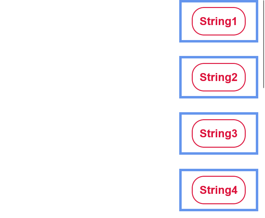
如上述範例所示,數據物件 (字串) 在 DataTemplate 中提供自己的樣式-此樣式包括其圓角的十字框線、其十字型色彩、字型大小,以及外部元素的邊界。
(每個) 所產生的 ListView 每個 ListViewItem 元素都會水準對齊右邊、具有粗藍色框線,以及一個大型邊界,以便與其他元素分開。 雖然 ListViewItems 內的數據對像是置中,但是專案本身可以靠右對齊。 而且,雖然數據物件 (字串) 只有少量的空間與其他元素分開,但每個 ListViewItem 元素都可以以大量空間分隔。
這些自定義是藉由建立 ListViewItem 樣式來執行,如上所示。 樣式專案會 ListViewItem 以類型專案為目標,而且會套用至該類型在定義樣式之範圍內的所有專案,在此案例中,只會 ListView 顯示 。 接著,會使用 Setter 為每個樣式屬性提供一個值,也就是將 HorizontalAlignment 設定為 Right。 這些屬性和值會影響外部 ListViewItem 元素。
此範例示範如何在簡單的 ItemsControl 上使用 ItemContainerStyle 屬性。 請注意,在此情況下,專案容器類型為 ContentPresenter。
<ItemsControl>
    <ItemsControl.ItemContainerStyle>
        <Style TargetType="ContentPresenter">
            <Setter Property="FontSize" Value="42" />
        </Style>
    </ItemsControl.ItemContainerStyle>

    <x:String>Hello</x:String>
    <x:String>World</x:String>
</ItemsControl>
備註
的 ItemsControl 衍生類別包括 Selector 和 MenuFlyoutPresenter。 Selector 的衍生類別包括 ComboBox、 FlipView、 ListBox 和 ListViewBase (ListView 和 GridView 衍生自) 。 因此,ItemContainerStyle類別可以用來編輯、GridViewItem等的 ListViewItemStyle。
針對中的每個 ItemsControl專案,會使用專案容器專案來顯示專案。 根據預設,專案容器是 ContentPresenter。 但 的 ItemsControl 子類別可以覆寫此專案,例如 ListView 中的容器類型是 ListViewItem。 的值 ItemContainerStyle 會設定為容器的 FrameworkElement.Style 屬性。
ItemContainerStyle 然後可用來變更 ItemsControl 所產生的每個元素樣式,並在該區域中提供許多彈性和自定義選項。 雖然 類別內 ItemContainerStyle 有許多樣式選項可用,但在嘗試編輯 包含數據的元素 彼此的顯示方式時最有用-變更其間距、水準對齊方式等等。若要變更 數據物件本身的視覺效果,例如其背景色彩或字型大小,請使用 ItemTemplate。 若要變更 ItemsControl/其項目的整體版面配置或方向,請查看編輯其 ItemsPanel。
適用於
另請參閱
- <xref:Microsoft.UI.Xaml.Controls.ItemsControl.ItemContainerStyleSelector%0a%0aP%3aMicrosoft.UI.Xaml.Controls.ItemsControl.ItemContainerTransitions>
意見反應
即將登場:在 2024 年,我們將逐步淘汰 GitHub 問題作為內容的意見反應機制,並將它取代為新的意見反應系統。 如需詳細資訊,請參閱:https://aka.ms/ContentUserFeedback。
提交並檢視相關的意見反應