Xamarin.Forms 雙螢幕設計模式
 下載範例
下載範例本指南介紹我們針對雙螢幕裝置所建議的設計模式,其中包含程式碼和範例,可協助您建立介面來提供吸引人且實用的使用者體驗。
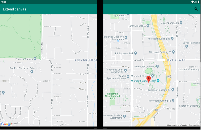
延伸畫布模式
延伸畫布模式會將兩個螢幕視為一個大型畫布,以便顯示地圖、影像、試算表,或其他利用延伸來取用最大空間的類似內容:
<ContentPage xmlns:local="clr-namespace:Xamarin.Duo.Forms.Samples"
             xmlns="http://xamarin.com/schemas/2014/forms"
             xmlns:x="http://schemas.microsoft.com/winfx/2009/xaml"
             xmlns:d="http://xamarin.com/schemas/2014/forms/design"
             xmlns:mc="http://schemas.openxmlformats.org/markup-compatibility/2006"
             mc:Ignorable="d"
             x:Class="Xamarin.Duo.Forms.Samples.ExtendCanvas">
    <Grid>
        <WebView x:Name="webView"
                 HorizontalOptions="FillAndExpand"
                 VerticalOptions="FillAndExpand" />
        <SearchBar x:Name="searchBar"
                   Placeholder="Find a place..."
                   BackgroundColor="DarkGray"
                   Opacity="0.8"
                   HorizontalOptions="FillAndExpand"
                   VerticalOptions="Start" />
    </Grid>
</ContentPage>
在此範例中, Grid 和內部內容會展開,以取用螢幕的所有可用空間,不論是在單一螢幕上顯示,還是跨越兩個螢幕。
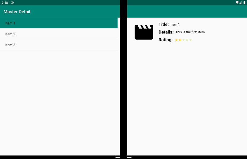
主從式模式
主要檢視與詳細檢視模式是指主要檢視 (通常是顯示在左側的清單) 提供內容,讓使用者從中選取項目,以在右側檢視其詳細資料:
<ContentPage xmlns:local="clr-namespace:Xamarin.Duo.Forms.Samples"
             xmlns="http://xamarin.com/schemas/2014/forms"
             xmlns:x="http://schemas.microsoft.com/winfx/2009/xaml"
             xmlns:dualScreen="clr-namespace:Xamarin.Forms.DualScreen;assembly=Xamarin.Forms.DualScreen"
             x:Class="Xamarin.Duo.Forms.Samples.MasterDetail">
    <dualScreen:TwoPaneView MinWideModeWidth="4000"
                            MinTallModeHeight="4000">
        <dualScreen:TwoPaneView.Pane1>
            <local:Master x:Name="masterPage" />
        </dualScreen:TwoPaneView.Pane1>
        <dualScreen:TwoPaneView.Pane2>
            <local:Details x:Name="detailsPage" />
        </dualScreen:TwoPaneView.Pane2>
    </dualScreen:TwoPaneView>
</ContentPage>
在此範例中,您可以利用 TwoPaneView 在一個窗格上設定清單,然後在另一個窗格上設定詳細檢視。
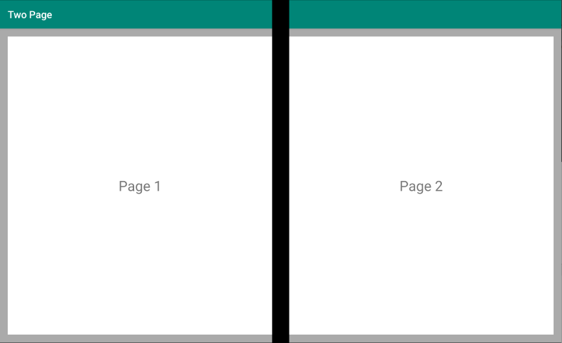
雙頁模式
雙頁模式適用於適合雙頁版面配置的內容,例如文件閱讀程式、筆記或畫板:
<Grid x:Name="layout">
    <CollectionView x:Name="cv"
                    BackgroundColor="LightGray">
        <CollectionView.ItemsLayout>
            <GridItemsLayout SnapPointsAlignment="Start"
                             SnapPointsType="MandatorySingle"
                             Orientation="Horizontal"
                             HorizontalItemSpacing="{Binding Source={x:Reference mainPage}, Path=HingeWidth}" />
        </CollectionView.ItemsLayout>
        <CollectionView.ItemTemplate>
            <DataTemplate>
                <Frame BackgroundColor="LightGray"
                       Padding="0"
                       Margin="0"
                       WidthRequest="{Binding Source={x:Reference mainPage}, Path=ContentWidth}"
                       HeightRequest="{Binding Source={x:Reference mainPage}, Path=ContentHeight}">
                    <Frame Margin="20"
                           BackgroundColor="White">
                        <Label FontSize="Large"
                               Text="{Binding .}"
                               VerticalTextAlignment="Center"
                               HorizontalTextAlignment="Center"
                               HorizontalOptions="Center"
                               VerticalOptions="Center" />
                    </Frame>
                </Frame>
            </DataTemplate>
        </CollectionView.ItemTemplate>
    </CollectionView>
</Grid>
CollectionView 具有分割鉸鏈寬度的格線版面配置,因此適用於提供這種雙螢幕體驗。
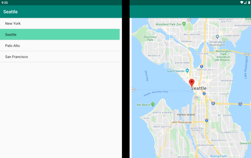
雙檢視模式
雙檢視模式看起來可能就像是「雙頁」檢視,但不同之處在於內容和使用者案例。 在此模式中,您會並排比較內容,可能是為了編輯文件或相片、比較不同的餐廳菜單,或區分程式碼檔案的合併衝突:
<ContentPage xmlns:local="clr-namespace:Xamarin.Duo.Forms.Samples"
             xmlns="http://xamarin.com/schemas/2014/forms"
             xmlns:x="http://schemas.microsoft.com/winfx/2009/xaml"
             xmlns:dualScreen="clr-namespace:Xamarin.Forms.DualScreen;assembly=Xamarin.Forms.DualScreen"
             x:Class="Xamarin.Duo.Forms.Samples.DualViewListPage">
    <dualScreen:TwoPaneView>
        <dualScreen:TwoPaneView.Pane1>
            <CollectionView x:Name="mapList"
                            SelectionMode="Single">
                <CollectionView.ItemTemplate>
                    <DataTemplate>
                        <Grid Padding="10,5,10,5">
                            <Frame Visual="Material"
                                   BorderColor="LightGray">
                                <StackLayout Padding="5">
                                    <Label FontSize="Title"
                                           Text="{Binding Title}" />
                                </StackLayout>
                            </Frame>
                        </Grid>
                    </DataTemplate>
                </CollectionView.ItemTemplate>
            </CollectionView>
        </dualScreen:TwoPaneView.Pane1>
        <dualScreen:TwoPaneView.Pane2>
            <local:DualViewMap x:Name="mapPage" />
        </dualScreen:TwoPaneView.Pane2>
    </dualScreen:TwoPaneView>
</ContentPage>
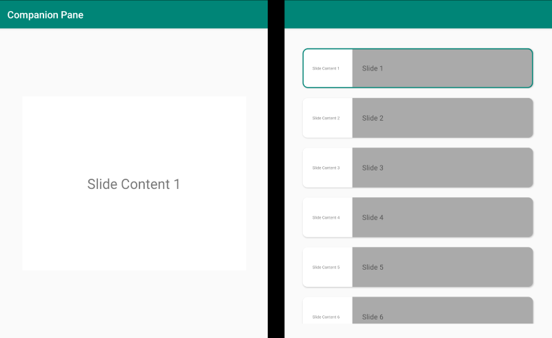
附屬模式
附屬模式示範如何使用第二個螢幕來提供與主要檢視相關的第二層內容,例如繪圖應用程式、遊戲或媒體編輯:
<ContentPage xmlns:local="clr-namespace:Xamarin.Duo.Forms.Samples"
             xmlns="http://xamarin.com/schemas/2014/forms"
             xmlns:x="http://schemas.microsoft.com/winfx/2009/xaml"
             xmlns:dualscreen="clr-namespace:Xamarin.Forms.DualScreen;assembly=Xamarin.Forms.DualScreen"
             x:Name="mainPage"
             x:Class="Xamarin.Duo.Forms.Samples.CompanionPane"
             BackgroundColor="LightGray"
             Visual="Material">
    <dualscreen:TwoPaneView x:Name="twoPaneView"
                            MinWideModeWidth="4000"
                            MinTallModeHeight="4000">
        <dualscreen:TwoPaneView.Pane1>
            <CarouselView x:Name="cv"
                          BackgroundColor="LightGray"
                          IsScrollAnimated="False" >
                <CarouselView.ItemTemplate>
                    <DataTemplate>
                        <Frame BackgroundColor="LightGray"
                               Padding="0"
                               Margin="0"
                               WidthRequest="{Binding Source={x:Reference twoPaneView}, Path=Pane1.Width}"
                               HeightRequest="{Binding Source={x:Reference twoPaneView}, Path=Pane1.Height}">
                            <Frame Margin="20"
                                   BackgroundColor="White">
                                <Label FontSize="Large"
                                       Text="{Binding ., StringFormat='Slide Content {0}'}"
                                       VerticalTextAlignment="Center"
                                       HorizontalTextAlignment="Center"
                                       HorizontalOptions="Center"
                                       VerticalOptions="Center" />
                            </Frame>
                        </Frame>
                    </DataTemplate>
                </CarouselView.ItemTemplate>
            </CarouselView>
        </dualscreen:TwoPaneView.Pane1>
        <dualscreen:TwoPaneView.Pane2>
            <CollectionView x:Name="indicators"
                            SelectionMode="Single"
                            Margin="20, 20, 20, 20"
                            BackgroundColor="LightGray"
                            WidthRequest="{Binding Source={x:Reference twoPaneView}, Path=Pane2.Width}"
                            ItemsSource="{Binding Source={x:Reference cv}, Path=ItemsSource}">
                <CollectionView.Resources>
                    <ResourceDictionary>
                        <Style TargetType="Frame">
                            <Setter Property="VisualStateManager.VisualStateGroups">
                                <VisualStateGroupList>
                                    <VisualStateGroup x:Name="CommonStates">
                                        <VisualState x:Name="Normal">
                                            <VisualState.Setters>
                                                <Setter Property="Padding"
                                                        Value="0" />
                                            </VisualState.Setters>
                                        </VisualState>
                                        <VisualState x:Name="Selected">
                                            <VisualState.Setters>
                                                <Setter Property="BorderColor"
                                                        Value="Green" />
                                                <Setter Property="Padding"
                                                        Value="1" />
                                            </VisualState.Setters>
                                        </VisualState>
                                    </VisualStateGroup>
                                </VisualStateGroupList>
                            </Setter>
                        </Style>
                    </ResourceDictionary>
                </CollectionView.Resources>
                <CollectionView.ItemsLayout>
                    <LinearItemsLayout Orientation="Vertical"
                                       ItemSpacing="10" />
                </CollectionView.ItemsLayout>
                <CollectionView.ItemTemplate>
                    <DataTemplate>
                        <Frame WidthRequest="{Binding Source={x:Reference twoPaneView}, Path=Pane2.Width}"
                               CornerRadius="10"
                               HeightRequest="60"
                               BackgroundColor="White"
                               Margin="0">
                            <StackLayout HorizontalOptions="Fill"
                                         VerticalOptions="Fill"
                                         Orientation="Horizontal">
                                <Label FontSize="Micro"
                                       Padding="20,0,20,0"
                                       VerticalTextAlignment="Center"
                                       WidthRequest="140" Text="{Binding ., StringFormat='Slide Content {0}'}" />
                                <Label FontSize="Small"
                                       Padding="20,0,20,0"
                                       VerticalTextAlignment="Center"
                                       HorizontalOptions="FillAndExpand"
                                       BackgroundColor="DarkGray"
                                       Grid.Column="1"
                                       Text="{Binding ., StringFormat='Slide {0}'}" />
                            </StackLayout>
                        </Frame>
                    </DataTemplate>
                </CollectionView.ItemTemplate>
            </CollectionView>
        </dualscreen:TwoPaneView.Pane2>
    </dualscreen:TwoPaneView>
</ContentPage>