Xamarin.Forms FlyoutPage
 下載範例
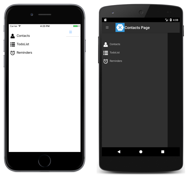
下載範例飛出視窗頁面通常會顯示專案清單,如下列螢幕快照所示:

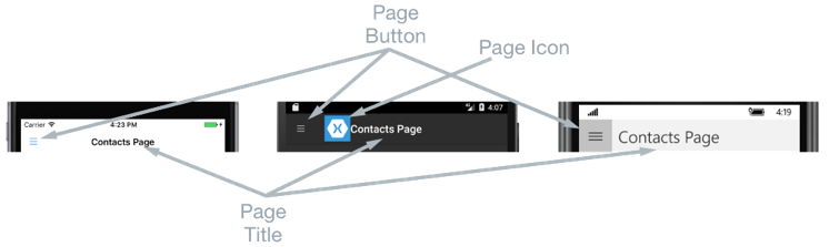
項目清單的位置在每個平台上都相同,且選取其中一個項目會巡覽至對應的詳細資料頁面。 此外,飛出視窗頁面也提供一個導覽列,其中包含可用來流覽至使用中詳細數據頁面的按鈕:
- 在 iOS 上,導覽列會出現在頁面頂端,並有一個按鈕,可巡覽至詳細資料頁面。 此外,活動詳細資料頁面也可以透過向左撥動飛出視窗來流覽至 。
- 在 Android 上,導覽列會出現在頁面頂端,並顯示一個標題、圖示,以及可巡覽至詳細資料頁面的按鈕。 該圖示是在
[Activity]屬性中定義,以裝飾 Android 平台特定專案中的MainActivity類別。 此外,活動詳細數據頁面也可以藉由將飛出視窗頁面向左撥動、點選畫面最右邊的詳細數據頁面,以及點 選畫面底部的 [上一頁 ] 按鈕來流覽。 - 在通用 Windows 平台 (UWP) 上,導覽列出現在頁面頂端,並具有可巡覽至詳細資料頁面的按鈕。
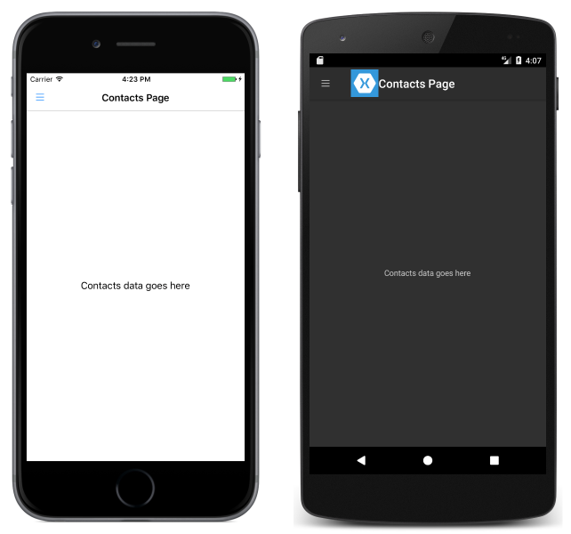
詳細數據頁面會顯示對應至飛出視窗頁面上所選取項目的數據,詳細數據頁面的主要元件會顯示在下列螢幕快照中:
詳細資料頁面包含導覽列,其內容會因平台而不同:
- 在 iOS 上,導覽列會出現在頁面頂端,並顯示標題,而且具有返回飛出視窗頁面的按鈕,前提是詳細數據頁面實例包裝在 實例中
NavigationPage。 此外,飛出視窗頁面可以透過向右撥動詳細數據頁面來傳回。 - 在 Android 上,導覽列會出現在頁面頂端,並顯示標題、圖示,以及返回飛出視窗頁面的按鈕。 該圖示是在
[Activity]屬性中定義,以裝飾 Android 平台特定專案中的MainActivity類別。 - 在UWP上,導覽列會出現在頁面頂端並顯示標題,並具有返回飛出視窗頁面的按鈕。
瀏覽行為
飛出視窗和詳細數據頁面之間的瀏覽體驗行為取決於平臺:
- 在 iOS 上,詳細數據頁面會在飛出視窗頁面 從左側投影片時向右滑動 ,而詳細數據頁面的左側部分仍會顯示。
- 在Android上,詳細數據和飛出視窗頁面會 彼此覆蓋 。
- 在UWP上,只要屬性設定為
Popover,FlyoutLayoutBehavior飛出視窗頁面就會從詳細數據頁面的左側投影片。
橫向模式中會觀察到類似的行為,不同之處在於iOS和Android上的飛出視窗頁面的寬度與直向模式飛出視窗頁面類似,因此會顯示更多詳細數據頁面。
如需控制瀏覽行為的資訊,請參閱 控制詳細數據頁面配置行為。
建立 FlyoutPage
FlyoutPage包含 Flyout 和 Detail 屬性,兩者都是 型Page別 ,分別用來取得和設定飛出視窗和詳細數據頁面。
重要
FlyoutPage 設計為根頁面,使用它作為其他頁面類型的子分頁,可能會導致非預期且不一致的行為。 此外,建議的飛出視窗頁面 FlyoutPage 一律為 ContentPage 實例,而且詳細數據頁面應該只填入 TabbedPage、 NavigationPage和 ContentPage 實例。 這有助於跨所有平台確保一致的使用者體驗。
下列 XAML 程式碼範例顯示 FlyoutPage,它會設定 Flyout 和 Detail 屬性:
<FlyoutPage xmlns="http://xamarin.com/schemas/2014/forms"
            xmlns:x="http://schemas.microsoft.com/winfx/2009/xaml"
            xmlns:local="clr-namespace:FlyoutPageNavigation;assembly=FlyoutPageNavigation"
            x:Class="FlyoutPageNavigation.MainPage">
    <FlyoutPage.Flyout>
        <local:FlyoutMenuPage x:Name="flyoutPage" />
    </FlyoutPage.Flyout>
    <FlyoutPage.Detail>
        <NavigationPage>
            <x:Arguments>
                <local:ContactsPage />
            </x:Arguments>
        </NavigationPage>
    </FlyoutPage.Detail>
</FlyoutPage>
下列程式碼範例示範以 C# 建立的相等 FlyoutPage:
public class MainPageCS : FlyoutPage
{
    FlyoutMenuPageCS flyoutPage;

    public MainPageCS()
    {
        flyoutPage = new FlyoutMenuPageCS();
        Flyout = flyoutPage;
        Detail = new NavigationPage(new ContactsPageCS());
        ...
    }
    ...
}
Flyout 屬性設定為 ContentPage 執行個體。 Detail 屬性設定為包含 ContentPage 的 NavigationPage 執行個體。
建立飛出視窗頁面
下列 XAML 程式碼範例顯示 FlyoutMenuPage 物件的宣告,它是透過 Flyout 屬性參考:
<ContentPage xmlns="http://xamarin.com/schemas/2014/forms"
             xmlns:x="http://schemas.microsoft.com/winfx/2009/xaml"
             xmlns:local="using:FlyoutPageNavigation"
             x:Class="FlyoutPageNavigation.FlyoutMenuPage"
             Padding="0,40,0,0"
             IconImageSource="hamburger.png"
             Title="Personal Organiser">
    <StackLayout>
        <ListView x:Name="listView" x:FieldModifier="public">
            <ListView.ItemsSource>
                <x:Array Type="{x:Type local:FlyoutPageItem}">
                    <local:FlyoutPageItem Title="Contacts" IconSource="contacts.png" TargetType="{x:Type local:ContactsPage}" />
                    <local:FlyoutPageItem Title="TodoList" IconSource="todo.png" TargetType="{x:Type local:TodoListPage}" />
                    <local:FlyoutPageItem Title="Reminders" IconSource="reminders.png" TargetType="{x:Type local:ReminderPage}" />
                </x:Array>
            </ListView.ItemsSource>
            <ListView.ItemTemplate>
                <DataTemplate>
                    <ViewCell>
                        <Grid Padding="5,10">
                            <Grid.ColumnDefinitions>
                                <ColumnDefinition Width="30"/>
                                <ColumnDefinition Width="*" />
                            </Grid.ColumnDefinitions>
                            <Image Source="{Binding IconSource}" />
                            <Label Grid.Column="1" Text="{Binding Title}" />
                        </Grid>
                    </ViewCell>
                </DataTemplate>
            </ListView.ItemTemplate>
        </ListView>
    </StackLayout>
</ContentPage>
頁面是由 ListView 在 XAML 中填入資料的 ,方法是將其 ItemsSource 屬性設定為 物件的陣列 FlyoutPageItem 。 每個 FlyoutPageItem 會定義 Title、IconSource 和 TargetType 屬性。
DataTemplate 會指派給 ListView.ItemTemplate 屬性,以顯示每個 FlyoutPageItem。 DataTemplate 包含 ViewCell,其包含 Image 和 Label。 針對每個 FlyoutPageItem,Image 會顯示 IconSource 屬性值,而 Label 顯示 Title 屬性值。
頁面設定了 Title 和 IconImageSource 屬性。 圖示會出現在詳細資料頁面上,前提是詳細資料頁面有標題列。 這必須藉由將詳細資料頁面執行個體包裝在 NavigationPage 執行個體中來於 iOS 上啟用。
下列程式碼範例示範以 C# 建立的相等頁面:
public class FlyoutMenuPageCS : ContentPage
{
    ListView listView;
    public ListView ListView { get { return listView; } }

    public FlyoutMenuPageCS()
    {
        var flyoutPageItems = new List<FlyoutPageItem>();
        flyoutPageItems.Add(new FlyoutPageItem
        {
            Title = "Contacts",
            IconSource = "contacts.png",
            TargetType = typeof(ContactsPageCS)
        });
        flyoutPageItems.Add(new FlyoutPageItem
        {
            Title = "TodoList",
            IconSource = "todo.png",
            TargetType = typeof(TodoListPageCS)
        });
        flyoutPageItems.Add(new FlyoutPageItem
        {
            Title = "Reminders",
            IconSource = "reminders.png",
            TargetType = typeof(ReminderPageCS)
        });

        listView = new ListView
        {
            ItemsSource = flyoutPageItems,
            ItemTemplate = new DataTemplate(() =>
            {
                var grid = new Grid { Padding = new Thickness(5, 10) };
                grid.ColumnDefinitions.Add(new ColumnDefinition { Width = new GridLength(30) });
                grid.ColumnDefinitions.Add(new ColumnDefinition { Width = GridLength.Star });

                var image = new Image();
                image.SetBinding(Image.SourceProperty, "IconSource");
                var label = new Label { VerticalOptions = LayoutOptions.FillAndExpand };
                label.SetBinding(Label.TextProperty, "Title");

                grid.Children.Add(image);
                grid.Children.Add(label, 1, 0);

                return new ViewCell { View = grid };
            }),
            SeparatorVisibility = SeparatorVisibility.None
        };

        IconImageSource = "hamburger.png";
        Title = "Personal Organiser";
        Padding = new Thickness(0, 40, 0, 0);
        Content = new StackLayout
        {
            Children = { listView }
        };
    }
}
下列螢幕快照顯示每個平臺上的飛出視窗頁面:
建立並顯示詳細數據頁面
FlyoutMenuPage 執行個體包含一個 ListView 屬性,它會公開其 ListView 執行個體,以便 MainPageFlyoutPage 執行個體可以註冊事件處理常式,來處理 ItemSelected 事件。 這讓 MainPage 執行個體能將 Detail 屬性設定為代表所選 ListView 項目的頁面。 下列程式碼範例示範事件處理常式:
public partial class MainPage : FlyoutPage
{
    public MainPage()
    {
        ...
        flyoutPage.listView.ItemSelected += OnItemSelected;
    }

    void OnItemSelected(object sender, SelectedItemChangedEventArgs e)
    {
        var item = e.SelectedItem as FlyoutPageItem;
        if (item != null)
        {
            Detail = new NavigationPage((Page)Activator.CreateInstance(item.TargetType));
            flyoutPage.listView.SelectedItem = null;
            IsPresented = false;
        }
    }
}
OnItemSelected 方法會執行下列動作:
- 它會從
ListView執行個體擷取SelectedItem,且在它不是null的前提下,將詳細資料頁面設定為FlyoutPageItem的TargetType屬性中,所儲存頁面類型的新執行個體。 頁面類型包裝在NavigationPage執行個體中,以確保透過FlyoutMenuPage上IconImageSource屬性參考的圖示,會顯示在 iOS 中的詳細資料頁面上。 ListView中的選取項目,設定為null以確保下次呈現FlyoutMenuPage時不會選取任何ListView項目。- 詳細資料頁面會呈現給使用者,方法是將
FlyoutPage.IsPresented屬性設定為false。 此屬性會控制是否顯示飛出視窗或詳細數據頁面。 它應該設定為true以顯示飛出視窗頁面,以及顯示false詳細數據頁面。
下列螢幕快照顯示 ContactPage 詳細數據頁面,其顯示在飛出視窗頁面上選取之後:
控制詳細數據頁面版面配置行為
管理 FlyoutPage 飛出視窗和詳細數據頁面的方式取決於應用程式是在手機或平板電腦上執行、裝置的方向,以及屬性的值 FlyoutLayoutBehavior 。 此屬性會決定詳細資料頁面的顯示方式。 可能值如下:
Default– 頁面會使用平台預設值來顯示。Popover– 詳細數據頁面涵蓋或部分涵蓋飛出視窗頁面。Split– 飛出視窗頁面會顯示在左側,而詳細數據頁面位於右側。SplitOnLandscape– 當裝置處於橫向方向時,會使用分割畫面。SplitOnPortrait– 當裝置為直向時,會使用分割畫面。
下列 XAML 程式碼範例示範如何設定 FlyoutPage 的 FlyoutLayoutBehavior 屬性:
<FlyoutPage xmlns="http://xamarin.com/schemas/2014/forms"
            xmlns:x="http://schemas.microsoft.com/winfx/2009/xaml"
            x:Class="FlyoutPageNavigation.MainPage"
            FlyoutLayoutBehavior="Popover">
  ...
</FlyoutPage>
下列程式碼範例示範以 C# 建立的相等 FlyoutPage:
public class MainPageCS : FlyoutPage
{
    FlyoutMenuPageCS flyoutPage;

    public MainPageCS()
    {
        ...
        FlyoutLayoutBehavior = FlyoutLayoutBehavior.Popover;
    }
}
重要
屬性的值 FlyoutLayoutBehavior 只會影響在平板電腦或桌面上執行的應用程式。 在手機上執行的應用程式一律具有 Popover 行為。