TableView 是一種檢視,用於顯示數據或選項的可捲動清單,其中的數據列沒有共用相同的範本。 不同於 ListView, TableView 沒有 的概念 ItemsSource,因此項目必須手動新增為子系。
使用案例
TableView 在:
- 呈現設定清單,
- 在表單中收集數據,或
- 顯示與數據列與數據列不同的數據(例如數位、百分比和影像)。
TableView 處理在吸引人的區段中捲動和配置數據列,這是上述案例的常見需求。 控件 TableView 會在可用時使用每個平台的基礎對等檢視,為每個平臺建立原生外觀。
結構
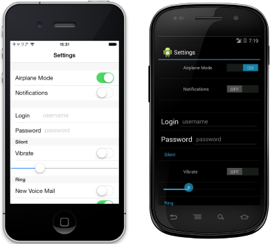
中的 TableView 元素會組織成區段。 在 的 TableView 根目錄是 TableRoot,這是一或多個 TableSection 實例的父代。 每個 TableSection 都包含標題和一或多個 ViewCell 實例:
<TableView Intent="Settings">
    <TableRoot>
        <TableSection Title="Ring">
            <SwitchCell Text="New Voice Mail" />
            <SwitchCell Text="New Mail" On="true" />
        </TableSection>
    </TableRoot>
</TableView>
對等的 C# 程式碼為:
Content = new TableView
{
    Root = new TableRoot
    {
        new TableSection("Ring")
        {
          // TableSection constructor takes title as an optional parameter
          new SwitchCell { Text = "New Voice Mail" },
          new SwitchCell { Text = "New Mail", On = true }
        }
    },
    Intent = TableIntent.Settings
};
外觀
TableViewIntent會公開 屬性,這個屬性可以設定為任何TableIntent列舉成員:
Data– 用於顯示資料項。 請注意, ListView 可能是捲動數據清單的較佳選項。Form– 當 TableView 做為窗體時使用。Menu– 用於呈現選取項目的功能表。Settings– 用於顯示組態設定的清單。
TableIntent您選擇的值可能會影響每個平臺上的顯示方式TableView。 即使沒有明確的差異,最好是選取 TableIntent 最符合您打算使用資料表的方式的 。
此外,您可以將 屬性設定TextColor為 Color,即可變更針對每個 TableSection 顯示之文字的色彩。
內建單元格
Xamarin.Forms 隨附內建數據格來收集和顯示資訊。 雖然 ListView 和 TableView 可以使用所有相同的儲存格, SwitchCell 但 EntryCell 與 TableView 案例最相關。
如需 TextCell 和 ImageCell 的詳細描述,請參閱 ListView 單元格外觀。
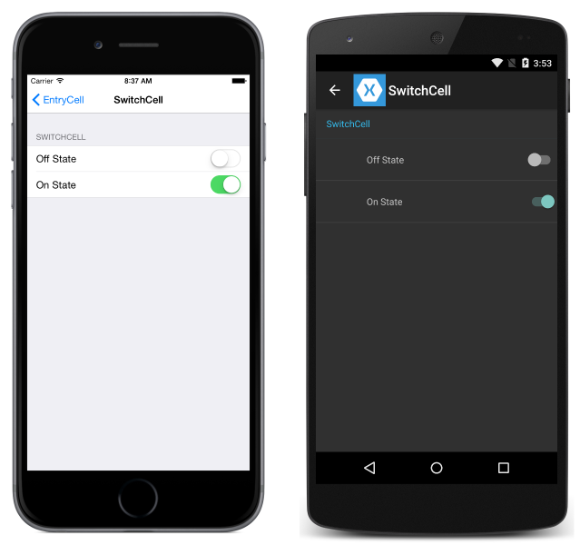
SwitchCell
SwitchCell 是用來呈現和擷取開啟/關閉或 true/false 狀態的控件。 它會定義下列屬性:
Text– 切換旁邊要顯示的文字。On– 參數是否顯示為開啟或關閉。OnColorColor– 位於位置上的 參數的 。
所有這些屬性都是可系結的。
SwitchCell 也會公開 OnChanged 事件,讓您回應單元格狀態的變更。
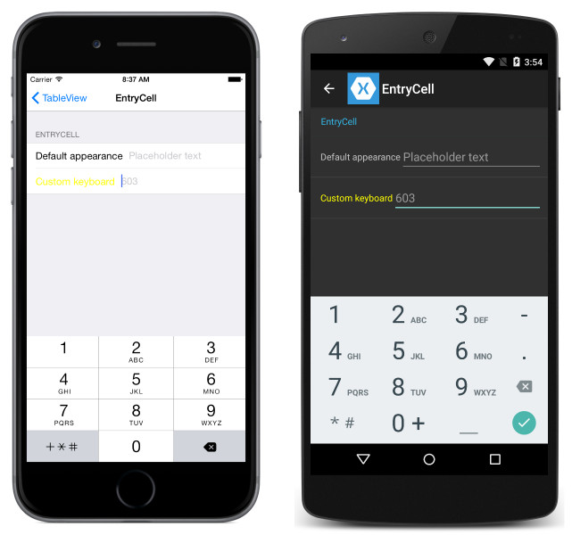
EntryCell
EntryCell 當您需要顯示使用者可以編輯的文字數據時,會很有用。 它會定義下列屬性:
Keyboard– 編輯時要顯示的鍵盤。 有數值、電子郵件、電話號碼等項目的選項。 請參閱 API 檔。Label– 要顯示在文字輸入欄位左邊的標籤文字。LabelColor– 標籤文字的色彩。Placeholder– 當專案欄位中為 Null 或空白時,要顯示的文字。 當文字項目開始時,此文字就會消失。Text– 輸入欄位中的文字。HorizontalTextAlignment– 文字的水平對齊方式。 值是置中、左或靠右對齊。 請參閱 API 檔。VerticalTextAlignment– 文字的垂直對齊方式。Start值為、Center或End。
EntryCell 也會公開 Completed 事件,當使用者在編輯文字時按下鍵盤上的 [完成] 按鈕時,就會引發此事件。
自定義儲存格
當內建單元格不夠時,自定義儲存格可用來呈現和擷取適合您應用程式的數據。 例如,您可能想要呈現滑桿,讓用戶選擇影像的不透明度。
所有自定義儲存格都必須衍生自 ViewCell,這是所有內建單元格類型所使用的相同基類。
這是自訂儲存格的範例:
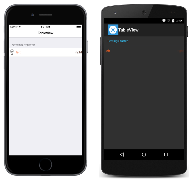
下列範例顯示用來在上述螢幕快照中建立 TableView 的 XAML:
<?xml version="1.0" encoding="UTF-8"?>
<ContentPage xmlns="http://xamarin.com/schemas/2014/forms"
             xmlns:x="http://schemas.microsoft.com/winfx/2009/xaml"
             x:Class="DemoTableView.TablePage"
             Title="TableView">
      <TableView Intent="Settings">
          <TableRoot>
              <TableSection Title="Getting Started">
                  <ViewCell>
                      <StackLayout Orientation="Horizontal">
                          <Image Source="bulb.png" />
                          <Label Text="left"
                                 TextColor="#f35e20" />
                          <Label Text="right"
                                 HorizontalOptions="EndAndExpand"
                                 TextColor="#503026" />
                      </StackLayout>
                  </ViewCell>
              </TableSection>
          </TableRoot>
      </TableView>
</ContentPage>
對等的 C# 程式碼為:
var table = new TableView();
table.Intent = TableIntent.Settings;
var layout = new StackLayout() { Orientation = StackOrientation.Horizontal };
layout.Children.Add (new Image() { Source = "bulb.png"});
layout.Children.Add (new Label()
{
    Text = "left",
    TextColor = Color.FromHex("#f35e20"),
    VerticalOptions = LayoutOptions.Center
});
layout.Children.Add (new Label ()
{
    Text = "right",
    TextColor = Color.FromHex ("#503026"),
    VerticalOptions = LayoutOptions.Center,
    HorizontalOptions = LayoutOptions.EndAndExpand
});
table.Root = new TableRoot ()
{
    new TableSection("Getting Started")
    {
        new ViewCell() {View = layout}
    }
};
Content = table;
下的 TableView 根元素是 TableRoot,且 TableSection 緊接在 TableRoot下方。 ViewCell直接定義在 TableSection底下,而 StackLayout 用來管理自定義數據格的配置,雖然這裡可以使用任何版面配置。
列高度
類別 TableView 有兩個屬性,可用來變更儲存格的數據列高度:
RowHeight– 將每個資料列的高度設定為int。HasUnevenRows– 如果設定為true,則數據列具有不同的高度。 請注意,將此屬性設定為true時,會自動計算並套用 Xamarin.Forms數據列高度。
當儲存格中TableView的內容高度變更時,會在 Android 和 通用 Windows 平台 上隱含更新數據列高度(UWP)。 不過,在 iOS 上,必須將 屬性設定 HasUnevenRows 為 true ,並藉由呼叫 Cell.ForceUpdateSize 方法,強制更新它。
下列 XAML 範例顯示 TableView 包含 的 ViewCell:
<ContentPage ...>
    <TableView ...
               HasUnevenRows="true">
        <TableRoot>
            ...
            <TableSection ...>
                ...
                <ViewCell x:Name="_viewCell"
                          Tapped="OnViewCellTapped">
                    <Grid Margin="15,0">
                        <Grid.RowDefinitions>
                            <RowDefinition Height="Auto" />
                            <RowDefinition Height="Auto" />
                        </Grid.RowDefinitions>
                        <Label Text="Tap this cell." />
                        <Label x:Name="_target"
                               Grid.Row="1"
                               Text="The cell has changed size."
                               IsVisible="false" />
                    </Grid>
                </ViewCell>
            </TableSection>
        </TableRoot>
    </TableView>
</ContentPage>
ViewCell點選 時,OnViewCellTapped會執行事件處理程式:
void OnViewCellTapped(object sender, EventArgs e)
{
    _target.IsVisible = !_target.IsVisible;
    _viewCell.ForceUpdateSize();
}
OnViewCellTapped事件處理程式會顯示或隱藏 中的ViewCell第二個 Label ,並藉由呼叫 Cell.ForceUpdateSize 方法來明確更新單元格的大小。
下列螢幕快照顯示點選之前的數據格:

下列螢幕快照顯示點選後的數據格:

重要
如果此功能過度使用,效能可能會降低。